Design guidelines to follow in Figma
For best deliverability experience, we suggest you to follow the following guidelines while designing the email in Figma. We test all design inputs with the following two parameters:
- Template width
- HTML size
If the design requires no changes, we mark it green. If it requires minor changes, we mark it yellow. If the design requires major changes and could lead to issues like getting marked as spam, or clipping, we mark it red.
Let’s discuss all test parameters individually:
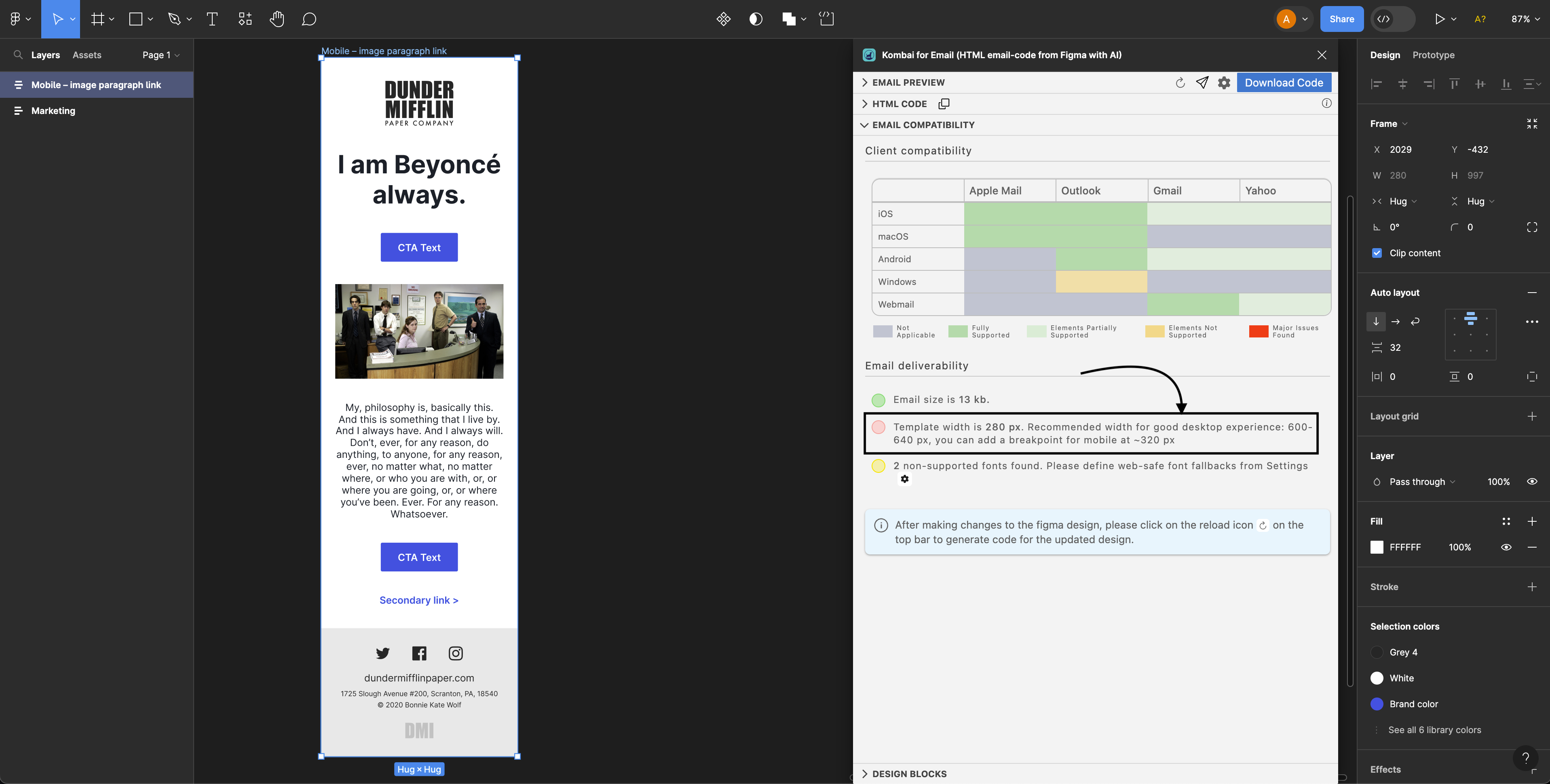
Template width
We flag email templates with <320px width as red. The ideal template width for a good desktop experience is between 600-640px. However, we also allow you to add a breakpoint for a better mobile experience.
How to fix?
Redesign the template at 600-640px width size and add breakpoints for the elements that you want to change at 320px or lower.
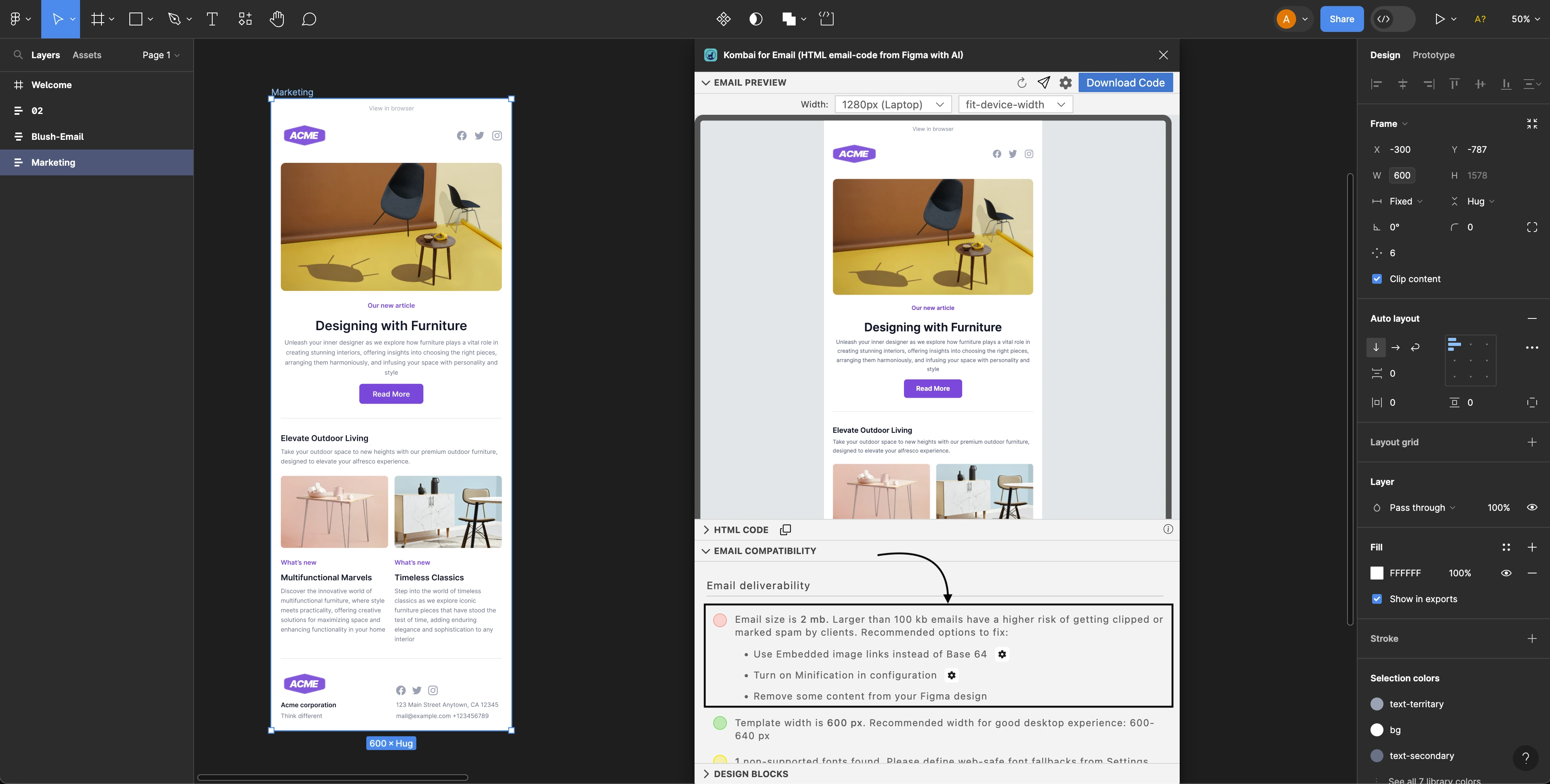
HTML size
Emails with more than 100KB size have a higher risk of getting clipped by Gmail or being marked as spam by email clients. Therefore, we mark this as red.
How to fix?
Here are a few possible fixes to reduce email size:
- Use embedded image links instead of Base64 images.
- Turn on Minification from the settings.
- Reduce content from your figma design.