Generating code for your design
Kombai's primary functionality lies in its capability to convert designs into usable code. This section outlines the steps and options available to users for this process. There are two steps to generate code for your designs:
- Identifying component
- Generating code for the identified component
Identifying your component
Kombai processes your loaded design, intelligently segmenting it into distinct sections or components. Hover over the design to view these identified sections.
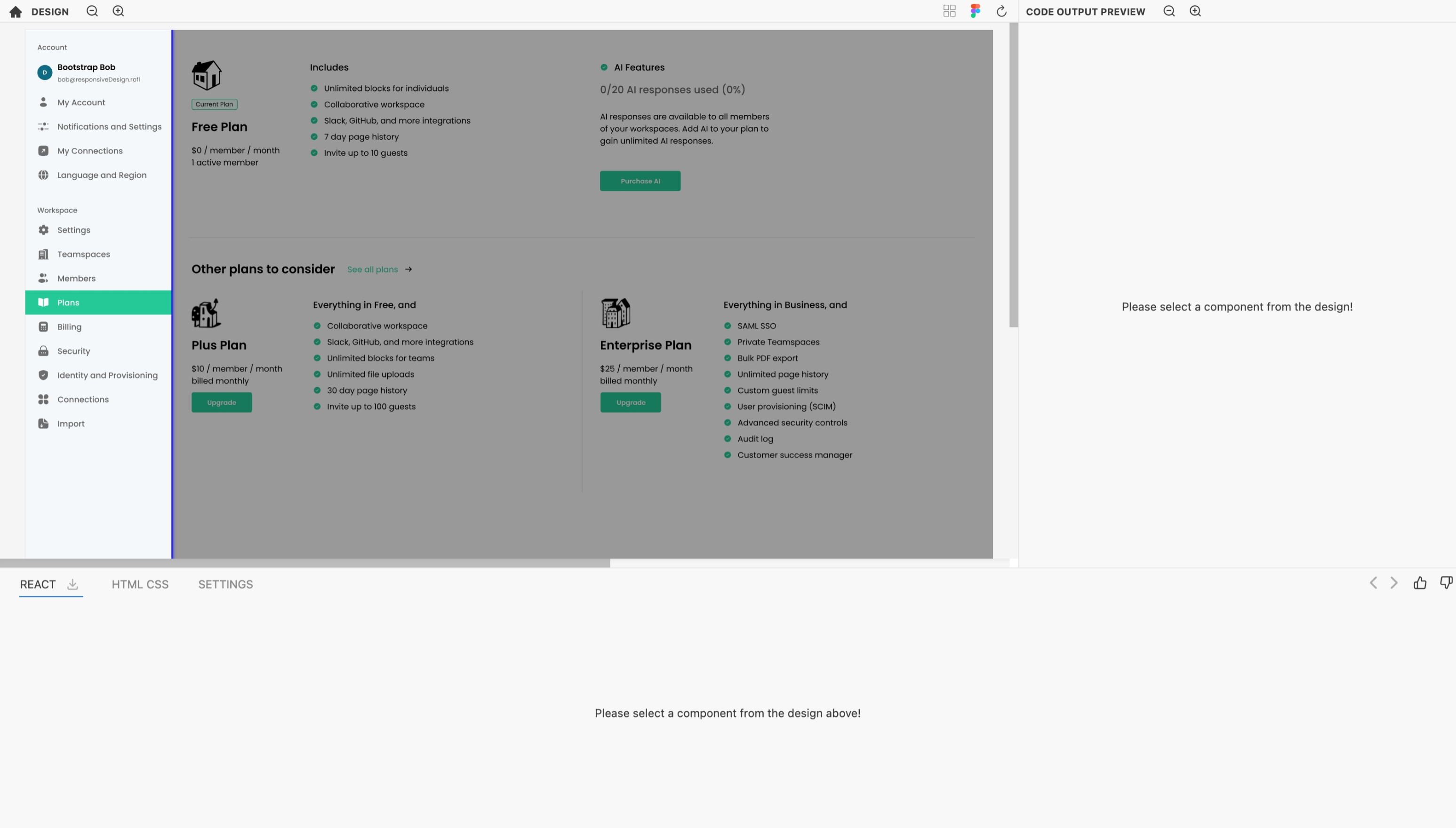
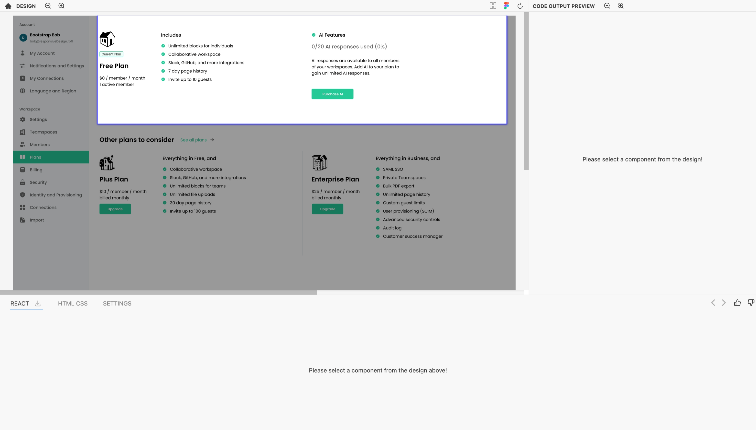
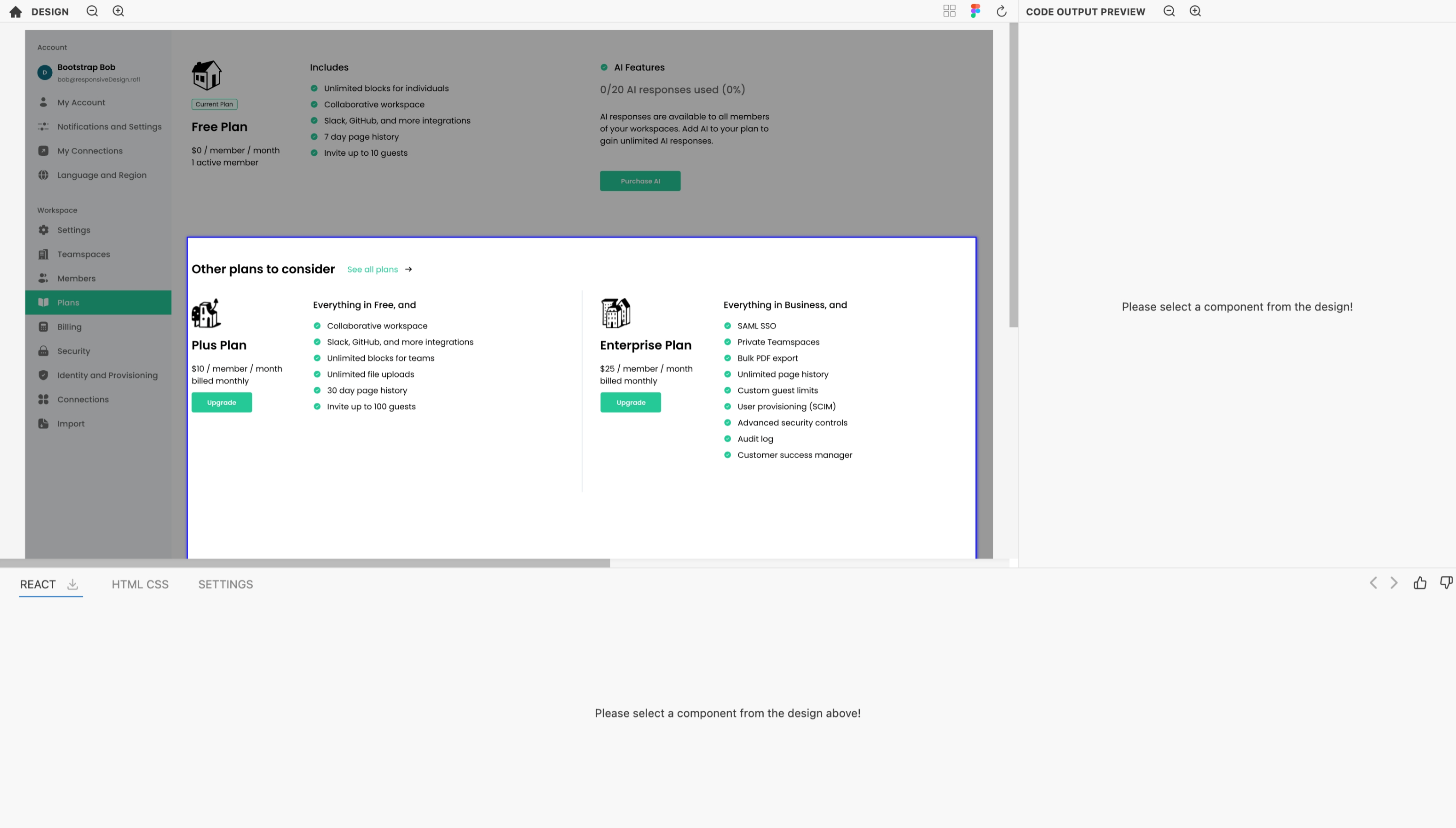
Each of these sections can be used to generate specific code.
Generating code
You can select any component that you would like to work on and Kombai will generate code for it. There are two ways to tell Kombai what area in the design should it generate code for:
For sections of a design
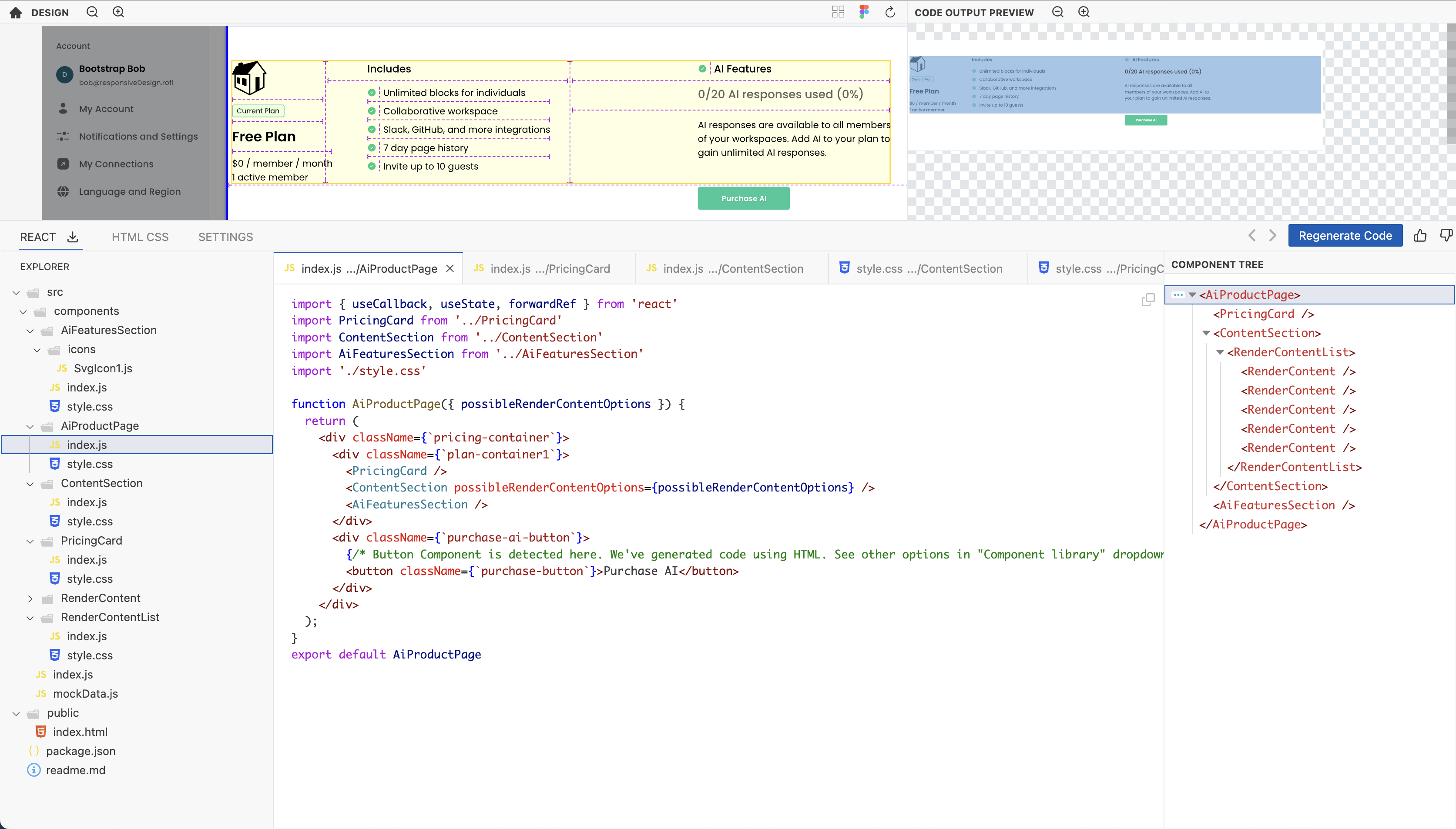
To generate code for a specific section, click on that section in the loaded design. Kombai's generative AI will interpret the design and produce the associated code.
For the entire design
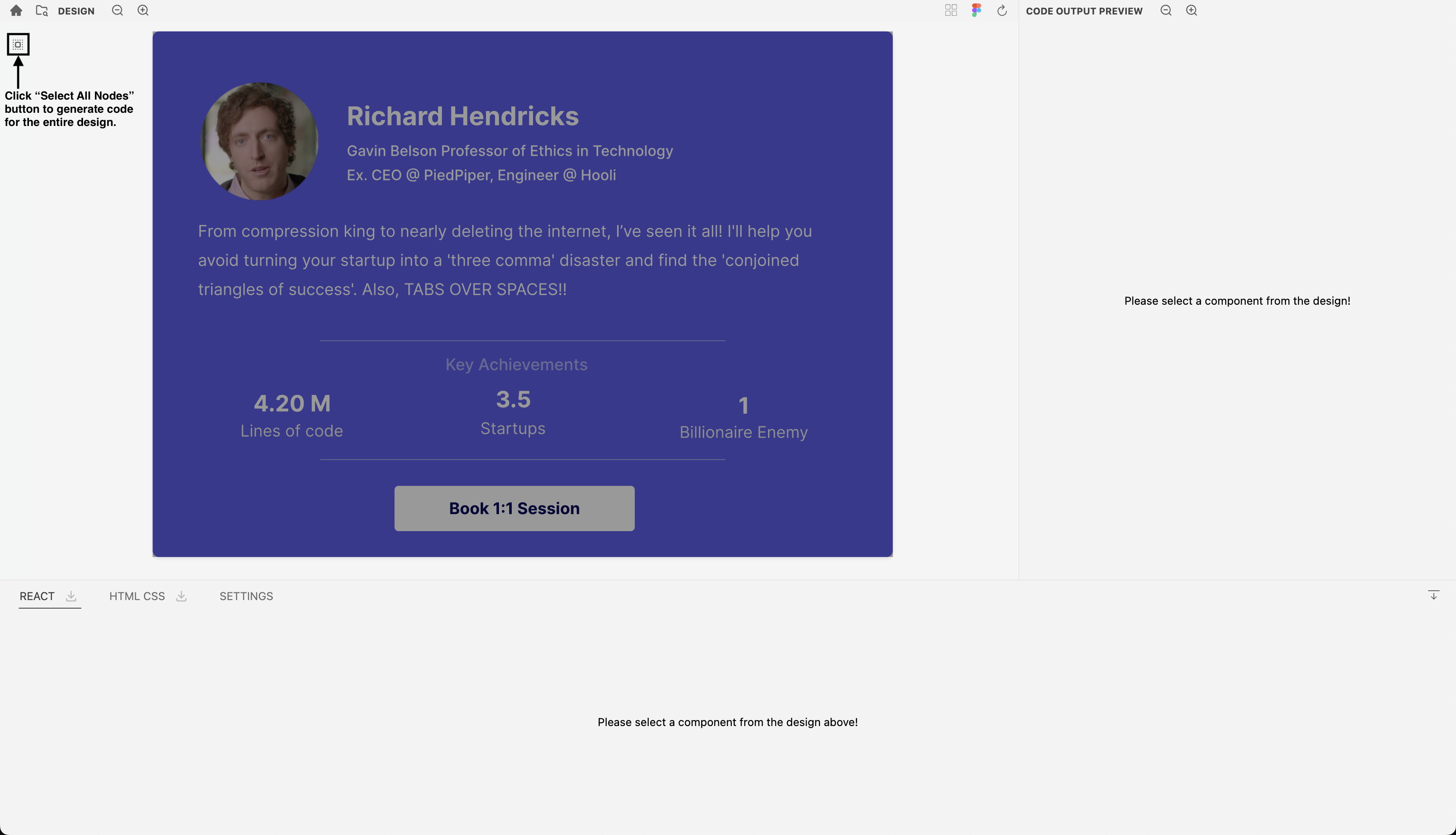
To generate code for the entire design, click on the button. Kombai's generative AI will interpret the design and produce the associated code.
Output format
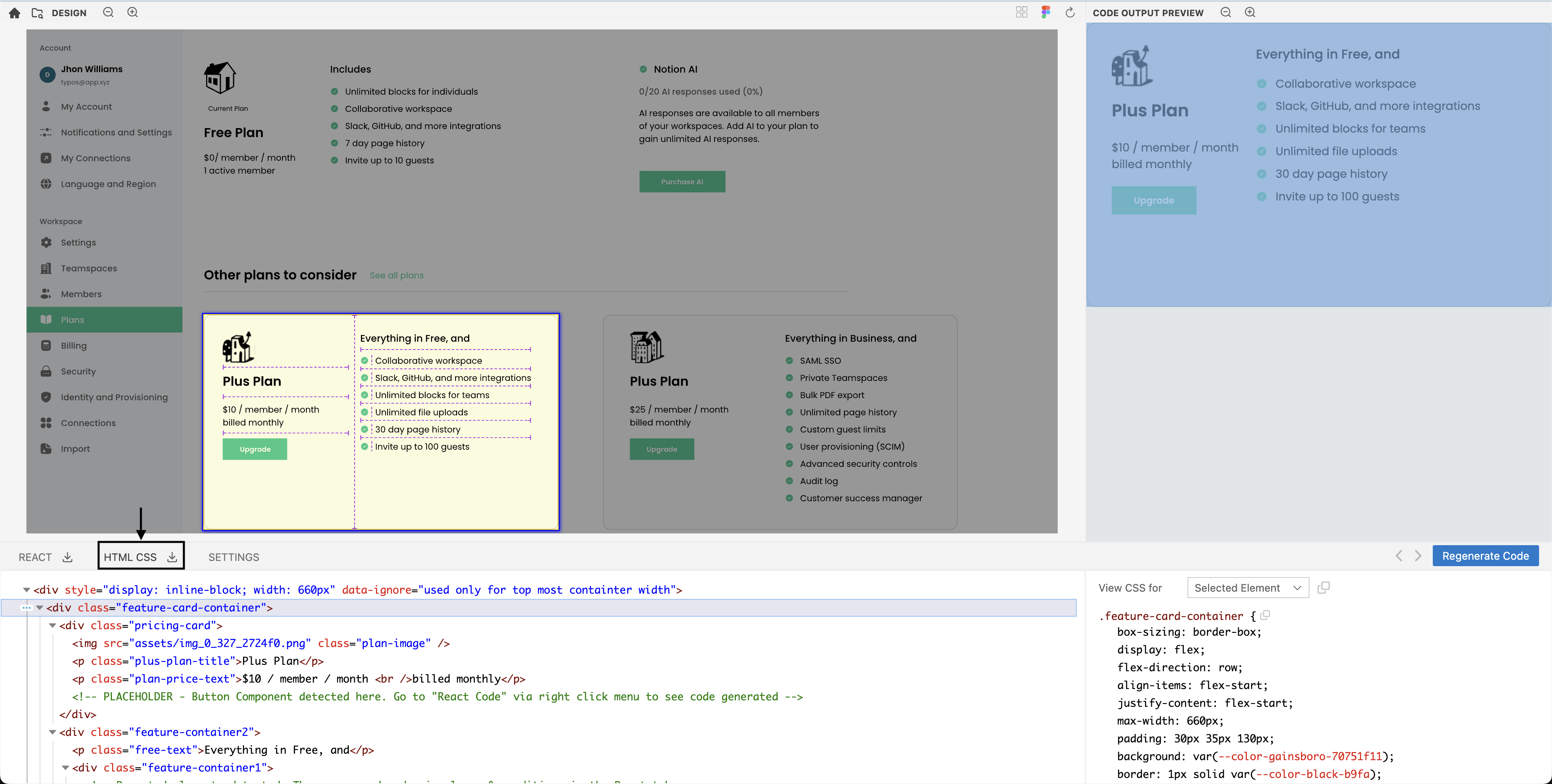
- HTML/CSS: To generate the HTML/CSS code for the design, click on HTML/CSS tab located below the design.
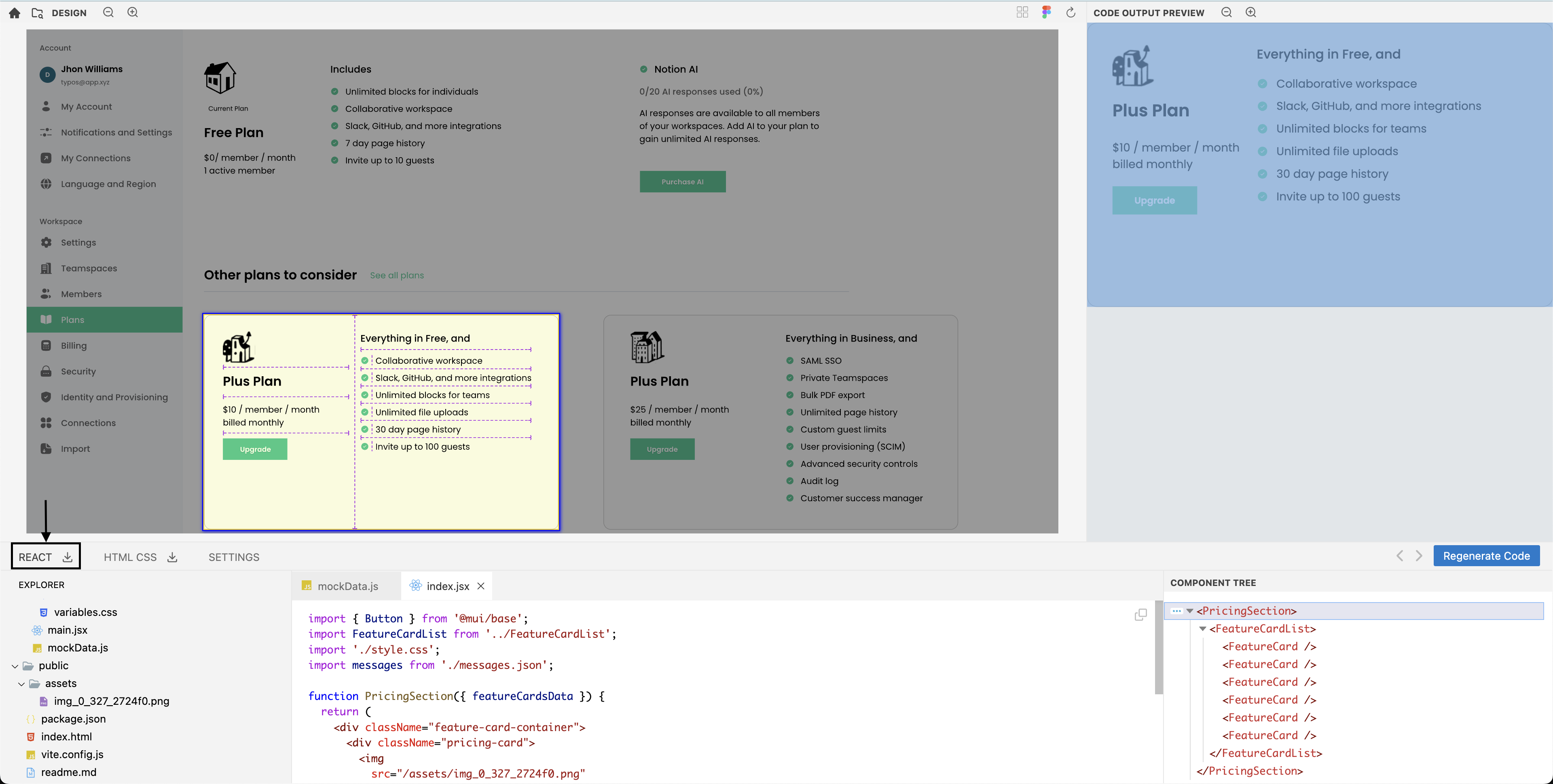
- React: To generate the HTML/CSS code for the design, click on React tab located below the design.
Code transformation
Kombai's auto-generated code can be further transformed based on your instructions. If you need customizations to the default code, prompt Kombai to make the required changes.
How to use this feature?
- Load your design in Kombai and select a component.
- Go to HTML CSS tab and click on the
located at the bottom right.
- Type your instruction in the input box and click the
.
- Now, Kombai will generate a new code for the selected component based on your prompt.
- Click on the
to accept the response and download the code, edit the prompt and retry, or to discard the response.
Note: Each time you prompt Kombai to customize the HTML/CSS, the transformations will be applied on top of the default Kombai-generated code.
Prompt examples
Here are two different prompts examples to customize the default Kombai-generated code:
A. Use semantic HTML instead of <div> elements.
B. Lazy load the image used in the code.
Customize your tech stack
To align with varied development environments, Kombai offers customization options for your tech stack:
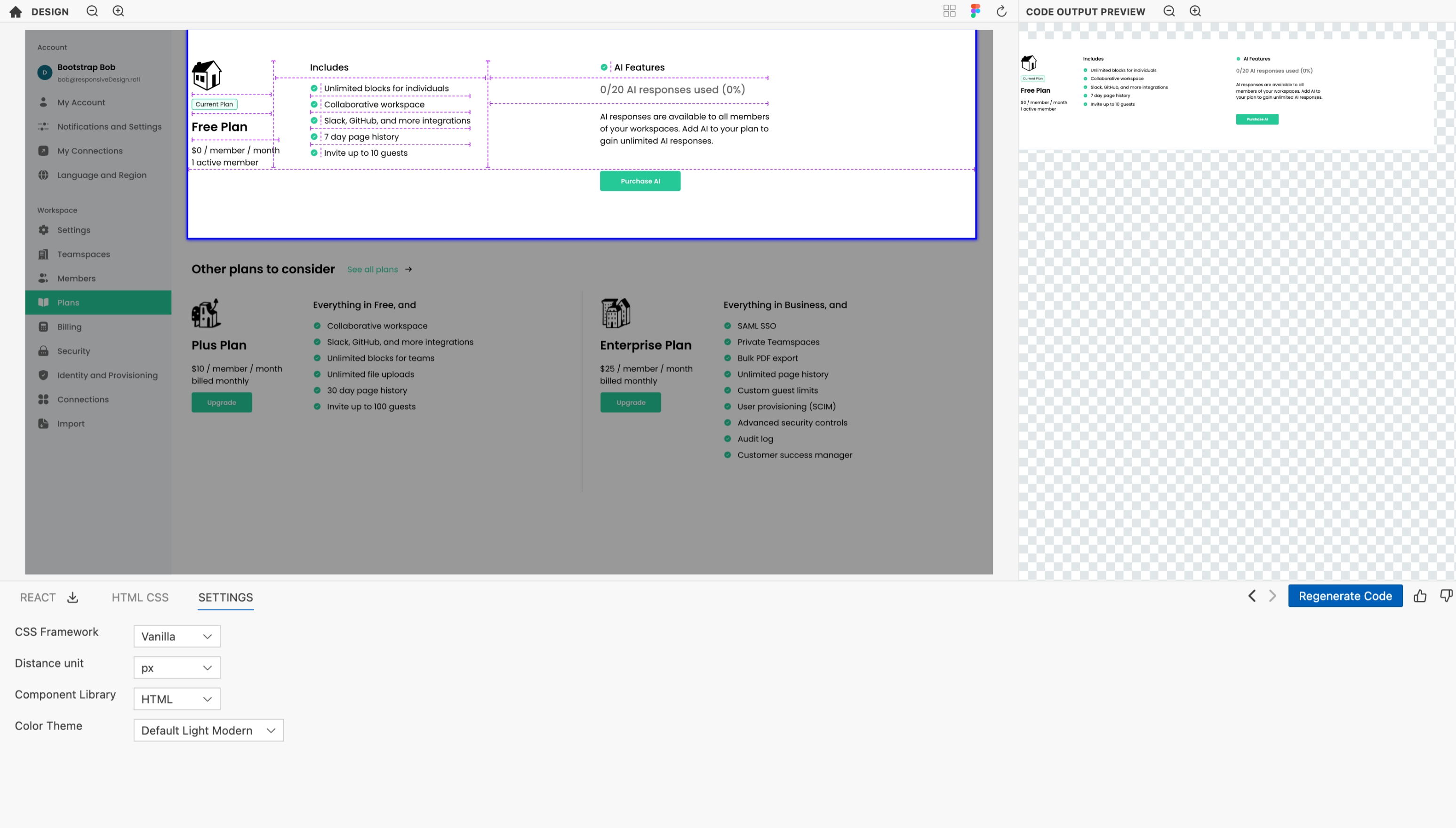
- Access the code generation settings in the "settings" tab located below the design.
CSS framework settings
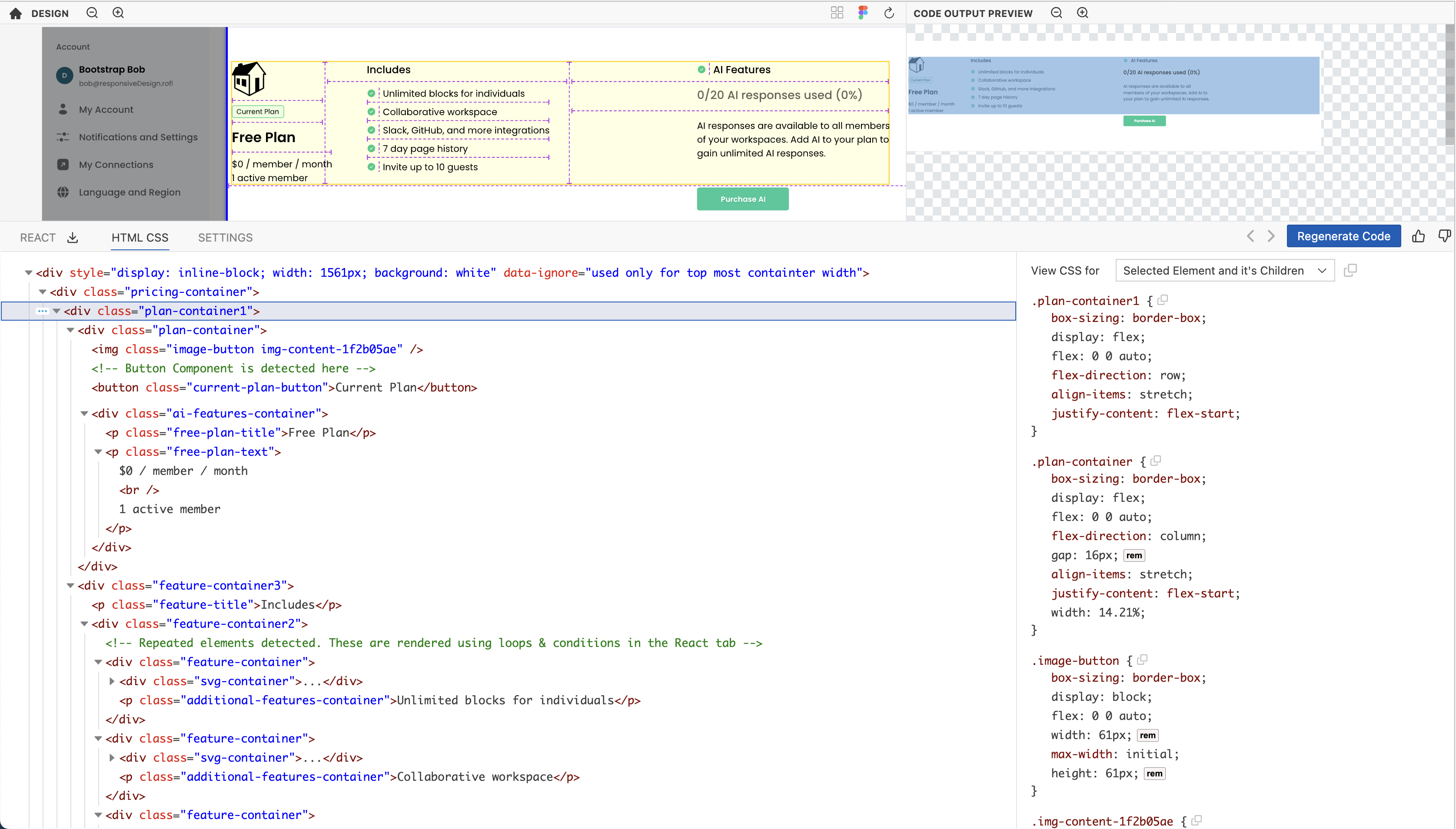
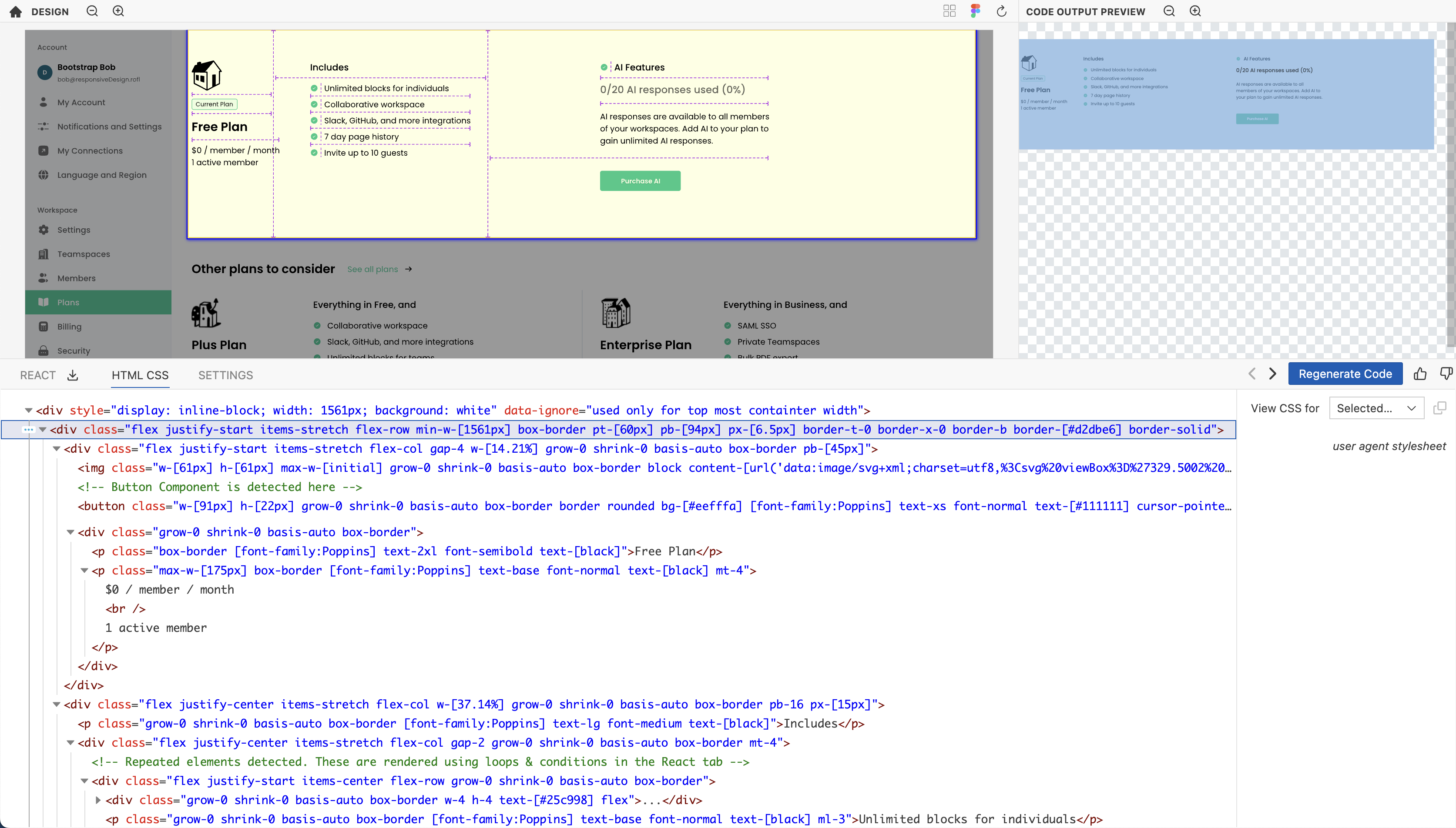
Choose your desired CSS framework:
-
Vanilla CSS: This is the standard CSS output.
-
Tailwind: Utilizes the Tailwind CSS framework for the output.
Language settings
Choose your desired language:
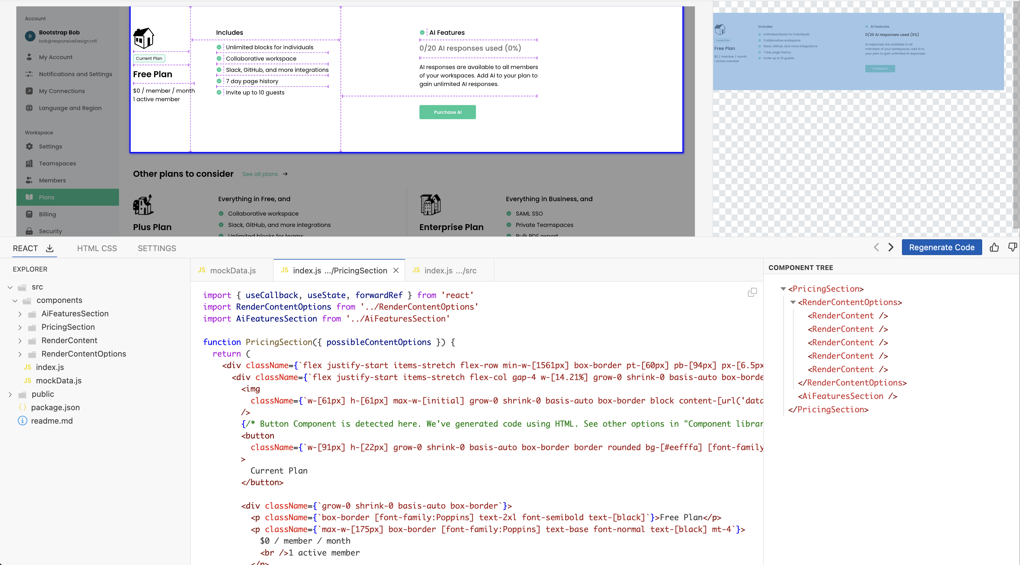
- JavaScript - Utilizes JavaScript for the output. In this case, the React tab will output the standard JSX code.
- TypeScript - Kombai supports generation of TypeScript code. The generated code includes explicit types for all variables and components. You can view and download the code in the React tab.
Component library settings
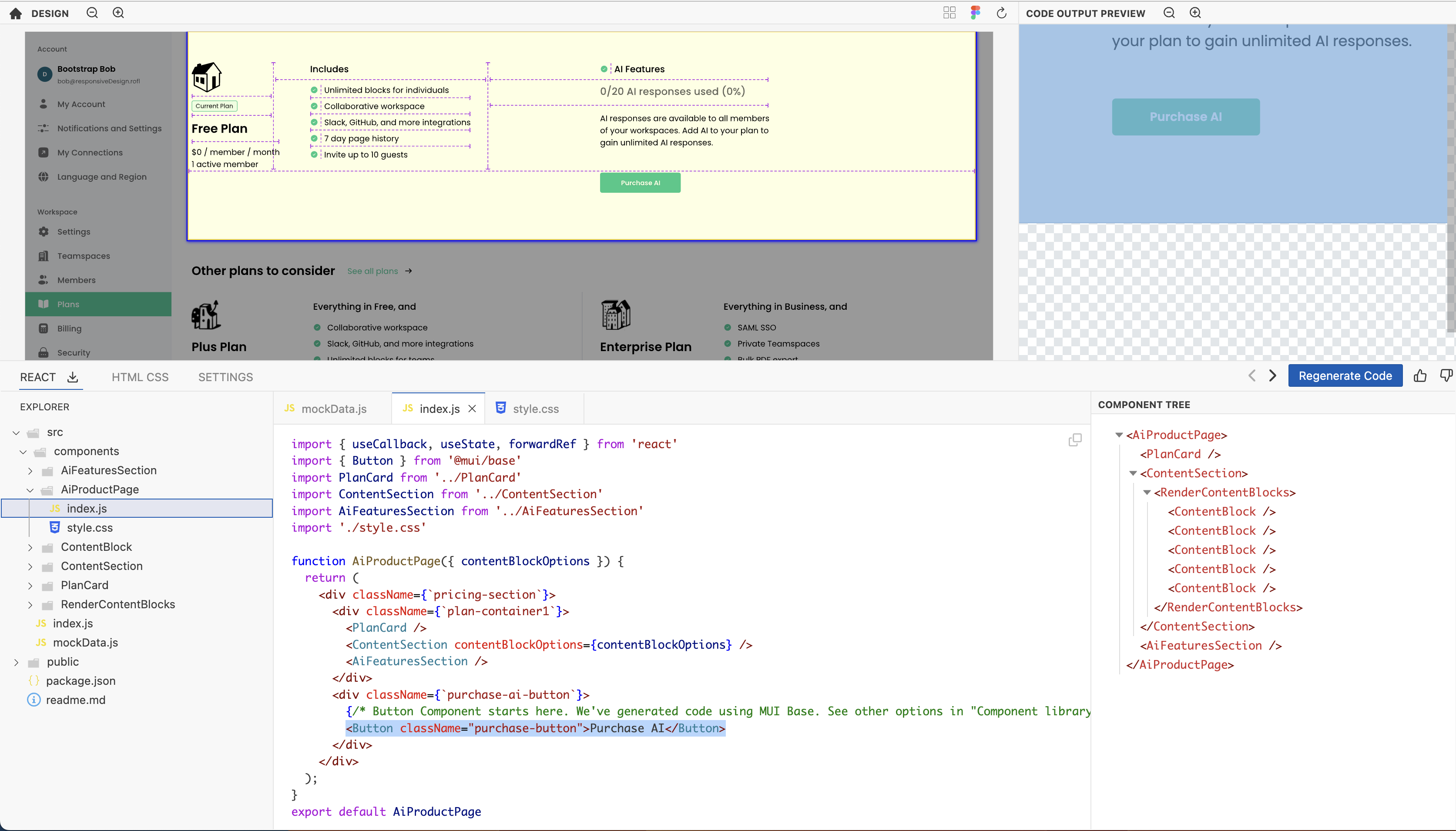
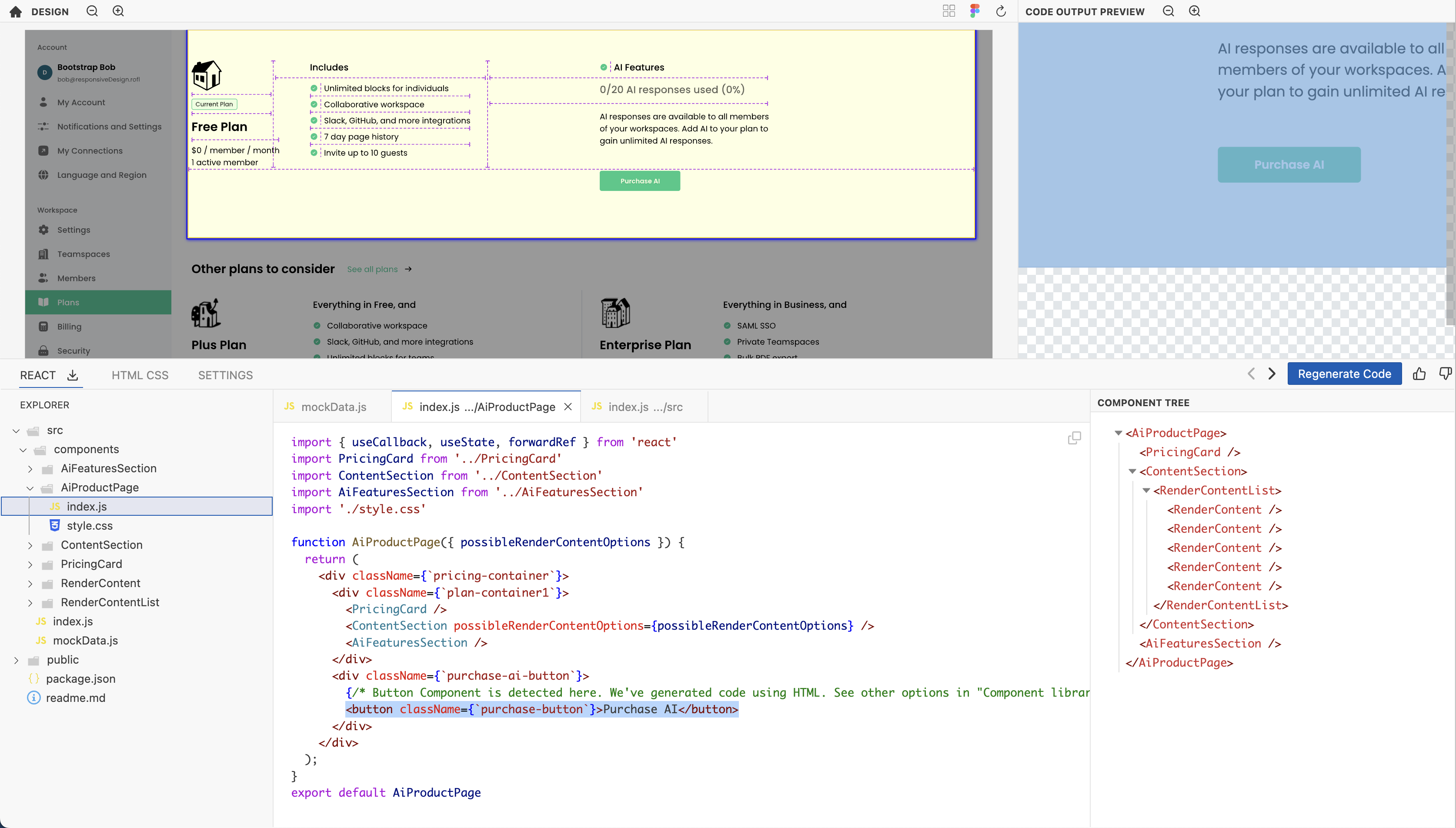
Kombai can potentially detect and generate code for components and integrate with libraries and can match the styling of native elements. Current support is ../public/generating-code/mui.png for following libraries and limited components:
-
MUI Base (headless components): Limited to form elements like button, input, checkbox, and select.
-
Native HTML elements: Supported with styling to closely resemble the original design.
Measurement units
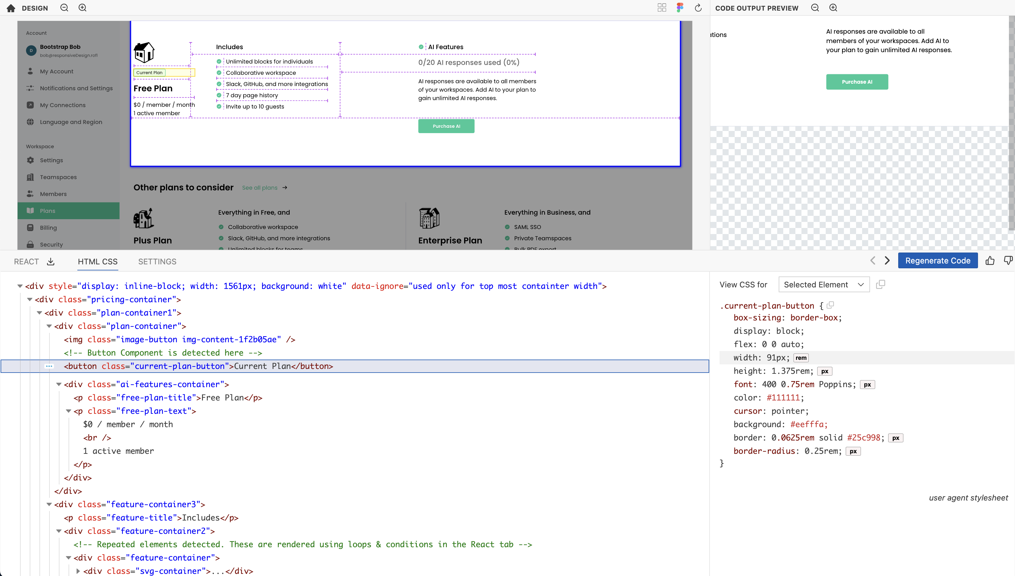
Customize the units used in your generated code:
-
px: Pixels as units.

-
rem: Relative to font-size of the root element.

You can click the px button to view the unit corresponding to px and vice versa
Auto-generated Alt-text
Kombai supports auto-generation of alt text for images used in the code. When this is turned on, our model auto-generates relevant alt text specific to each image used in the design.
To turn on auto-generation of alt-text:
- Load the design in Kombai.
- Go to Settings and click on Autogenerate in Alt Text for Images.
Now, Kombai will regenerate the code and the latest React and HTML/CSS code will include the alt text.
Mark text as headers
The default auto-generated code uses <p> tag for all the text used in the design. However, you can also mark certain texts as headings. Kombai allows you to replace specific <p> tags with any header tag from <h1> to <h6>.
We categorize all the text used in the design on the basis of font family and font size. You need to choose the font family and corresponding font size of the <p> tag that you want to replace with one of the header tags.
For example, if your design has a title text of 50px and font-family is Times New Roman, you need to select Times New Roman from the Font Family dropdown followed by selecting 50px from the Font Size dropdown and <h1> from the Header Tag dropdown.
To mark text as header:
- Load the design in Kombai.
- Go to Settings.
- In Mark Texts as Headers section, select the Font Family and Font Size of the concerned text.
- Next, choose a header tag from
<h1>to<h6>for the text and click on Add Combination. - Click on Save changes to save your combination.
With these features, Kombai offers an adaptable and efficient design-to-code solution. Make sure to explore each option to find the best fit for your development workflow.
Reviewing layout
Export React code
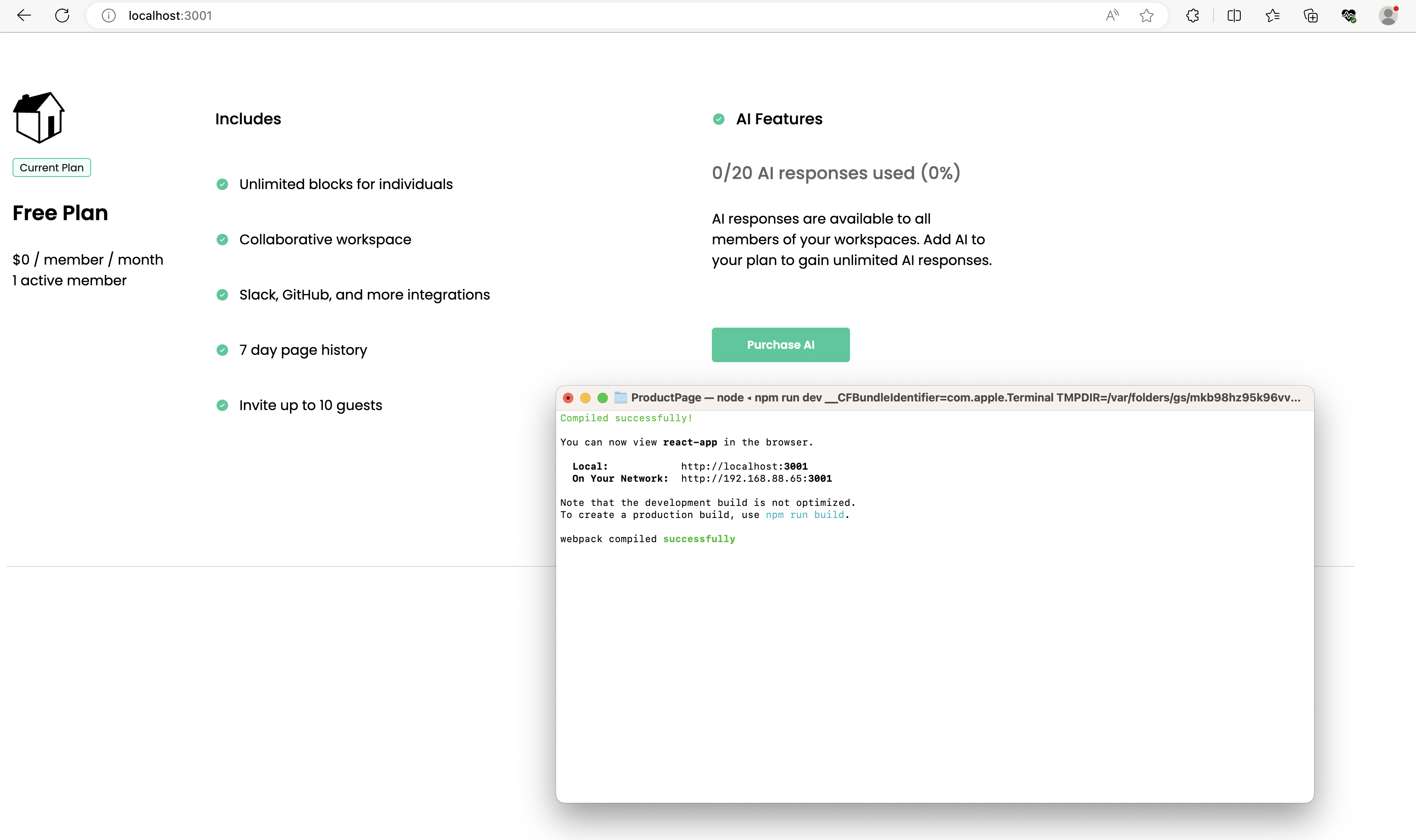
Click the download button next to the React tab to download the code. The code downloads as a zip file with the name of the root component.
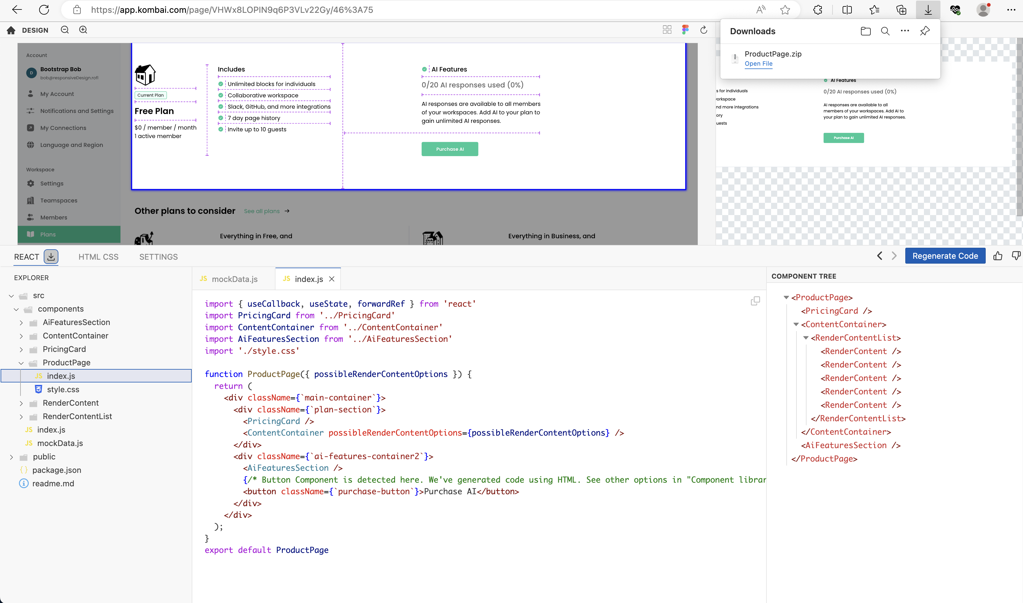
In the above example, the zip file contains the following files:
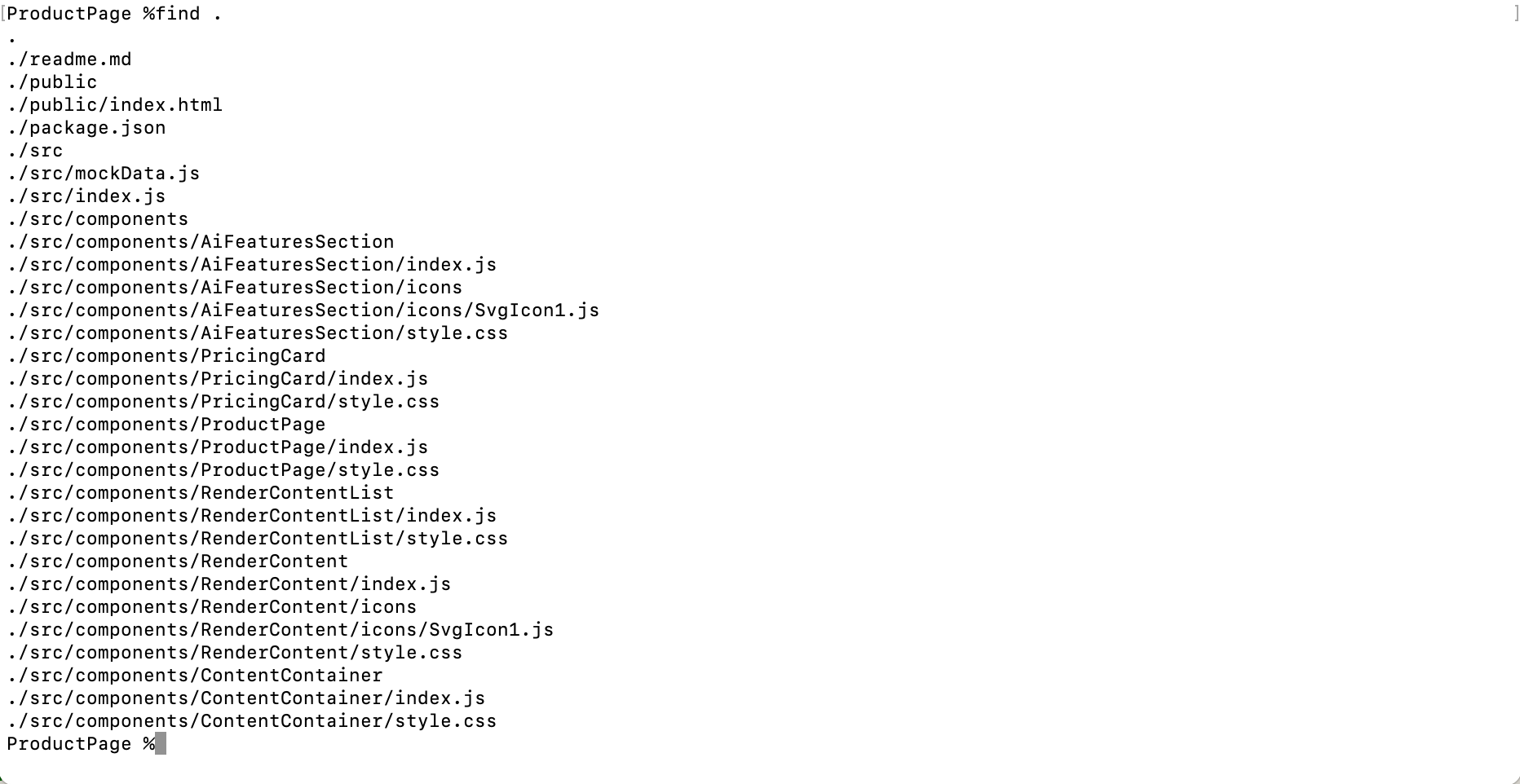
Run npm install && npm run dev to start the development server.
Export HTML code
Select any HTML element in the HTML CSS code panel and right click to copy the code. The tool gives following four options -
- Copy HTML
- This element
- This element with children
- Copy CSS
- This element
- This element with children
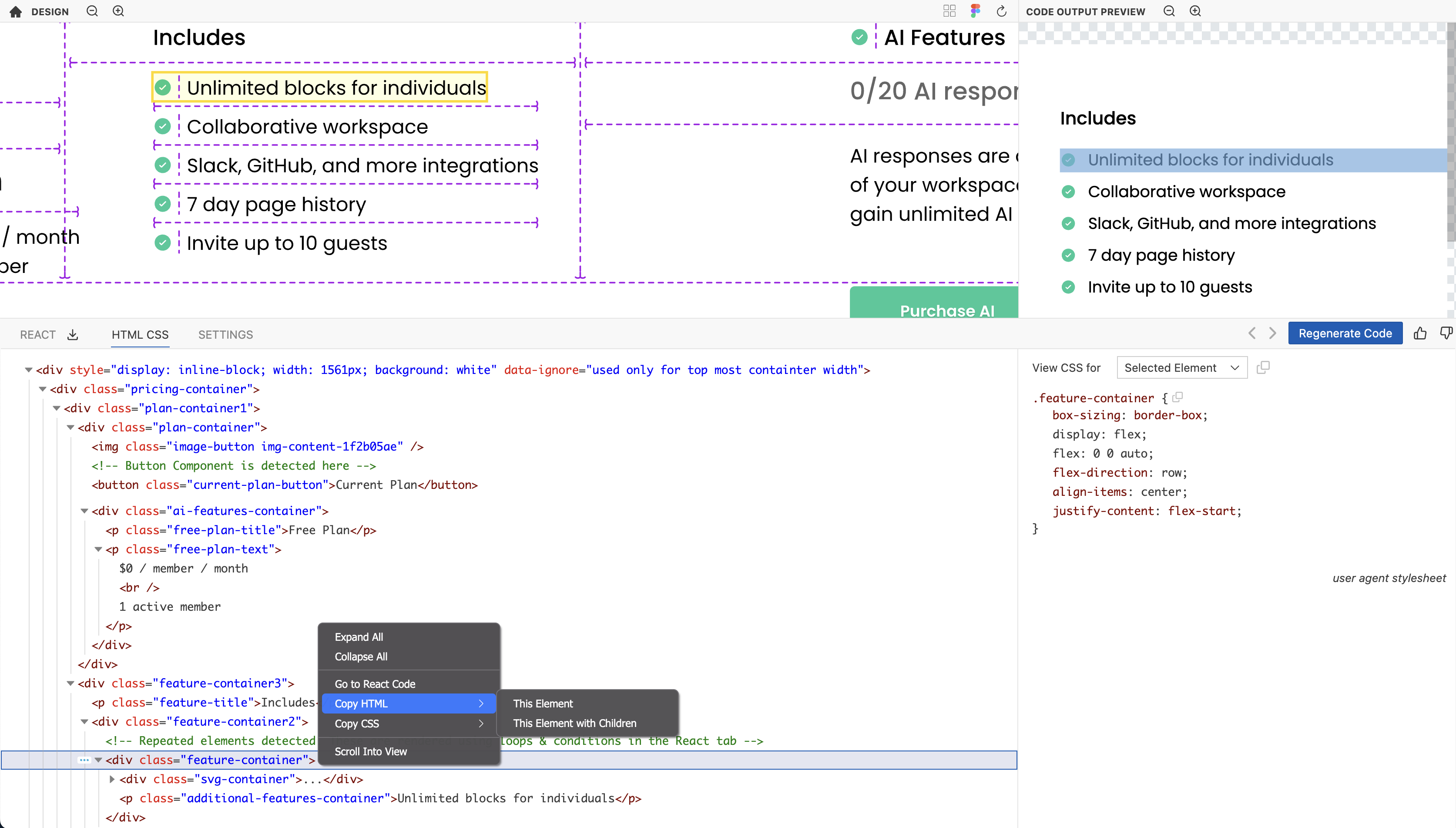
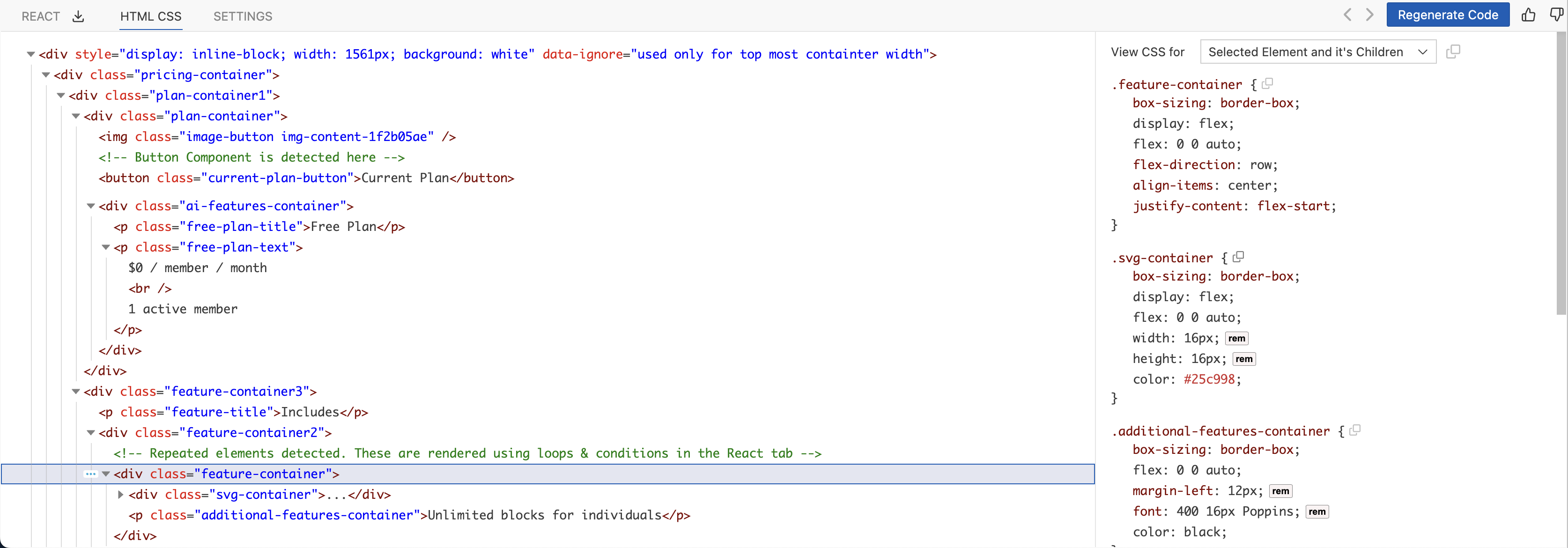
The example output for Copy HTML - This element is as follows -
<div class="feature-container">
  <div class="svg-container">
    <svg
      viewBox="0 0 16 16"
      x="0"
      y="0"
      fill="none"
      xmlns="http://www.w3.org/2000/svg"
    >
      <g
        id="Bold / Essentional, UI / Check Circle_2"
        xmlns="http://www.w3.org/2000/svg"
      >
        <path
          id="Vector_20"
          fill-rule="evenodd"
          clip-rule="evenodd"
          d="M14.667,8c0,3.682 -2.985,6.667 -6.667,6.667c-3.682,0 -6.667,-2.985 -6.667,-6.667c0,-3.682 2.985,-6.667 6.667,-6.667c3.682,0 6.667,2.985 6.667,6.667zM10.687,5.98c0.195,0.195 0.195,0.512 0,0.707l-3.333,3.333c-0.196,0.195 -0.512,0.195 -0.708,0l-1.333,-1.333c-0.195,-0.195 -0.195,-0.512 0,-0.707c0.195,-0.195 0.512,-0.195 0.707,0l0.98,0.98l1.49,-1.49l1.49,-1.49c0.195,-0.195 0.512,-0.195 0.707,0z"
          fill="currentColor"
        />
      </g>
    </svg>
  </div>
  <p class="additional-features-container">Unlimited blocks for individuals</p>
</div>
The example output for Copy HTML - This element with children is as follows -
.feature-container {
  box-sizing: border-box;
  display: flex;
  flex: 0 0 auto;
  flex-direction: row;
  align-items: center;
  justify-content: flex-start;
}
.svg-container {
  box-sizing: border-box;
  display: flex;
  flex: 0 0 auto;
  width: 16px;
  height: 16px;
  color: #25c998;
}
.additional-features-container {
  box-sizing: border-box;
  flex: 0 0 auto;
  margin-left: 12px;
  font: 400 16px Poppins;
  color: black;
}
This is useful when you want to use templating based frameworks such as Django, Jinja, Angular, Vue, Svelte, etc. where you can copy and paste these DOM elements.
An example output when Tailwind using CSS Framework -
<div
  class="flex justify-start items-center flex-row grow-0 shrink-0 basis-auto box-border"
>
  <div
    class="grow-0 shrink-0 basis-auto box-border w-4 h-4 text-[#25c998] flex"
  >
    <svg
      viewBox="0 0 16 16"
      x="0"
      y="0"
      fill="none"
      xmlns="http://www.w3.org/2000/svg"
    >
      <g
        id="Bold / Essentional, UI / Check Circle_2"
        xmlns="http://www.w3.org/2000/svg"
      >
        <path
          id="Vector_20"
          fill-rule="evenodd"
          clip-rule="evenodd"
          d="M14.667,8c0,3.682 -2.985,6.667 -6.667,6.667c-3.682,0 -6.667,-2.985 -6.667,-6.667c0,-3.682 2.985,-6.667 6.667,-6.667c3.682,0 6.667,2.985 6.667,6.667zM10.687,5.98c0.195,0.195 0.195,0.512 0,0.707l-3.333,3.333c-0.196,0.195 -0.512,0.195 -0.708,0l-1.333,-1.333c-0.195,-0.195 -0.195,-0.512 0,-0.707c0.195,-0.195 0.512,-0.195 0.707,0l0.98,0.98l1.49,-1.49l1.49,-1.49c0.195,-0.195 0.512,-0.195 0.707,0z"
          fill="currentColor"
        />
      </g>
    </svg>
  </div>
  <p
    class="grow-0 shrink-0 basis-auto box-border [font-family:Poppins] text-base font-normal text-[black] ml-3"
  >
    Unlimited blocks for individuals
  </p>
</div>
The copy CSS option is also available in the CSS properties panel for every individual class as well as all the classes for an element as well as all the children.
Tag Image Layer(optional)
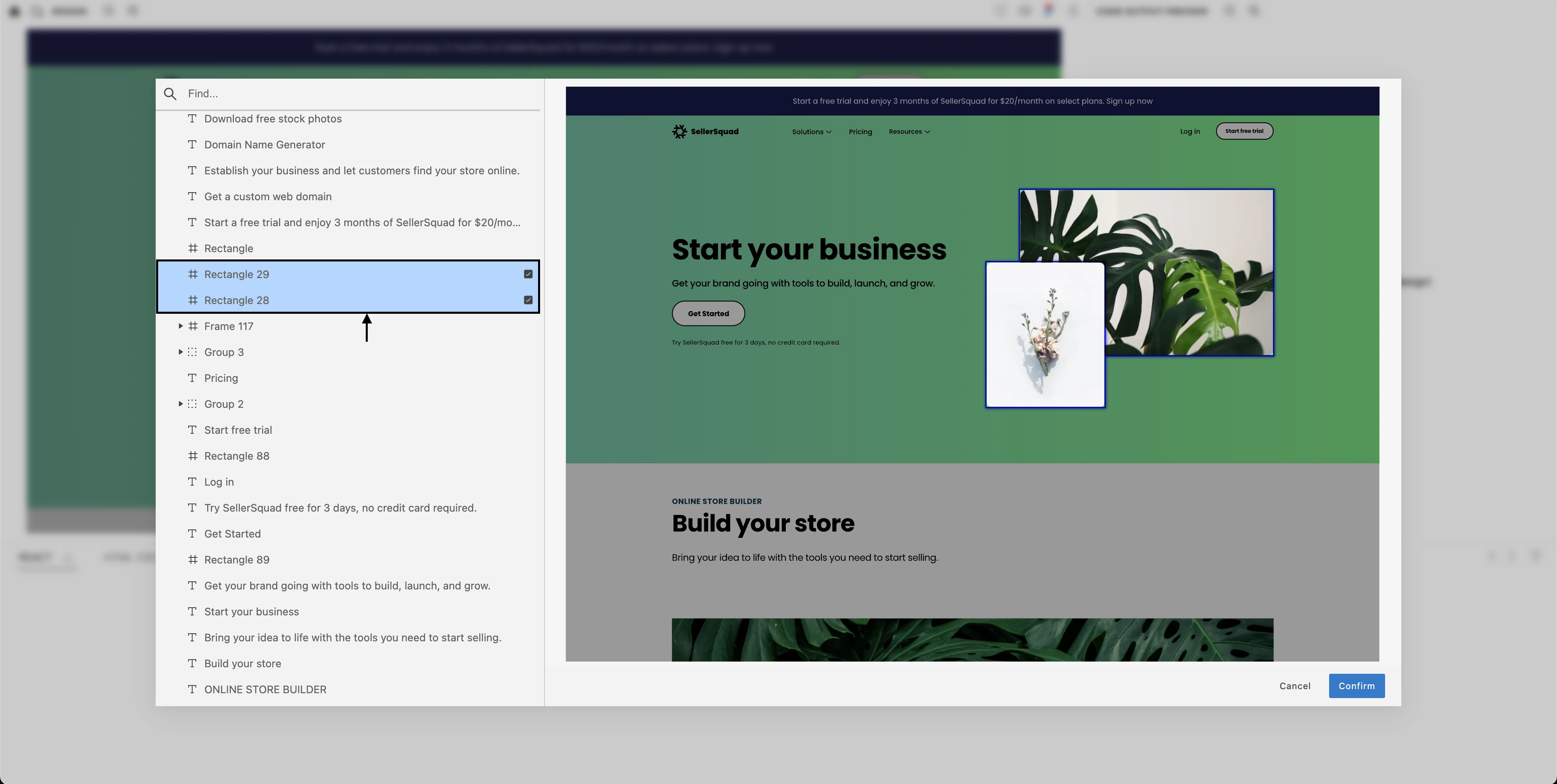
Sometimes, designers find Figma very useful for creating high-quality images and graphics for their projects. They bring multiple shapes, vectors and images together, overlap them on top of one another to form an unique image. When Kombai comes across such figma designs, it finds it difficult to generate code that is 100% accurate to the design.
To avoid such issues, Kombai allows you to mark Figma layers as images. This helps Kombai understand what Figma layers you want to import as image in the code. As a result, such layers are converted to image before getting used in the code.
To mark layers as images:
- Load the design in Kombai. Click here to know how to load designs in Kombai.
- Click on Tag Image Layer in the menu options.
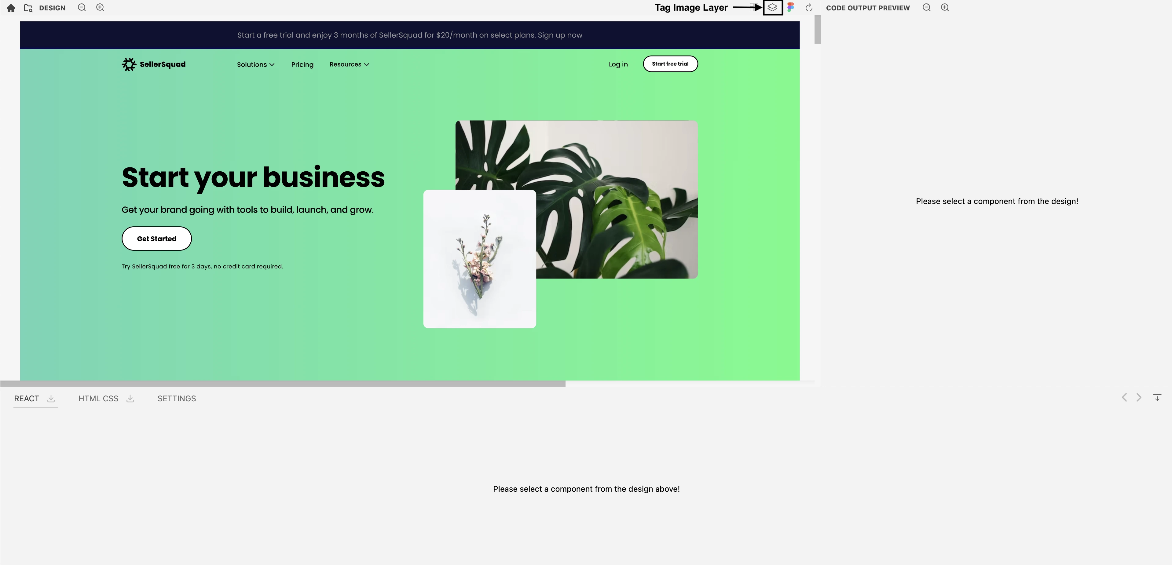
- Mark the frames that you want to be used as images in the code.
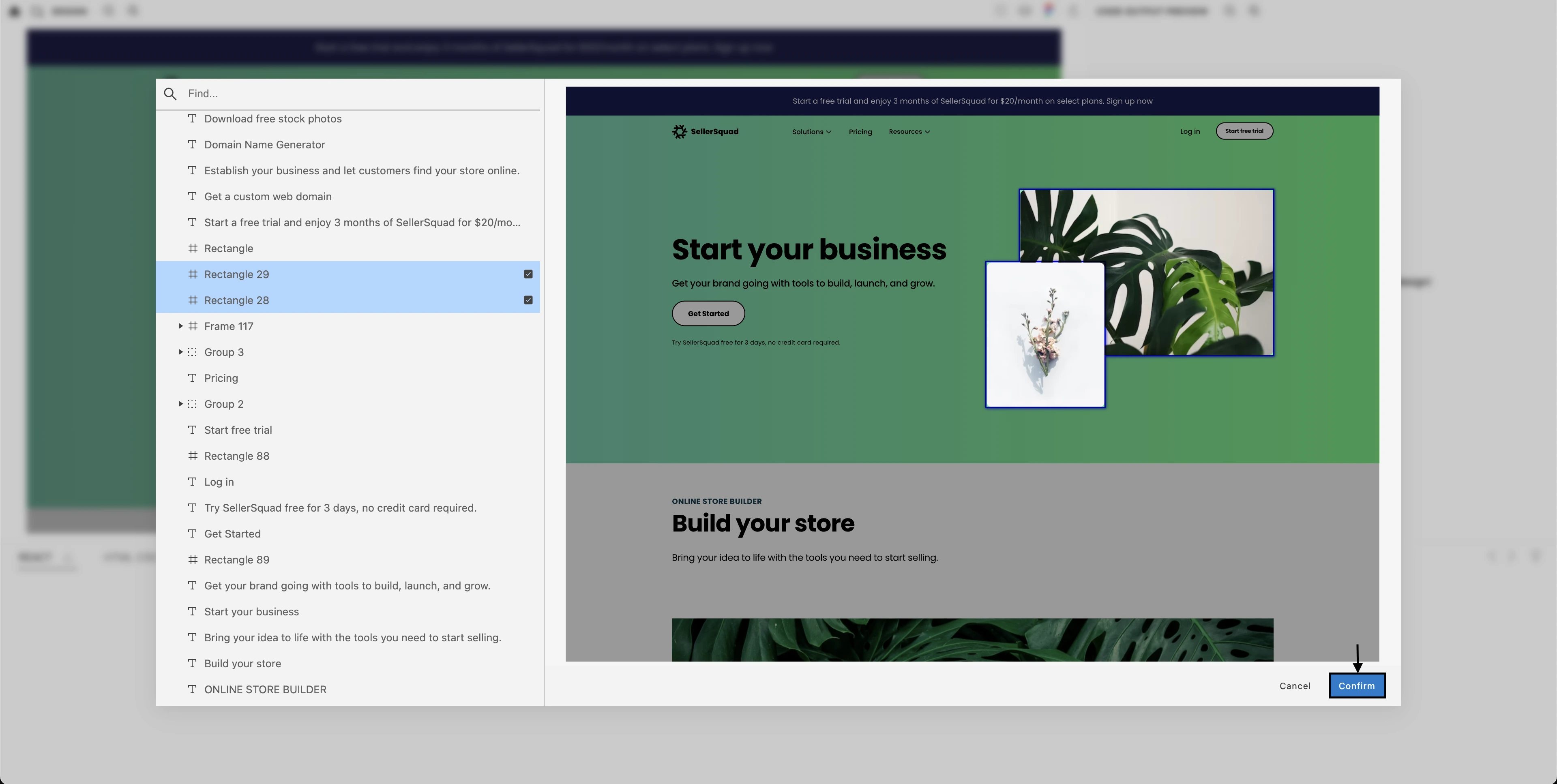
- Click Confirm.
Troubleshooting
Check out our section on Design Prompt Engineering to learn how to make minor tweaks to your design to nudge Kombai in the right direction to generate the code you want.