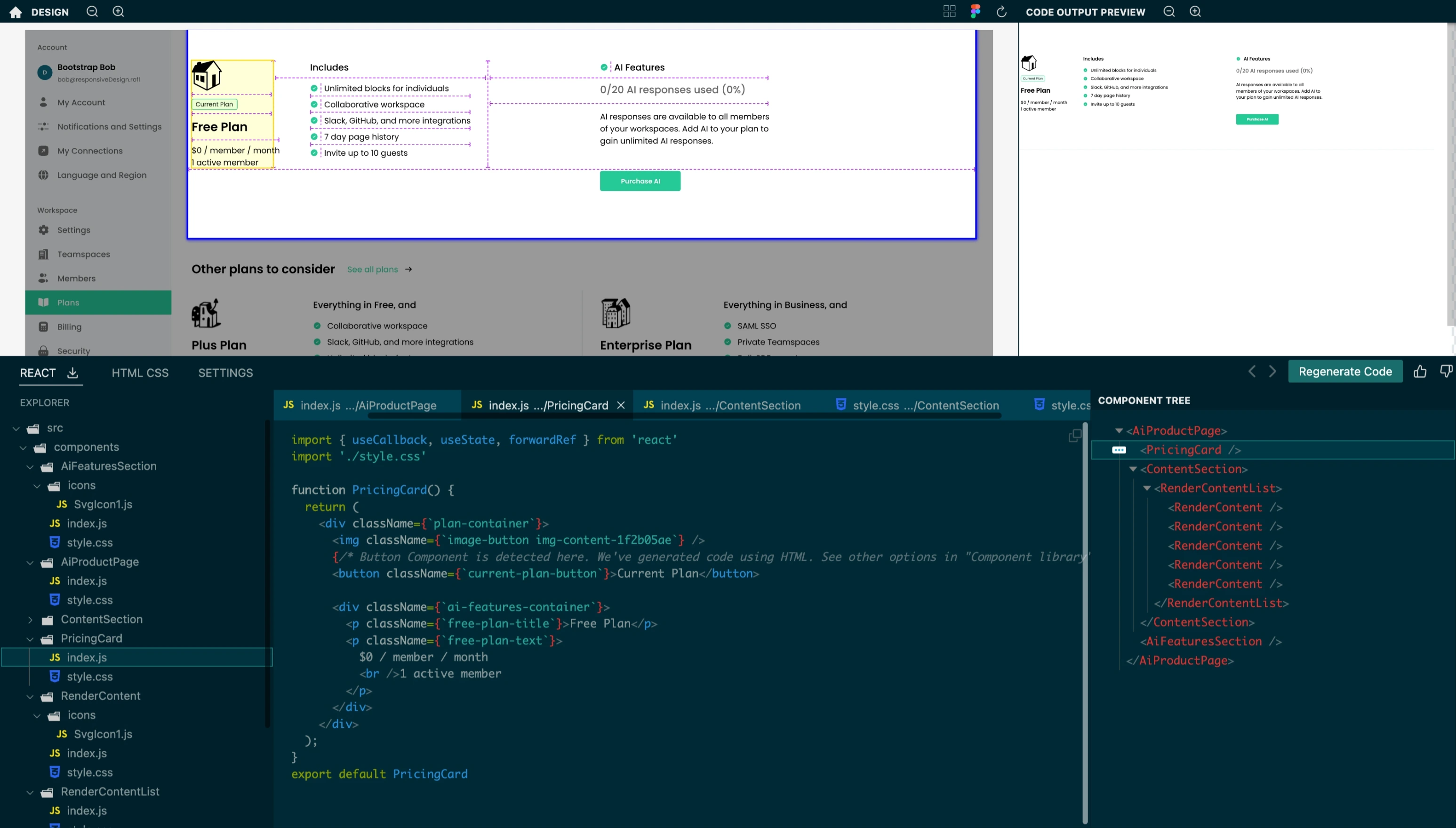
User Interface Overview
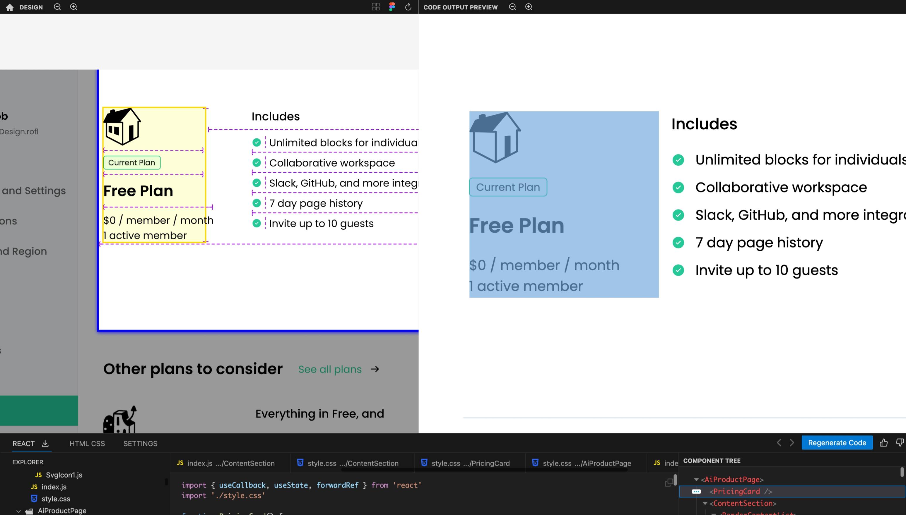
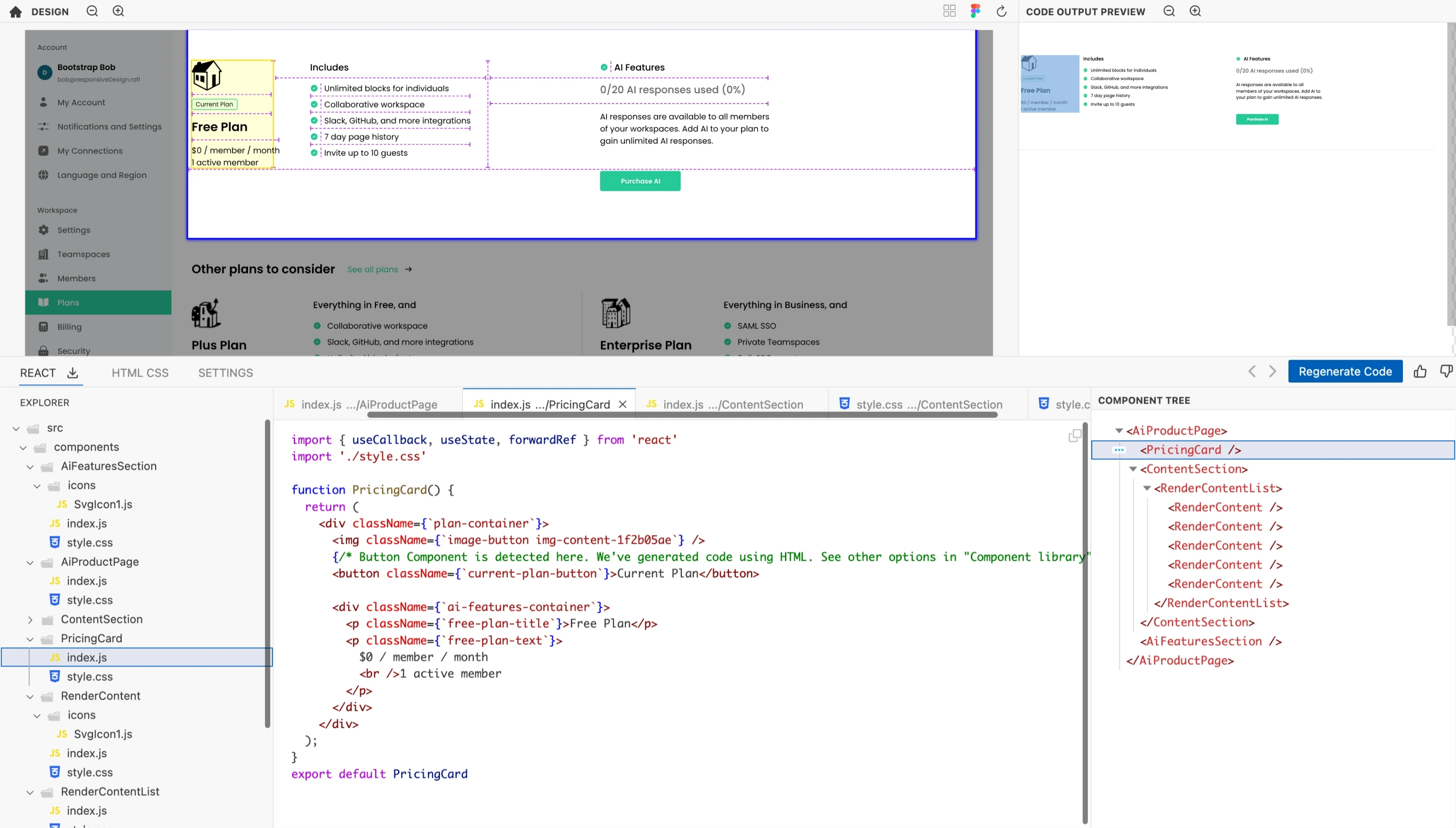
Our platform organizes its interface into three primary sections: the Design Preview, the Code Output Preview, and the Code Panel.
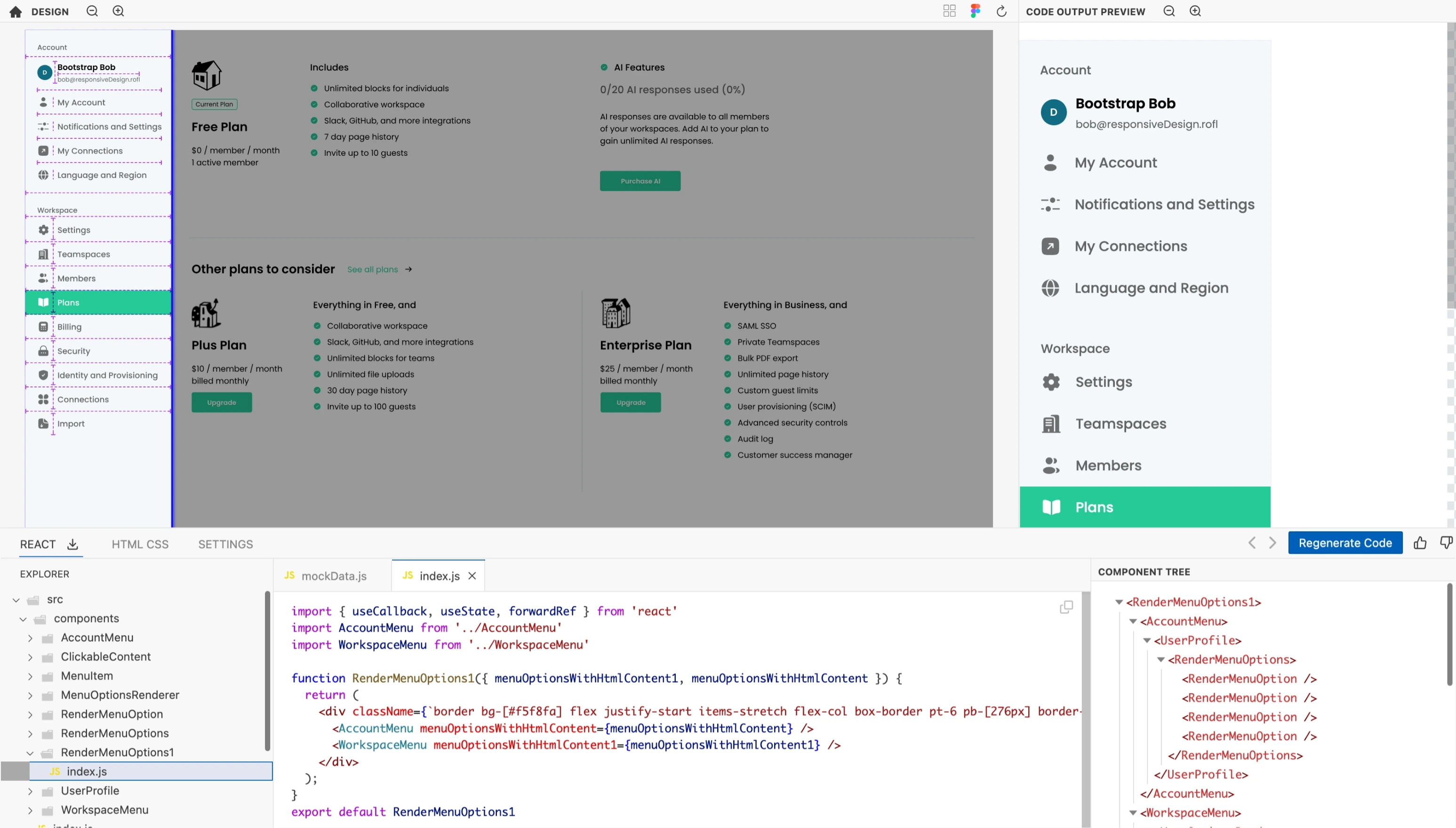
Design Preview
This pane displays the design you've uploaded. Use it as a visual anchor while transitioning between design and code. It supports zoom and pan functionalities are available for a detailed inspection of the design.
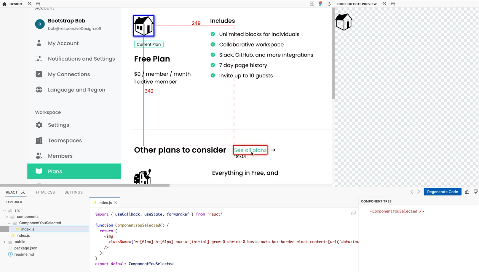
Highlight a component, then hold down the Option key while hovering over adjacent design elements to view the distances between them.
Code Output Preview
Presents a real-time preview of the generated code. It also supports zoom and pan functionalities for a detailed inspection of the preview.
Code Panel
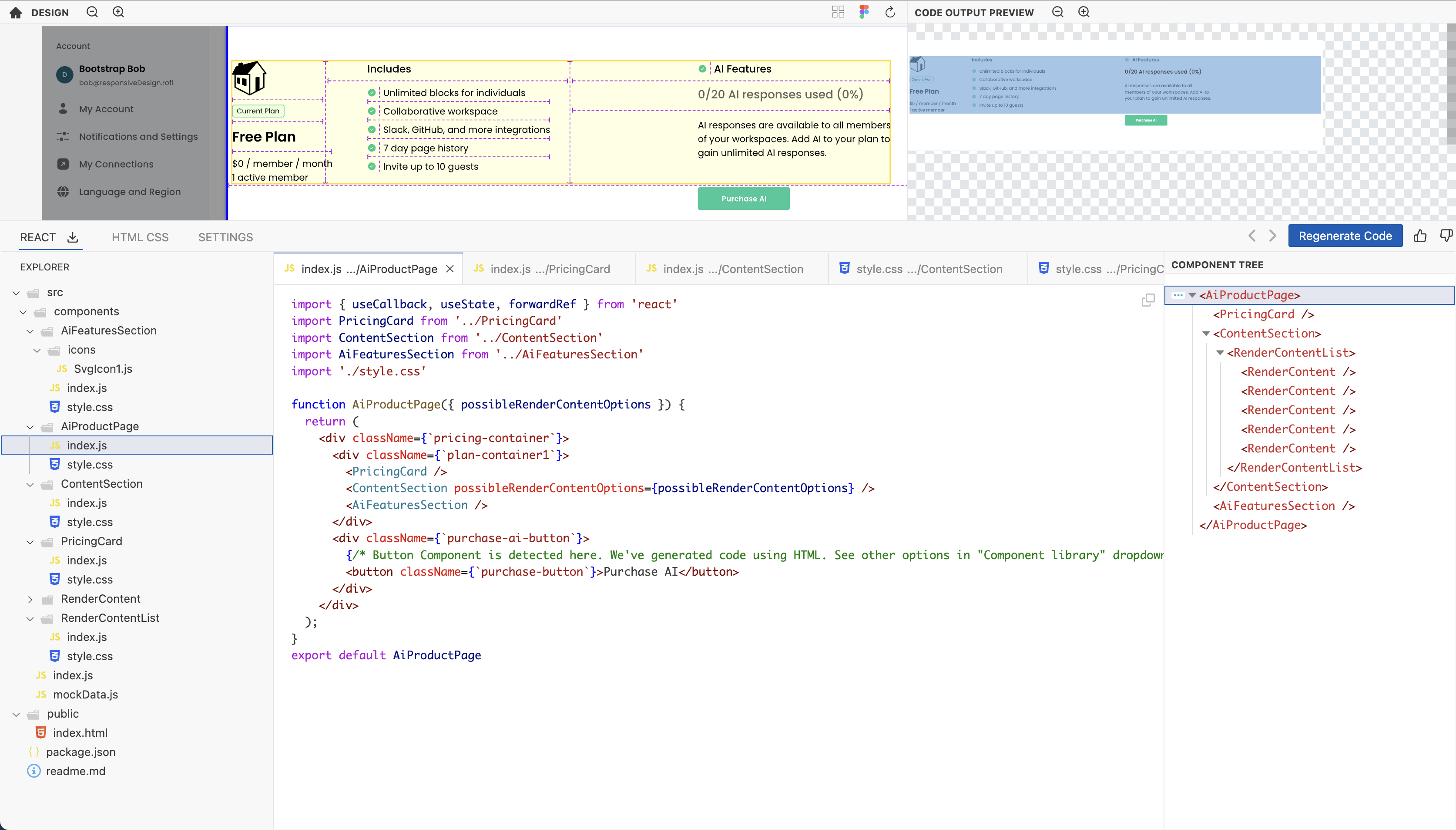
The code section is bifurcated into two main tabs: React and HTML/CSS.
React Tab
- File Explorer: Navigate through the files and directories of your generated React code with ease.
- File Viewer Tabs: Actively opened files are displayed here, each within its distinct tab for swift referencing.
- Component Dependency Tree: A visual tree map to understand the relationships and interdependencies of your React components.
HTML & CSS Tab
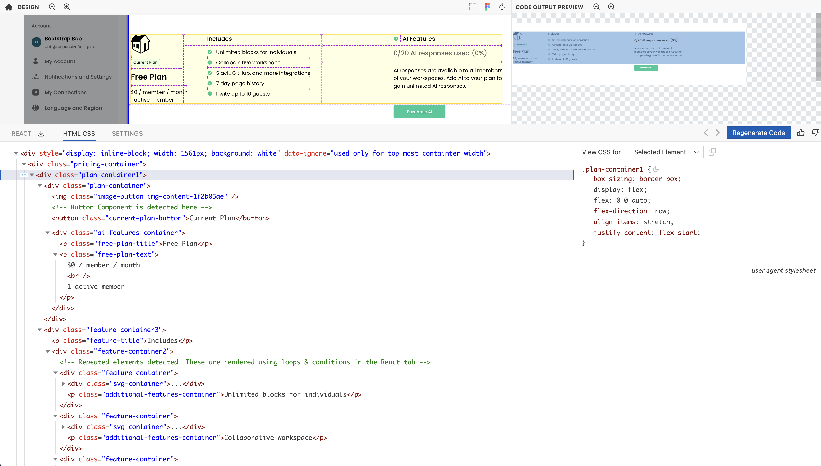
- Elements: Inspect the hierarchical tree of HTML elements, which will be rendered by the generated React code.
- CSS Properties: Displays the styling details for the currently active HTML element, allowing for direct adjustments.
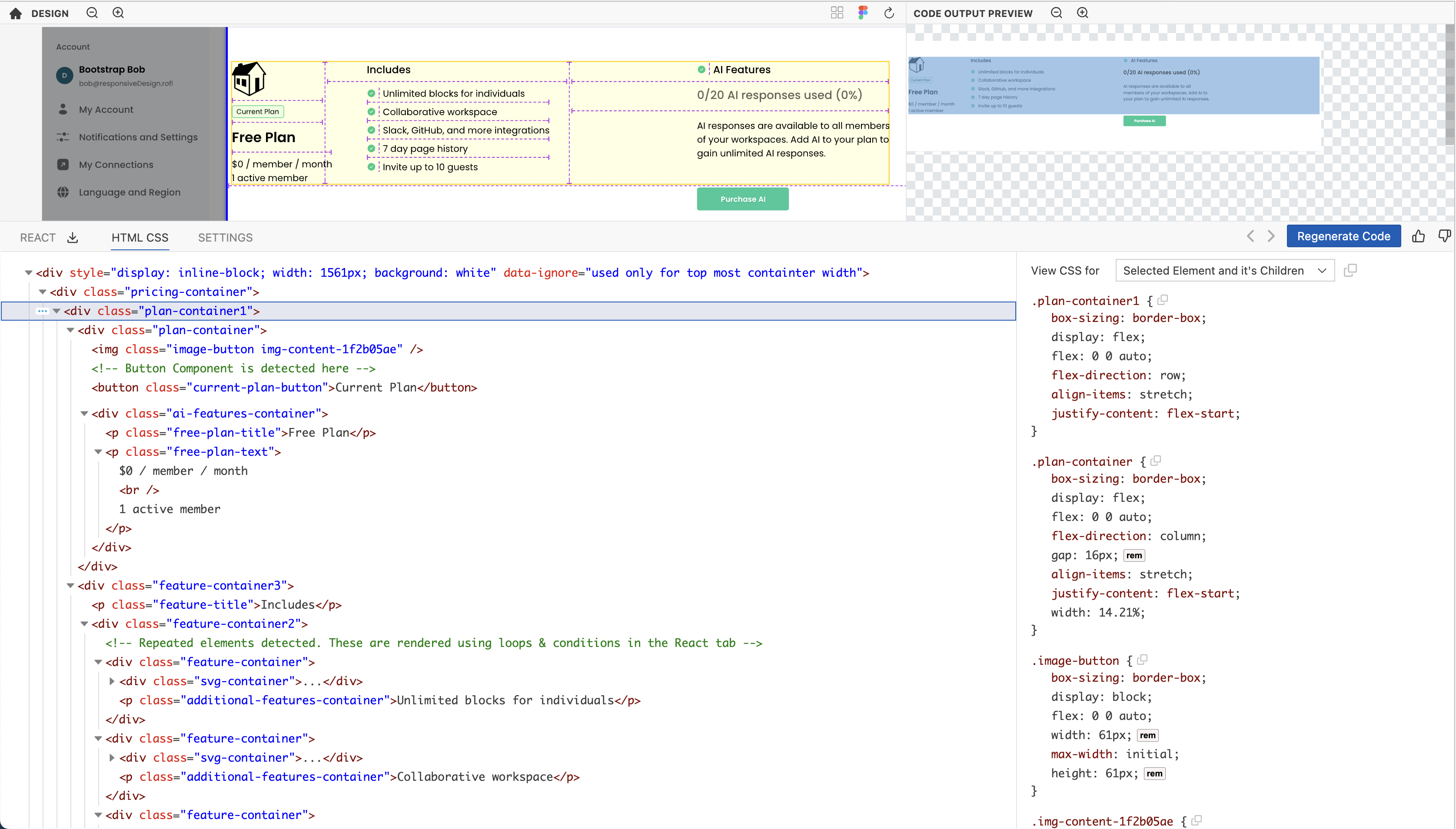
- To view the styles of all the children of the selected element, select
Selected Element and its Childrenfrom theView CSS fordropdown.
Interactions
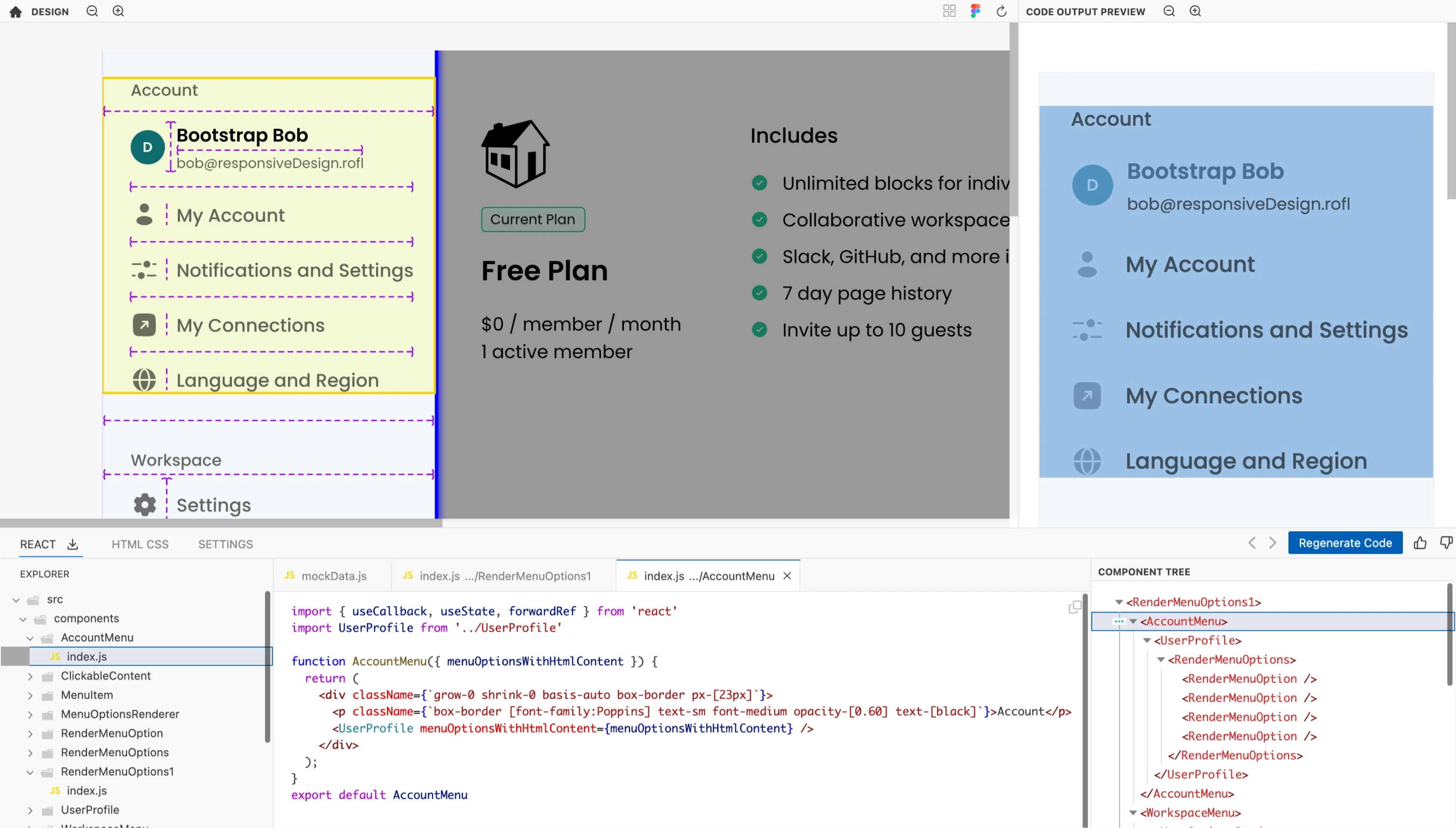
- All the above panels are synchronized. Selecting an element in one panel, be it the Design Preview, Code Output Preview, or React/HTML code sections, automatically echoes the same selection across all panels.
Theming
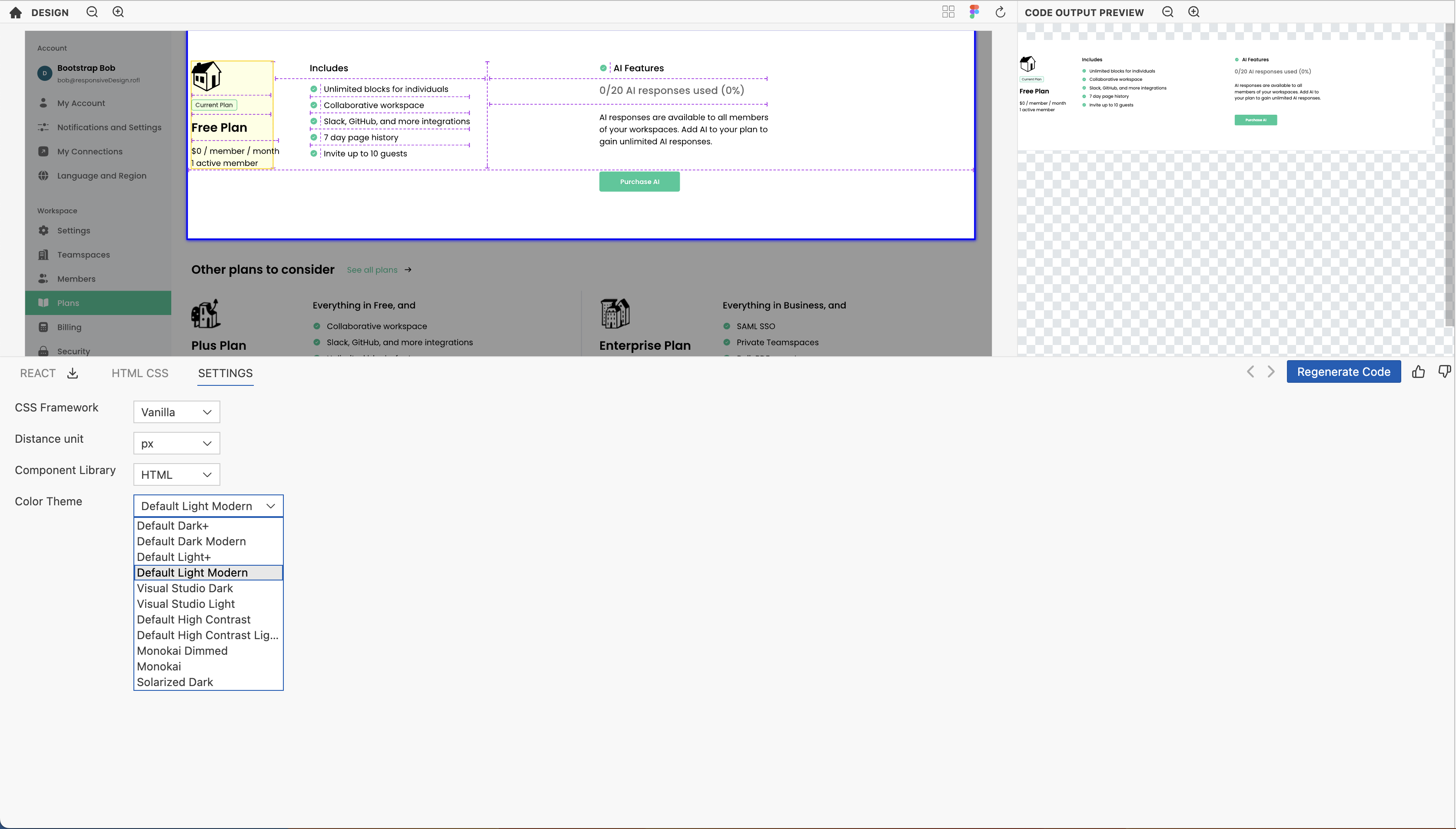
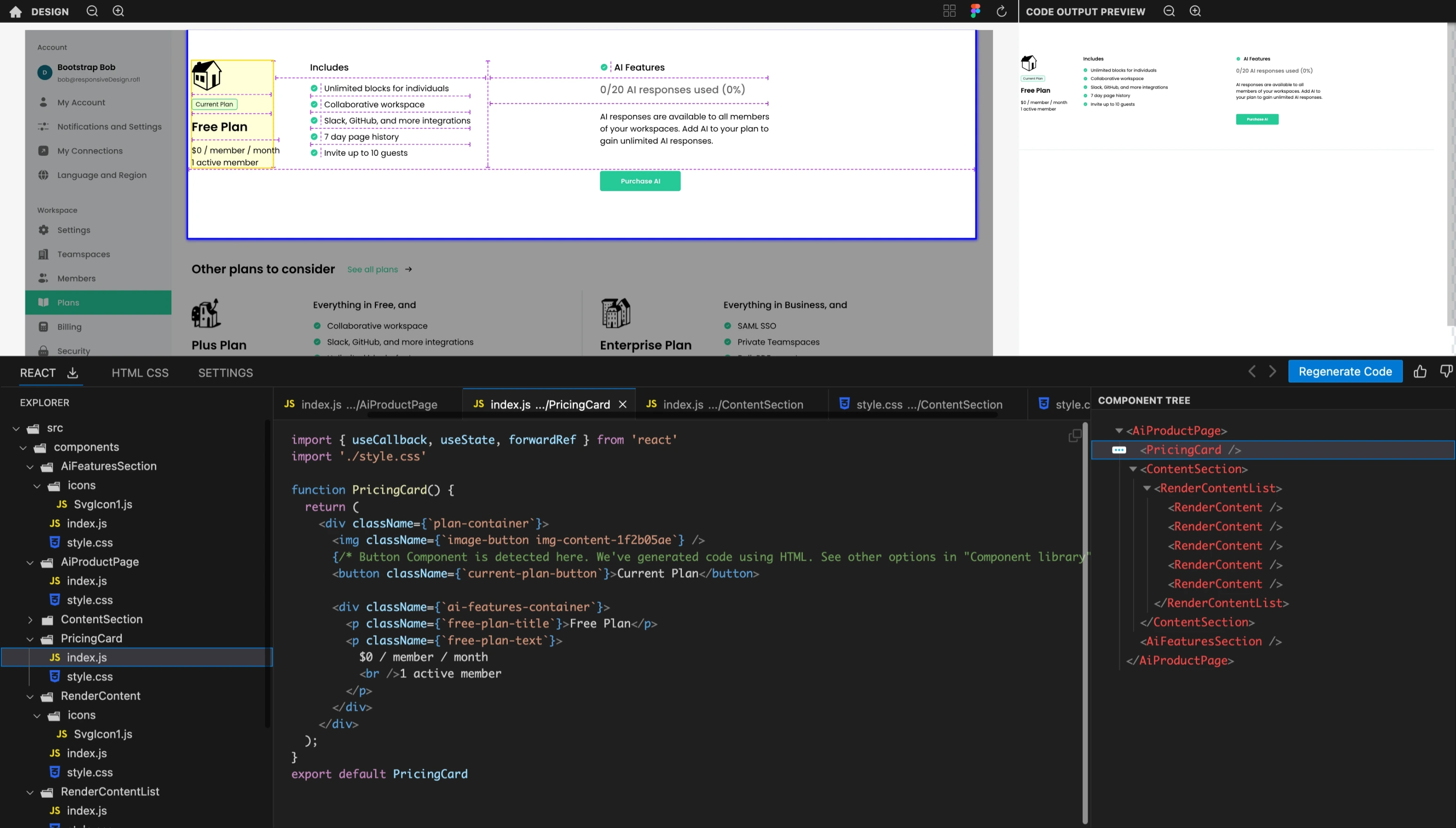
We support themes commonly used in Visual Studio Code. You can find and apply them from the Settings panel.
For example -
and
