
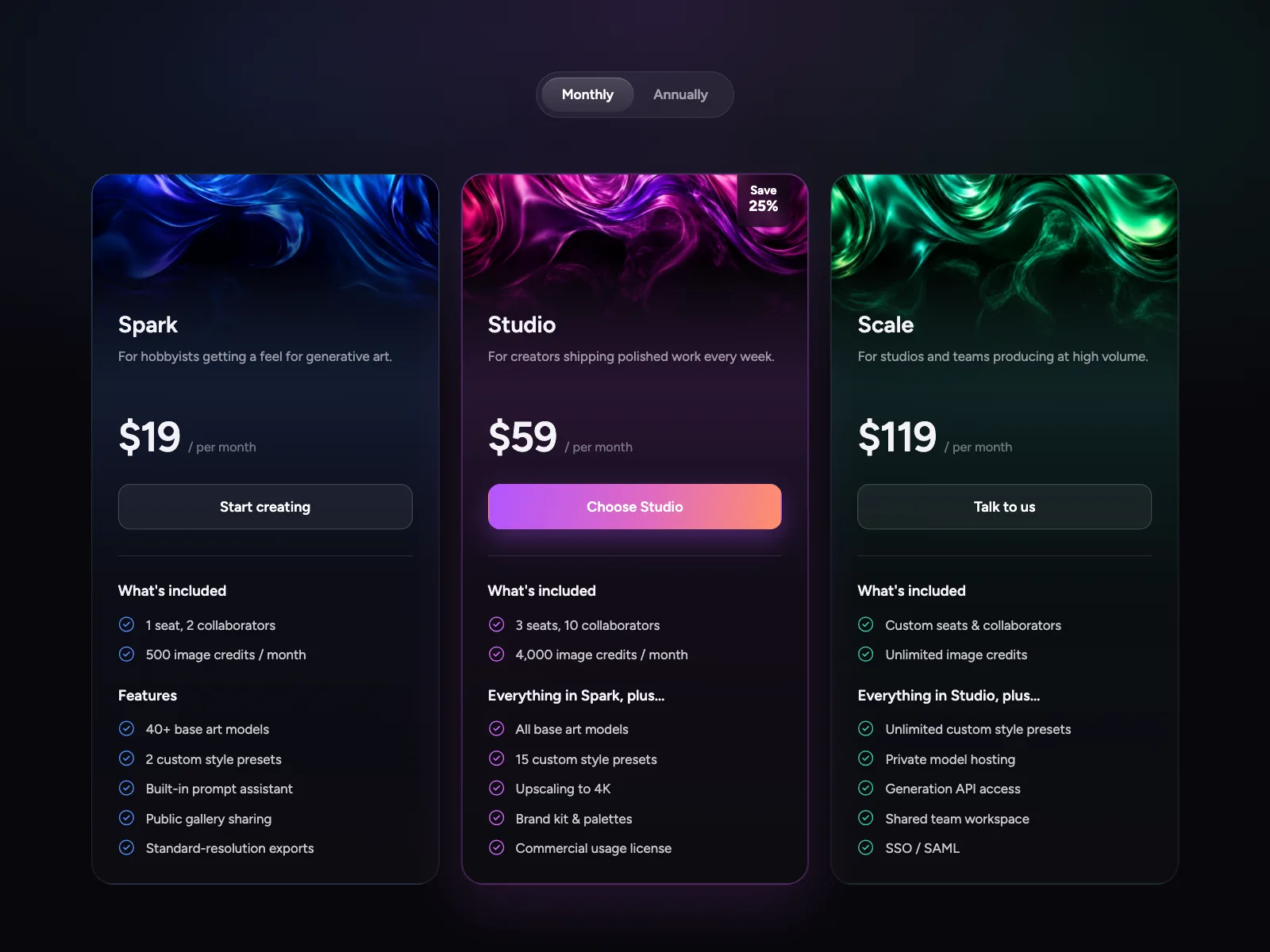


Pricing tables from the Kombai gallery: a generative-art platform's three tiers, a habit app's yearly and monthly plans and a document-workflow tool's pricing page.
What is a pricing table?
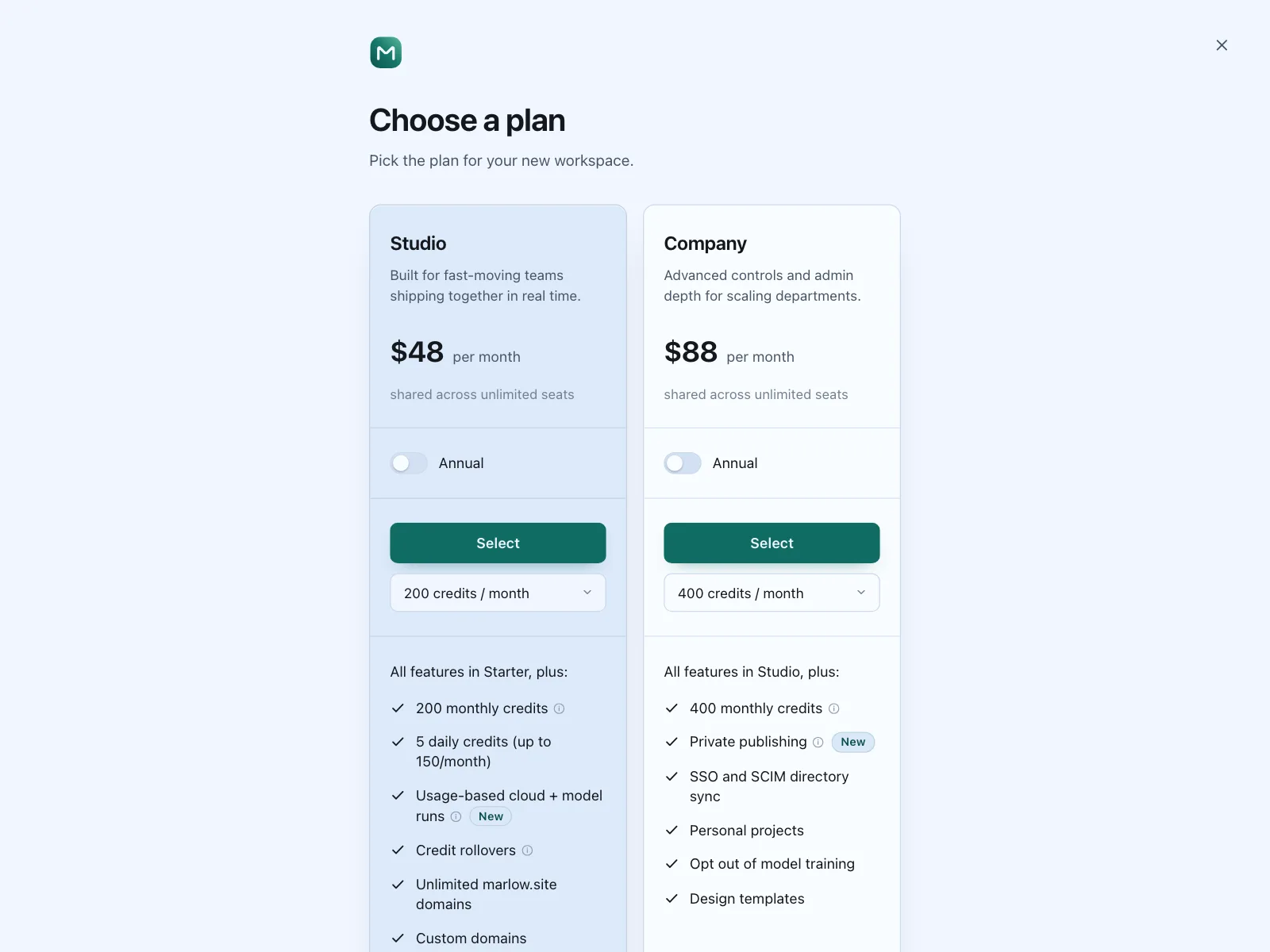
A pricing table lays out the plans a product sells, each with a name, a price, the features it includes and a button to choose it. People compare two to four plans at a glance and pick the one that fits, often after switching between monthly and yearly prices.
- Each plan is a card or column with a name, a price, a feature list and one button.
- One plan is often raised, outlined or badged as the recommended pick.
Pricing tables show up across subscription and paywall, checkout, billing and compare screens.
When to use a pricing table
- A few clear plansTwo to four tiers that differ by limits, seats or features.
- Upgrade momentsInside the product, when someone hits a limit or a trial ends.
- Billing choicesMonthly and yearly prices people want to weigh before paying.
When not to use one
- One price for everyoneShow the price next to the buy button. A table of one adds nothing.
- Every deal is customIf the price always comes from a quote, ask people to book a call.
- Dozens of featuresDon't cram them into the cards. Put the full list in a comparison table below.
Anatomy of a pricing table
This one works. Switch between monthly and yearly, or tab to the switch and use the arrow keys.
- Monthly
- Yearly
- Current plan
- Keyboard focus
- Billing switchMonthly or yearly, with the saving
- Plan and priceName, price and billing period
- Feature listWhat the plan includes
- ButtonOne per plan, named for it
- BadgeMarks the recommended plan
- StatesMonthly, yearly, current, focus
Pricing table variants
We sorted every pricing design in the Kombai gallery and found six patterns. Browse all 175 web and 35 mobile designs.
1. Tier cards with a recommended plan
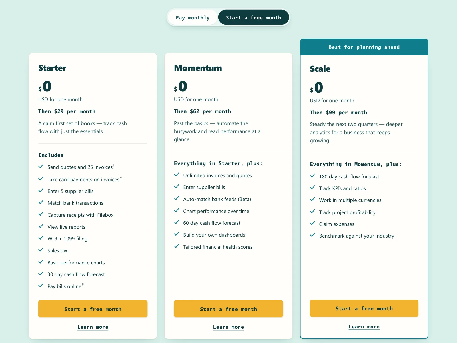
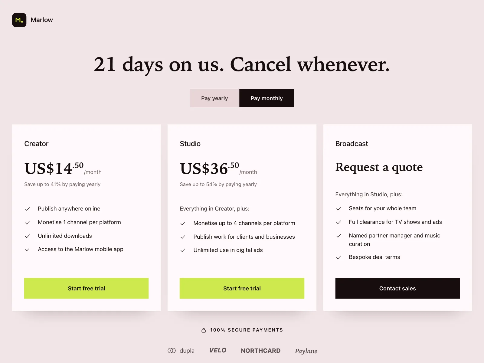
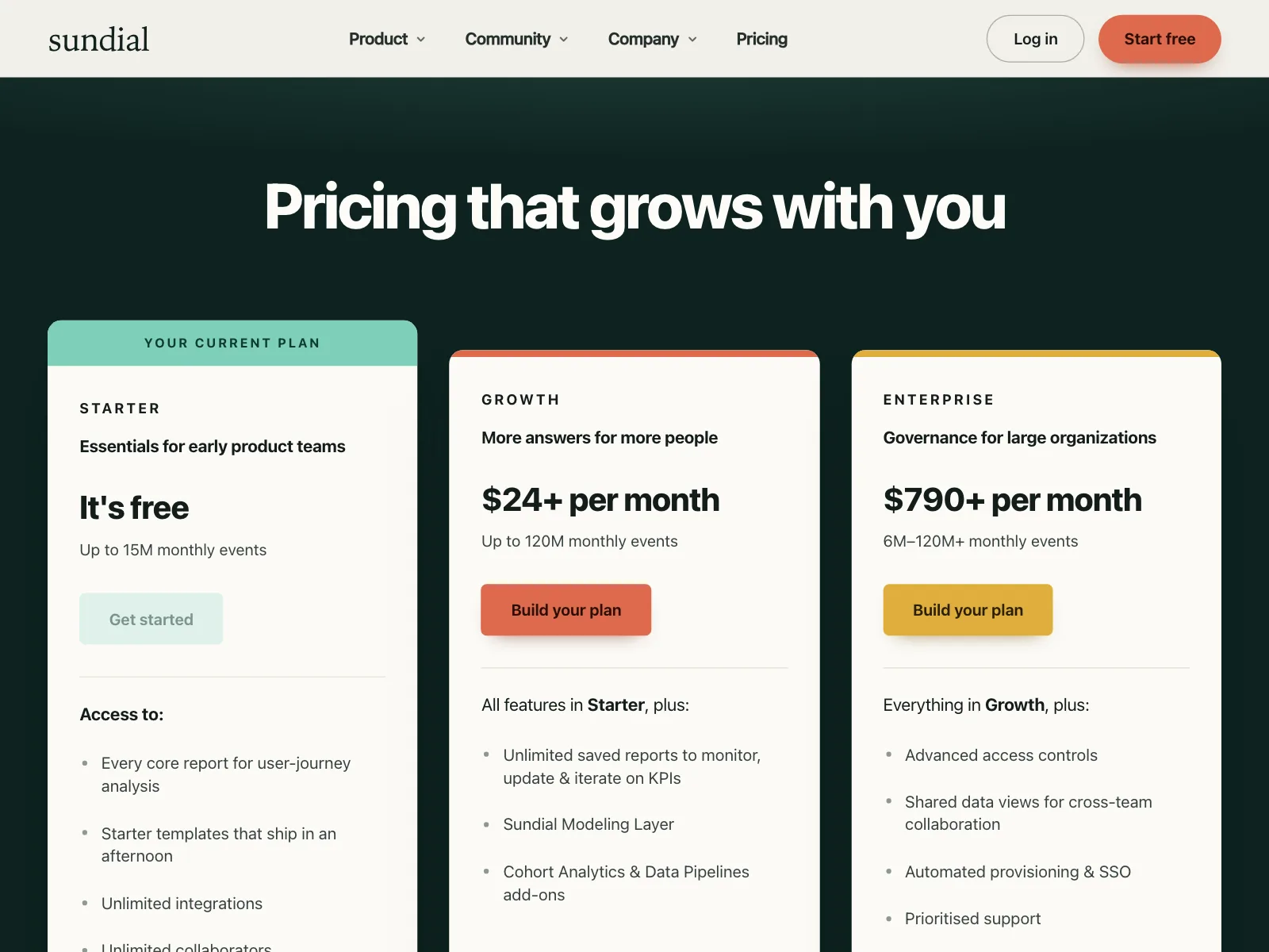
The default. Three or four plan cards in a row, with the most popular plan raised, outlined or badged.


2. Billing period switch
A Monthly and Yearly switch above the plans, usually with the saving spelled out, like "Save 20%".


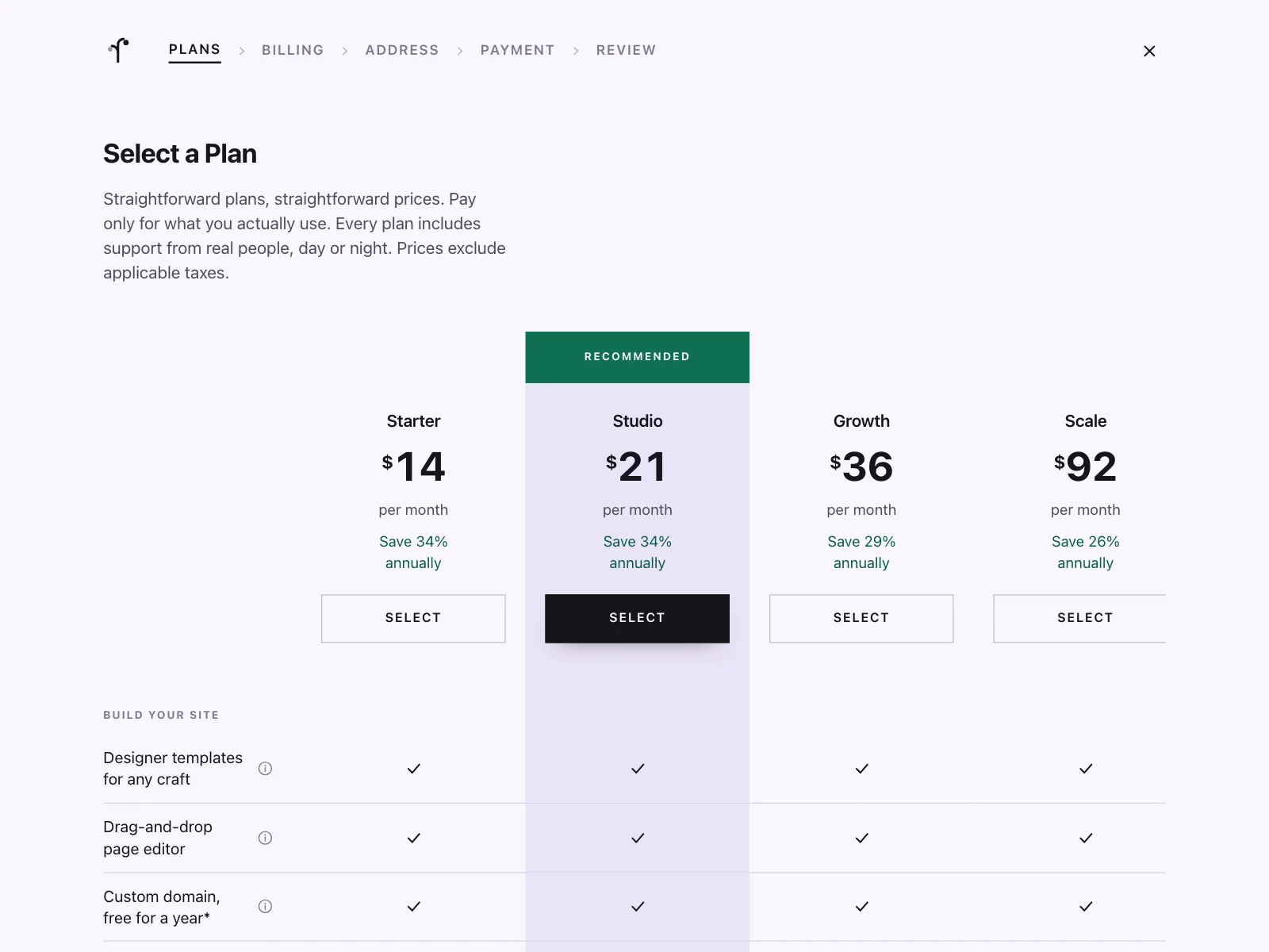
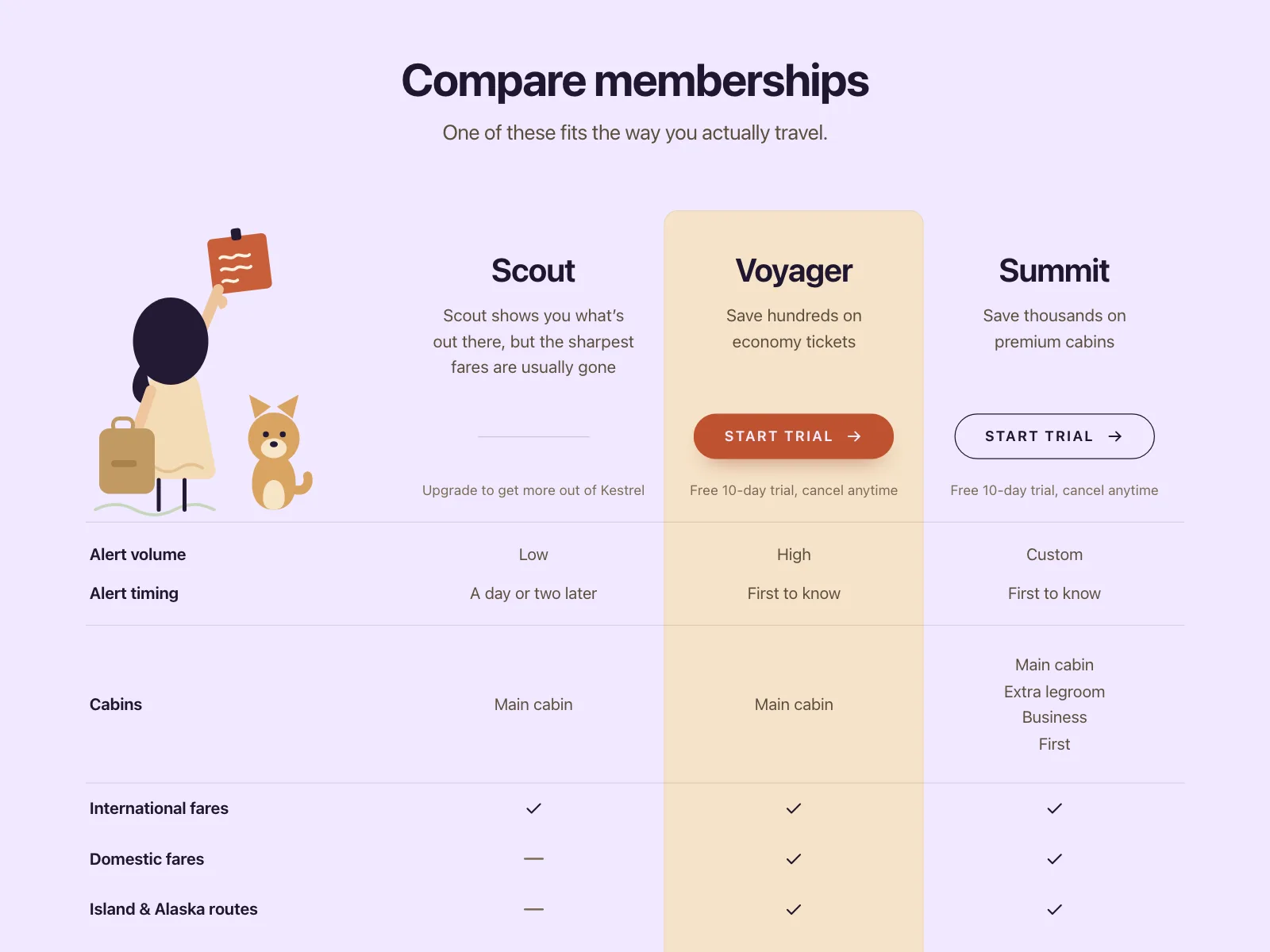
3. Comparison tables
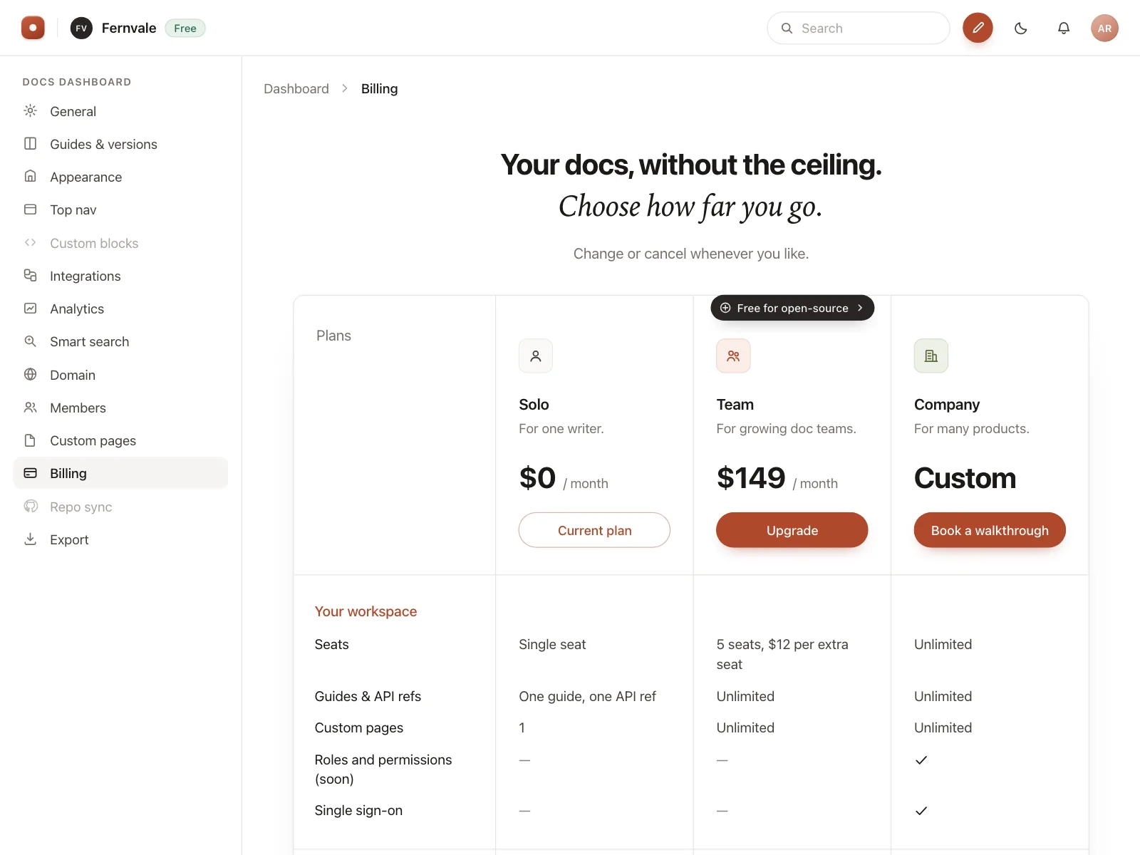
Plans as columns and features as rows, ticked or crossed, for products where the details decide the plan.

4. Usage sliders
A slider sets the volume of emails, events or jobs, and the price follows it.


5. Stacked plan picker
Mobile paywalls stack two or three plans as radio cards, one already selected, above a single button.



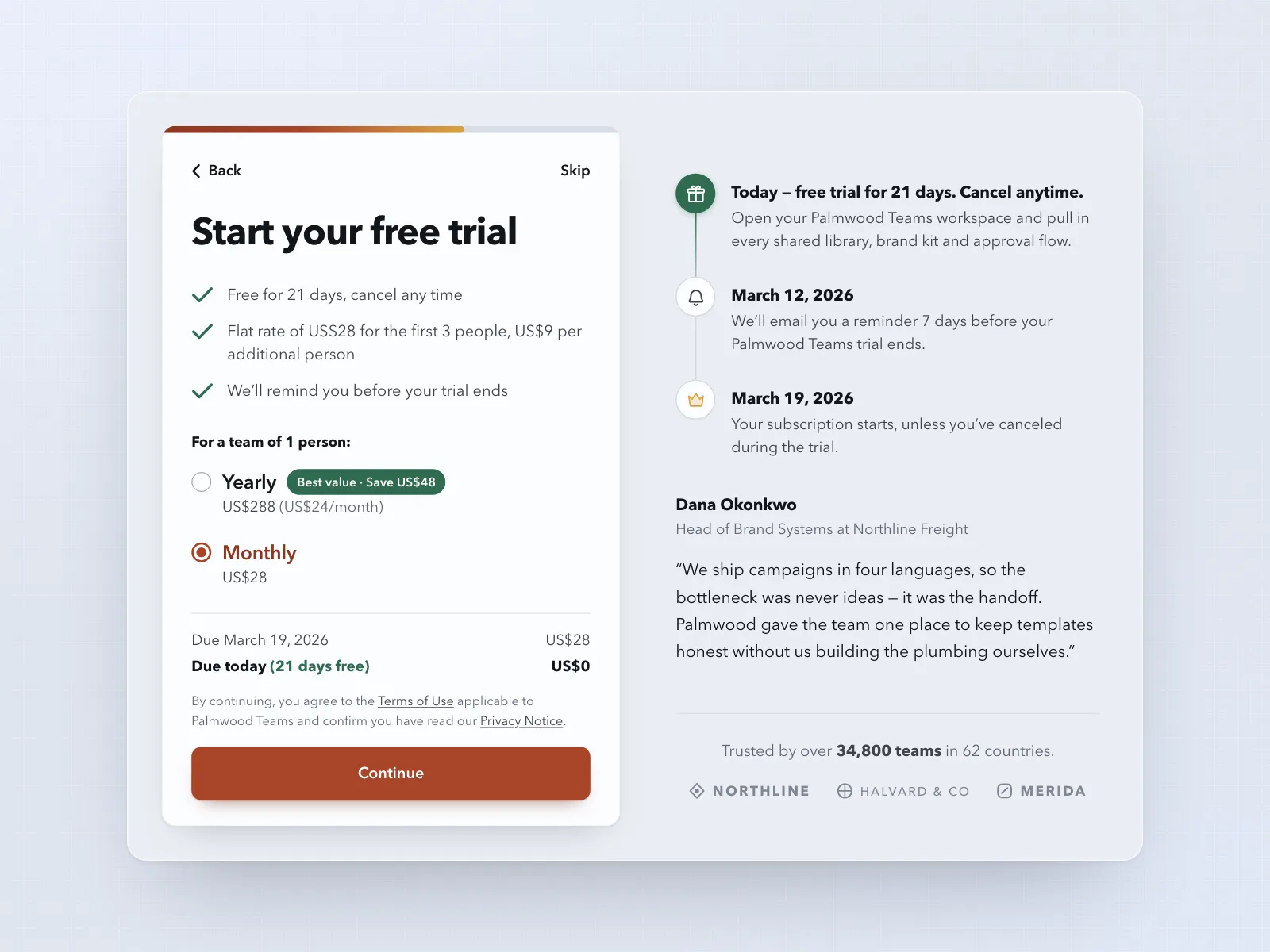
6. Trial timelines
A plan choice paired with a timeline of the free trial: what people get today and when the first charge lands.


Where pricing tables show up
Pricing pages
The public page on the marketing site that lists every plan and its price.
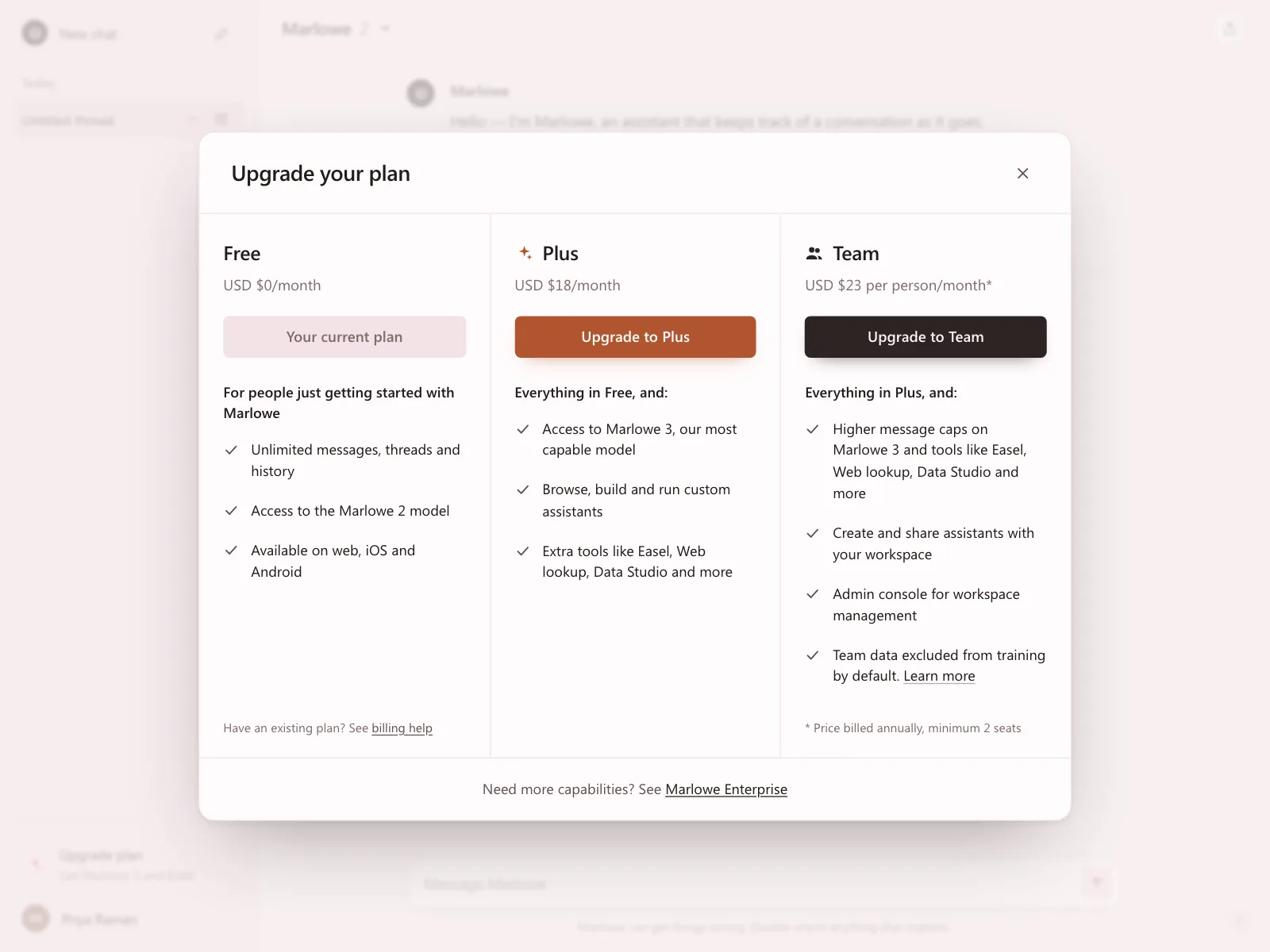
Upgrade prompts
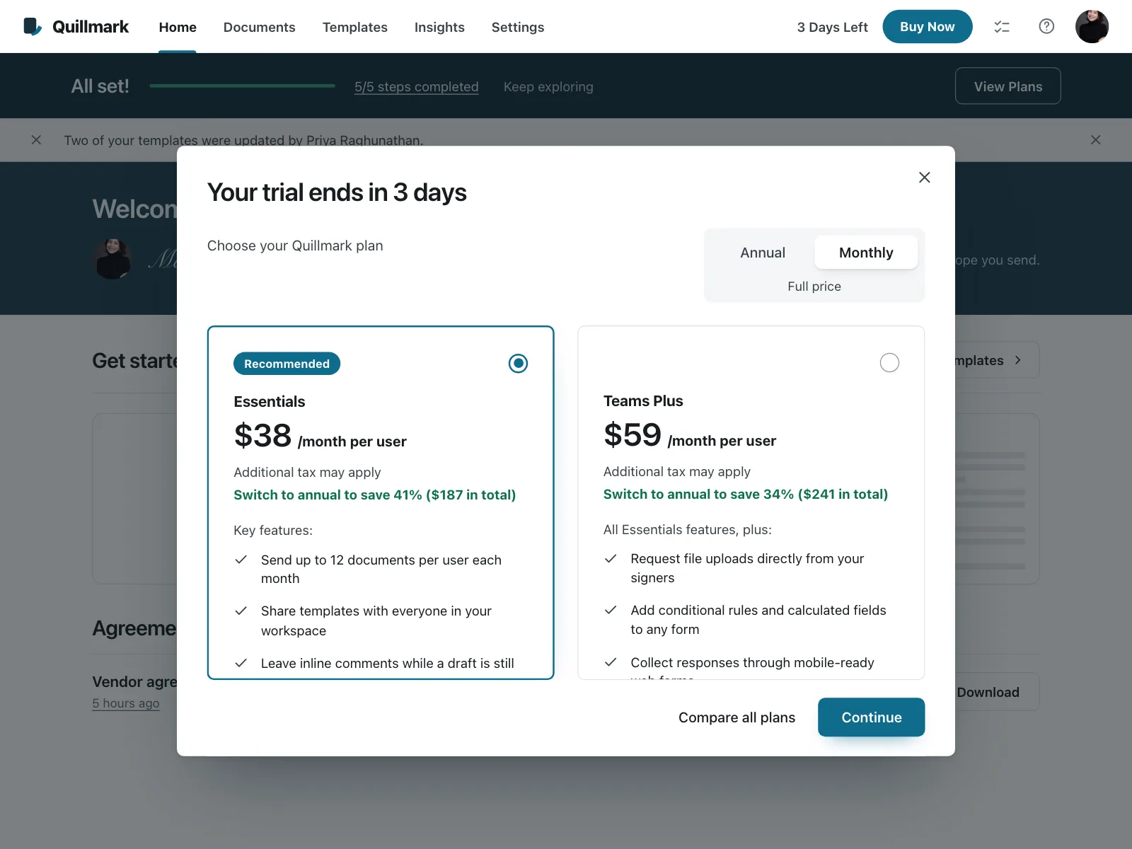
A sheet or modal inside the product, shown when someone hits a limit or a trial runs out.

Billing settings
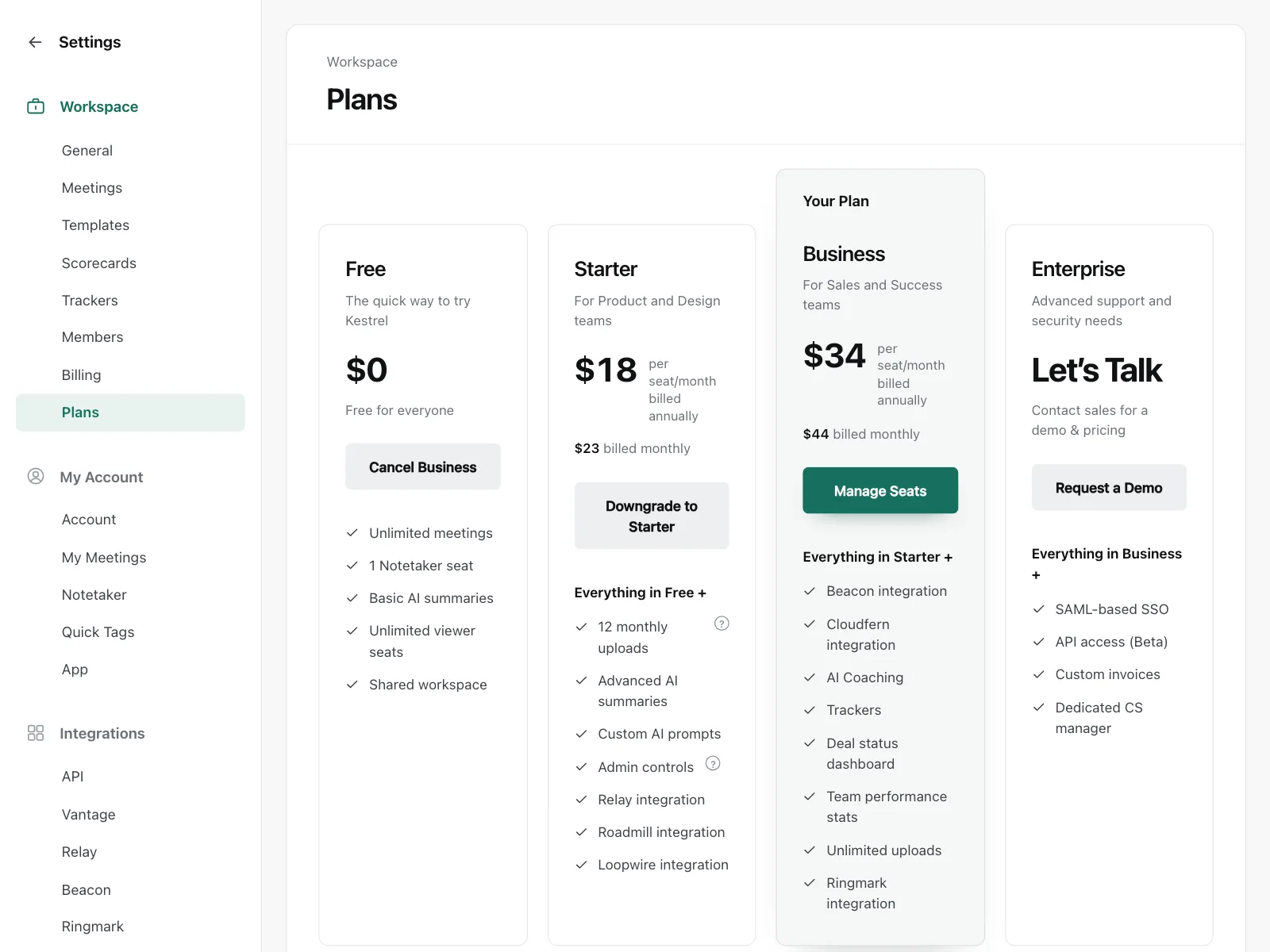
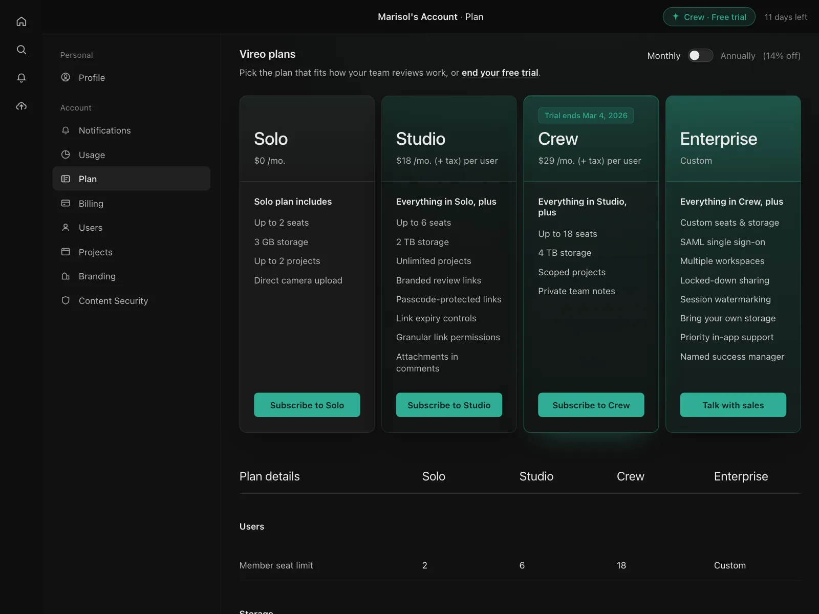
The plans tab in account settings, where people see the plan they are on and switch to another.

Signup and onboarding
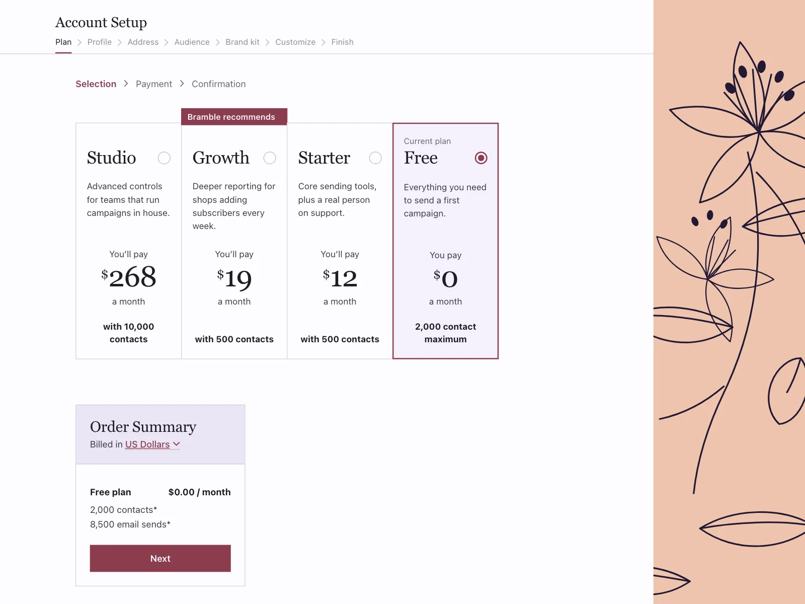
A plan step in the signup flow, picked while the account or workspace is being set up.

Pricing table vs similar components

Build notes
- Build the billing switch as a labeled radio group. Arrow keys then move between Monthly and Yearly.
- Give each plan a heading and its features a real list, so assistive tech can jump from plan to plan.
- Mark the recommended plan with a text badge like "Most popular", not with color alone.
- Name each button for its plan, like "Choose Studio", so it still makes sense out of context.
- Show yearly prices per month and say how they are billed, like "$10 a month, billed $120 yearly".
- For a full comparison, use a <table> with th scope="col" for plans and th scope="row" for features.
FAQ
How many plans should a pricing table show?
Three is the most common on web pricing pages in the Kombai gallery, followed by two and four. Mobile paywalls often show just two: yearly and monthly. Past four plans the choice gets hard to scan, so move niche plans behind a link.
Should the billing switch default to monthly or yearly?
Default to the period most people buy. If you lead with yearly, show the per-month figure and the billed total together, like "$10 a month, billed $120 yearly", so the charge at checkout is no surprise.
Should one plan be highlighted?
Yes, when one plan fits most people. Raise it, outline it or give it a "Most popular" badge, and highlight only one. Put the recommendation in text, so it does not rely on color alone.
What's the difference between a pricing table and a comparison table?
A pricing table is the row of plan cards with prices and the main features. A comparison table is the longer grid below it, with every feature as a row and a tick or a cross for each plan.
Related terms
All glossary terms · Browse 175 web and 35 mobile pricing table designs