


CTA bands from the Kombai gallery: a back-office service's booking panel, a billing toolkit's closing mobile screen and a project tracker's walkthrough invite.
What is a CTA band?
A CTA band, short for call-to-action band, is a strip that asks for the action one more time after people have read the page. It has a short headline, a line that removes a doubt and one main button, often with a quieter second option. It usually sits just above the footer.
- One headline and one primary action, with nothing else competing for attention.
- A contrasting background sets it apart from the sections around it.
CTA bands show up across footer, testimonials, FAQ and about screens.
When to use a CTA band
- End of a long pagePeople who scrolled to the bottom are ready and need one clear next step.
- After proofRight after testimonials, stats or an FAQ has answered the last doubts.
- Between big sectionsA mid-page band on very long pages, so the action is never far away.
When not to use one
- Short pagesIf the hero button is still on screen, a second ask is noise.
- Several different asksPick one. Three buttons in a band make people choose none.
- Inside a taskMid-checkout or in settings, a promo band gets in the way.
Anatomy of a CTA band
This one works. Type an email and press Start free trial, or submit it empty to see the error.
- Default
- Keyboard focus
- Error
- Success
- HeadlineThe outcome, in a few words
- Supporting lineRemoves the last doubt
- Primary actionOne button, or a field and a button
- Secondary actionA quieter alternative
- BackgroundSets the band apart
- StatesDefault, focus, error, success
CTA band variants
We sorted every CTA band design in the Kombai gallery and found six patterns. Browse all 167 web and 38 mobile designs.
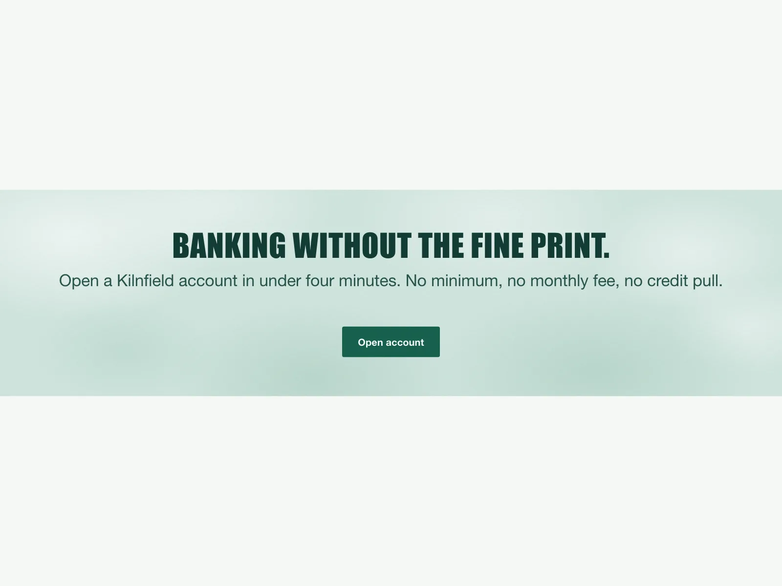
1. Centered band
The default. A headline, one line and one or two buttons, centered on a tinted or gradient strip.


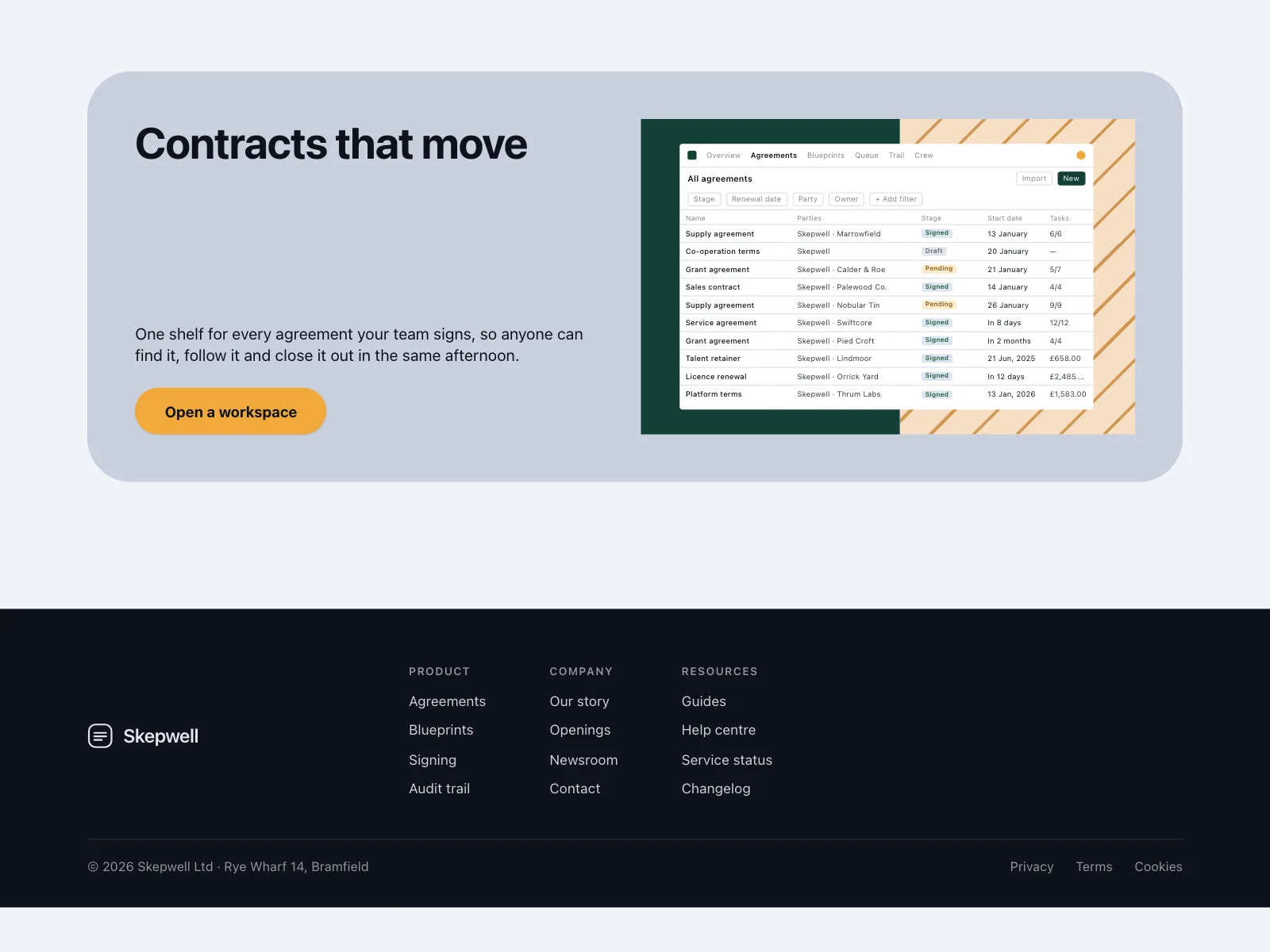
2. Split with a product shot
Copy and the button on one side, a screenshot or product panel on the other, often bleeding off the edge.

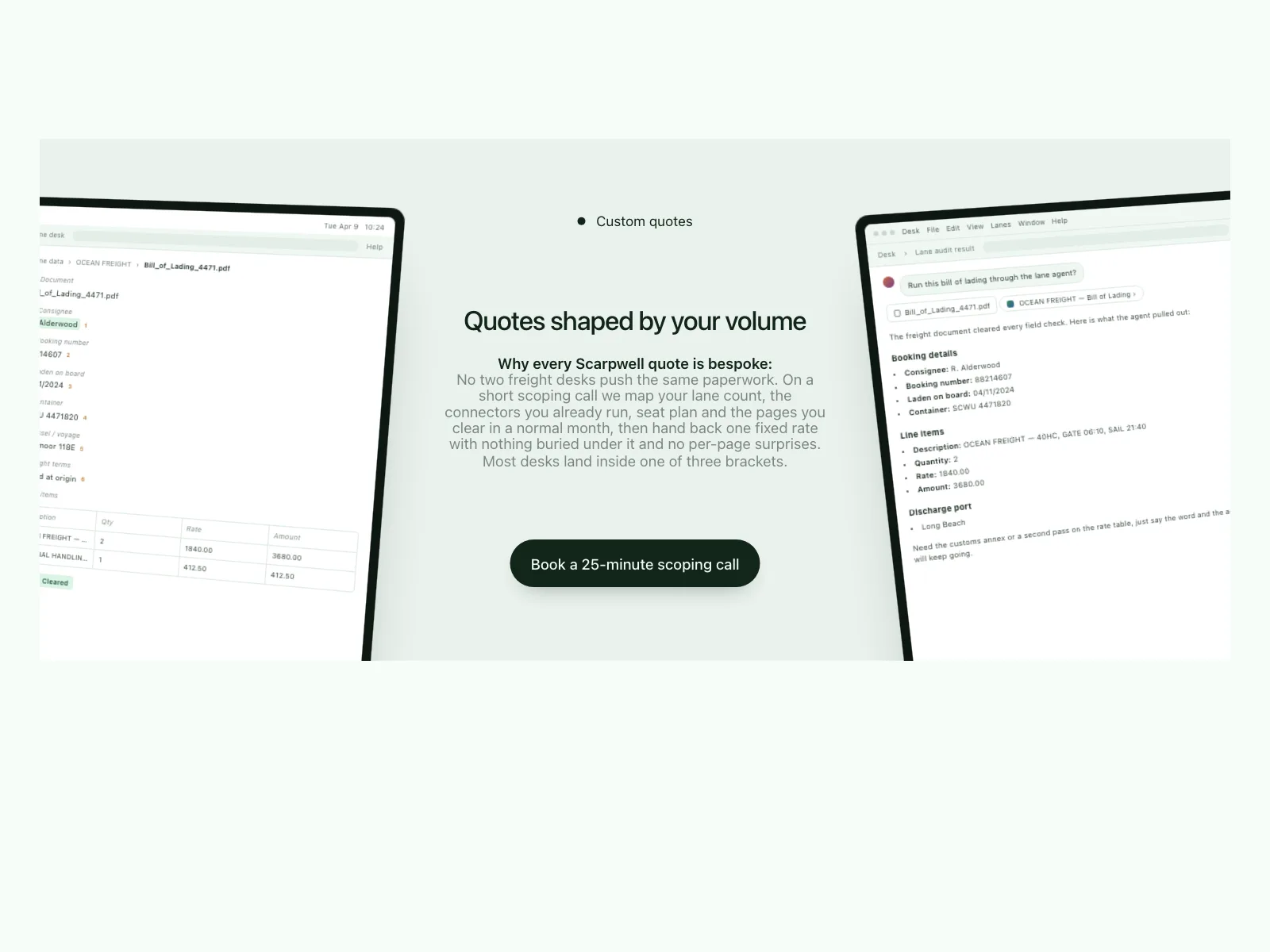
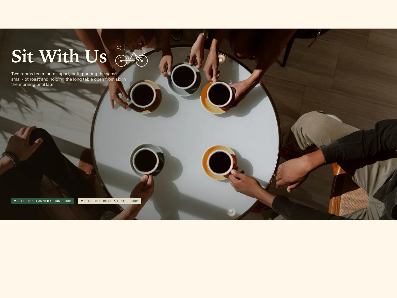
3. Full-bleed photo
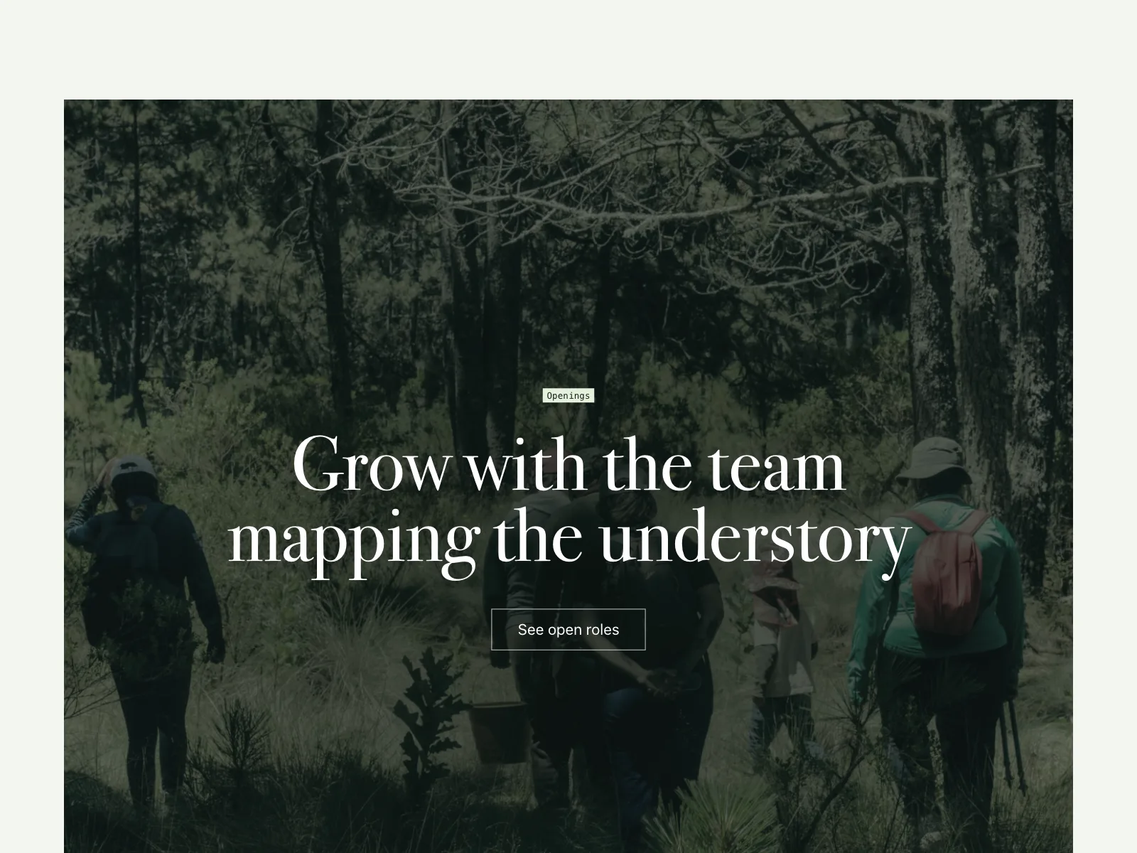
A photograph fills the band with the headline and a light button on top, behind a dark scrim.

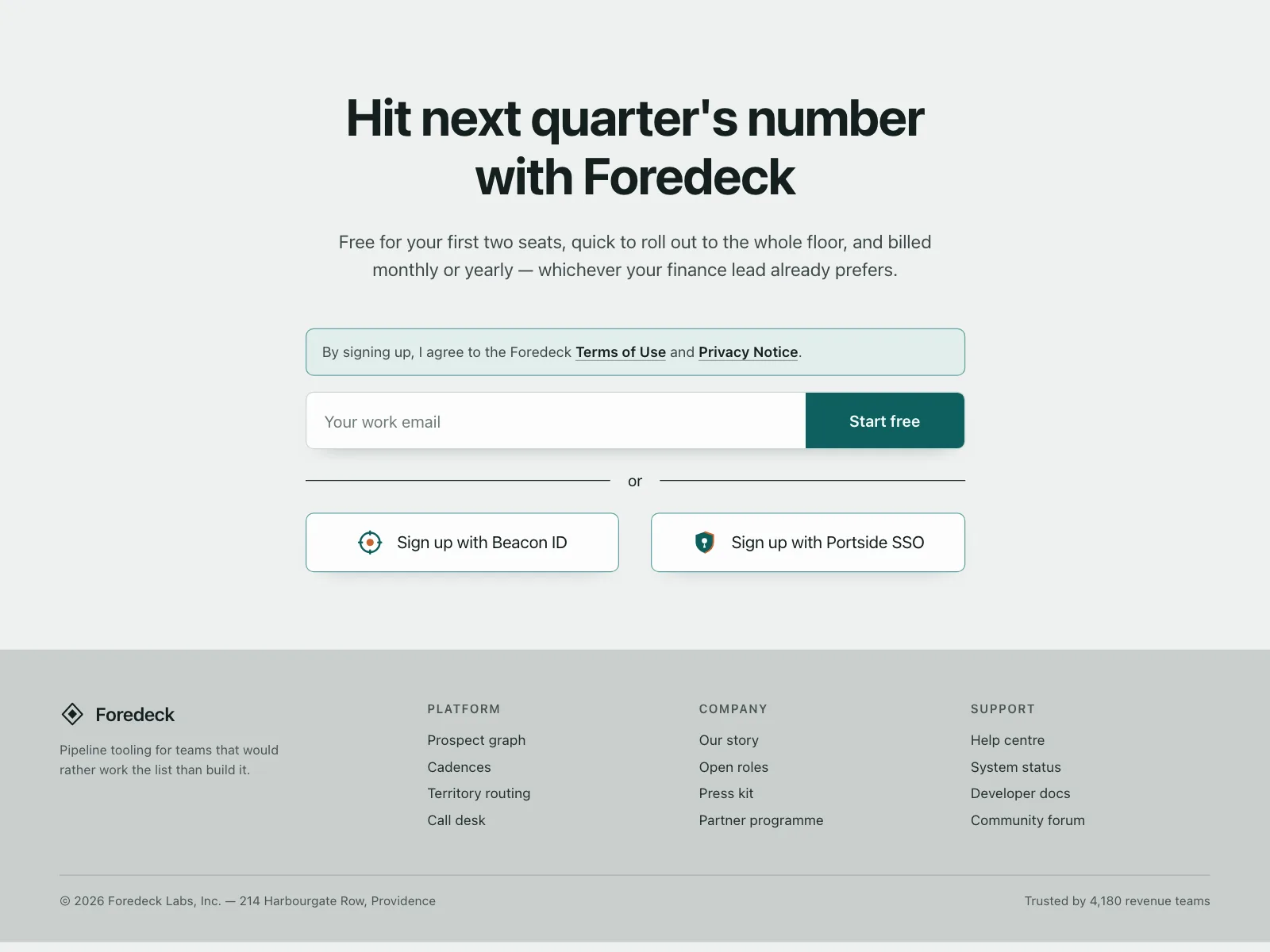
4. Email capture
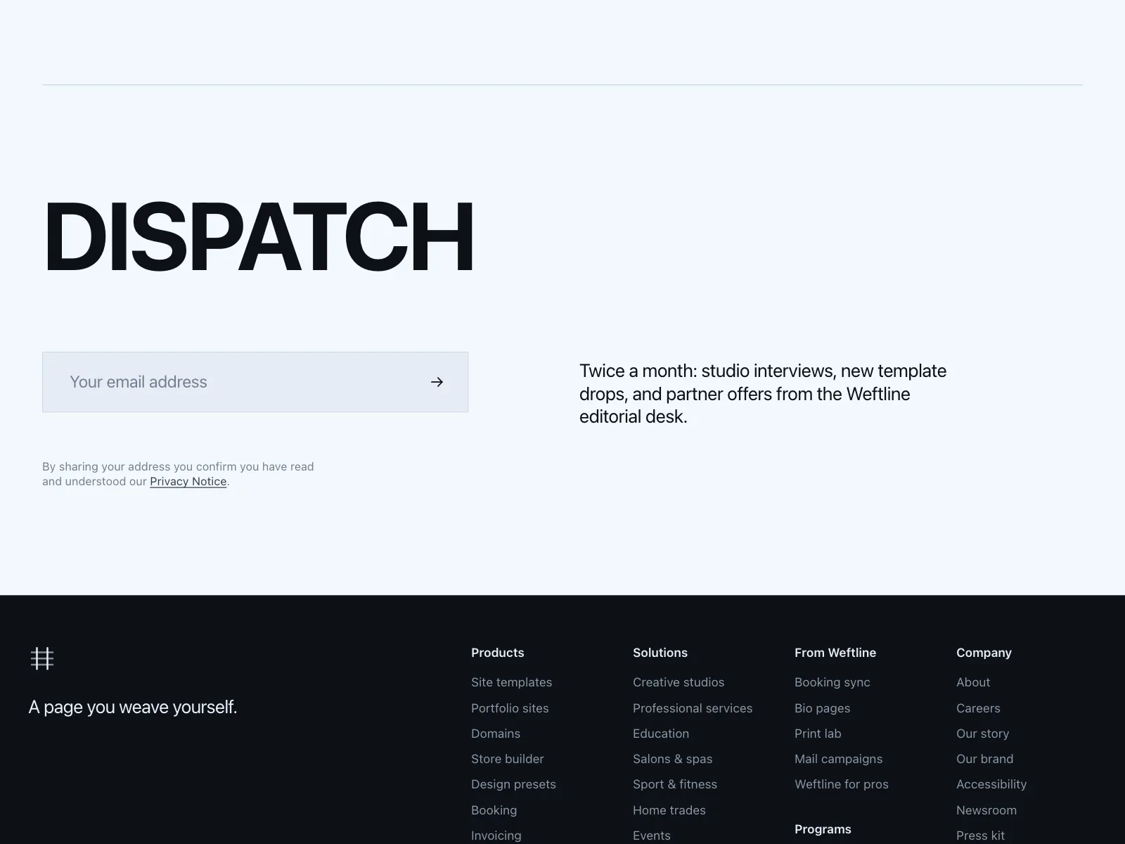
An email field and a button replace the plain button, for trials, waitlists and newsletters.


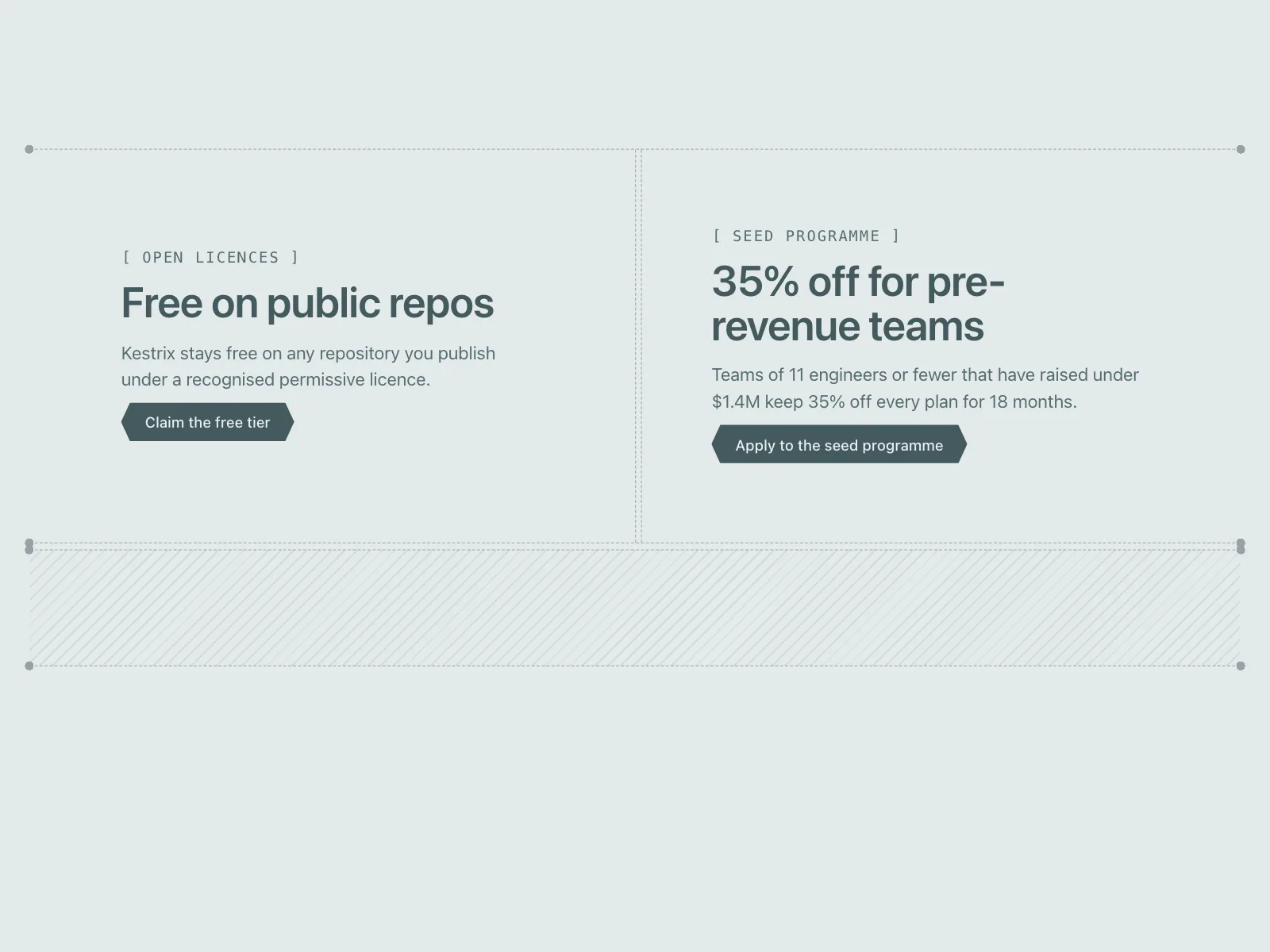
5. Two paths
Two cards side by side, one per audience or action, like book a demo or call us.


6. Closing mobile screen
On phones the band becomes a whole screen, with the buttons pinned to the bottom.


Where cta bands show up
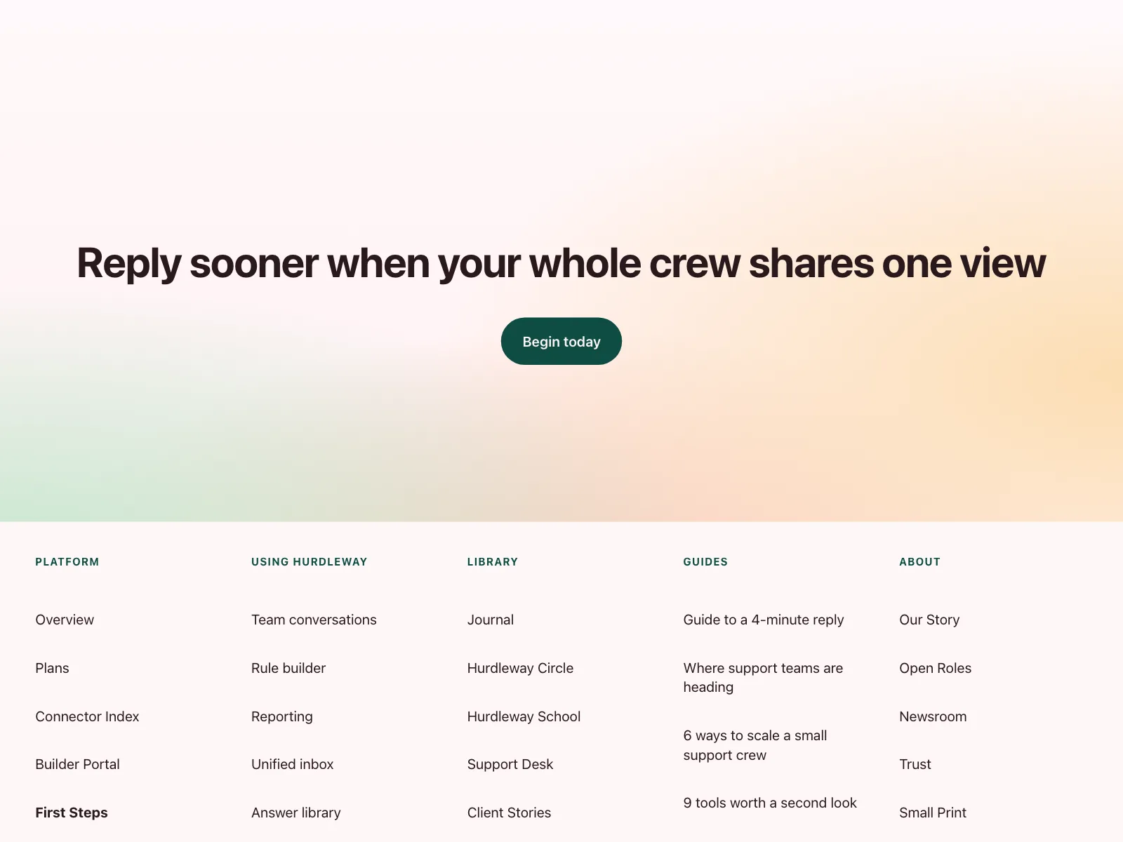
Above the footer
The last thing on a landing page, sitting right on top of the footer links.
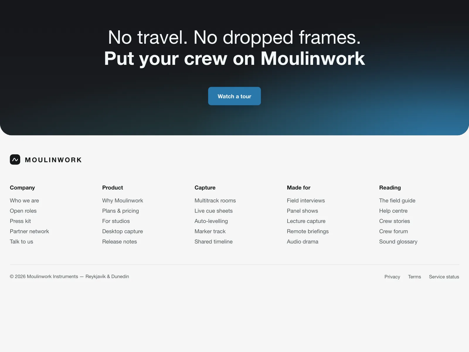
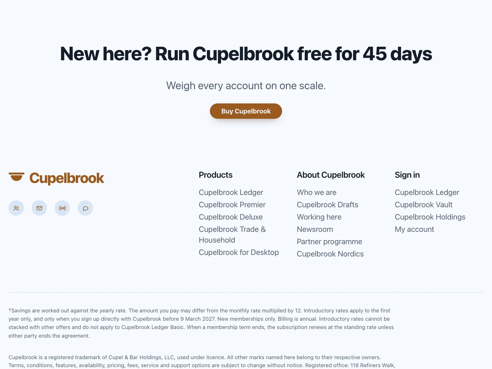
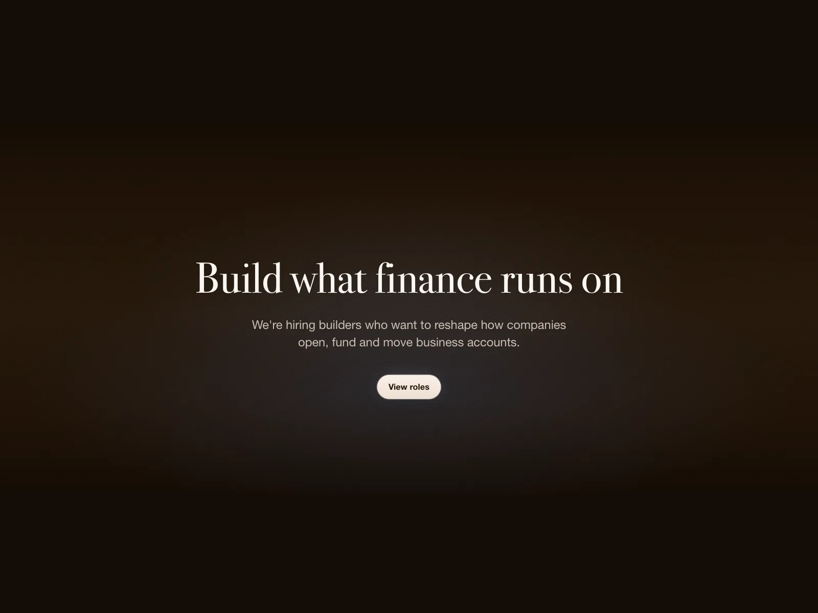
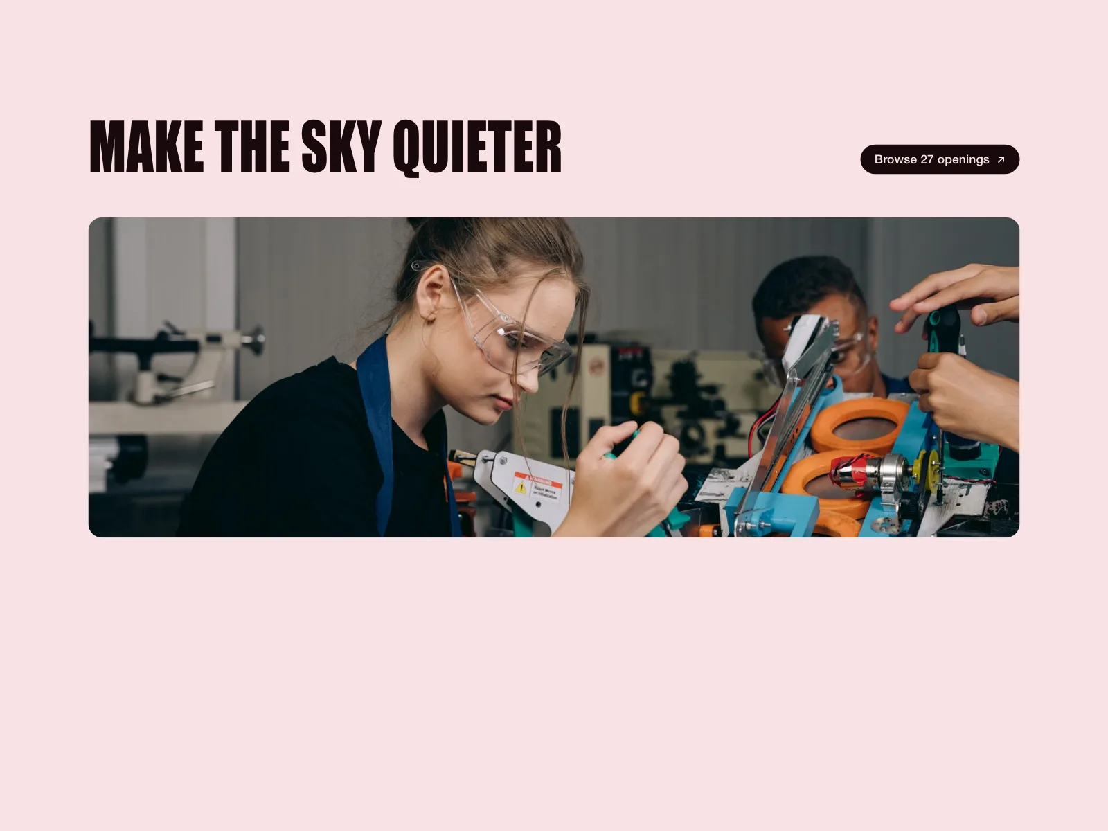
Careers pages
A short line about the team and one button to the open roles.
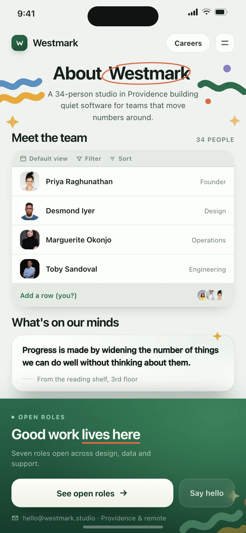
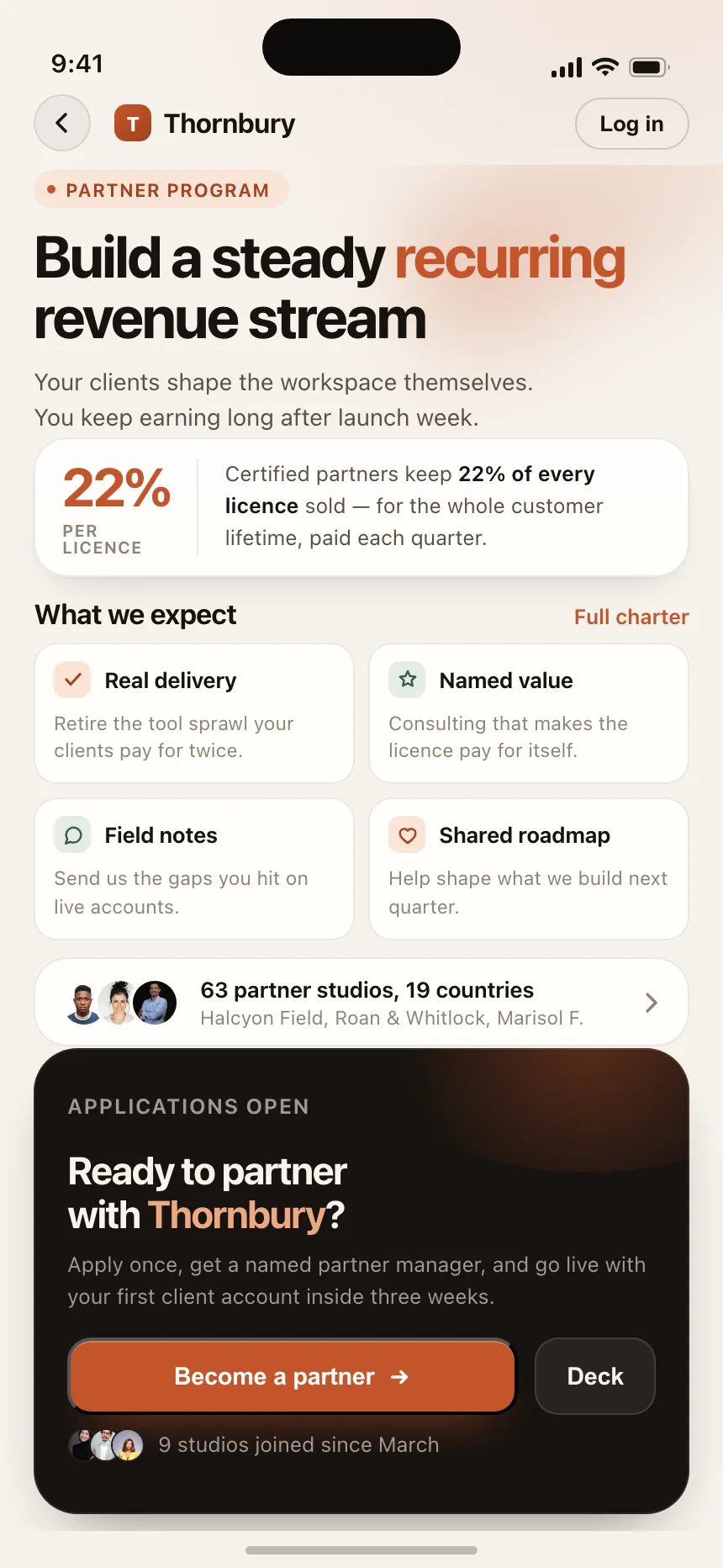
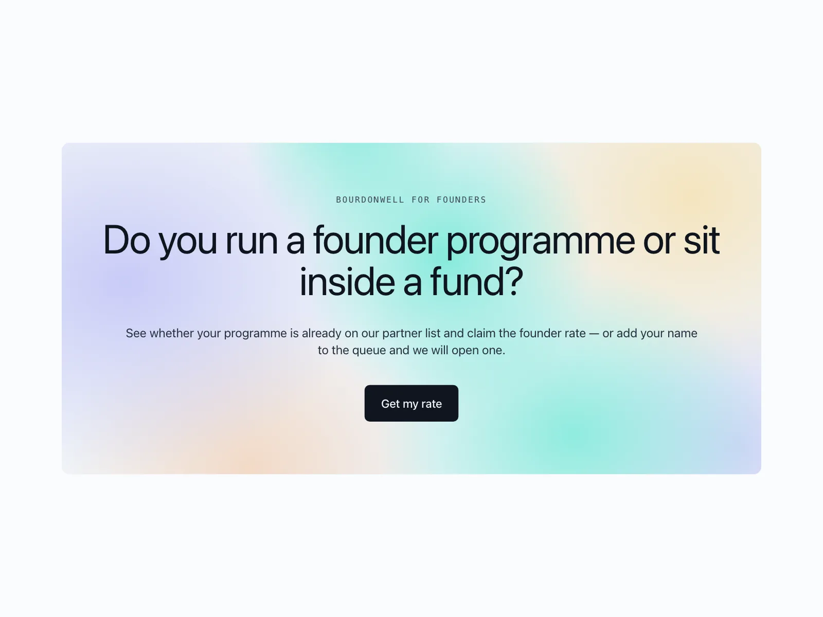
Partner programs
An invitation to apply, often with the commission or discount in the headline.

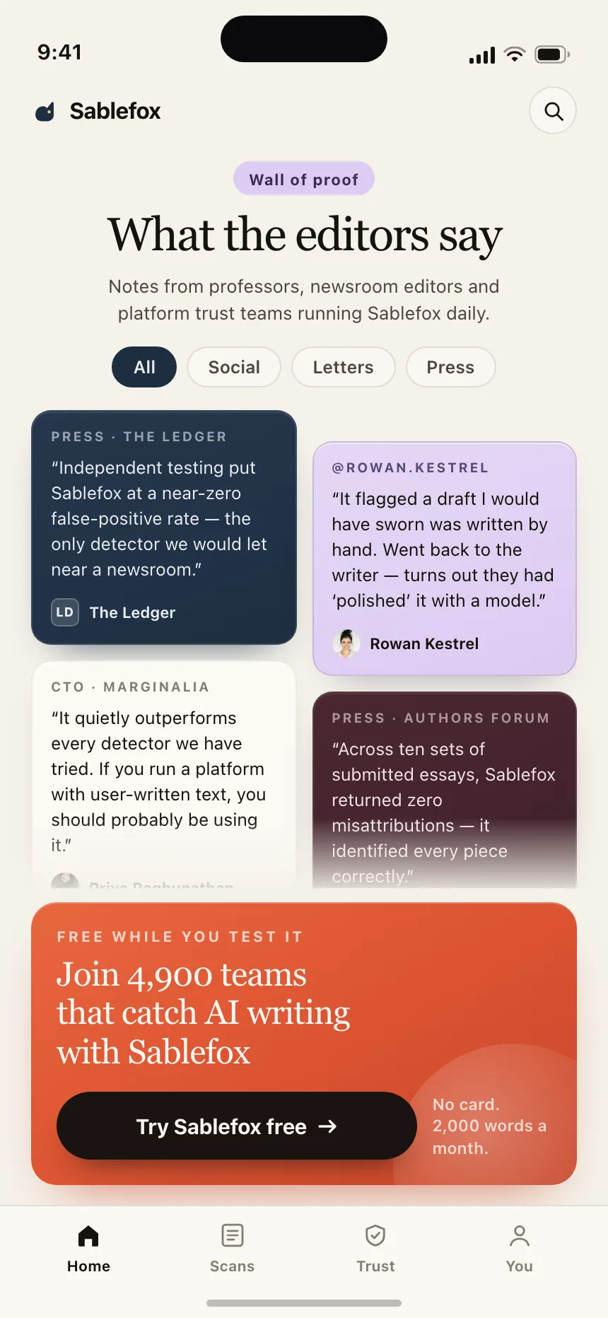
Trials and offers
A free trial, a discount or a signup bonus, stated plainly next to the button.


CTA band vs similar components

Build notes
- Use a <section> with a heading, so the band shows up in the page outline.
- Name the button by its outcome, like "Start free trial", not "Submit".
- Keep 4.5:1 contrast for the copy and button text, even over gradients and photos.
- Give an email field a label, type="email" and autocomplete="email".
- Describe errors in text next to the field and link them with aria-describedby.
- Repeat the hero's main action. A new ask at the bottom splits attention.
FAQ
What is the difference between a CTA band and a hero section?
A hero opens the page and makes the pitch. A CTA band closes it and repeats the ask for people who read everything. They usually share the same primary action, and the band is shorter.
How many buttons should a CTA band have?
One primary button. A second, quieter option works when there are two real paths, like Start free and Talk to sales. More than two turns the band into a menu.
What should a CTA band headline say?
The outcome people get, not the product name. "Close the month in an afternoon" beats "Try our app today". The line under it should answer the last objection: price, a card requirement or setup time.
Should a CTA band repeat on every page?
On marketing pages, yes, usually as the last block above the footer. Leave it out of docs, help articles and anywhere people are in the middle of a task.
Related terms
All glossary terms · Browse 167 web and 38 mobile CTA band designs