
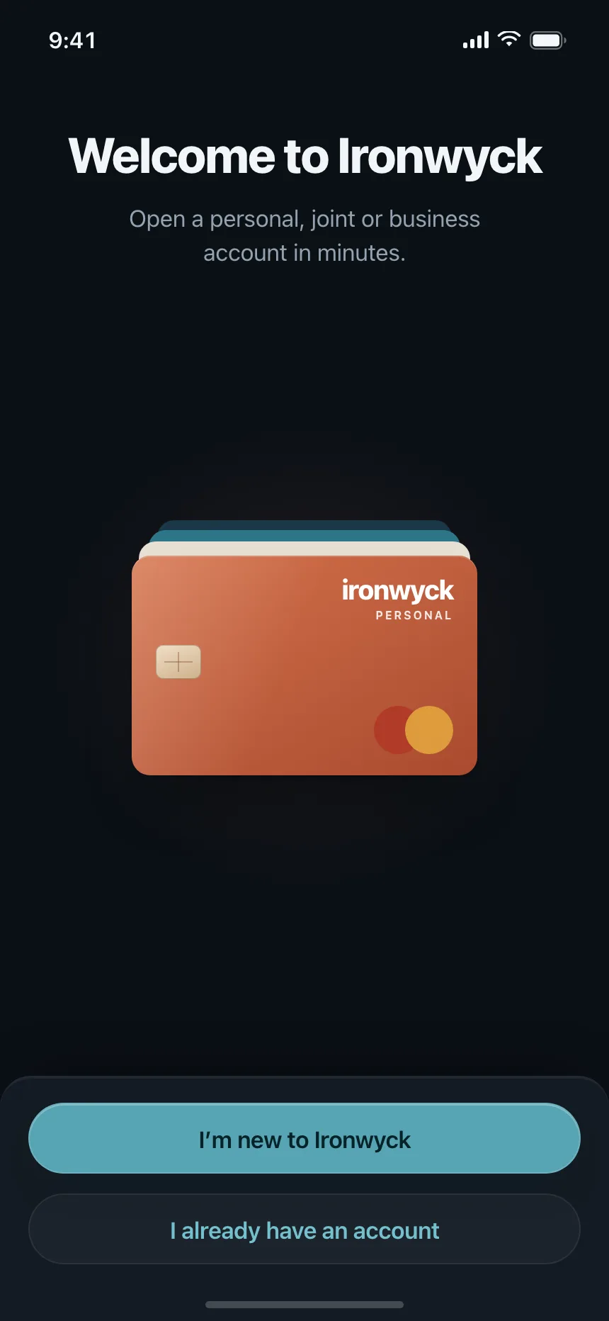
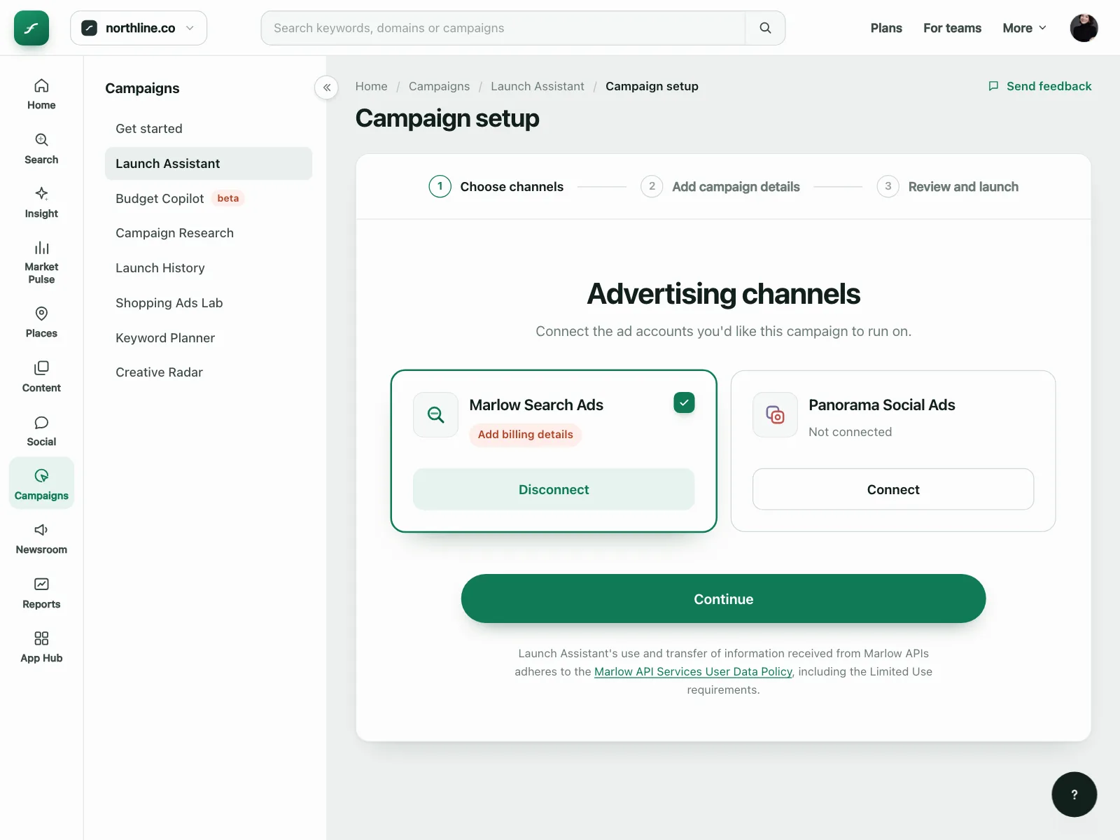
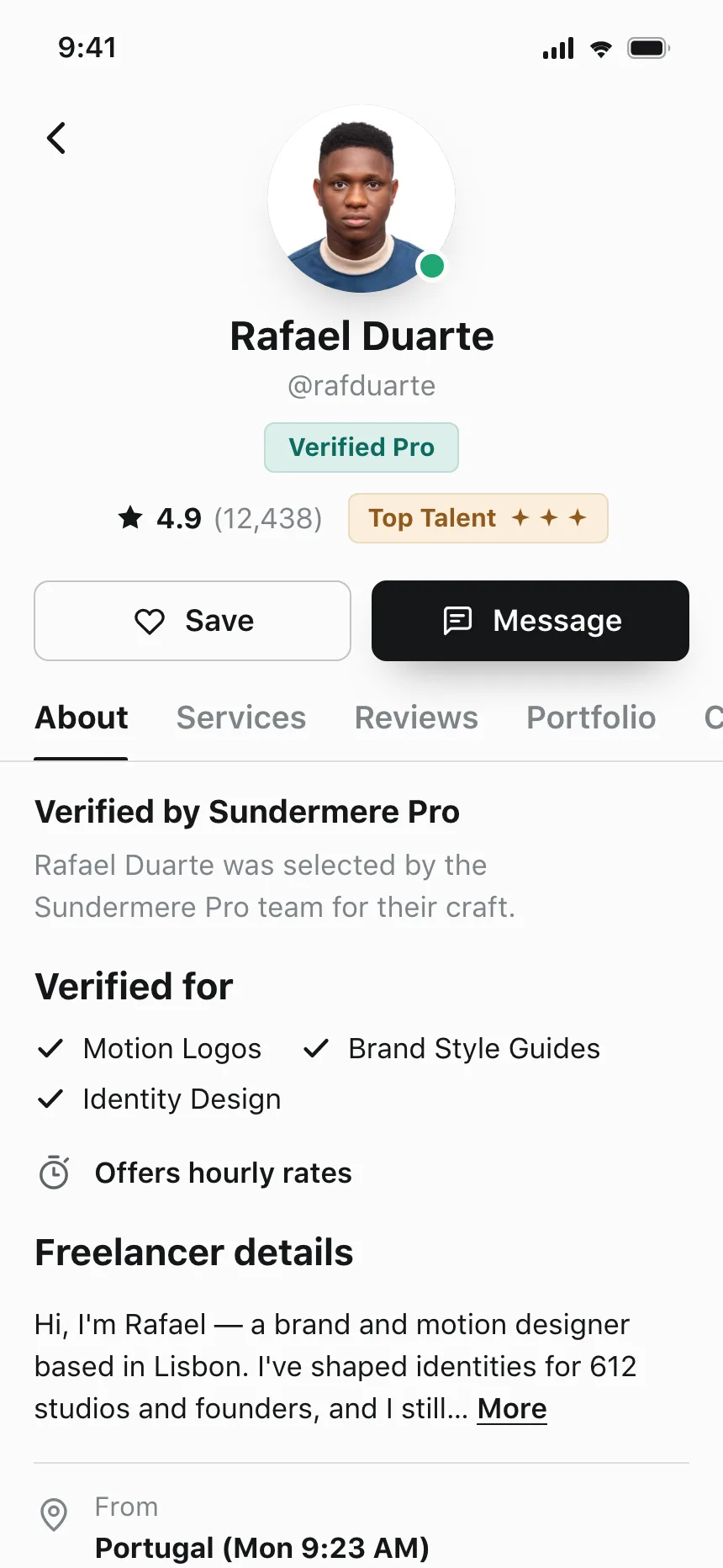
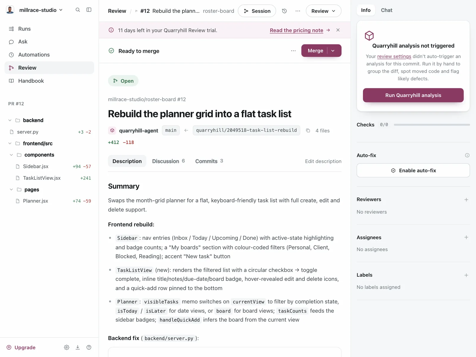
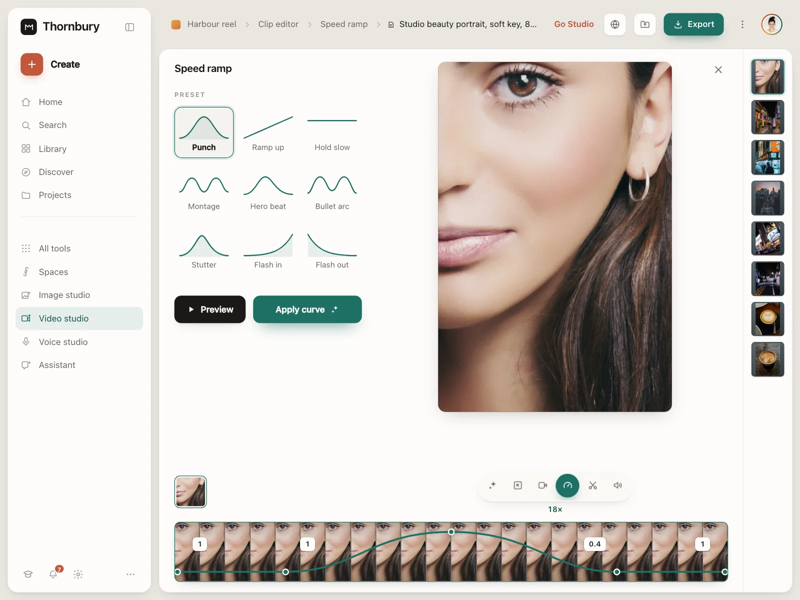
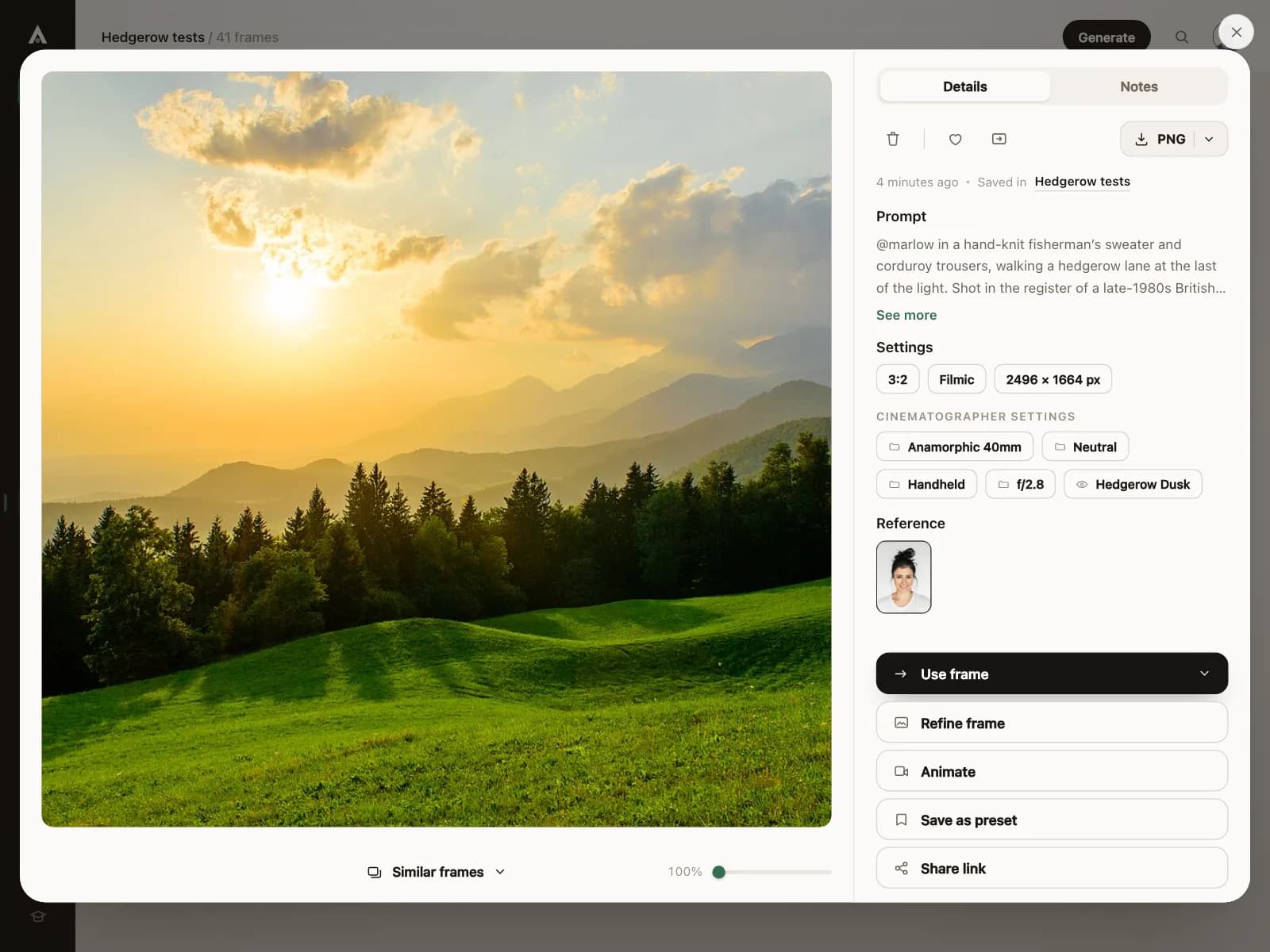
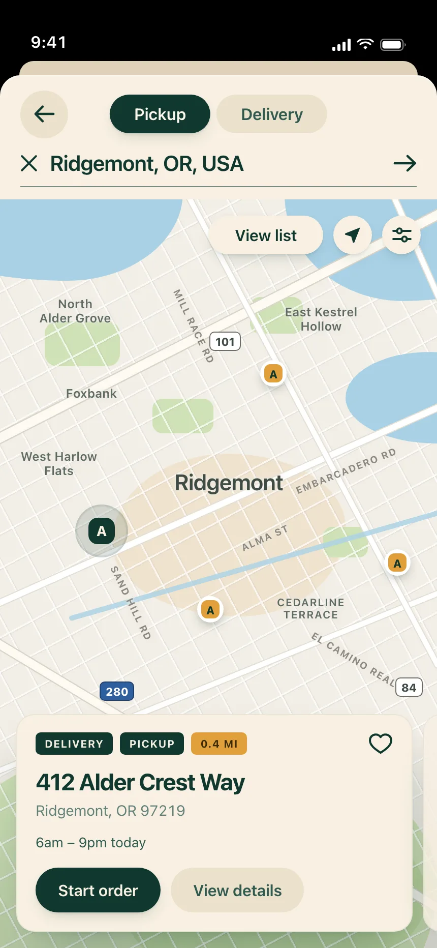
Buttons from the Kombai gallery: a banking app's welcome screen, an ad manager's channel setup and a talent marketplace's profile actions.
What is a button?
A button is a labeled control that runs one action when people click, tap or press it. Its style ranks it: a filled button marks the main action, and outline or text buttons carry the alternatives. The label says what happens, usually with a verb.
- The label starts with a verb, like Save, Send or Add to cart.
- Fill, outline and color rank buttons as primary, secondary or destructive.
Buttons show up across sign-in, dialog, account setup and checkout screens.
When to use a button
- Running an actionSaving, sending, buying or confirming something on the current screen.
- Submitting a formThe last step of a form, labeled with what happens next, like Create account.
- Confirming a choiceA dialog that asks people to go ahead or cancel.
When not to use one
- Going to another pageNavigation is a link. Style the link as a button if it needs the weight.
- Turning a setting on or offUse a toggle switch, or a checkbox inside a form.
- Switching between viewsUse a segmented control or tabs.
Anatomy of a button
This one works. Send the invoice, or tab to a button and press Enter or Space.
Invoice #1042
Marlow Studio, due Nov 30
$1,280.00
- Default
- Hover
- Pressed
- Disabled
- Loading
- Keyboard focus
- ContainerThe fill or outline people press
- LabelA verb for what happens
- IconOptional, beside the label
- Secondary buttonLess weight for the other choice
- StatesHover, pressed, disabled, loading, focus
Button variants
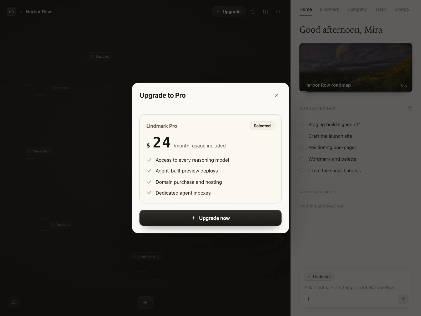
We sorted every button design in the Kombai gallery and found six patterns. Browse all 55 web and 35 mobile designs.
1. Primary and secondary pairs
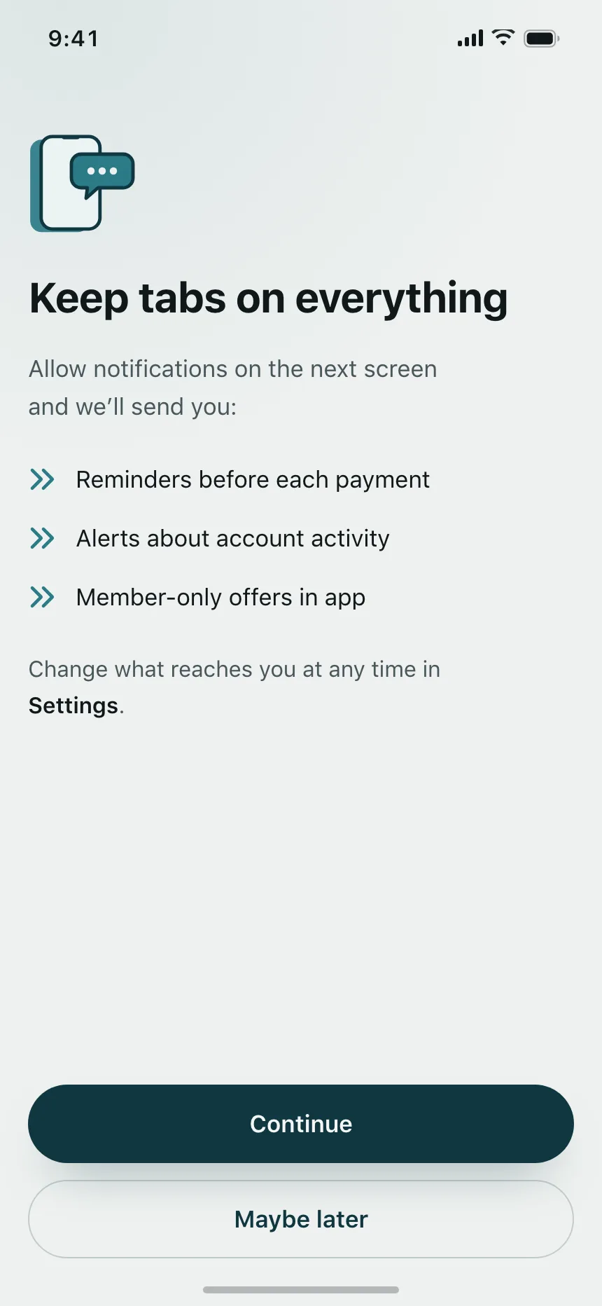
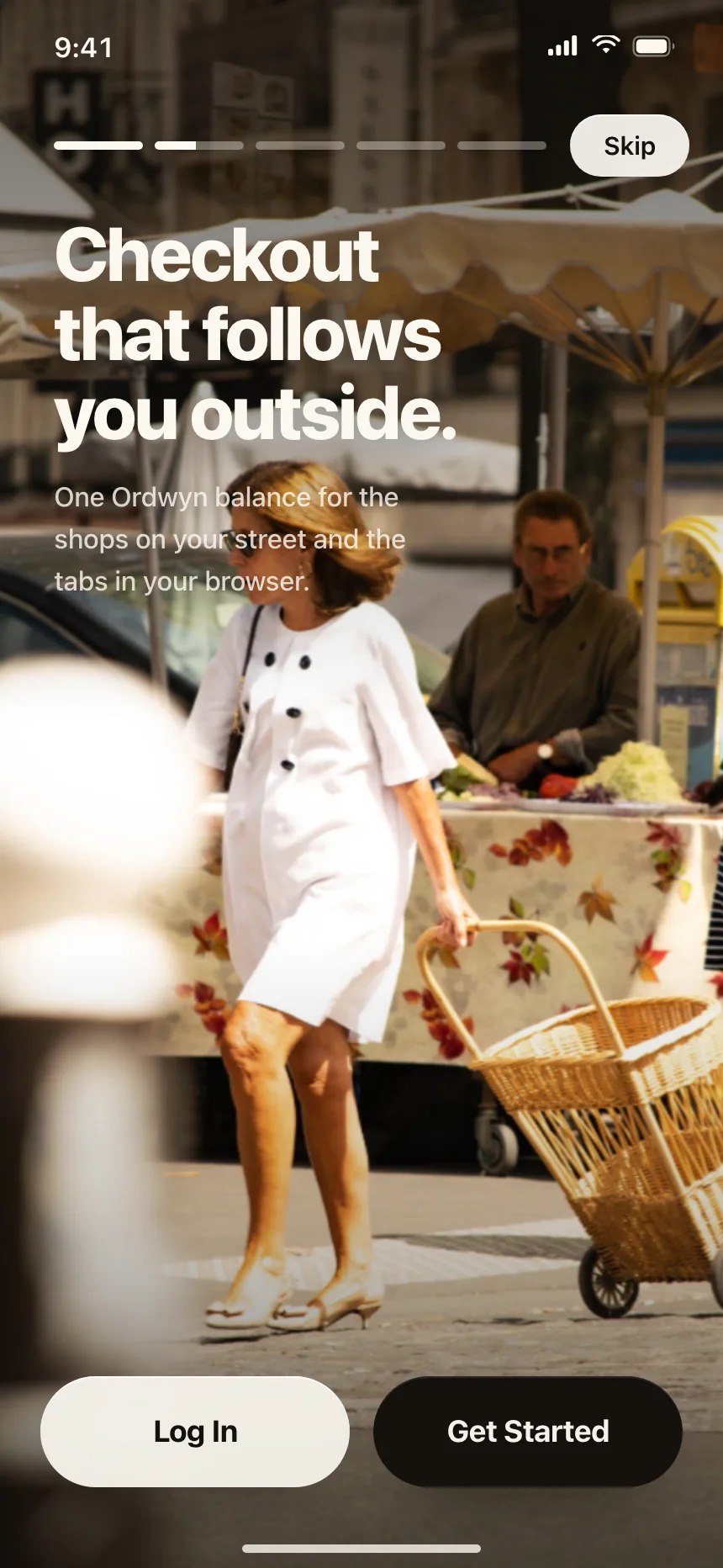
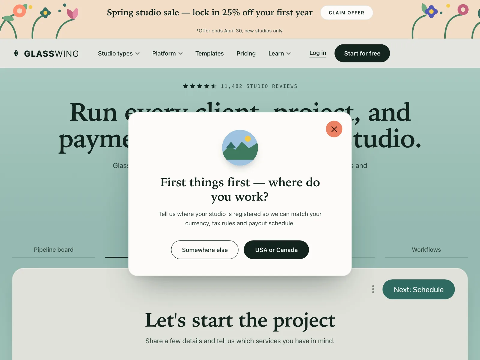
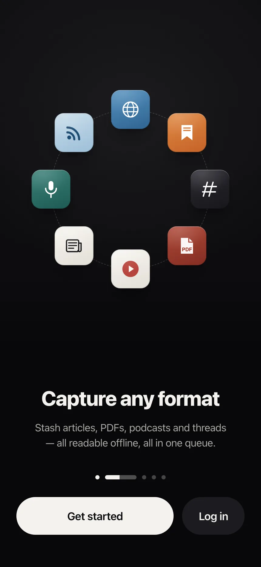
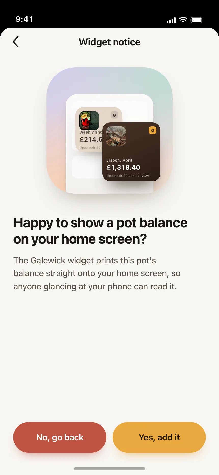
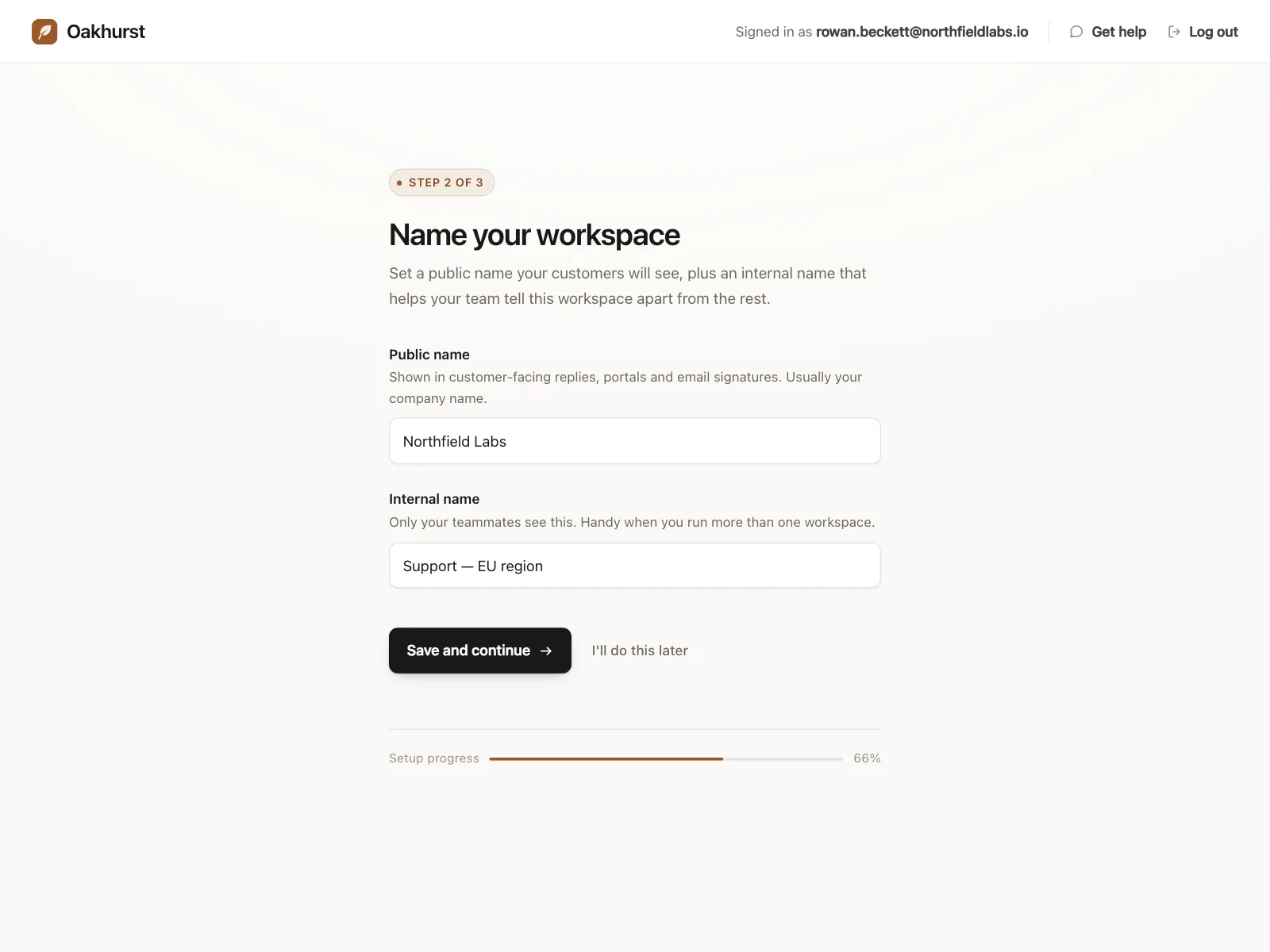
The default. A filled button for the likely choice next to an outline or ghost button for the other one.
2. Full-width buttons
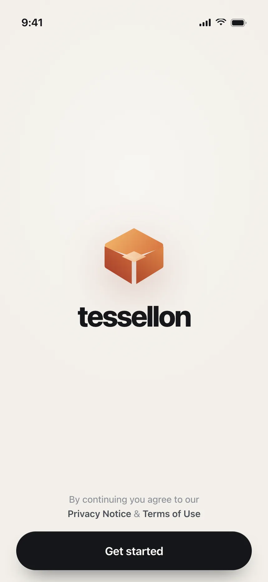
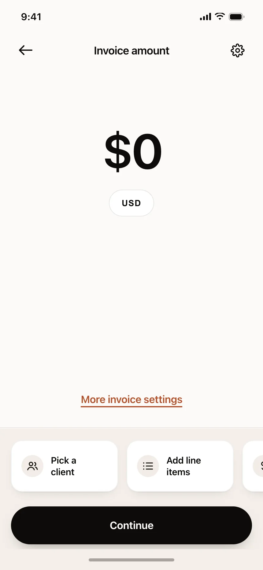
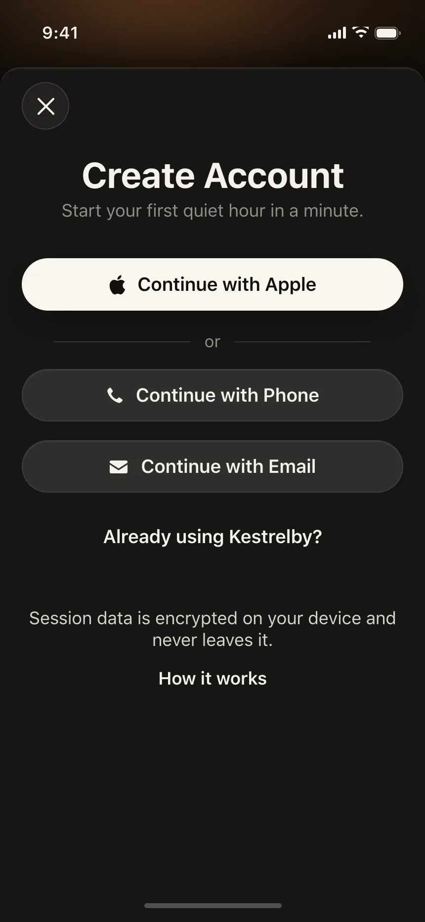
One button stretched across the screen or dialog, often docked at the bottom on mobile, for the single next step.
3. Destructive buttons
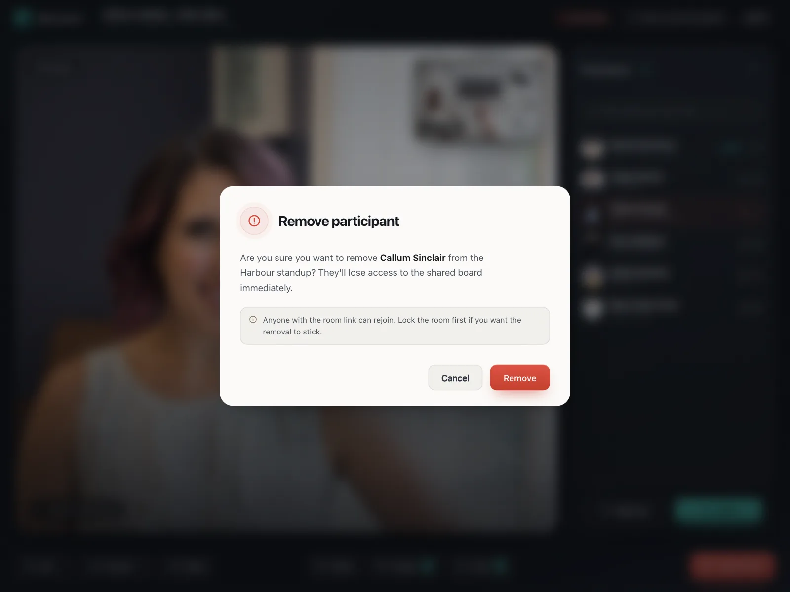
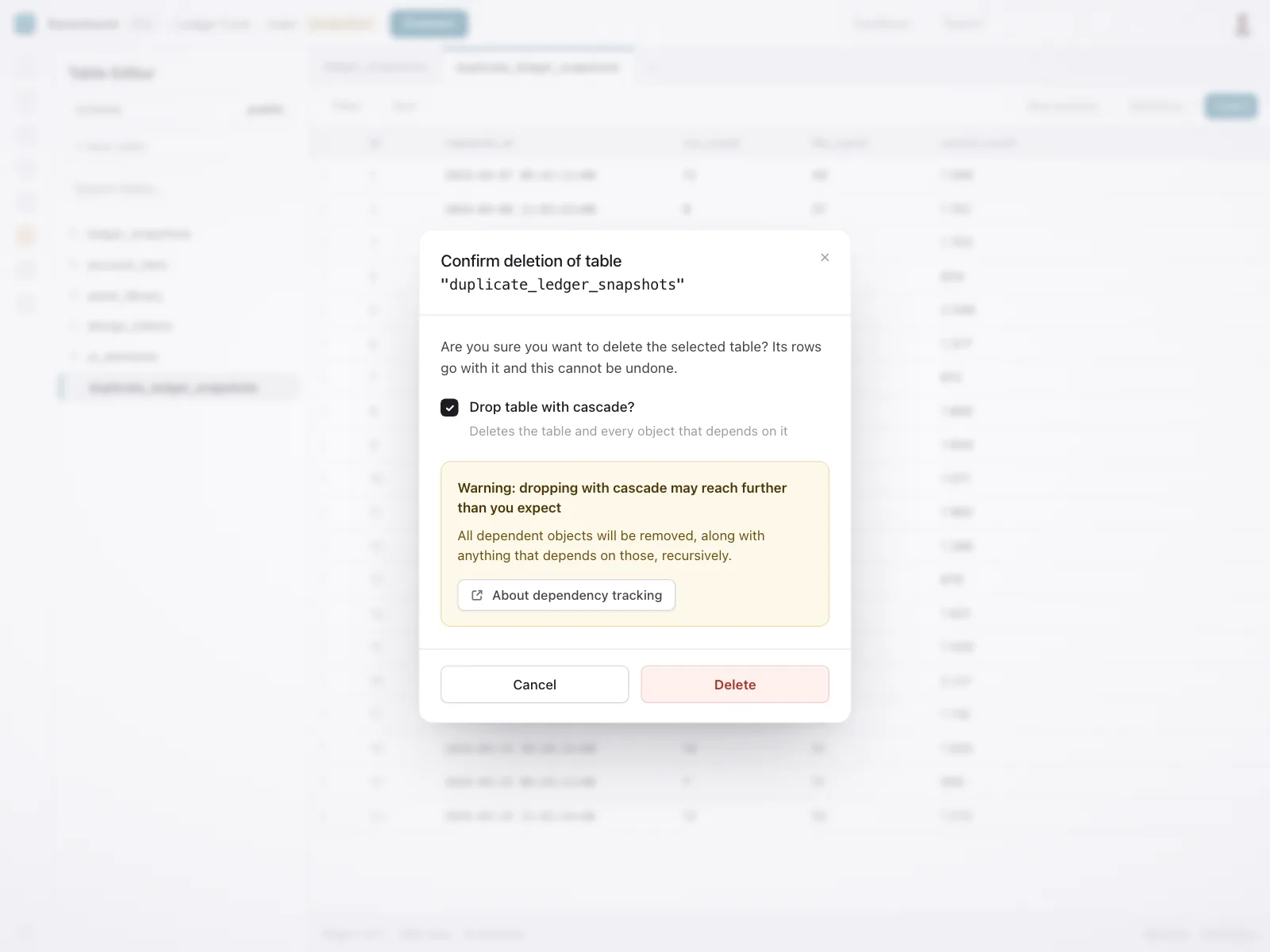
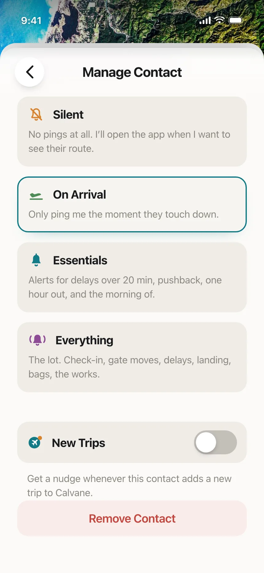
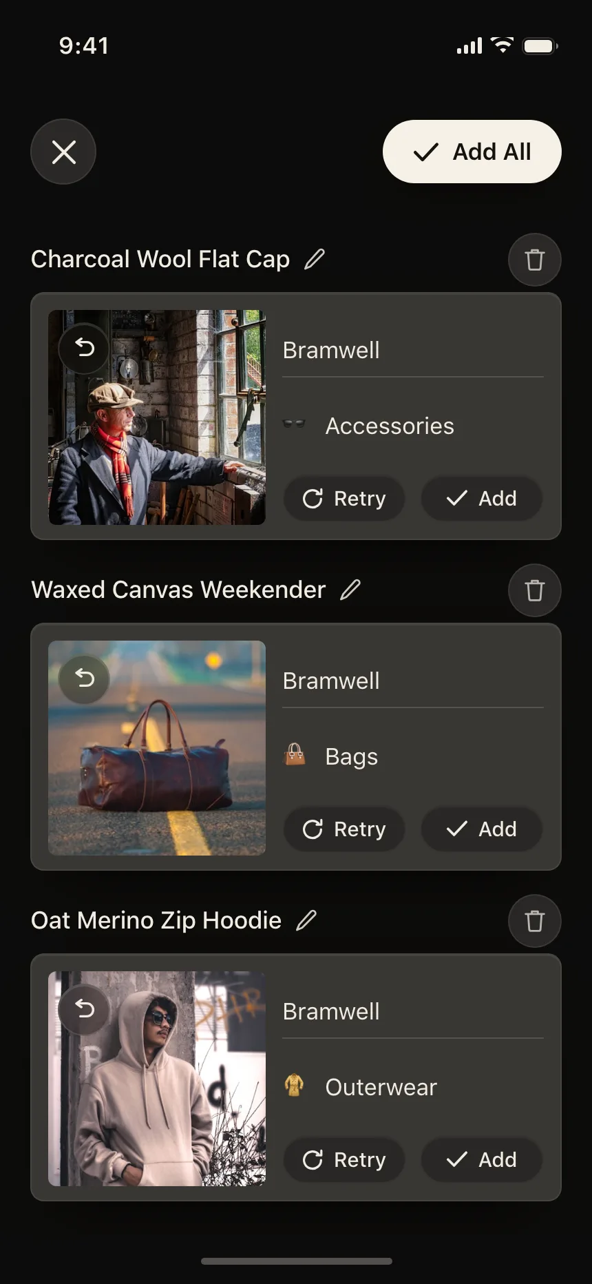
Red or pale red buttons for removing and deleting, usually inside a confirmation with a Cancel beside them.
4. Sign-in buttons
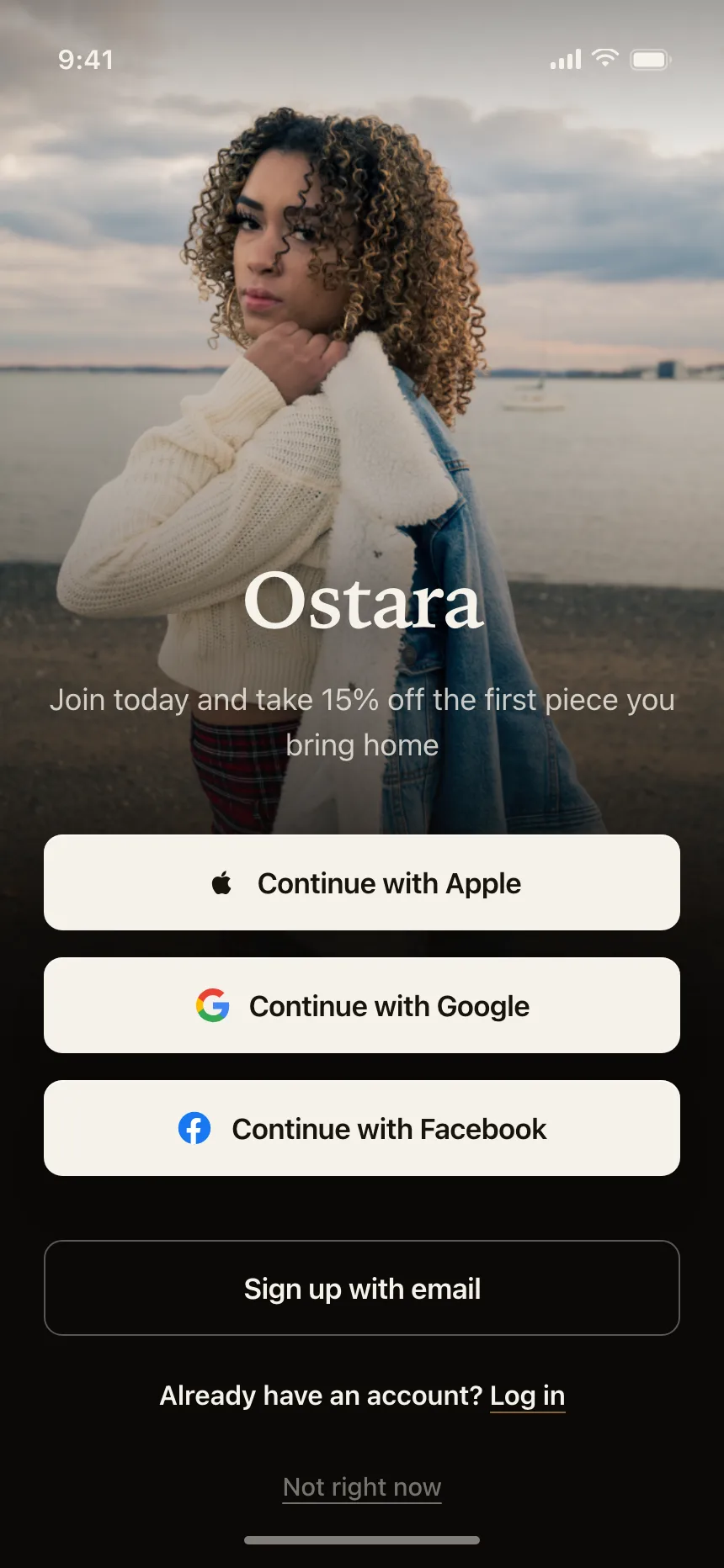
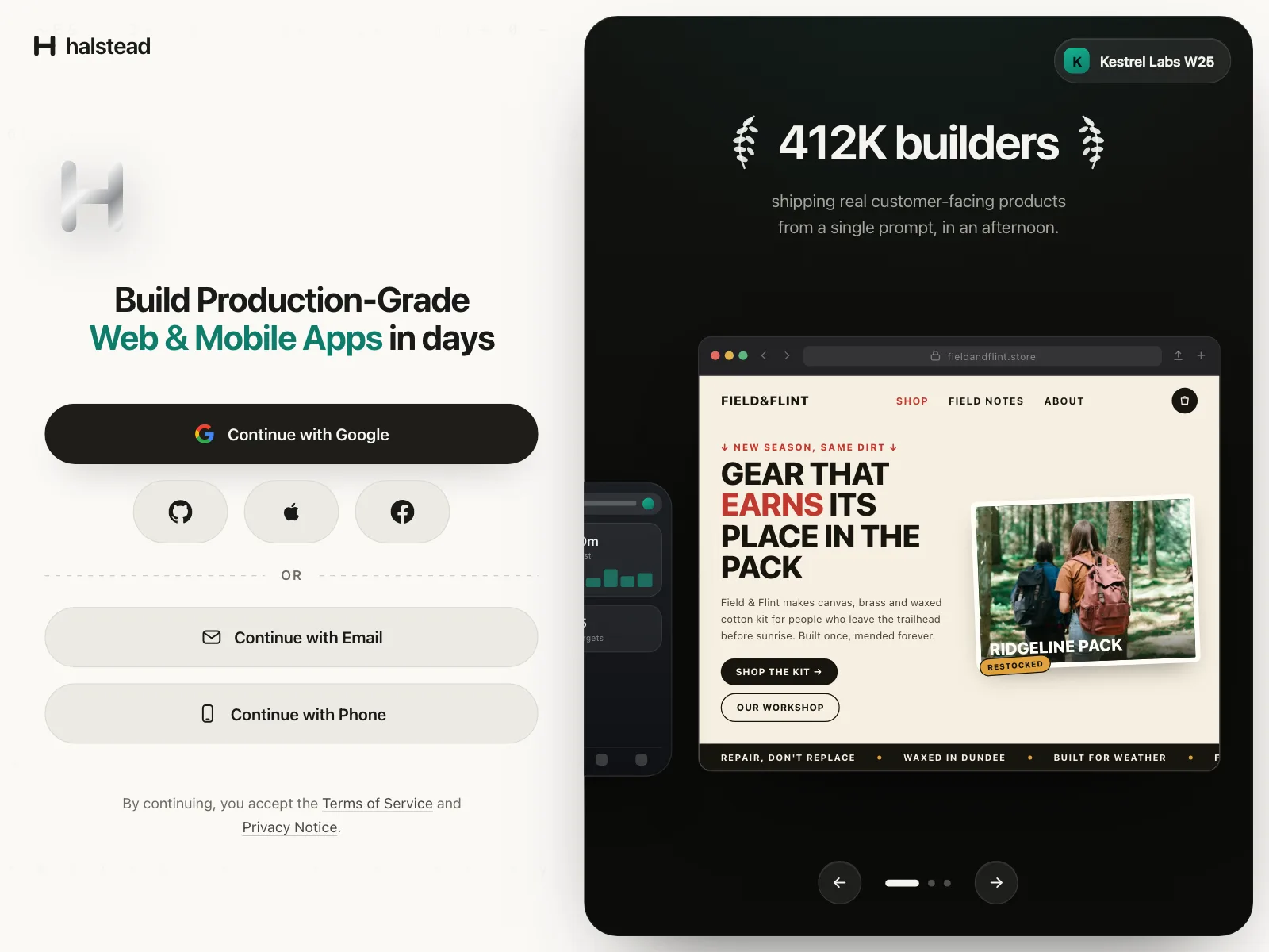
A stack of equal buttons, each with a provider's logo, so every way to sign in has the same weight.
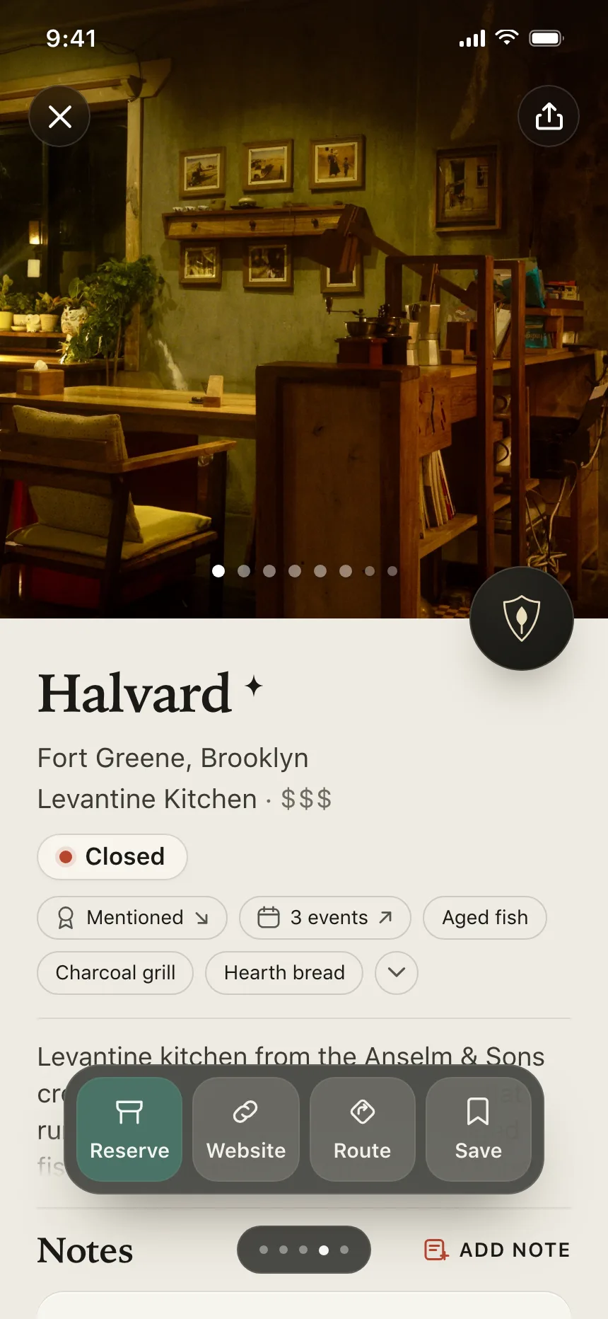
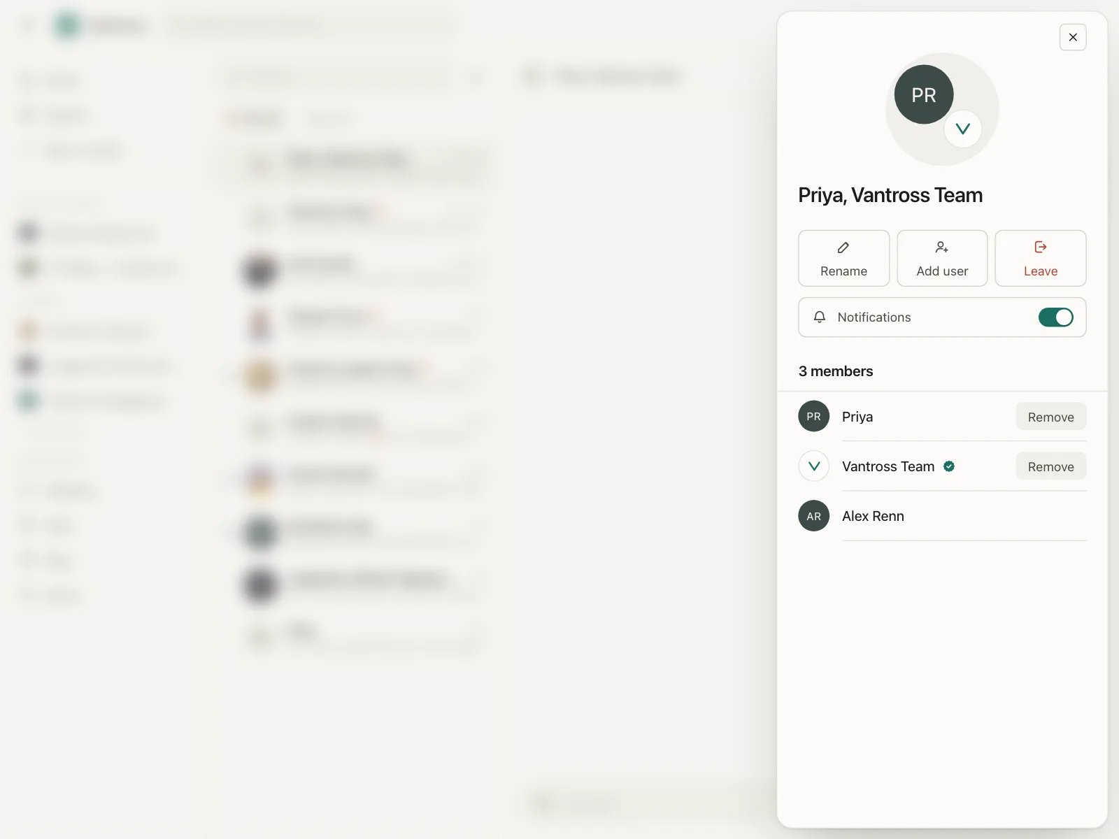
5. Icon buttons
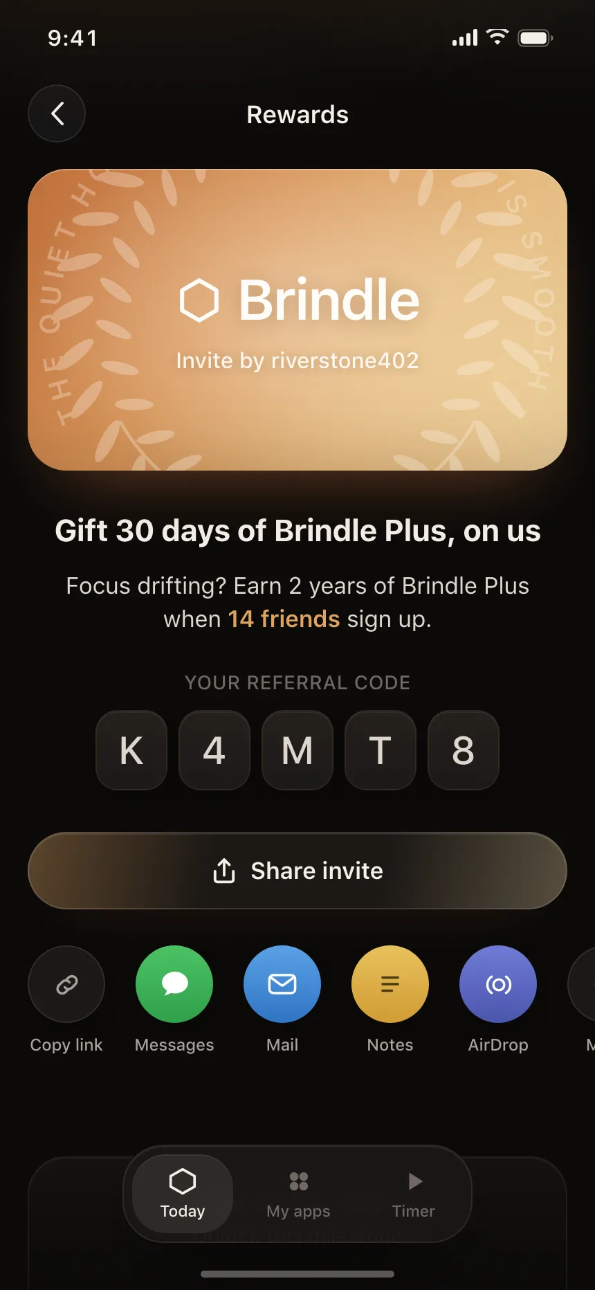
Round or square buttons led by an icon, often with a short label under it, for share sheets and quick actions.
6. Row buttons
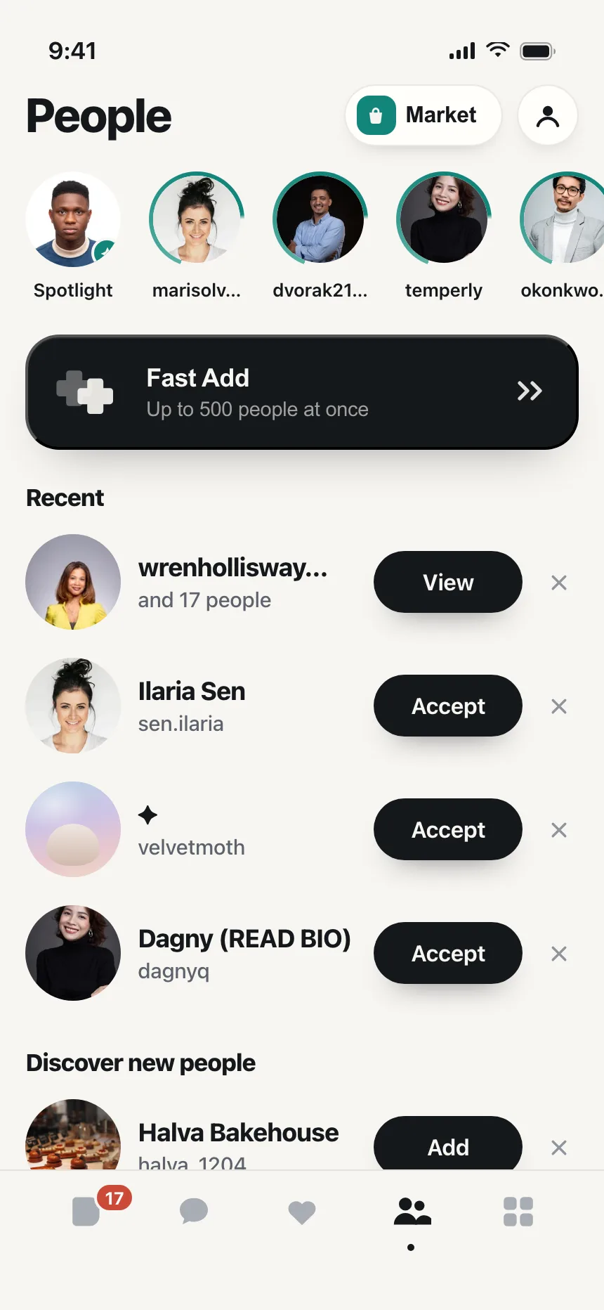
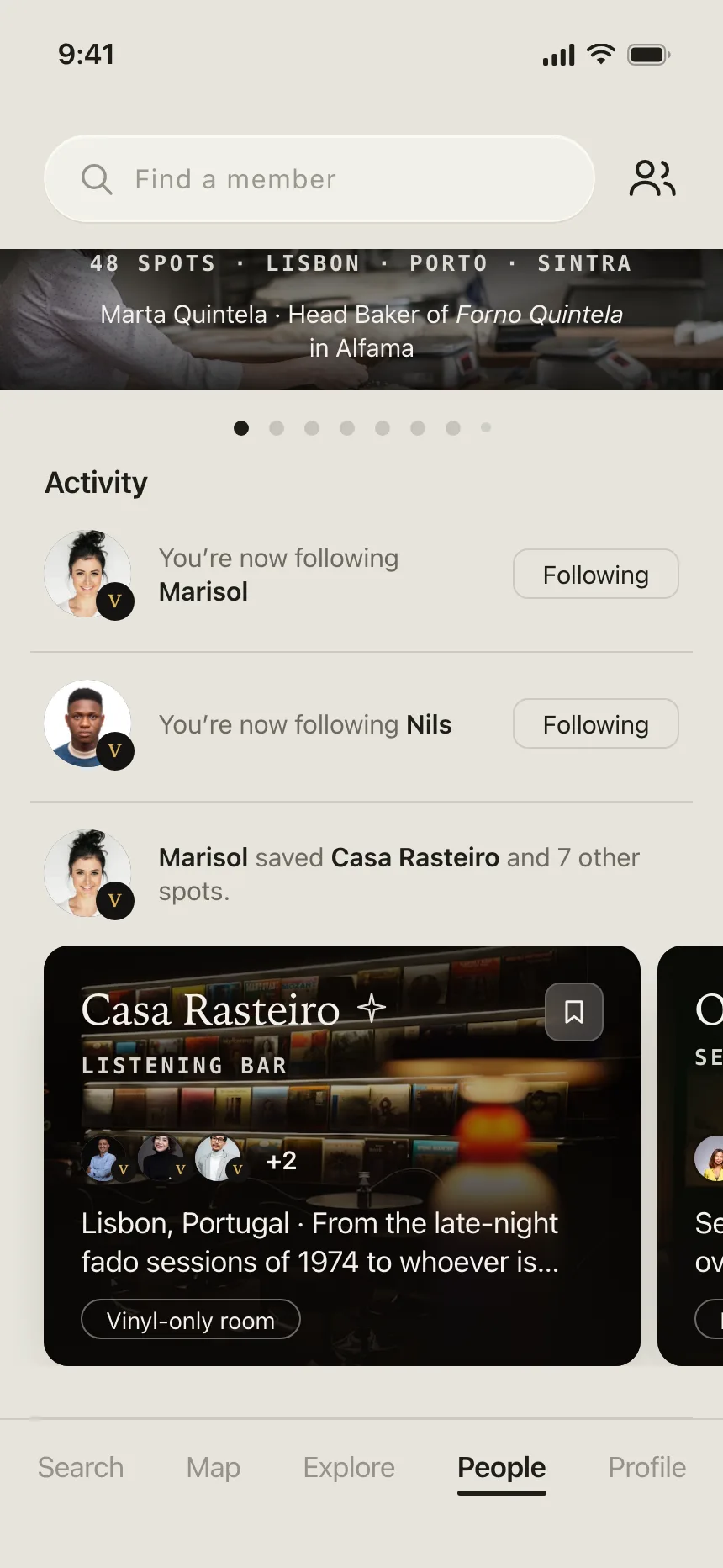
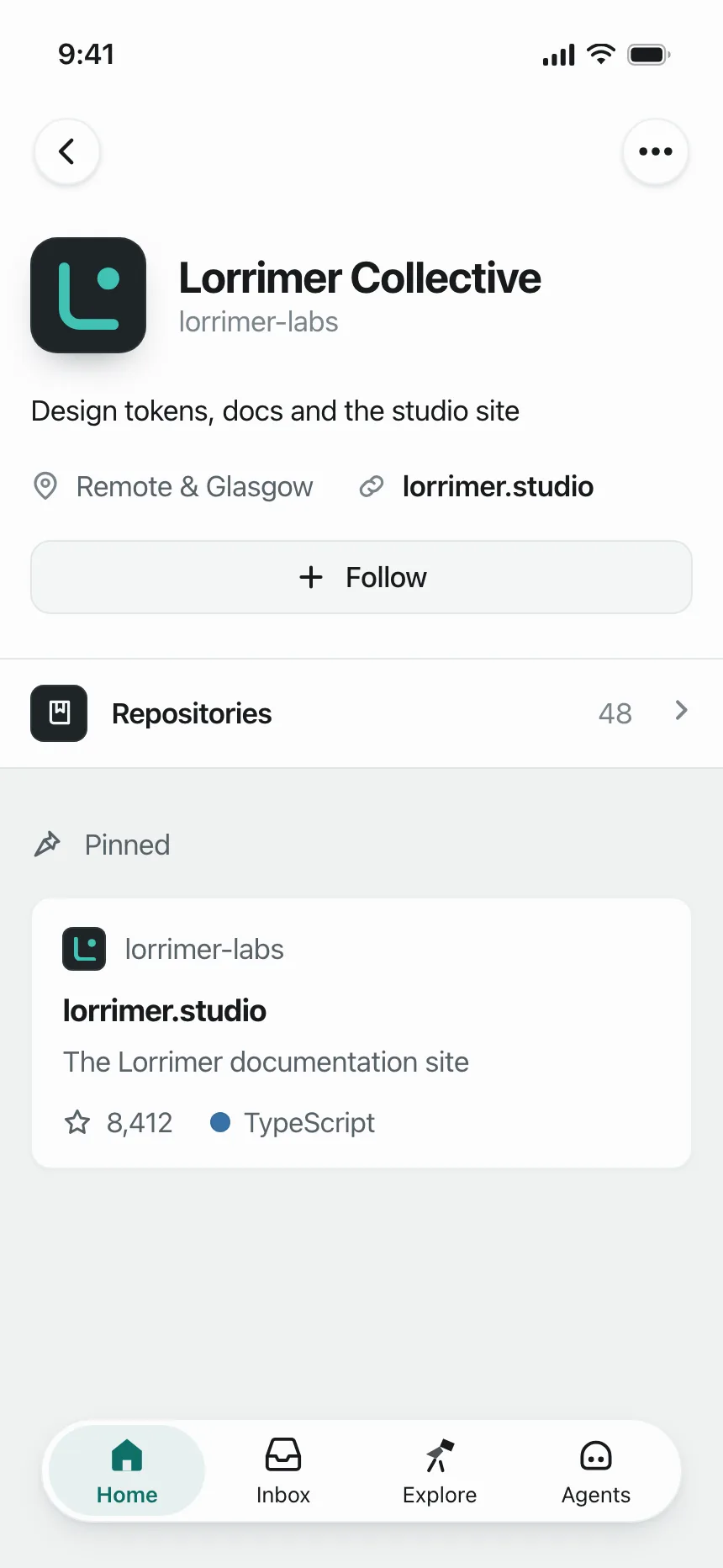
Small pill buttons repeated on every row or card, like Follow, Accept or Add, so each item has its own action.
Where buttons show up
Onboarding and permission prompts
A clear yes and a quiet way out, like Get started and Log in, or Yes, add it and No, go back.
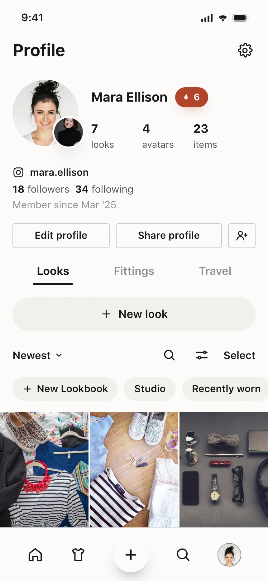
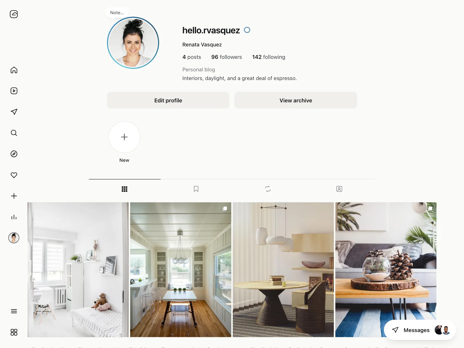
Profiles
Edit profile and Share on your own page, Follow and Message on someone else's.
Editors and workspaces
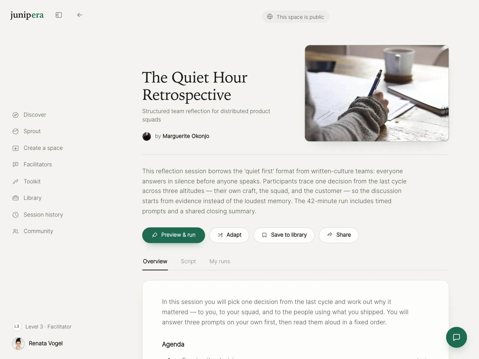
A row of tool buttons above the work, with one filled button for the main step, like Run, Merge or Apply.
Button vs similar components
Build notes
- Use <button> for actions and <a> for navigation, so the role matches what it does.
- Set type="button" on buttons in a form that should not submit it. The default is submit.
- Enter and Space activate a button. Keep the focus ring visible.
- Give icon-only buttons a name, with visually hidden text or aria-label.
- Make the hit area at least 44 by 44 points, even when the button looks smaller.
- Show a spinner inside the button while the action runs, and ignore repeat clicks.
FAQ
What's the difference between a button and a link?
A button does something on the current page, like submitting a form or opening a dialog. A link takes people somewhere else. Use the element that matches the job and style it however you like, so keyboards and screen readers behave the way people expect.
How many primary buttons should a screen have?
One, or two at most. Apple's guidelines say to keep prominent buttons to one or two per view. Give the most likely action the filled style, make the rest outline or text buttons, and use style rather than size to show which one matters.
How big should a button be?
Apple's guidelines ask for a hit region of at least 44 by 44 points. WCAG 2.2 sets 24 by 24 CSS pixels as the level AA minimum, with a few exceptions. The visible shape can be smaller than that, as long as the area people can tap is not.
Should I disable a button until a form is valid?
Usually not. A disabled button doesn't say what's missing, and a native disabled button can't be focused, so people tabbing through the form skip right past it. Keep it enabled and show errors on submit, or say next to it what's left to fill in.
Related terms
All glossary terms · Browse 55 web and 35 mobile button designs