
Dialog
A dialog opens a window above the page that asks for a decision or a few details before people go on.
- Also called
- modal, popup, alert
- Platforms
- Web, Mobile
- In the gallery
- 125 web and 135 mobile designs
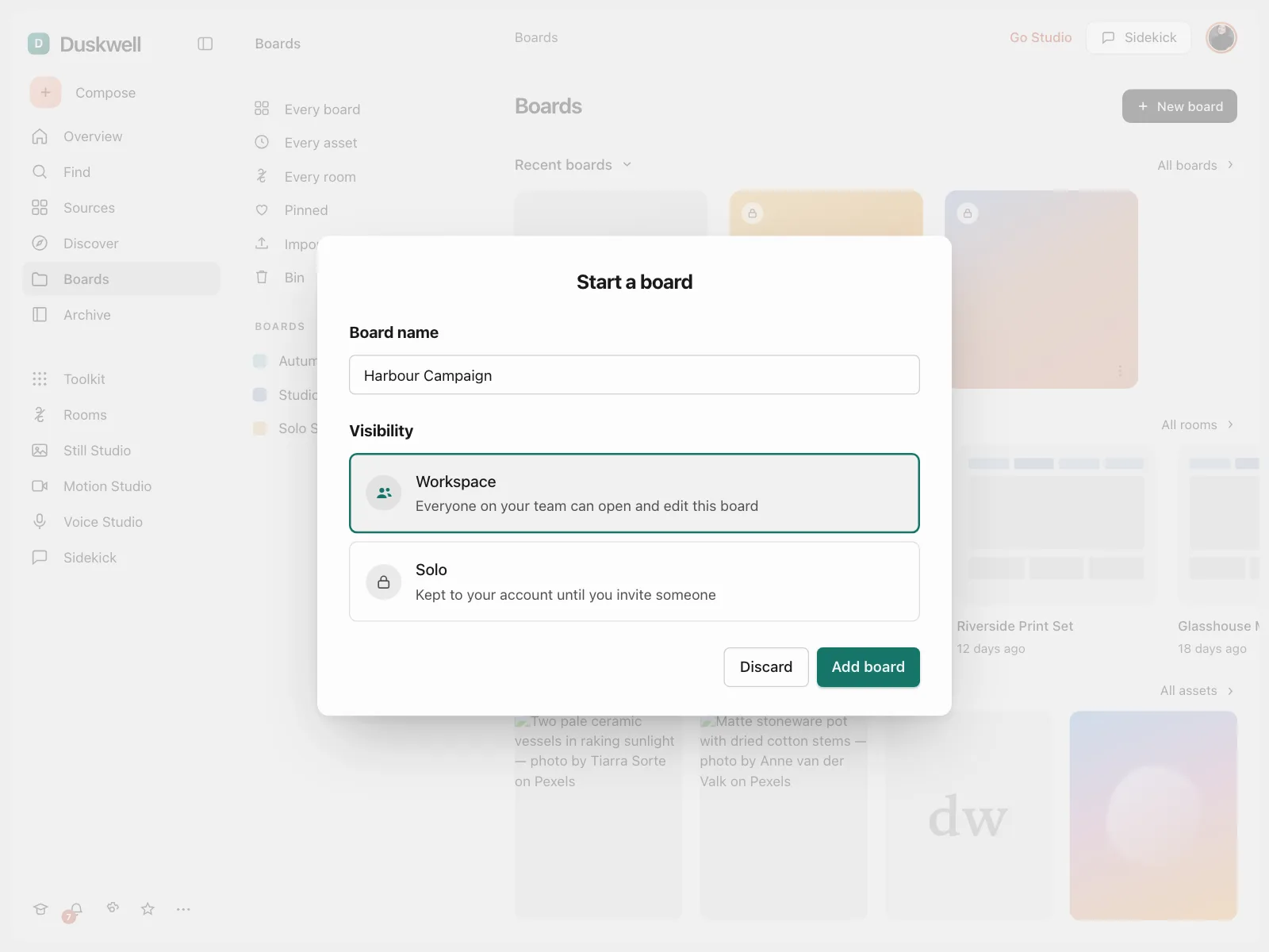

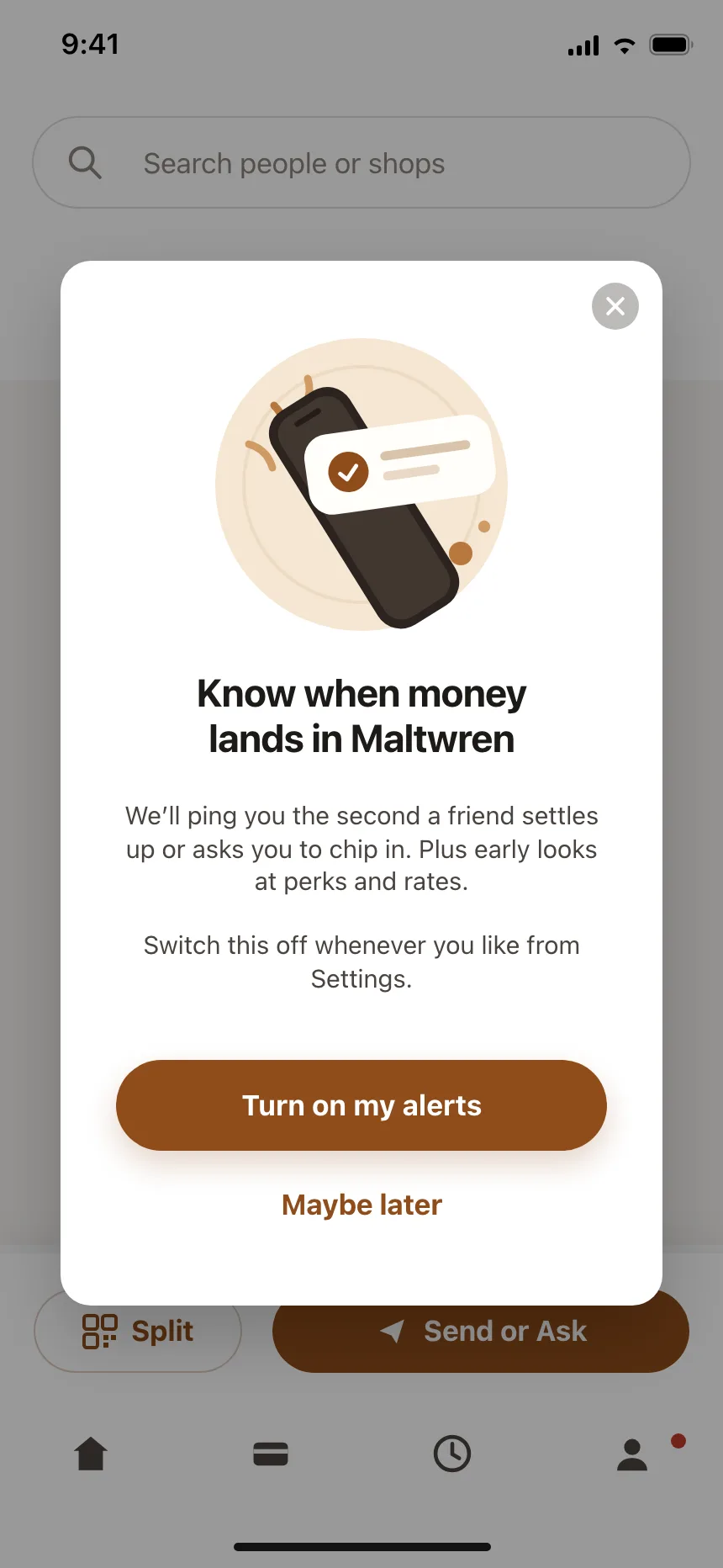
Dialogs from the Kombai gallery: a creative asset workspace's new board form, a travel app's delete alert and a peer payment app's notification opt-in.
What is a dialog?
A dialog is a window that opens on top of the current screen and asks for a decision or a few details. A scrim dims the content behind it, and that content stays out of reach until people answer, cancel or close the dialog. When it closes, they are back where they started.
- A title names the decision, and the buttons name the outcomes, like Delete or Keep editing.
- Keyboard focus moves into the dialog when it opens and stays there until it closes.
Dialogs show up across checkout, account deletion, permission and settings screens.
When to use a dialog
- A decision before going onConfirming something that can't be undone, like deleting an account.
- A short, focused taskRenaming, inviting or creating something with a few fields.
- Something people must answerA permission request or a blocking problem that needs a response.
When not to use one
- Information with no decisionA dialog interrupts. Use a toast or an inline message instead.
- Long or multi-step tasksGive them their own page or a full screen overlay.
- Everyday actions people can undoAct right away and offer Undo, rather than asking first.
Anatomy of a dialog
This one works. Press Delete board to open it, Tab to move between its buttons and Escape to close it.
Boards / Spring launch
Board settings
- Name
- Spring launch
- Cards
- 14 cards, 32 comments
Delete this board and everything on it.
Delete Spring launch?
Its 14 cards and 32 comments go with it. You can't undo this.
- Closed
- Open
- Keyboard focus
- Busy
- ScrimDims and blocks the page
- TitleNames the decision
- BodySays what will happen
- ActionsCancel and the main action
- Close buttonA way out that changes nothing
- StatesClosed, open, focus, busy
Dialog variants
We sorted every dialog design in the Kombai gallery and found six patterns. Browse all 125 web and 135 mobile designs.
1. Confirmations
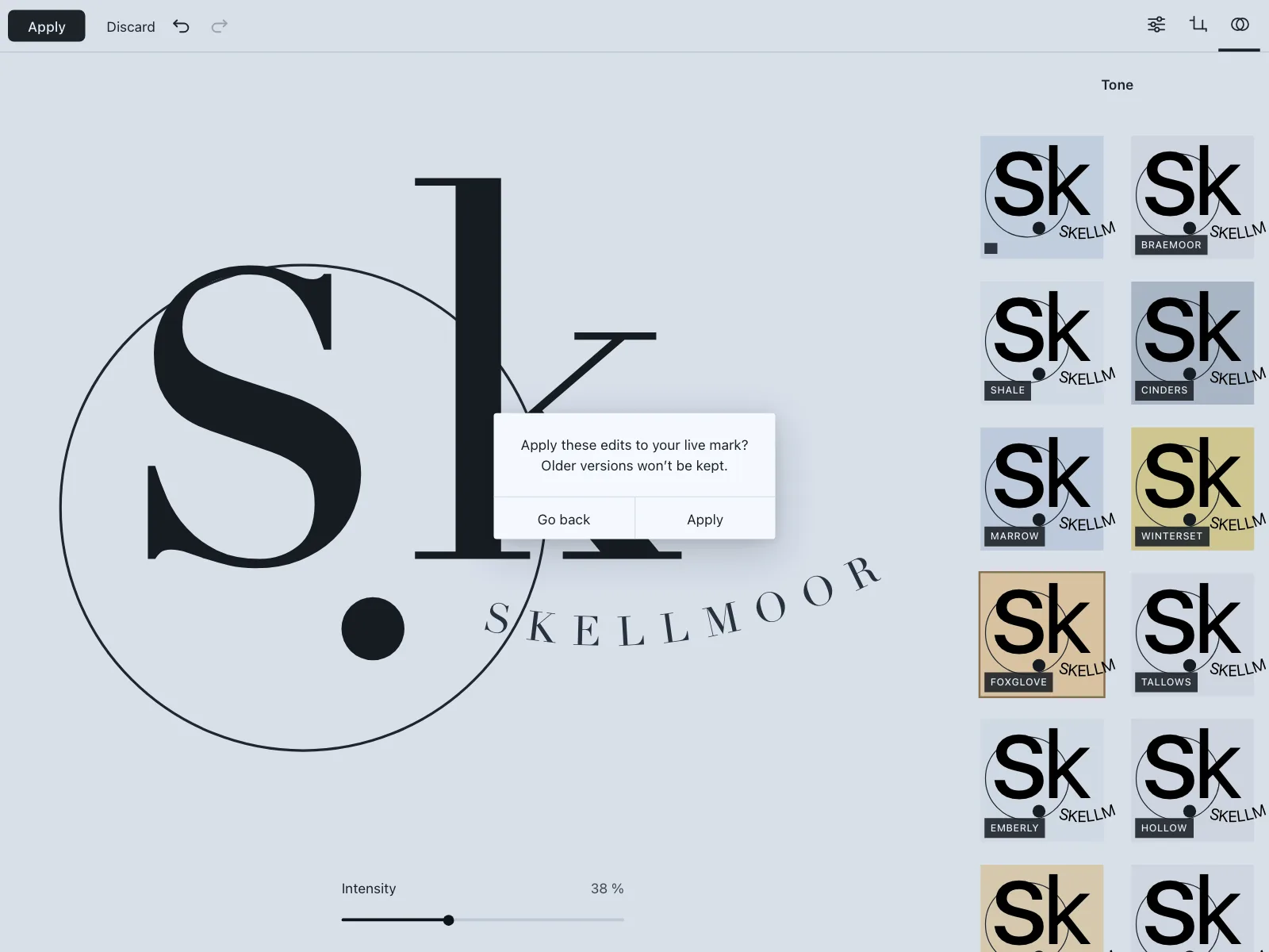
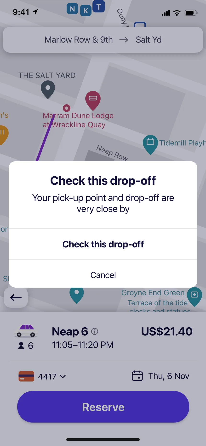
Two buttons that ask people to confirm a choice before it goes through, like applying edits or checking a drop-off point.

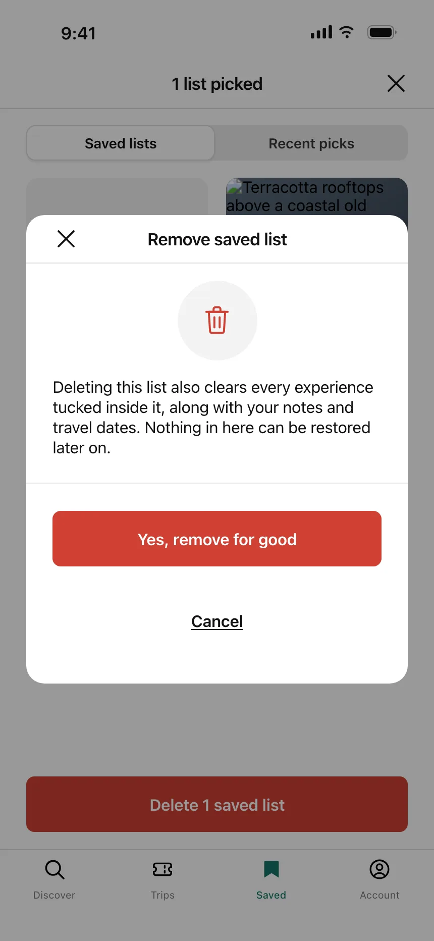
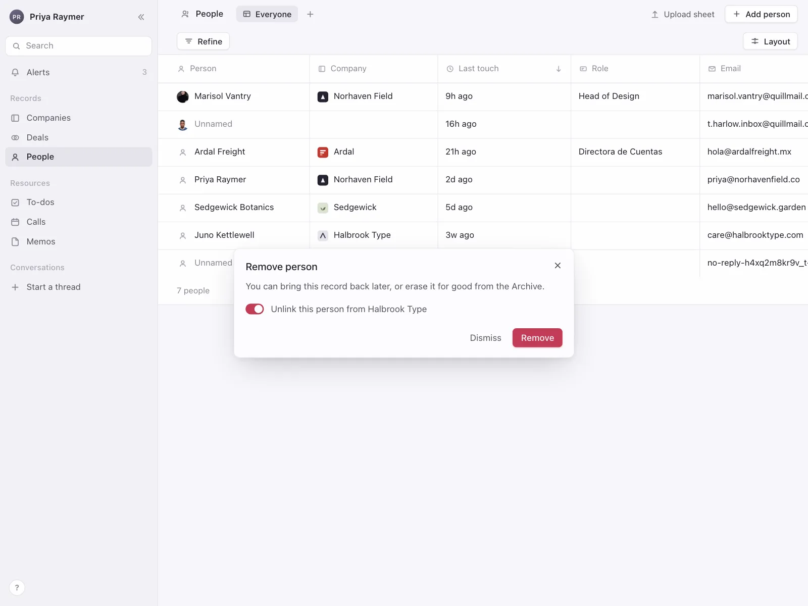
2. Destructive confirms
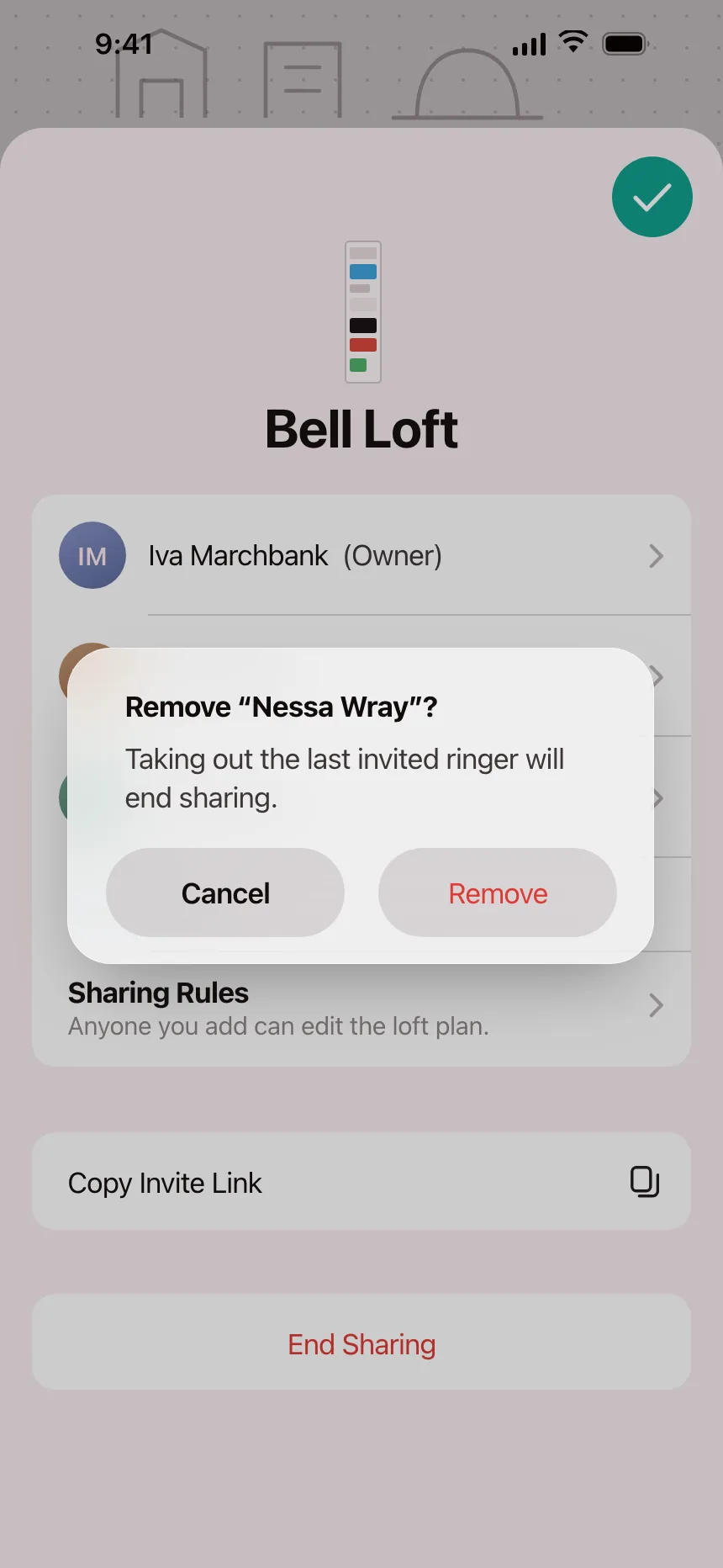
A red button for deletes and removals that can't be undone. Some ask people to type a word before the button works.

3. Form dialogs
A few fields to create, rename or set up something, with Cancel and a submit button that names the result.


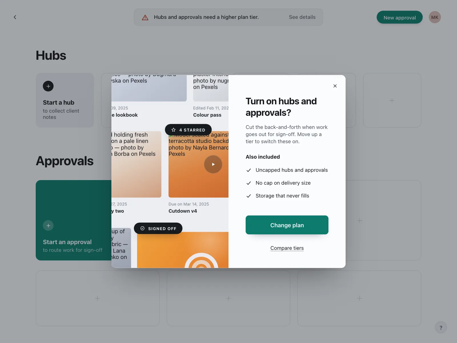
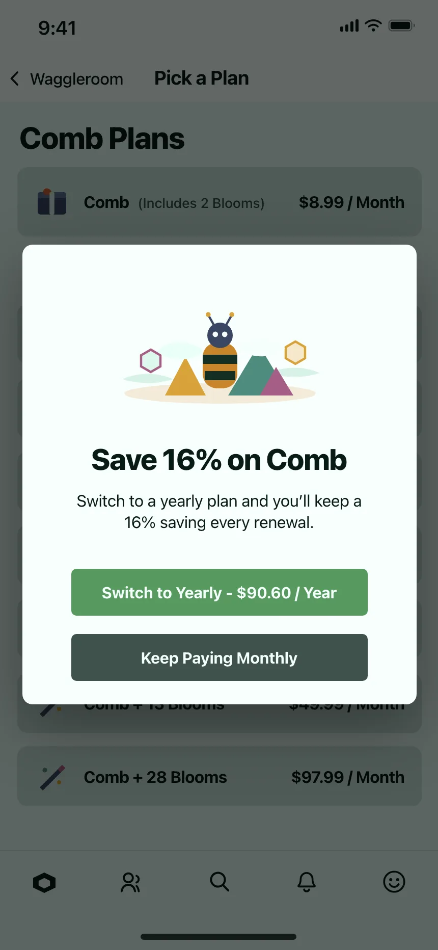
4. Upsells and paywalls
A locked feature or a better plan, offered at the moment someone reaches for it, with a quiet way to say no.

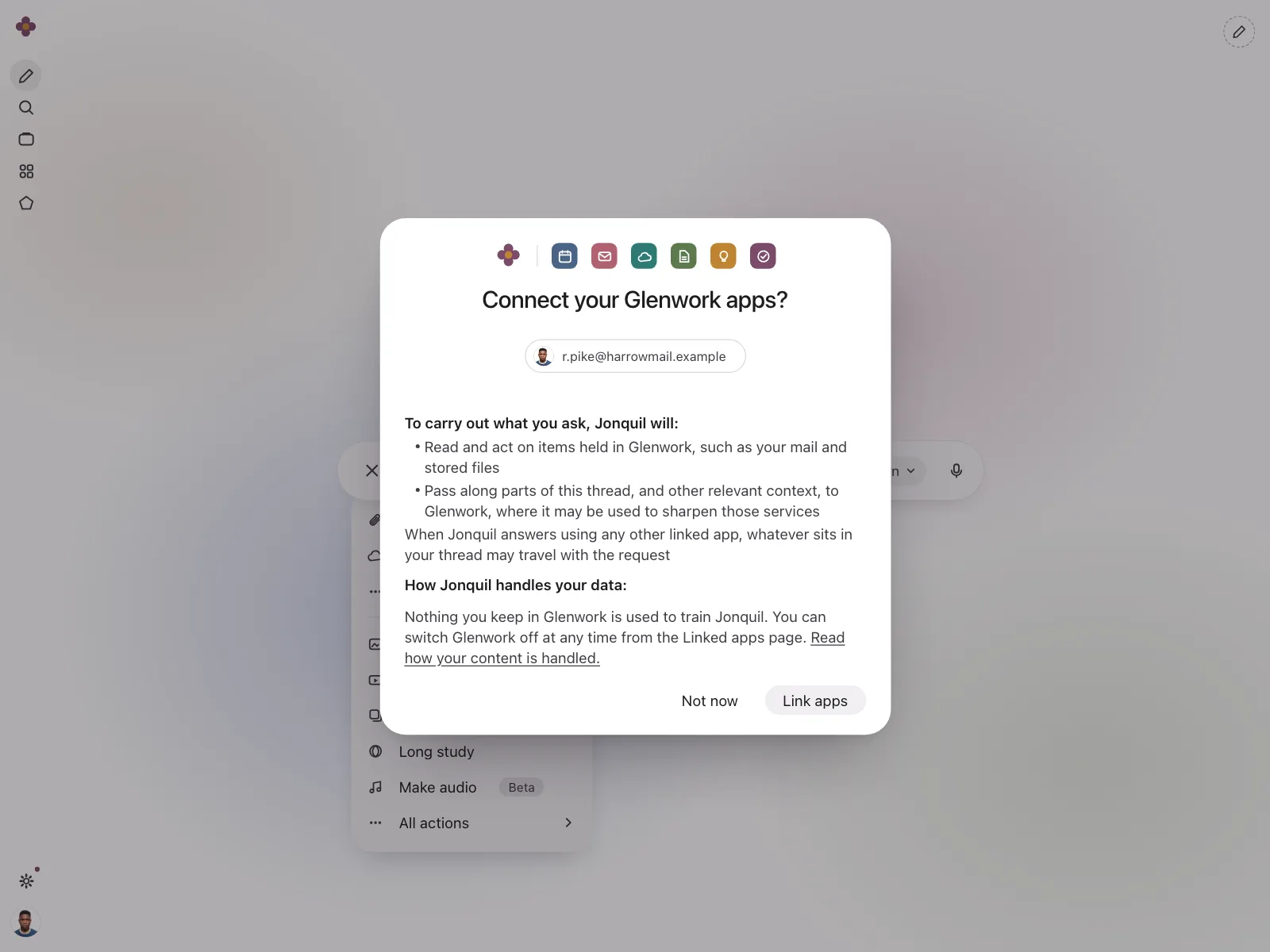
5. Permission and opt-in prompts
A short reason, often with an illustration, for turning on notifications, location or access to another app.


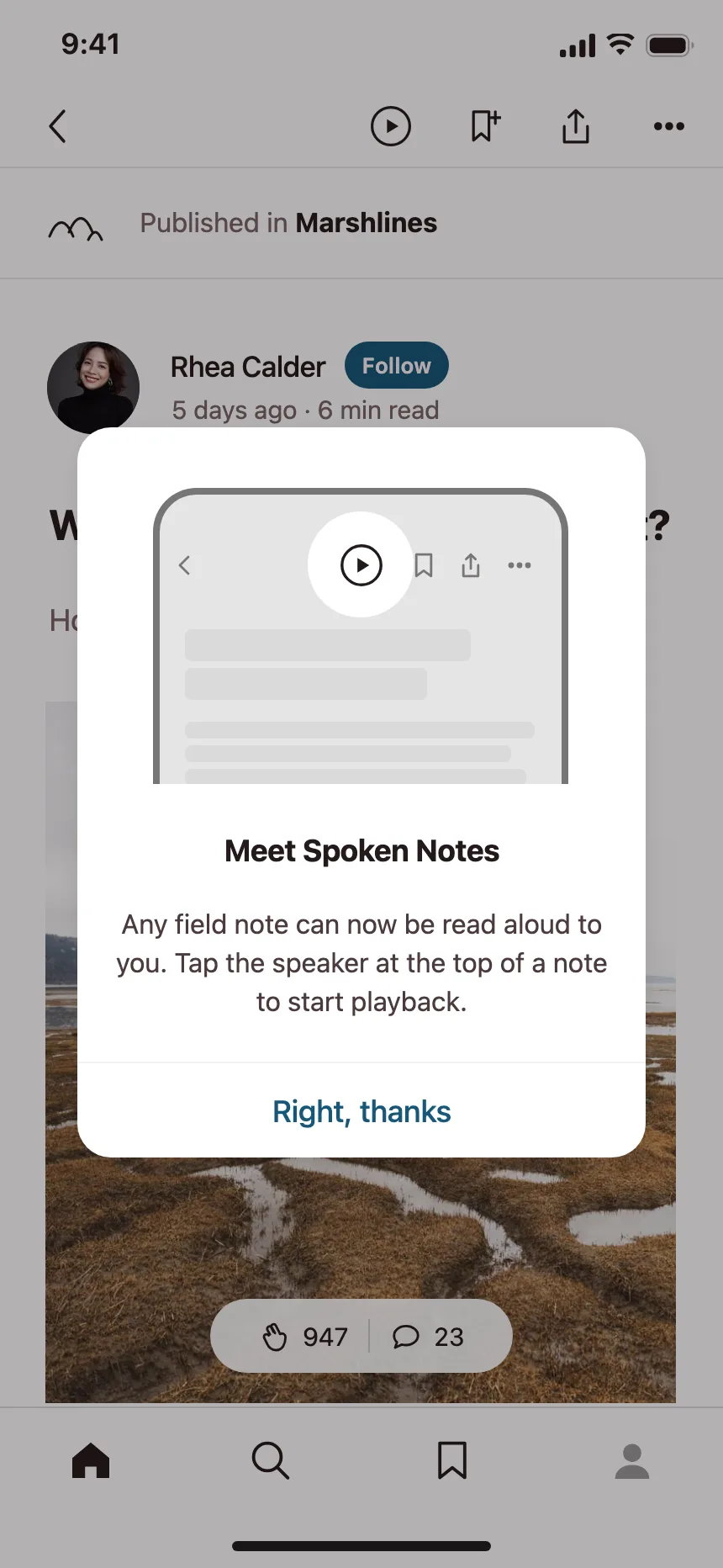
6. Onboarding and announcements
Tour steps and new-feature introductions, usually a picture, two lines of copy and one button to try it.


Where dialogs show up
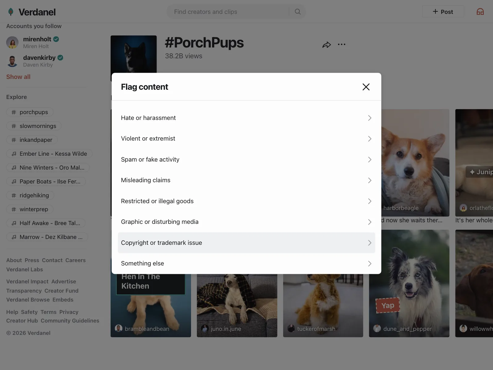
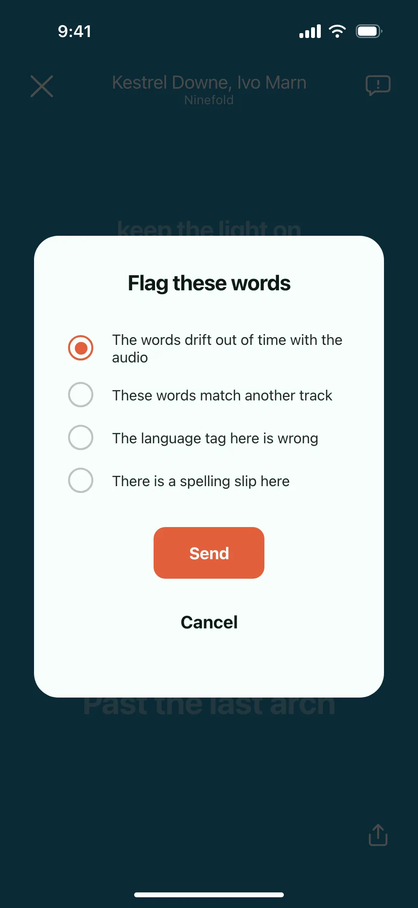
Reporting and safety
Report flows list the reasons as rows, so people flag a post or a profile without leaving it.

Sharing and invites
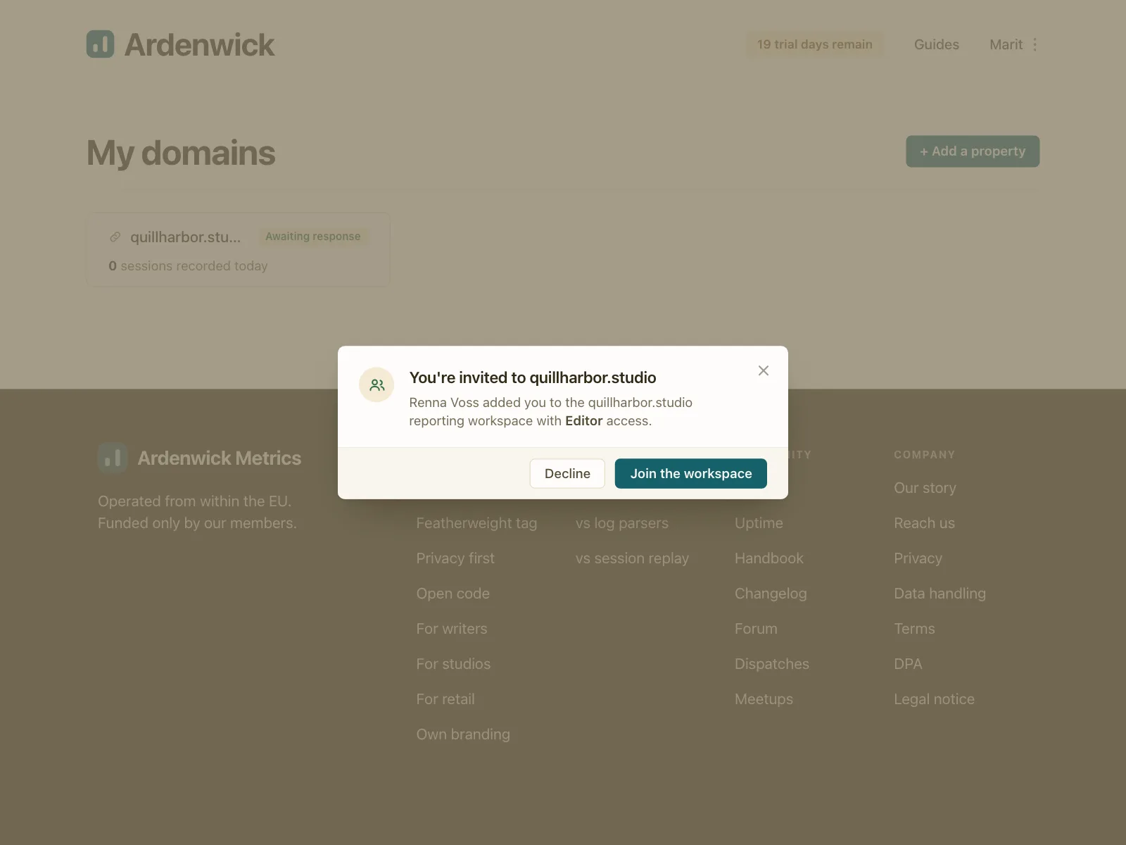
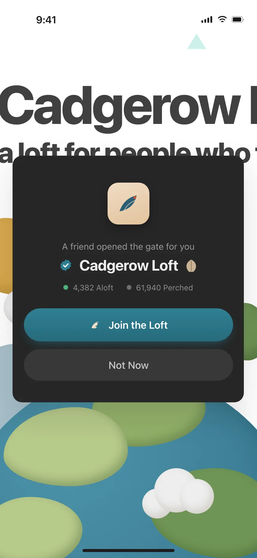
Invite fields, link settings and invitations to join a workspace.

Settings and security
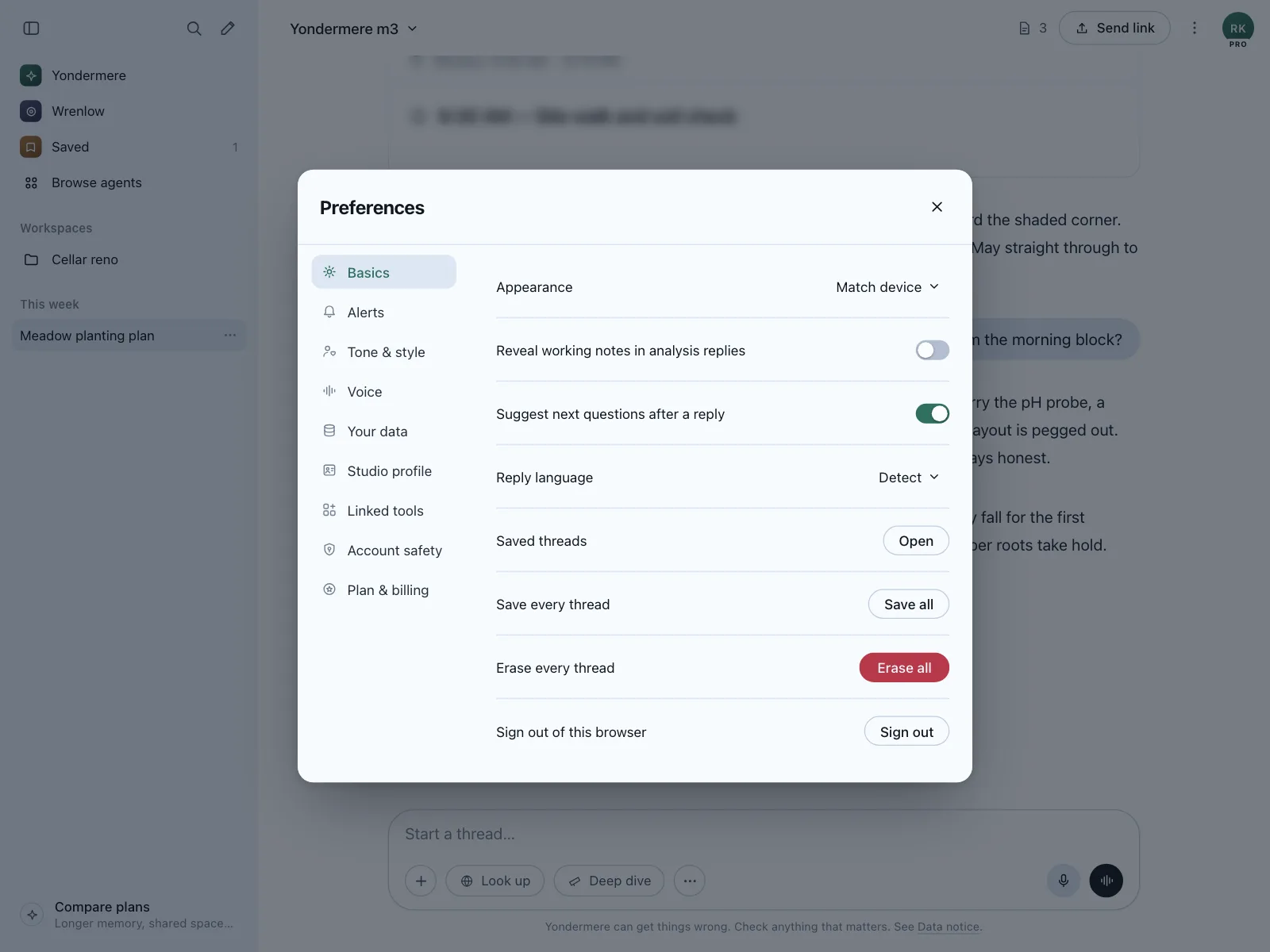
Preferences, profile edits and two-factor setup opened over the app, so people land back where they were.


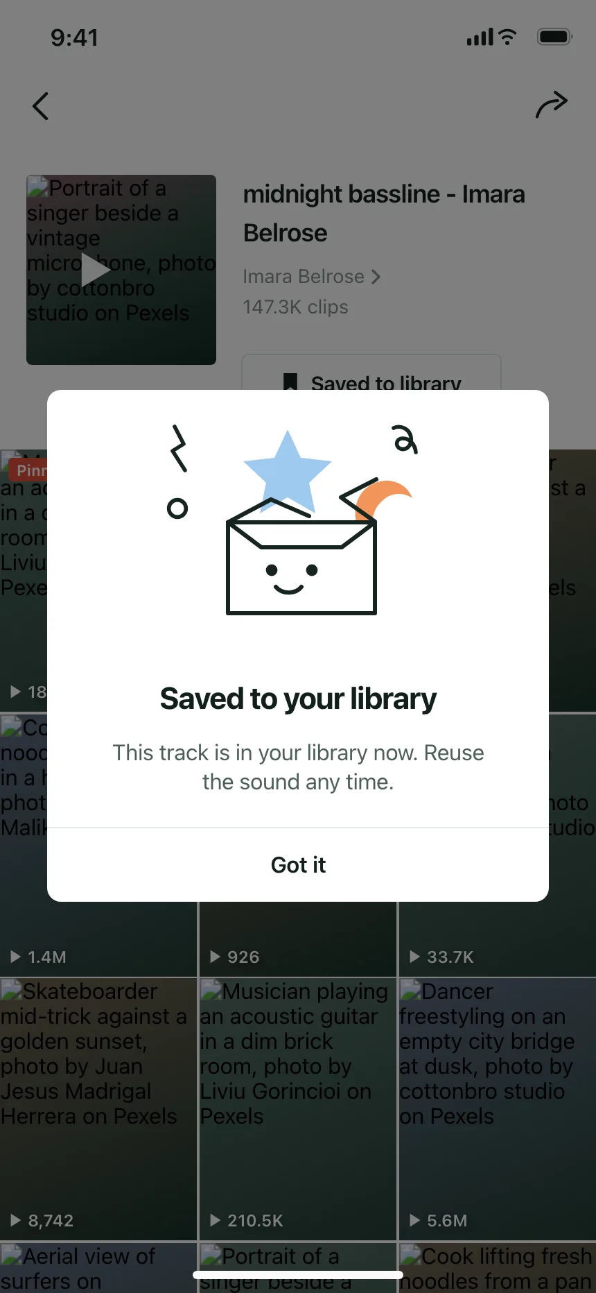
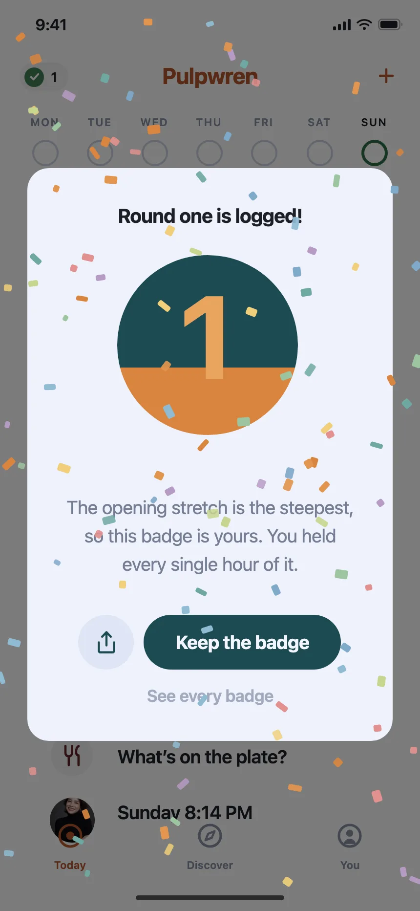
Success and rewards
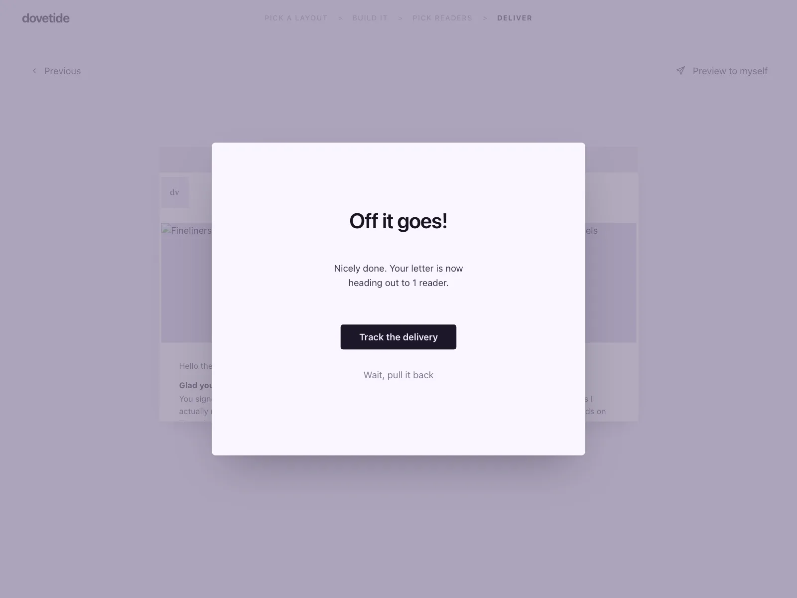
A sent, saved or earned moment that people close with one button.
Dialog vs similar components

Build notes
- Use the native <dialog> element with showModal(). The browser makes the page behind it inert and closes it on Escape.
- For a custom dialog, set role="dialog" and aria-modal="true", and point aria-labelledby at the visible title.
- Use role="alertdialog" for confirmations that need an answer, with aria-describedby on the message.
- Move focus inside on open and keep Tab and Shift+Tab within the dialog. On close, return focus to the button that opened it.
- For a destructive confirm, put first focus on the least destructive action, like Cancel.
- Name buttons for the result, like Delete or Save changes, rather than OK.
FAQ
What's the difference between a dialog and a modal?
A modal is any layer that blocks the page until it closes. Most dialogs are modal, but a dialog can also be non-modal, like a find and replace window that lets people keep working on the page behind it.
Should clicking outside a dialog close it?
For a dialog that only shows information, yes. For a form or a destructive confirm, no: a stray click shouldn't throw away typed text or count as an answer. Either way, Escape and a visible Cancel or close button should always work.
Should every delete ask for confirmation?
No. Confirm deletes that are rare and can't be undone, like closing an account. For everyday deletes people can undo, like an email or a file, delete right away and offer Undo.
How many buttons should a dialog have?
One or two, and three at most. Put Cancel on the leading side and the main action on the trailing side, and label each button with what it does.
Related terms
All glossary terms · Browse 125 web and 135 mobile dialog designs