
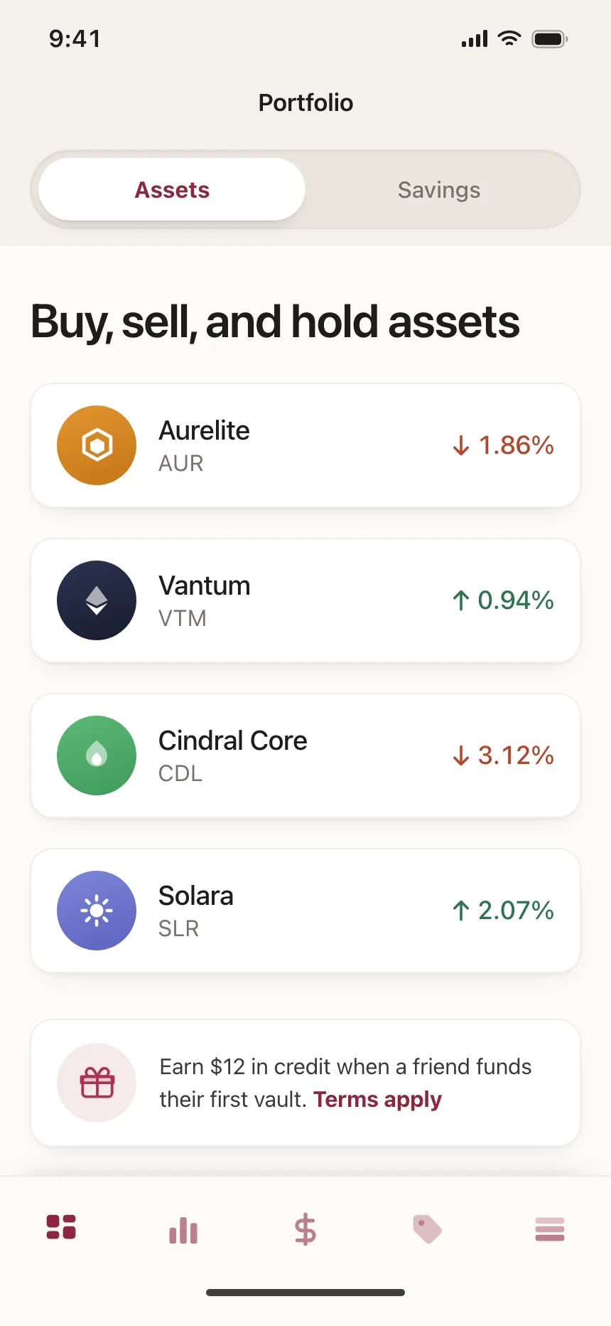

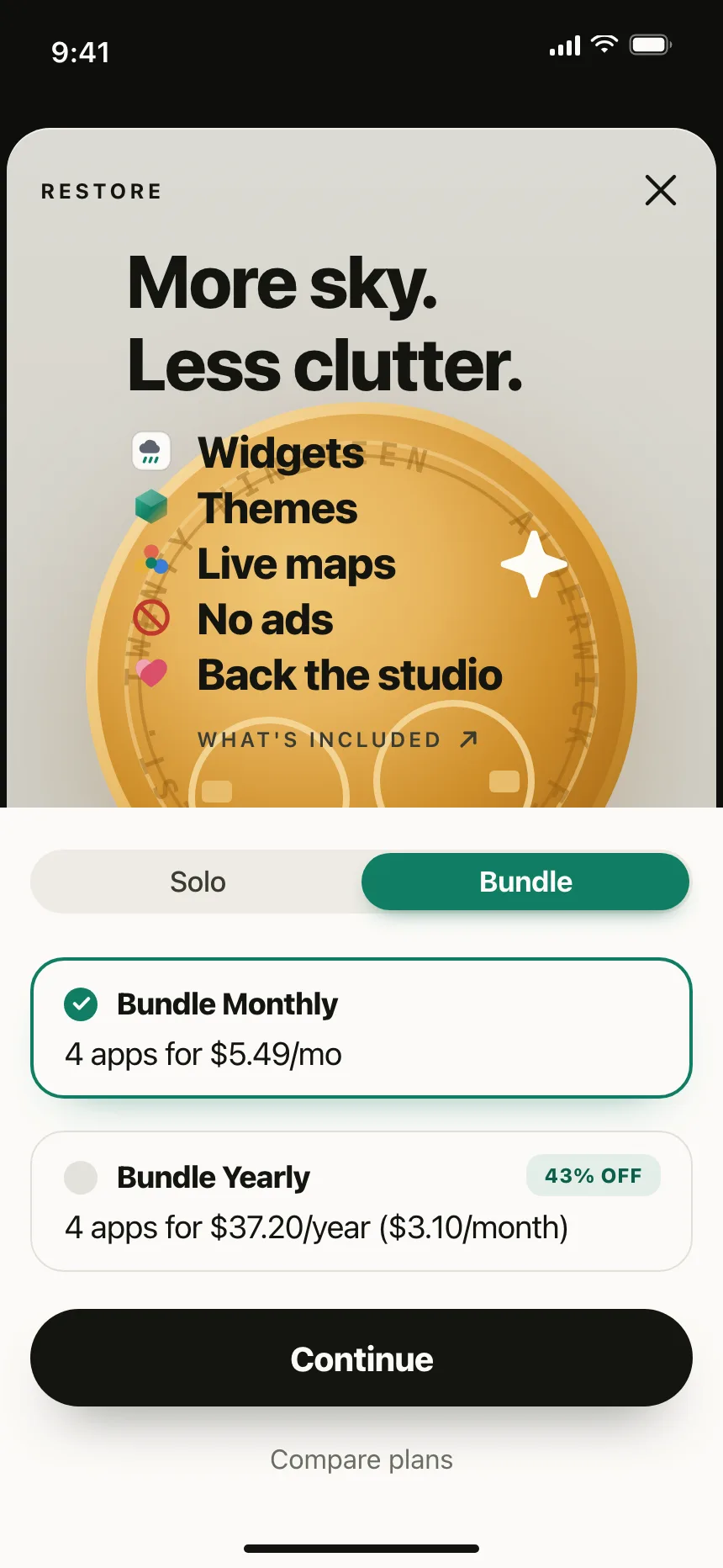
Segmented controls from the Kombai gallery: a crypto wallet's assets and savings, a career marketplace's alert frequencies and a weather app's bundle offer.
What is a segmented control?
A segmented control groups two to five related options into one bar of equal segments. Exactly one segment is selected at a time, and picking another changes the view or the value right away, without leaving the screen.
- The selected segment is filled or raised, and the rest stay flat.
- Labels are short nouns or icons, not a mix of both in one control.
Segmented controls show up across pricing, charts, dashboard and calendar screens.
When to use a segmented control
- Switching viewsList, map or calendar views of the same results.
- Picking a range or modeWeek, month or year above a chart, or day, night and auto.
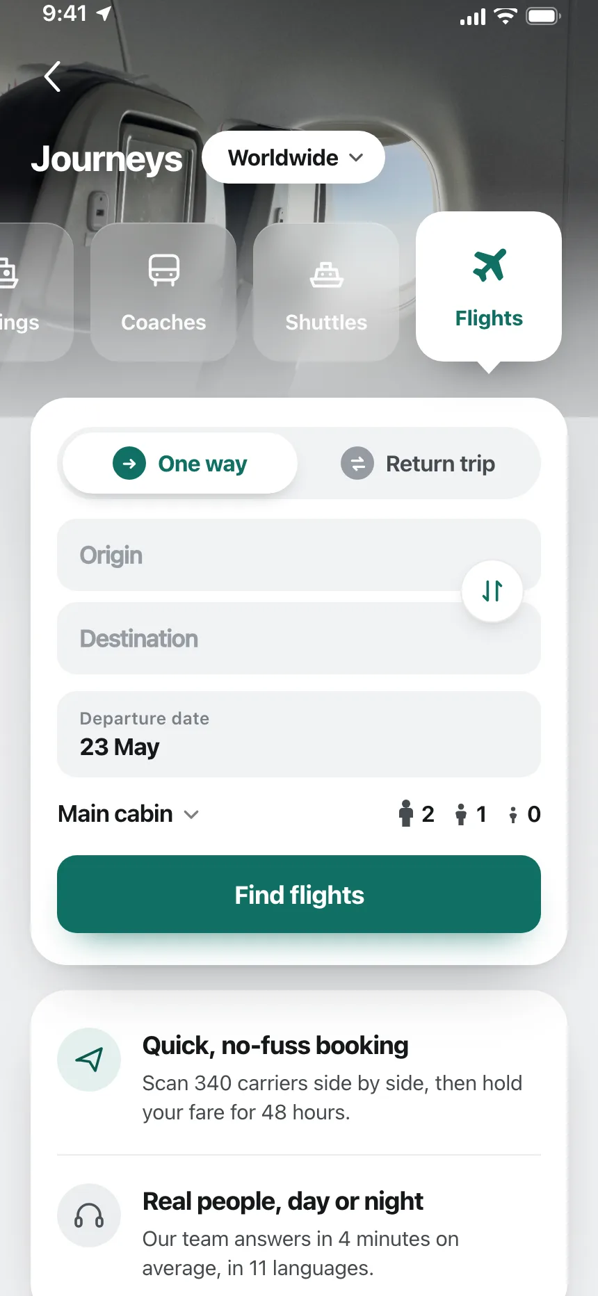
- A quick either-orOne way or return, monthly or annual, at the top of a form.
When not to use one
- Separate sectionsFor whole areas of an app, use tabs or a tab bar.
- More than five optionsOn a phone, past about five segments, use a dropdown.
- Several selectionsIf people pick more than one, use checkboxes or filter chips.
Anatomy of a segmented control
This one works. Pick a range, or tab to it and use the arrow keys.
Spending
$412this week
- Selected
- Disabled
- Keyboard focus
- TrackHolds the segments together
- SegmentOne option, equal in width
- SelectionMarks the current segment
- LabelA short noun
- StatesSelected, disabled, focus
Segmented control variants
We sorted every segmented control design in the Kombai gallery and found six patterns. Browse all 55 web and 35 mobile designs.
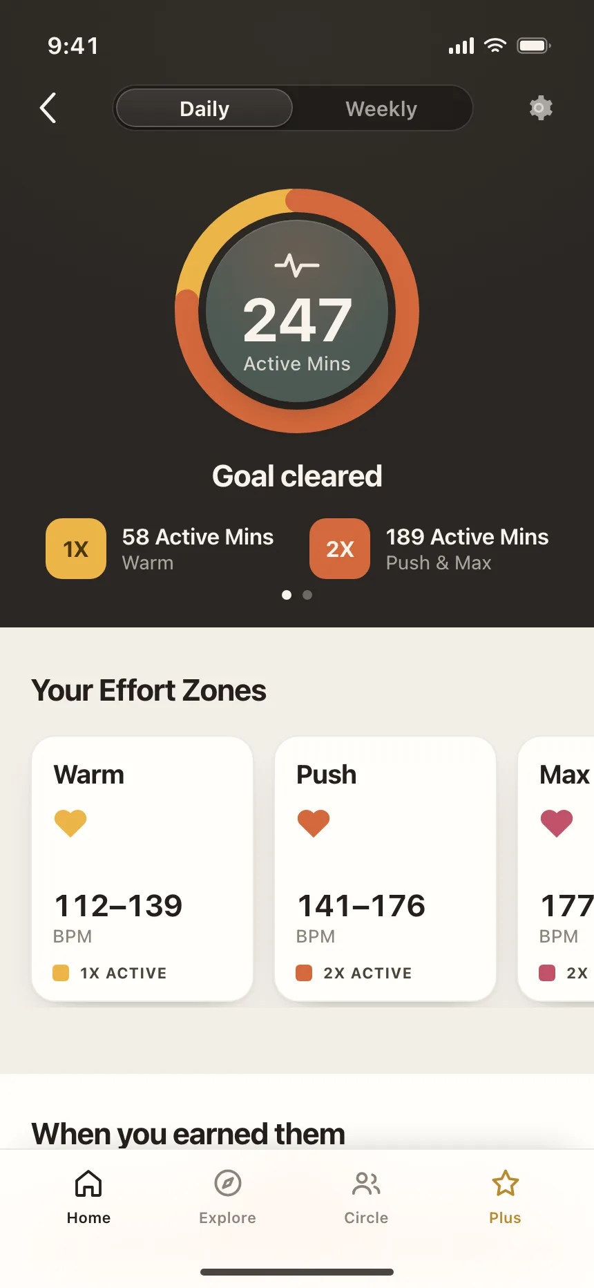
1. Two-way switches
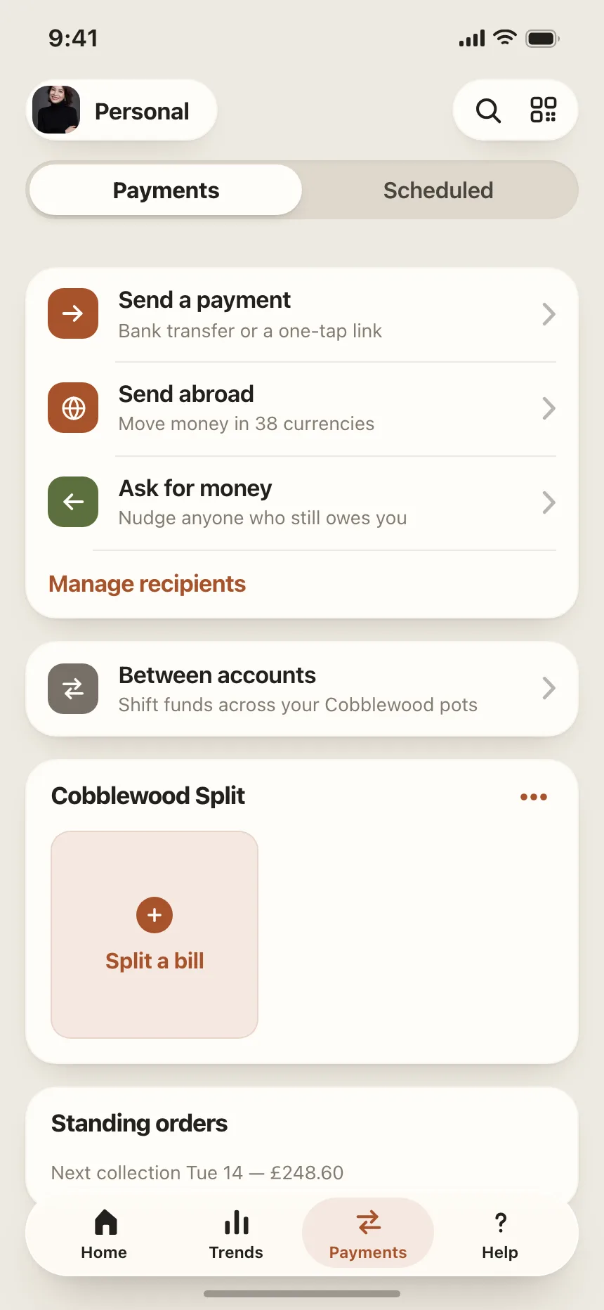
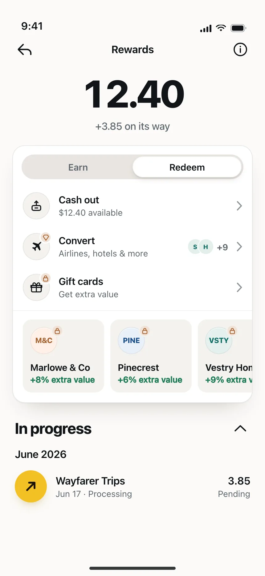
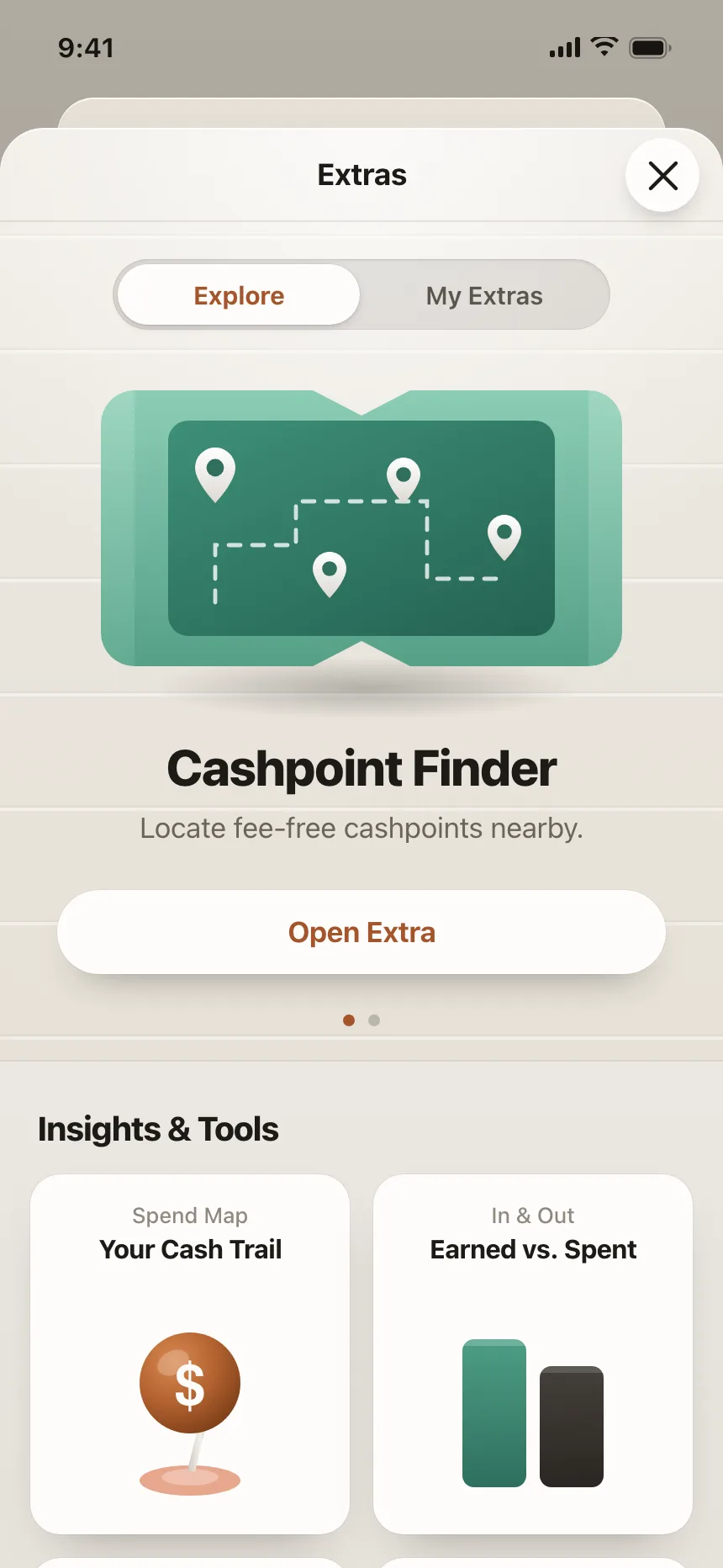
The default. Two labels in a pill track, like Payments and Scheduled, with the current view raised or filled.
2. Icon segments
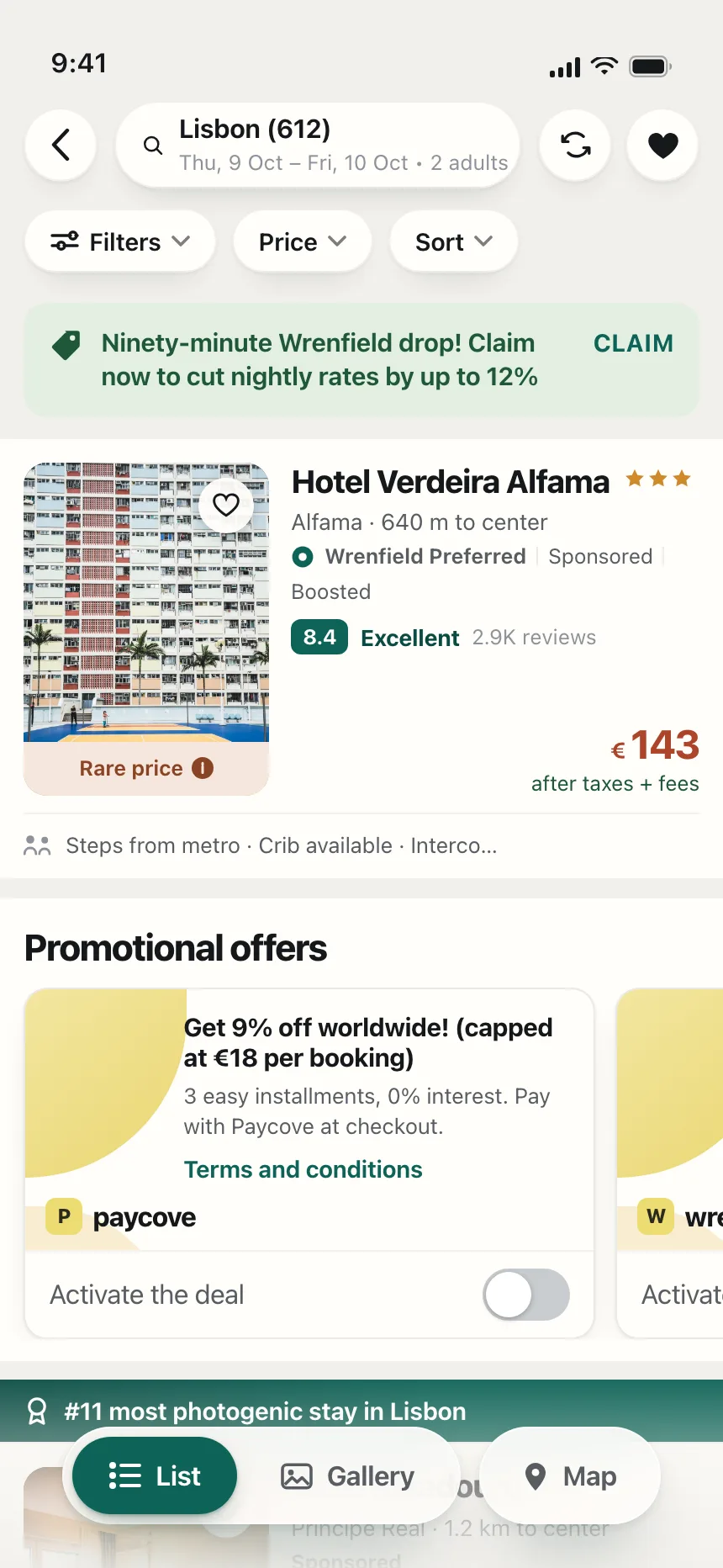
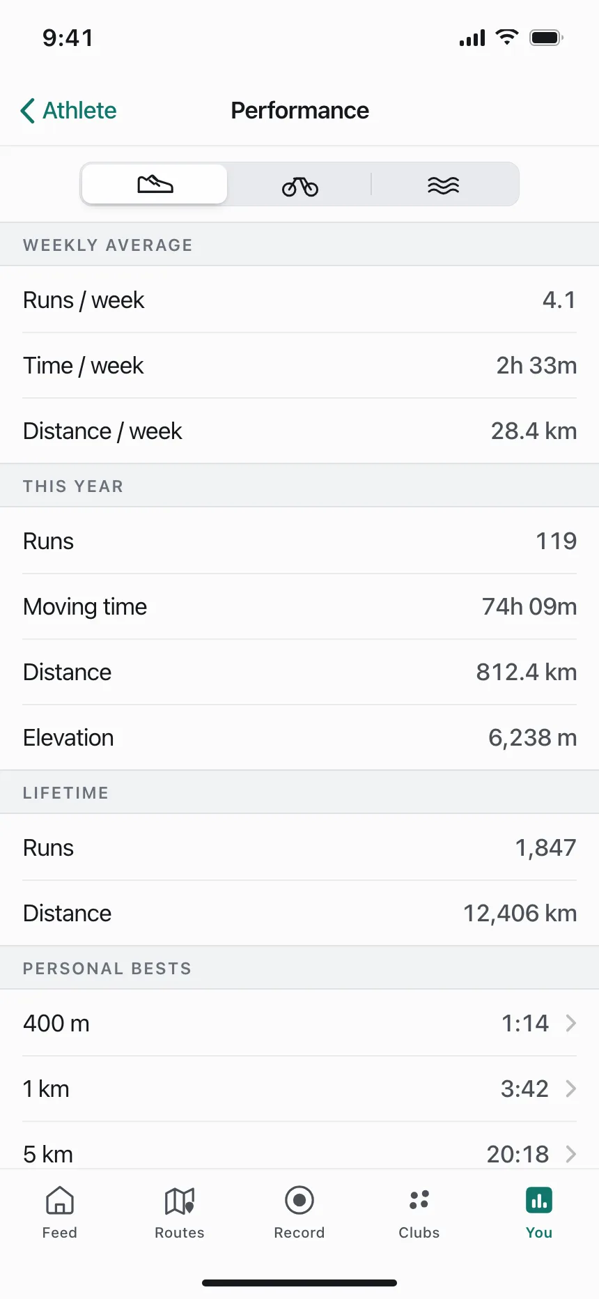
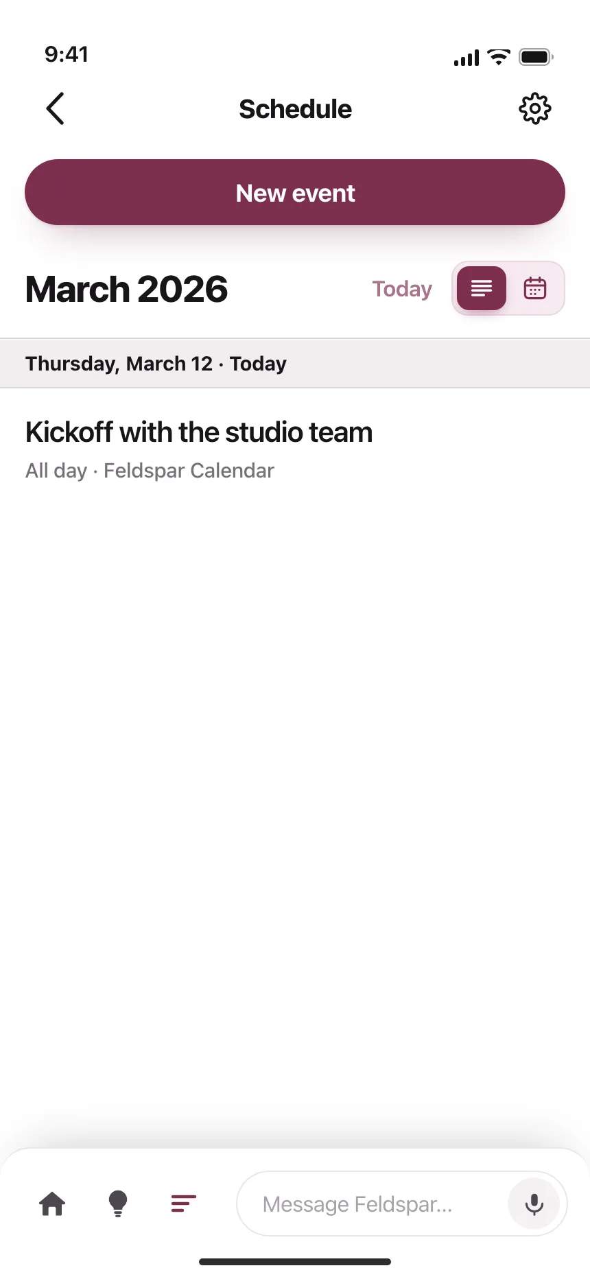
Icons, alone or with a word, stand for each view, like list, gallery and map, or one sport per segment.
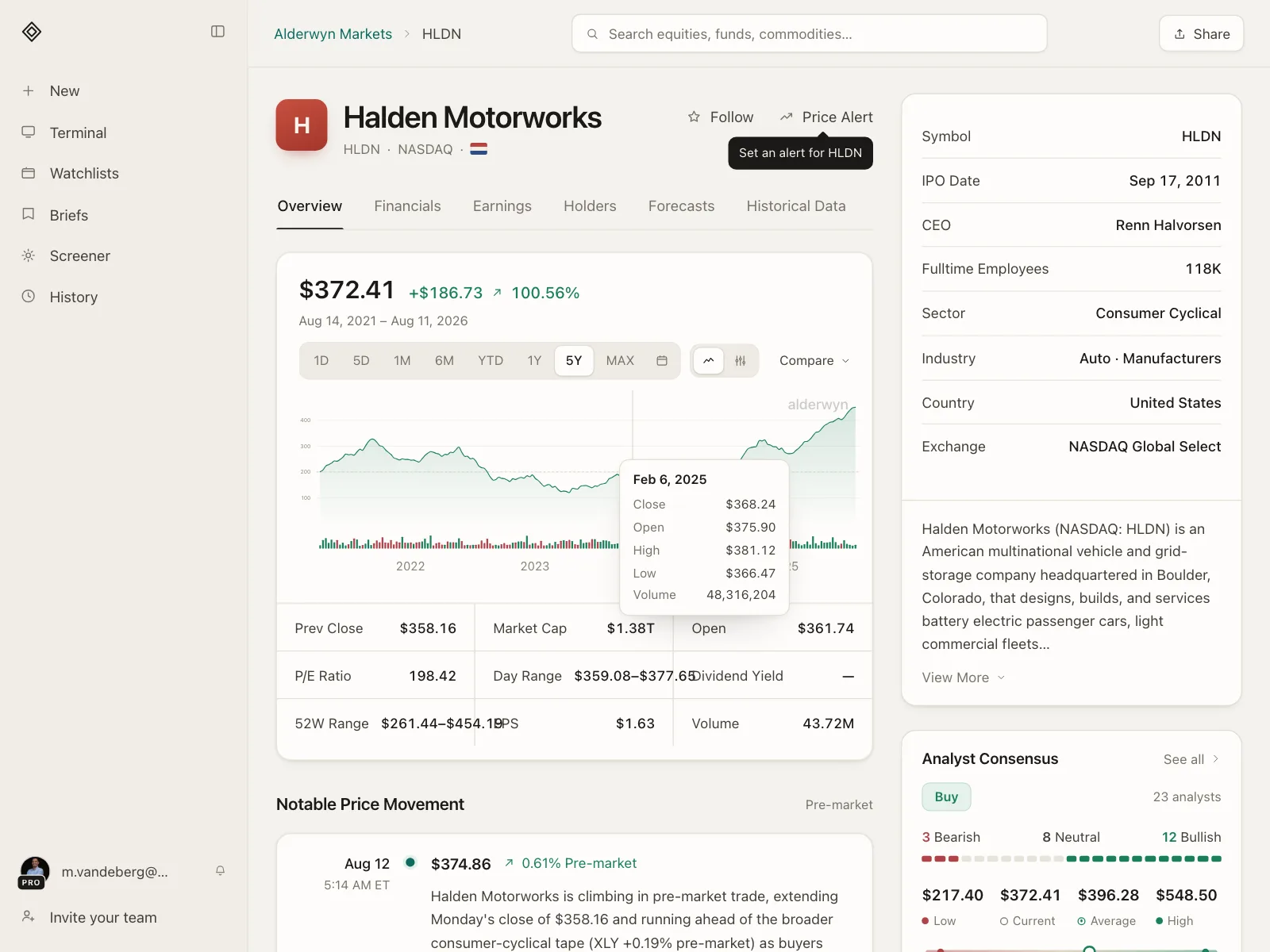
3. Time ranges
Short ranges like 1D, 1W and 1M, or daily and weekly, above a chart that redraws for each one.

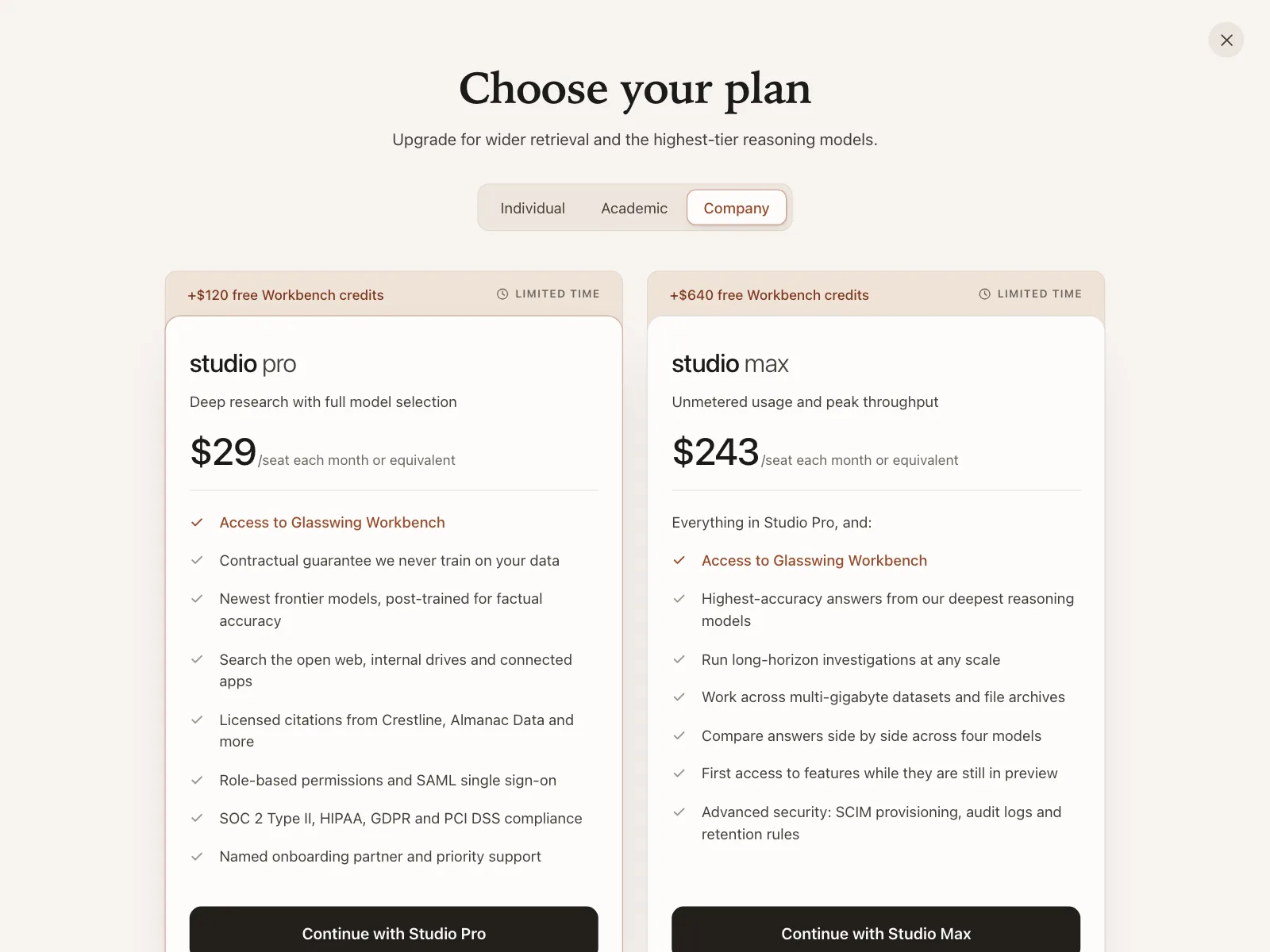
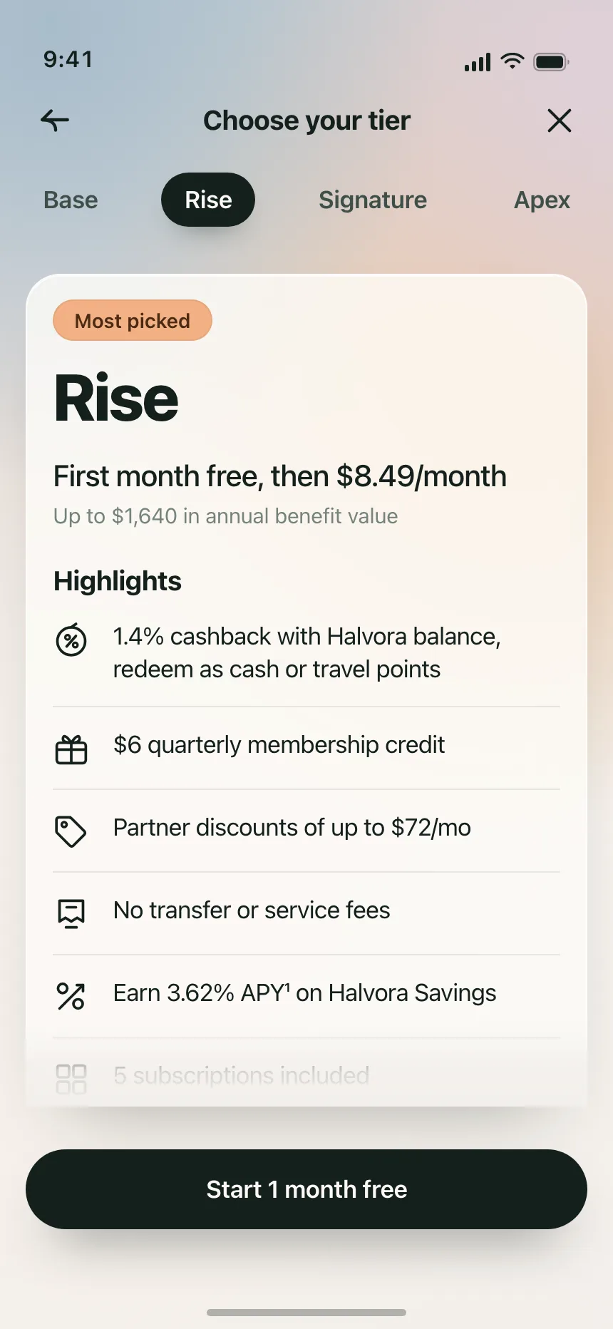
4. Plan toggles
Monthly or annual billing, or one segment per plan tier, above prices that change with the choice.

5. Settings segments
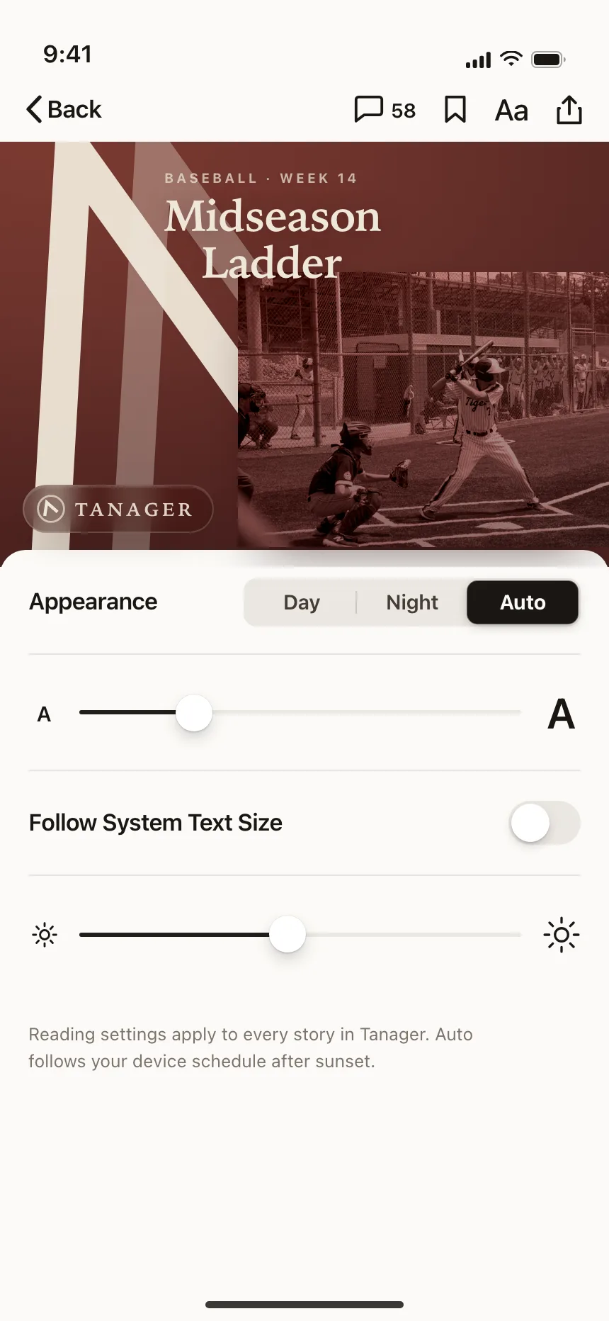
Three or four modes in a settings row, like Day, Night and Auto, or Daily, Weekly and Off.

6. Inspector groups
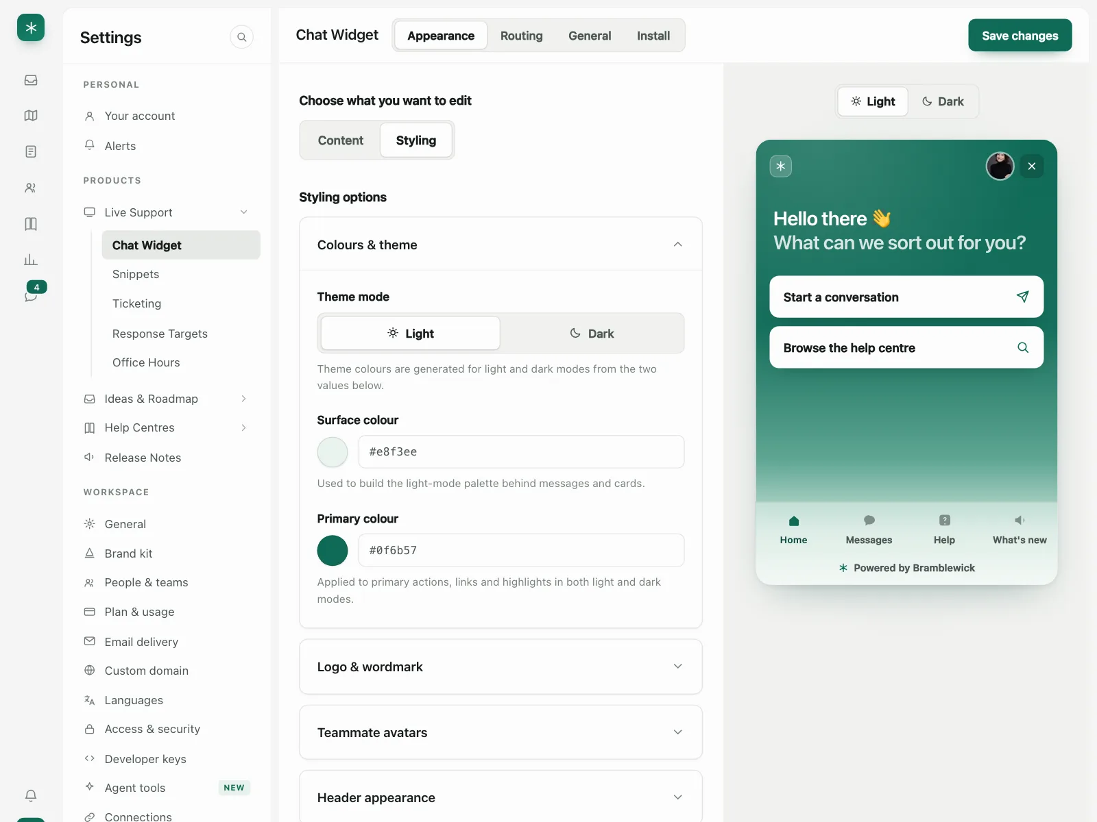
Joined buttons in an editor panel for sizes, alignment or compression, one group per property.


Where segmented controls show up
Booking and forms
An either-or at the top of a form that changes the fields below, like one way or return.

Sending and sharing
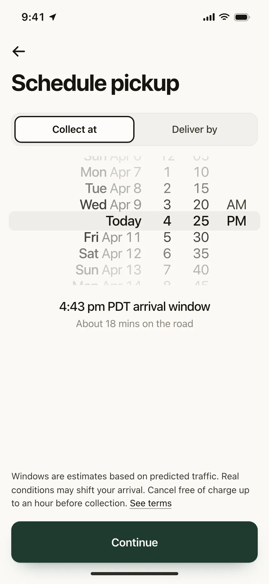
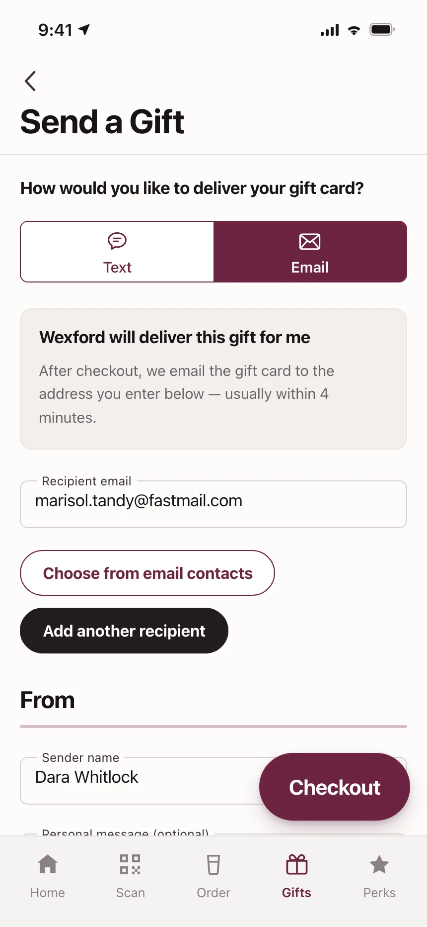
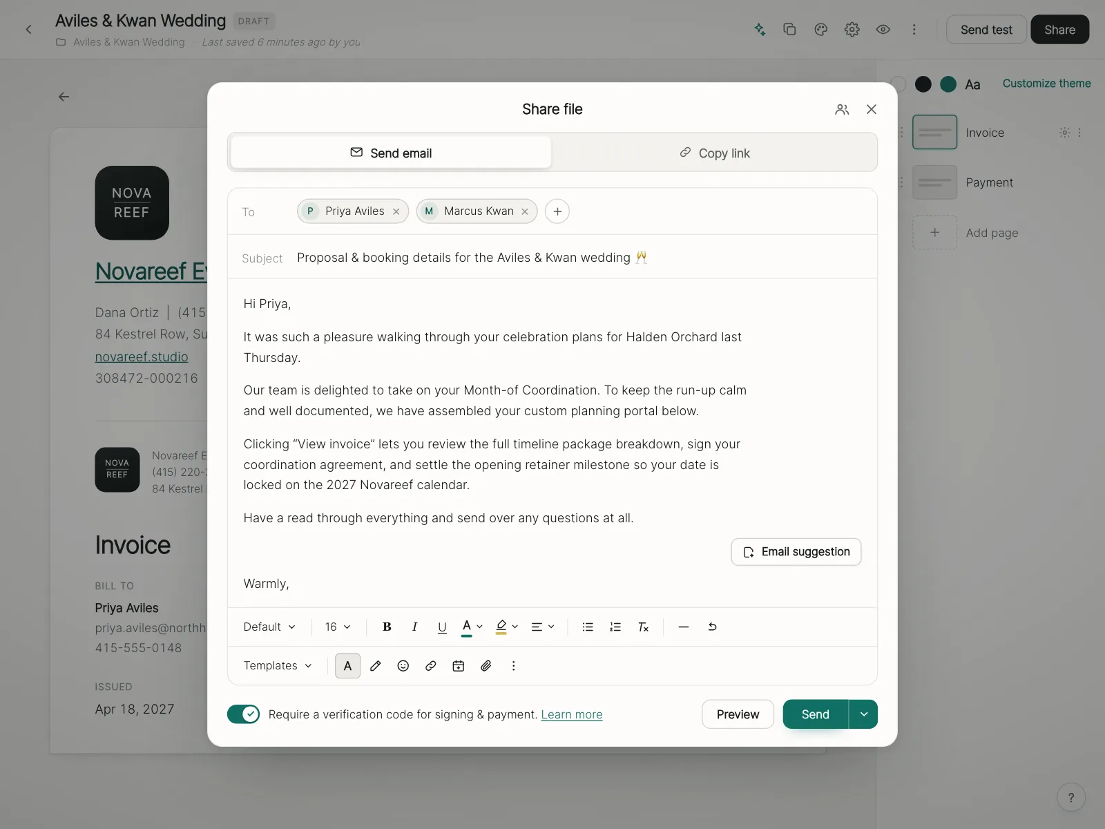
How something goes out: by text or email, or as a link or a message.

Payments and money
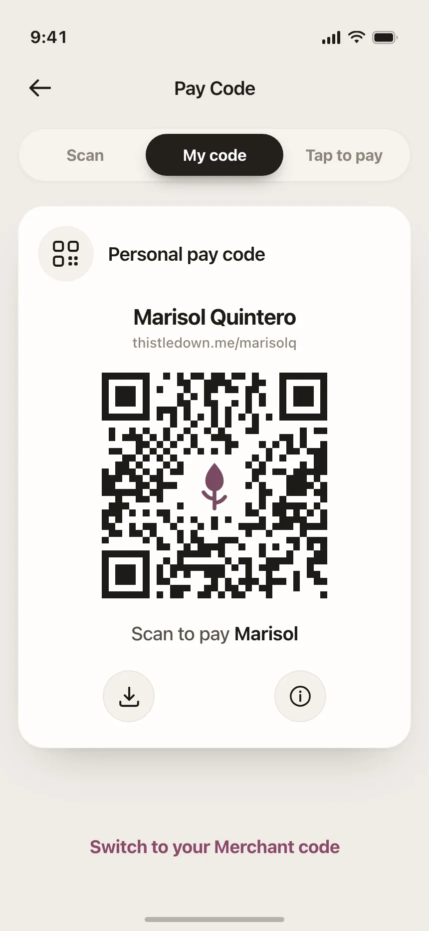
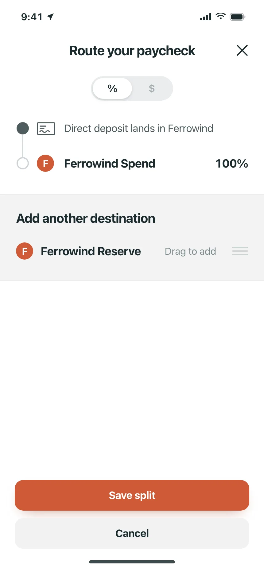
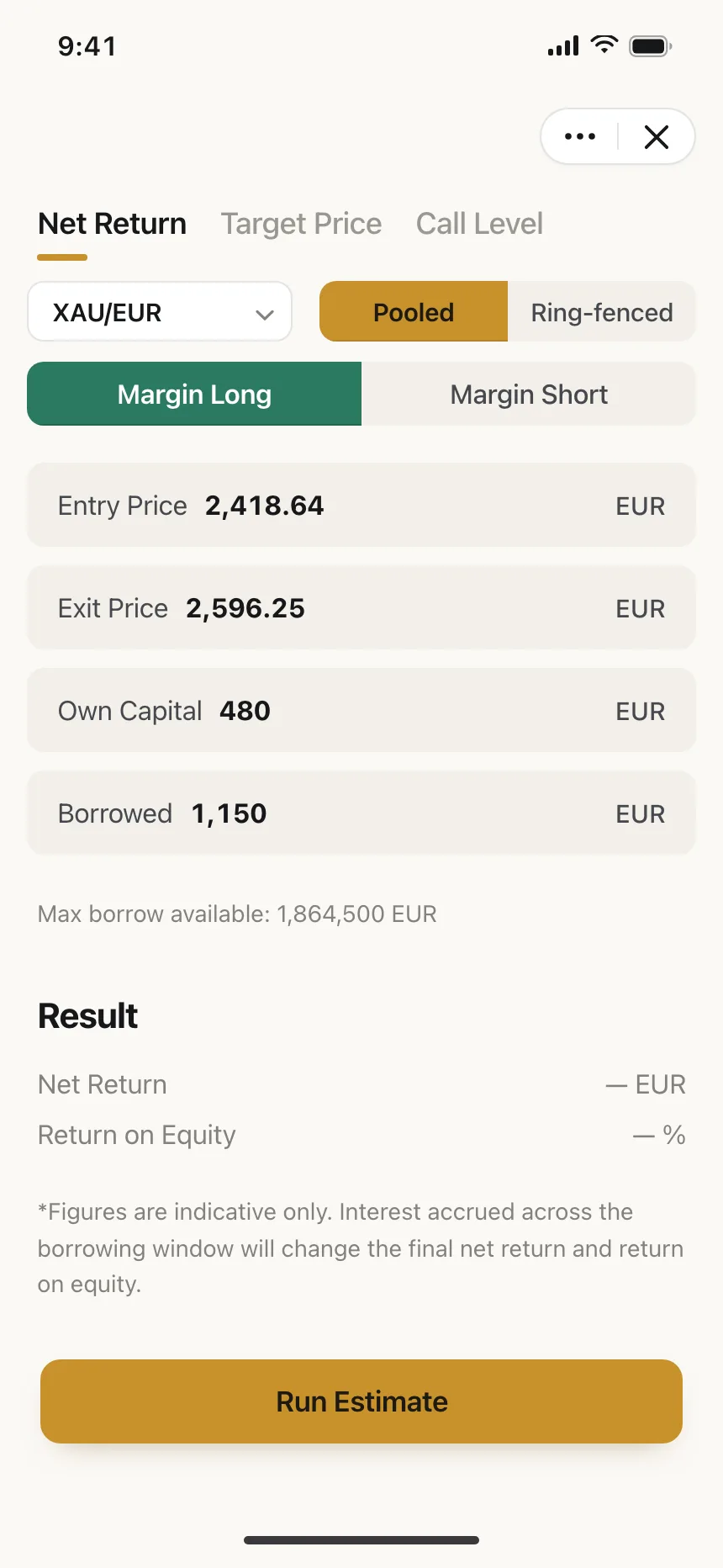
Scan or show a pay code, split a deposit by percent or amount, or go long or short.
Segmented control vs similar components


Build notes
- When it picks a value, build it as a radio group: role="radiogroup" around role="radio" segments.
- When each segment swaps a panel of content, use the tabs pattern with role="tablist" and role="tab".
- The control is one tab stop. Arrow keys move the selection and wrap at the ends.
- Keep segments equal in width, and use text or icons in one control, not both.
- Give icon-only segments a name, like aria-label="Map view".
- Mark the selection with fill or contrast, not with color alone.
FAQ
What is the difference between a segmented control and tabs?
Both show one selected option. A segmented control changes a value or a view within the same content, like Week or Month on one chart. Tabs switch between separate panels of content, and Apple's guidelines point to a tab bar for moving between whole sections of an app.
How many segments can a segmented control have?
Apple's guidelines suggest no more than about five on iPhone, and about five to seven in a wide layout. Past that, labels get cramped and hard to scan, and a dropdown or tabs work better.
Segmented control or radio buttons?
Both pick one option. A segmented control is compact and usually applies right away, so it suits views and modes. Radio buttons stack with room for descriptions, so they suit form questions people read and compare.
Can a segmented control use icons?
Yes, for well-known views like list and grid. Apple's guidelines advise using either text or icons in one control, not a mix, and icon-only segments need an accessible name for screen readers.
Related terms
All glossary terms · Browse 55 web and 35 mobile segmented control designs