
Tabs
Tabs are a row of labels that switch between views of related content, showing one panel at a time on the same page.
- Also called
- tab bar, bottom navigation
- Platforms
- Web, Mobile
- In the gallery
- 50 web and 150 mobile designs

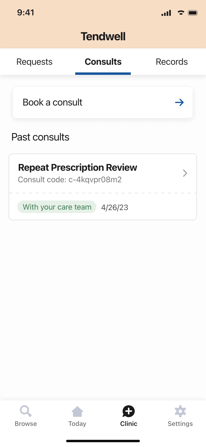
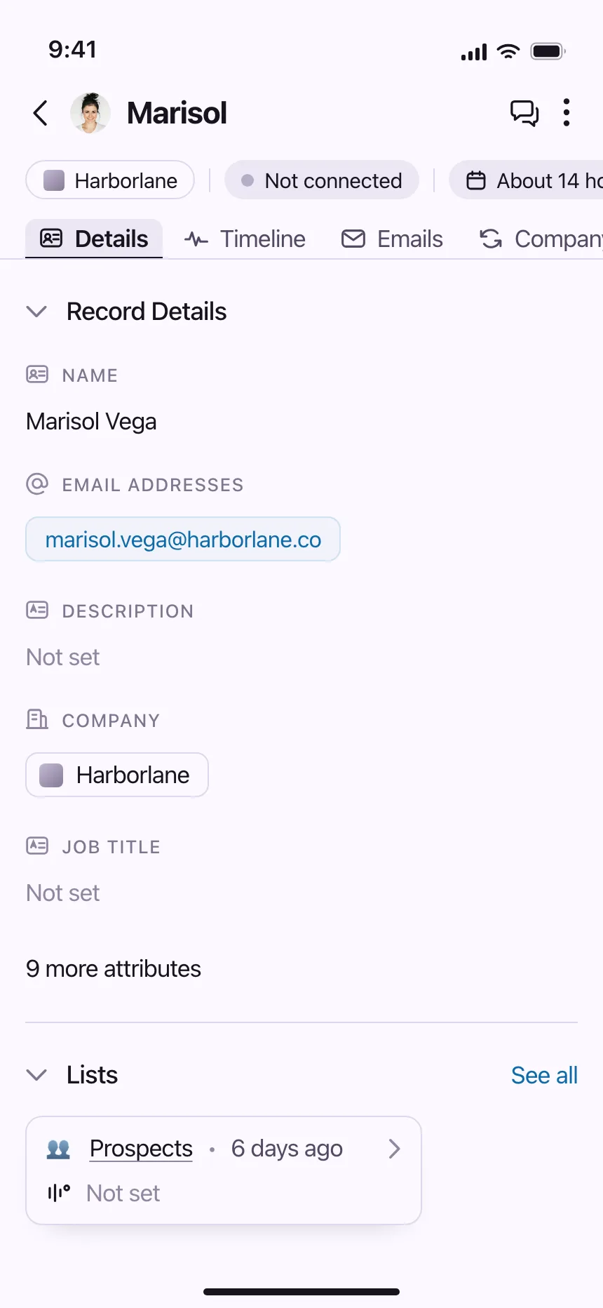
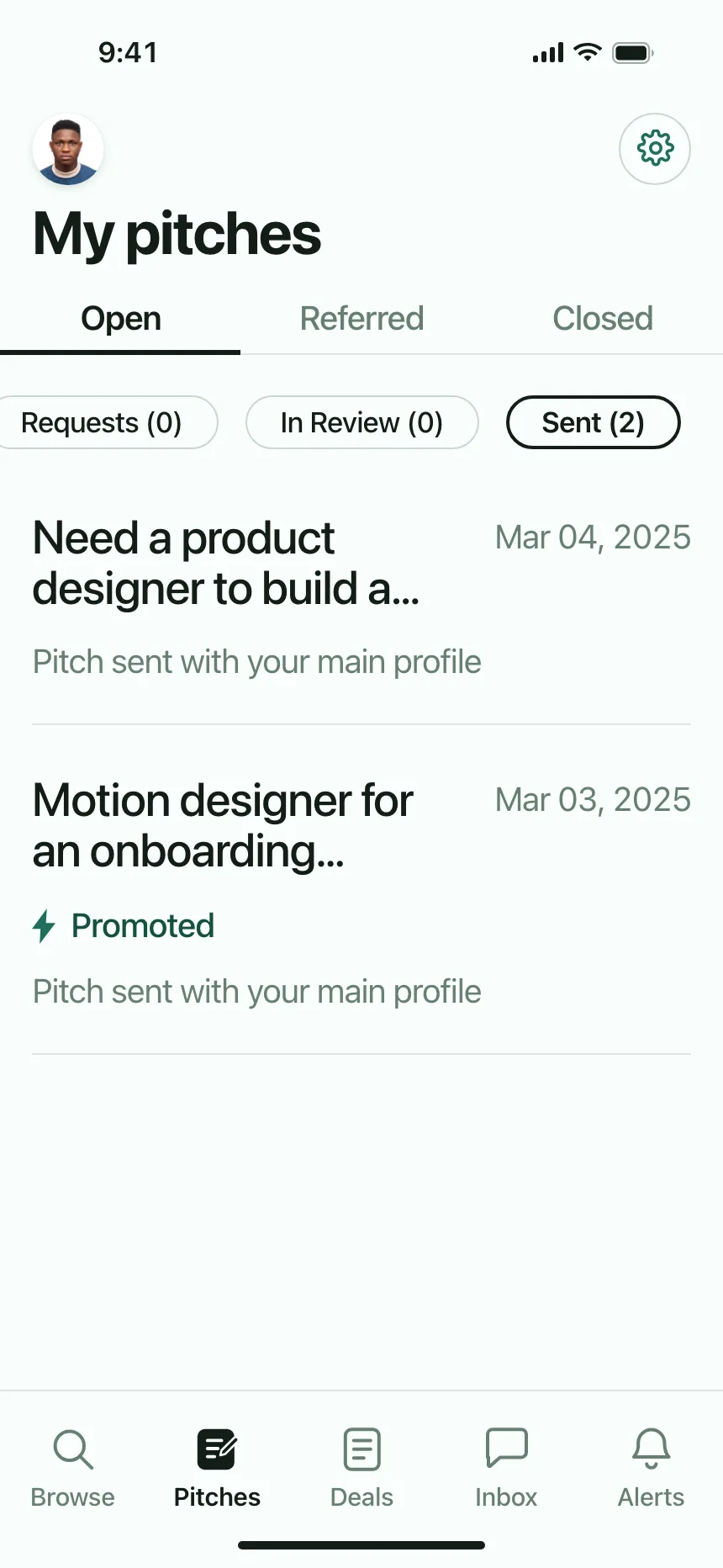
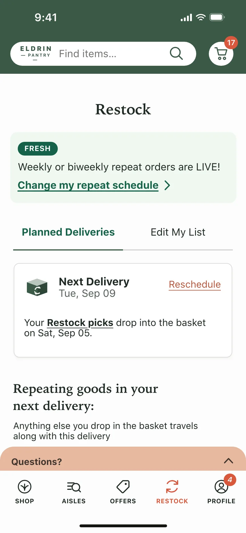
Tabs from the Kombai gallery: a crawling API's settings, a telehealth app's consults and a CRM's contact record.
What are tabs?
Tabs are a set of labels, each tied to a panel of content. Selecting a label shows its panel in the same spot and hides the others, so related views share one space without a page load. On phones, a tab bar along the bottom does the same job for the main sections of an app.
- The selected tab is marked with an underline, a fill or bolder text.
- Only one panel shows at a time, right below or beside its tabs.
Tabs show up across settings, profile, search and followers screens.
When to use a tabs
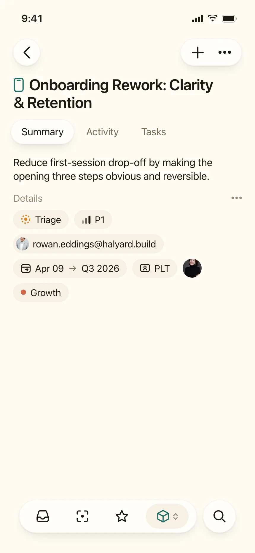
- Peer views of one thingOverview, Activity and Settings for the same project or person.
- Content people switch betweenFollowers and following, or upcoming and past bookings.
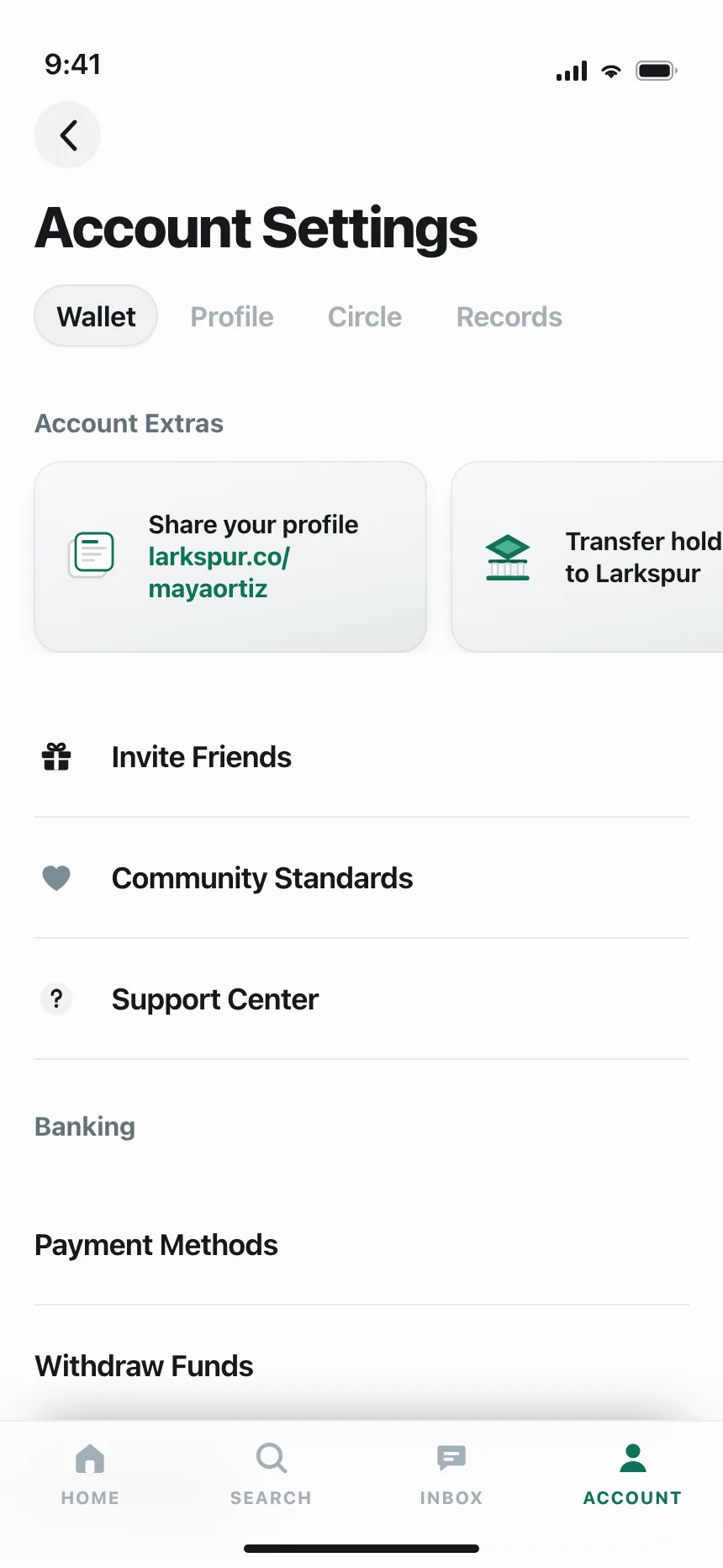
- Main sections on phonesA bottom tab bar for Home, Search, Inbox and Profile.
When not to use one
- Steps in orderFor a sequence people must finish, use a stepper or a wizard.
- Comparing panelsOnly one tab shows at a time. Put things people compare side by side.
- ActionsA tab shows content. To run an action, use a button or a toolbar.
Anatomy of a tabs
This one works. Pick a tab, or tab to the row and use the arrow keys, Home and End.
Country sourdough
One loaf, about 24 hours
- 500 g bread flour
- 350 g water
- 100 g starter
- 10 g salt
- Mix and rest for an hour.
- Fold four times, then shape.
- Proof overnight and bake hot.
Rated 4.8 by 12 bakers. Most say the crumb opens up on the second try.
- Selected
- Unselected
- Keyboard focus
- With a count
- Tab listThe row that holds the tabs
- TabOne short label per panel
- IndicatorMarks the selected tab
- PanelContent for the selected tab
- StatesSelected, unselected, focus, count
Tabs variants
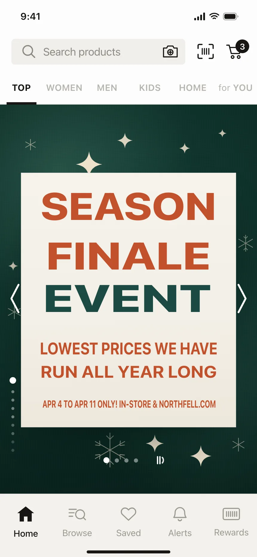
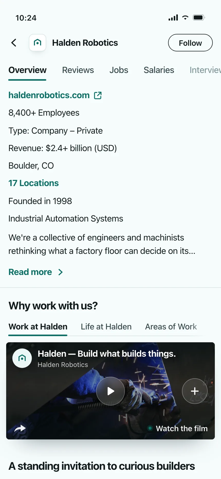
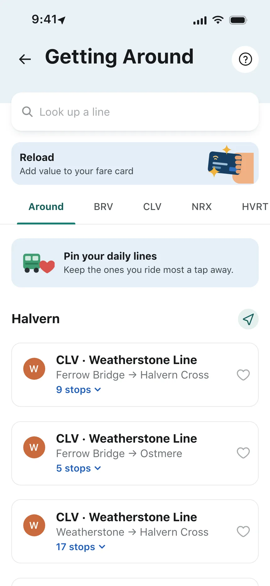
We sorted every tabs design in the Kombai gallery and found six patterns. Browse all 50 web and 150 mobile designs.
1. Underlined tabs
The default. Plain text labels with a line under the selected one, often across a settings page or a sheet.


2. Tabs with icons or counts
An icon or a number beside each label, like Drafts 0 or 94 Followers, so people see what each tab holds.


3. Pill tabs
The selected tab sits in a filled or outlined pill, which reads well on busy or colored backgrounds.

4. Scrolling tab rails
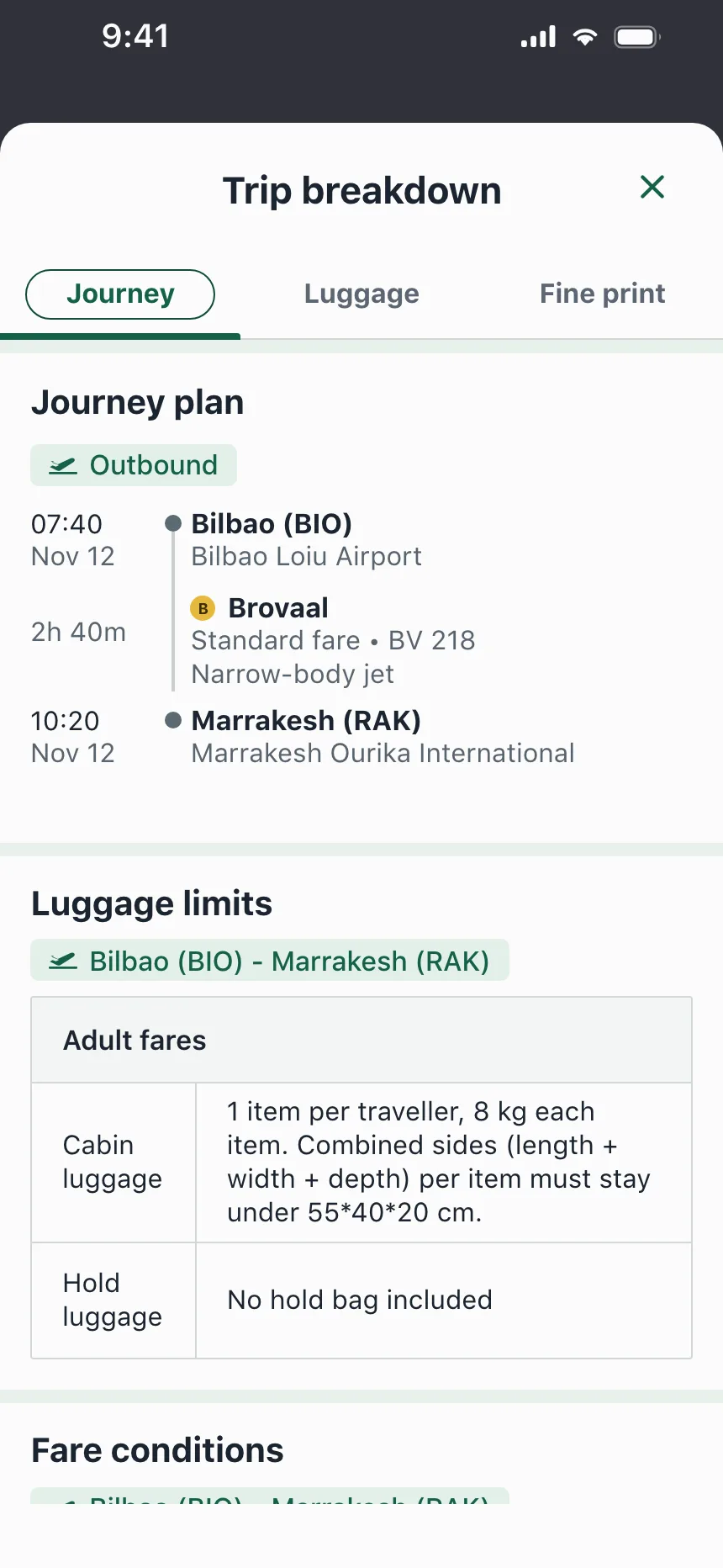
More tabs than fit the width, in a row that scrolls sideways. The cut-off last label hints that there is more.
5. Segmented tabs
Tabs drawn as one rounded track with the selected segment raised, common at the top of iOS sheets.


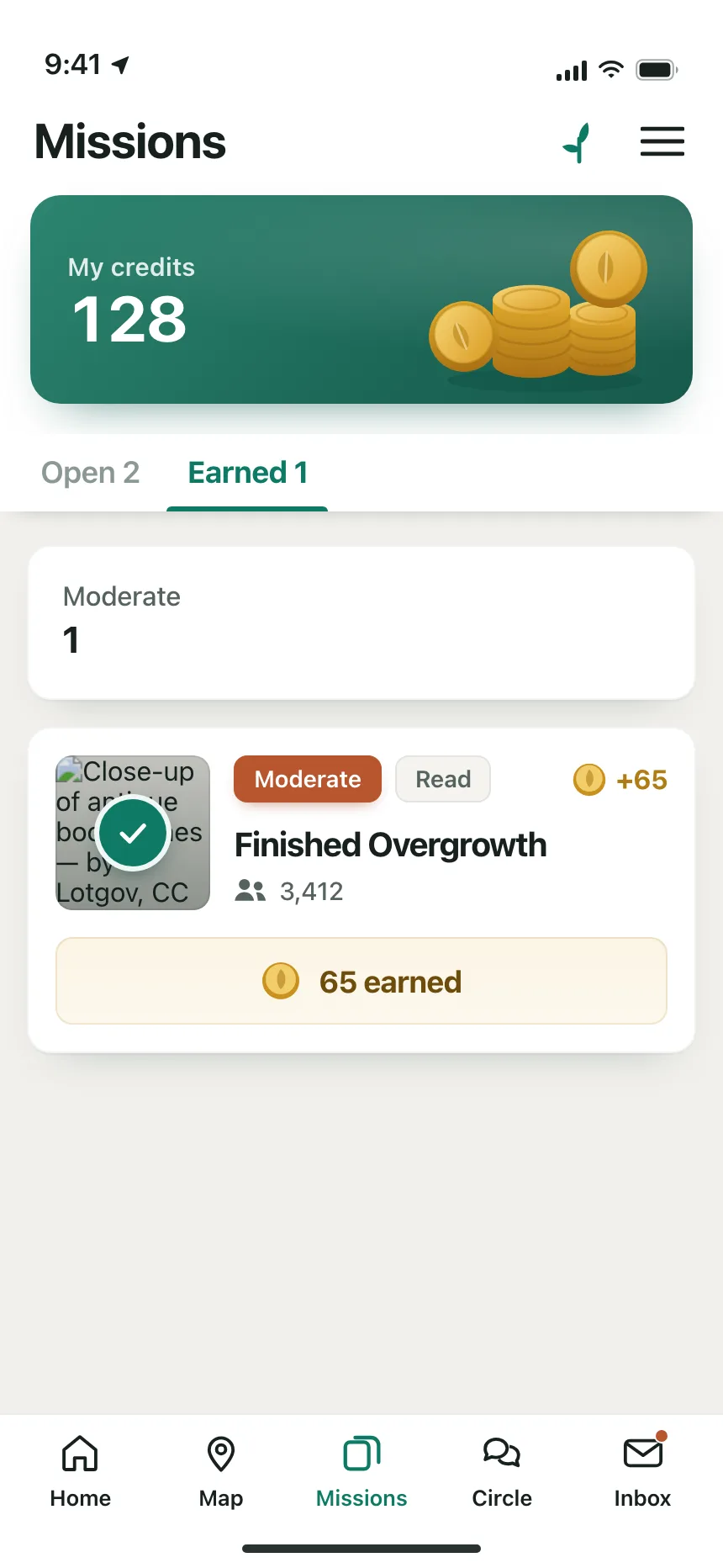
6. Bottom tab bars
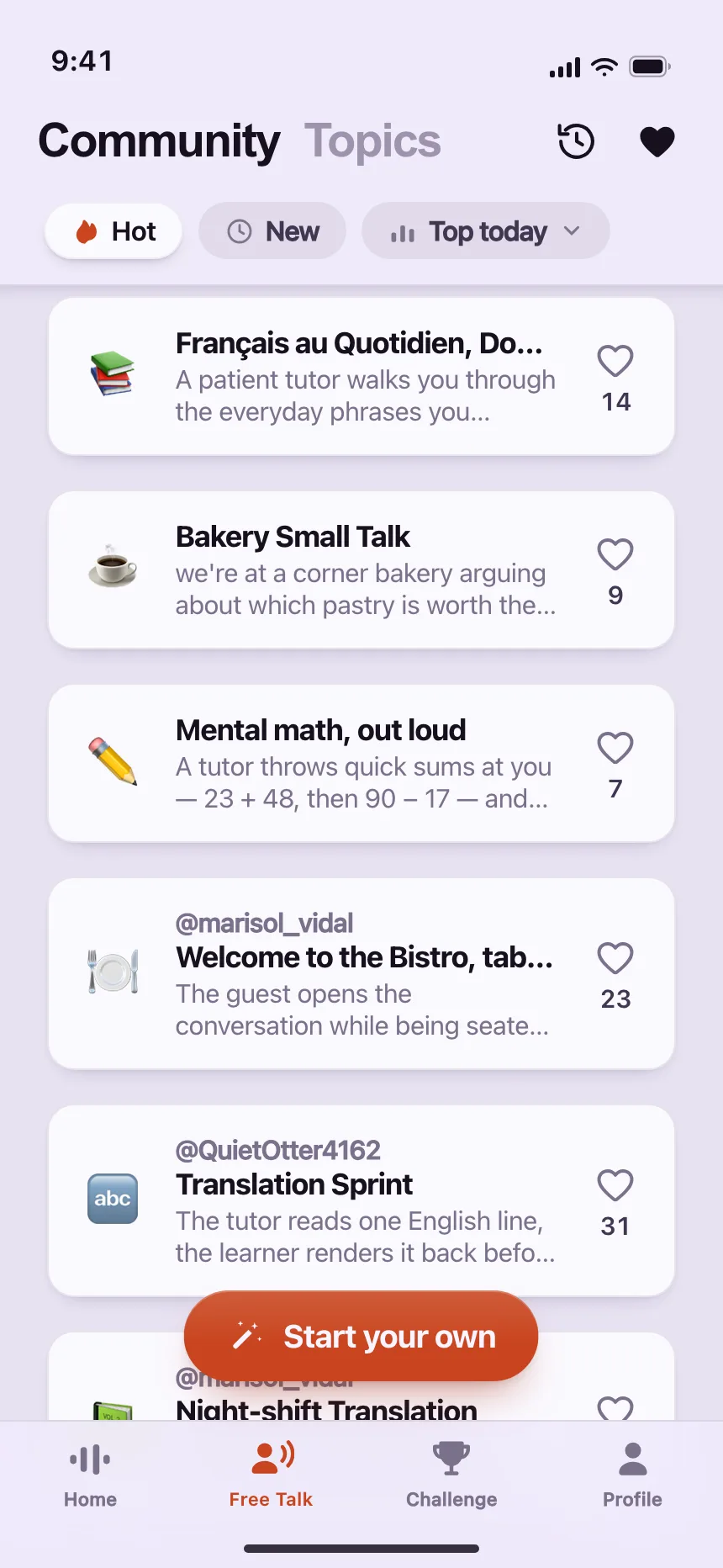
Four or five icons with short labels along the bottom of a phone screen, one per main section, sometimes with a badge.
Where tabs show up
Settings
Profile, Billing, Security and API keys as tabs across the top of one settings page.


Profiles and records
Posts, followers and activity for one person, or summary and tasks for one project.


Search results
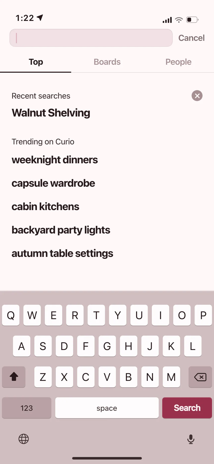
Tabs under the search box split results by type, like posts, people and boards.


Dialogs
Upload, Link and Camera, or Pending and Members, without opening a second dialog.


Tabs vs similar components

Build notes
- Use role="tablist" on the row, role="tab" on each tab and role="tabpanel" on each panel.
- Set aria-selected on the selected tab, and point its aria-controls at its panel.
- Left and Right arrows move between tabs, Home and End jump to the first and last.
- Keep only the selected tab in the Tab order, so Tab moves on into the panel.
- Show the panel on focus when it is ready instantly. Wait for Enter or Space when it has to load.
- Keep a bottom tab bar visible, and use it for sections, never for actions.
FAQ
What's the difference between tabs and a segmented control?
Tabs switch between panels of different content, like Overview and Settings. A segmented control picks a view or a value for the same content, like Day, Week and Month on a calendar. Many iOS sheets in the gallery draw their tabs as a segmented control, but the job is still tabs.
Should tabs be buttons or links?
Use buttons with the tab role when they swap panels on the same page. When each tab has its own URL, like the sections of a settings area, use links in a nav element and mark the current one with aria-current. Links also give every view its own address and a working back button.
How many tabs is too many?
When they no longer fit on one line. On the web, let the row scroll sideways or move the rest into a More menu. For phone tab bars, Apple's guidelines advise against overflow tabs, because content behind a More tab is harder to reach and notice.
Do tabs hurt SEO?
Not when every panel is in the HTML and only hidden with CSS or the hidden attribute. Search engines can read the content of tabs that are not selected. Problems start only when a panel loads its content after a click.
Related terms
All glossary terms · Browse 50 web and 150 mobile tabs designs