


Side navigation from the Kombai gallery: a voice AI console's grouped sidebar, a notes app's drawer and a ceramics seller's shop dashboard.
What is a side navigation?
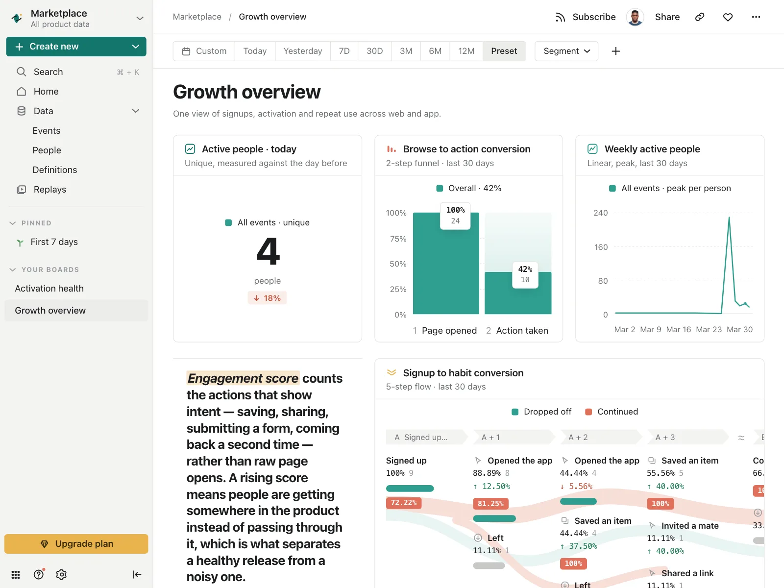
Side navigation is a column of links down one edge of an app, usually the left. It lists every main section at once, keeps the current one highlighted and stays in place while the content beside it changes. On phones the same links move into a drawer that slides in over the screen.
- Items pair an icon with a short label, grouped under section names.
- It can collapse to a narrow rail of icons to give the content more room.
Sidebars show up across dashboard, settings, CRM and project tracker screens.
When to use a side navigation
- Many sectionsApps with more destinations than fit across a top bar.
- Long working sessionsTools people stay in all day and switch sections in often, like a CRM.
- Grouped destinationsSections that fall into clear groups, like Build, Data and Settings.
When not to use one
- A few top sectionsA handful of sections fits in a navbar, or a tab bar on phones.
- Marketing sitesVisitors scan a page top to bottom. A sidebar takes width from the story.
- Deep hierarchiesPast two levels, show the deeper items in a list beside the sidebar.
Anatomy of a side navigation
This one works. Pick a section, open Recipes, or collapse the sidebar to a rail. Everything is reachable with Tab, Enter and Space.
Orders
Three new since you last looked.
- Item
- Current
- Keyboard focus
- Collapsed
- HeaderWorkspace or app name
- ItemIcon and label, one per section
- Group labelNames a set of items
- Collapsible groupOpens nested items
- Collapse buttonShrinks it to a rail
- StatesCurrent, focus, collapsed
Side navigation variants
We sorted every side navigation design in the Kombai gallery and found five patterns. Browse all 50 web and 30 mobile designs.
1. Grouped under labels
The default. Items sorted under small uppercase or muted labels, like Platform, Query and Settings.


2. Nested, collapsible sections
Items with a chevron that open to show sub-pages, so a long list folds down to its top level.


3. Icon rails
A narrow column of icons, sometimes with a tiny label under each, that leaves most of the width to the work.


4. Rail with a second panel
An icon rail picks the area, and a wider panel beside it lists what is inside, like files, accounts or channels.


5. Drawers on phones
The same list slides in from the left edge over the screen, often with the account or workspace at the top.


Where sidebars show up
Inboxes and queues
Each view or folder carries a count, so people see what is waiting before they open it.


AI assistants
Past conversations listed in the sidebar, usually under a New chat button.


Ride app menus
Wallet, promo codes and trip history in a drawer, often with the rider's stats at the top.


Side navigation vs similar components

Build notes
- Put the links in a <nav> element with a name, and list them in a <ul>.
- Mark the current section with aria-current="page" and a visible highlight.
- Make collapsible groups buttons with aria-expanded and aria-controls, not links.
- Give icon-only rail items an accessible name, and show the label on hover and focus.
- Keep the items in the same order on every page, as WCAG 3.2.3 requires.
- Remember whether people collapsed it, and don't start it hidden.
FAQ
Side navigation or top navigation?
Use a navbar when the product has a few top sections, and side navigation when it has many, or when sections have their own sub-pages. A sidebar lists every section at once and keeps them in view while people work. Many apps use both: a top bar for search and the account, a sidebar for sections.
How many levels should a sidebar show?
Two at most. Apple's guidelines say to show no more than two levels of hierarchy in a sidebar, and to put deeper items in a list beside it. Fold the second level under disclosure controls so the sidebar stays short.
Should the sidebar collapse?
Let people collapse or hide it when they need the width, like in an editor or on a canvas, and remember their choice. An icon rail with tooltips keeps the sections one click away. Apple's guidelines also say not to hide it by default, so it stays easy to find.
What happens to side navigation on mobile?
It turns into a drawer that slides in from the edge, opened from a menu button or the avatar. For an app with only a few sections, a tab bar along the bottom is often the better choice on a phone.
Related terms
All glossary terms · Browse 50 web and 30 mobile side navigation designs