
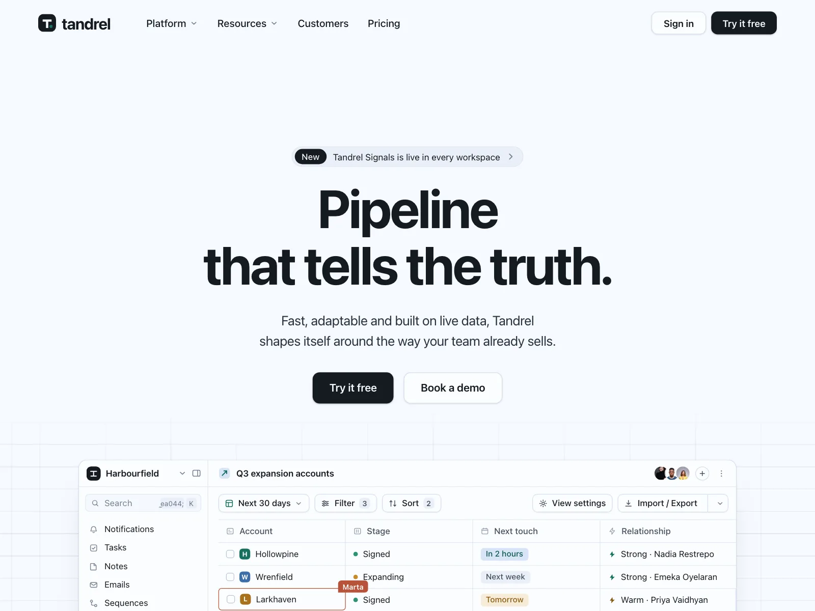
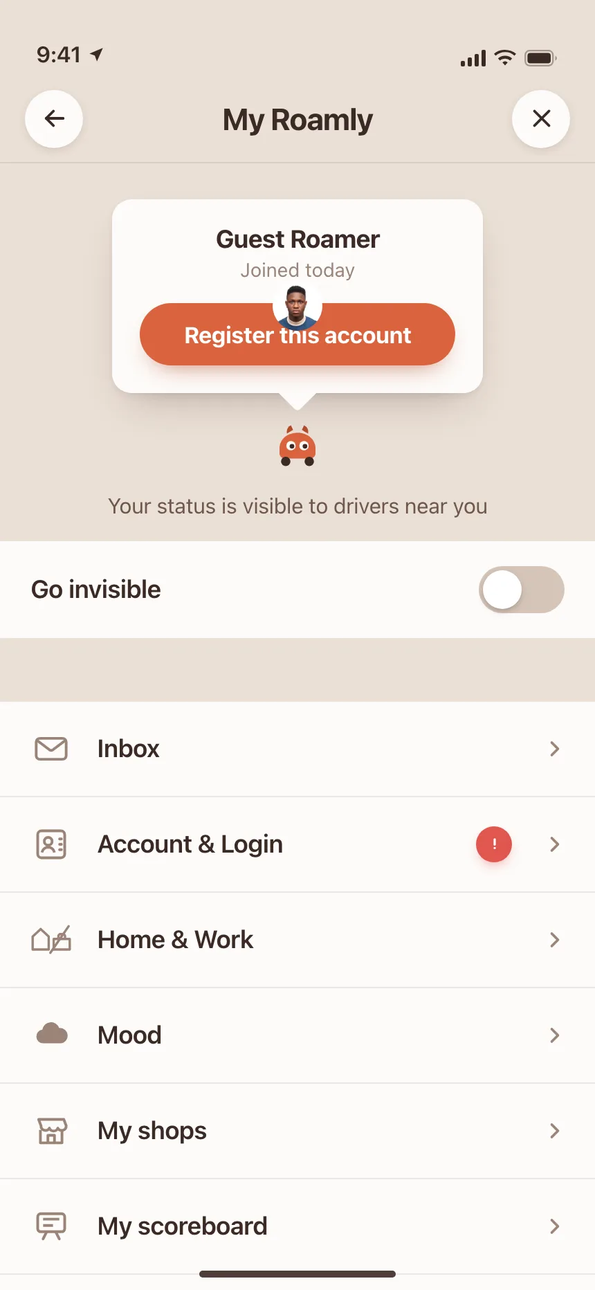
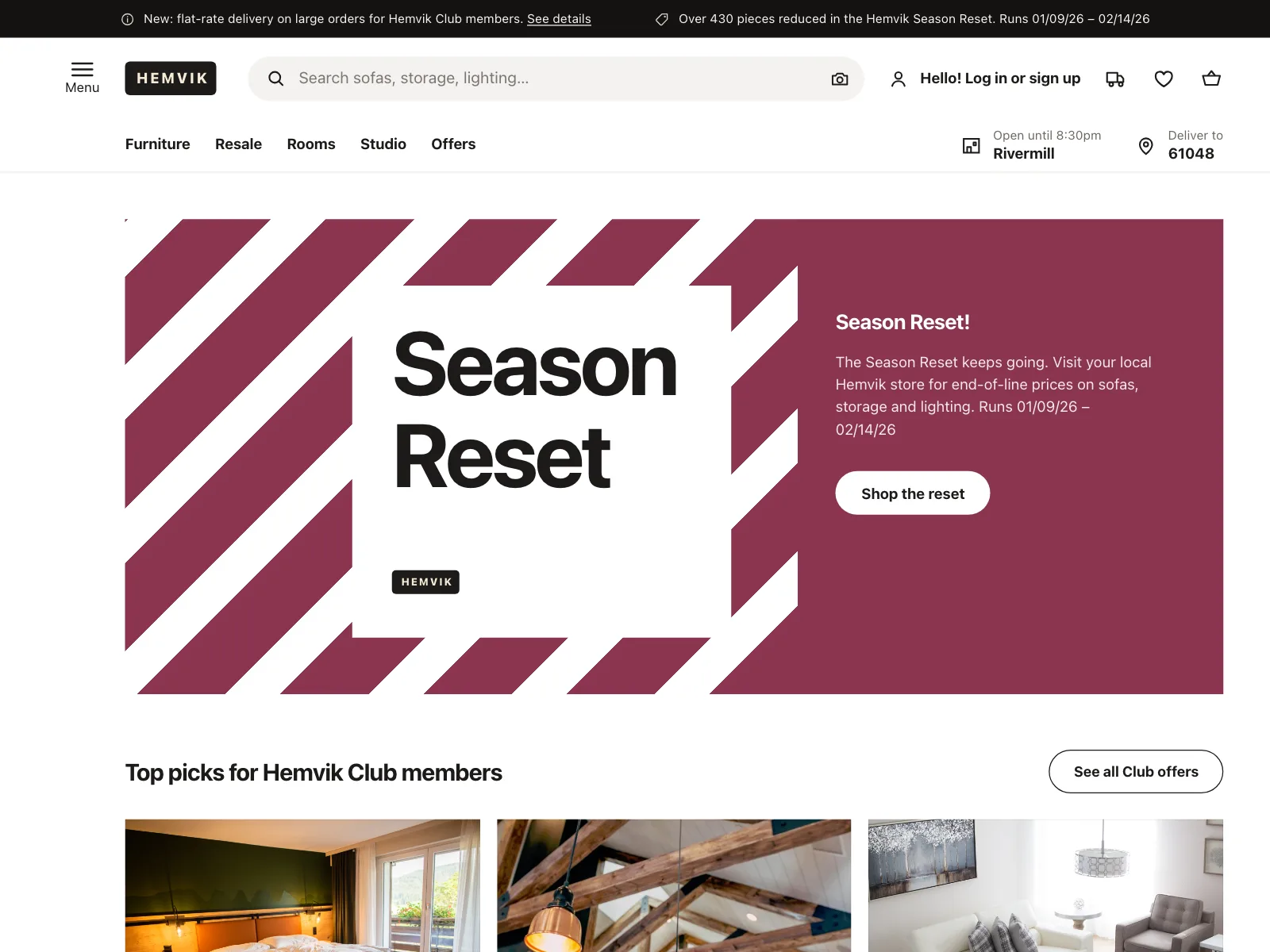
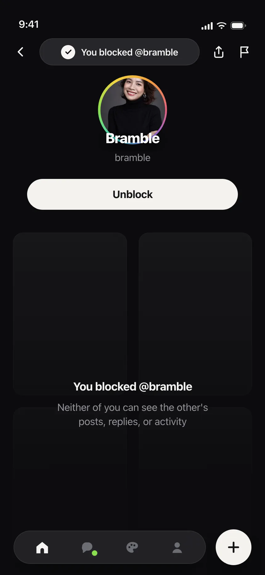
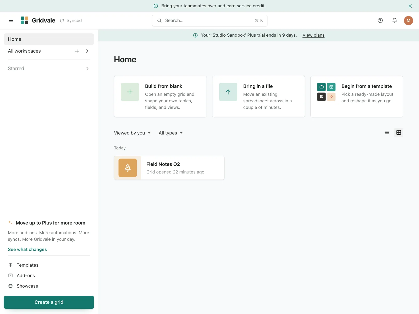
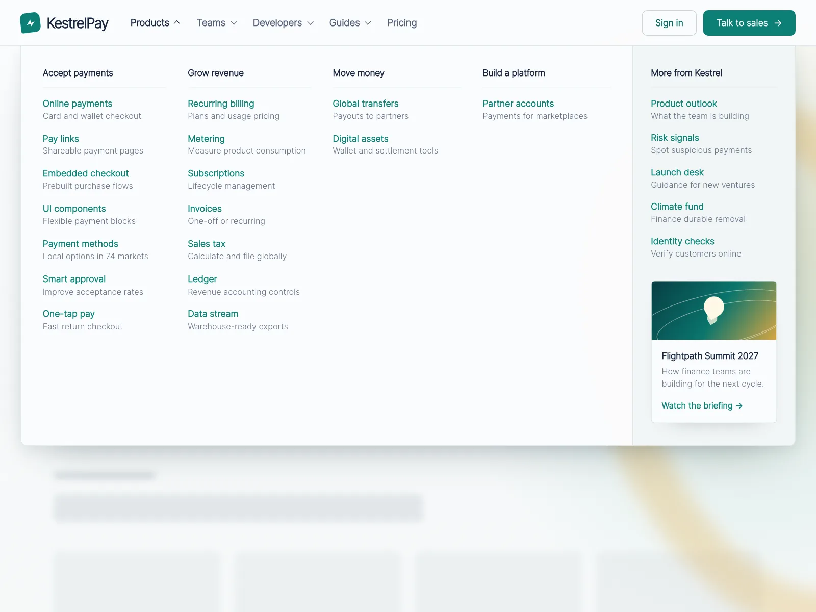
Navbars from the Kombai gallery: a CRM's marketing site, a ride-hailing app's account screen and a furniture retailer's store header.
What is a navbar?
A navbar is the strip at the top of every page that holds the logo, links to the main sections and actions like Sign in. It stays the same from page to page, so people always know how to get home, jump to a section or reach their account.
- The logo sits at the start and links to the home page.
- On small screens the links fold behind a menu button.
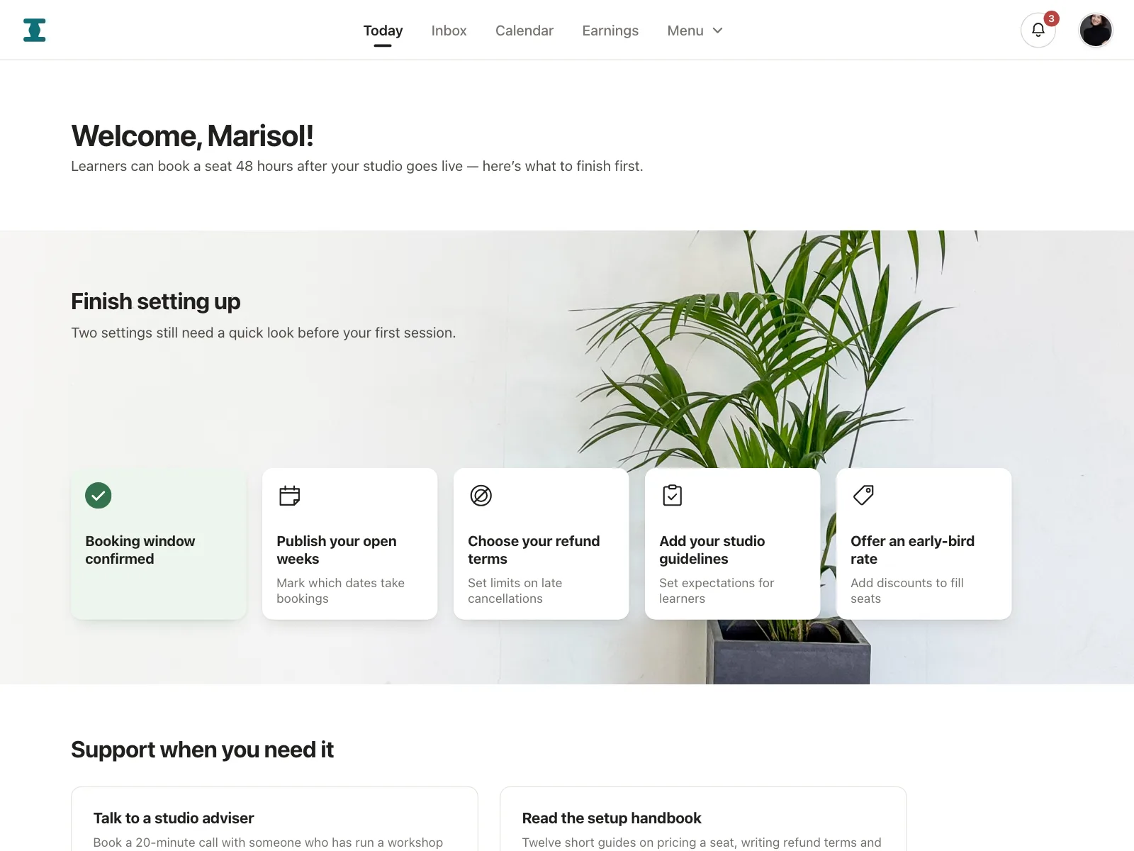
Navbars show up across hero, home, storefront and dashboard screens.
When to use a navbar
- A few top sectionsDestinations people need from any page, like Product, Pricing and Docs.
- Account actionsSign in, search, the cart or the profile menu that every screen shares.
- The main call to actionA Start free or Book a demo button that stays in reach on every page.
When not to use one
- Many sectionsPast a handful of links, group them in a mega menu or move to a side navigation.
- Focused flowsCheckout and sign-up work better with just the logo and a way back.
- Views of one thingTo switch between Overview and Settings on one page, use tabs.
Anatomy of a navbar
This one works at two widths. Pick a link, or tab through the bar. On the small one, open the menu with Enter or Space and close it with Escape.
- Link
- Hover
- Current page
- Keyboard focus
- Menu open
- LogoLinks back home
- LinksThe main sections
- ActionsSign in and the main button
- Menu buttonHolds the links on phones
- StatesCurrent page, focus, menu open
Navbar variants
We sorted every navbar design in the Kombai gallery and found six patterns. Browse all 299 web and 3 mobile designs.
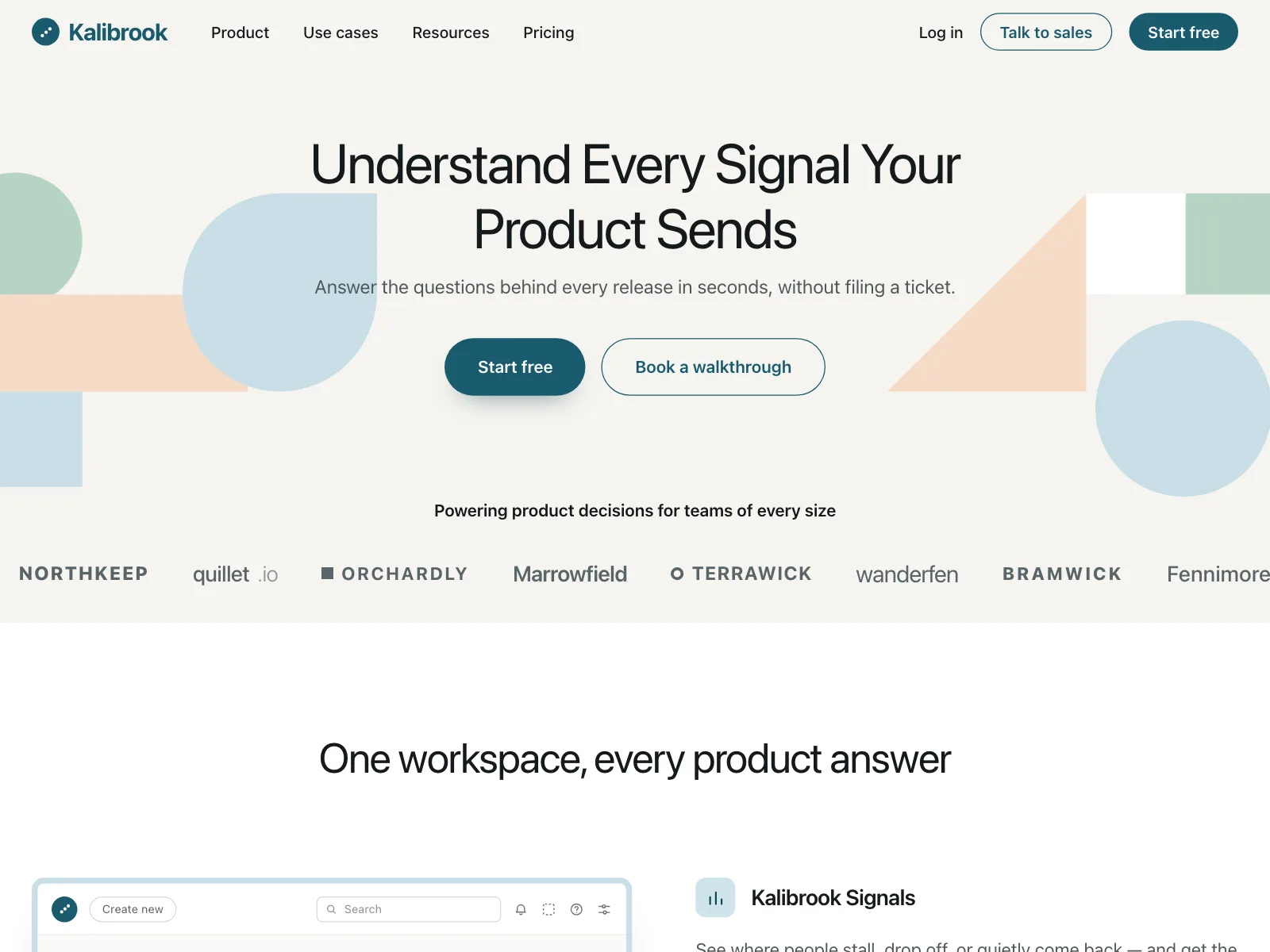
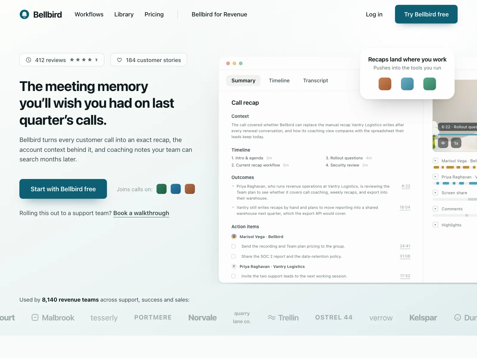
1. Logo, links and actions
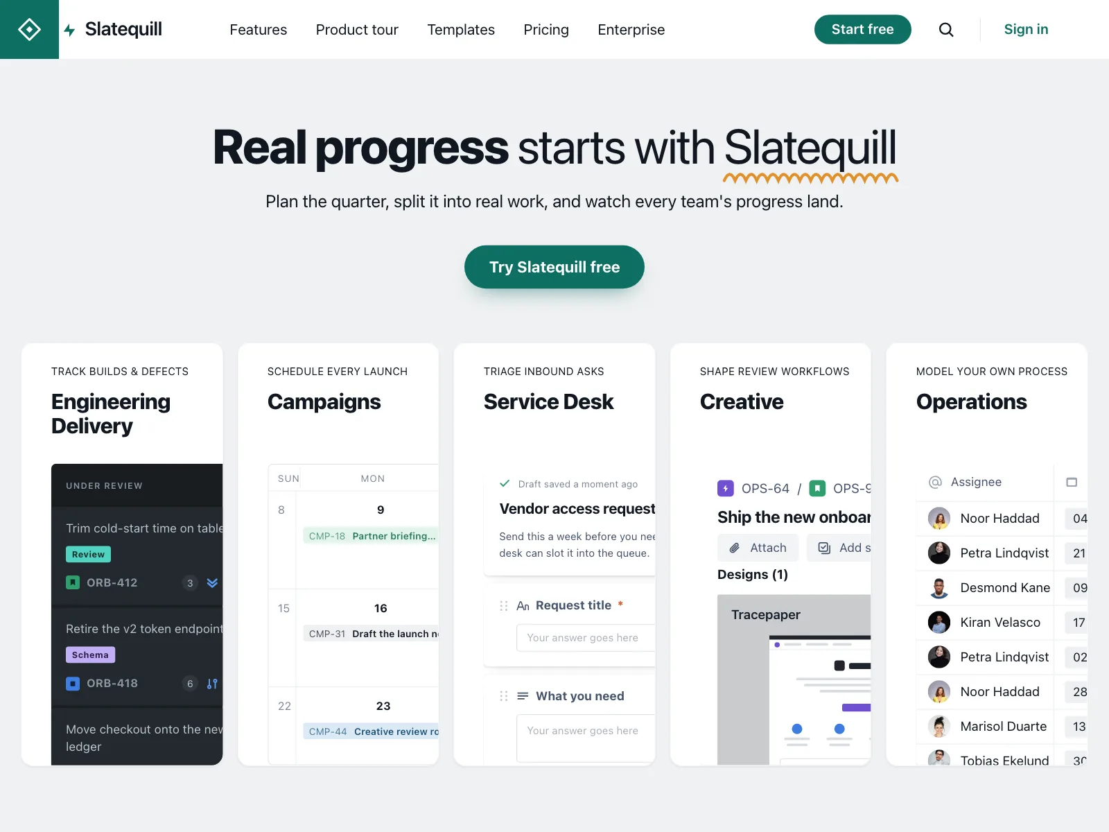
The default. Logo on the left, section links next to it or centered, and Sign in with a primary button on the right. Links often open dropdowns.
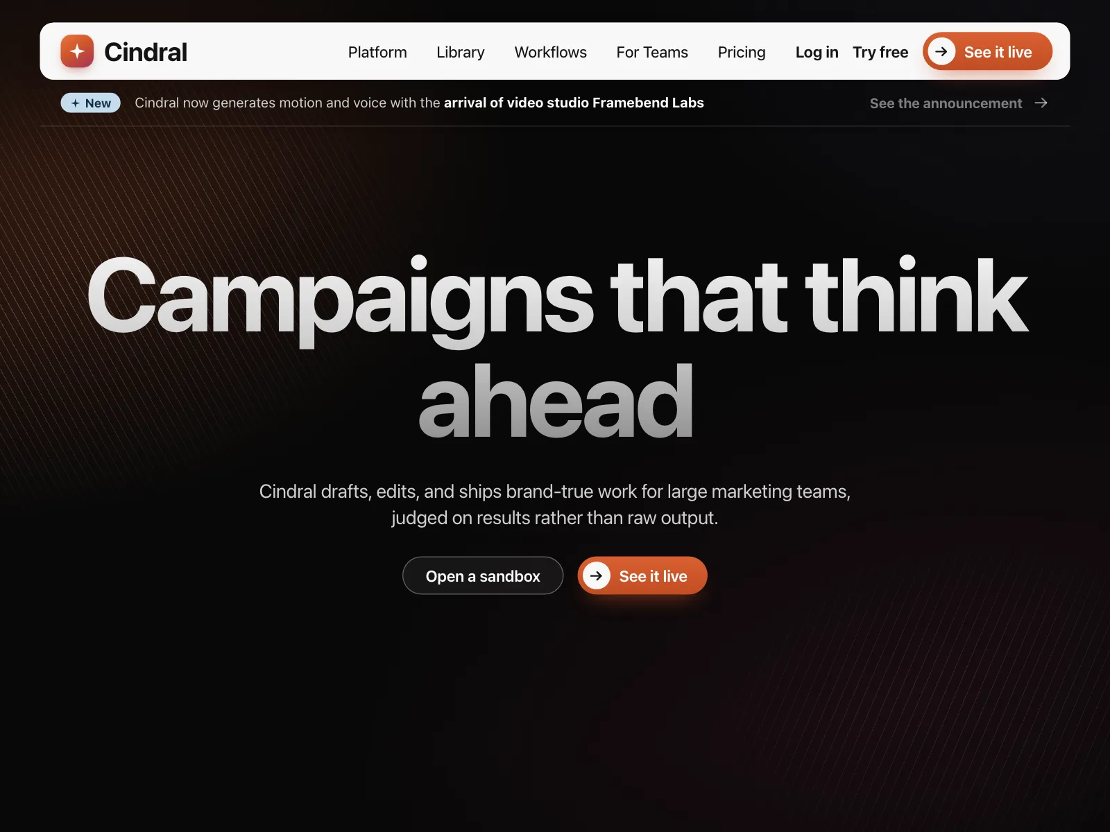
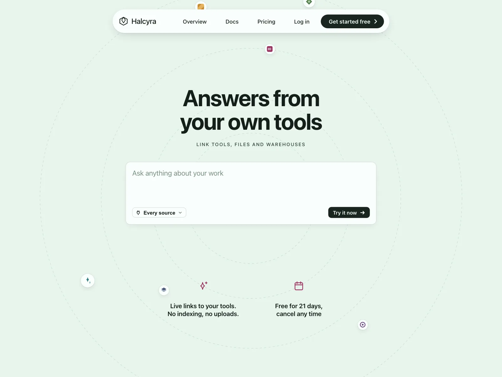
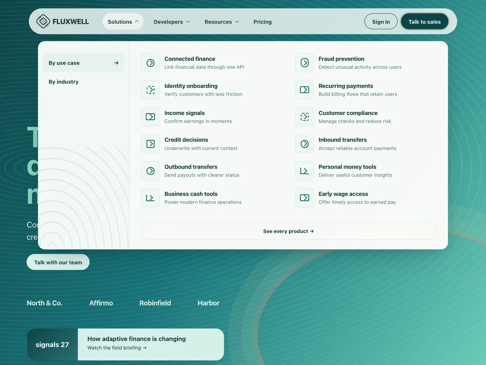
2. Floating pill bars
The whole bar sits in a rounded capsule that floats over the page, a common look on software marketing sites.
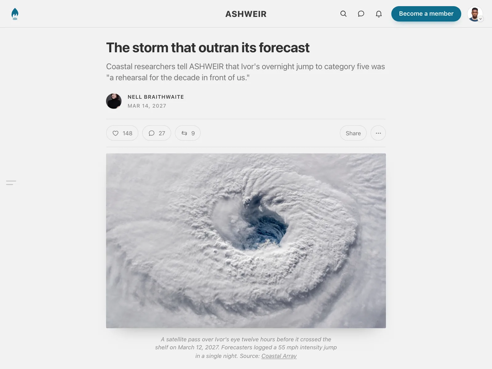
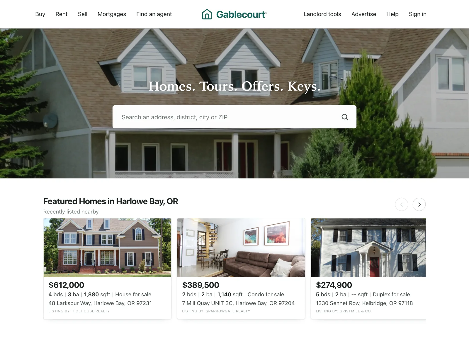
3. Centered logo
The wordmark sits in the middle with links or icons on both sides. Newspapers, magazines and property sites use it.

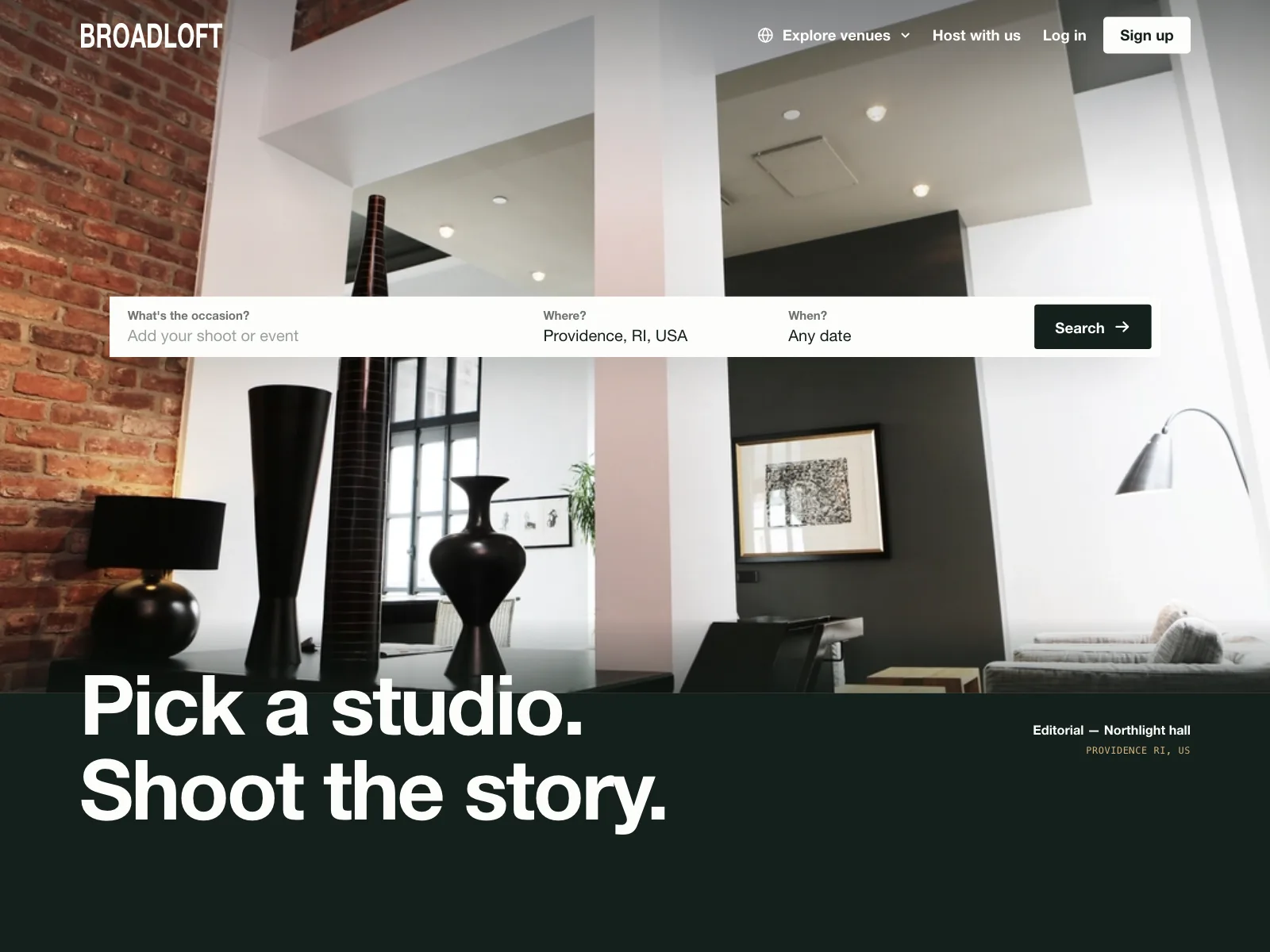
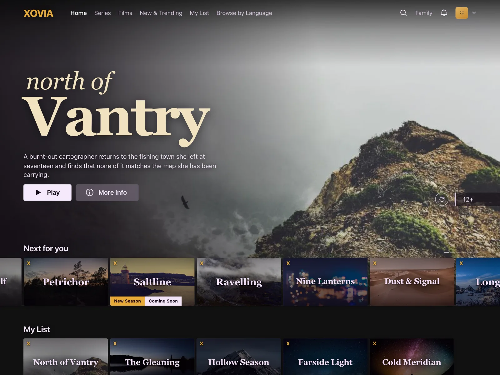
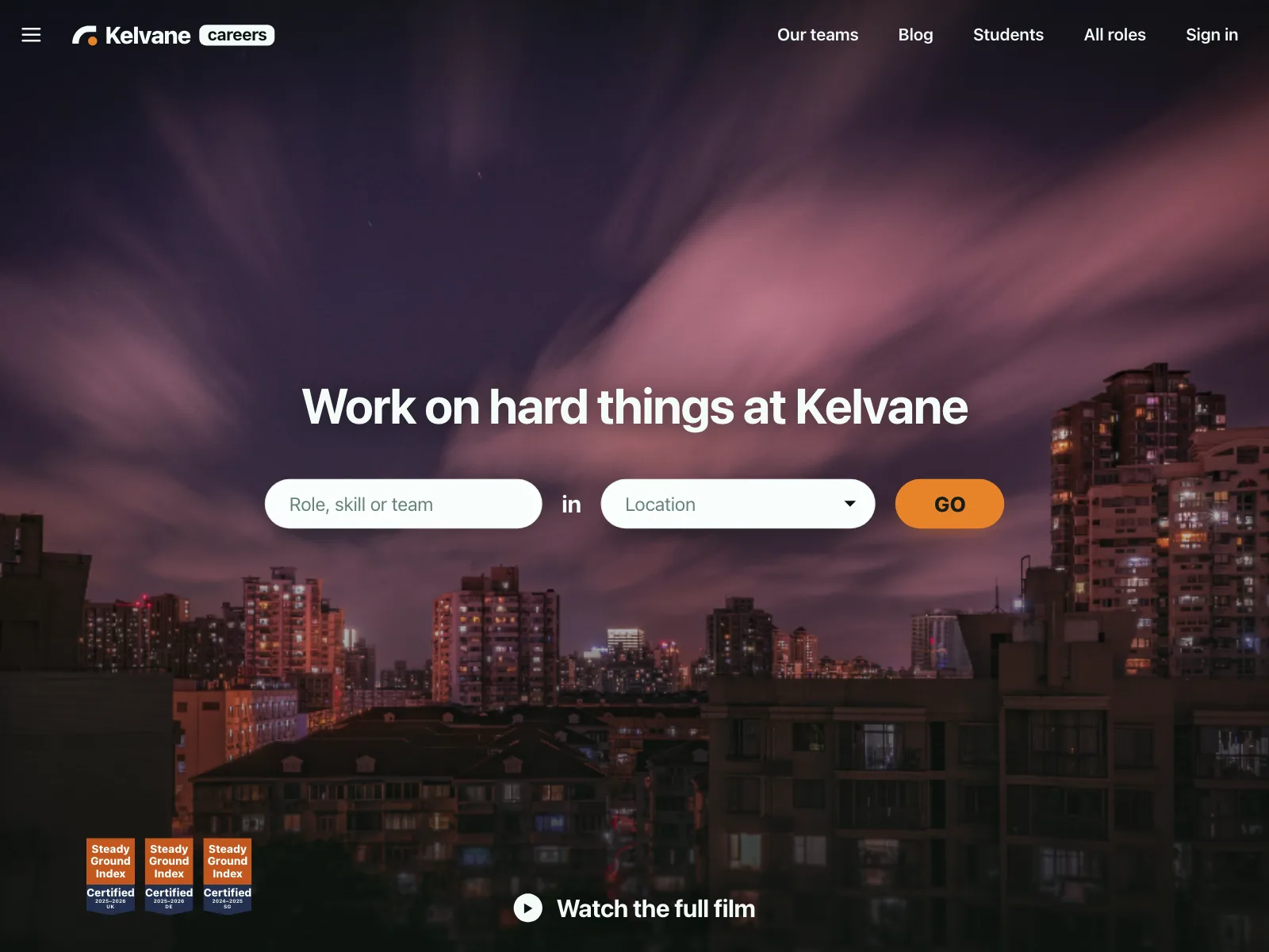
4. Transparent over the hero
No background of its own. Light text sits straight on a photo or video, so the hero image starts at the top edge.
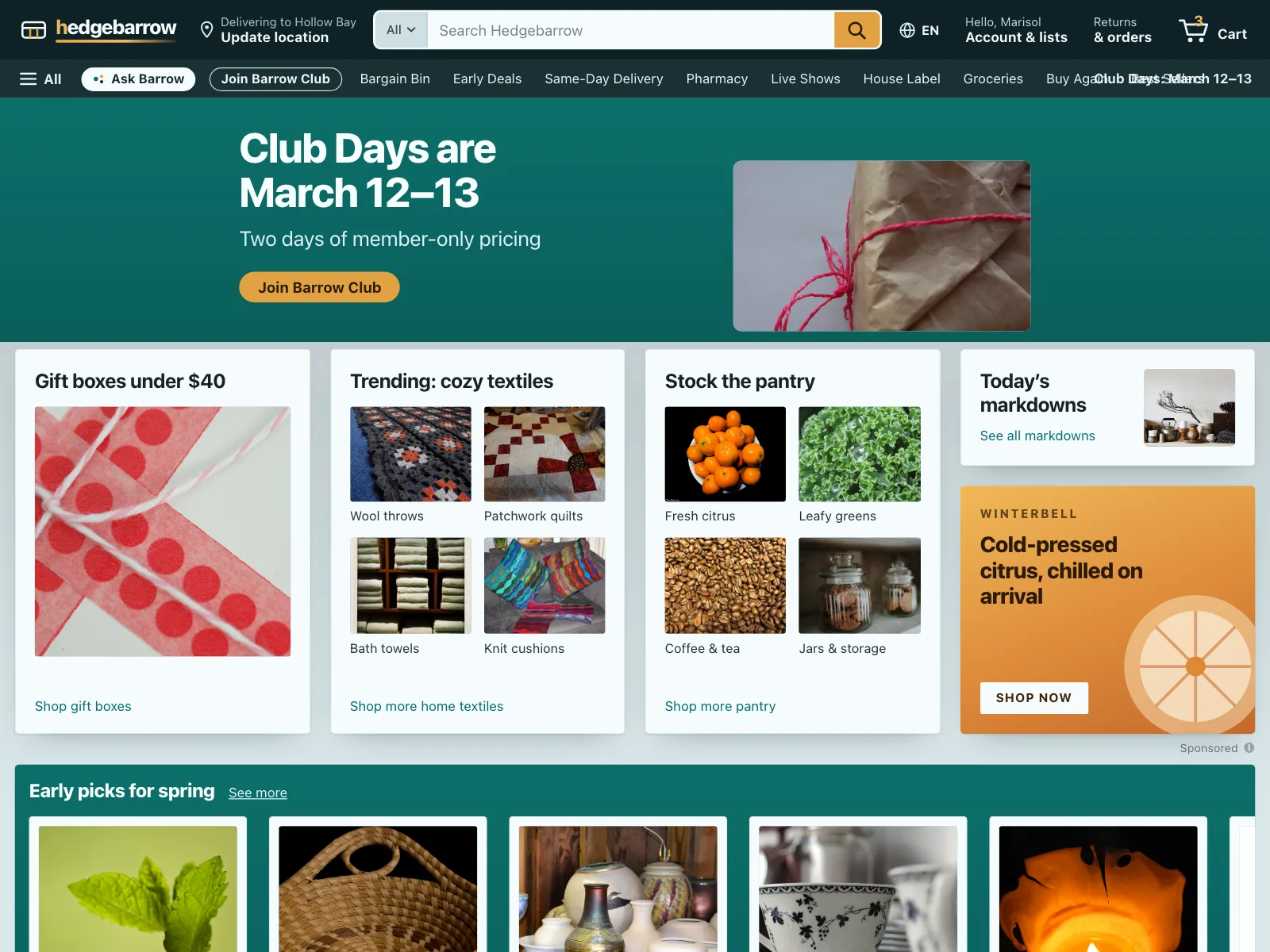
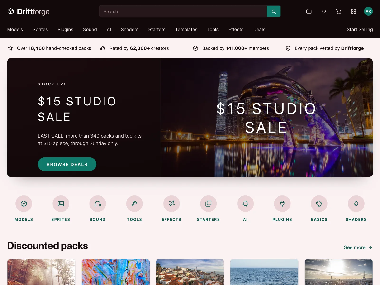
5. Two-row store headers
A top row with the logo, a wide search box, account and cart, and a second row of shop categories.
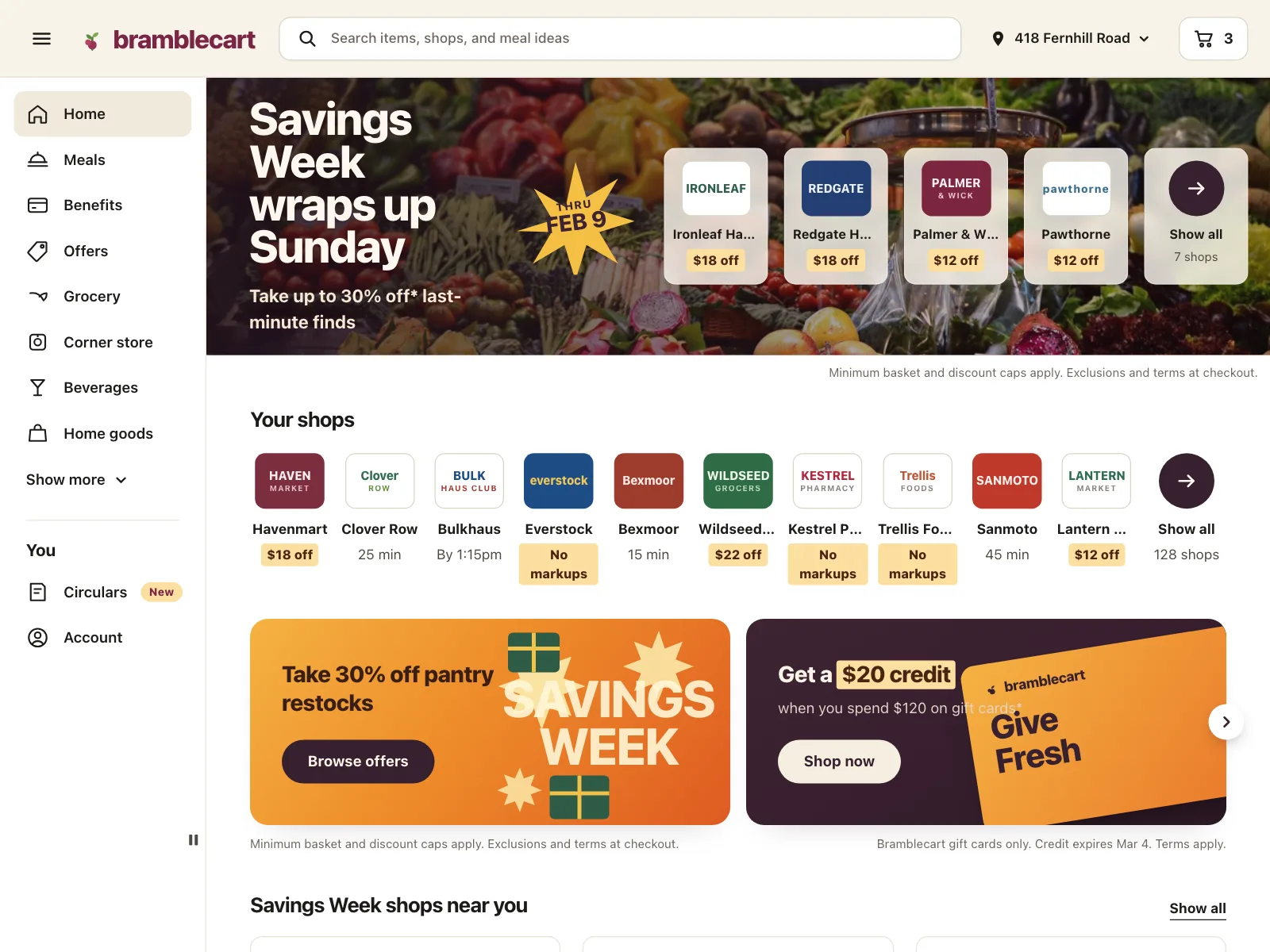
6. Mobile menus
On a phone the links move into a panel or sheet that opens from the bar, often with photo cards for each section.


Where navbars show up
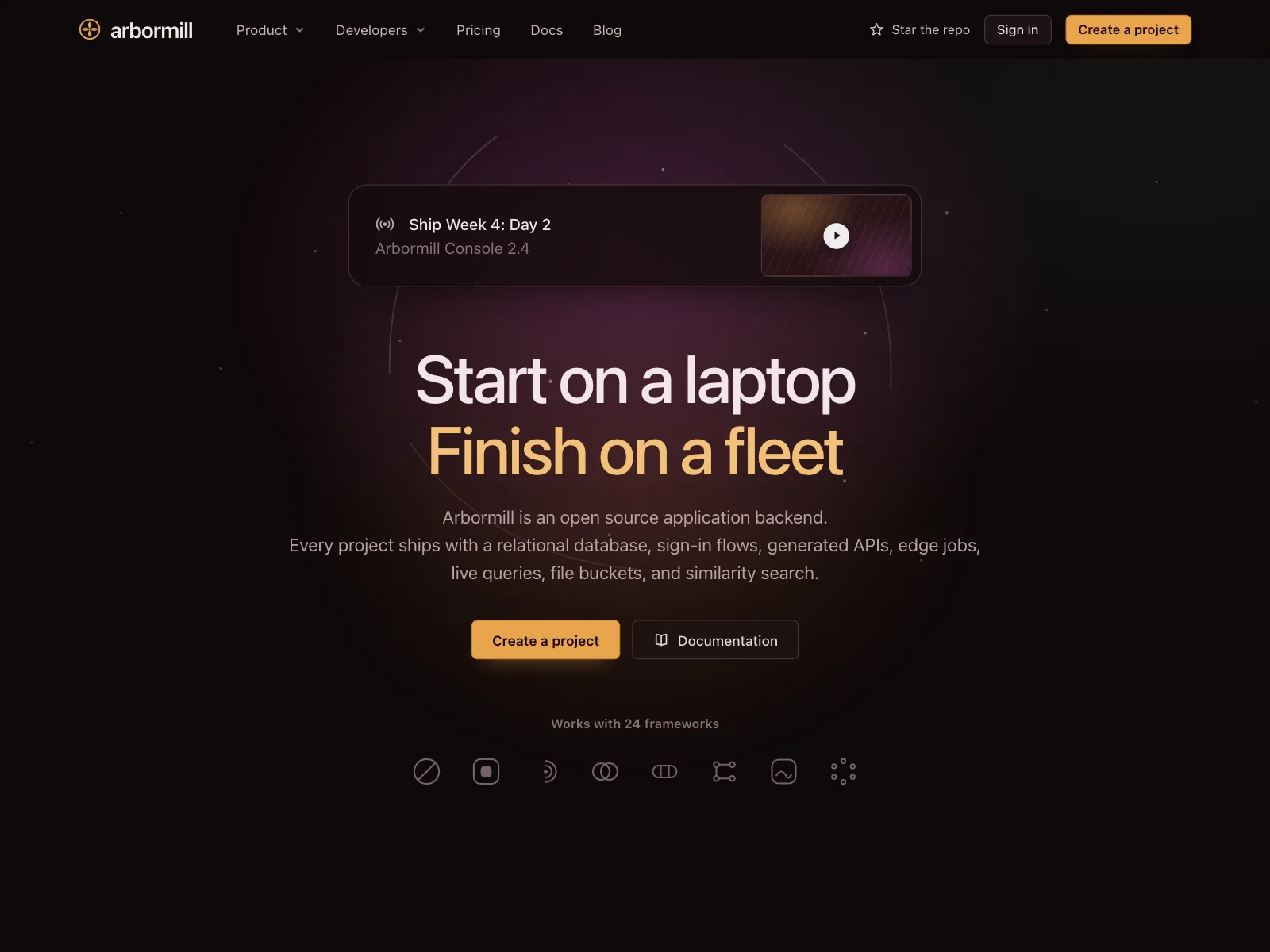
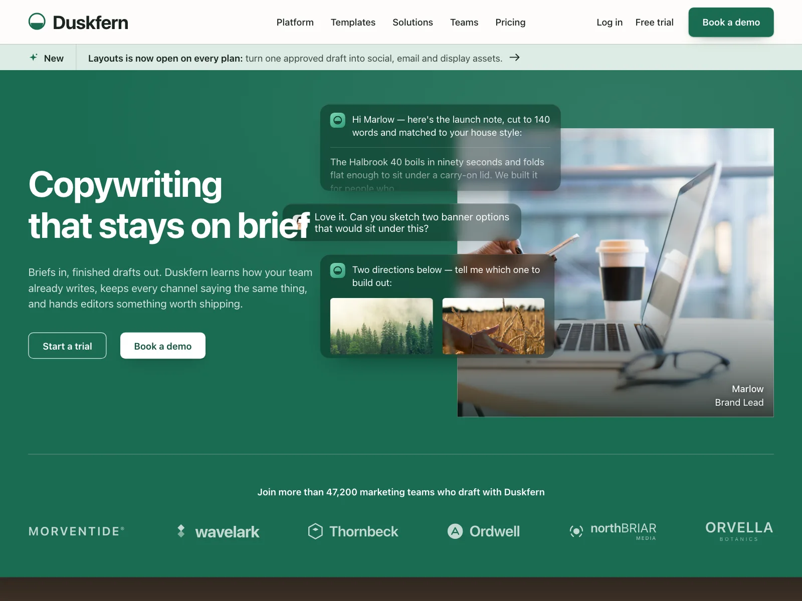
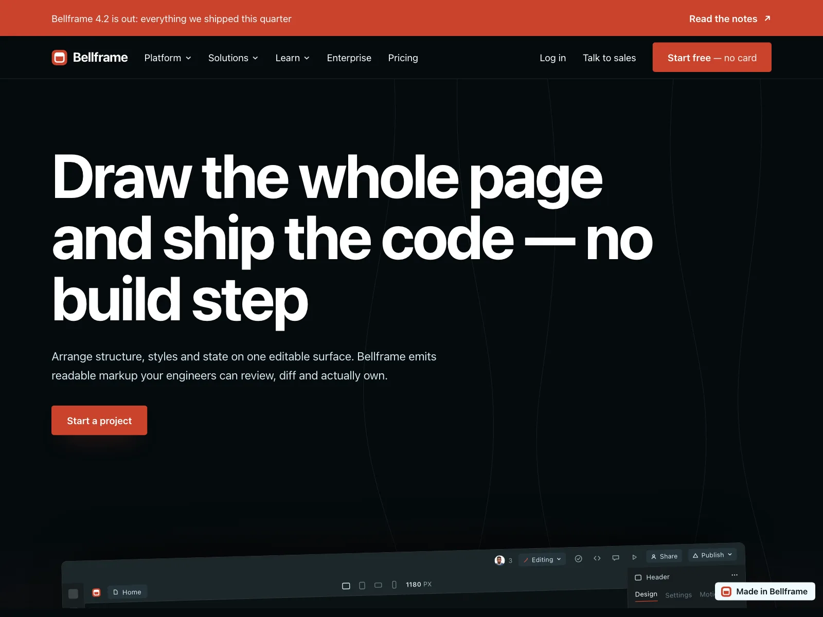
Marketing sites
Product, pricing and docs links beside Log in and a trial button, often under an announcement strip.
Product apps
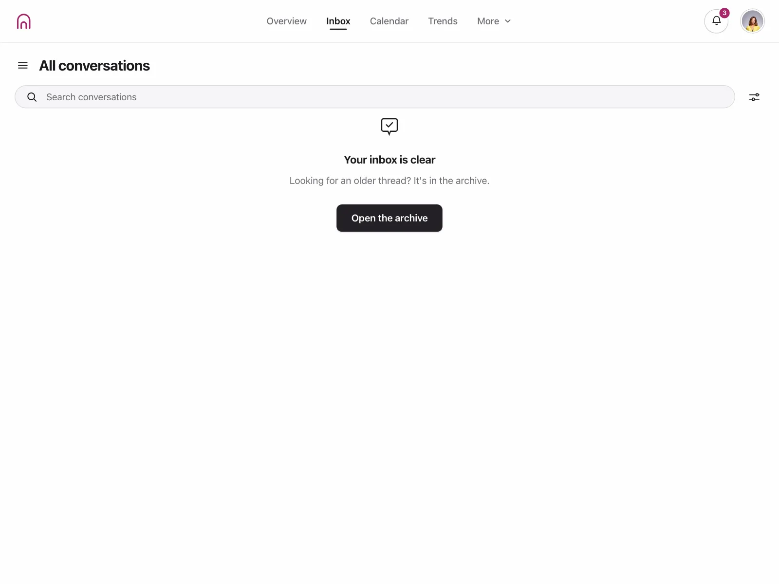
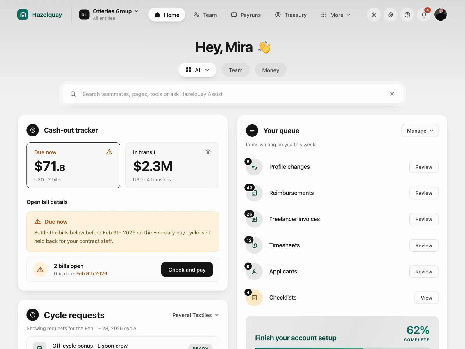
The app bar: a few workspace sections, notifications and the account avatar above the work itself.
Phone screens
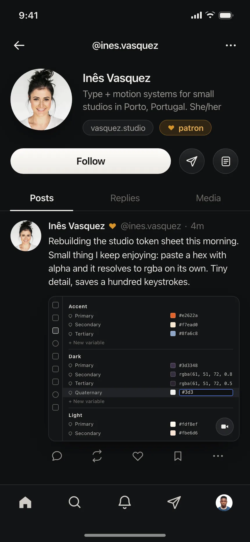
A slim bar with a back button, a title and one to three icon actions, like share or more.

Navbar vs similar components
Build notes
- Wrap the links in a <nav> element with a name like "Main", and list them in a <ul>.
- Mark the link to the page people are on with aria-current="page".
- Put a skip link before the navbar so keyboard users can jump to the main content.
- On small screens, put the links behind a menu button with aria-expanded and aria-controls.
- Dropdowns open with Enter or Space and close with Escape, which returns focus to their button.
- Give the page scroll-padding-top on a sticky navbar, so it never covers the focused element.
FAQ
What's the difference between a navbar and a header?
The header is the whole top region of a page, which can hold a logo, a search box and an announcement strip. The navbar is the set of main links inside it, marked up with a nav element. On most sites they share one bar, which is why people use the words interchangeably.
Should a navbar be sticky?
Make it sticky when people need its actions while they scroll, like search or a cart, and keep it short. A sticky bar must never fully hide the element that has keyboard focus: that fails WCAG 2.4.11. Setting scroll-padding-top on the page to the bar's height fixes most cases.
Should I use a hamburger menu on desktop?
Usually not. A wide screen has room for the main links, and showing them tells people what the site offers at a glance. Keep the menu button for small screens, with the main action, like Sign up, still visible beside it.
Should a navbar use the menubar role?
Not for site navigation. The WAI-ARIA Authoring Practices build it as a list of links in a nav element, with disclosure buttons for dropdowns, and skip the menu roles because they promise app-style keyboard behavior that a set of links does not provide.
Related terms
All glossary terms · Browse 299 web and 3 mobile navbar designs