
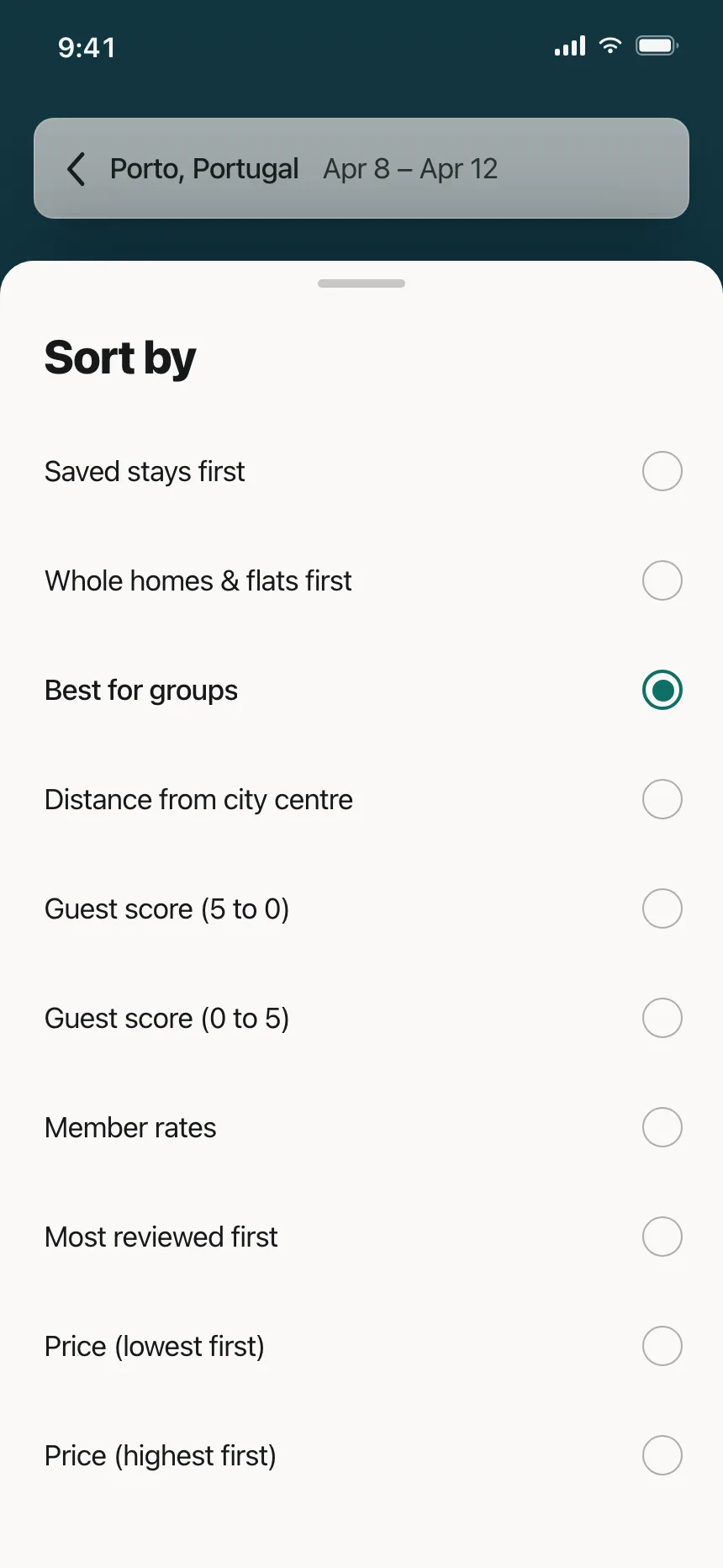
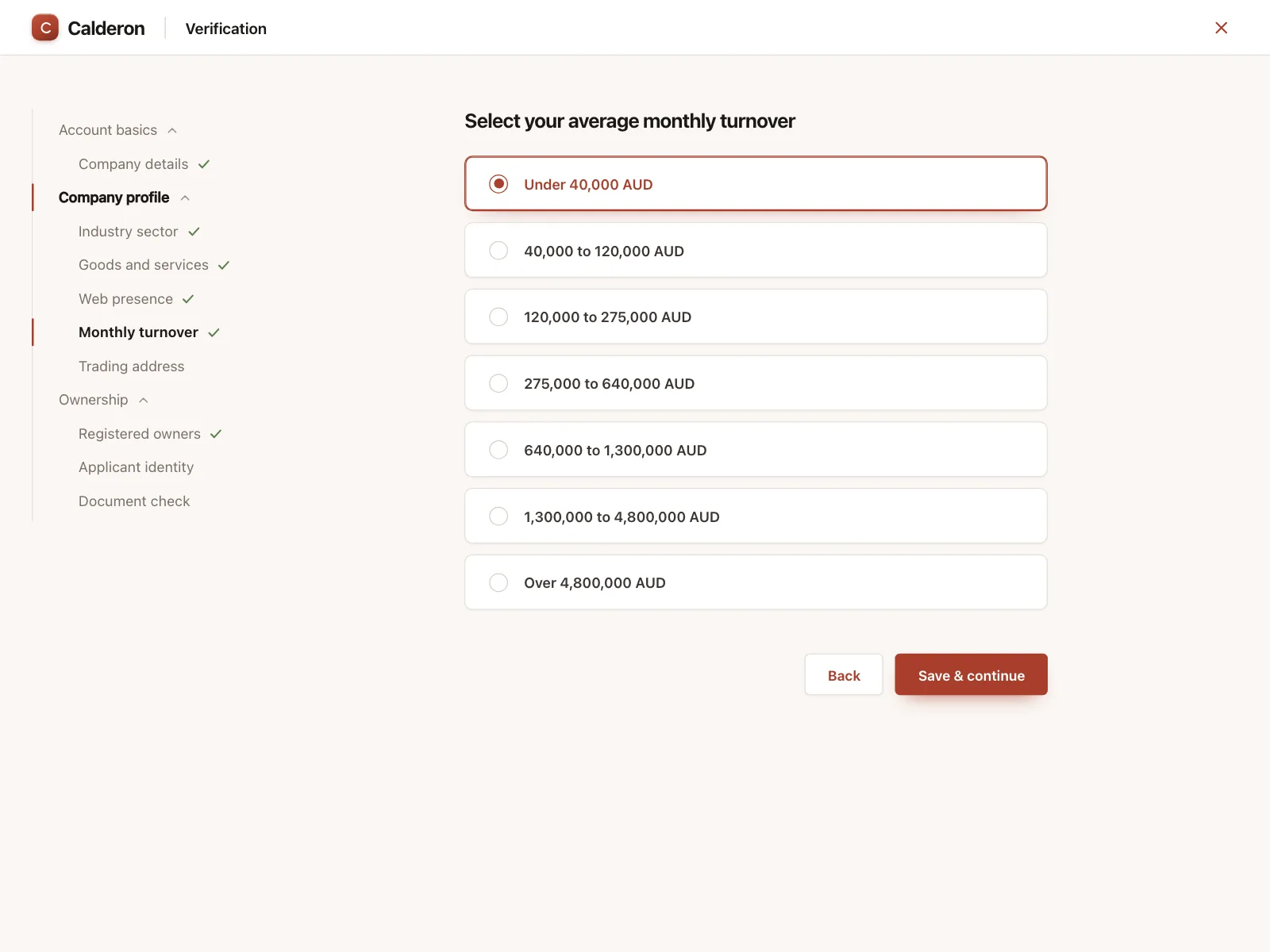
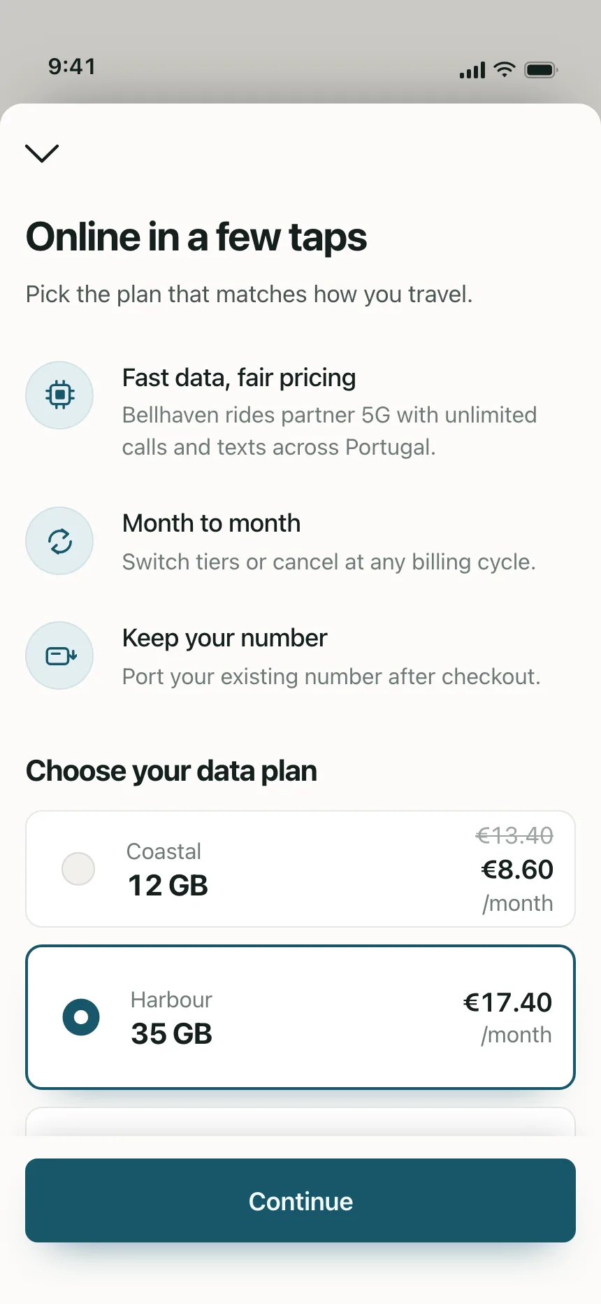
Radio buttons from the Kombai gallery: a stays app's sort sheet, a business bank's turnover question and a travel eSIM's data plans.
What is a radio button?
A radio button is a small circle for choosing one option from a set. All the options stay visible, and selecting one clears whichever was selected before, so the group never holds more than one answer.
- A filled dot inside the circle marks the selected option.
- Options sit together under a question or heading that names the choice.
Radio buttons show up across checkout, account setup, settings and feedback screens.
When to use a radio button
- One answer from a fewSort order, a plan or a delivery speed, where only one makes sense.
- Options people compareEvery choice stays on screen with its price or explanation.
- A required questionForms and onboarding steps that need exactly one answer.
When not to use one
- Several answers allowedIf people might pick more than one, use checkboxes.
- Long listsUse a dropdown or a searchable select for countries or time zones.
- Switching viewsTo change what the screen shows on the spot, use a segmented control or tabs.
Anatomy of a radio button
This one works. Pick a delivery speed, or tab into the group and use the arrow keys.
- Unselected
- Selected
- Disabled
- Keyboard focus
- CircleThe ring every option has
- DotFills the selected option
- LabelNames the option
- Group labelThe question above the set
- DescriptionOptional detail, like a price
- StatesUnselected, selected, disabled, focus
Radio button variants
We sorted every radio button design in the Kombai gallery and found five patterns. Browse all 55 web and 35 mobile designs.
1. Radio lists
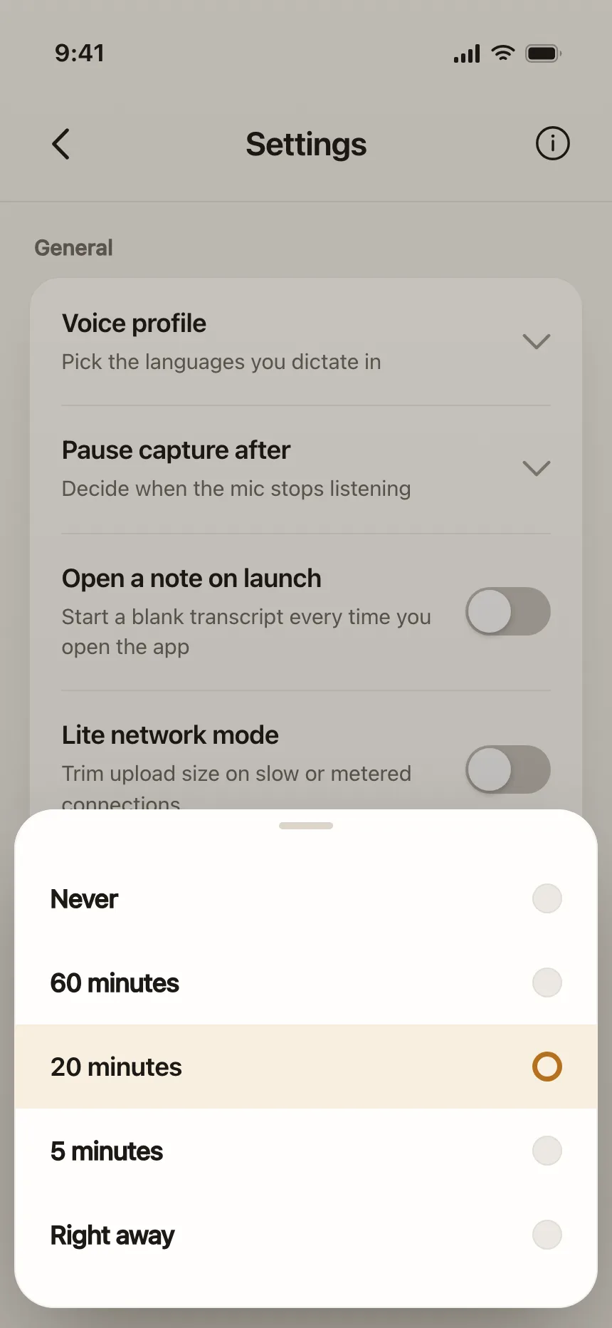
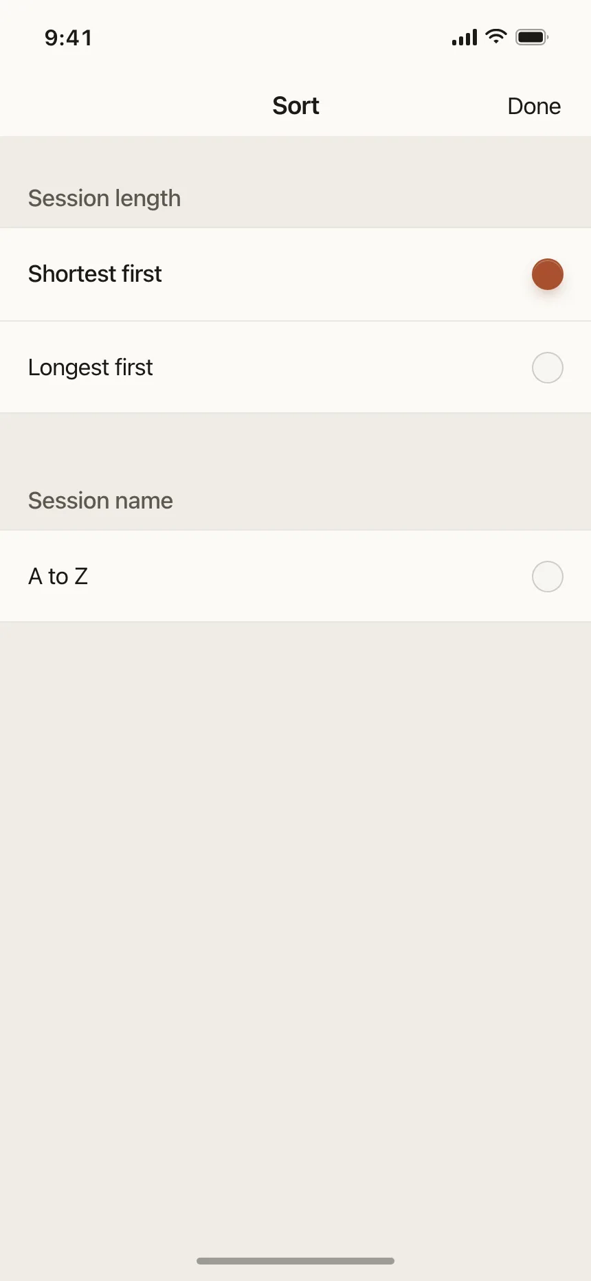
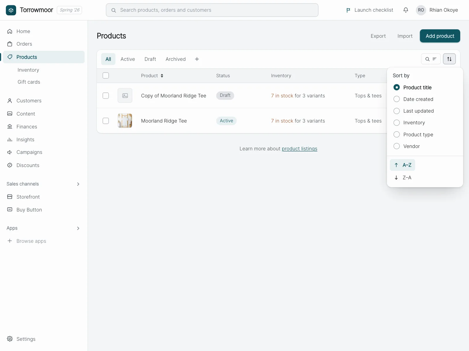
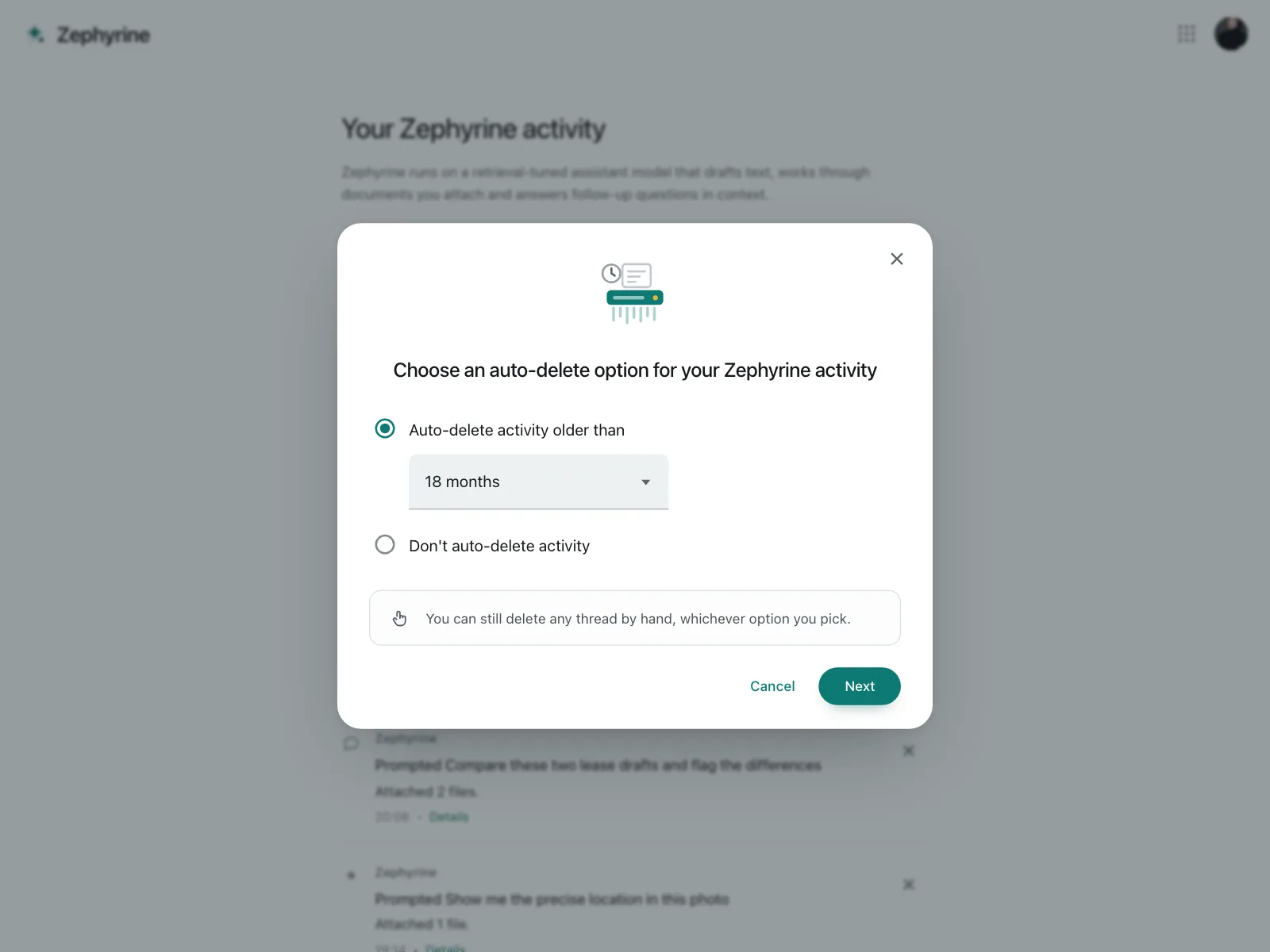
The default. One row per option with the circle at the start or the end, for sort orders, timings and settings.
2. Radio cards
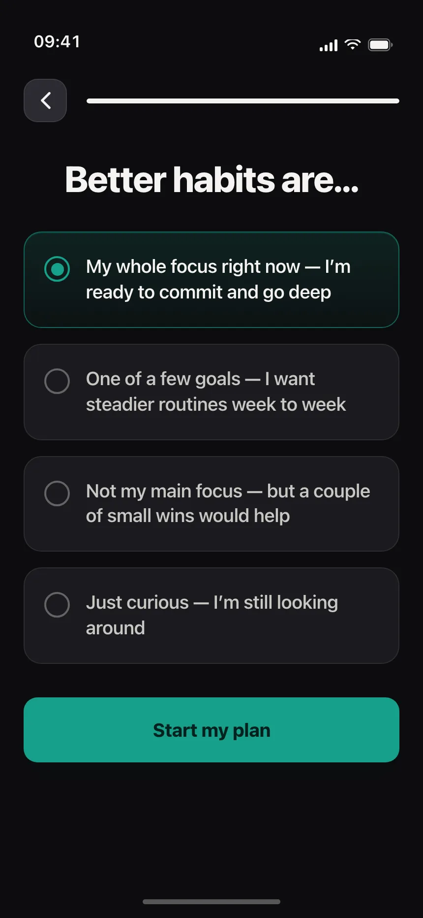
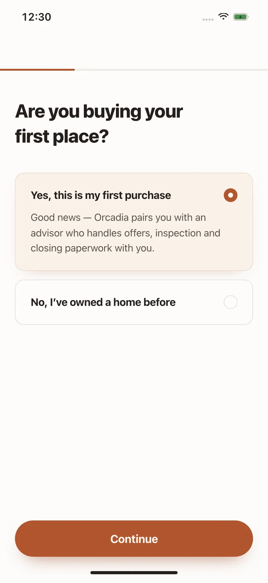
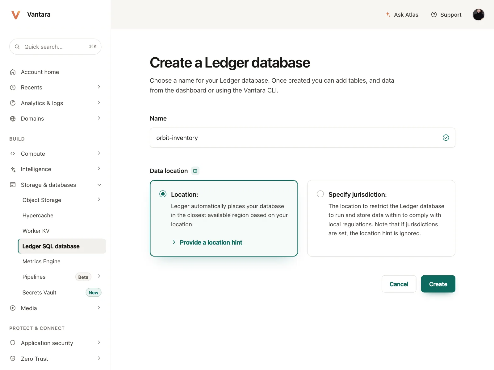
Each option is a card with a title and a line of explanation, and the selected card gets an outline or a tint.
3. Rows with details
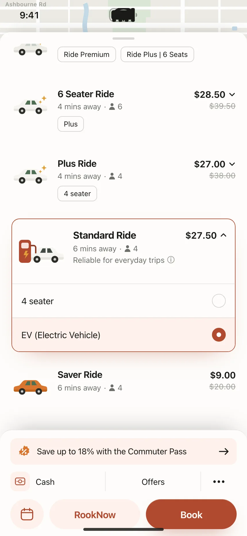
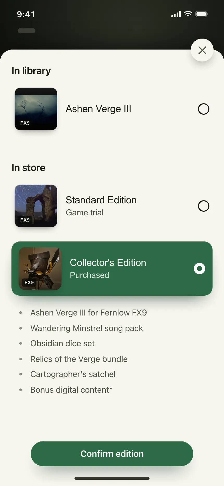
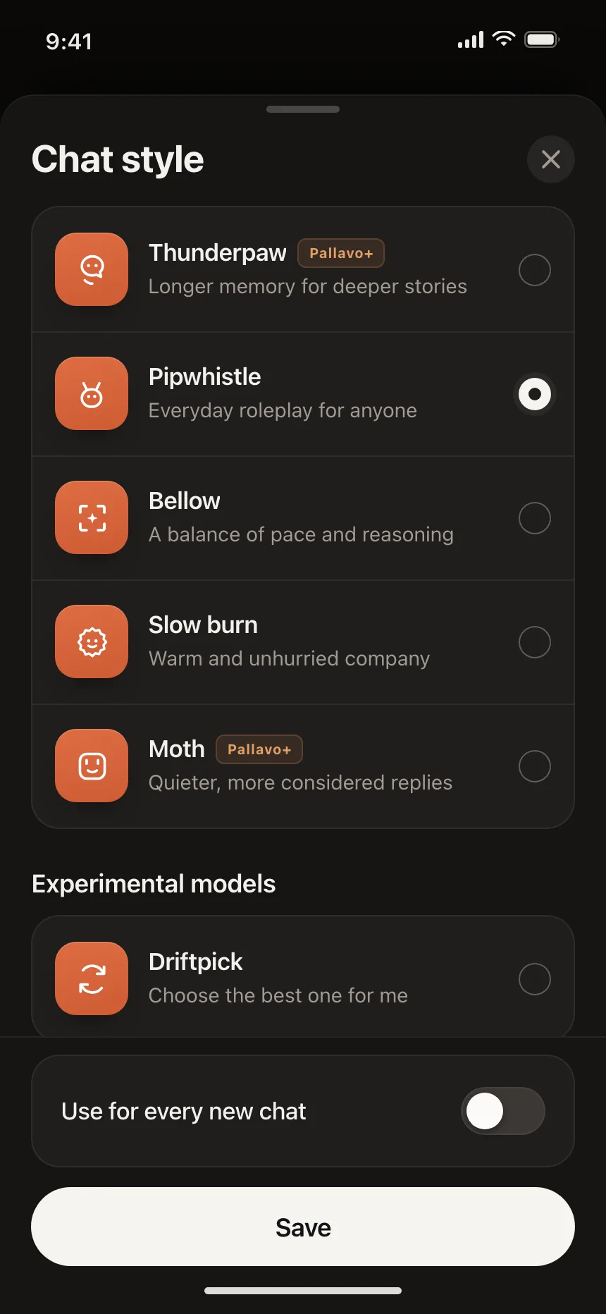
Options carry a thumbnail, an icon or a price, like ride tiers or game editions, so people compare before they pick.
4. Visual options
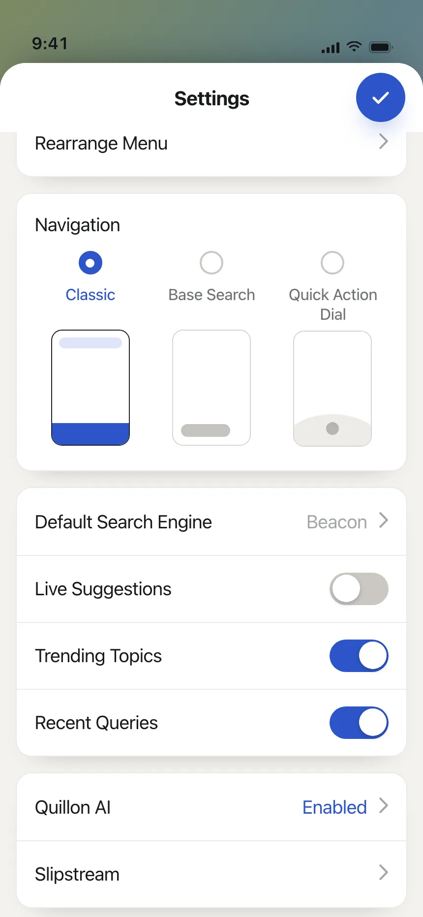
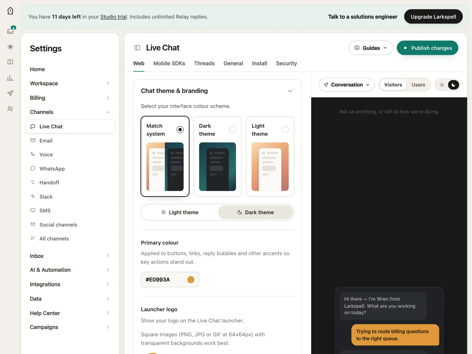
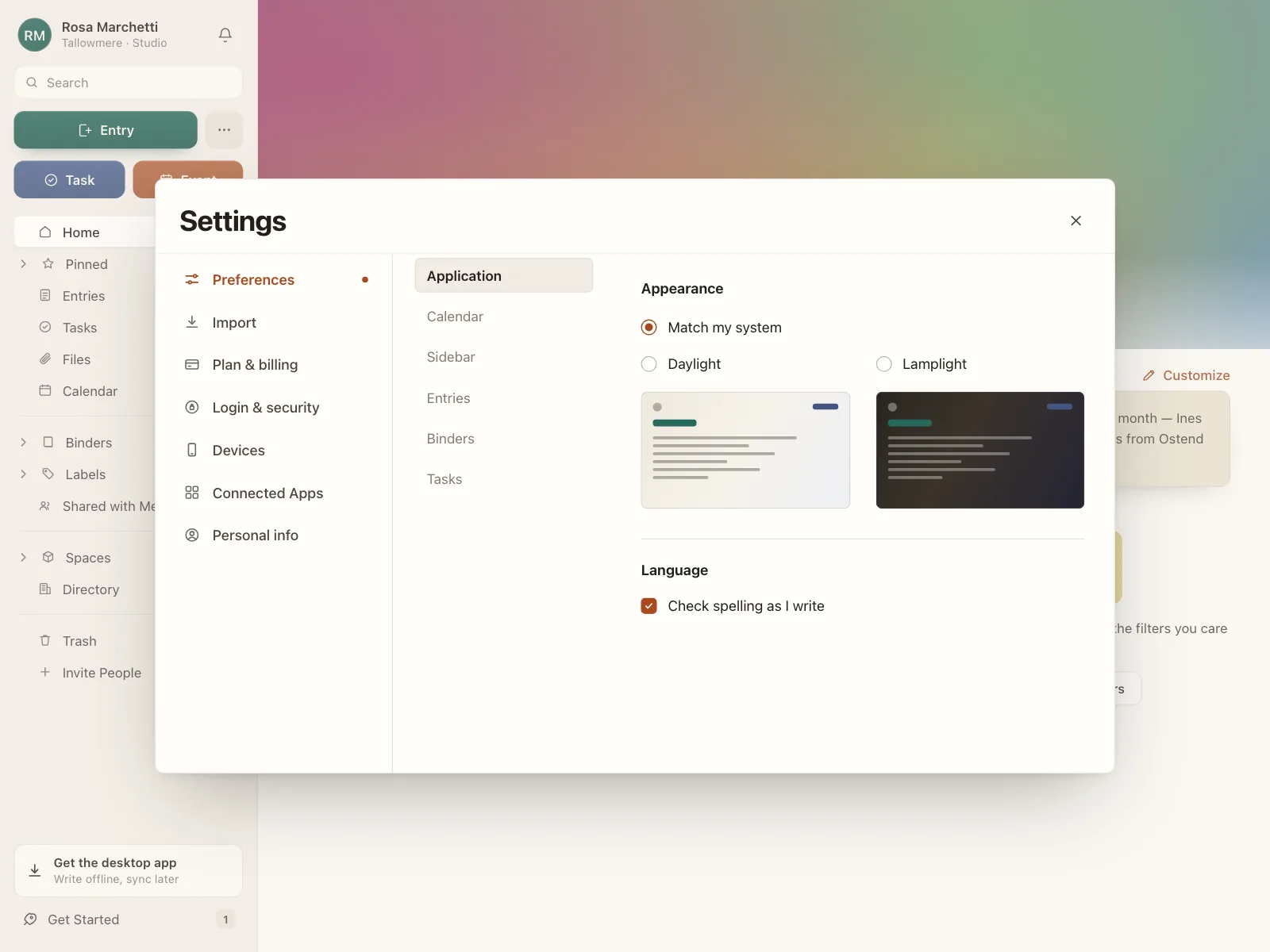
A preview of each choice, like a theme or a layout, with the radio beside or below it.
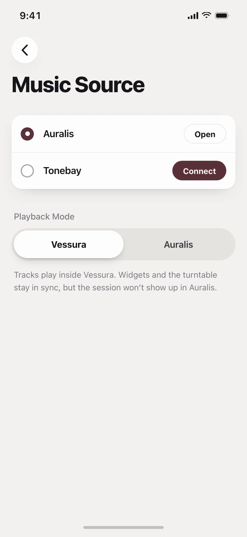
5. Radio pairs
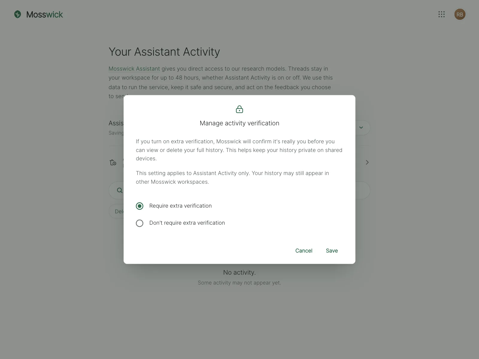
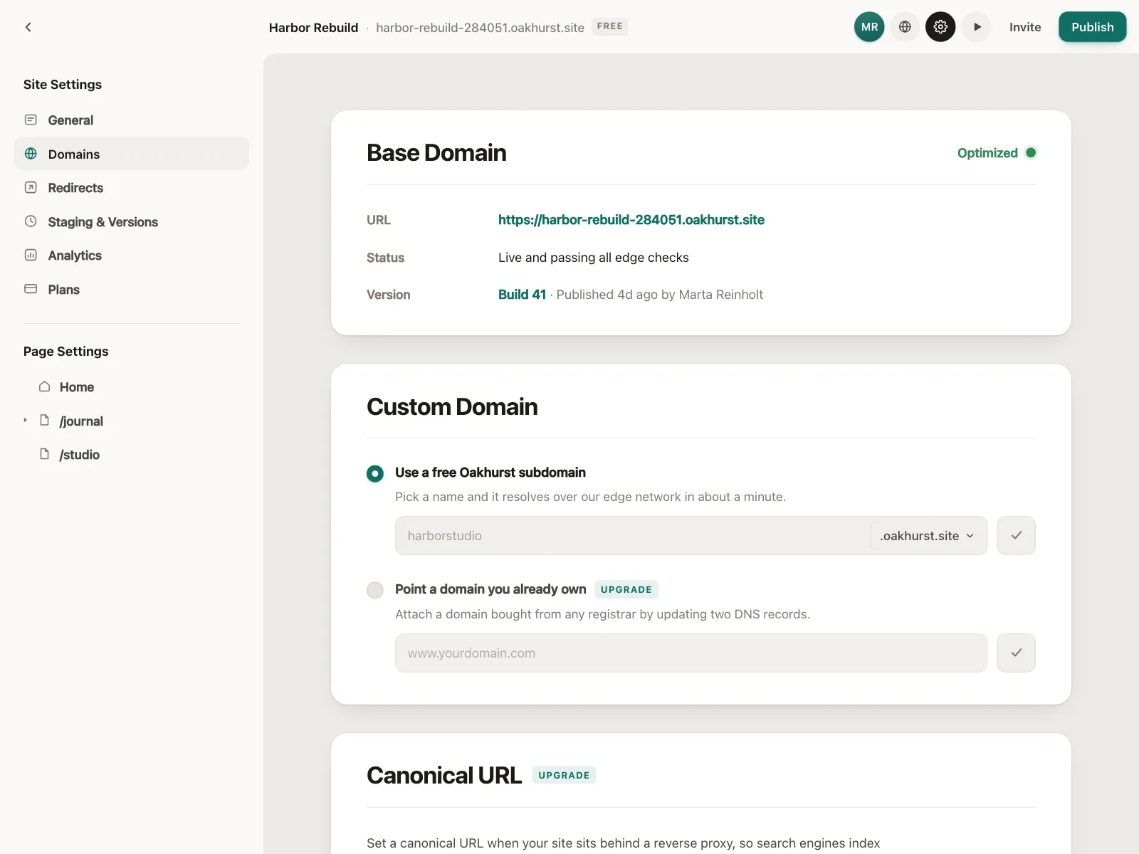
Two options, often a default and an alternative, like a free subdomain or a domain you already own.
Where radio buttons show up
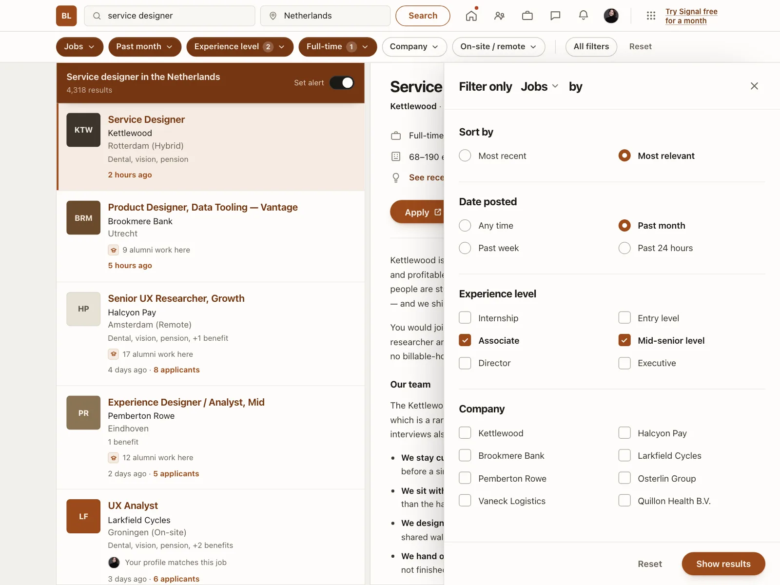
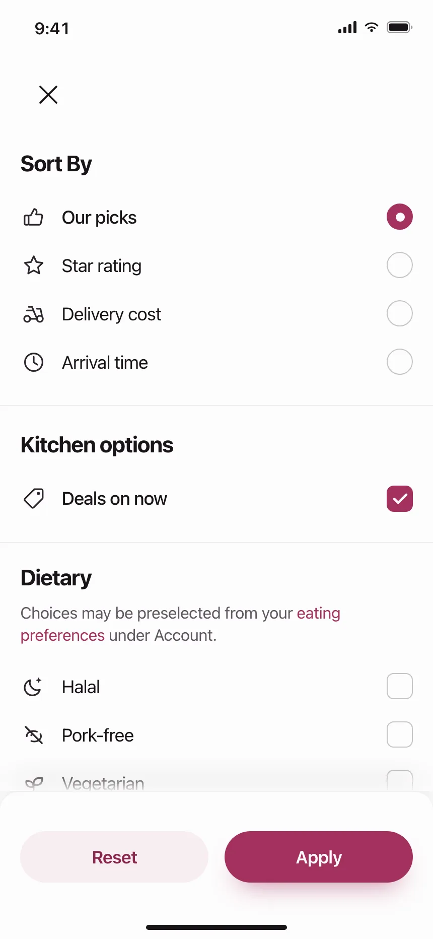
Sort and filter sheets
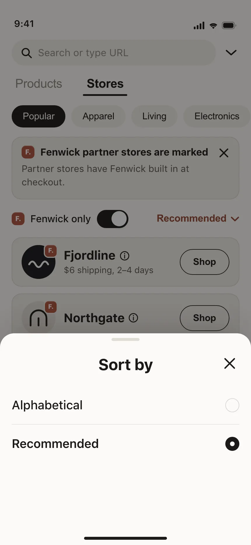
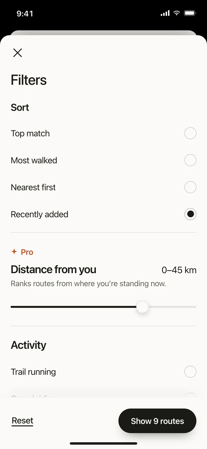
One sort order at a time, often above checkboxes or sliders for the filters.
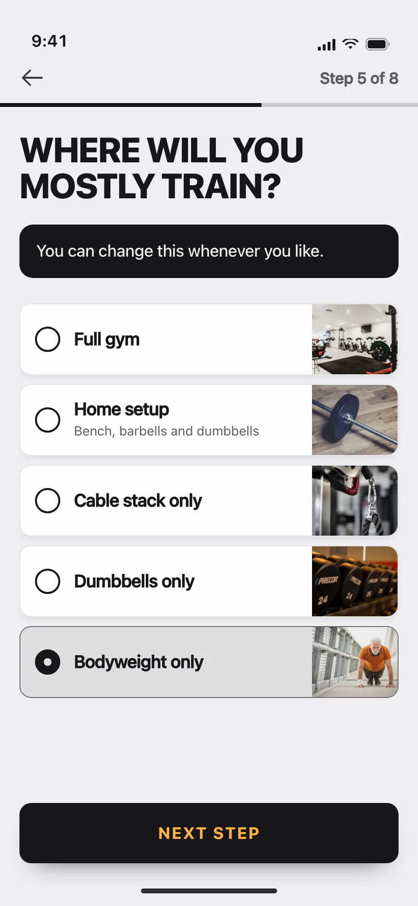
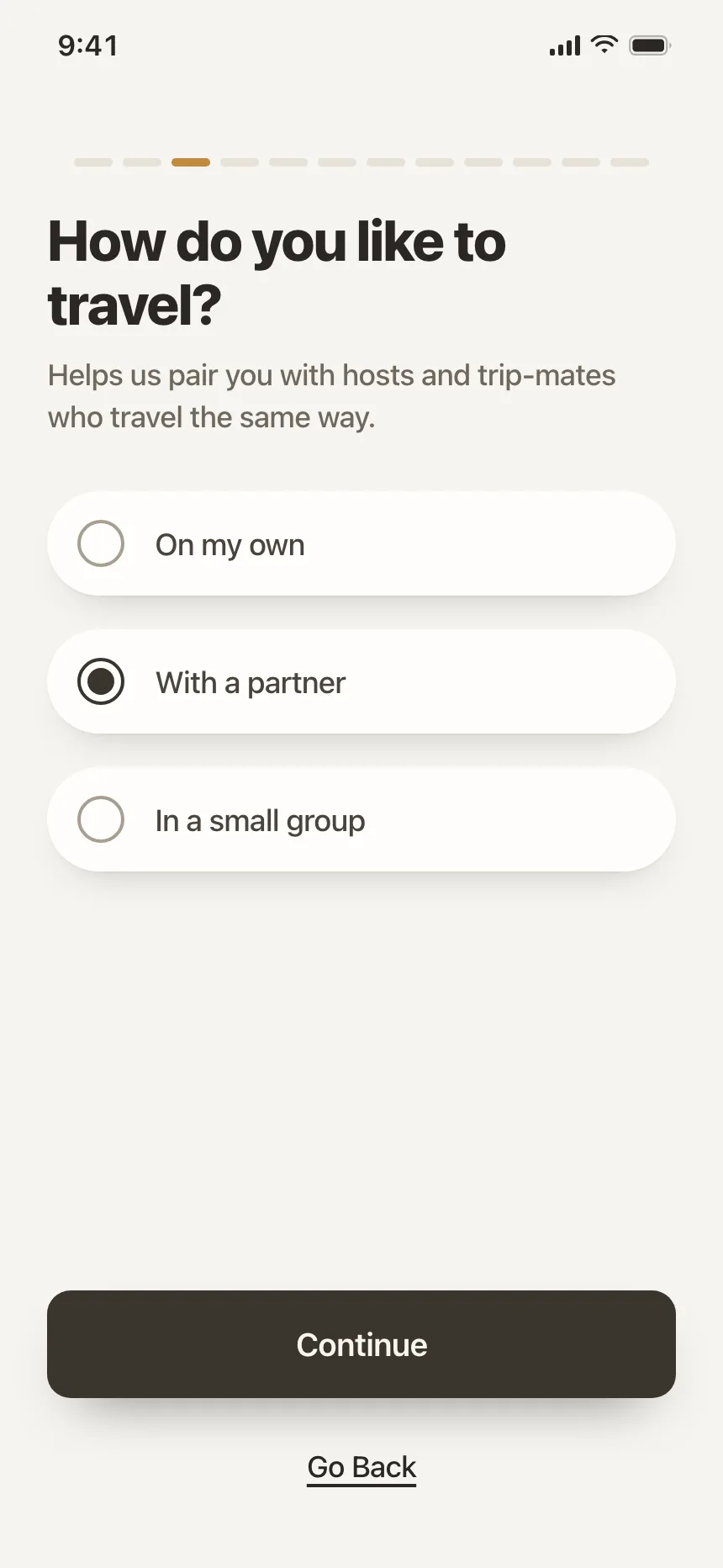
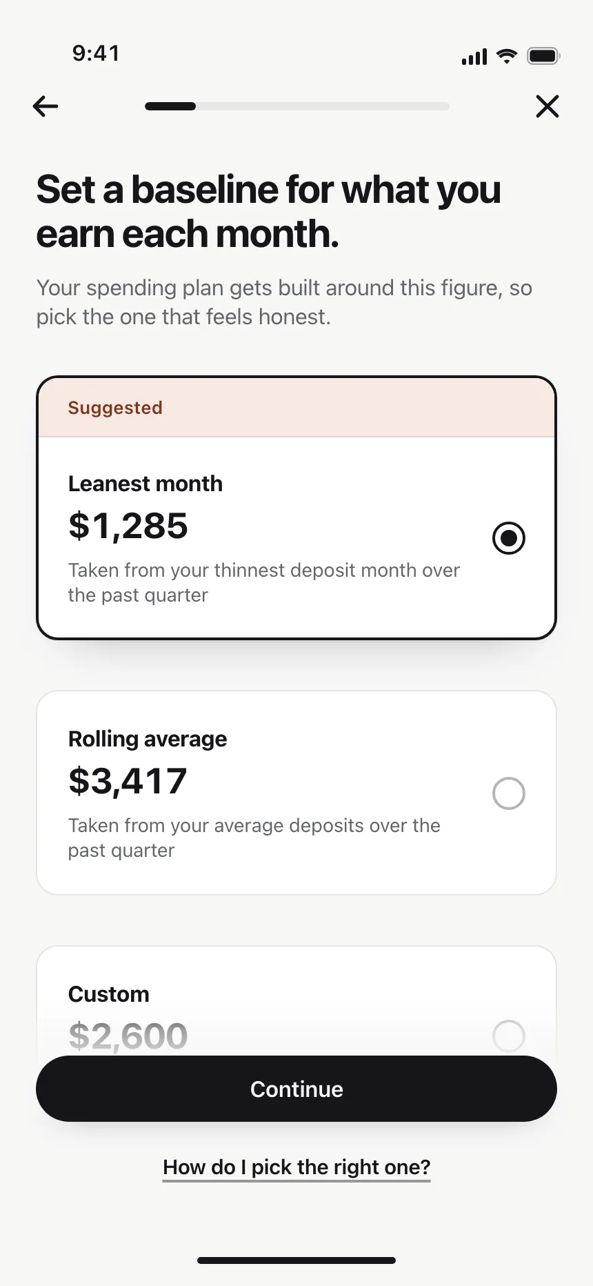
Onboarding questions
One question per screen, with big tappable rows and a Continue button below.
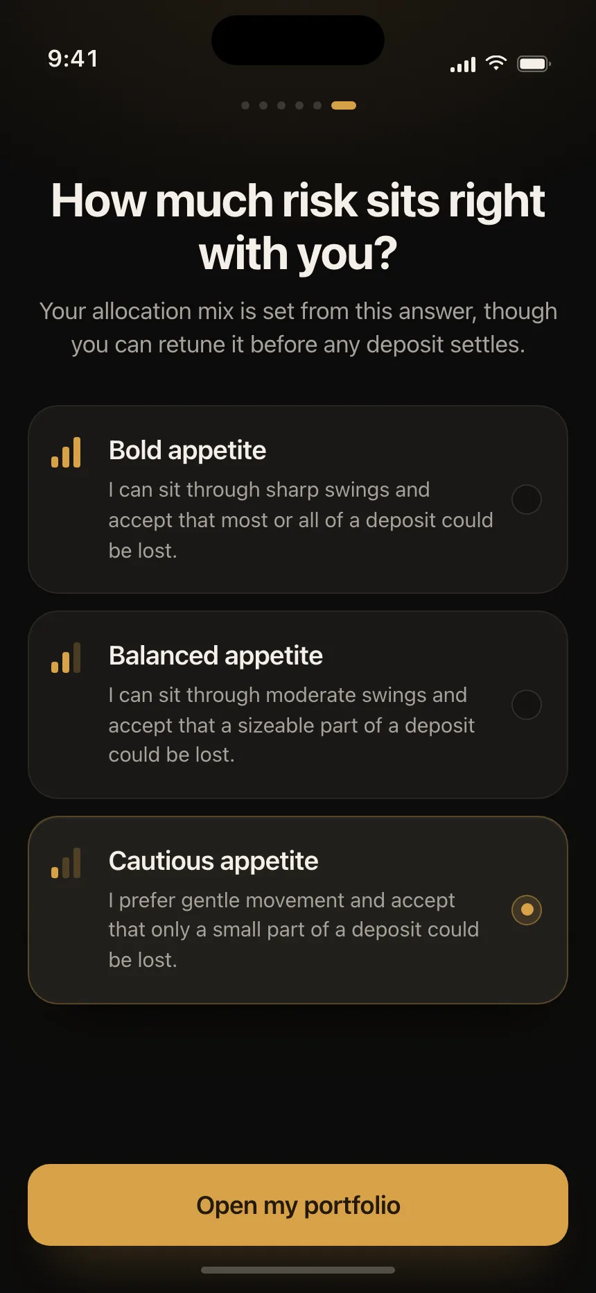
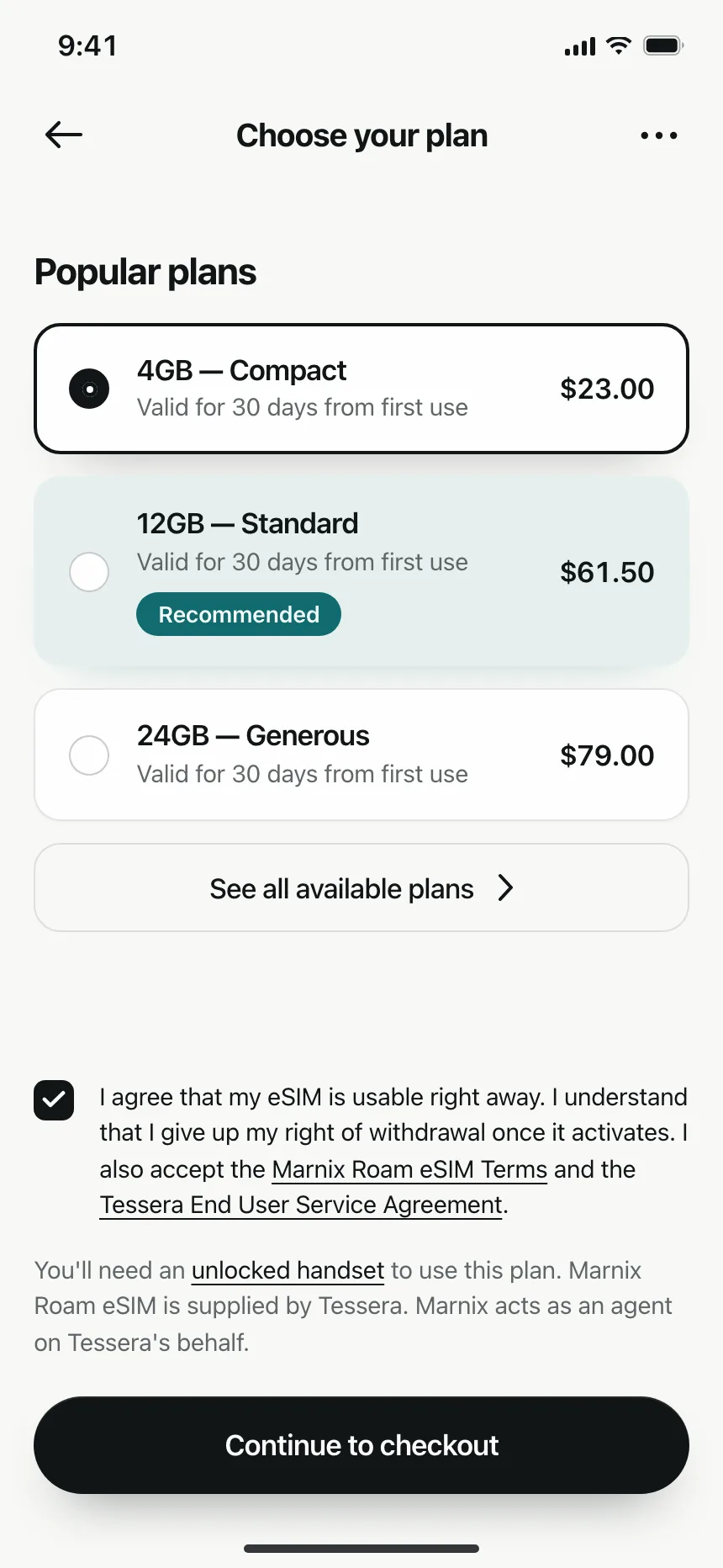
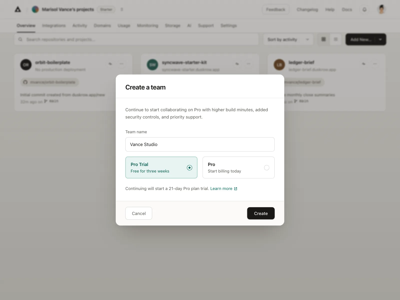
Plans and amounts
Data plans, team tiers and savings amounts, each with its price on the card.
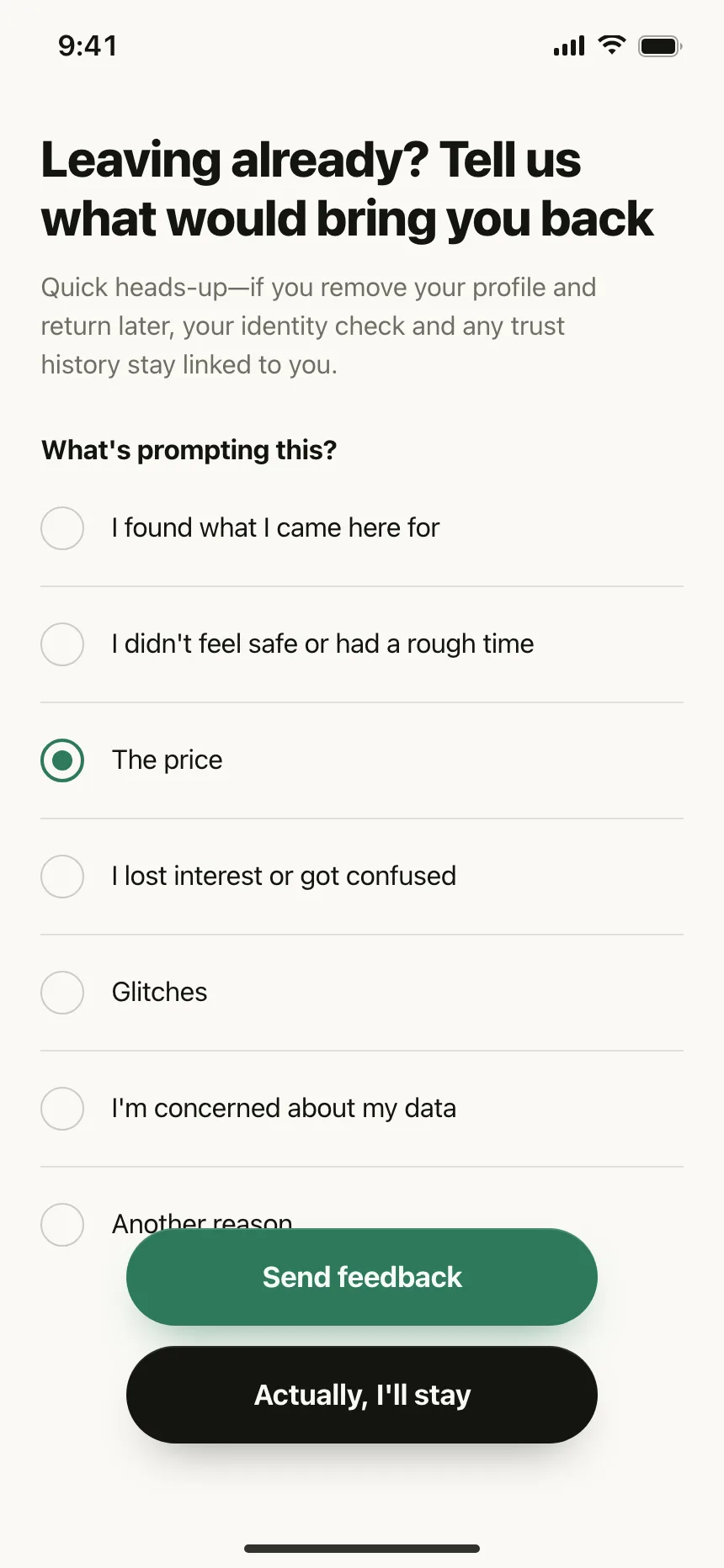
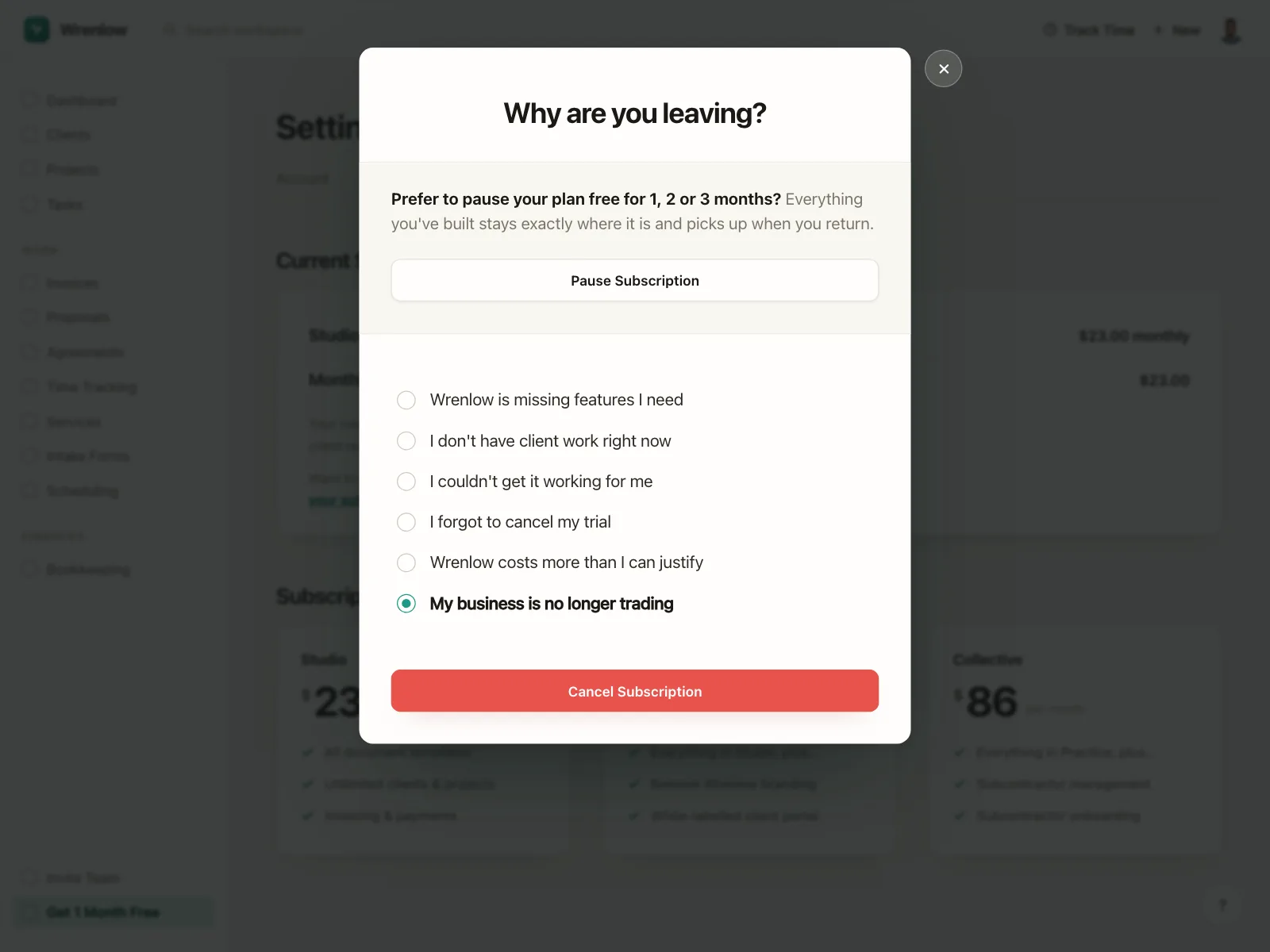
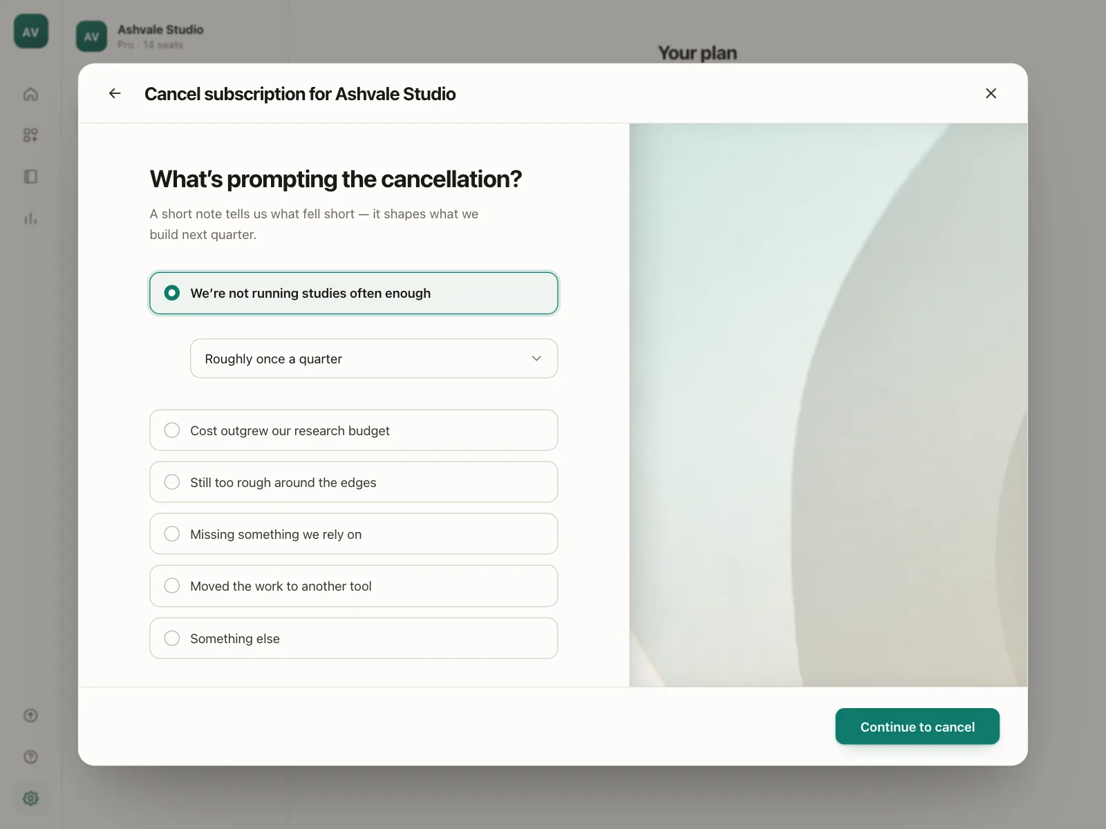
Cancellation surveys
A short list of reasons before someone leaves, with one answer and an optional note.
Radio button vs similar components
Build notes
- Give every radio in a group the same name, so selecting one clears the others.
- Wrap the group in a <fieldset> with a <legend> that asks the question.
- The group is one tab stop. Arrow keys move the selection and wrap at the ends.
- For custom radios, use role="radiogroup" around elements with role="radio" and aria-checked.
- Put radios to the left of their labels, and make the label clickable.
- Add None of the above or I do not know when that is a valid answer.
FAQ
Should I use radio buttons or checkboxes?
Use radio buttons when people can pick only one option, and checkboxes when they might need more than one. A radio group can never hold two answers, so it suits questions like a plan, a size or a delivery speed.
Should one radio button be selected by default?
In a form question, usually not. The GOV.UK Design System advises against pre-selecting, because people are more likely to miss the question or submit the wrong answer. For a setting that already has a value, like a sort order, show the current value as selected.
How do arrow keys work in a radio group?
The whole group is one tab stop. Tab moves focus to the selected radio, or the first one if none is selected. The arrow keys move to the next or previous option and select it, wrapping at the ends, and Tab leaves the group.
Radio buttons or a dropdown?
Radio buttons show every option at once, which suits short lists people should read and compare. A dropdown hides its options behind a click, which suits long, familiar lists like countries or time zones.
Related terms
All glossary terms · Browse 55 web and 35 mobile radio button designs