
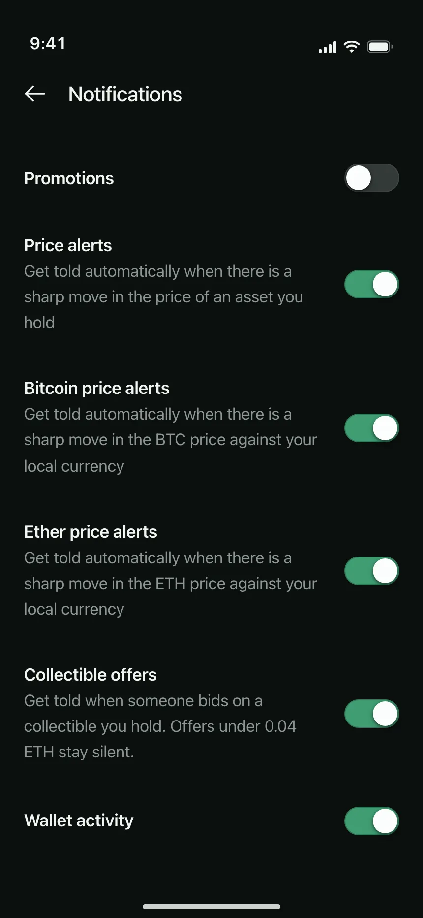
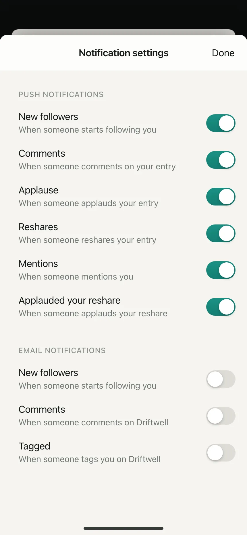
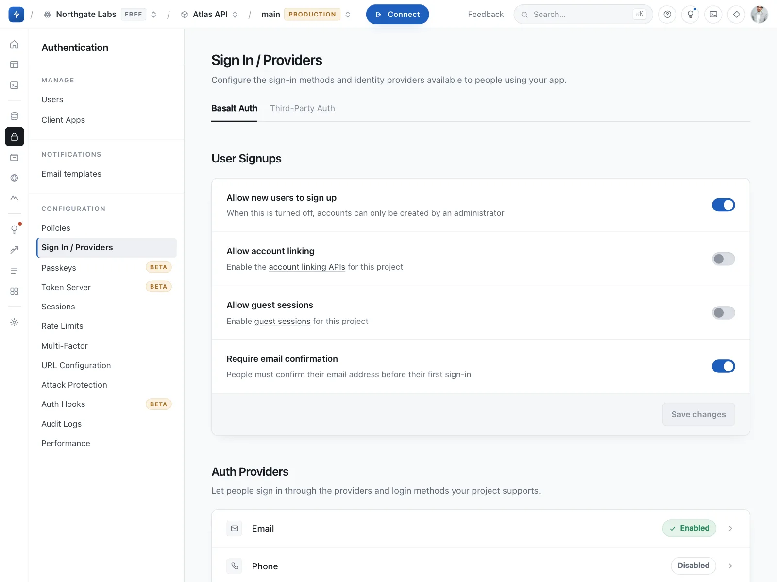
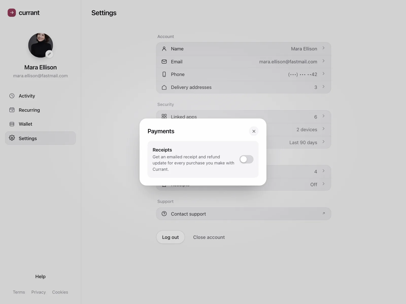
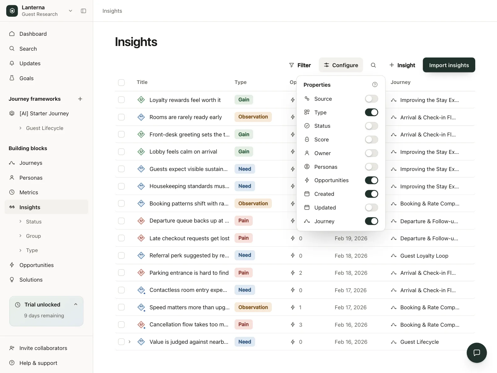
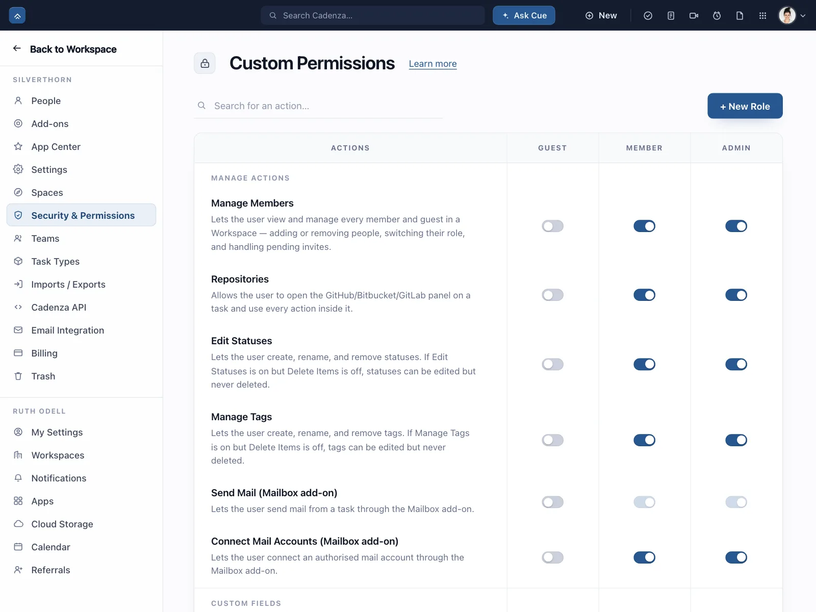
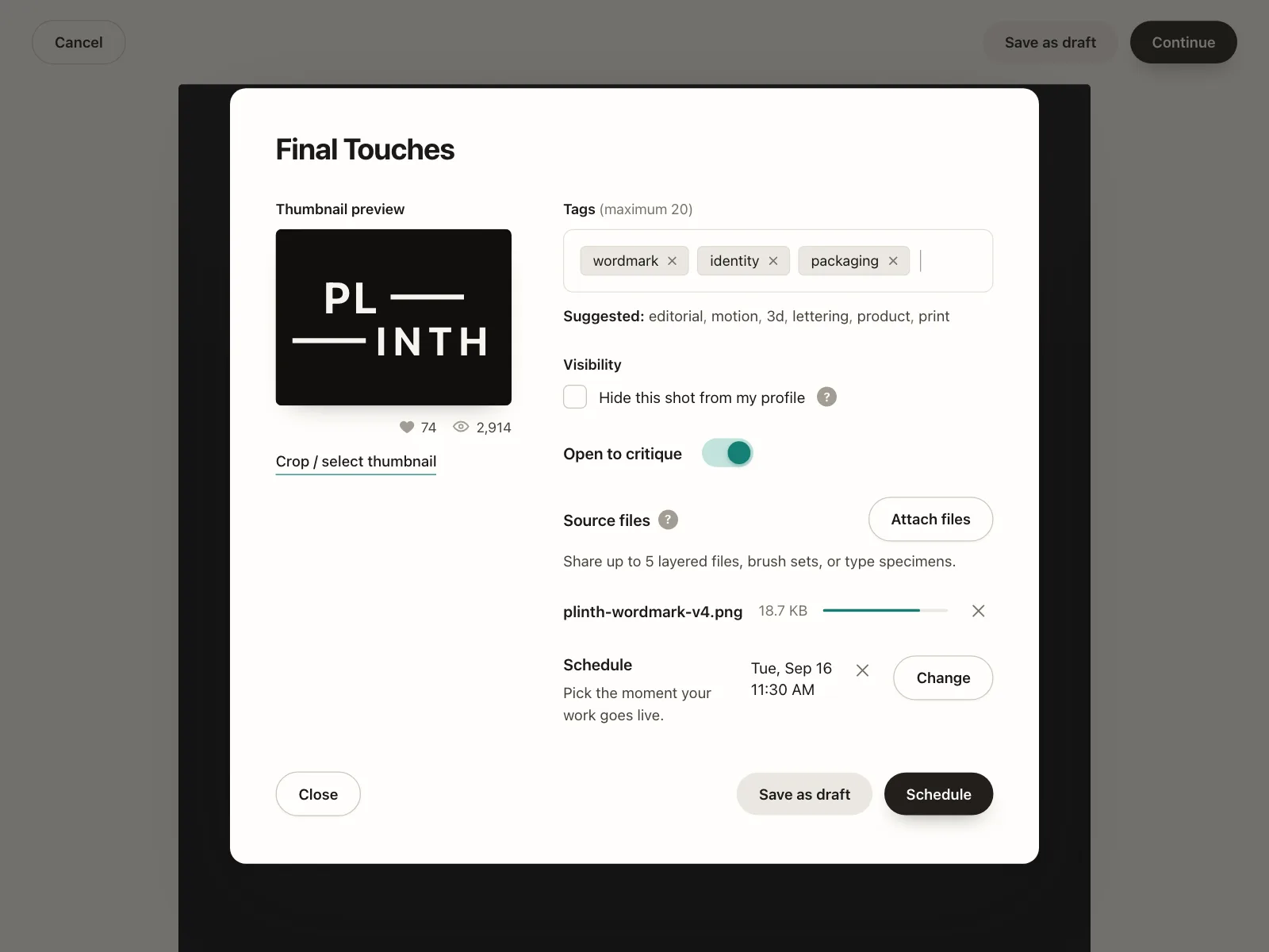
Toggle switches from the Kombai gallery: a crypto wallet's alerts, a journaling community's notifications and a backend console's sign-in providers.
What is a toggle switch?
A toggle switch is a two-state control for a single option. Sliding the thumb across the track flips the option between on and off, and the new state applies immediately, with no Save button.
- On fills the track with an accent color. Off shows a neutral track.
- Each switch controls exactly one thing, named by the label beside it.
Toggle switches show up across settings, notifications, permission and search screens.
When to use a toggle switch
- Instant changesThe setting applies the moment it flips, like muting alerts.
- One binary optionThe option has a clear on and off, like dark mode.
- An obvious labelPeople can tell from the label exactly what turns on.
When not to use one
- Changes that wait for SaveInside a form with a submit button, use a checkbox.
- More than two choicesUse radio buttons, a segmented control or a dropdown.
- Unclear effectsIf people can't predict what happens, use a button that names the action.
Anatomy of a toggle switch
This one works. Flip it, or tab to it and press Space.
- Off
- On
- Disabled
- Keyboard focus
- TrackCarries the state color
- ThumbSlides to show on or off
- LabelNames what turns on
- DescriptionOptional, one line
- StatesOff, on, disabled, focus
Toggle switch variants
We sorted every toggle switch design in the Kombai gallery and found five patterns. Browse all 59 web and 35 mobile designs.
1. Switch rows with descriptions
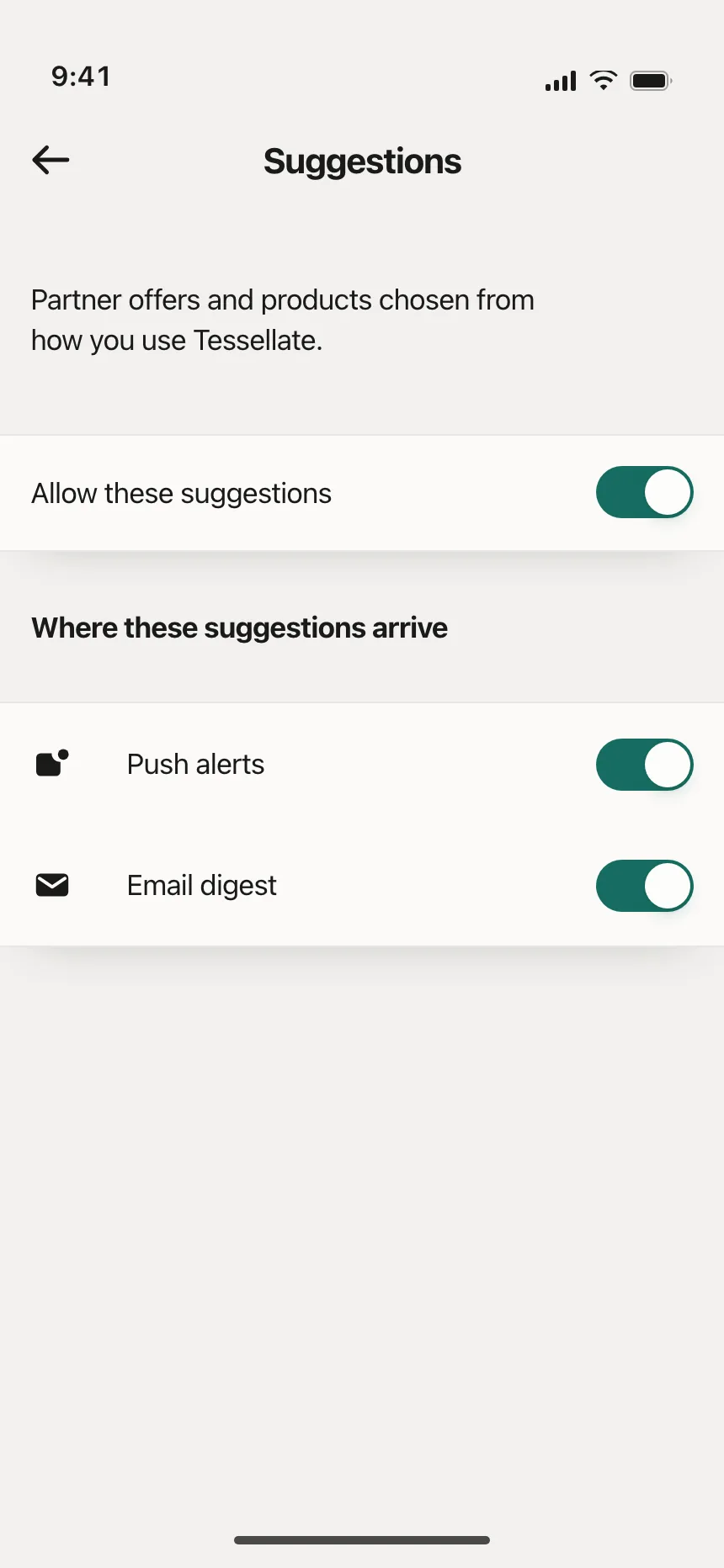
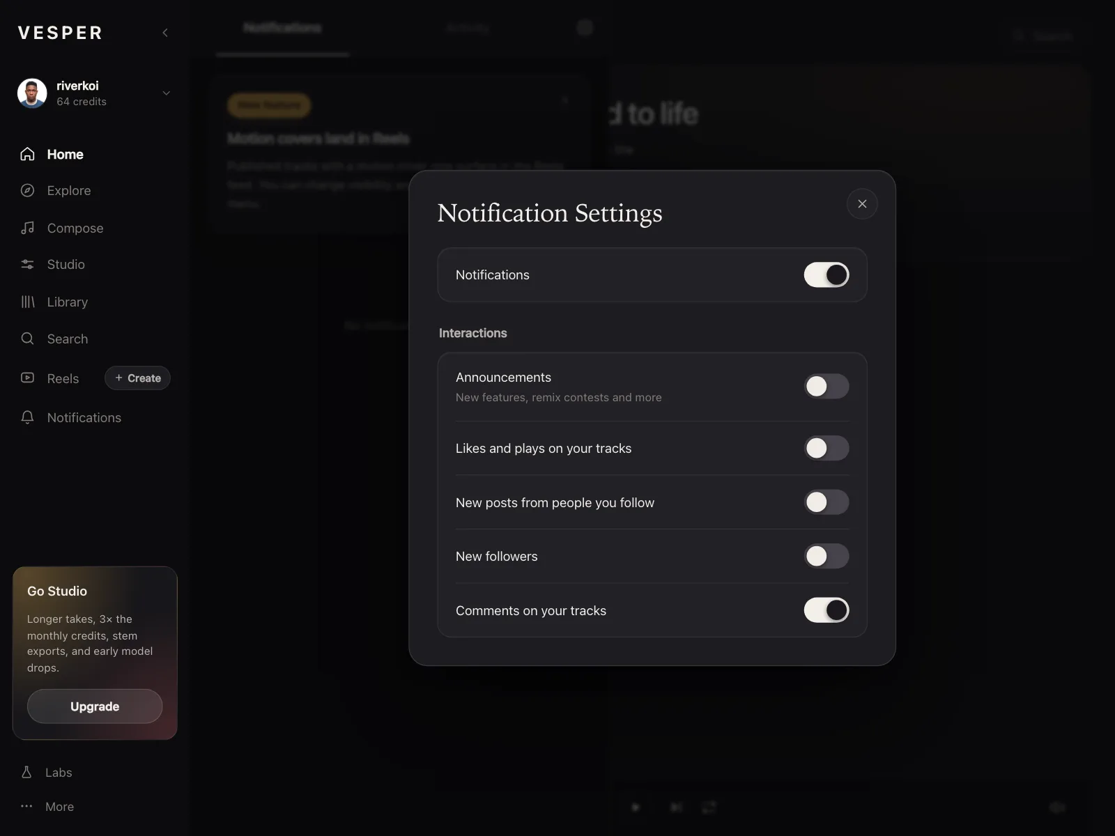
The default. A label, a one-line explanation and the switch at the end of the row.
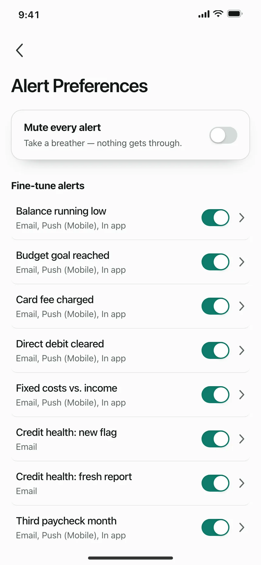
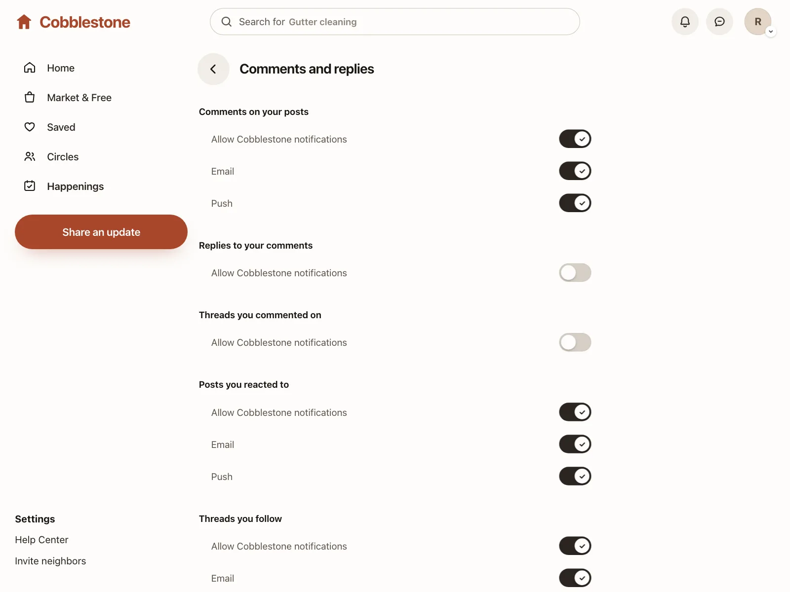
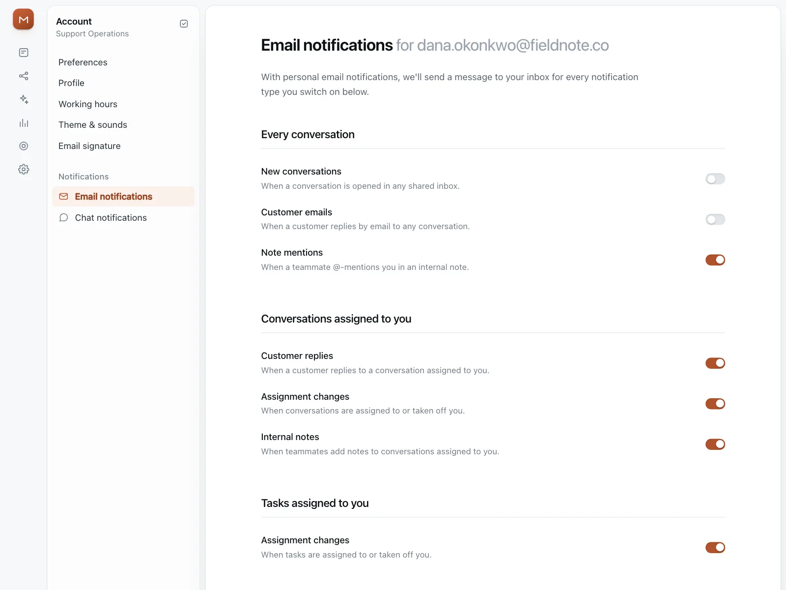
2. Switch cards
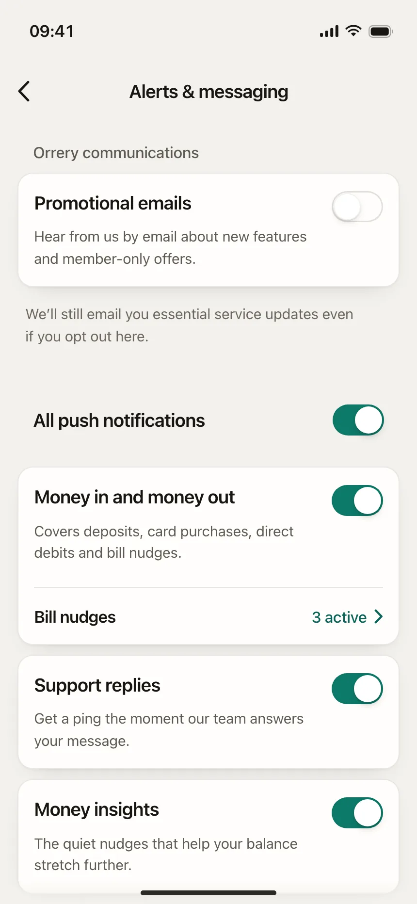
Each switch sits in its own card with an icon and a longer explanation, for options that each need context.
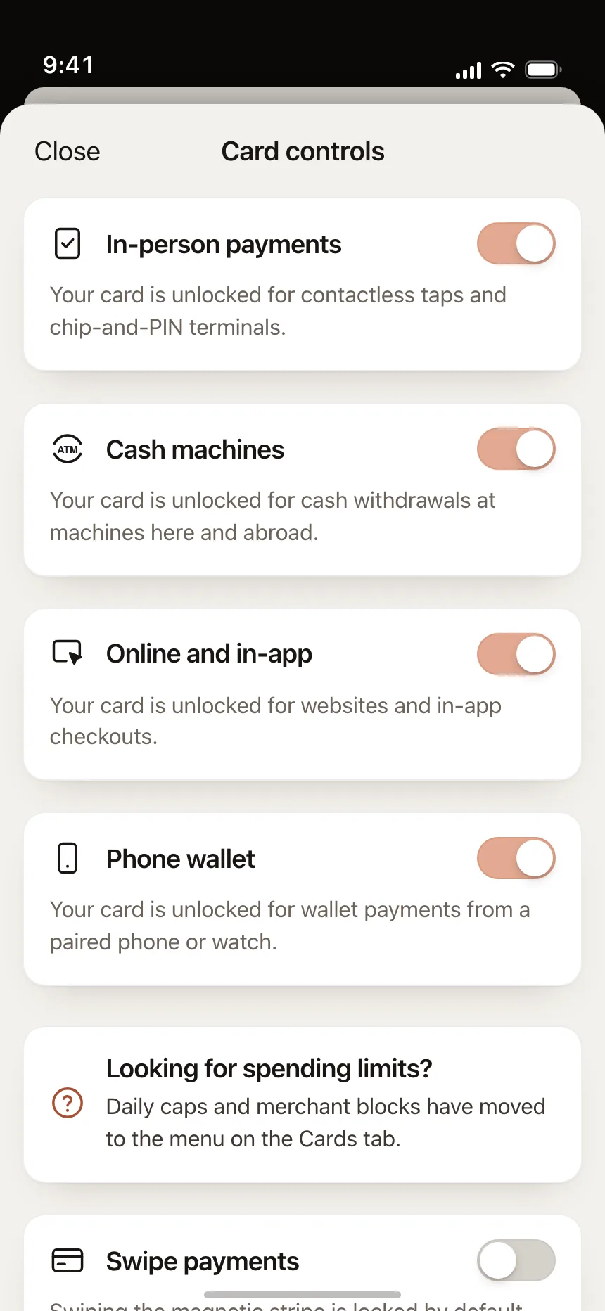
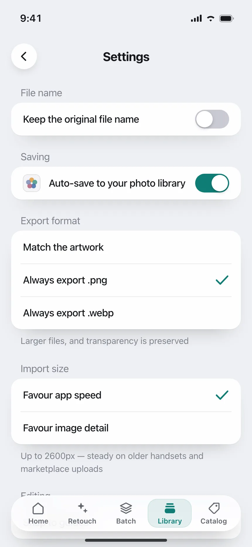
3. Labeled switches
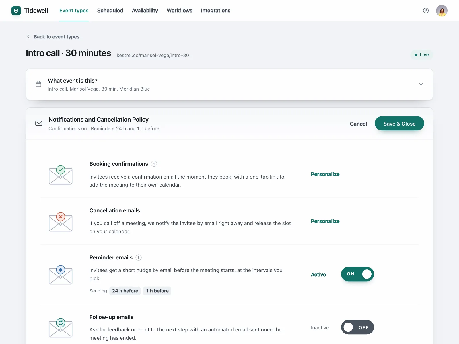
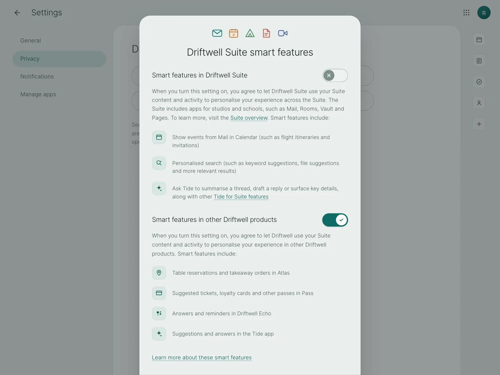
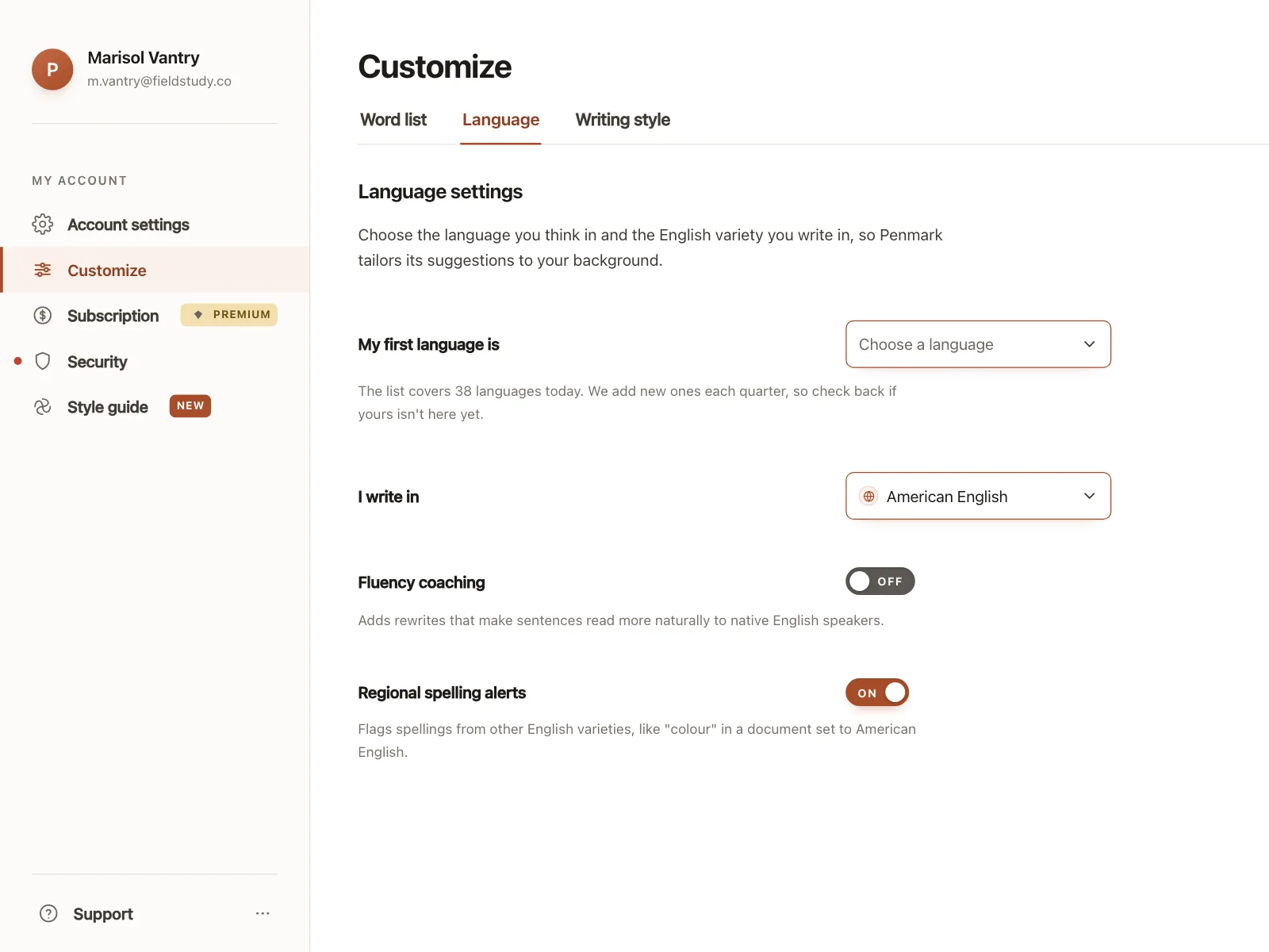
ON and OFF text, or a check inside the thumb, so the state doesn't depend on color alone.
4. Master switch
One switch at the top turns a whole group on or off, with the individual switches below it.
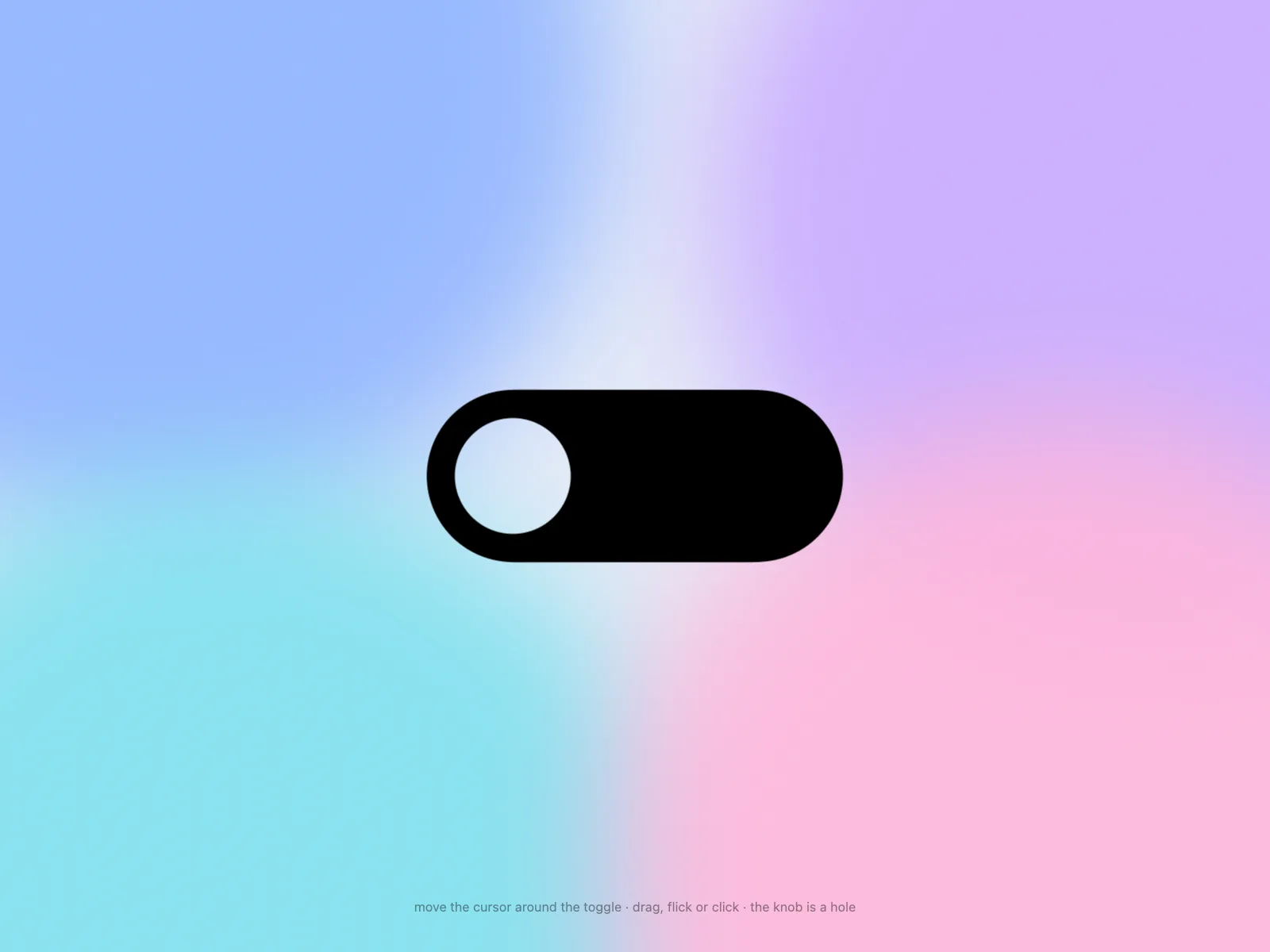
5. Expressive switches
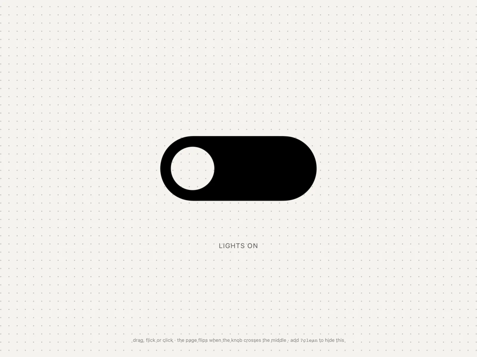
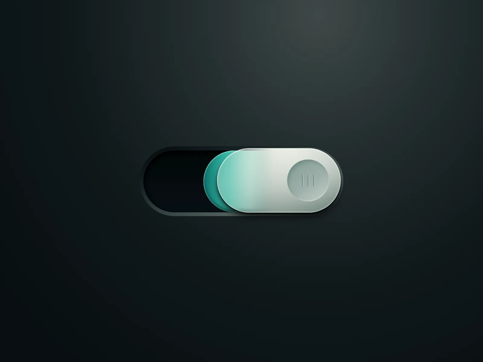
Oversized, animated switches used as a product moment, like a theme flip on a landing page.
Where toggle switches show up
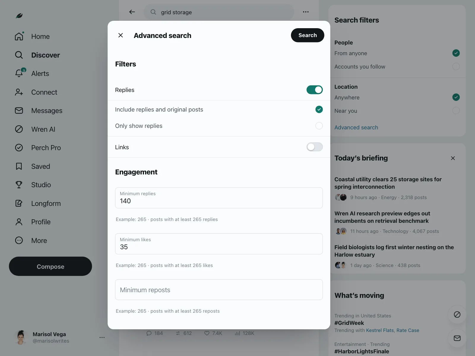
Filters and search
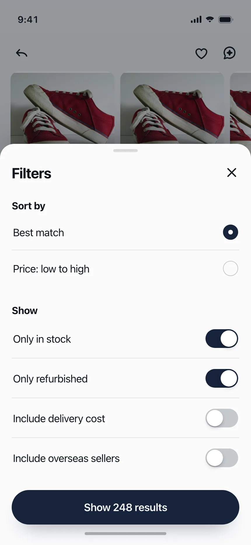
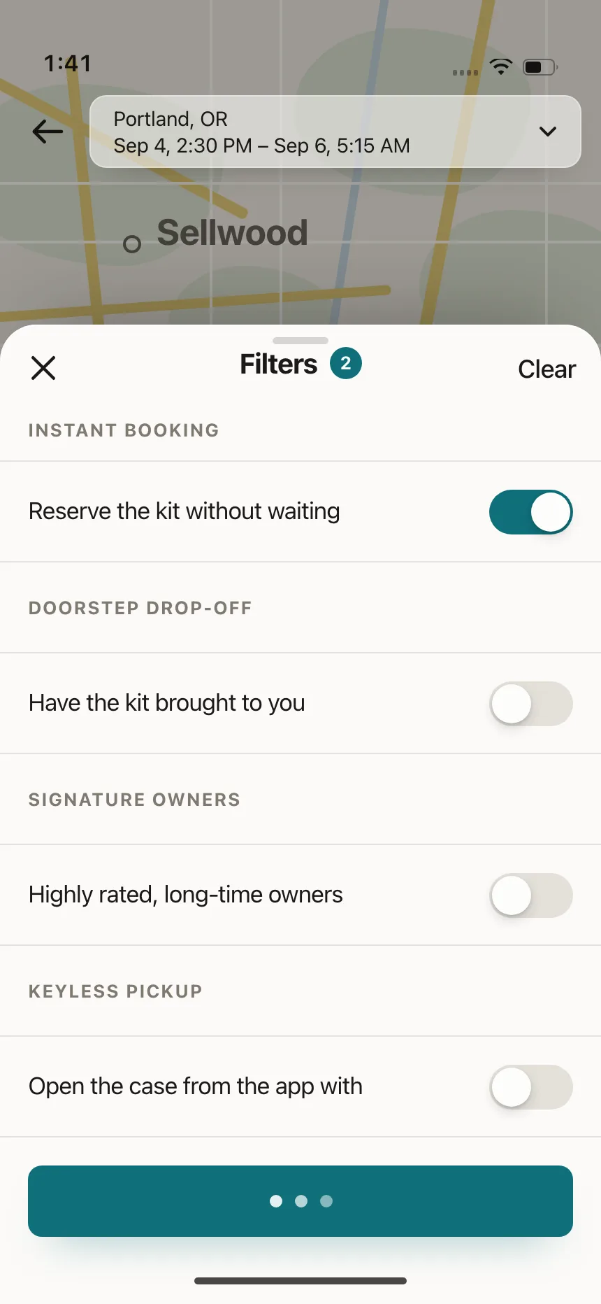
Switches turn individual filters on in a sheet or modal, next to sort options.
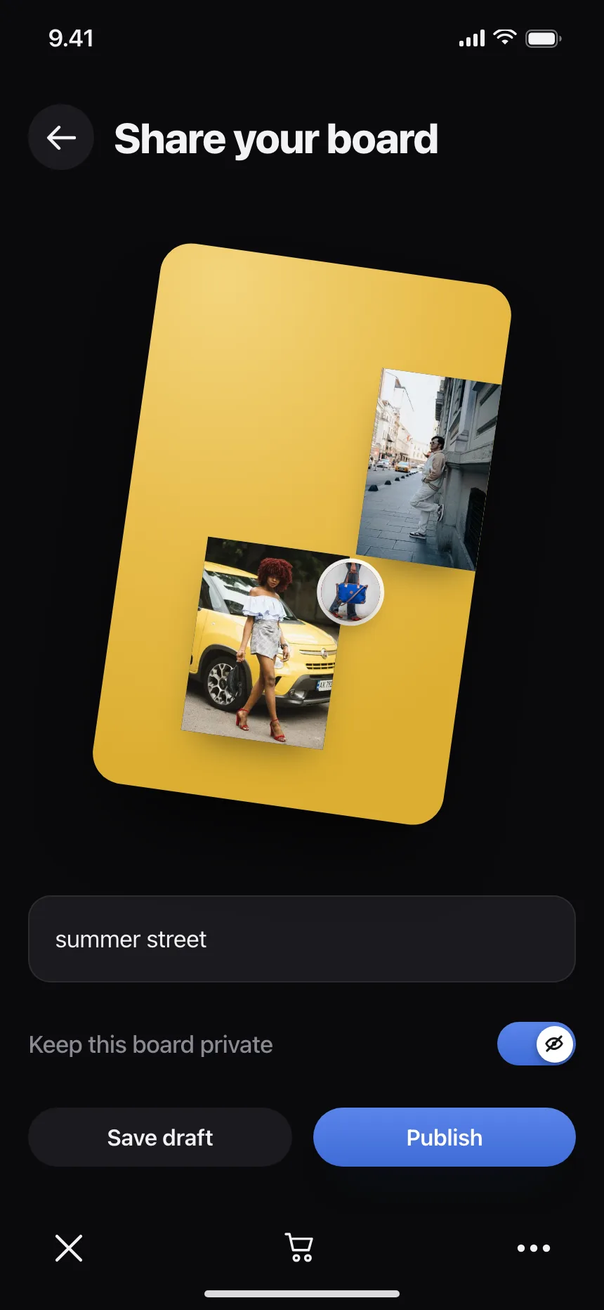
Sharing and privacy
A single switch decides who can see a board, a project or a link.
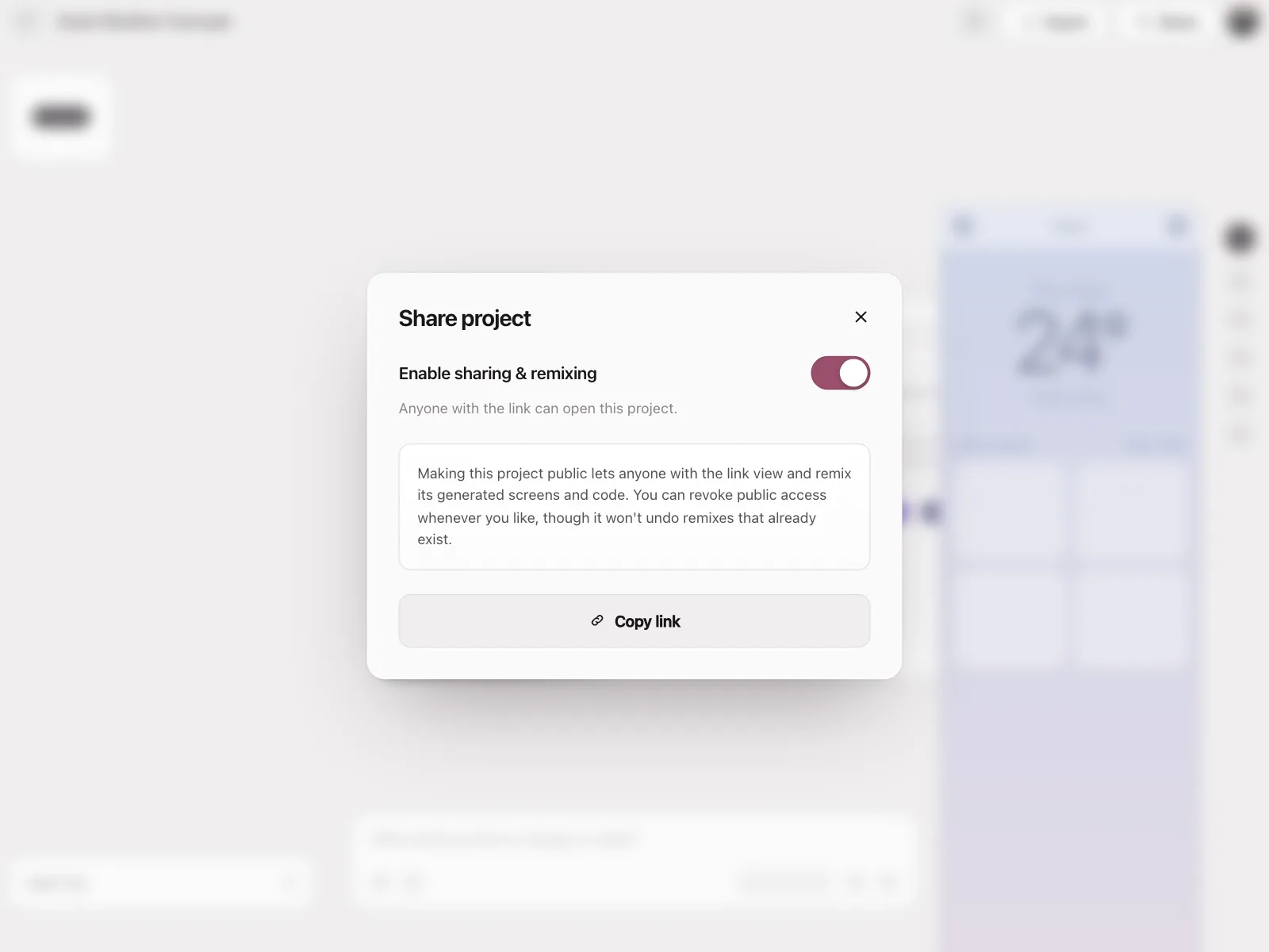
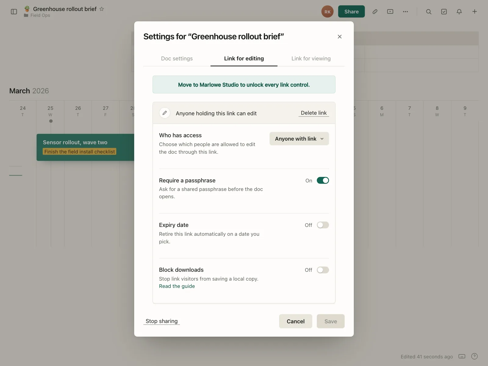
Consent and permissions
Per-category consent, AI training opt-ins and tool permissions.
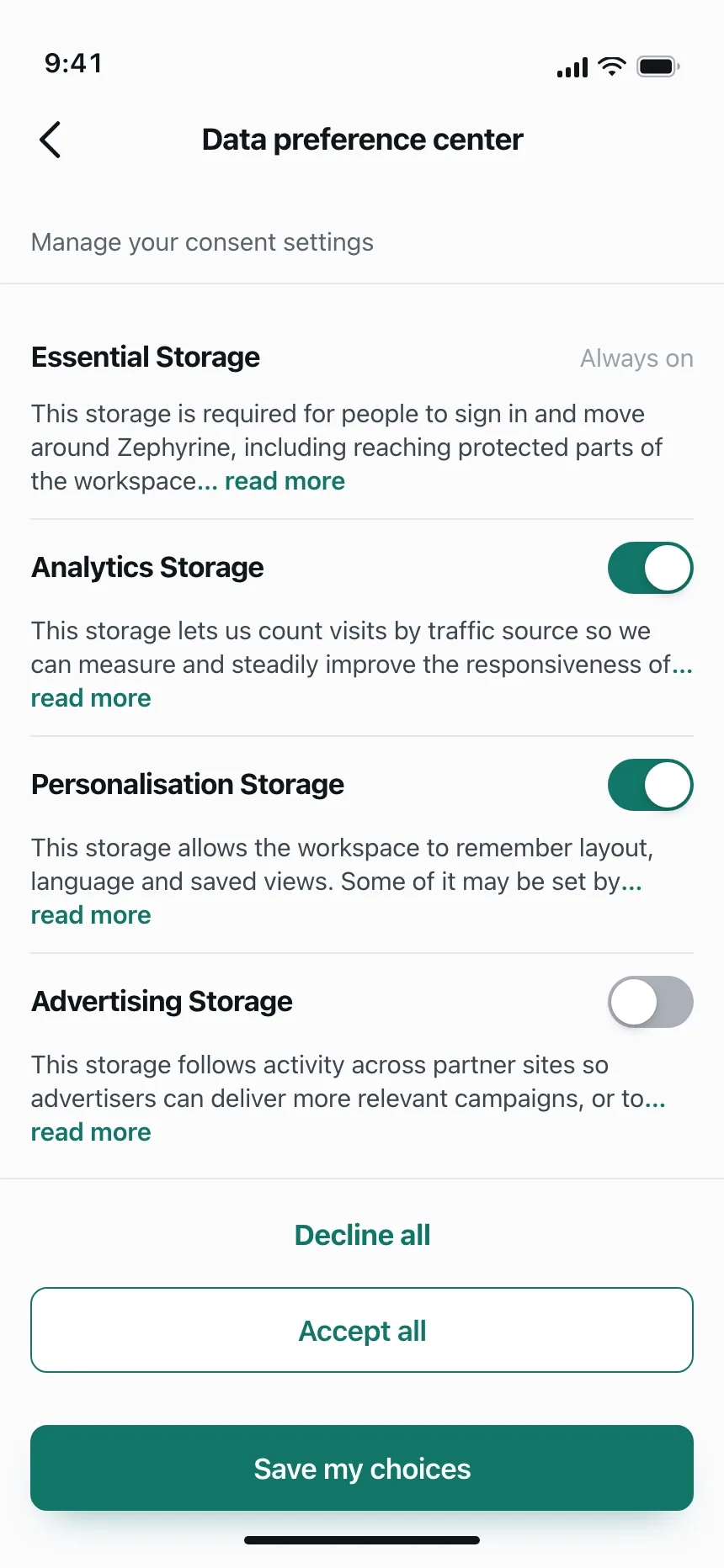
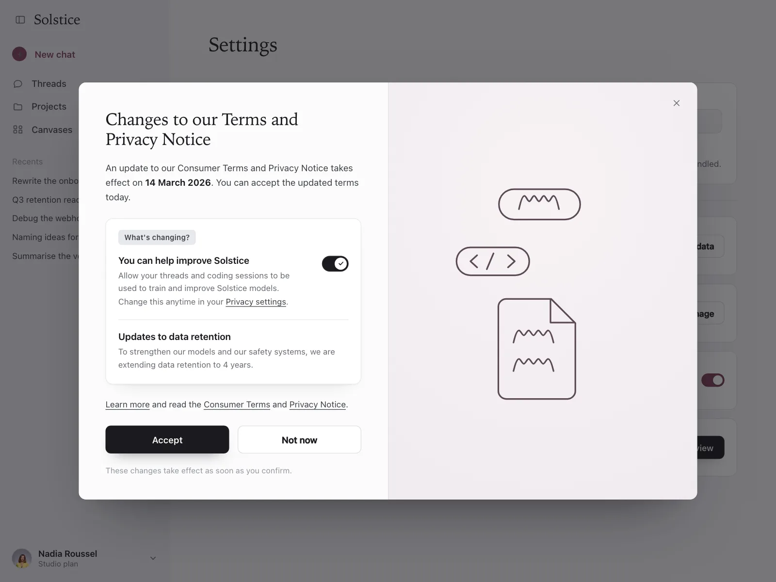
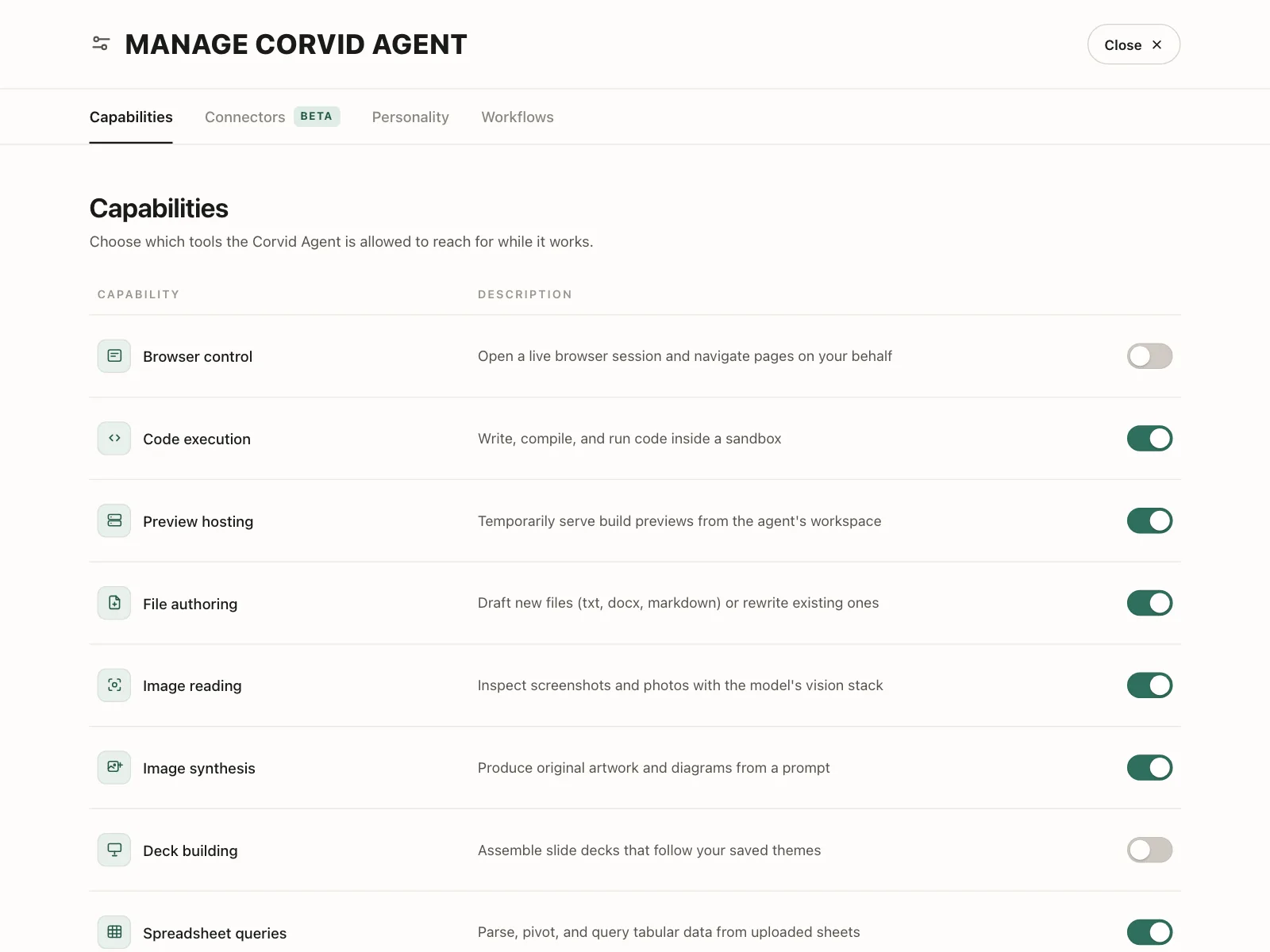
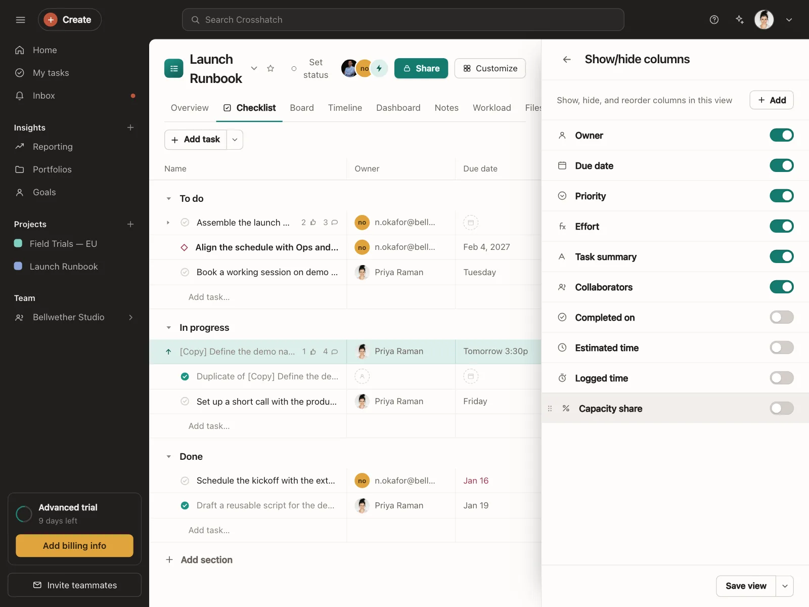
Table and view options
Show or hide columns, and set permissions per role across a matrix.
Toggle switch vs similar components
Build notes
- Use role="switch" with aria-checked, or a native checkbox styled as a switch.
- Make the whole row the click target, label included.
- Space toggles it, and keyboard focus needs a visible ring.
- Pair color with a second cue: thumb position, a check or ON and OFF text.
- Keep touch targets at 44 by 44 points or more on mobile.
- Save on flip and show a failure inline. Don't add a Save button.
FAQ
What's the difference between a toggle switch and a checkbox?
A toggle switch applies its change the moment it flips. A checkbox records a choice that usually takes effect when the form is submitted, and it works for picking several options from a list.
Should a toggle switch save immediately?
Yes. People expect a switch to act right away, like a light switch. If the change needs a confirm step or a Save button, use a checkbox instead, and if saving fails, flip the switch back and say why next to it.
Should the label go on the left or the right?
Put the label on the left and the switch at the end of the row in settings lists, so labels line up and switches form one column. Standalone switches can sit to the left of a short label.
Is a toggle switch the same as a toggle button?
No. A toggle switch has a track and a thumb and stands for on or off. A toggle button is a regular button that stays pressed, like Bold in a text editor, and often sits in a group.
Related terms
All glossary terms · Browse 59 web and 35 mobile toggle switch designs