
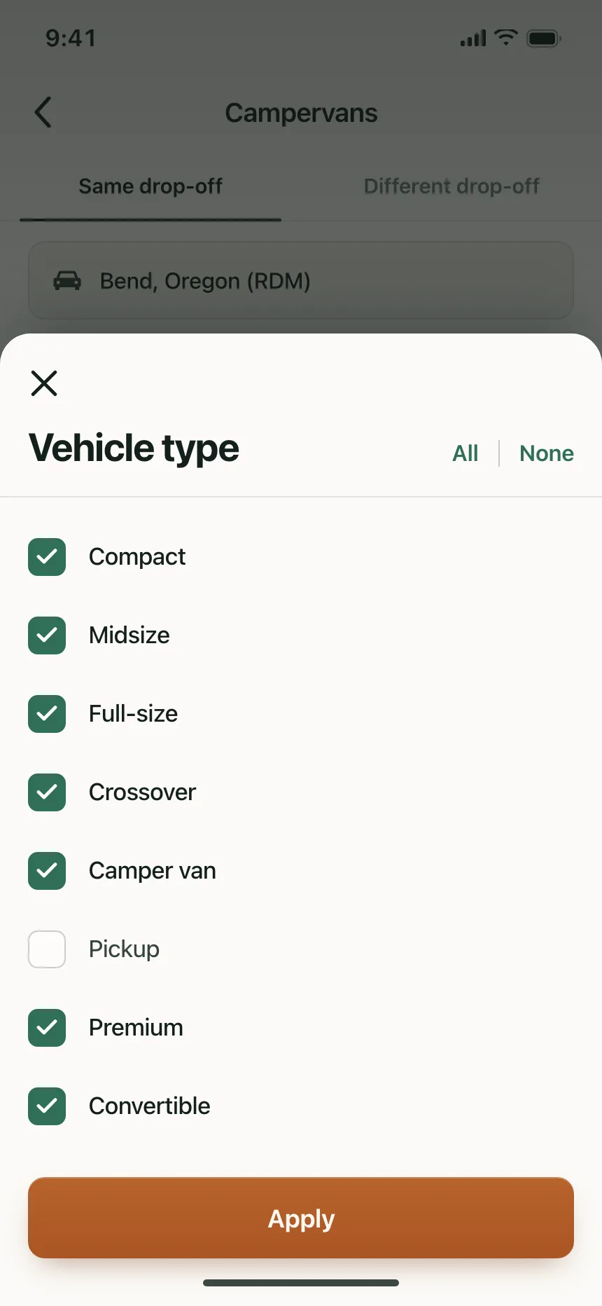
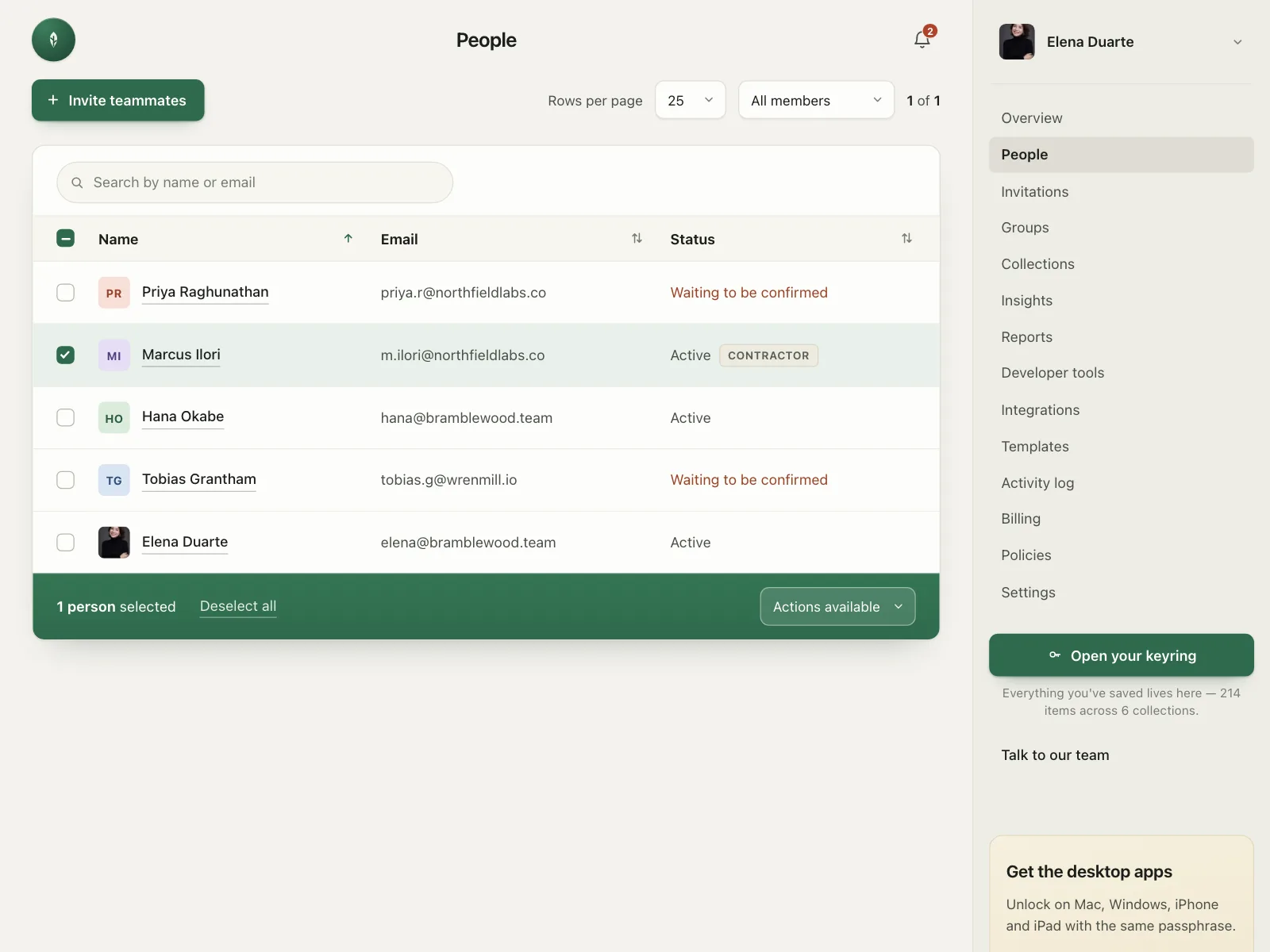
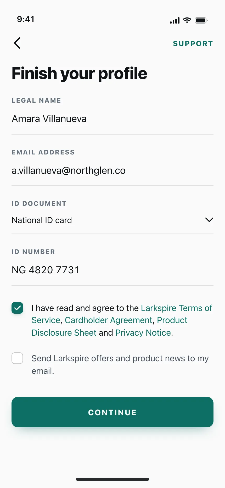
Checkboxes from the Kombai gallery: a campervan rental's vehicle filter, a password vault's members table and a card app's sign-up terms.
What is a checkbox?
A checkbox is a small square that people tick to select an option and tick again to clear it. In a group, each box works on its own, so people can pick none, one or all of the options. The choice usually takes effect when the form is submitted.
- A tick marks checked. A dash marks a parent box when only some of its options are checked.
- The label is part of the target: clicking it toggles the box.
Checkboxes show up across forms, tables, sign-up and checkout screens.
When to use a checkbox
- Picking several optionsFilters, export columns or interests, where any mix is valid.
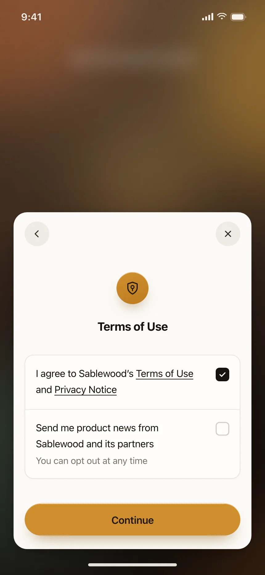
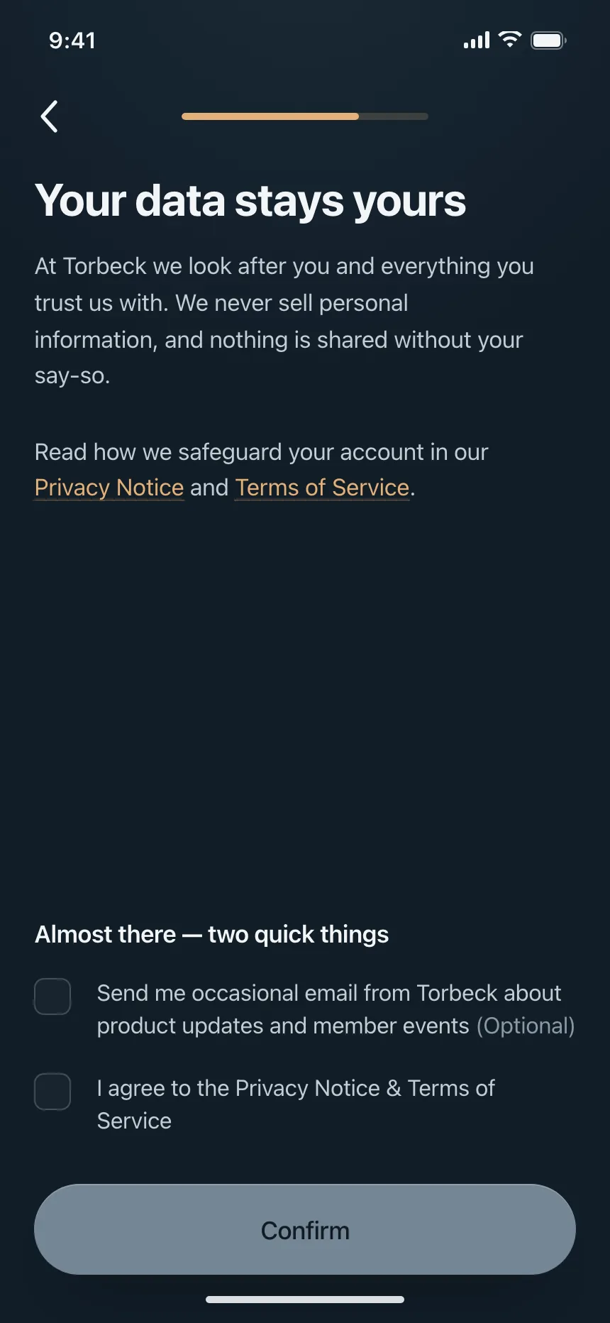
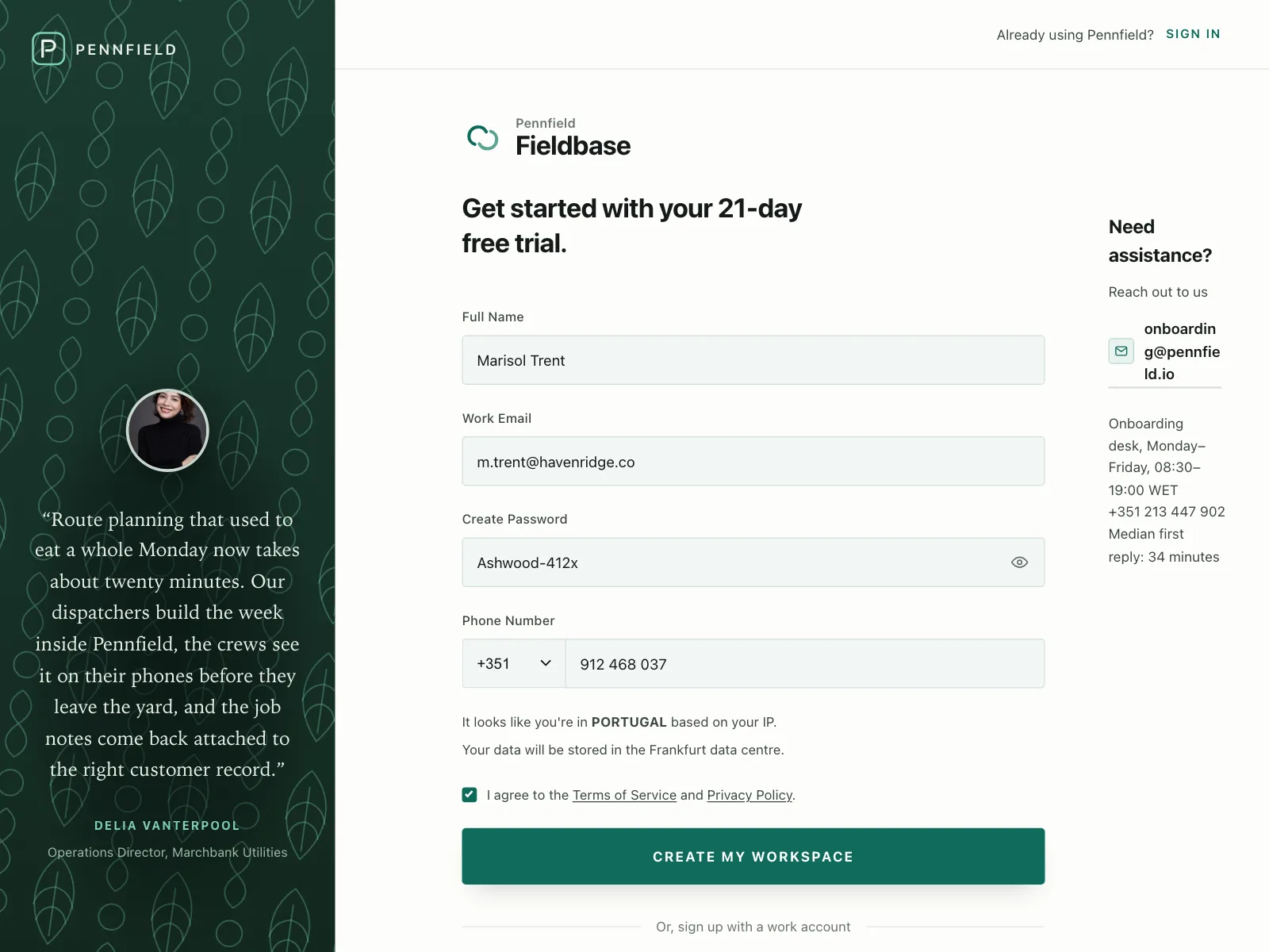
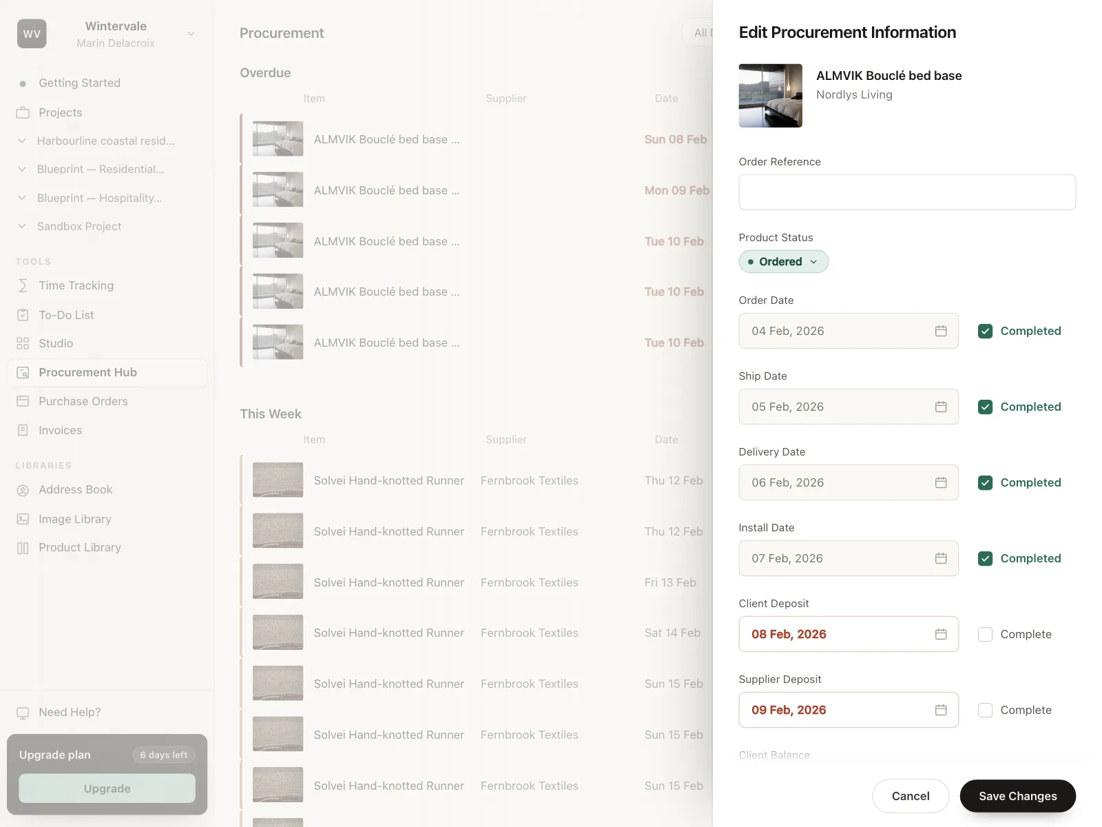
- Agreeing to termsOne box people tick before they continue, like accepting a policy.
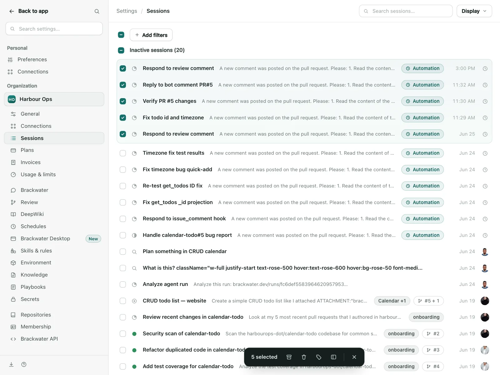
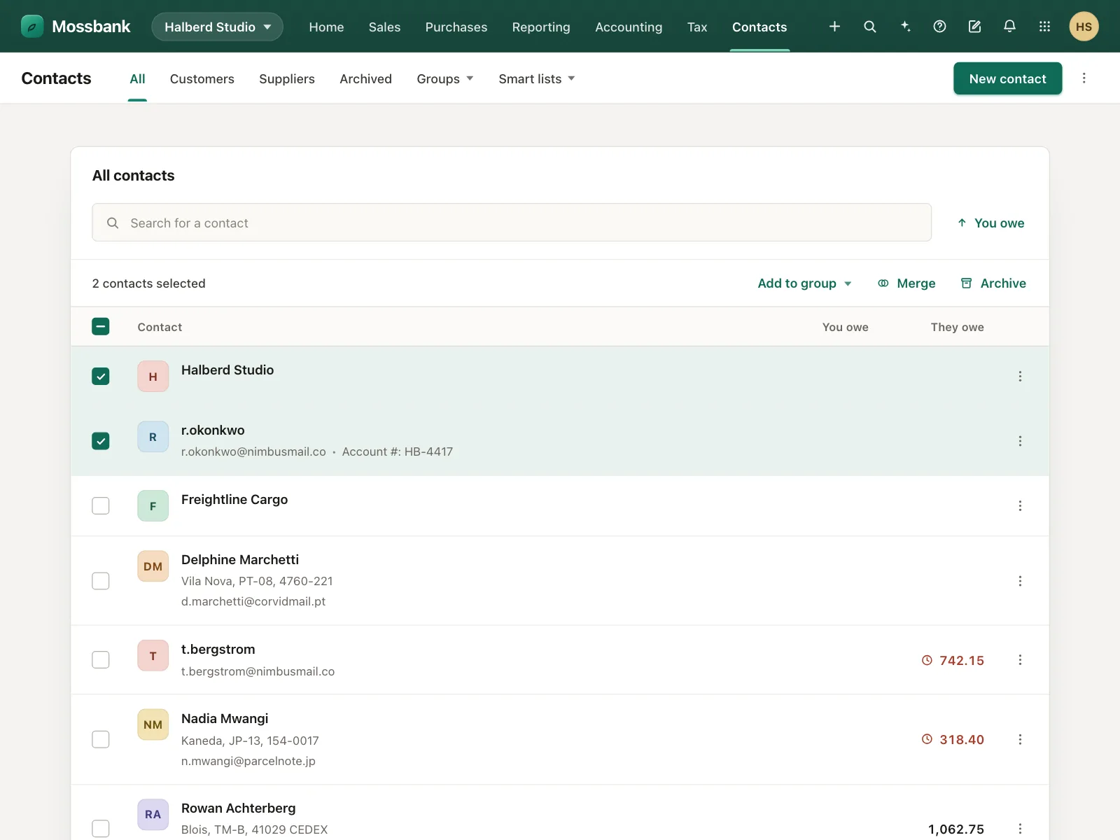
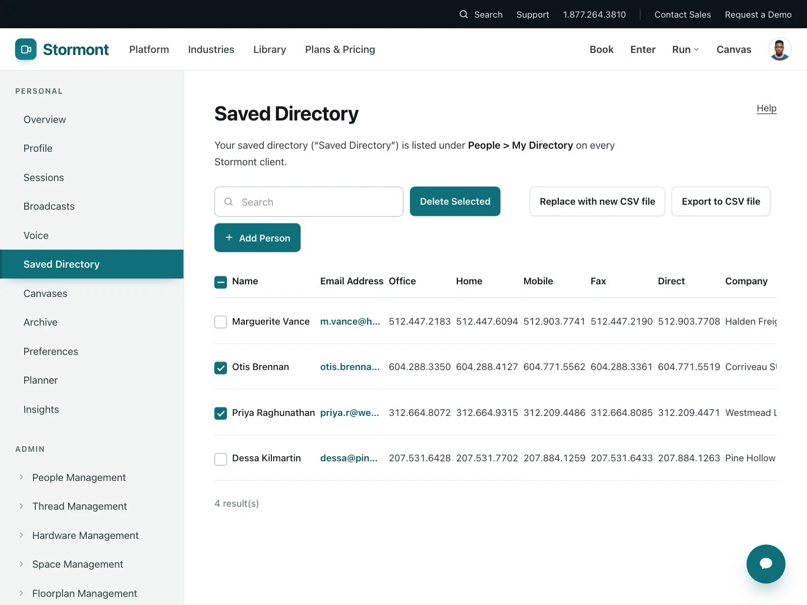
- Selecting rowsBulk actions on tables and lists, with a select-all box in the header.
When not to use one
- Only one answer allowedUse radio buttons or a segmented control.
- Settings that apply instantlyUse a toggle switch, which acts the moment it flips.
- Running a commandA checkbox records a choice. To run an action, use a button.
Anatomy of a checkbox
This one works. Tick a column, use All columns to select every one, or tab to a box and press Space.
- Unchecked
- Checked
- Mixed
- Disabled
- Keyboard focus
- BoxThe square that holds the state
- Check markA tick, or a dash when mixed
- LabelClicking it toggles the box
- Group labelThe legend that names the list
- StatesUnchecked, checked, mixed, disabled, focus
Checkbox variants
We sorted every checkbox design in the Kombai gallery and found five patterns. Browse all 55 web and 35 mobile designs.
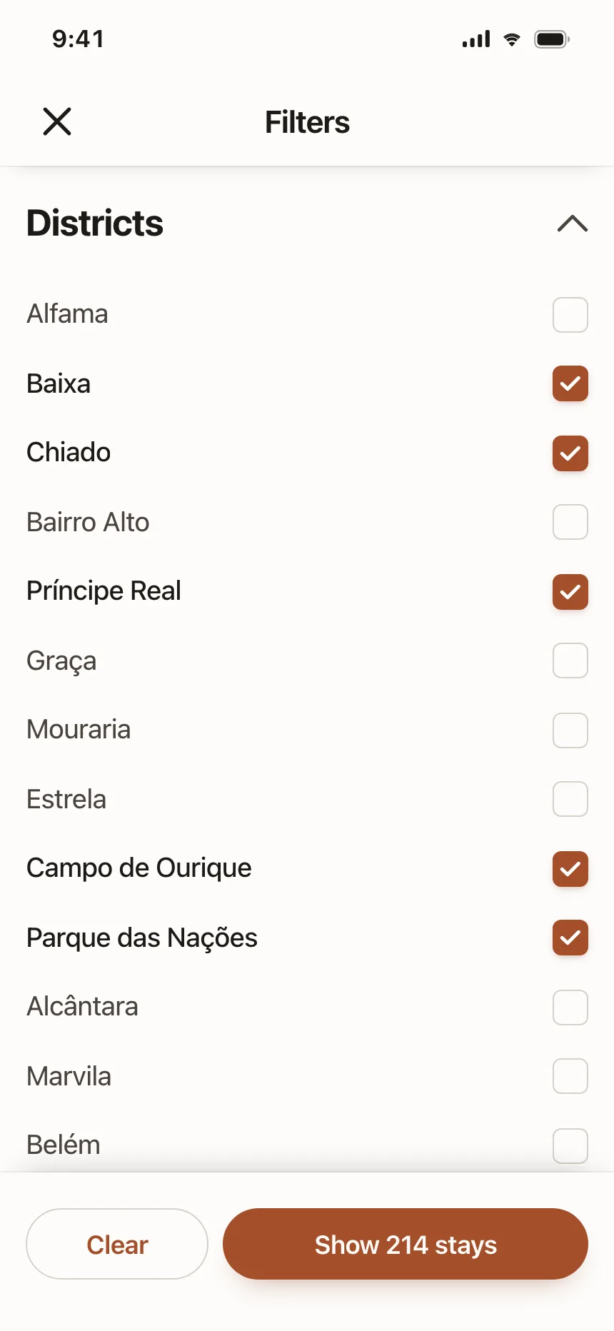
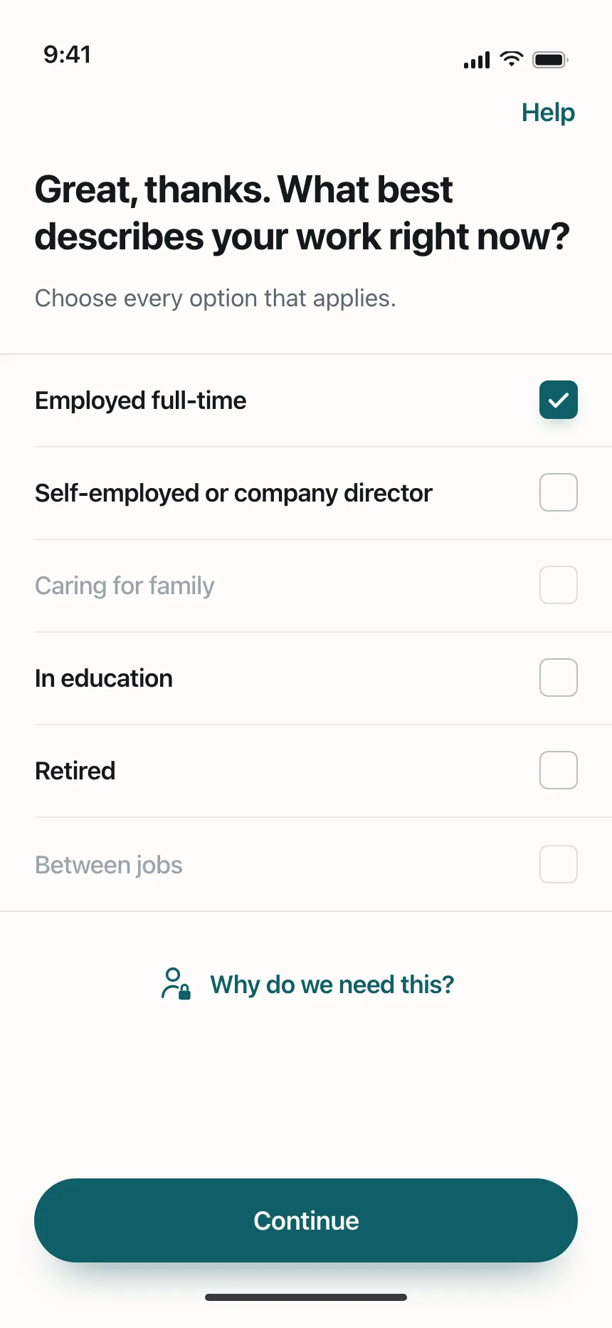
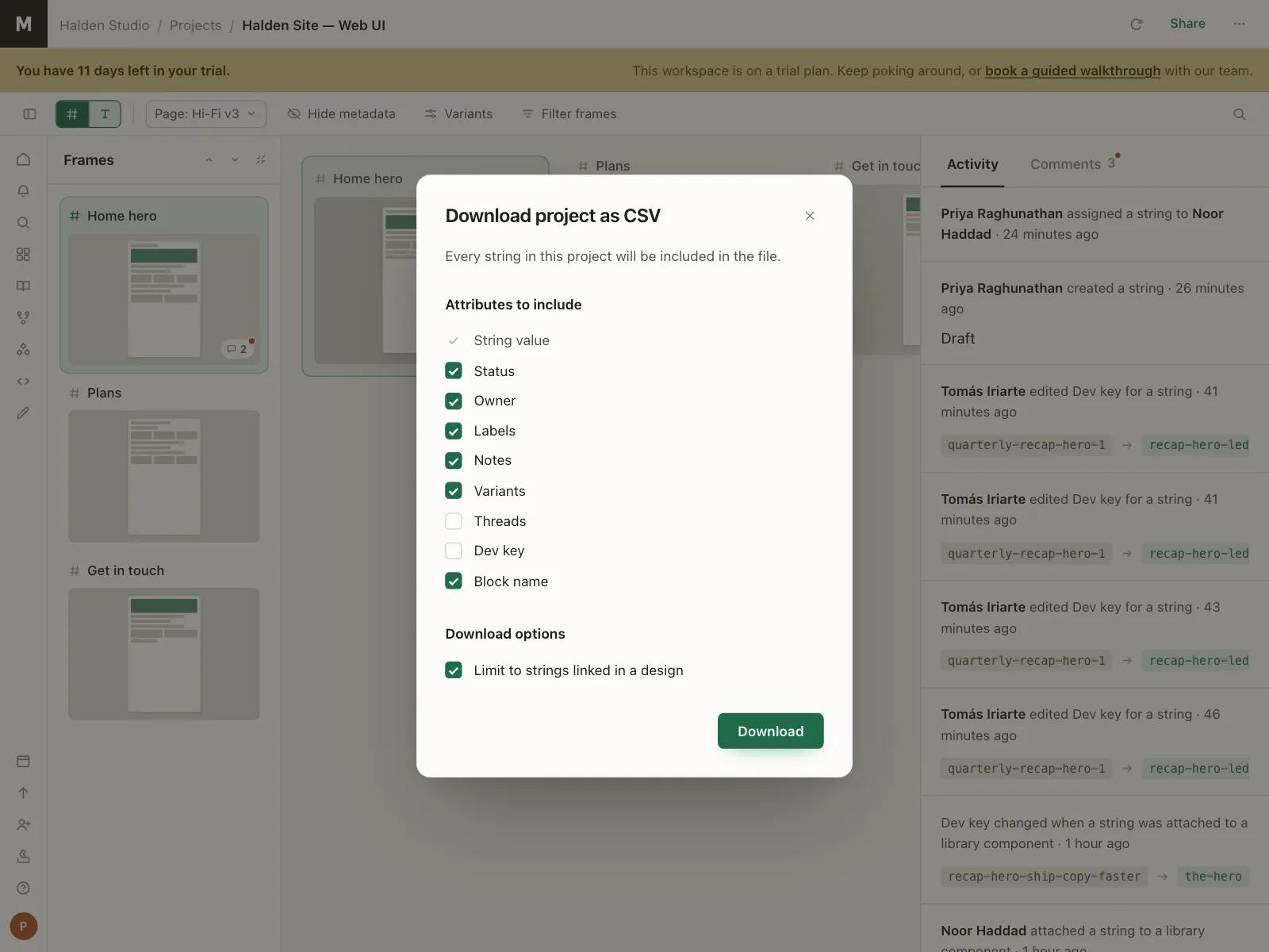
1. Checkbox lists
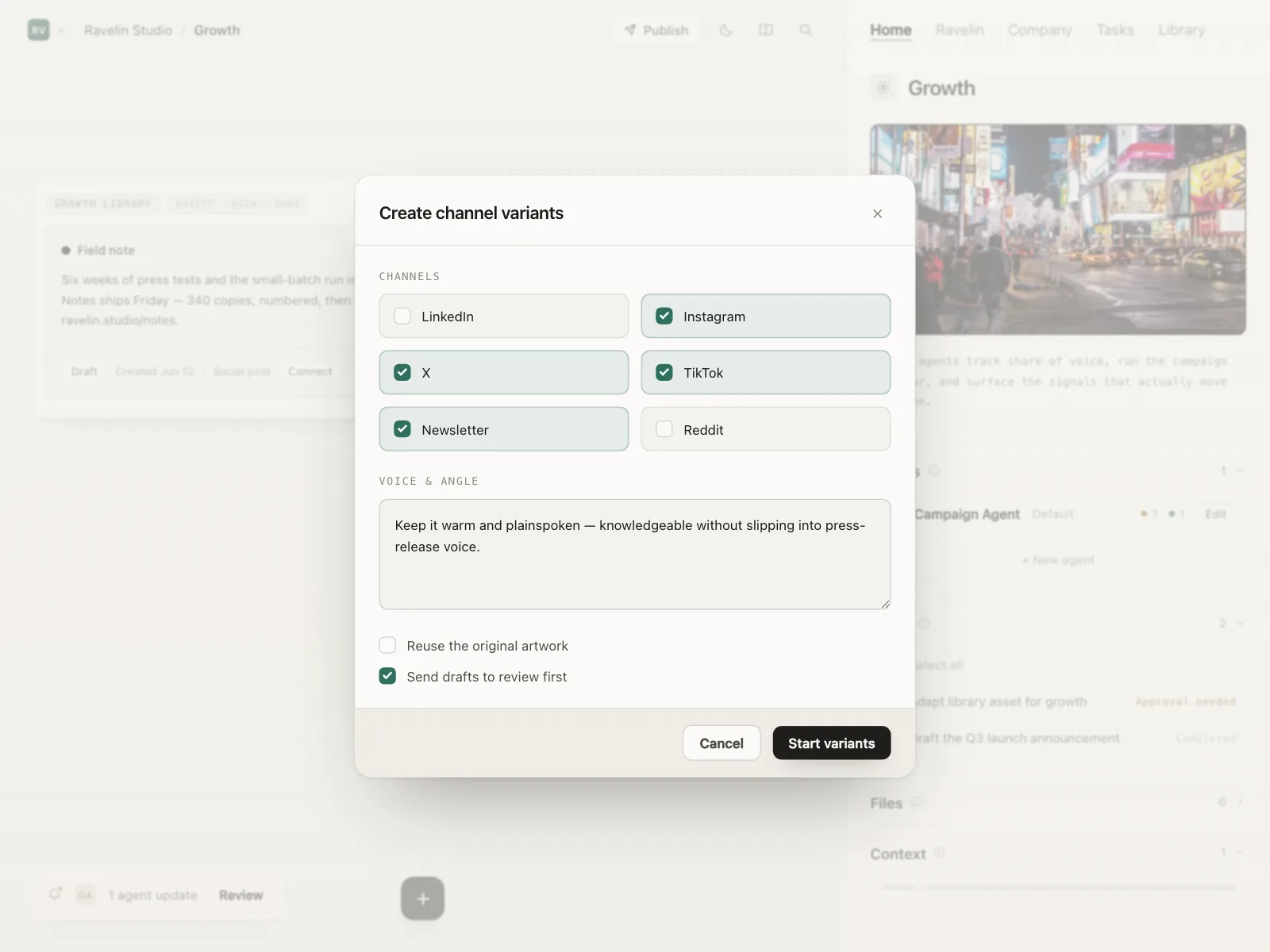
The default. One square box per row, at the start or the end of the label, in a list people scan top to bottom.
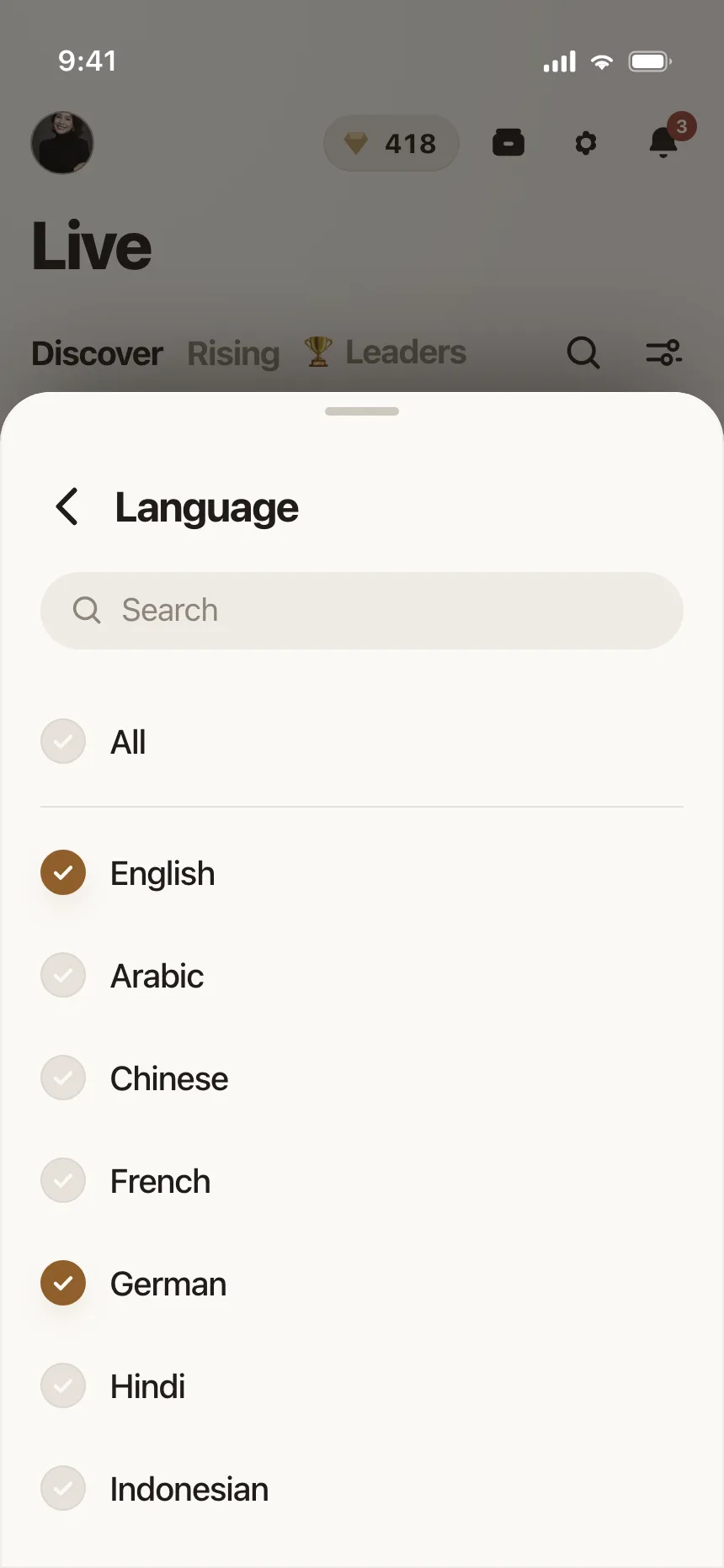
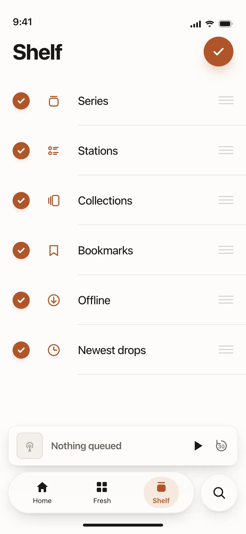
2. Round checkboxes
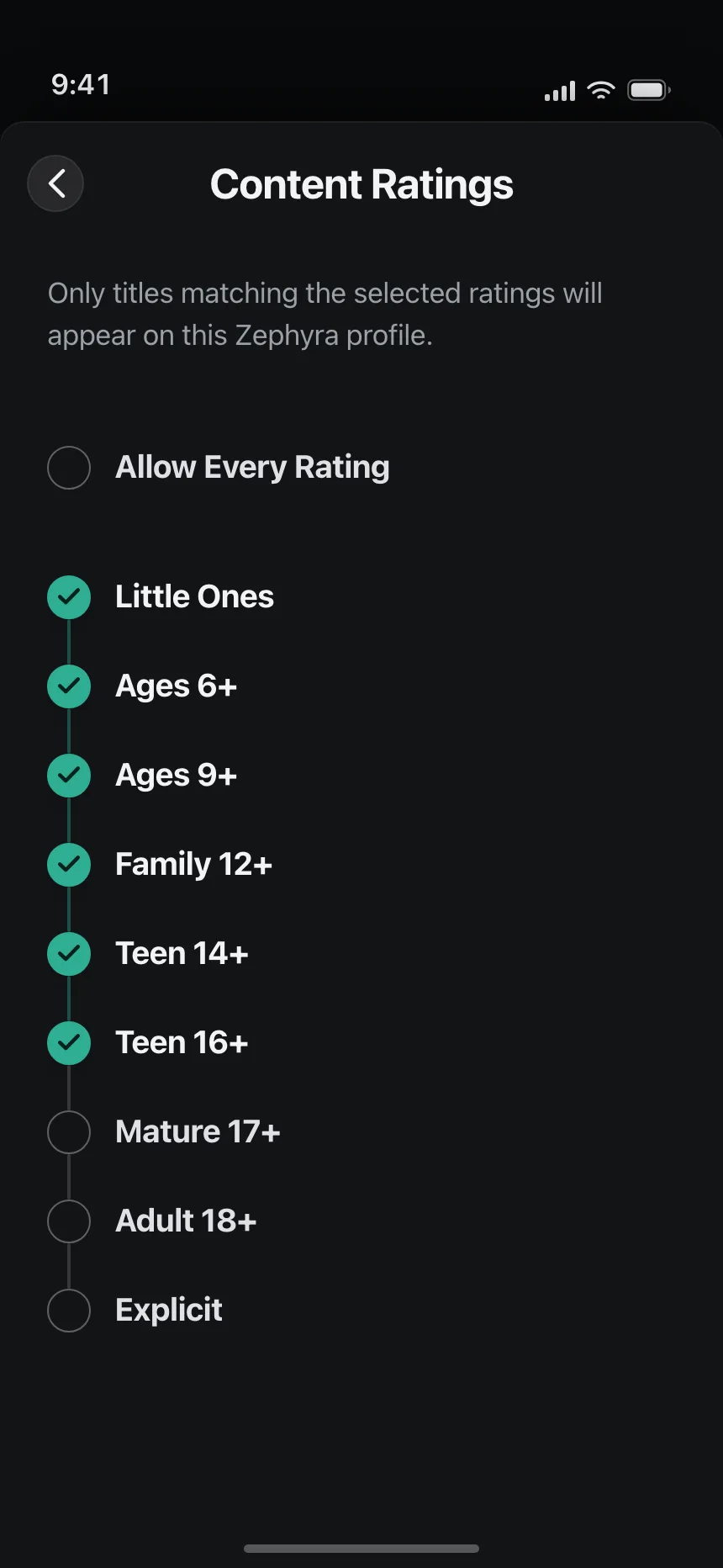
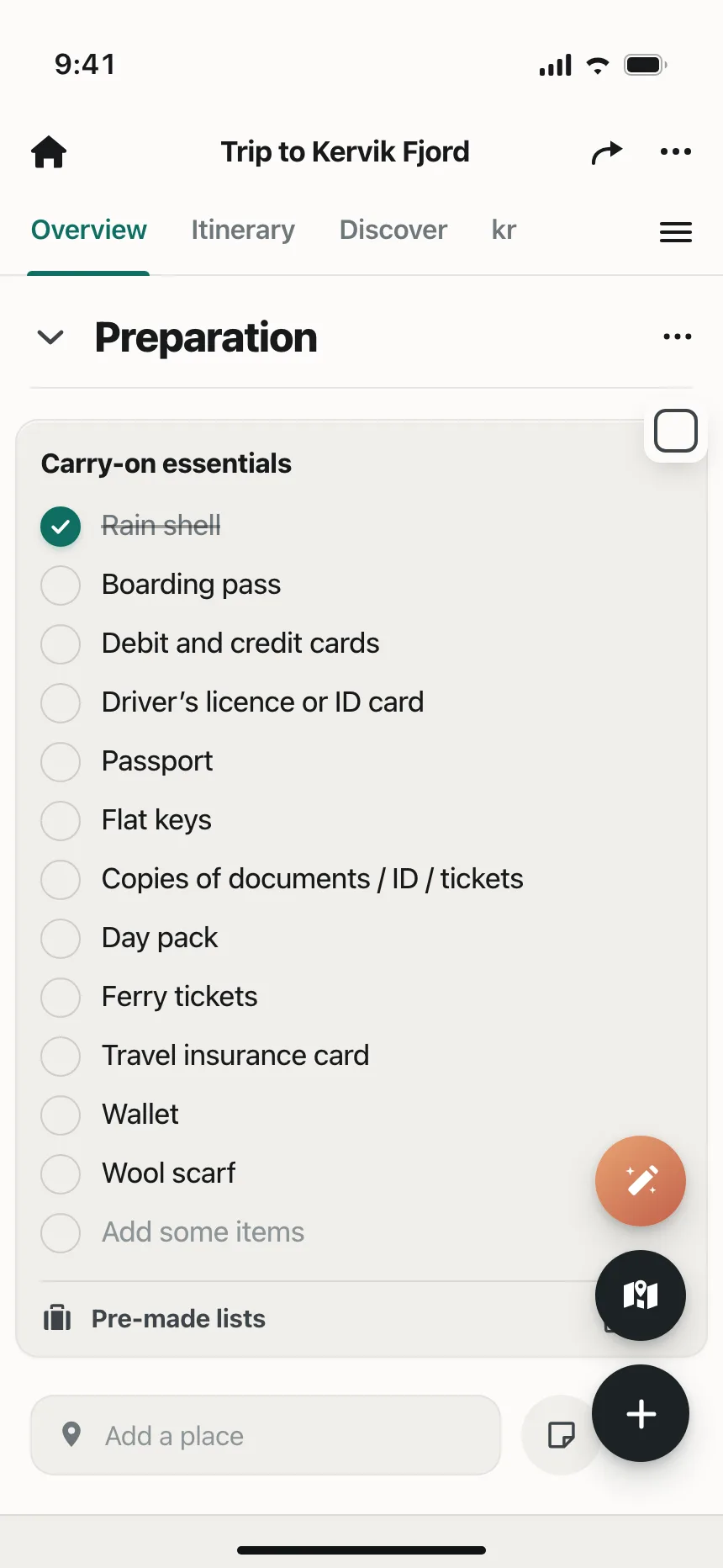
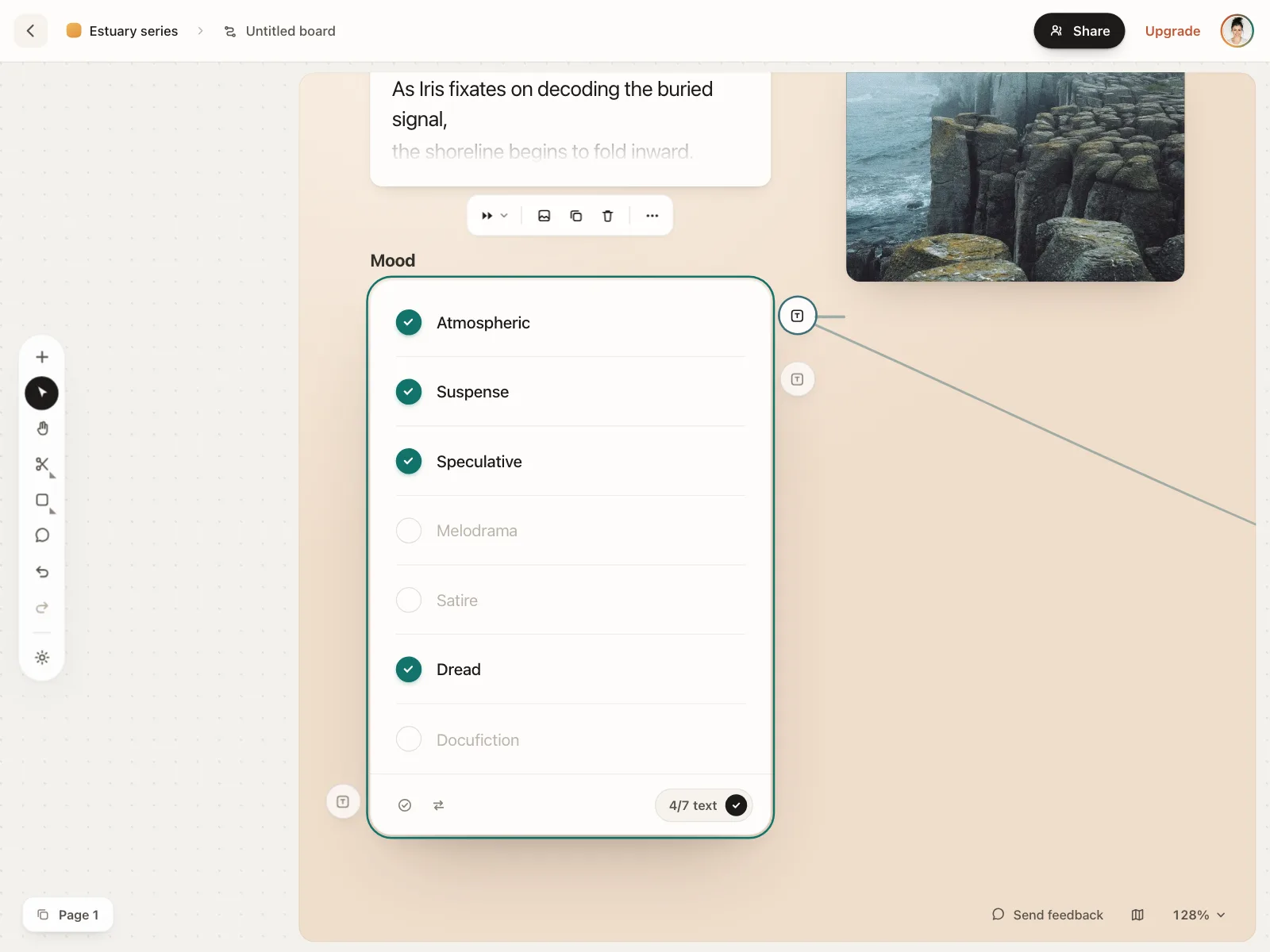
Circles that fill with a tick, common on mobile for picking items from a list or a set of tiers.
3. Select all and mixed state
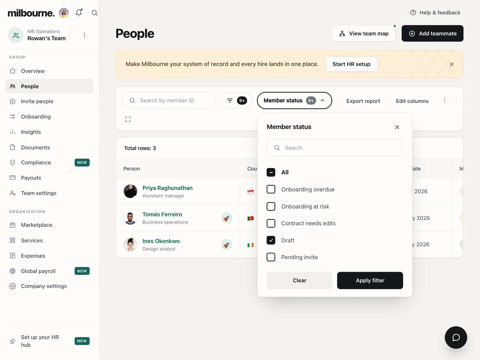
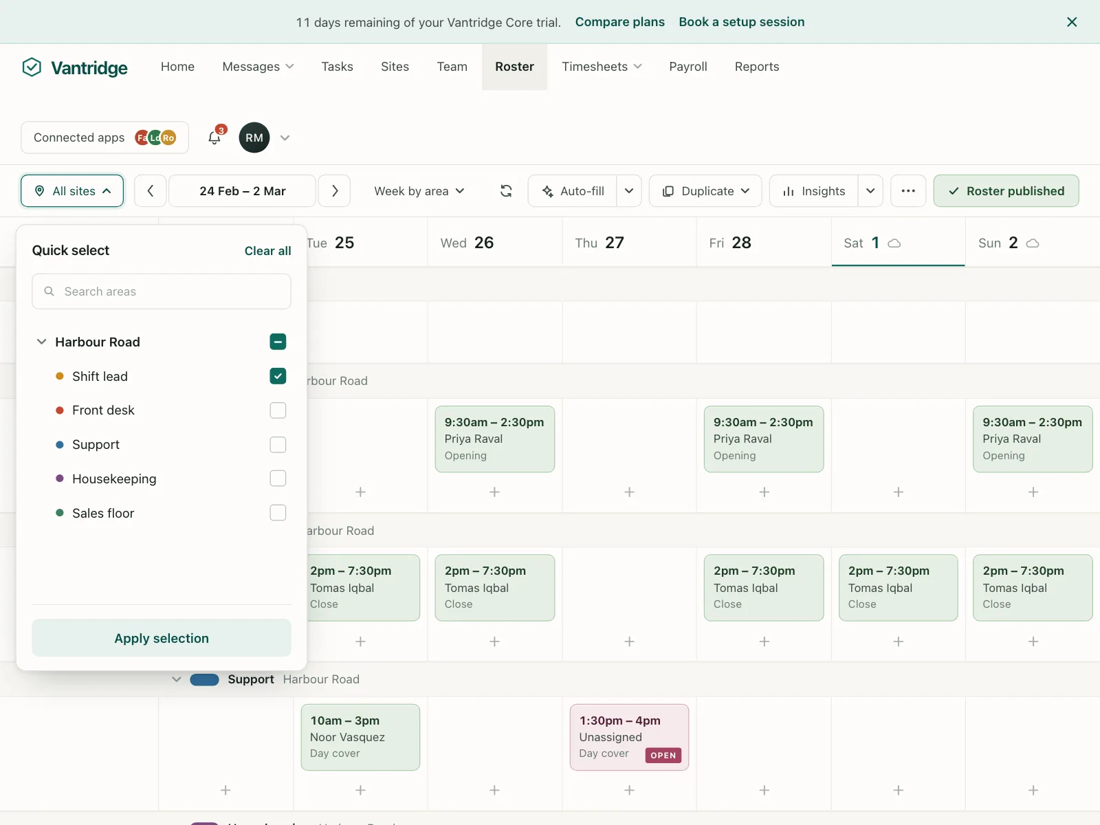
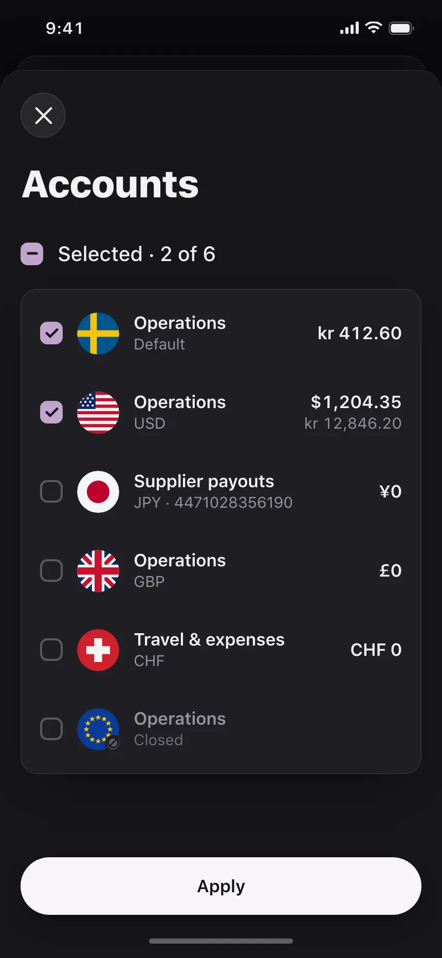
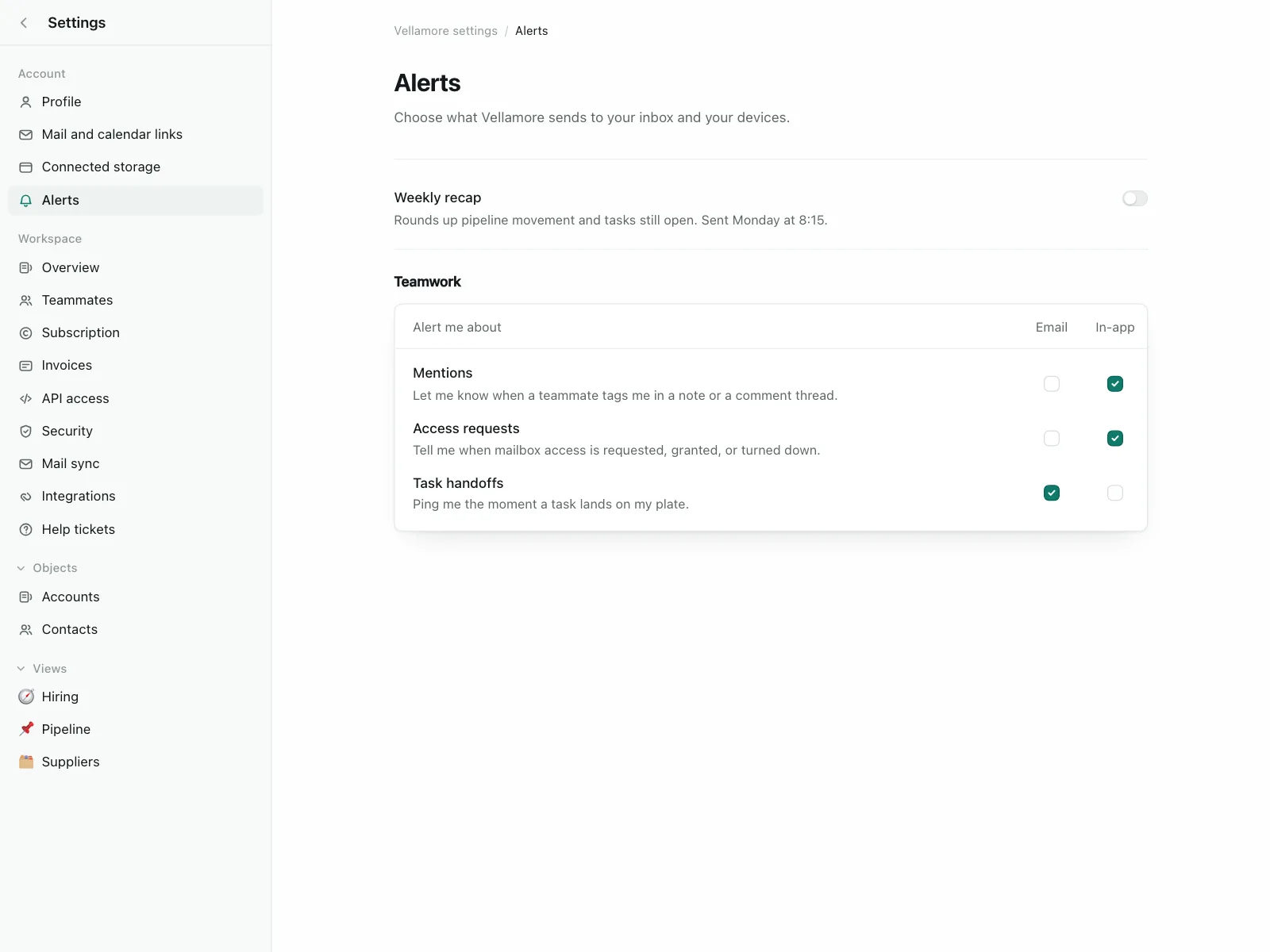
A parent box above a group that checks or clears every option, and shows a dash when only some are checked.
4. Checkbox grids
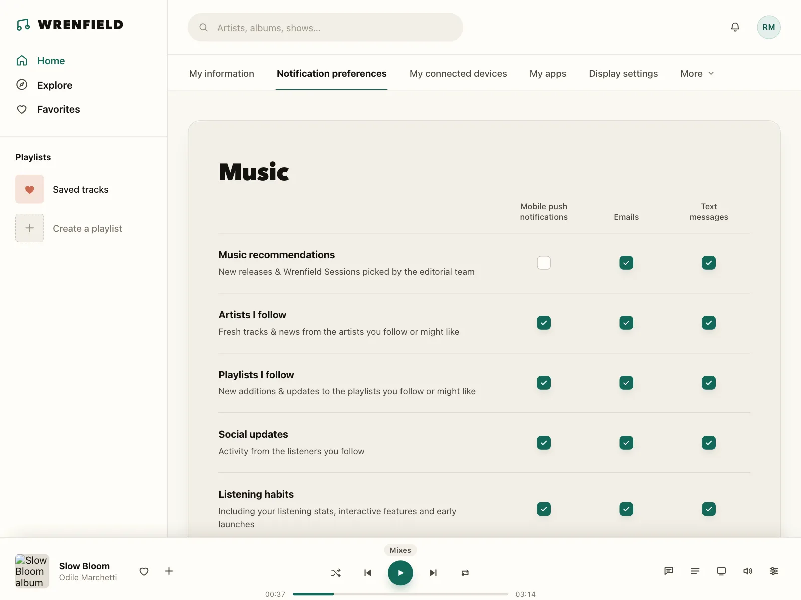
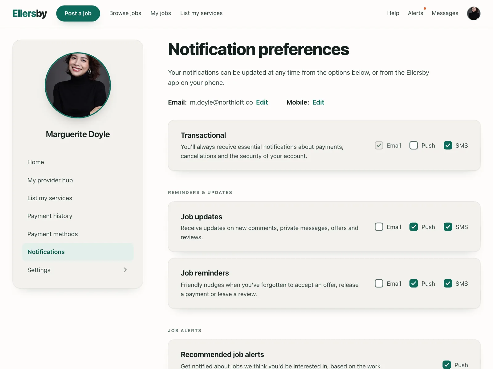
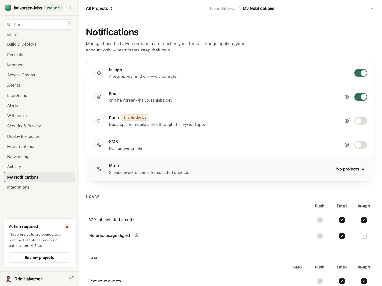
A matrix with one column per channel, like email, push and SMS, and one row per kind of message.
5. Selectable cards
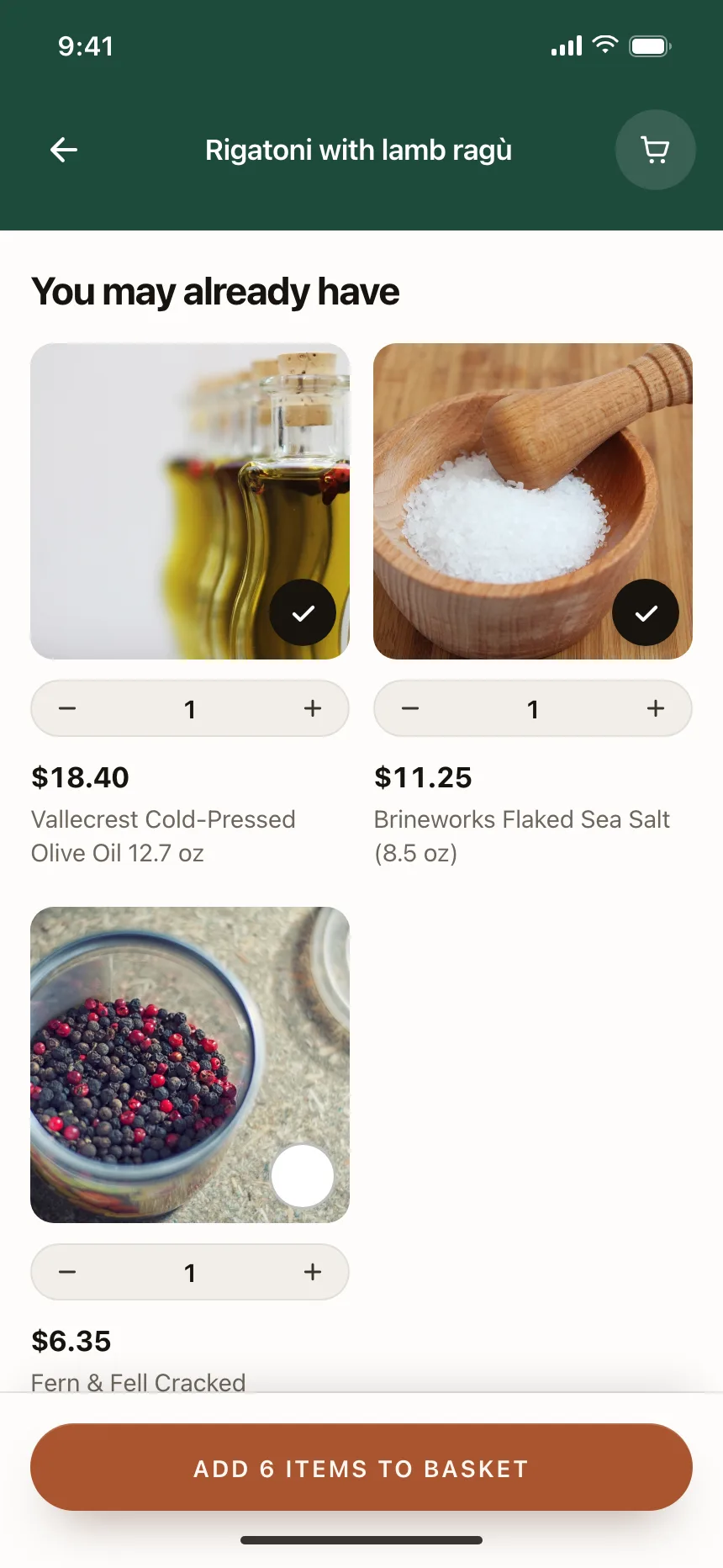
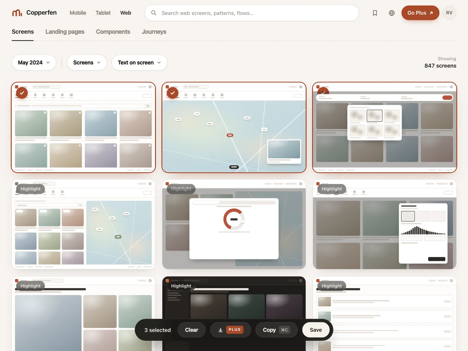
Photos or tiles with a check badge in the corner, for picking visual items like images, products or channels.
Where checkboxes show up
Filters
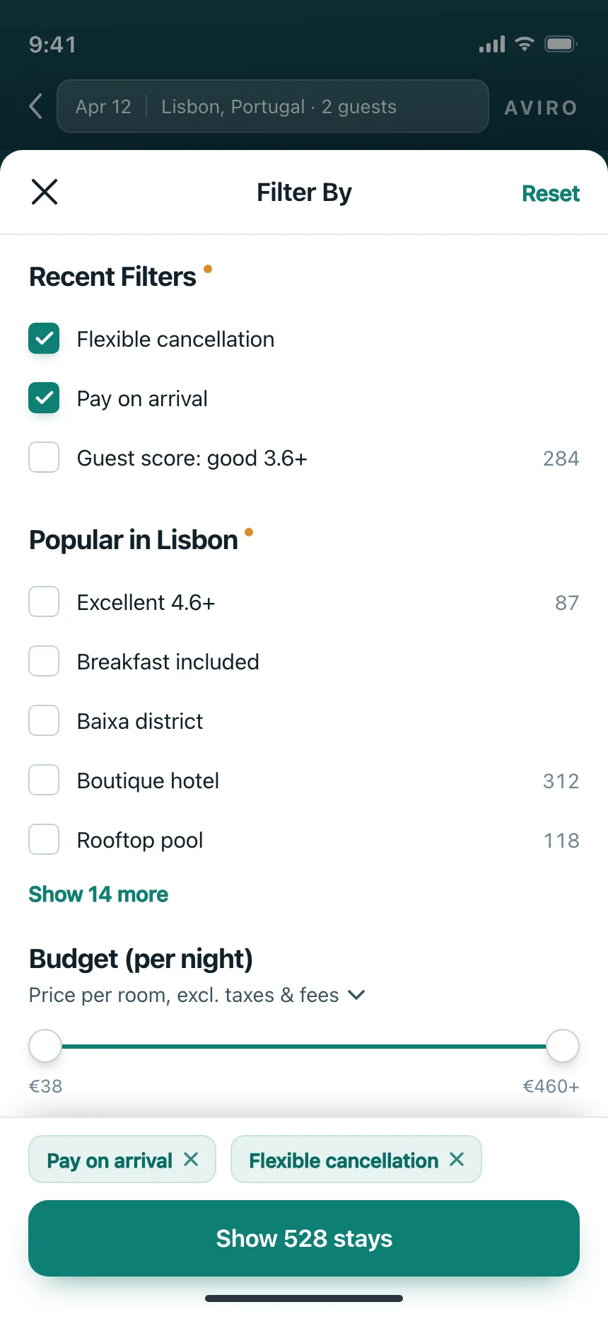
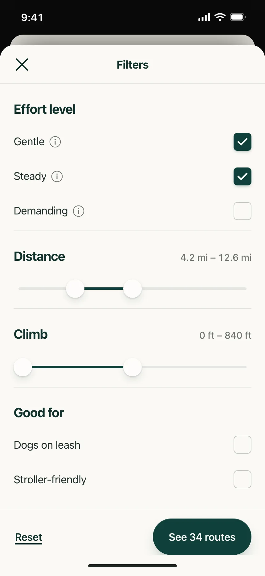
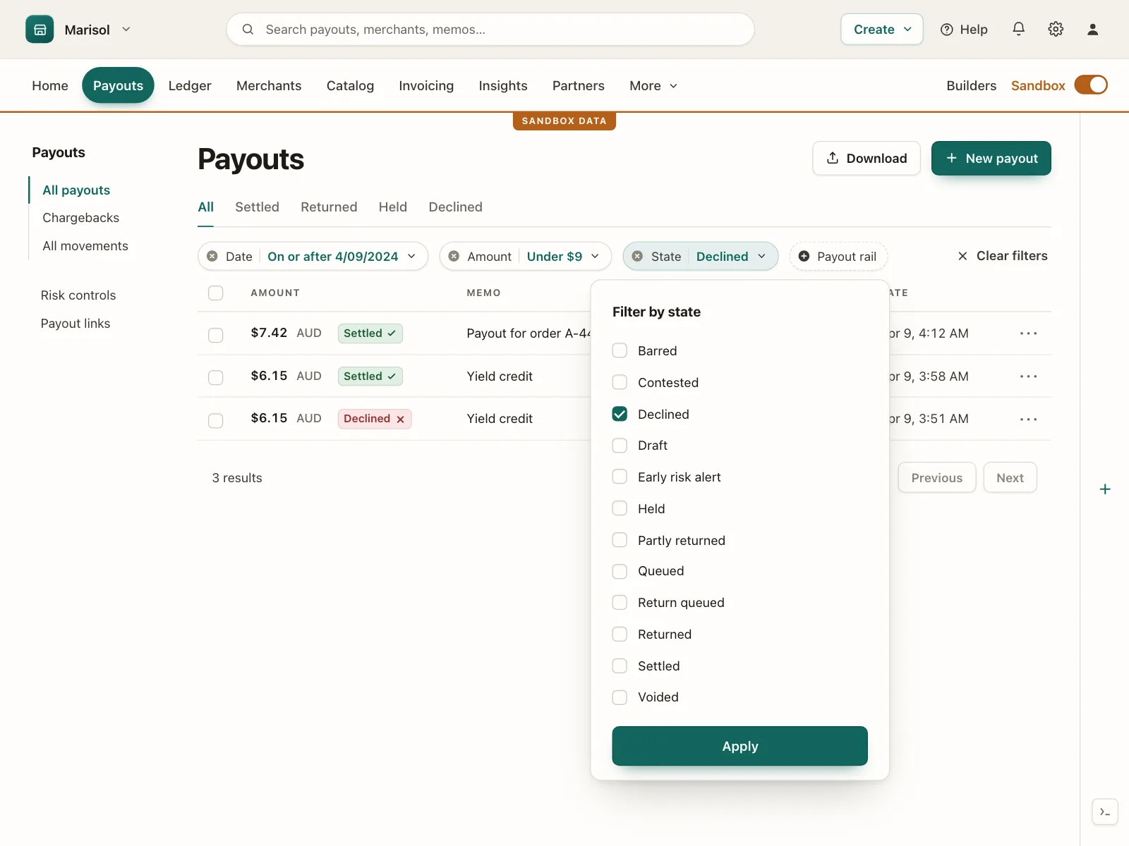
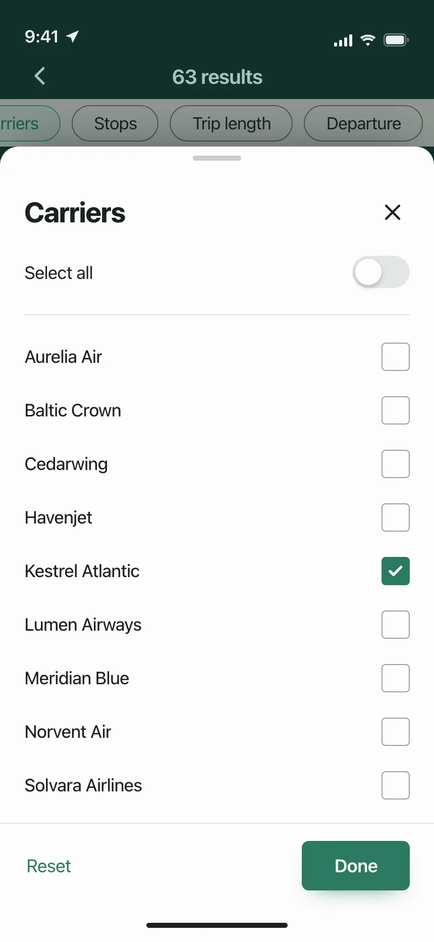
Filter sheets and drawers list each option with a box, then show the result count on the apply button.
Terms and consent
A required box to accept the terms, often next to an optional one for marketing email.
Bulk actions
Row checkboxes in tables and lists, with a bar of actions that appears once something is selected.
Checklists
Packing lists, milestones and moods that people tick off as they go.
Checkbox vs similar components
Build notes
- Use a native <input type="checkbox"> with a <label>, so clicking the label toggles it.
- Group related boxes in a <fieldset> with a <legend> that asks the question.
- Space toggles the focused checkbox, and focus needs a visible ring.
- Set the mixed state with the indeterminate property in script. There is no HTML attribute for it.
- For a custom checkbox, use role="checkbox" with aria-checked set to true, false or mixed.
- An unchecked box sends nothing on submit, so treat a missing value as no.
FAQ
What's the difference between a checkbox and a radio button?
Checkboxes let people pick any number of options, including none. Radio buttons allow exactly one choice from a group, and picking one clears the others. If only one answer makes sense, use radio buttons.
Should I use a checkbox or a toggle switch?
Use a checkbox when the choice is saved with a form or applied later. Use a toggle switch when the change happens the moment it flips, like turning on notifications.
What is an indeterminate checkbox?
It is a third, mixed state for a parent box whose options are only partly checked, usually drawn as a dash. Checking the parent checks every option in the group, and unchecking it clears them all.
Should the checkbox go before or after its label?
The GOV.UK Design System puts checkboxes to the left of their labels, which makes them easier to find for people using screen magnifiers. Mobile list rows often put the box at the end instead. Either way, make the label part of the click target.
Related terms
All glossary terms · Browse 55 web and 35 mobile checkbox designs