
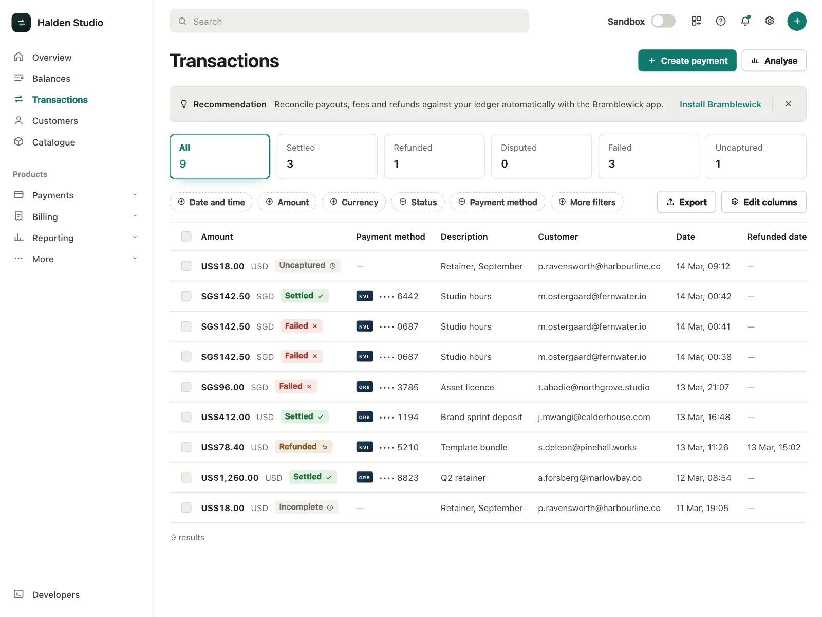


Tables from the Kombai gallery: a payments dashboard's transactions, a football app's league standings and a CRM's company directory.
What is a table?
A table is a grid of rows and columns. Each row is one record, like an invoice or a team member, and each column is one attribute of it, like the amount or the status. Column headers name what every cell holds, so people can read across a row or down a column and compare values.
- A header row names every column and often holds the sort controls.
- Every row has the same columns, so values line up and compare at a glance.
Tables show up across dashboard, comparison, pricing and order history screens.
When to use a table
- Many records, several fieldsInvoices, users or files that people scan and compare by the same fields.
- Sorting and filteringPeople need the largest, newest or overdue items fast.
- Acting on several itemsSelecting rows to archive, export or mark as paid in one go.
When not to use one
- Page layoutDon't use a table to place content side by side. Use CSS grid or flexbox.
- Few fields per itemIf each item has a title and one line of detail, a stacked list reads better.
- Visual itemsProducts, photos and listings sell on their images. Use cards or a gallery.
Anatomy of a table
This one works. Sort a column, tick a few rows and mark them paid, or tab through it and press Space on a checkbox.
- Sorted
- Selected
- Keyboard focus
- Empty
- ToolbarCount, filters and bulk actions
- Header rowNames each column
- Sort controlReorders rows by a column
- Selection checkboxPicks rows for bulk actions
- RowOne record, a cell per column
- StatesSorted, selected, focus, empty
Table variants
We sorted every table design in the Kombai gallery and found six patterns. Browse all 200 web and 30 mobile designs.
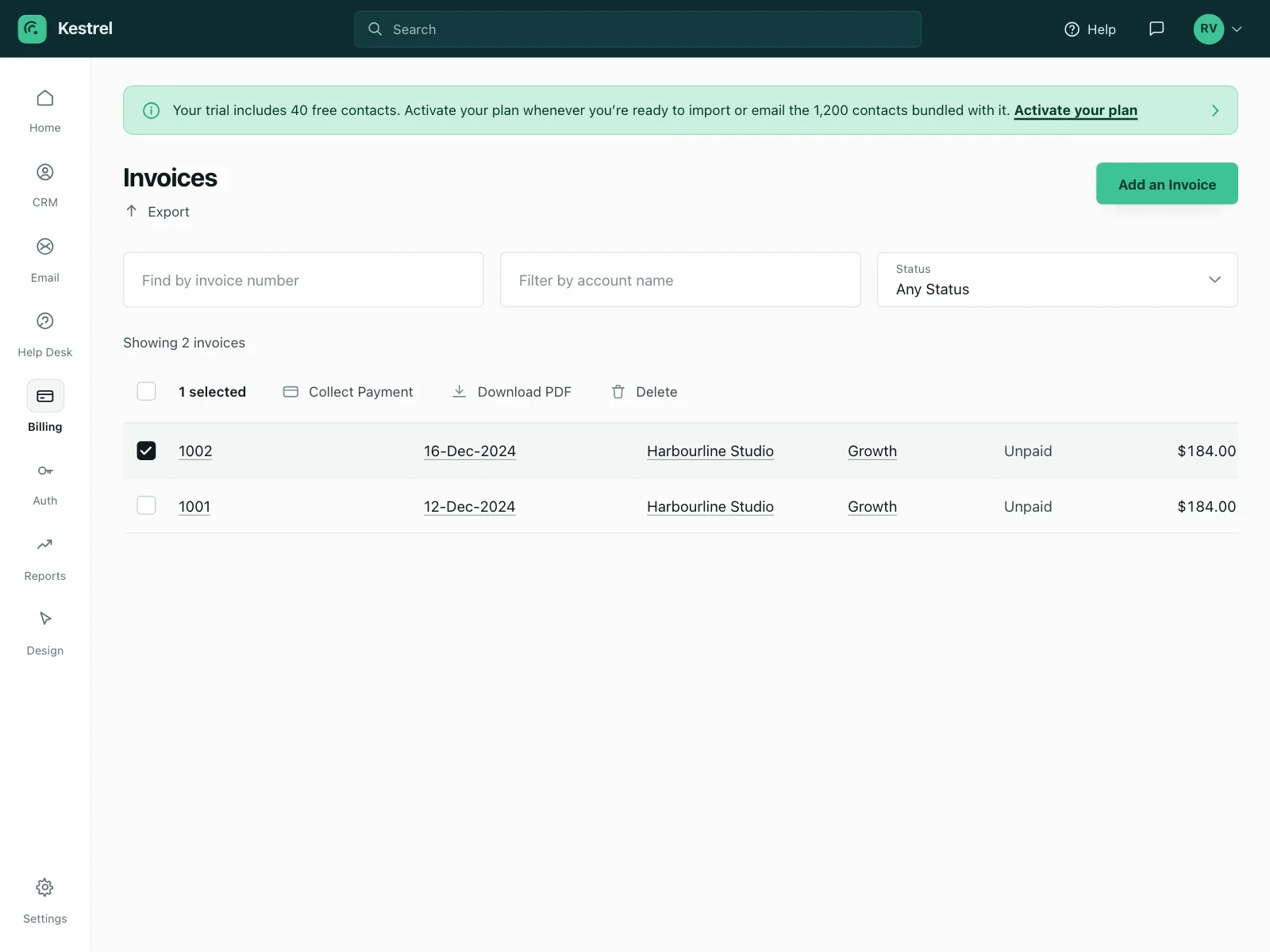
1. Selectable rows with bulk actions
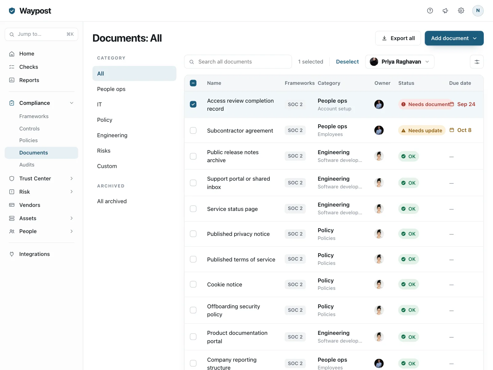
A checkbox starts each row. Selecting rows swaps in actions like delete, export or collect payment, with a count of what is selected.


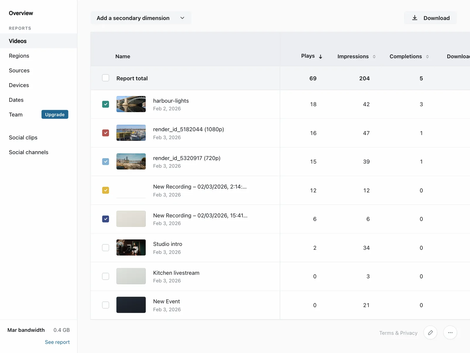
2. Sortable columns
Arrows in the header show which column orders the rows and in which direction. Clicking the header again flips the order.

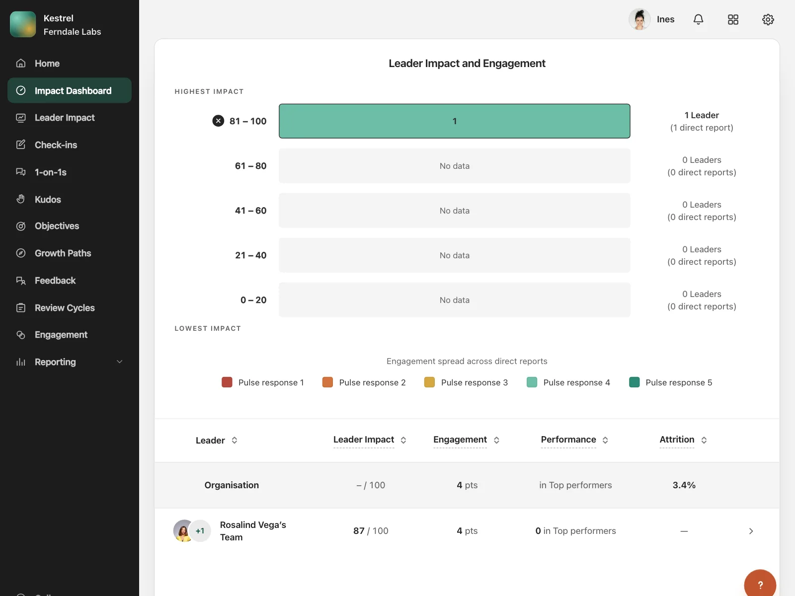
3. Status pills
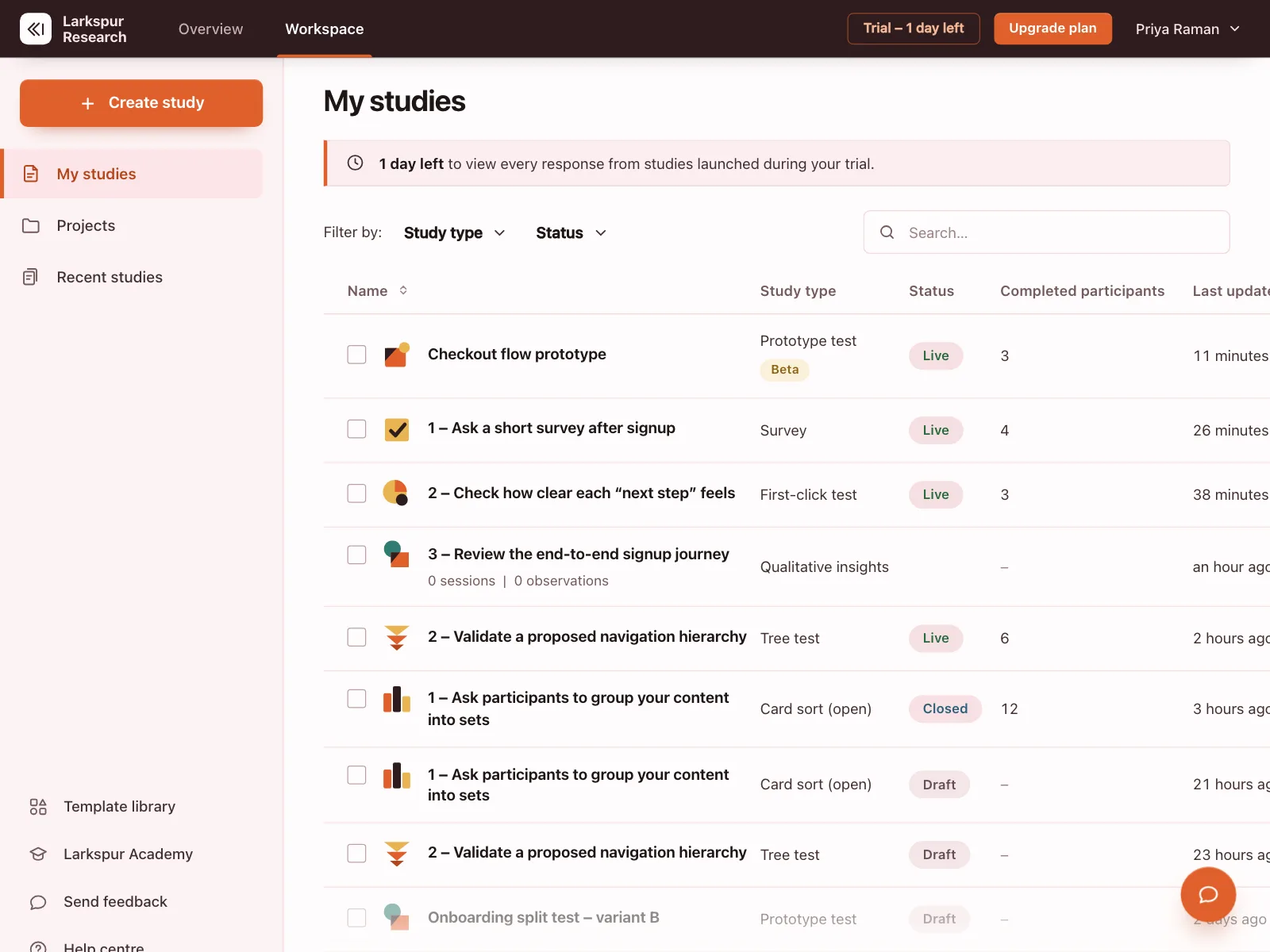
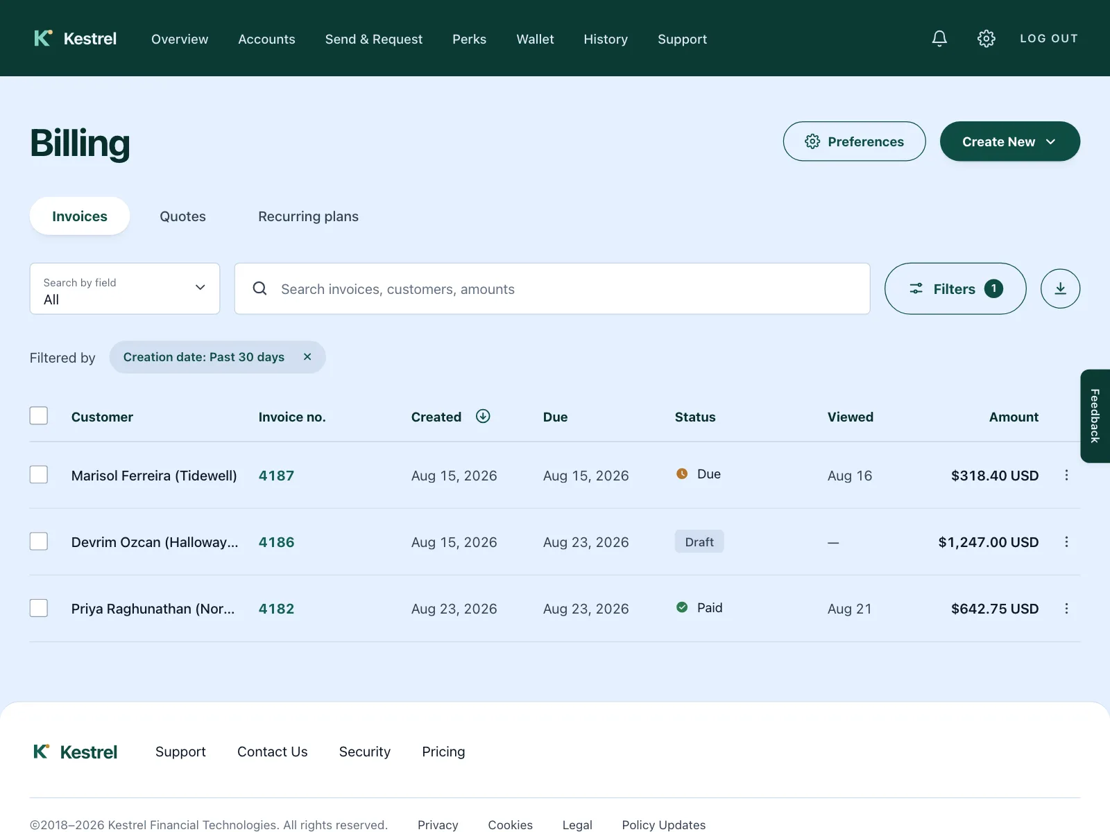
A colored pill in one column, like Live, Paid or Needs update, so people spot the rows that need attention without reading each one.
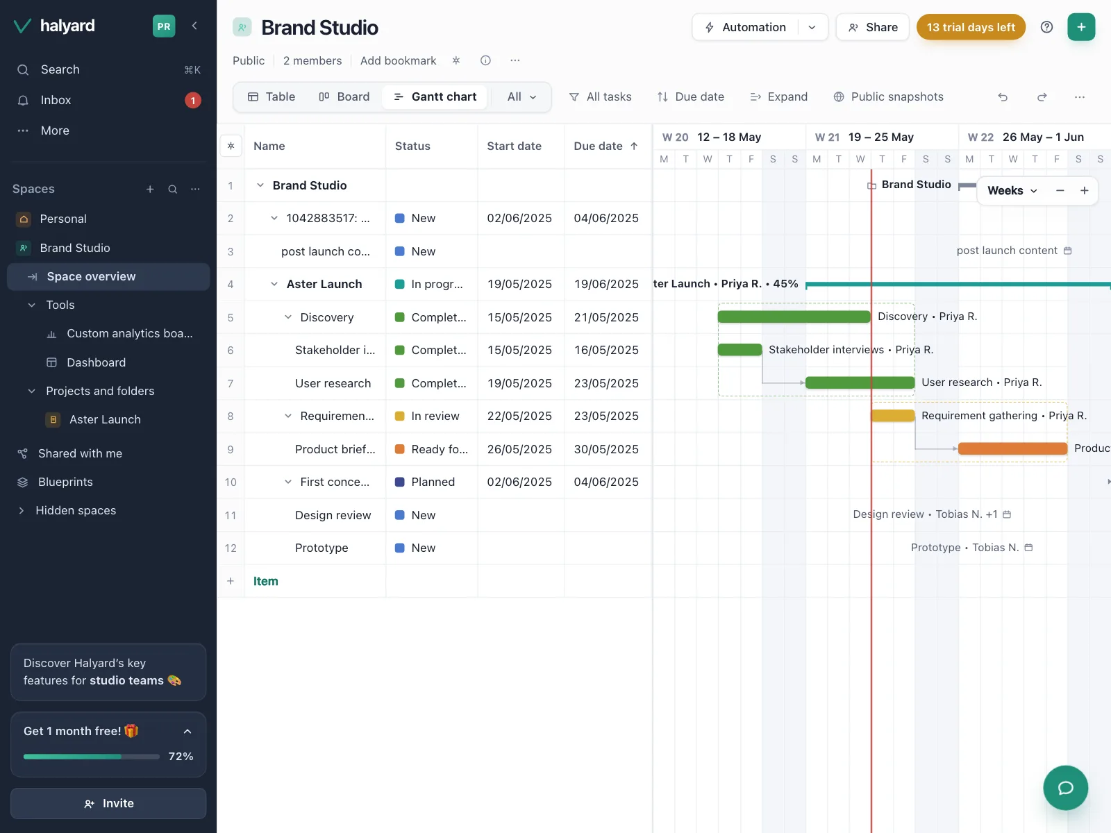
4. Grouped and expandable rows
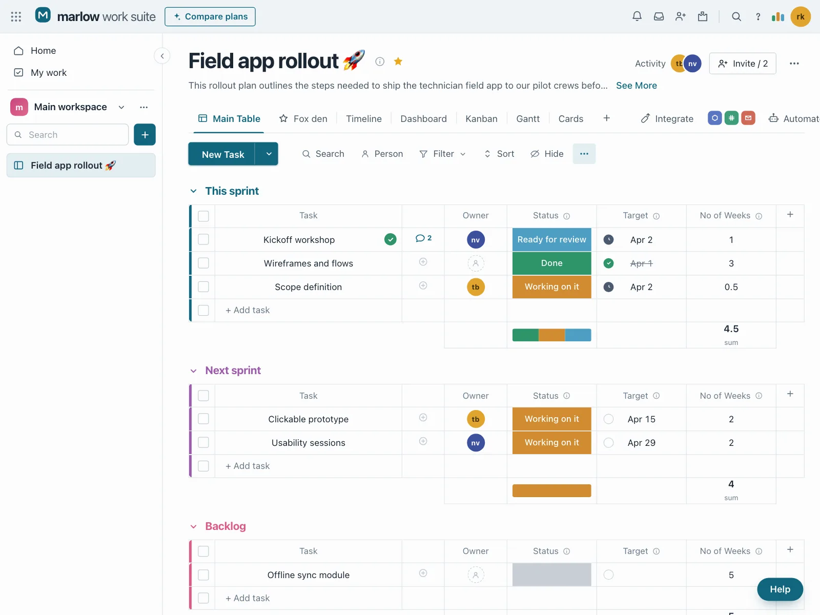
Rows sit under group headers that fold away, or open to show the items inside them, like tasks by sprint or line items under a subtotal.

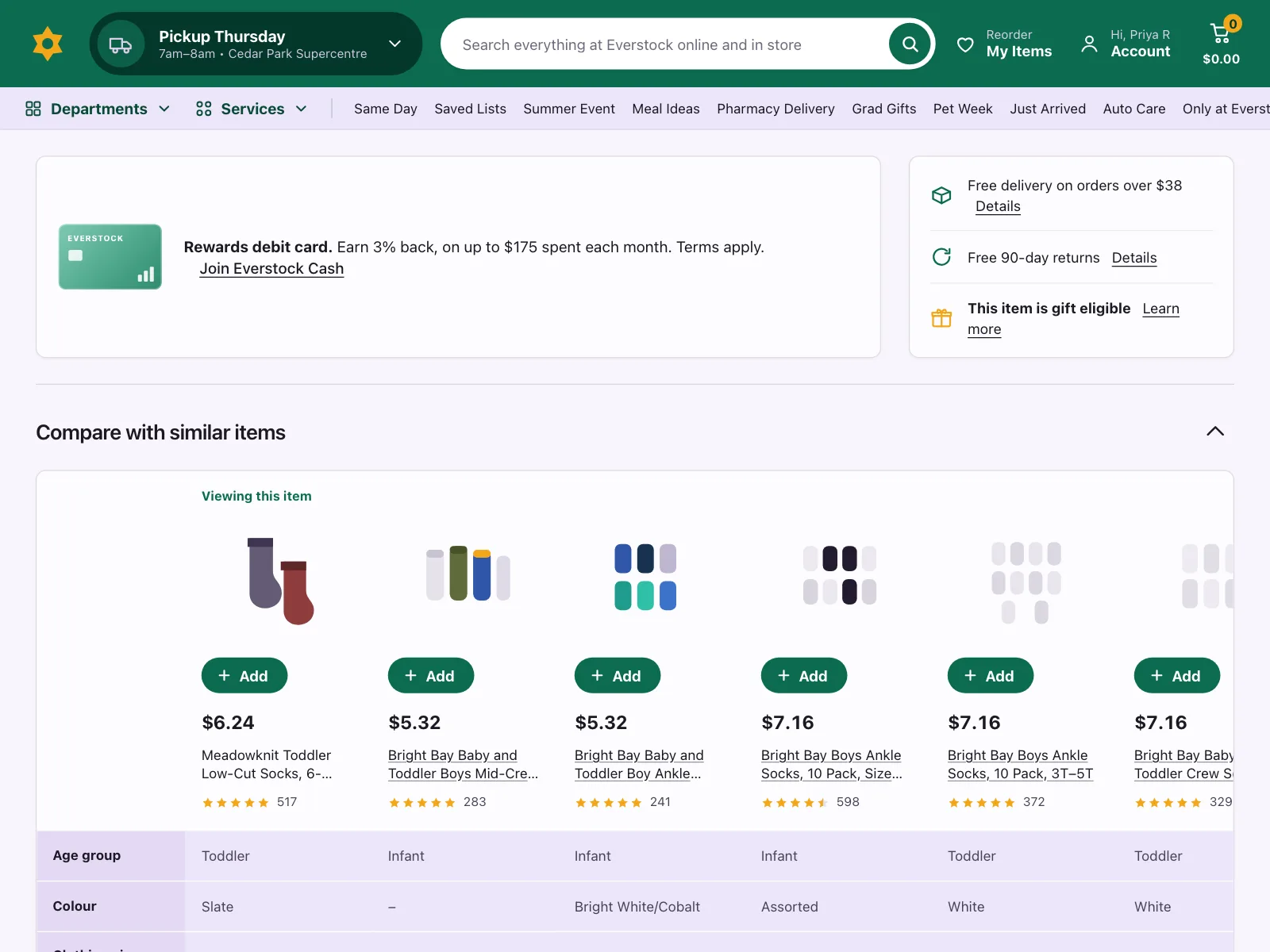
5. Comparison tables
Plans or products across the top, features down the side, and checks, crosses or values in the cells. The most common mobile table in the gallery, often on an upgrade screen.


6. Spreadsheet grids
Numbered rows, typed columns and a New row button, the way databases and notes apps show records. People add rows and columns as they go.


Where tables show up
Billing and finance
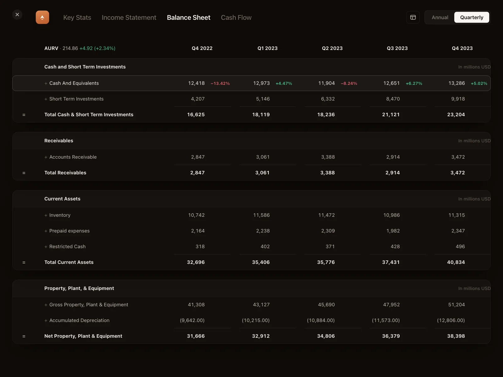
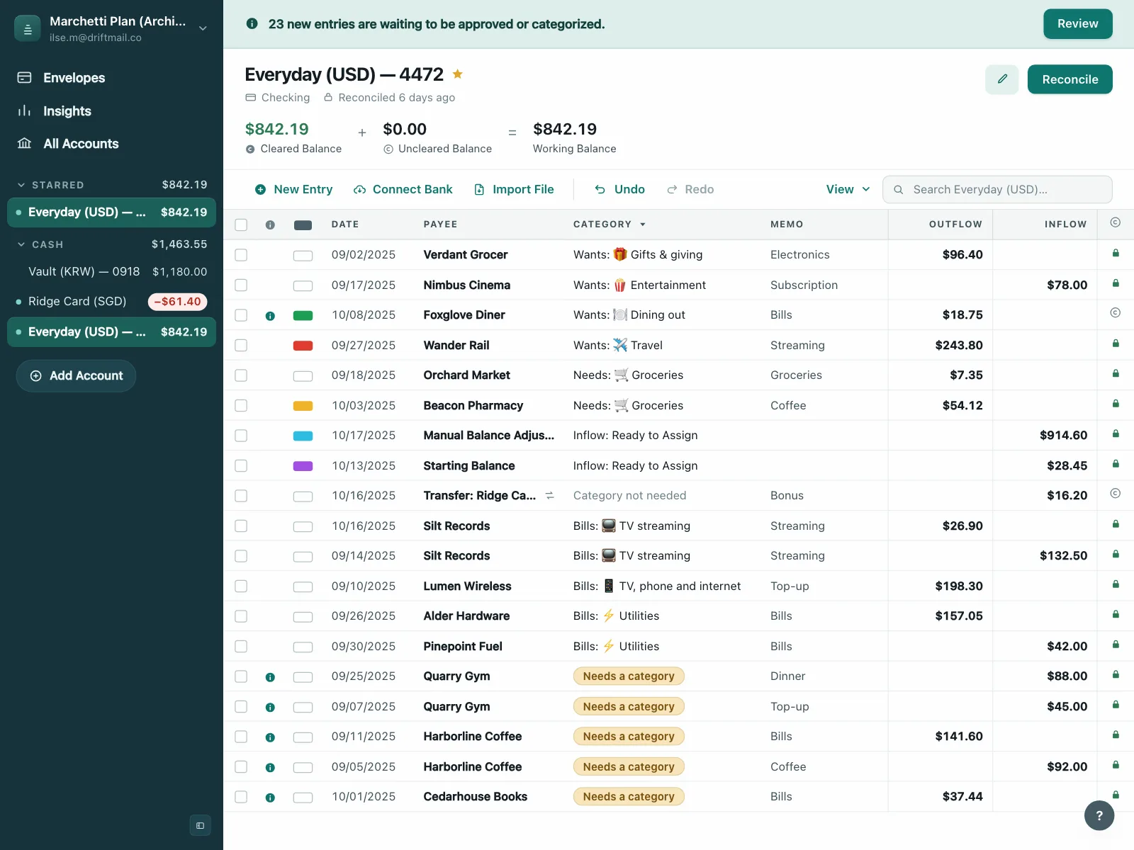
Invoices, account registers and fee schedules, where amounts line up in their own column.


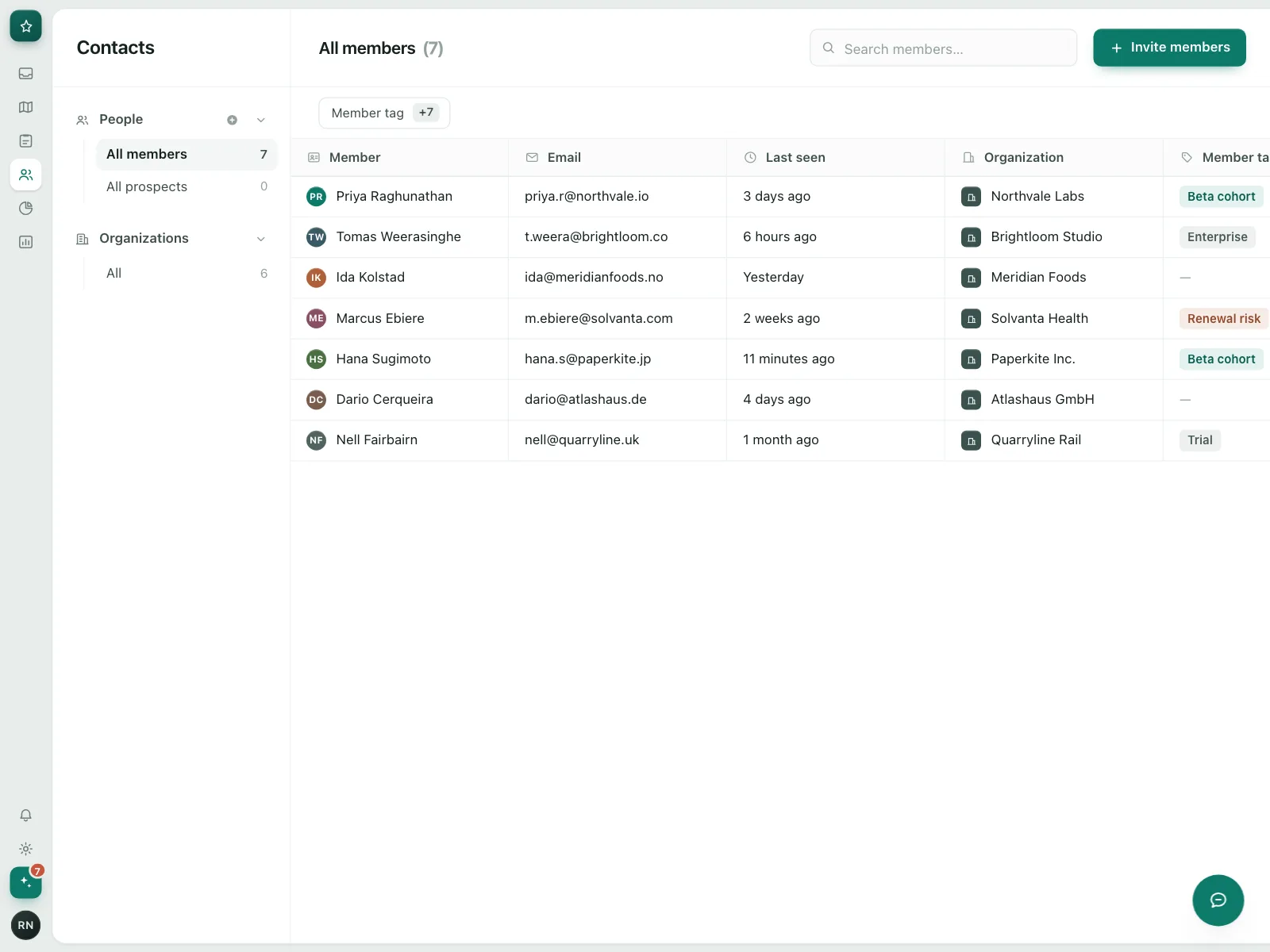
People and access
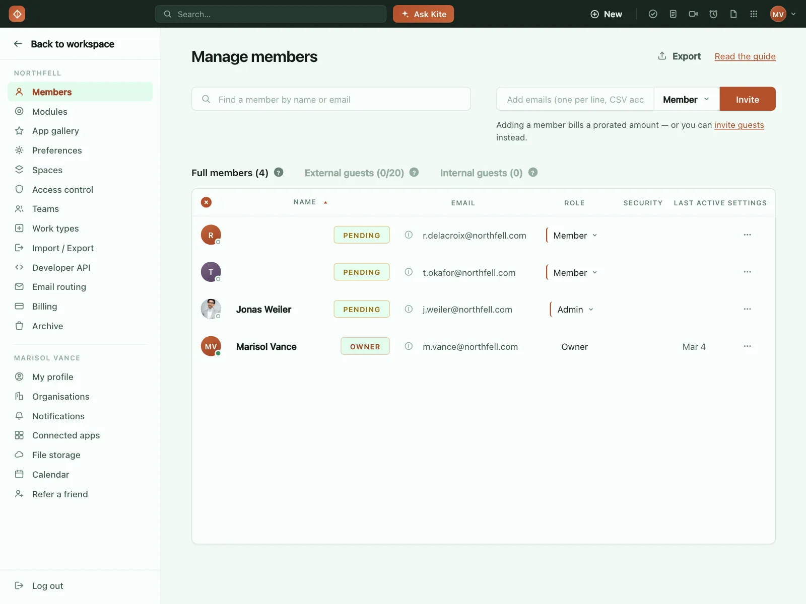
Members, roles and pending invites in admin settings, one row per person.

Size guides
Measurement and conversion charts on mobile shopping screens, usually in a sheet over the product.


Rankings and screeners
Leaderboards, collection rankings and stock screeners, dense with numbers and green and red changes.

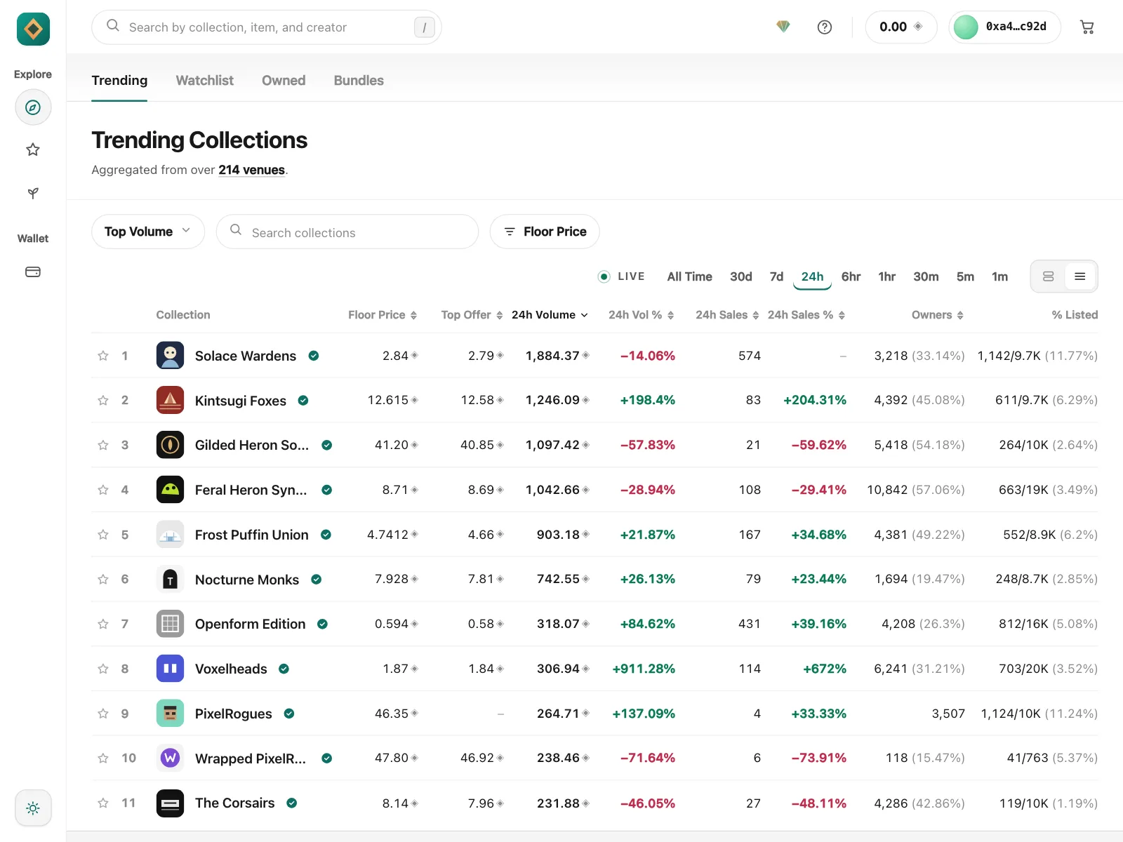

Table vs similar components

Build notes
- Use a native <table> with a <caption>, and <th scope="col"> for column headers.
- Wrap each sortable header in a <button>, and set aria-sort on the sorted column only.
- Label each row checkbox with its row. Set select-all to indeterminate when only some rows are picked.
- Right-align columns of numbers so the digits line up for comparison.
- Every control in a table sits in the tab order. Switch to the grid pattern, with arrow keys, only when cells are editable.
- Let wide tables scroll sideways inside their own container on small screens, with the header kept in view.
FAQ
What is the difference between a table and a data grid?
A table displays data, and any links, buttons or checkboxes in it sit in the normal tab order. A data grid is an interactive widget: it takes one tab stop, and people move between cells with the arrow keys. Use a plain table unless cells need to be edited or operated like a spreadsheet.
How do you make a table work on mobile?
Keep only the columns people need and let the table scroll sideways inside its container. When each row has just a few fields, show rows as a stacked list or cards instead. Most mobile tables in the Kombai gallery are plan comparisons, size charts and fee schedules with a few narrow columns.
Should numbers be right-aligned in a table?
Yes, when people compare them down a column. Right-aligned numbers line up by place value, so 1,240 and 86 are easy to tell apart at a glance. Right-align the column header too, so it sits over its numbers.
Pagination or infinite scroll for a table?
Pagination, or a Load more button, for tables people work in. It keeps their place, shows how many records there are and leaves the footer reachable. Show the total count and let people pick how many rows a page holds.
Related terms
All glossary terms · Browse 200 web and 30 mobile table designs