
Card
A card frames the content and actions about one thing, like a home, a recipe or a project, so a set of them is easy to browse.
- Also called
- tile
- Platforms
- Web, Mobile
- In the gallery
- 171 web and 179 mobile designs

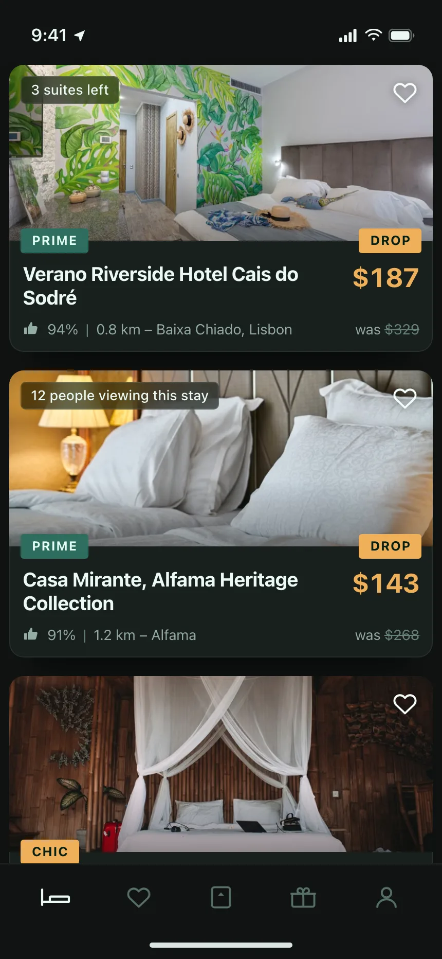

Cards from the Kombai gallery: a real-estate portal's saved homes, a travel app's hotel deals and a textile R&D tool's development programs.
What is a card?
A card is a contained block, set apart by a border, a background or a shadow, that holds the content and actions about one thing. Cards repeat in a grid, a row or a stack, and each one usually opens a page with the full detail.
- Each card stands on its own: often an image, a title, a few details and one main action.
- Cards in a set share one layout, so people can scan them side by side.
Cards show up across dashboard, storefront, blog index and pricing screens.
When to use a card
- Browsing mixed contentItems with an image and a few facts, like listings, recipes or courses.
- Items of equal weightA set people look over side by side before opening one.
- Separate widgetsDashboard metrics or settings groups that each need their own frame.
When not to use one
- Dense dataMany fields that people compare across items belong in a table.
- Long text-only listsInboxes and settings read faster as a stacked list.
- A single block of contentA card around the only thing on a page adds a frame for nothing.
Anatomy of a card
This one works. Open a card from anywhere on it, save one with the heart, or tab to a title and press Enter.
Cottage on Elm Row
2 beds, 1 bath, 860 sq ft
$412,000Loft above the bakery
1 bed, 1 bath, 540 sq ft
$289,000
- Rest
- Hover
- Keyboard focus
- Loading
- ContainerFrames one item
- MediaPhoto, preview or icon
- TitleNames the item, links to it
- DetailsPrice, facts or status
- ActionAn extra like Save
- StatesRest, hover, focus, loading
Card variants
We sorted every card design in the Kombai gallery and found six patterns. Browse all 171 web and 179 mobile designs.
1. Image on top
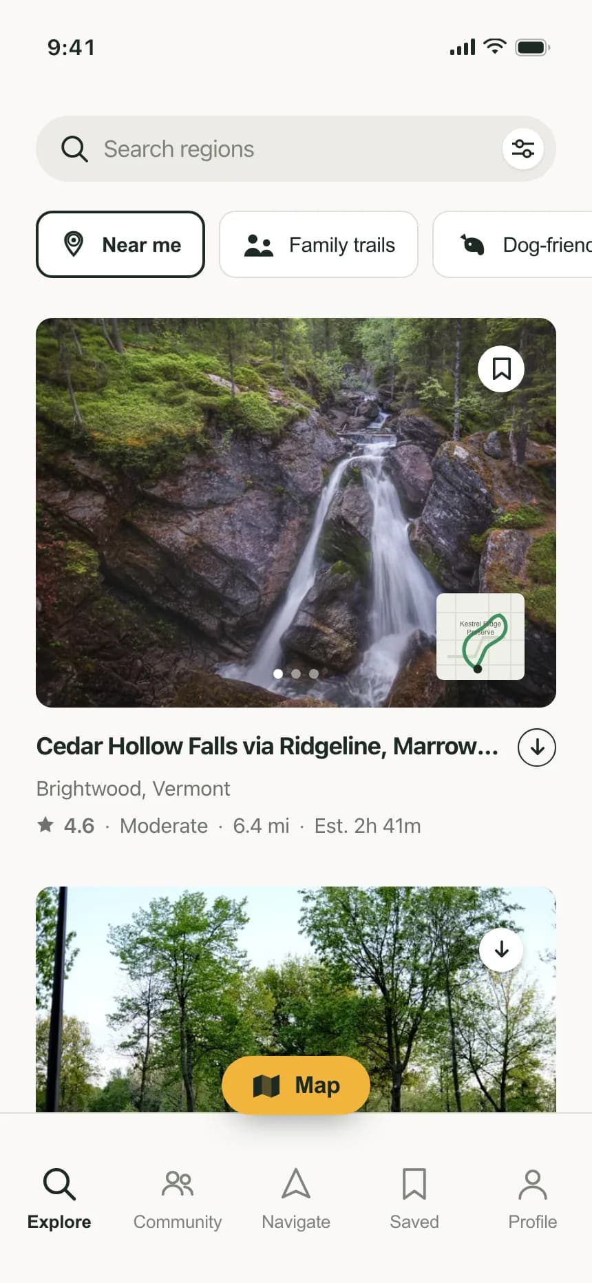
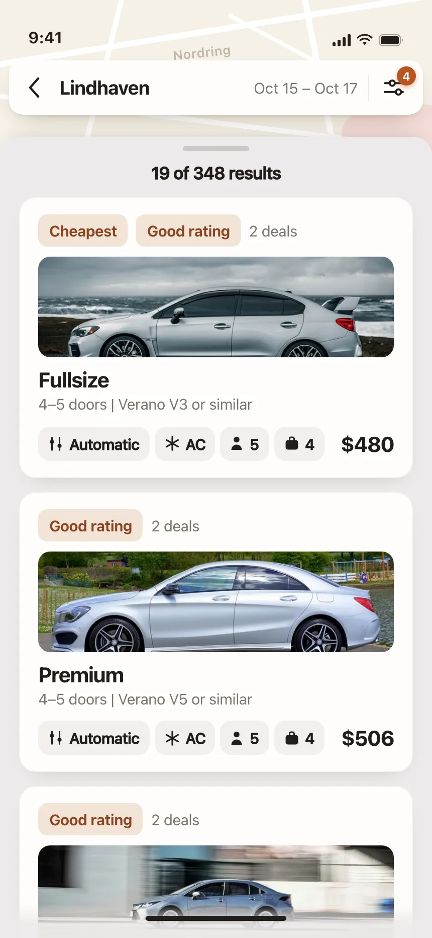
The default. A photo fills the top, with the title, a few facts and a price or rating below. Listings, products and trails all use it.

2. Text over image
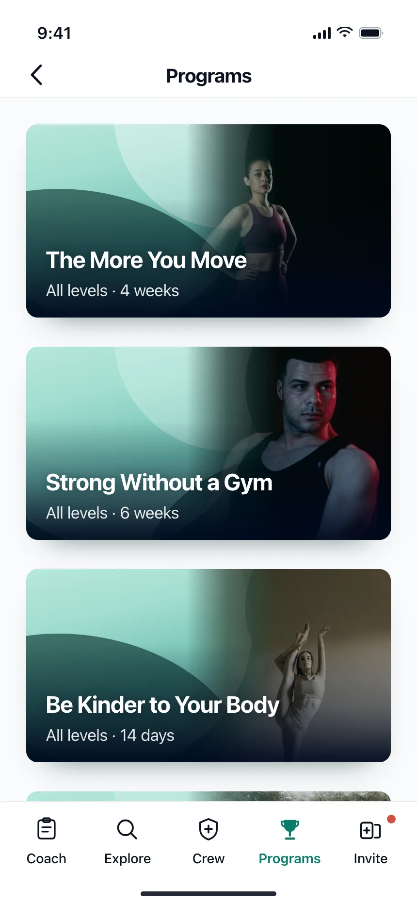
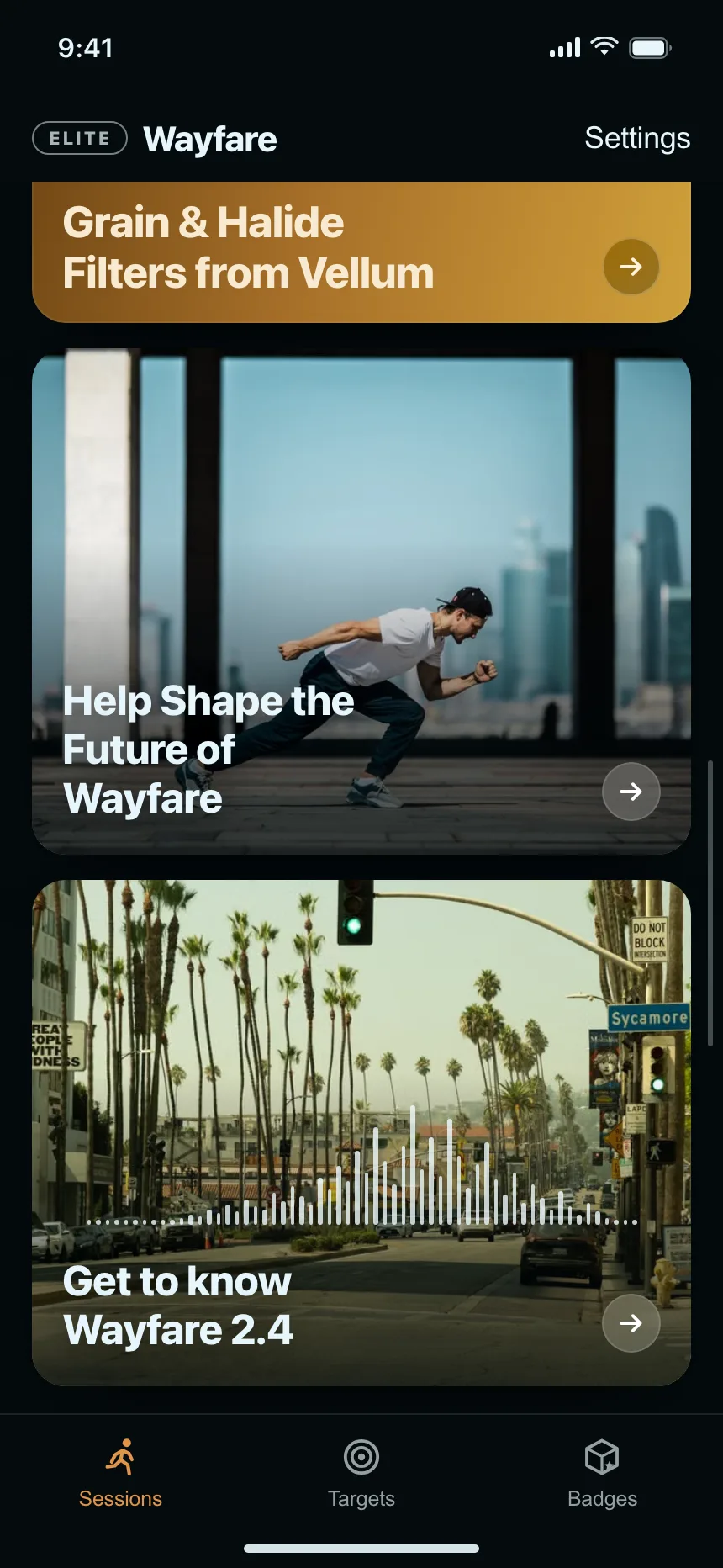
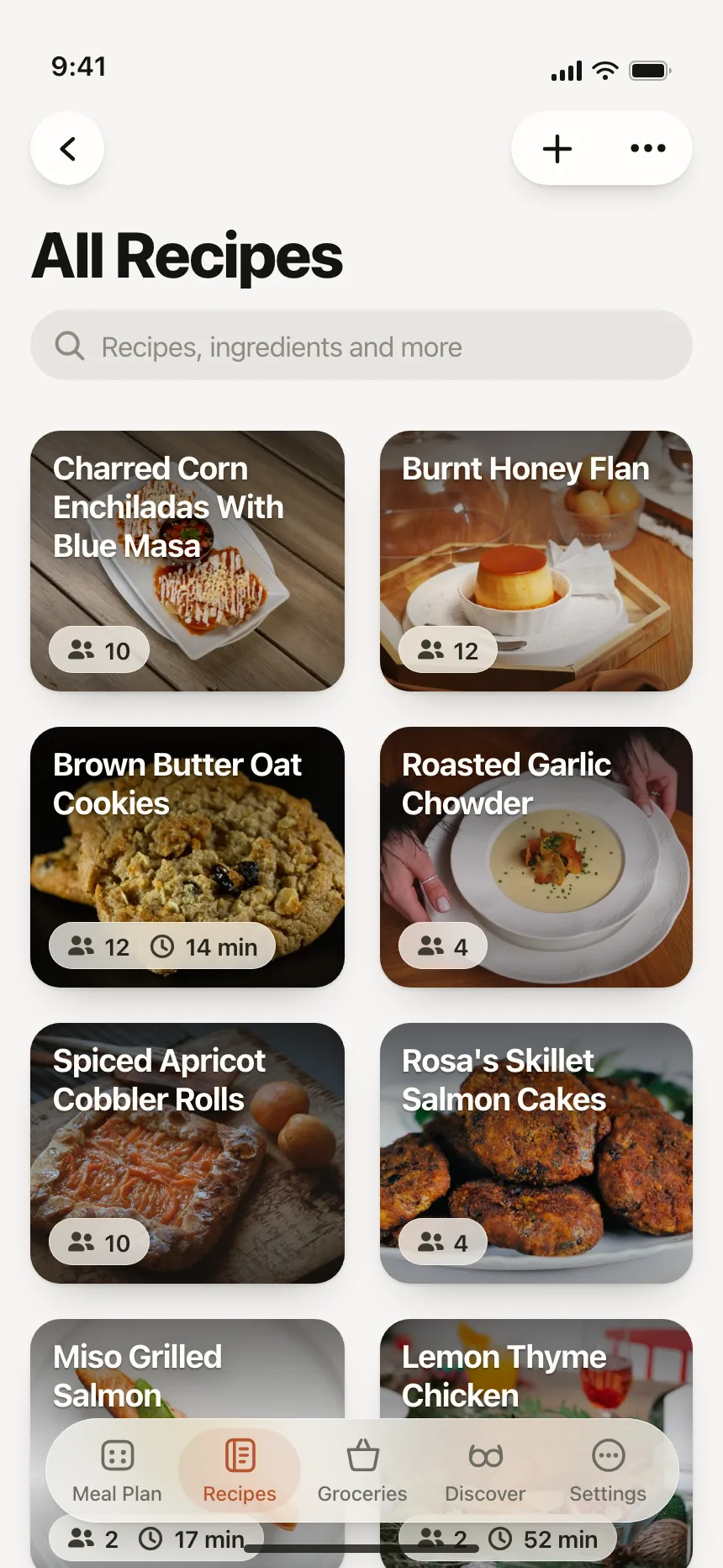
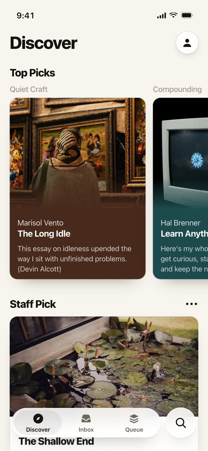
The title sits on the photo itself, over a dark gradient that keeps it readable. Common for programs, recipes and editorial picks.
3. Horizontal cards
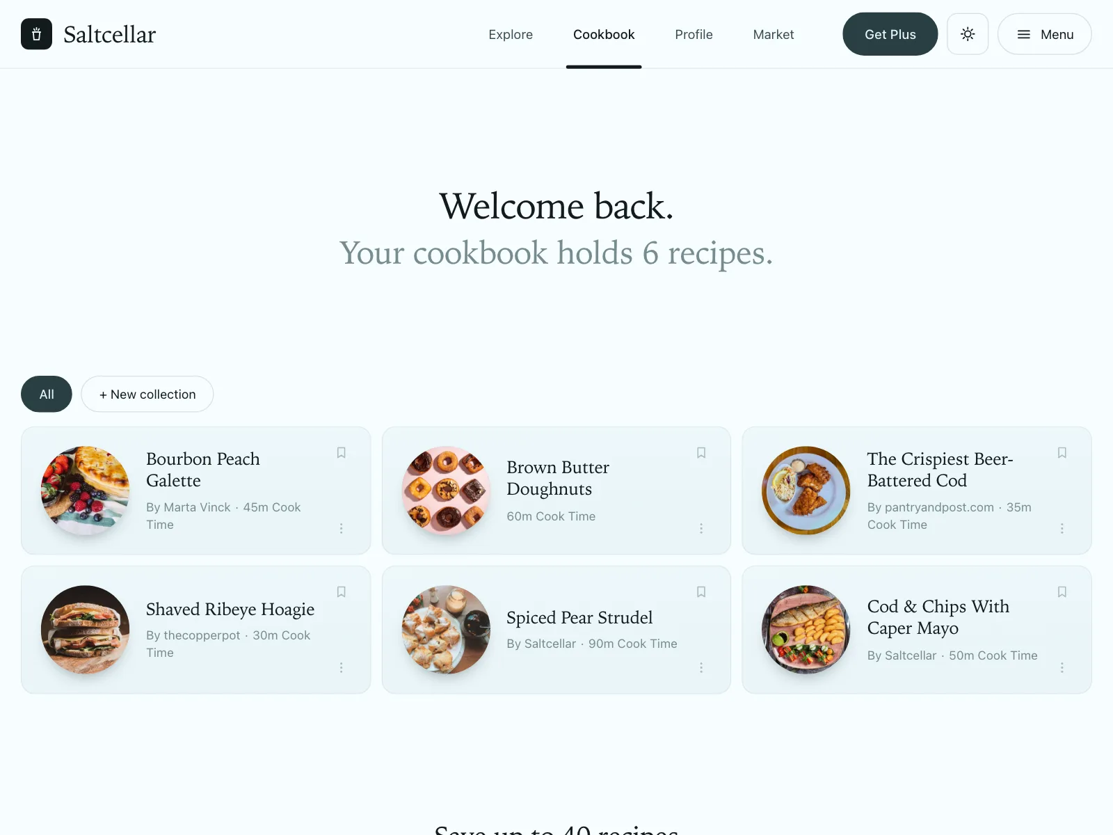
A thumbnail on one side and the details on the other, so cards stack in a column like a richer list.


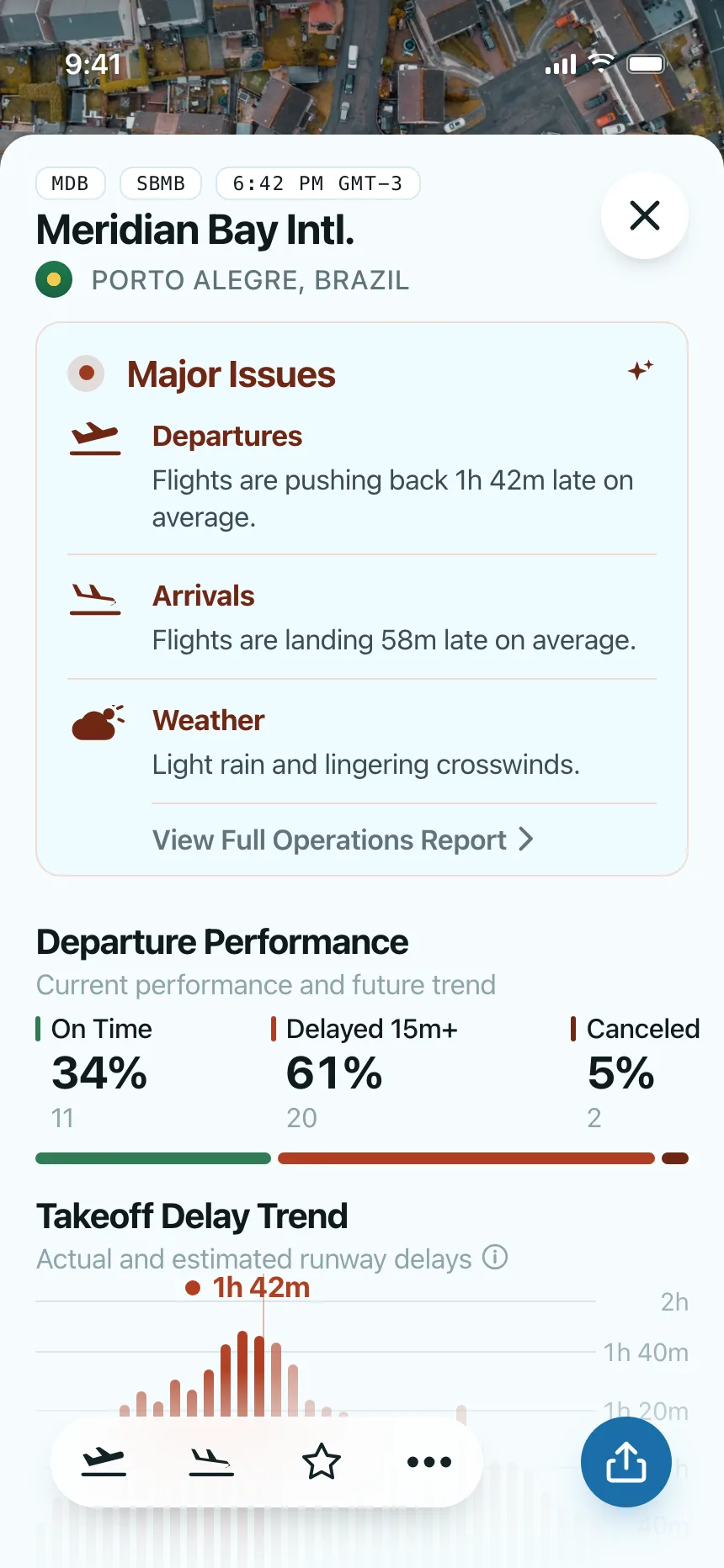
4. Stat cards
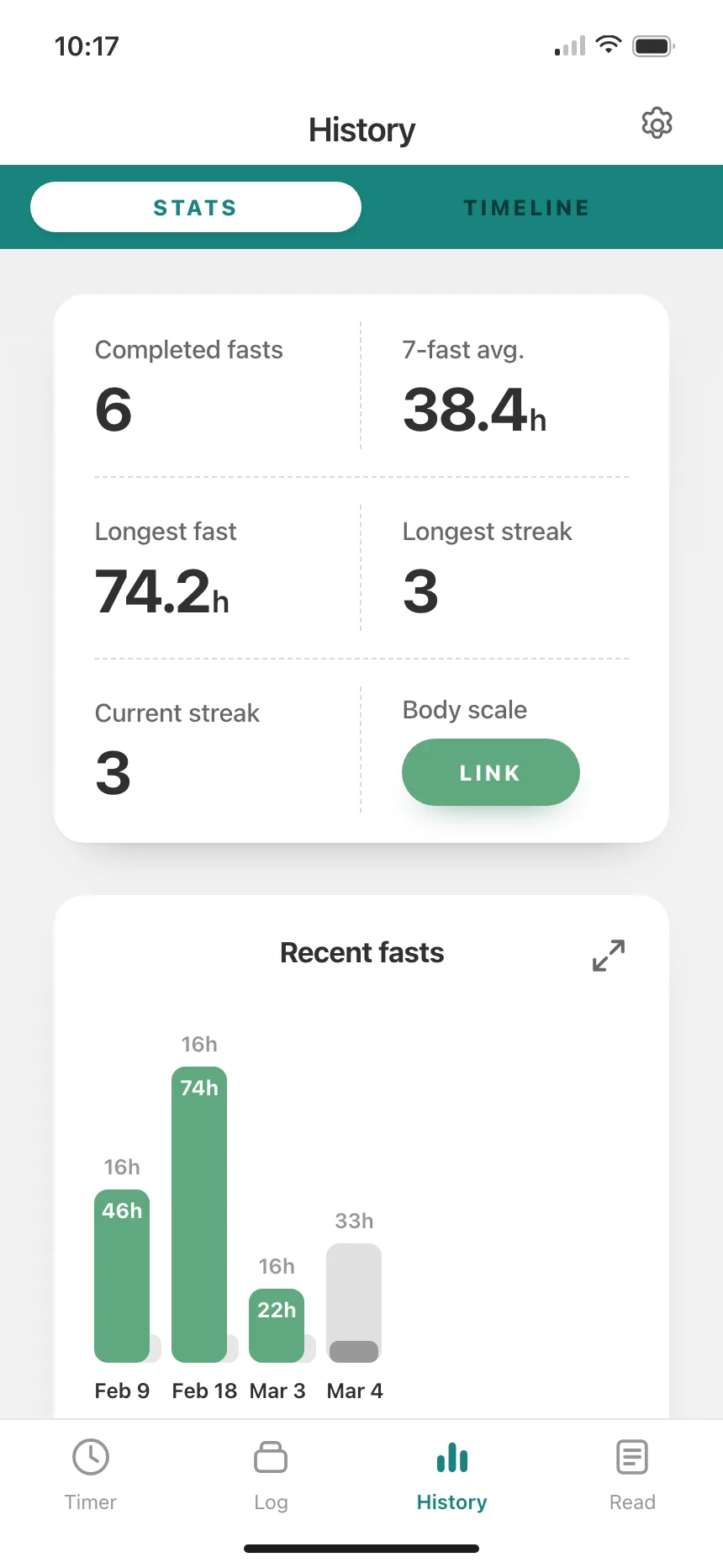
One number with its label and a progress bar or comparison, repeated in a row or grid of equal cards.

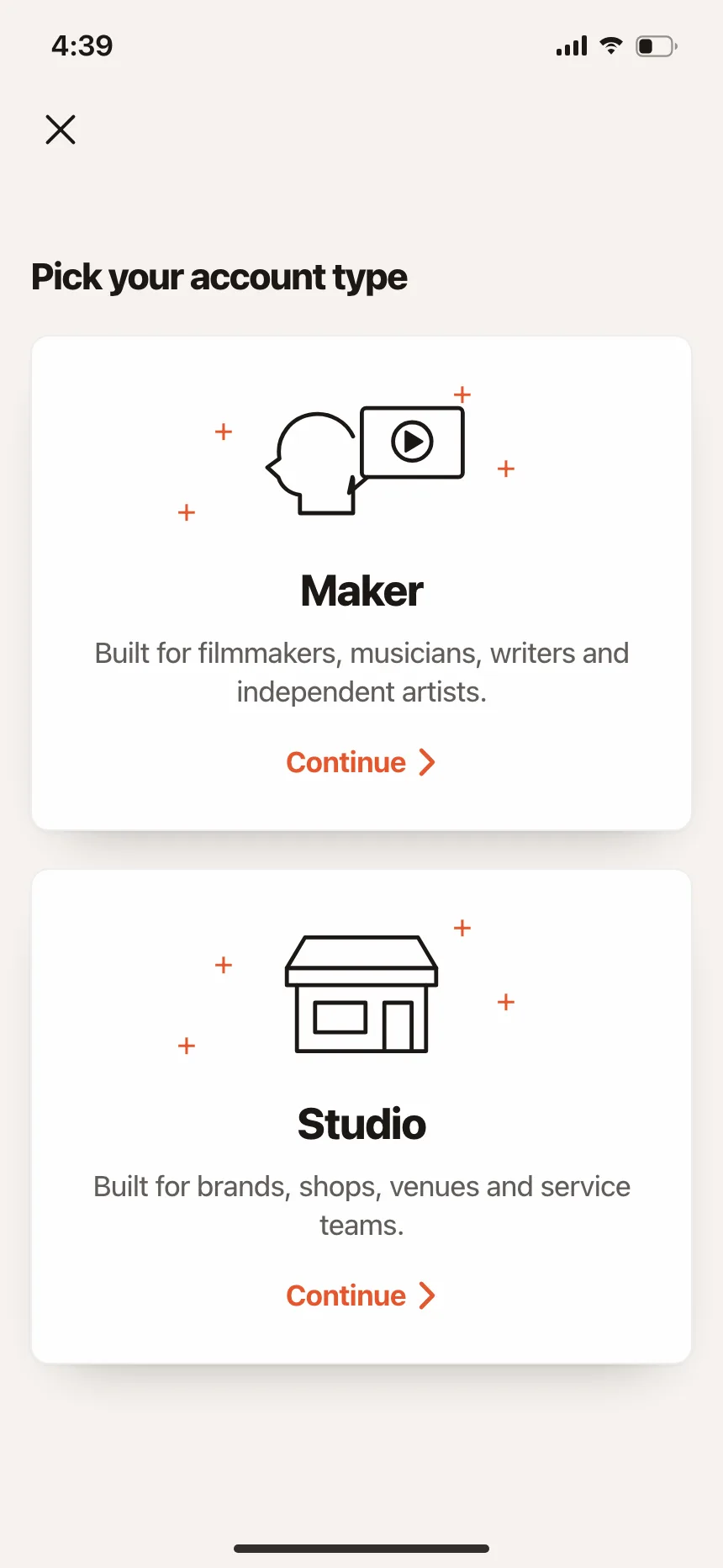
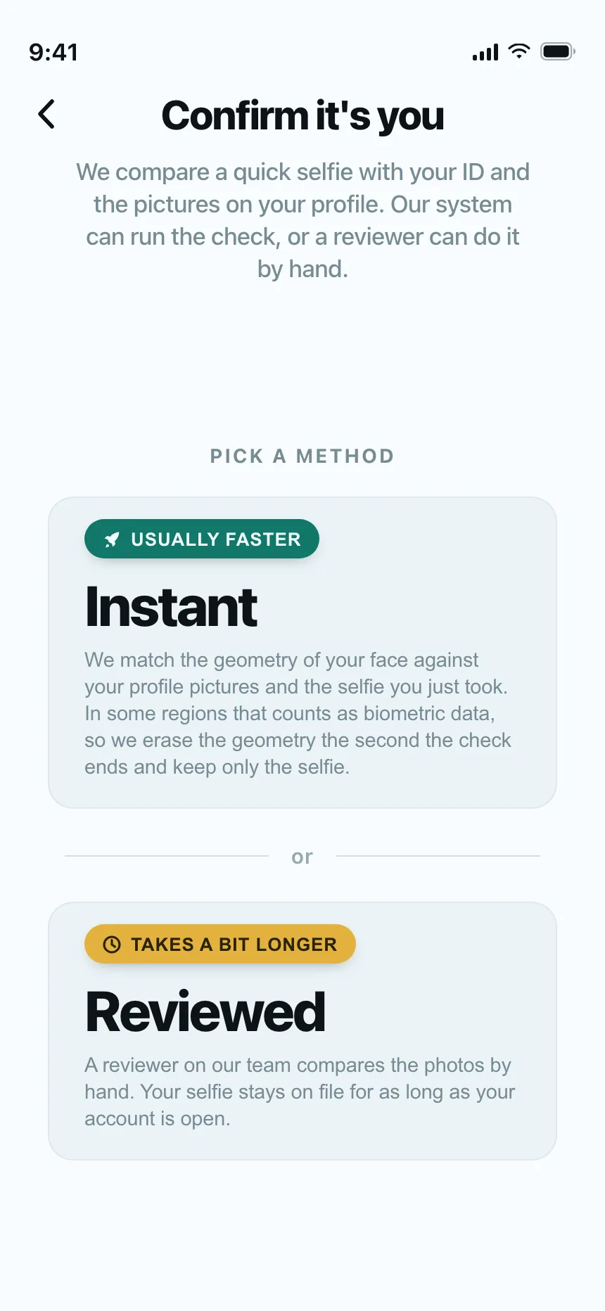
5. Choice cards
Large cards for a single decision, like an account type or a setup path, each with a short explanation of what it means.

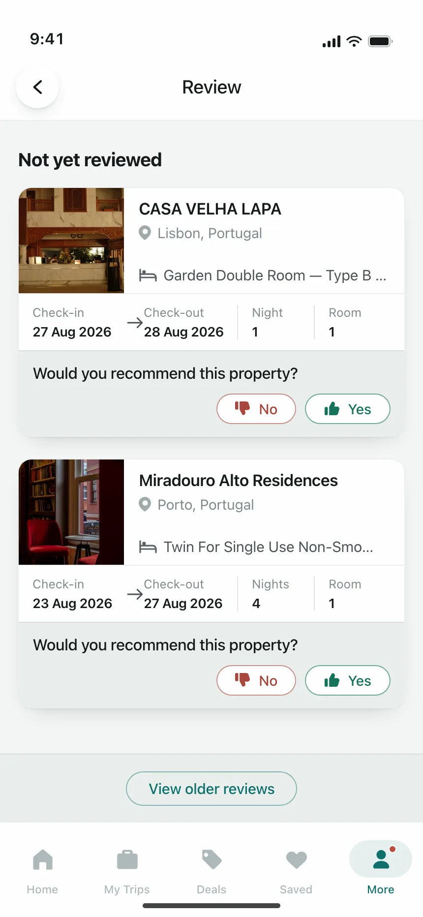
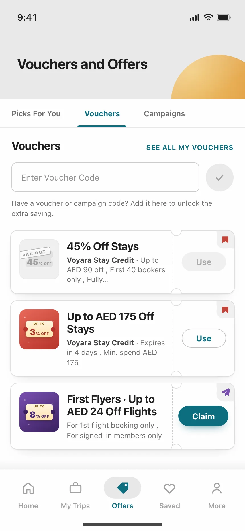
6. Cards with actions
A record with its status and the next step on the card itself, like Request signatures, Claim or a yes or no answer.

Where cards show up
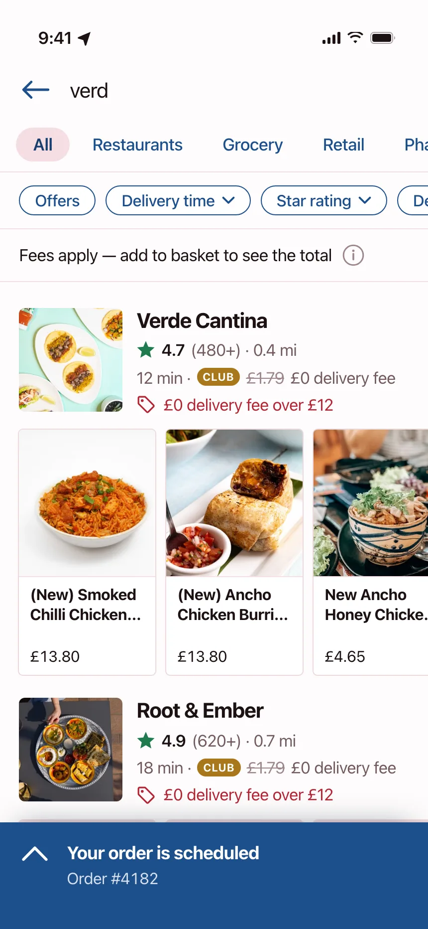
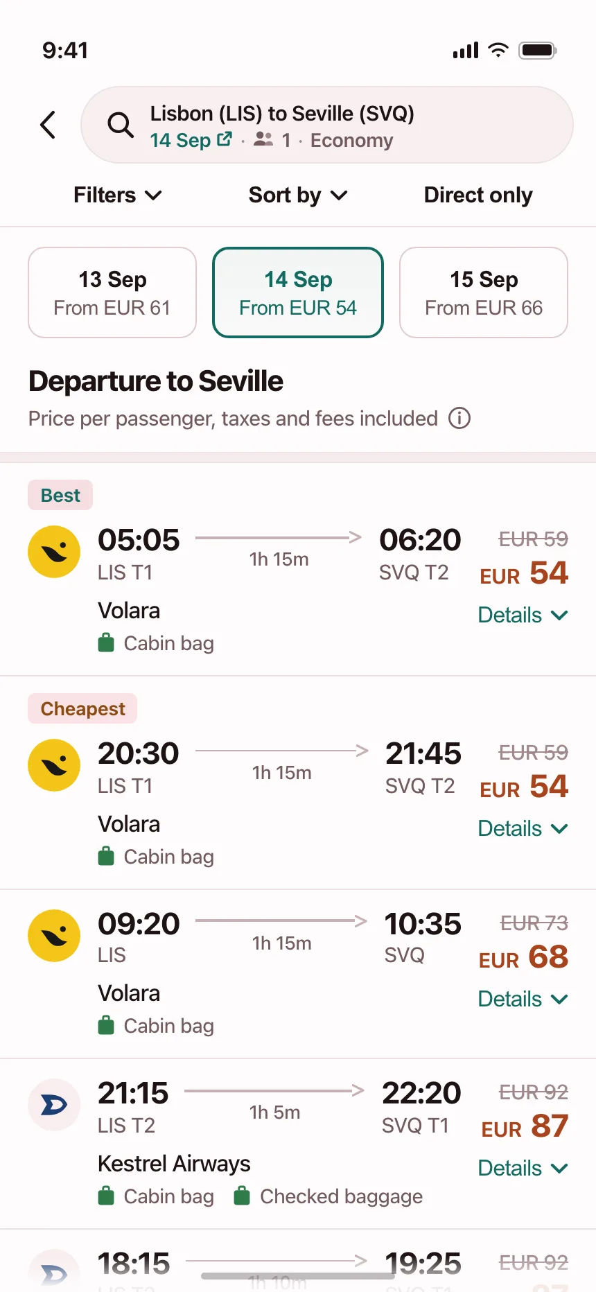
Search results
Restaurants, flights and models in a results feed, each card carrying the facts people compare.
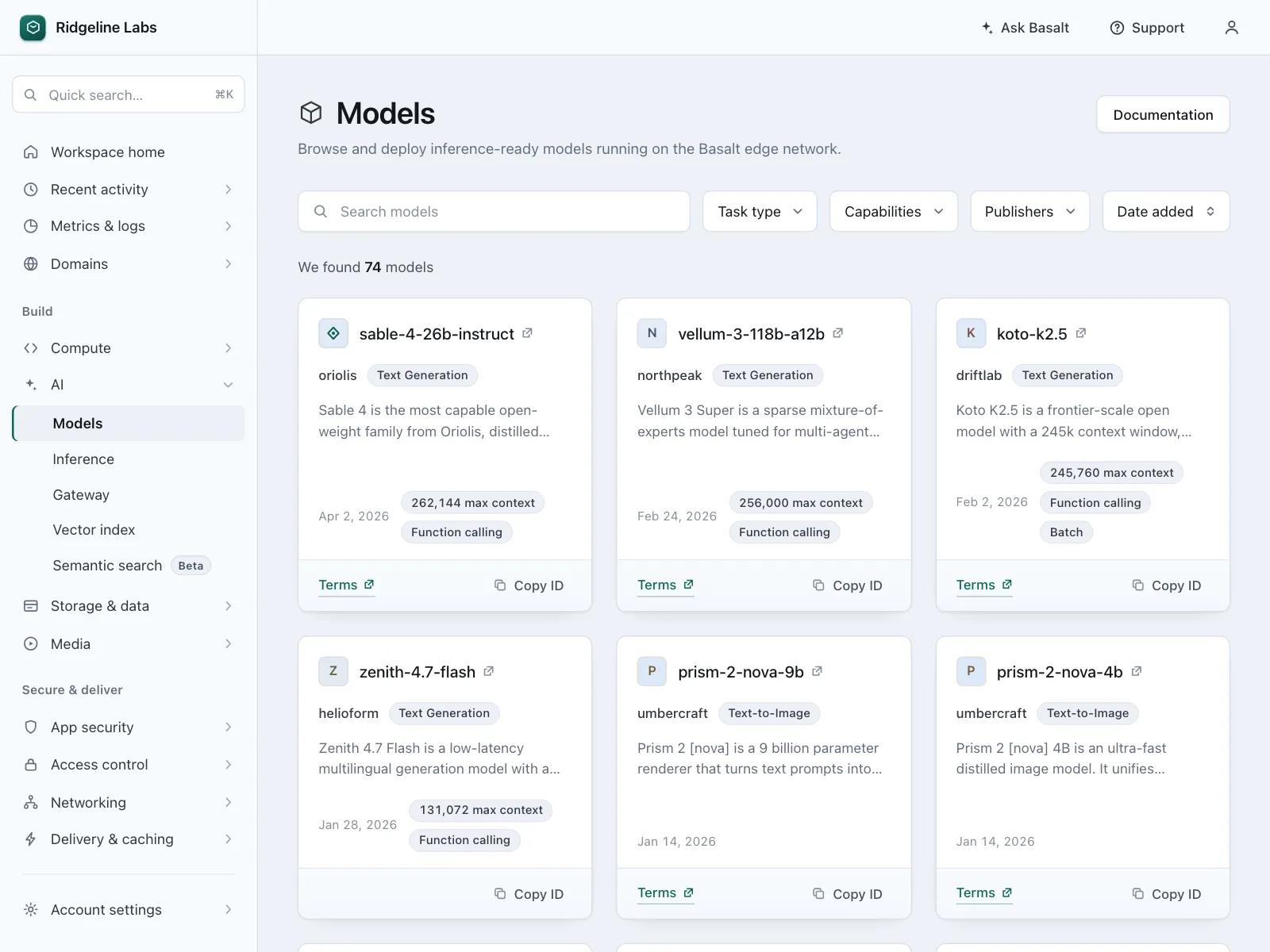
Templates and projects
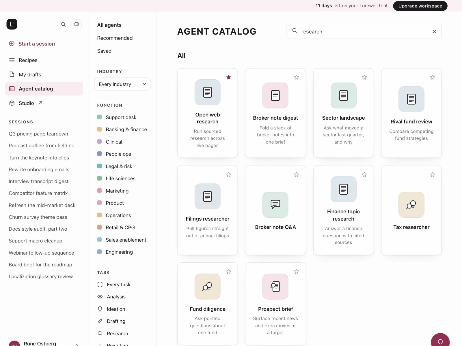
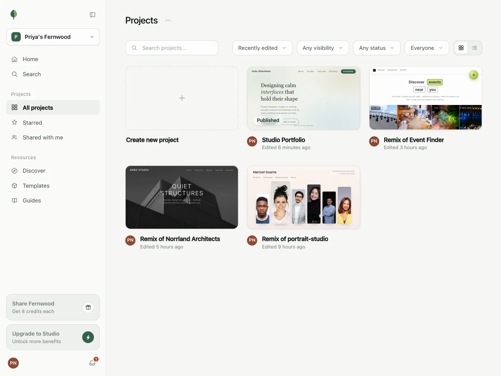
Galleries of templates, agents and projects, where each card is a starting point with a one-line description.

Feeds
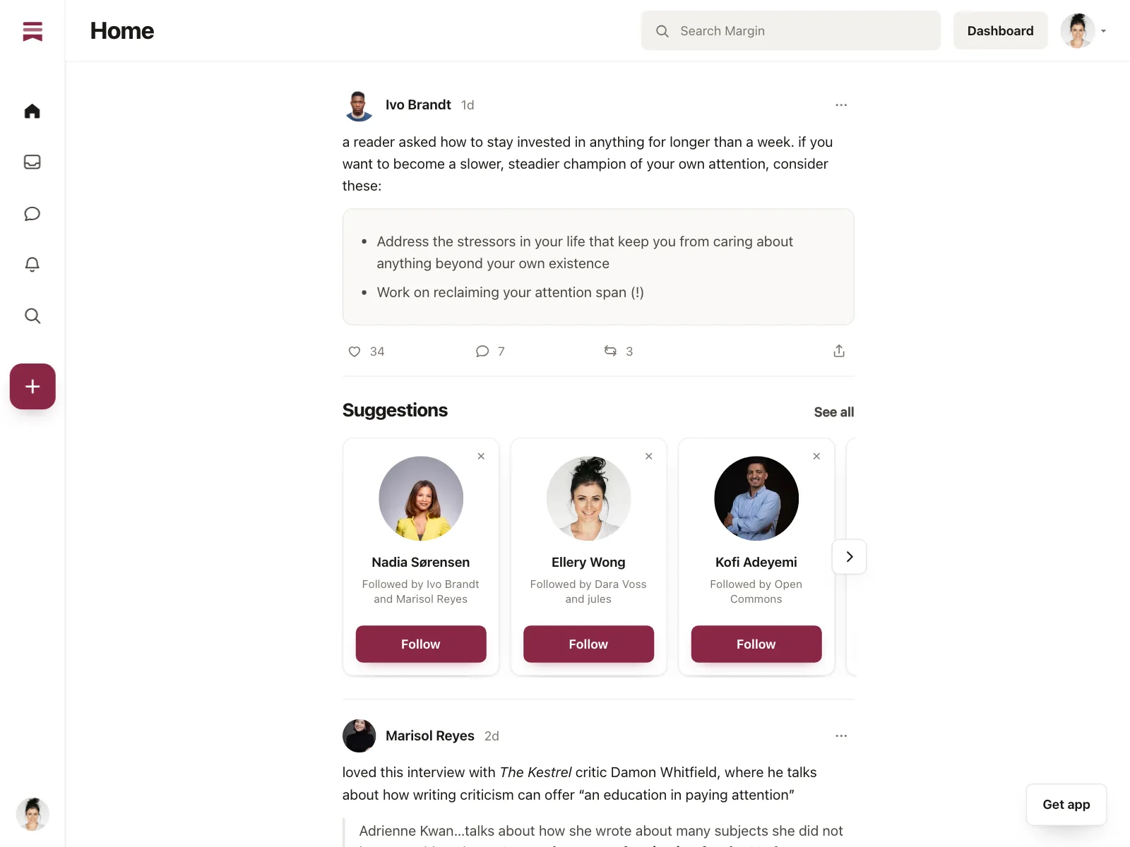
Posts, link previews and essay picks in social and reading apps, one card per post.

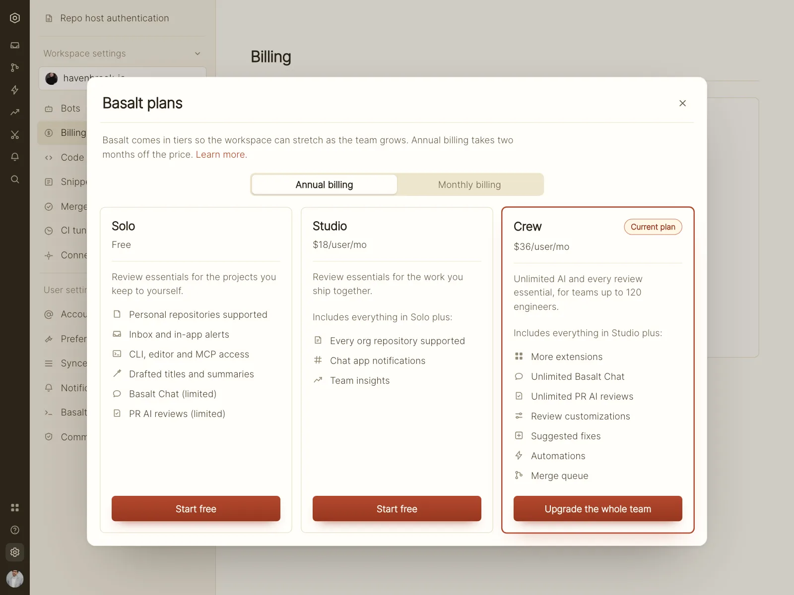
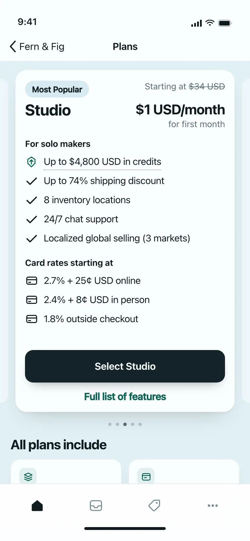
Plans and pricing
Plan cards side by side, each with a price, a feature list and one button.

Card vs similar components


Build notes
- Put the title in a heading and make it the link, instead of wrapping the whole card in <a>.
- Stretch the title link over the card with an absolutely positioned ::after to make all of it clickable.
- Raise extra buttons, like Save, above the stretched link, and give each one an accessible name.
- Group a set of cards in a <ul>, so screen readers announce how many there are.
- Put the image after the heading in the source, and move it to the top with CSS order.
- Keep small buttons at least 24 by 24 CSS pixels, the WCAG 2.2 AA minimum.
FAQ
Should the whole card be clickable?
Yes, when the card leads to one place. Make the title the link and stretch its click area over the card, so people can click anywhere while screen readers hear only the title as the link name. The cost is that text inside the card gets harder to select.
What's the difference between a card and a list item?
A card is a self-contained block with its own frame, usually with an image and room for actions, and cards sit in grids or rails. A list item is a row in a single column, split from its neighbors by a rule. Use cards for browsing and a list for scanning many items fast.
How many actions should a card have?
One main action, usually opening the item, plus one or two small ones like Save or Share. If a card needs more, move them to a menu or to the detail page.
How do you make a card grid responsive?
Use CSS grid with repeat(auto-fill, minmax(240px, 1fr)). The browser fits as many 240 pixel columns as the row holds without overflowing, and the cards stretch to share the space left over, so the grid steps down to one column on a phone.
Related terms
All glossary terms · Browse 171 web and 179 mobile card designs