
Stacked list
A stacked list puts items in a single column of rows that share one layout, so people can scan down it and pick one.
- Also called
- list view
- Platforms
- Web, Mobile
- In the gallery
- 50 web and 165 mobile designs
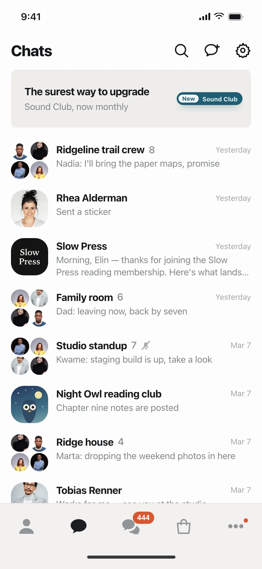

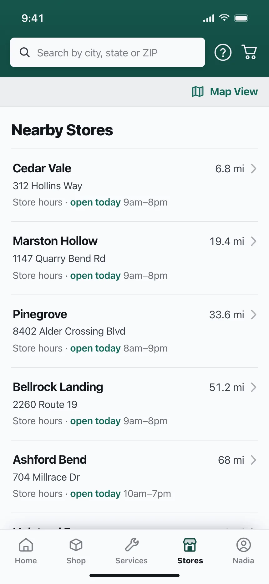
Stacked lists from the Kombai gallery: a messaging app's chat inbox, a directory of local trades and a hardware retailer's nearby stores.
What is a stacked list?
A stacked list is a single column of rows, one per item, each laid out the same way. A row often starts with an avatar, icon or thumbnail, carries a title and a line of detail, and ends with a time, a value, a switch or a chevron. Selecting a row usually opens the item.
- Every row follows one layout, so the eye runs straight down the column.
- Thin rules or even spacing separate the rows.
Stacked lists show up across settings, search, notifications and followers screens.
When to use a stacked list
- Many similar itemsMessages, contacts, results or payments with a title and a little detail.
- Small screensOne column fits a phone without squeezing anything.
- Settings and pickersRows of options, each with a switch, a value or a chevron.
When not to use one
- Comparing several fieldsIf people compare values across items, use a table.
- Image-led itemsProducts and places that sell on their photos read better as cards.
- Nested itemsItems inside other items need a tree or an accordion.
Anatomy of a stacked list
This one works. Open a conversation and it is marked read, or tab down the rows and press Enter.
Messages
- Rhea Alder, 2 unreadAre we still on for Saturday's hike?9:41
- Studio standup, 1 unreadKwame: the new build is up, take a look9:12
- Marco DiazThanks, the tickets came throughYesterday
- Ines ParkSent a photoMon
- Unread
- Read
- Hover
- Keyboard focus
- Leading visualAvatar, icon or thumbnail
- TitleNames the item
- Supporting textOne line of detail
- Trailing elementTime, count or chevron
- DividerSeparates the rows
- StatesUnread, read, hover, focus
Stacked list variants
We sorted every stacked list design in the Kombai gallery and found six patterns. Browse all 50 web and 165 mobile designs.
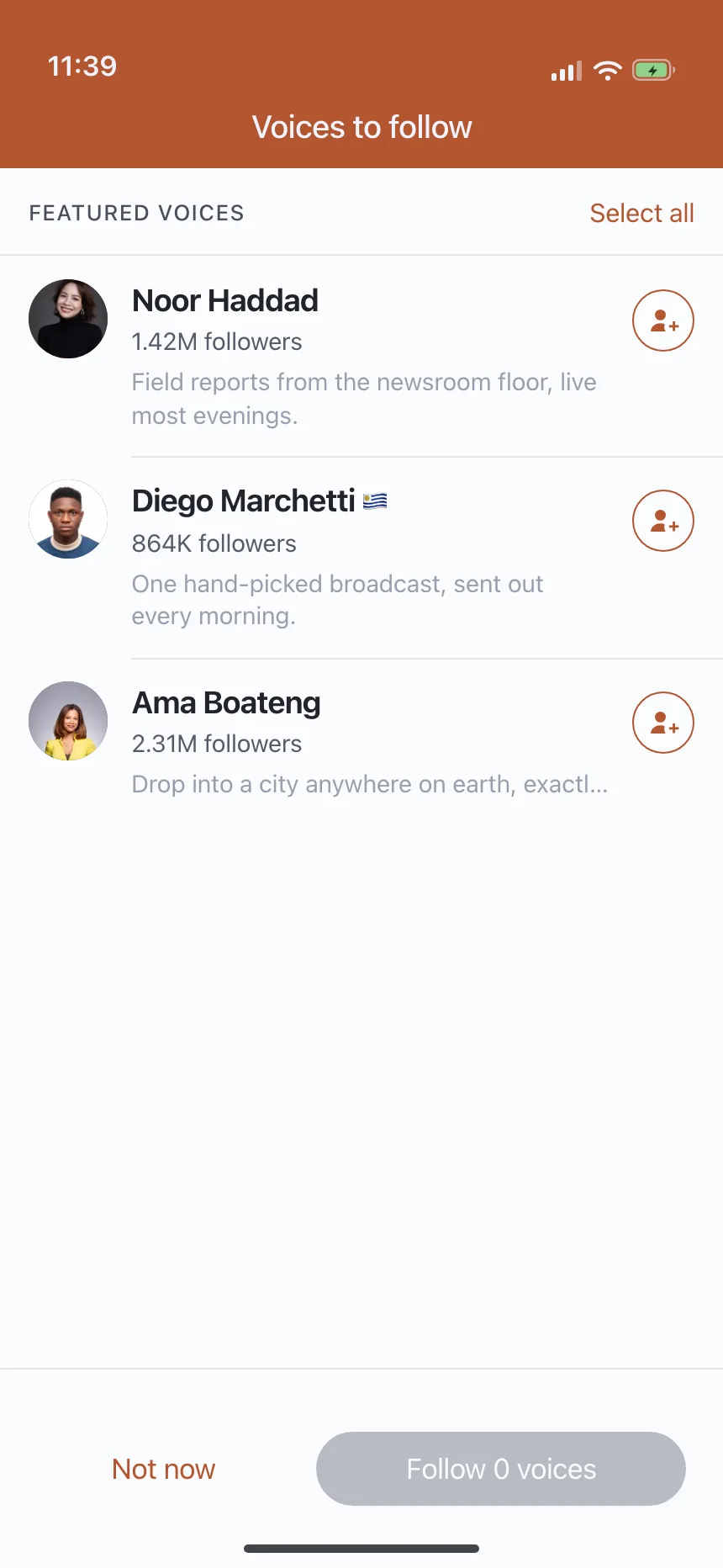
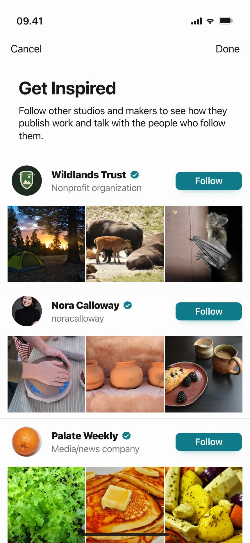
1. Avatar rows
A round photo or initials, a name and a line about the person, often with a Follow button at the end.

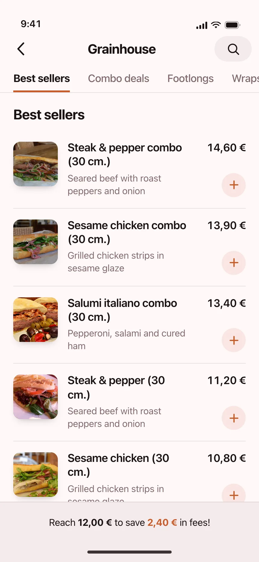
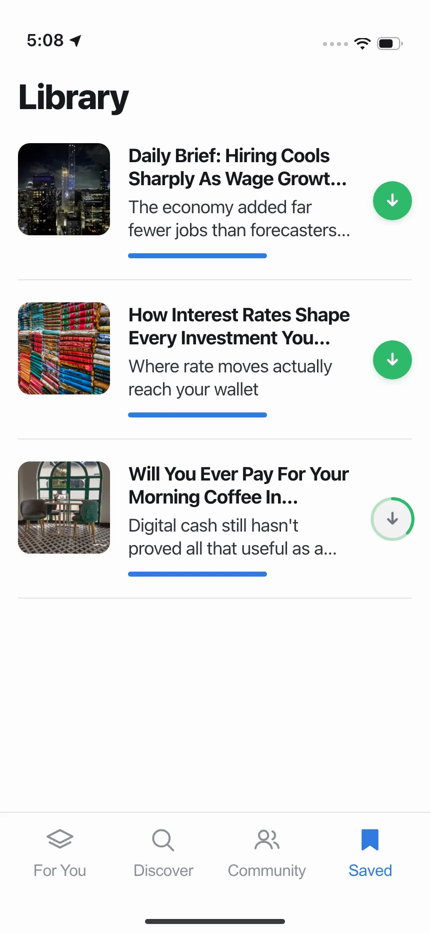
2. Thumbnail rows
A square image beside a title and a short description, used for menu items, articles and songs.

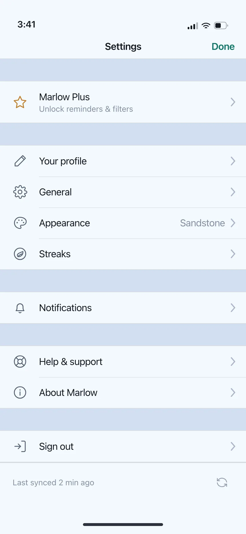
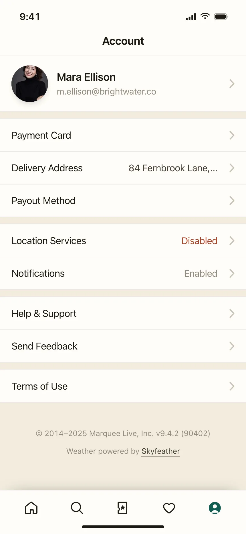
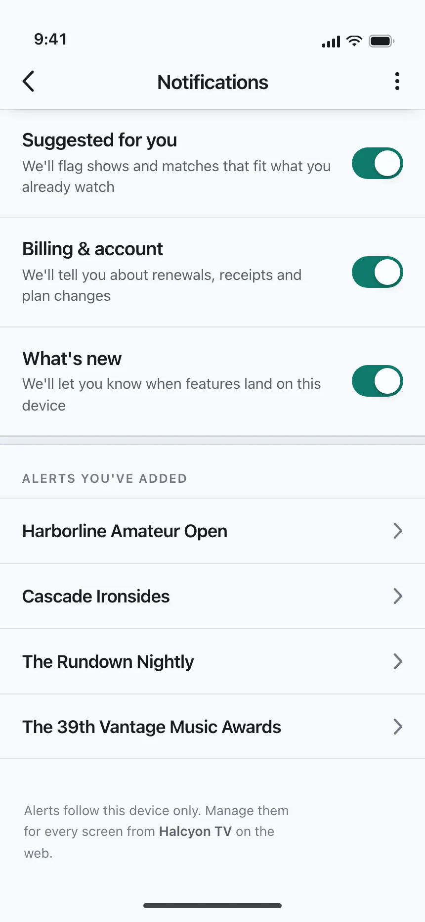
3. Settings rows
Icon, label and a chevron, a value or a switch, gathered into groups with a little space between them.
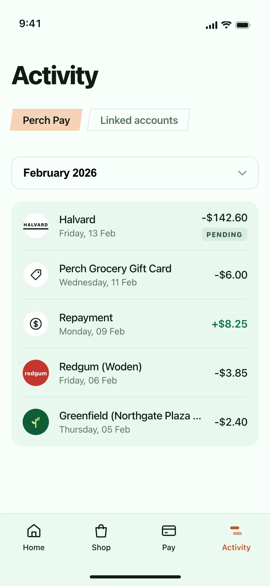
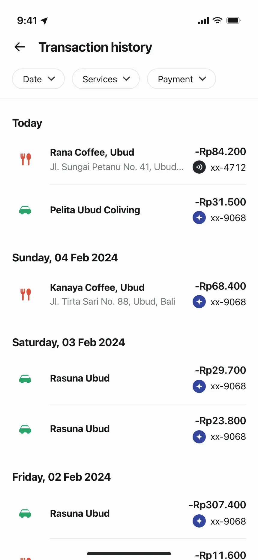
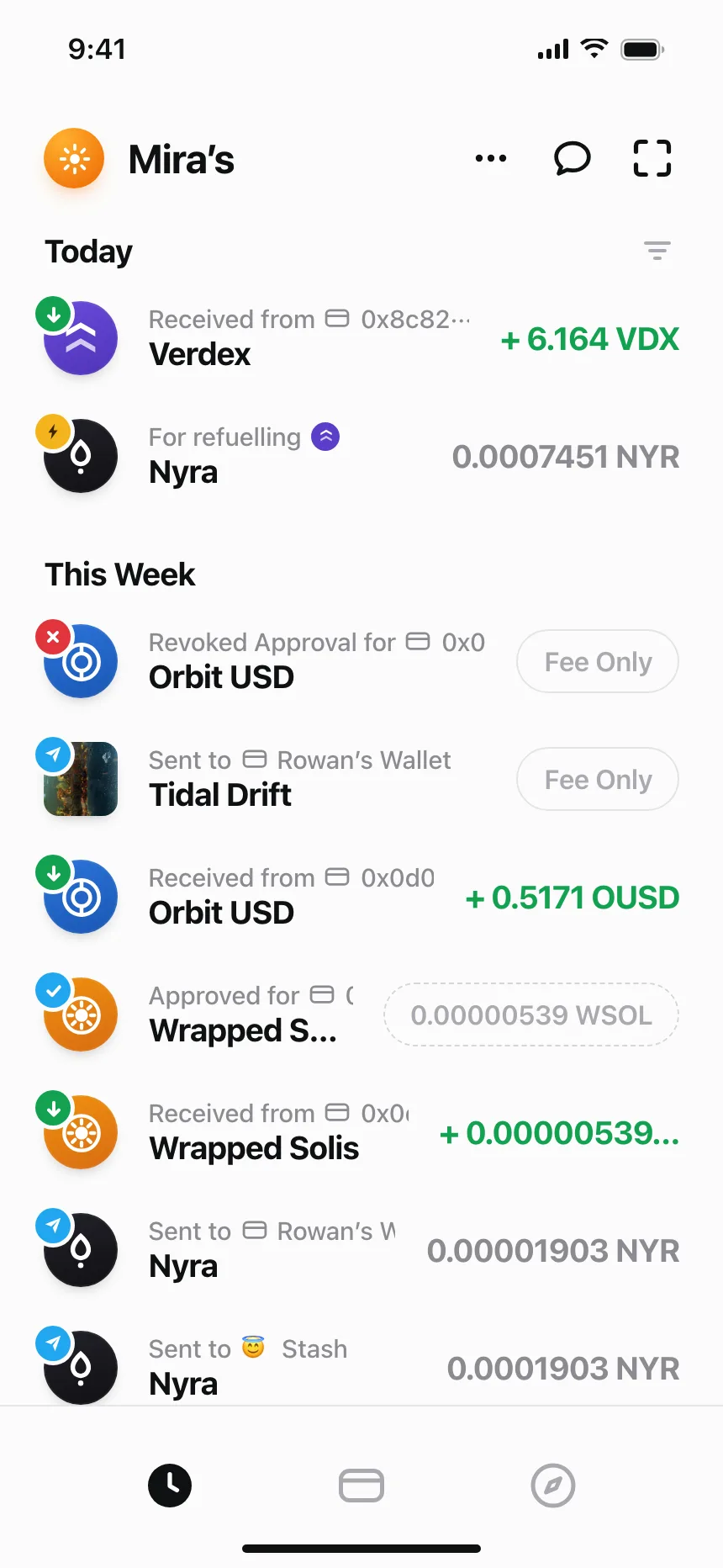
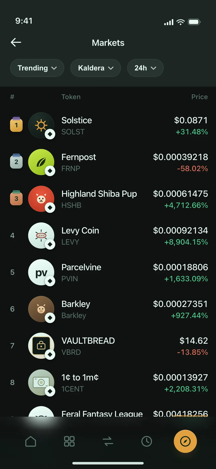
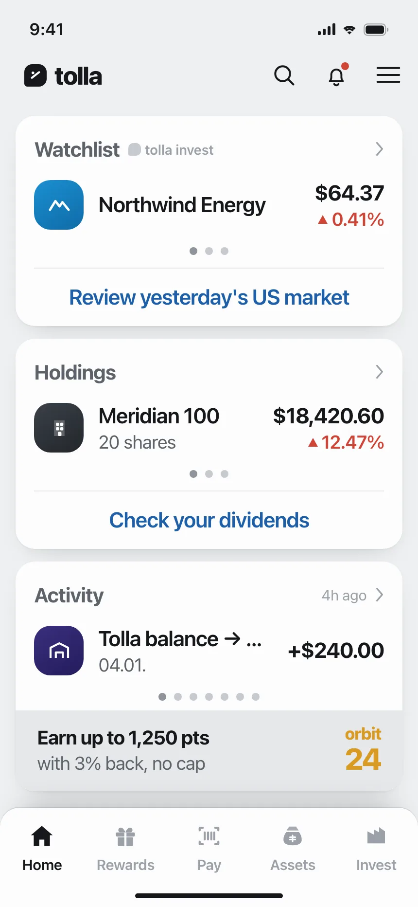
4. Rows grouped by date
Payments, activity and history under Today, This week or dated headers, with the amount or time at the end of each row.
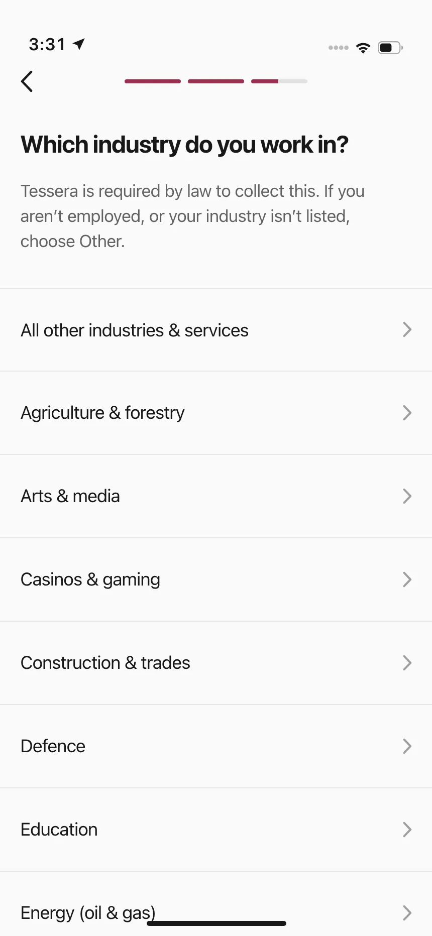
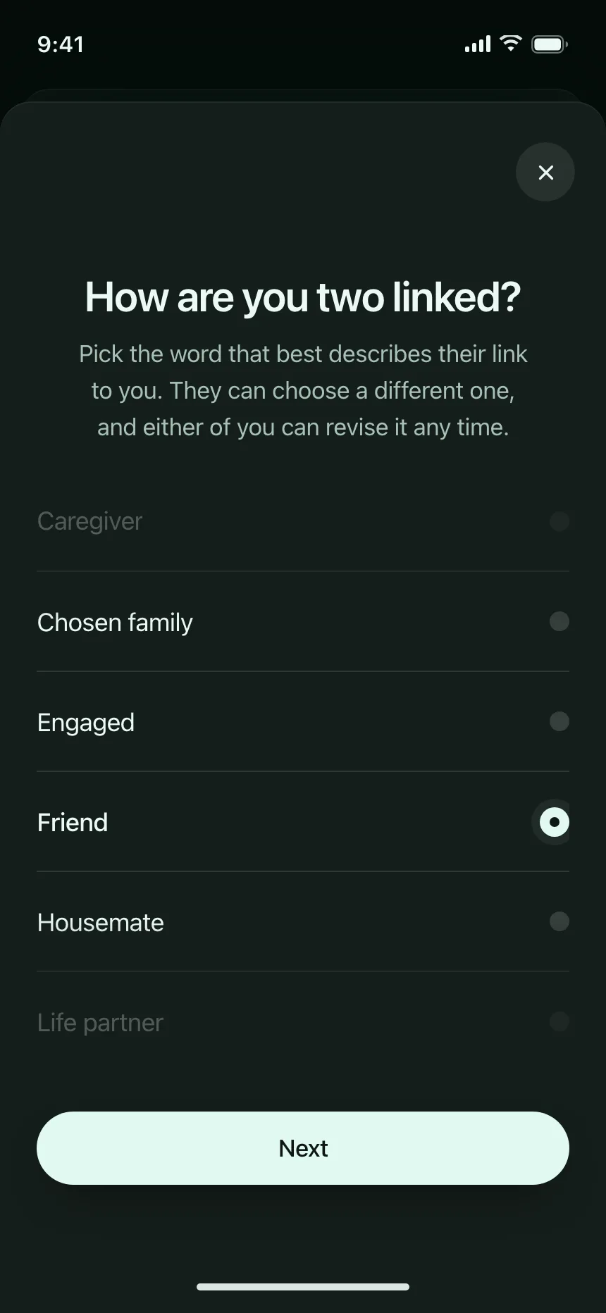
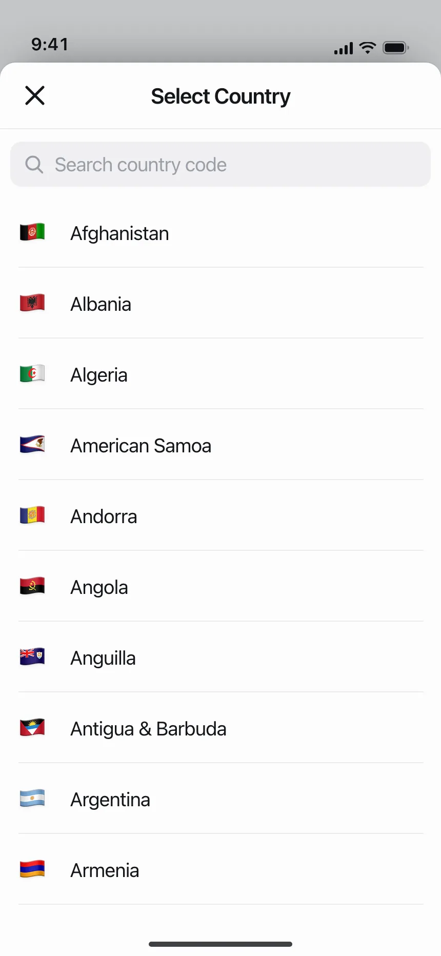
5. Option rows
Full-width rows to pick one answer or several, like an industry, a relationship or a country from a searchable list.
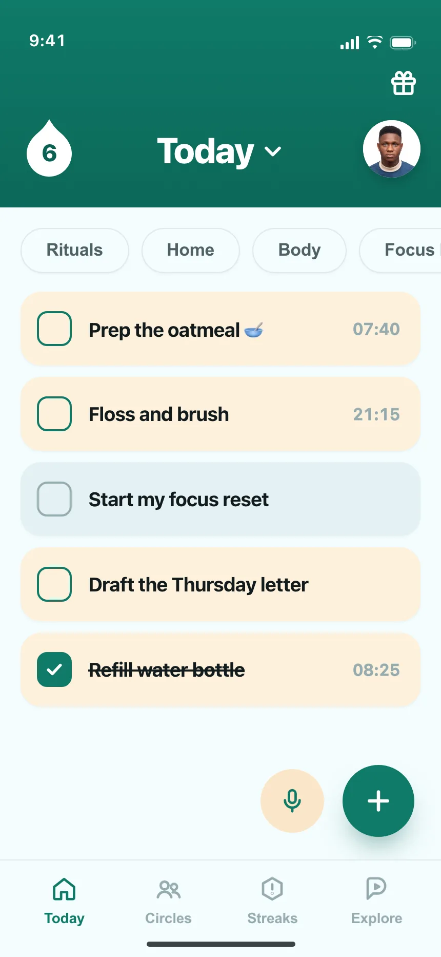
6. Checklists
Rows with a checkbox at the start, for tasks, shopping items and setup steps that people tick off.
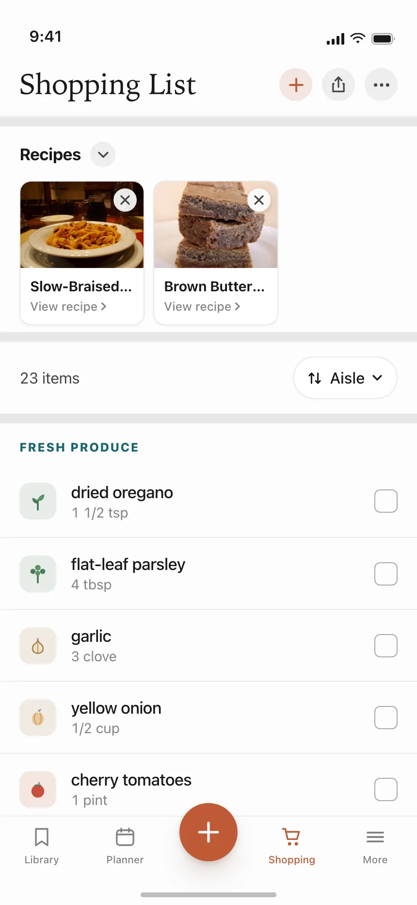

Where stacked lists show up
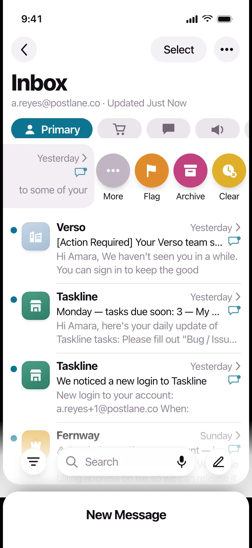
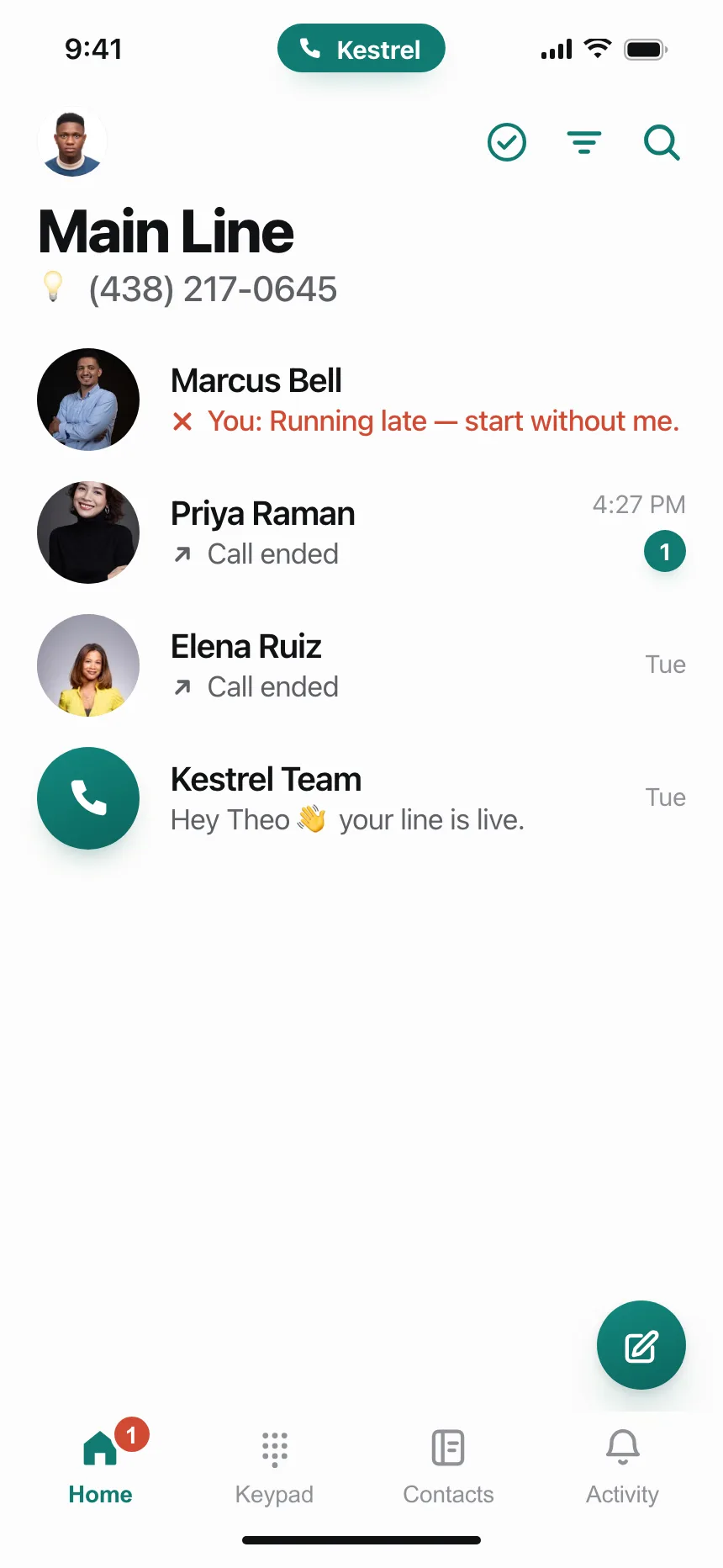
Inboxes
Email, chat and call threads: sender, a one-line preview, the time and an unread marker.

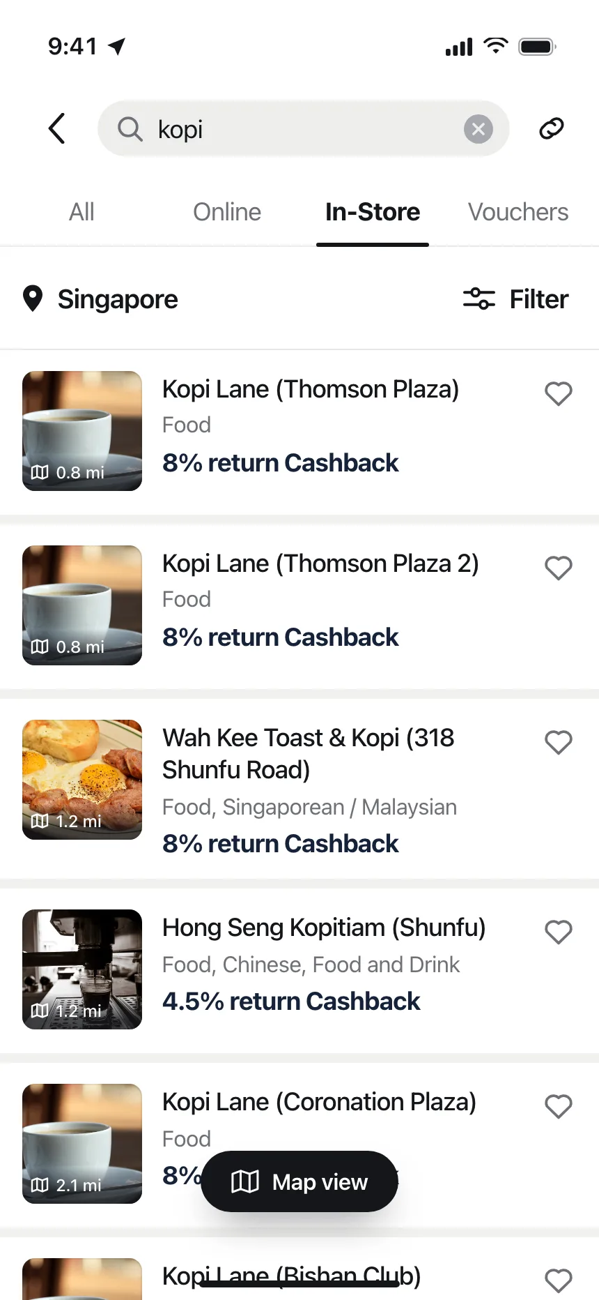
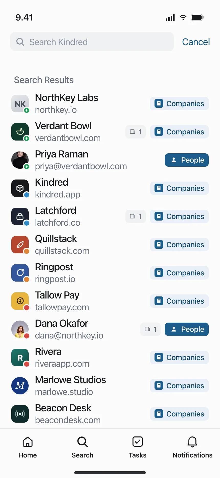
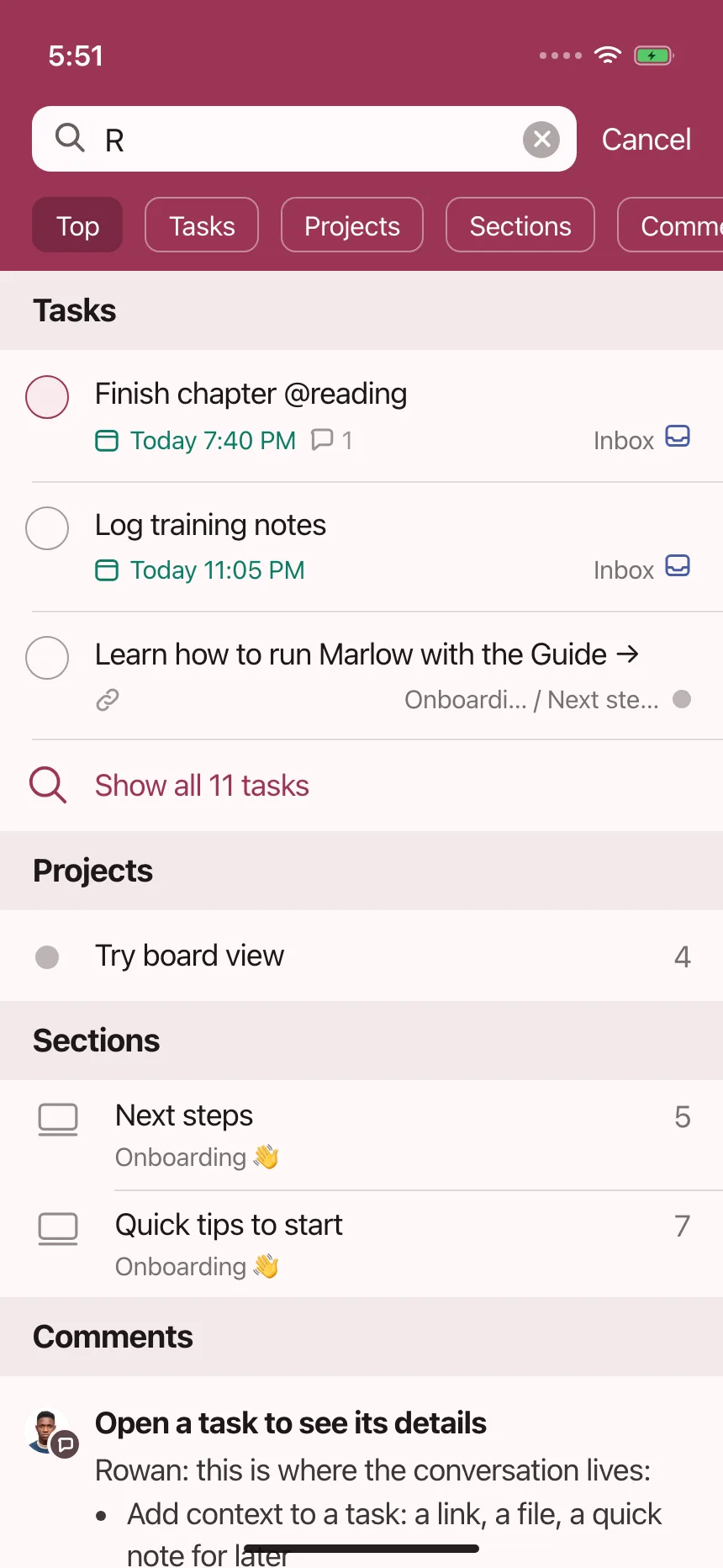
Search results
Stores, companies and tasks returned for a query, often split into sections by type.
Workspace lists
Pages, routines and recent files in work tools, one row each with when it was last touched.


Stacked list vs similar components
Build notes
- Mark up the rows as a <ul> with one <li> per item, so screen readers announce how many there are.
- When the whole row opens the item, make the title the link and stretch it over the row.
- Keep switches, menus and Follow buttons as their own controls, above the stretched link.
- Don't mark unread rows with color alone. Add a dot or a count and bold text, and put "unread" in the link's name.
- Make each row the full tap target, at least the 44 by 44 point control size Apple uses on iOS.
- Group long lists under short sticky headers, like dates or letters.
FAQ
What is the difference between a stacked list and a table?
A stacked list gives each item one row with a title and a line or two of detail, laid out freely. A table lines every value up under named columns so people can compare across items. Use a list when people read items one at a time, and a table when they compare fields.
Should list rows have dividers?
Use thin dividers or clear spacing, not both. Dividers help dense lists like inboxes and settings. Spacing alone works when rows already have strong leading visuals, like avatars or thumbnails.
How tall should a list row be?
Tall enough that the whole row is an easy tap. Apple's default control size on iOS is 44 by 44 points, so a one-line row should be at least that tall, and rows with a second line of text need more.
How do you handle a very long list?
Add search above it, group rows under headers like dates or letters, and load more as people reach the end. For thousands of rows, render only the rows on screen so scrolling stays smooth.
Related terms
All glossary terms · Browse 50 web and 165 mobile stacked list designs