


Carousels from the Kombai gallery: an activewear brand's new arrivals, a paddle-sports training app's session cards and a rental listing's photos.
What is a carousel?
A carousel is a horizontal row of slides, usually cards or images, with only a few in view at a time. People swipe, click an arrow or pick a dot to move the others into view. It fits a long set into the space of one row.
- Arrows, dots or a slide cut off at the edge show that there is more.
- Slides share one size and shape, so the row reads as one set.
Carousels show up across feature, customer quote, home and product detail screens.
When to use a carousel
- Optional browsingPicks, deals and related items that people may skim but do not need.
- Several photos of one thingProduct and listing photos, one large image at a time.
- Short sequencesOnboarding or feature tours of a few steps.
When not to use one
- Content everyone must seeSlides past the first are easy to miss. Put key messages on the page.
- Comparing itemsPeople can't compare what they can't see at once. Use a grid or a table.
- Banners that rotate on their ownMoving slides pull attention and can change before people finish reading.
Anatomy of a carousel
This one works. Use the arrows or the dots, swipe the row on a phone, or tab to the slides and use the arrow keys.
Weeknight dinners
- First slide
- Last slide
- Keyboard focus
- ViewportThe window slides move through
- SlideOne card, labeled "1 of 4"
- ArrowsPrevious and next
- DotsPosition, and a way to jump
- StatesFirst, last, focus
Carousel variants
We sorted every carousel design in the Kombai gallery and found six patterns. Browse all 111 web and 30 mobile designs.
1. Card rails with arrows
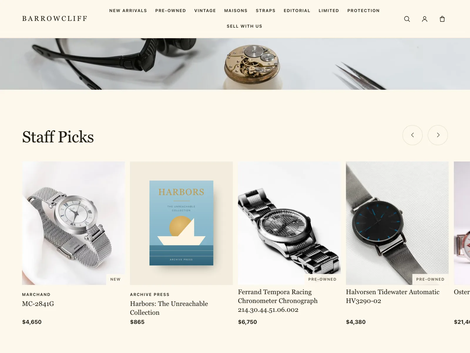
A row of product or listing cards with arrow buttons above or beside it, cut off at the edge so the next card shows.


2. Swipeable cards with dots
One card fills most of the width, the next one peeks in, and page dots below show where you are.


3. Hero carousels
One large slide at a time at the top of a home screen, often a show, a collection or a promotion with its own button.


4. Product photo carousels
Photos of one product or listing, one at a time, with arrows, dots or a strip of thumbnails to jump between them.


5. Onboarding and feature tours
A few slides that each explain one thing, with a progress bar or dots and a button to move on.


6. Stories
A row of round avatars that opens a full-screen viewer, stepping through posts with a progress bar on top.


Where carousels show up
Deals and recommendations
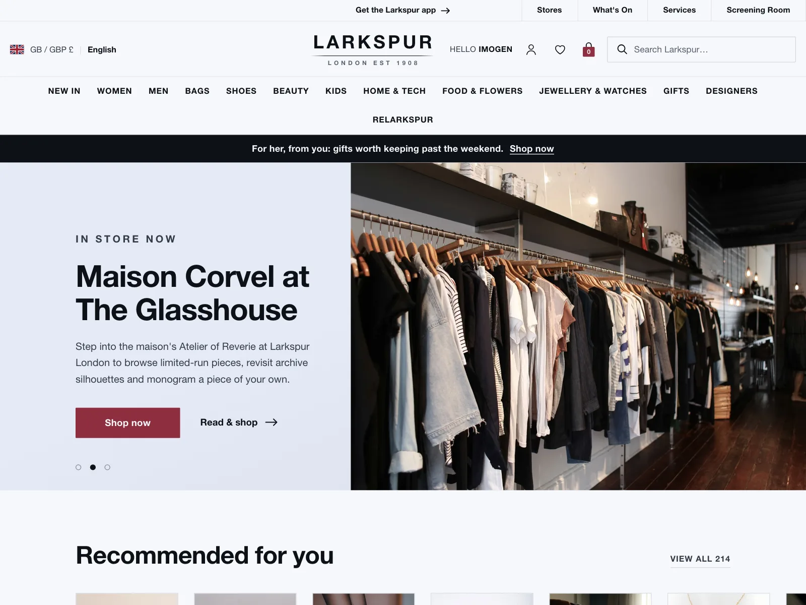
Rows of deals and picks on store and travel home screens, each with a See all link to the full list.


Media libraries
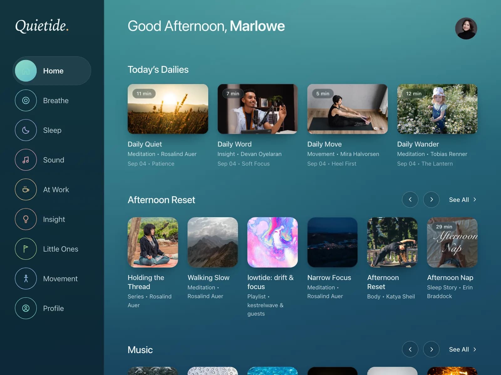
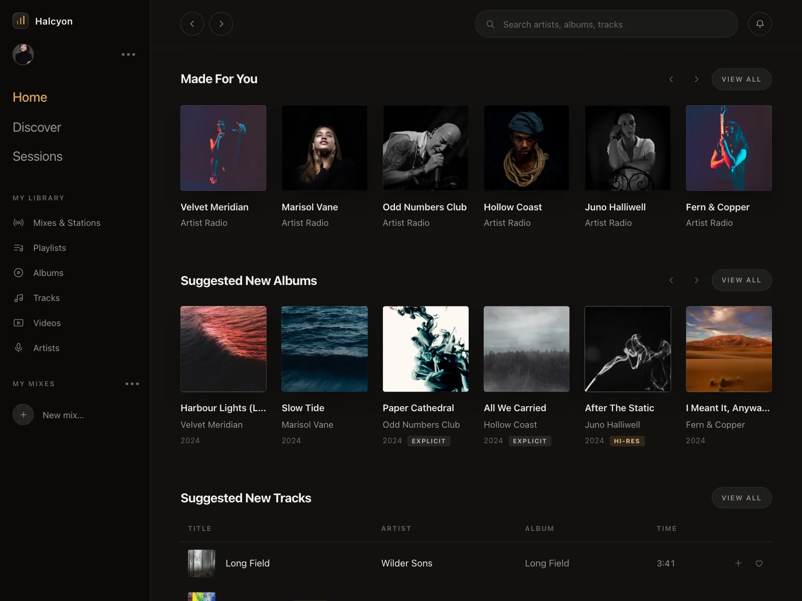
Music, meditation and audio apps stack one rail per row: picks for you, new releases and ranked charts.

Setup steps
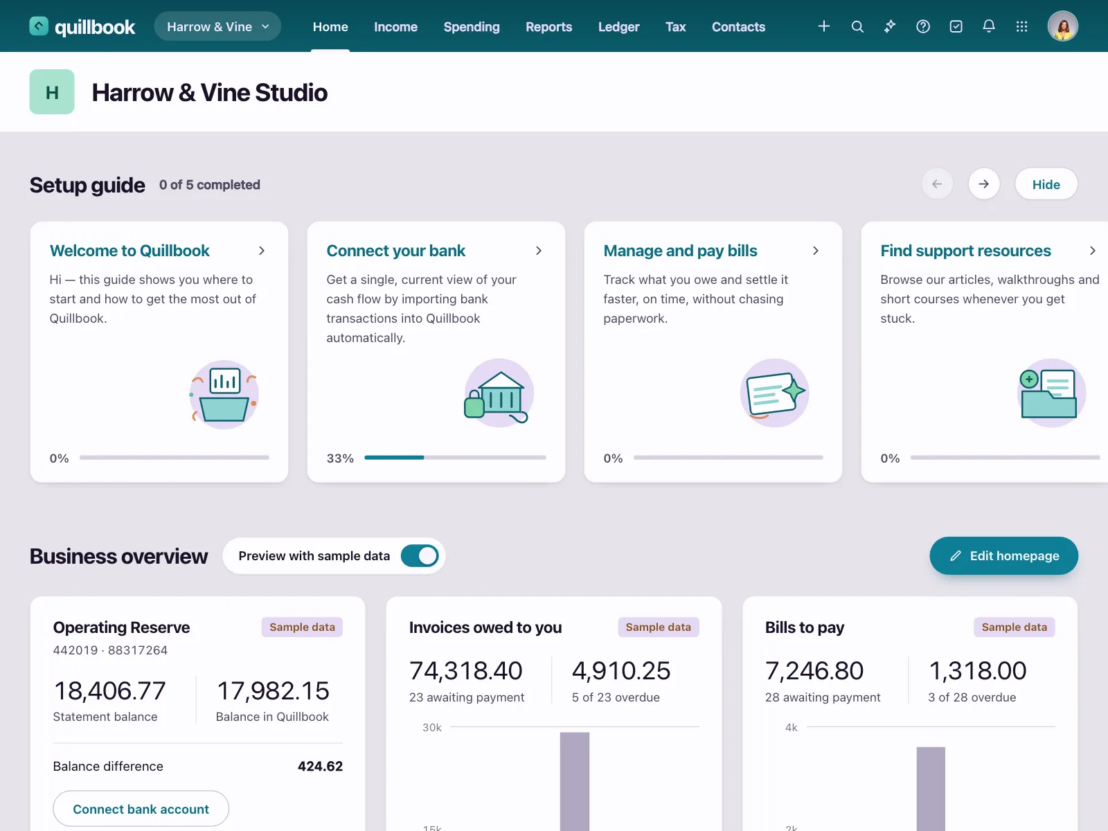
Onboarding tasks on a dashboard, one card per step, with progress so people see what is left.


Carousel vs similar components


Build notes
- Give the container aria-roledescription="carousel" and a label. Each slide is role="group" with aria-roledescription="slide".
- Label slides by position, like "2 of 4", when they have no names of their own.
- Announce slide changes with aria-live="polite" when the carousel does not rotate on its own.
- If it rotates, stop on hover and on keyboard focus, and put a pause button first in the tab order.
- Make Previous, Next and each dot a real <button>, at least 24 by 24 CSS pixels even when the dot is smaller.
- Use CSS scroll snapping for swipe, and skip smooth scrolling under prefers-reduced-motion.
FAQ
Should a carousel auto-rotate?
Usually not. Moving slides pull attention and can change before people finish reading. If yours must rotate, stop it while the pointer is over it or focus is inside it, and add a pause button. WCAG 2.2 requires a way to pause, stop or hide movement that starts on its own, lasts more than five seconds and plays alongside other content.
How many slides should a carousel have?
Few enough that people reach the end: three to five for hero banners and tours. Product rails can run longer when a See all link leads to the full list.
Carousel or grid?
Use a grid when people need to compare items or see everything. Use a carousel when the row is optional, like related picks, and space is tight. A carousel row with a See all link to a grid gives both.
How should a carousel work on mobile?
Let people swipe, snap each slide into place and show the edge of the next slide so the row reads as scrollable. CSS scroll snapping does this natively: scroll-snap-type on the row and scroll-snap-align on each slide.
Related terms
All glossary terms · Browse 111 web and 30 mobile carousel designs