


Testimonials from the Kombai gallery: an incident tool's wall of customer quotes, a finance app's full-screen member story and a wellbeing brand's photo cards.
What are testimonials?
A testimonials section quotes customers about what a product did for them. Each quote carries a name, a role or company and usually a photo or initials, so it reads as a person and not as marketing copy. A page can show one strong quote or a whole wall of them.
- Every quote is attributed: a name, a role or company and a face.
- The best quotes name a specific result, not a general feeling.
Testimonials show up across case study, contact, sign-up and partner program screens.
When to use a testimonials
- Backing up a claimRight after a feature or a price, where people wonder if it is true.
- Before a commitmentNext to sign-up, paywall and demo forms.
- Products people choose by word of mouthApps, courses and services bought on trust.
When not to use one
- Quotes you made upInvented or anonymous praise costs more trust than it earns.
- Vague praise"Great product!" says nothing. Use a quote with a detail.
- Inside a taskMid-checkout or mid-form, a quote is a distraction.
Anatomy of a testimonials
This one works. Step through the quotes with the arrows, or tab to them and press Enter.
- Initials avatar
- Photo avatar
- Keyboard focus
- QuoteOne specific result, in their words
- AvatarPhoto or initials
- Name and roleWho said it, and where
- RatingOptional stars
- ControlsPrevious and next, for sliders
- StatesInitials, photo, focus
Testimonials variants
We sorted every testimonials design in the Kombai gallery and found six patterns. Browse all 313 web and 33 mobile designs.
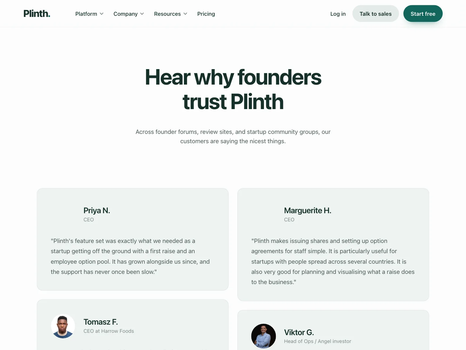
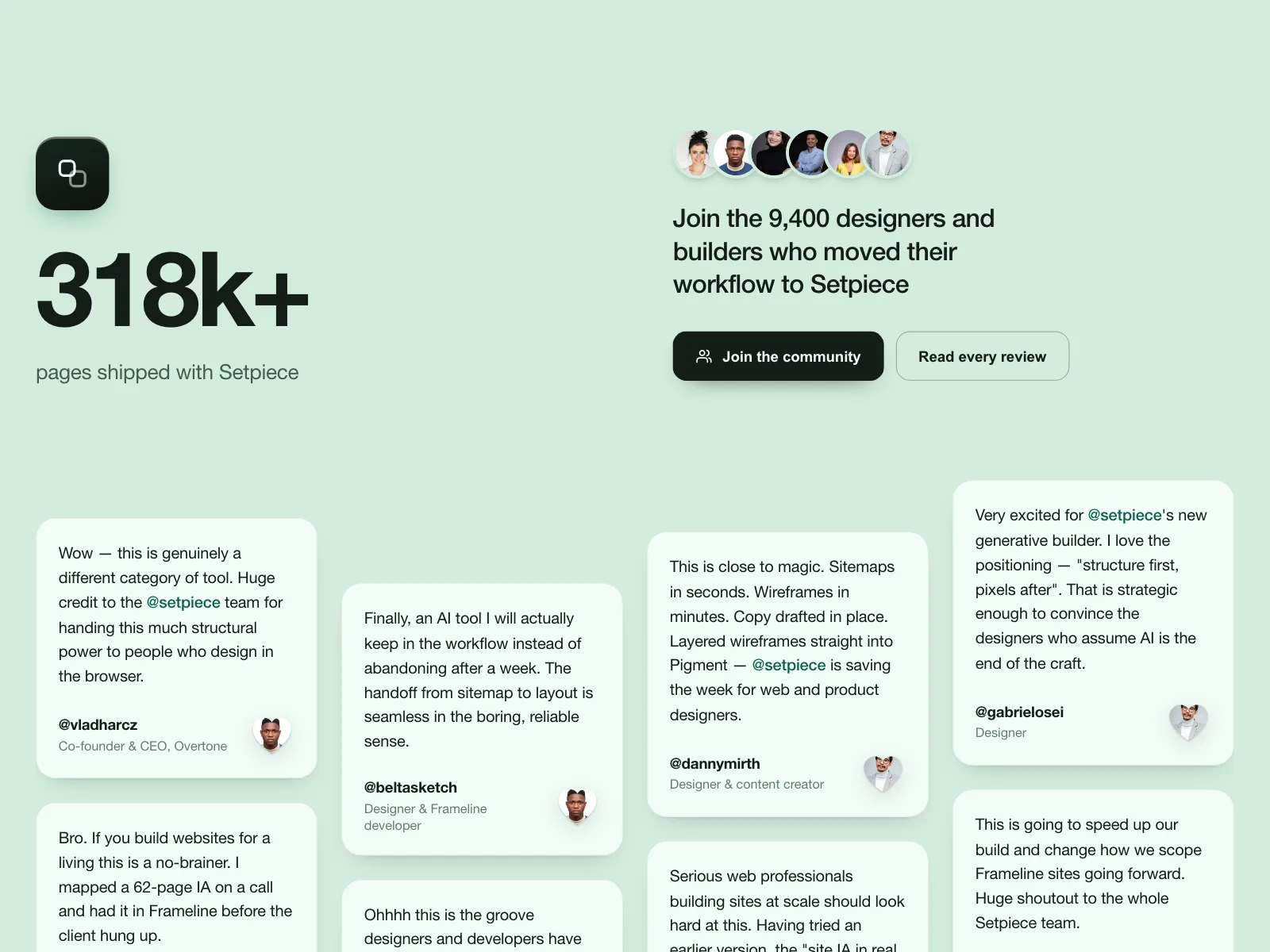
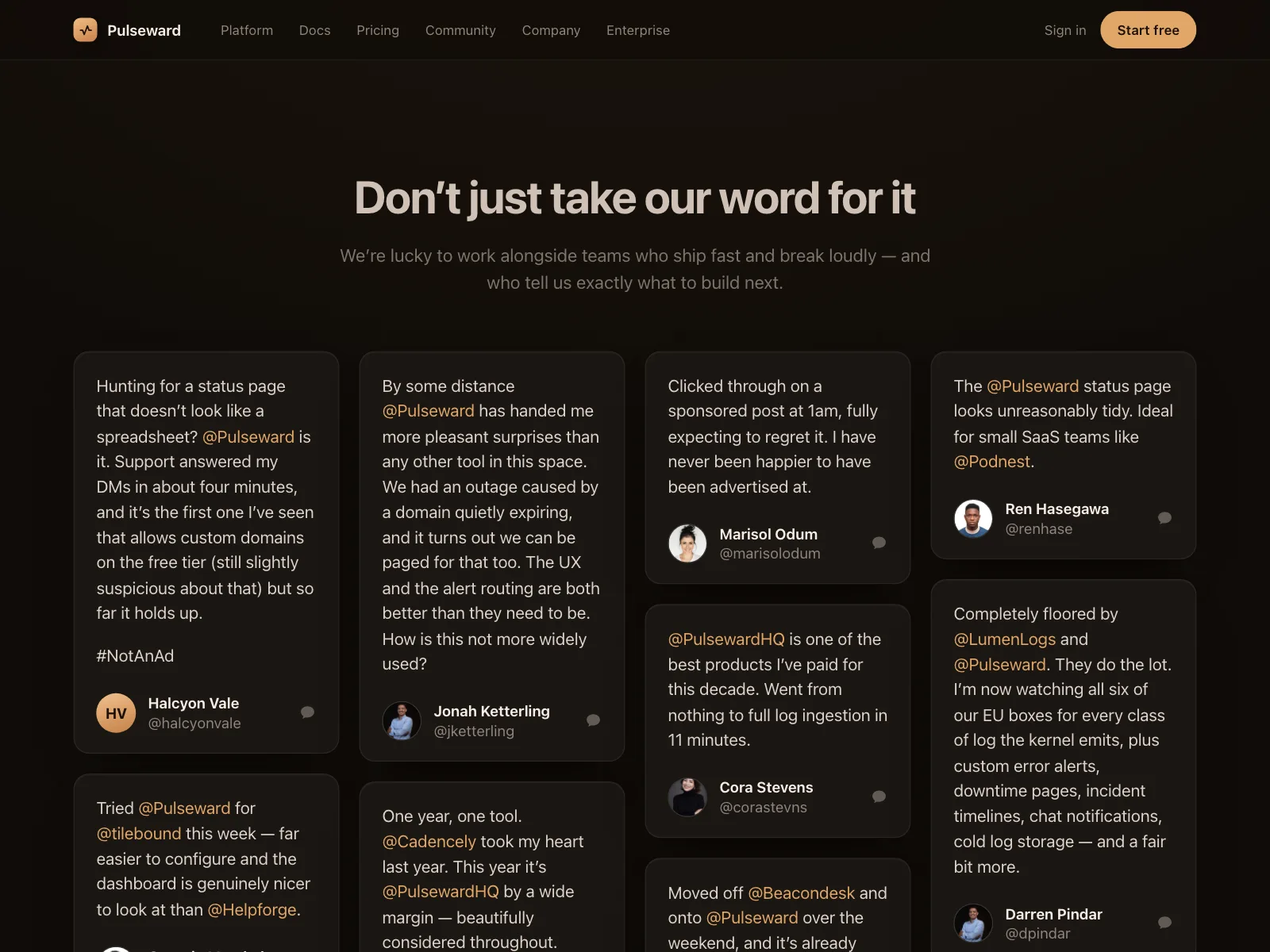
1. Quote wall
The default. A grid or masonry of quote cards, each with a name, a role and a small avatar.

2. Single featured quote
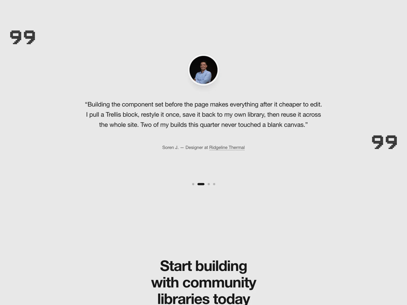
One large quote with a face and a name, given the whole section or screen.


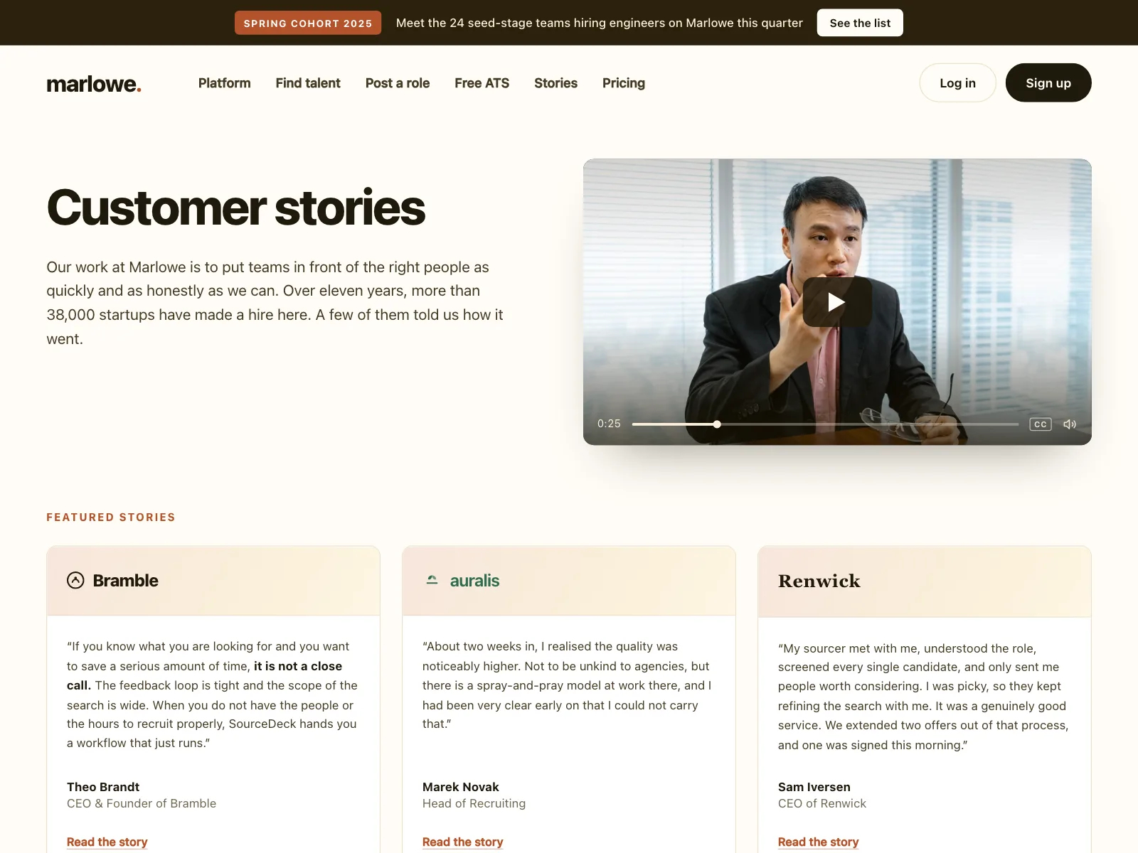
3. Video and photo stories
Portrait cards with a play button or a short quote over the photo, often linking to a full story.



4. Mixed mosaic
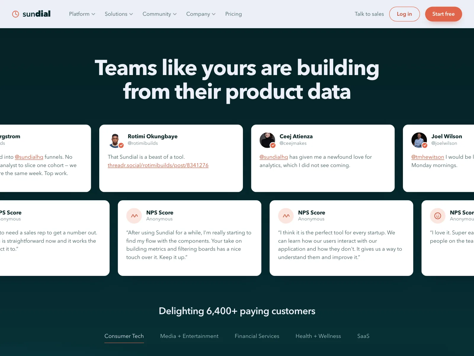
Quotes, portraits, logos and award badges in one grid, with a big rating or count in the middle.


5. Card slider
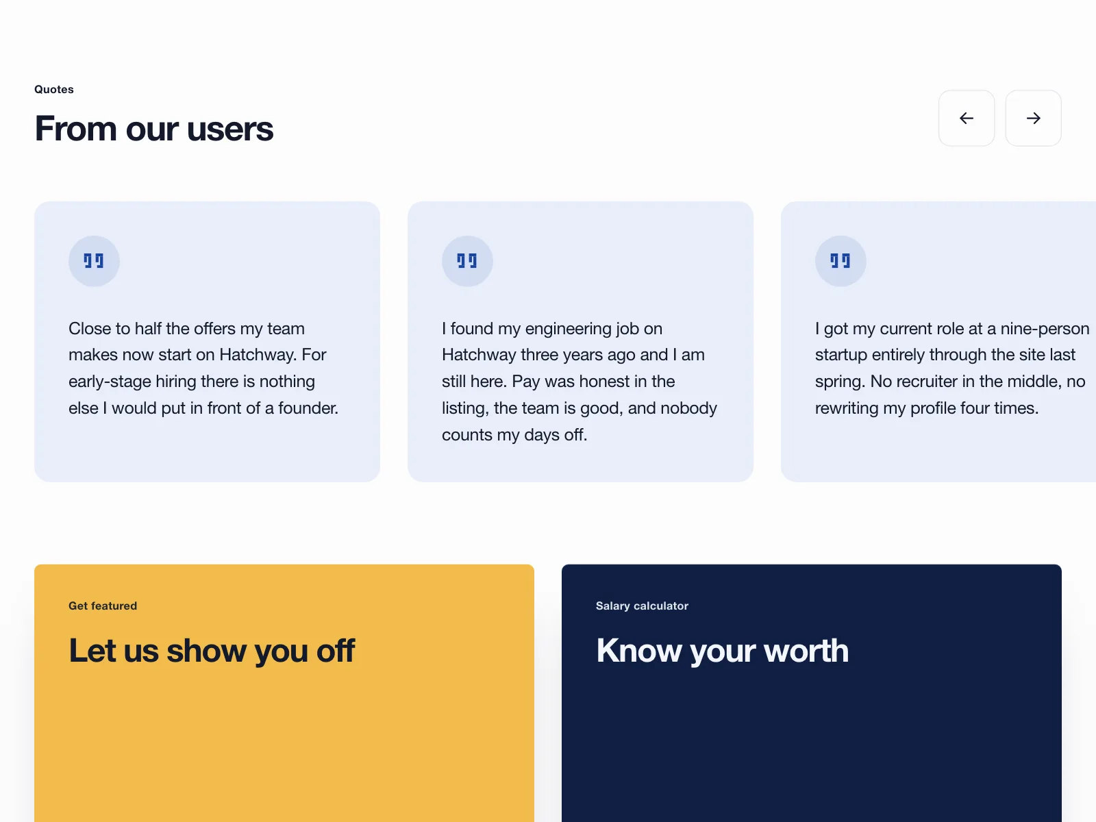
A row of quote cards that swipes sideways or steps with arrows, one or a few in view at a time.


6. Social posts
Quotes styled as posts, with handles, mentions and dates, so they read as unprompted.

Where testimonials show up
Onboarding and paywalls
Mobile apps put a rating and two or three quotes right before the trial or plan choice.


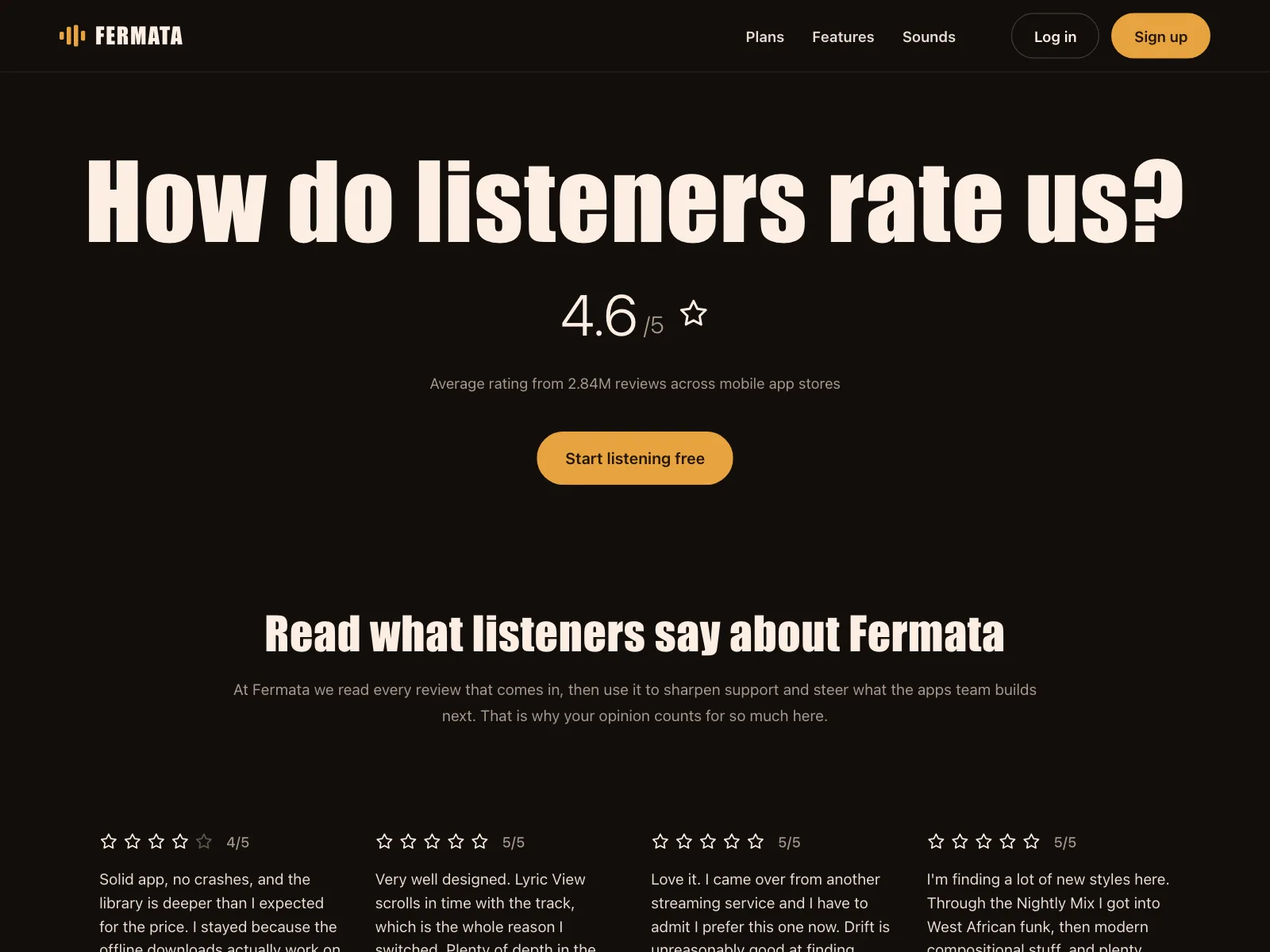
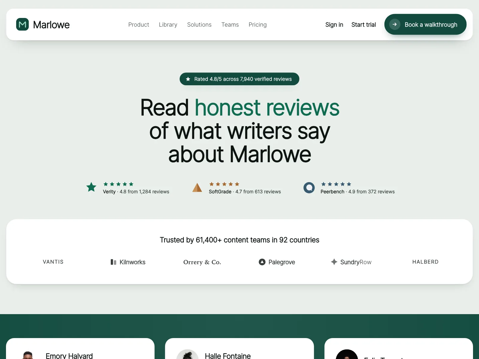
Ratings and review pages
An average score up top, then individual reviews with stars underneath.

Next to sign-in and setup forms
A split screen with the form on one side and one customer quote on the other.


Press quotes
Lines from reviews and articles, credited to the publication instead of a person.


Testimonials vs similar components
Build notes
- Put the quote in a <blockquote> and the name outside it, in a <figcaption> or the line below.
- Give a decorative avatar alt="", since the name beside it already says who it is.
- A slider is a carousel: label slides "1 of 3" and give each arrow button a name.
- Use aria-live="polite" on slides that only change when someone clicks.
- If quotes rotate on their own, add a pause button and stop on hover and focus.
- Give star ratings a text label, like "Rated 4 out of 5".
FAQ
What makes a good testimonial?
A specific result from a named person people can picture. "We closed the books two days earlier" beats "Love this product". Keep it to one or two sentences, and cut the rest of the interview.
How many testimonials should a page show?
One strong quote beats ten weak ones. Use a single featured quote next to a key claim, and save a wall of quotes for a dedicated page where people came to read them.
Should testimonials have photos?
Yes, when you have permission. A face makes a quote feel real. Without a photo, initials in a colored circle keep the layout even and still read as a person.
Are testimonial sliders a good idea?
Only when space is tight. A slider hides every quote but one, so put the strongest first. Never rotate it automatically without a pause button, which WCAG requires for content that moves on its own.
Related terms
All glossary terms · Browse 313 web and 33 mobile testimonials designs