


Bento grids from the Kombai gallery: a wind energy company's brand board, a clean-energy app's home screen and a work-management tool's feature tour.
What is a bento grid?
A bento grid is a section split into tiles of different sizes on one shared grid. A large anchor tile carries the main message, and smaller tiles around it each hold one feature, number or image. The mix of sizes ranks the messages, and the shared gutters hold them together as one block.
- Tiles span different numbers of columns and rows on the same grid.
- Each tile holds one idea: a title, a line of copy and a visual.
Bento grids show up across features, pricing, careers and dashboard screens.
When to use a bento grid
- Several short messagesFive or six features or facts that each need a line and a visual.
- One clear headlinerOne message deserves the big tile and the rest support it.
- Overview screensHome screens and dashboards that sum up many things at a glance.
When not to use one
- Items of the same kindProducts, posts or people belong in an even card grid.
- A sequenceSteps people follow in order read better as a numbered list.
- Long explanationsA tile holds a line or two. Longer copy belongs in a feature section.
Anatomy of a bento grid
This one works. Switch between desktop, tablet and phone widths to watch the tiles reflow.
- Desktop, 4 columns
- Tablet, 2 columns
- Phone, 1 column
- GridShared columns and rows
- Anchor tileThe biggest, for the main message
- Supporting tilesSmaller, one idea each
- Tile contentTitle, a line of copy, a visual
- GutterOne gap between every tile
- StatesDesktop, tablet, phone
Bento grid variants
We sorted every bento grid design in the Kombai gallery and found five patterns. Browse all 88 web and 37 mobile designs.
1. Product UI tiles
The most common pattern. Each tile holds a small mock of one feature, like a chart, a form or a code panel, under a short title.


2. Stat tiles
Big numbers in their own tiles, set beside copy tiles, for results, scale or a track record.



3. Photo and mixed media
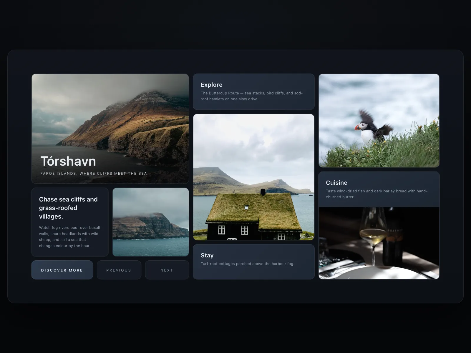
Photography and art share the grid with copy tiles. Common for travel, brands and creative tools.

4. Icon and illustration tiles
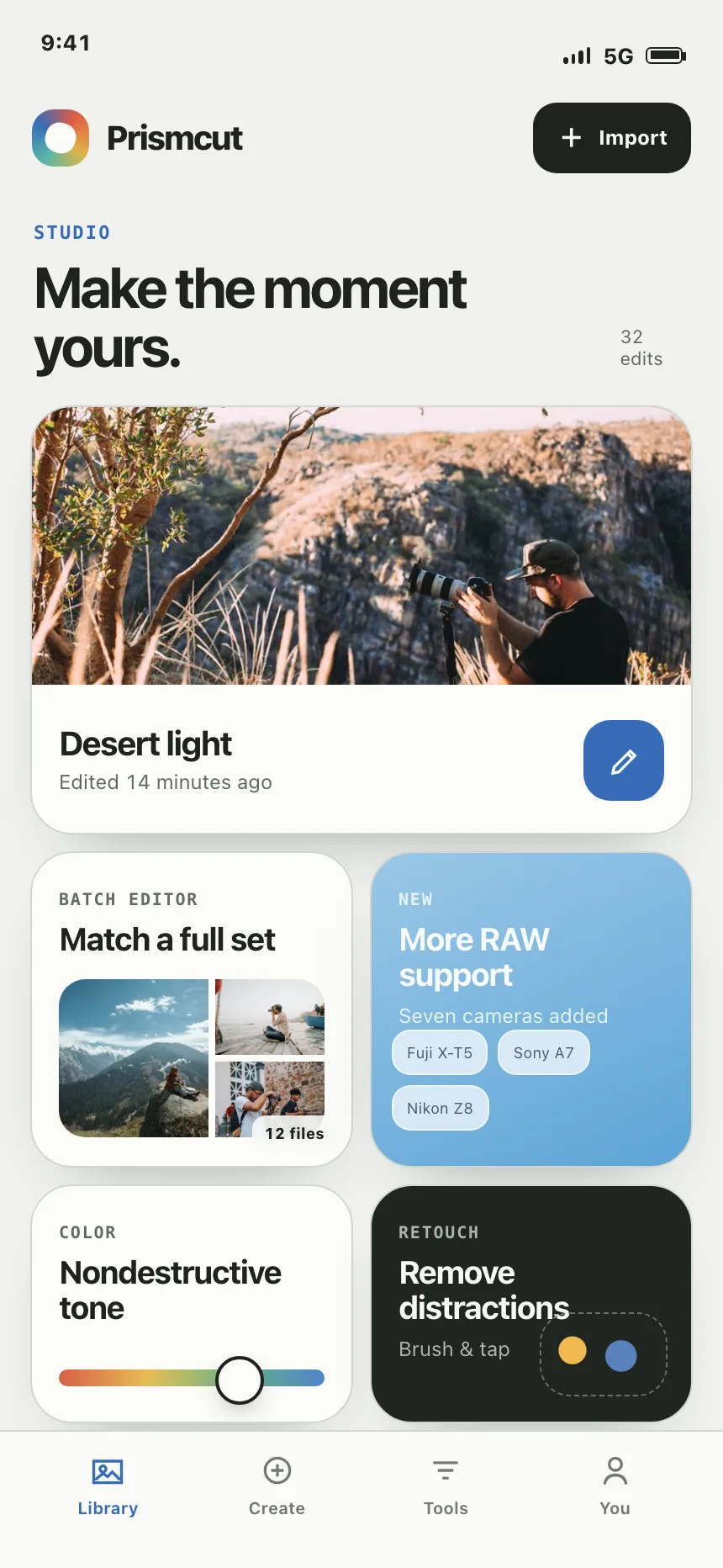
A simple icon or drawing above a title and a line of copy, for values, principles and features with no UI to show.


5. Wide tile over pairs
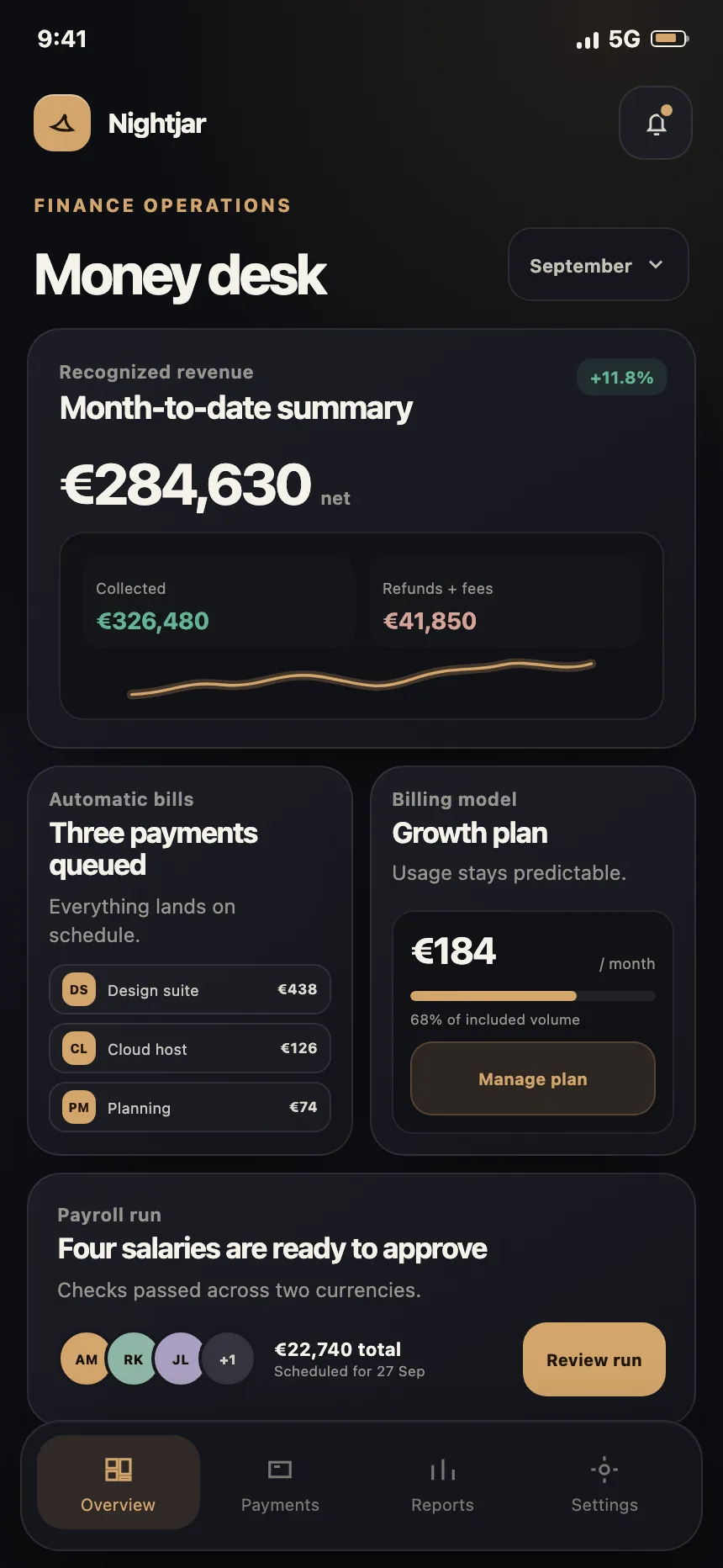
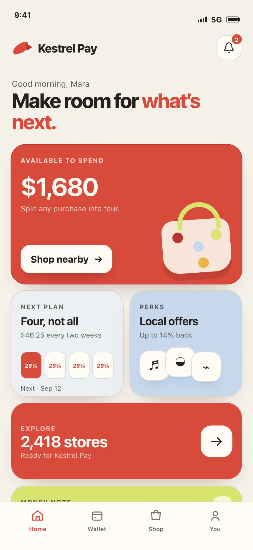
The mobile pattern. One full-width tile on top, then rows of two small tiles, then full-width strips.

Where bento grids show up
Feature overviews
A landing page section where each tile shows one feature at work.


Brand and design system boards
Logo, color, type and imagery laid out as tiles, so a whole identity fits on one screen.


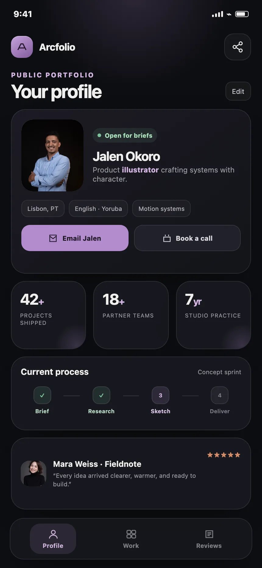
Portfolios and studio pages
Stats, portraits, client names and quotes, so a person or a team reads at a glance.


Pricing and promotions
A plan or an offer takes the big tile, with inclusions, perks or a booking button in the tiles around it.


Bento grid vs similar components


Build notes
- Build it with CSS grid. Tiles span columns and rows, and one gap sets every gutter.
- Keep the HTML in reading order. Grid placement moves tiles only visually.
- Avoid grid-auto-flow: dense when order matters. It fills holes by moving tiles out of sequence.
- Collapse to one column on phones, with no sideways scrolling at 320 CSS pixels wide.
- Give every tile its own heading, so screen reader users can jump from tile to tile.
- Keep hover motion small, and turn it off under prefers-reduced-motion.
FAQ
Why is it called a bento grid?
After the Japanese bento box, a lunch box split into compartments of different sizes. A bento grid does the same with content: one tray, several unequal sections, each holding one thing.
How many tiles should a bento grid have?
Enough to read in one screen, usually four to eight. Past that the anchor tile stops standing out and the grid reads as a wall of cards. Split a long list into two sections instead.
How do bento grids work on mobile?
They stack. Most mobile designs in the Kombai gallery put one full-width tile on top, then pairs of small tiles, then full-width strips. On a narrow phone, a single column in reading order is the safe default.
What's the difference between a bento grid and a card grid?
A card grid repeats equal cards for items of the same kind, like posts or products. A bento grid mixes sizes on purpose to rank several different messages, with the biggest tile for the most important one.
Related terms
All glossary terms · Browse 88 web and 37 mobile bento grid designs