


Feature sections from the Kombai gallery: a recovery wearable's three phone cards, a note-taking app's mobile feature tour and an on-call tool's grid of feature cards.
What is a feature section?
A feature section is the part of a page that turns a product pitch into specifics. It names a handful of capabilities and gives each one a title, a sentence or two and a visual: an icon, a screenshot or a small illustration. It usually sits right below the hero, and long product pages repeat it.
- Every item follows the same pattern, so people can scan the titles alone.
- One headline above the items says what they add up to.
Feature sections show up across home, pricing, partner program and waitlist screens.
When to use a feature section
- Explaining a productRight after the hero, to show what the product actually does.
- Comparing plans or tiersTo spell out what each plan or program includes.
- Mobile app toursA short tour of what a new app can do, before or after sign-up.
When not to use one
- Steps in a sequenceIf order matters, use a numbered how it works section.
- Proof and resultsNumbers and quotes belong in a stats section or testimonials.
- Twenty small featuresA long checklist reads better as a comparison table.
Anatomy of a feature section
This one works. Pick a feature, or tab to the list and use the arrow keys.
- Idle
- Selected
- Keyboard focus
- Section headingEyebrow and one headline
- Feature listOne capability per item
- Title and descriptionA name and a line of detail
- VisualShows the selected feature
- StatesIdle, selected, focus
Feature section variants
We sorted every feature section design in the Kombai gallery and found six patterns. Browse all 224 web and 44 mobile designs.
1. Icon columns
Rows of two to five columns, each an icon, a short title and a line or two of copy.

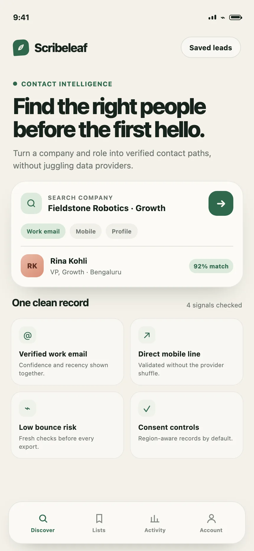

2. Cards with product shots
Each card pairs a title and a sentence with a cropped screenshot or mock of that feature.


3. Split rows
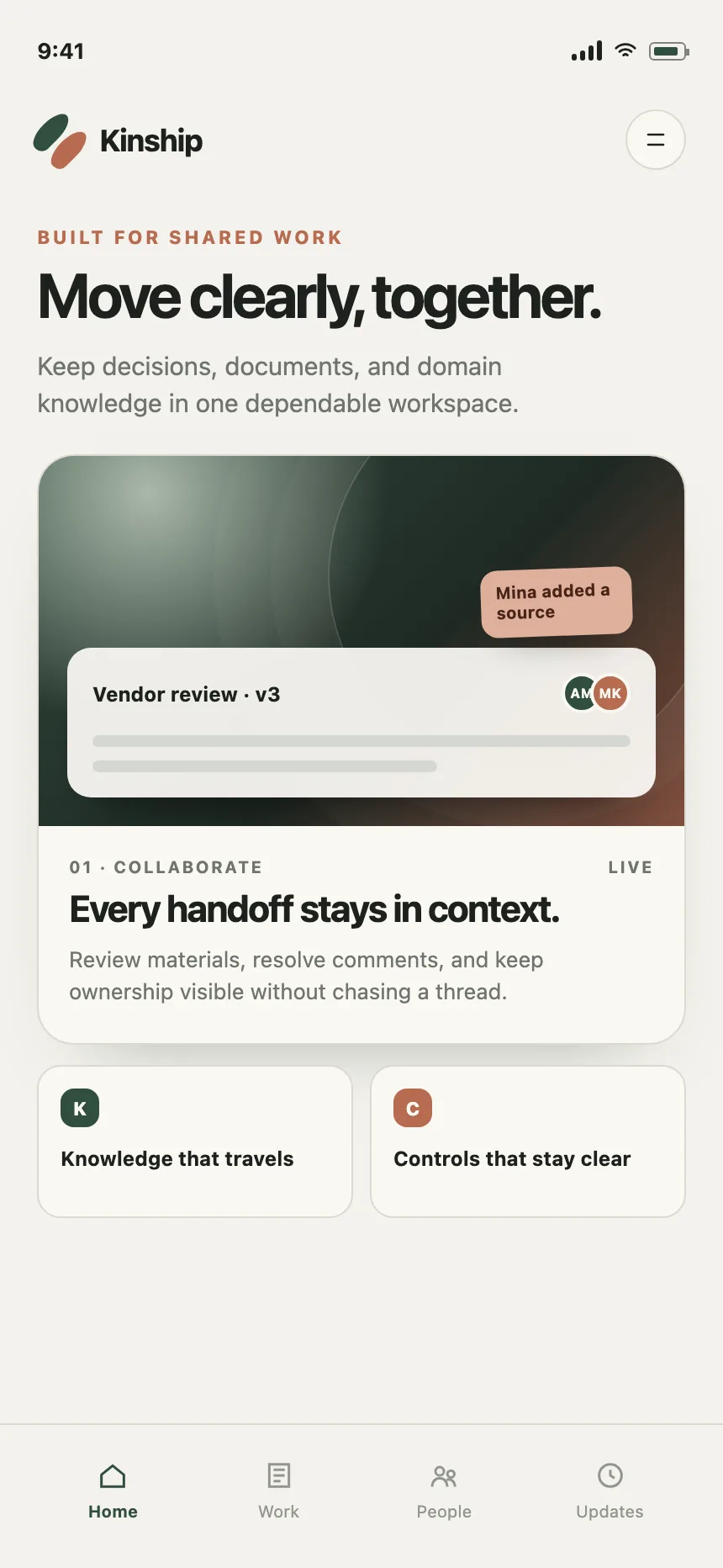
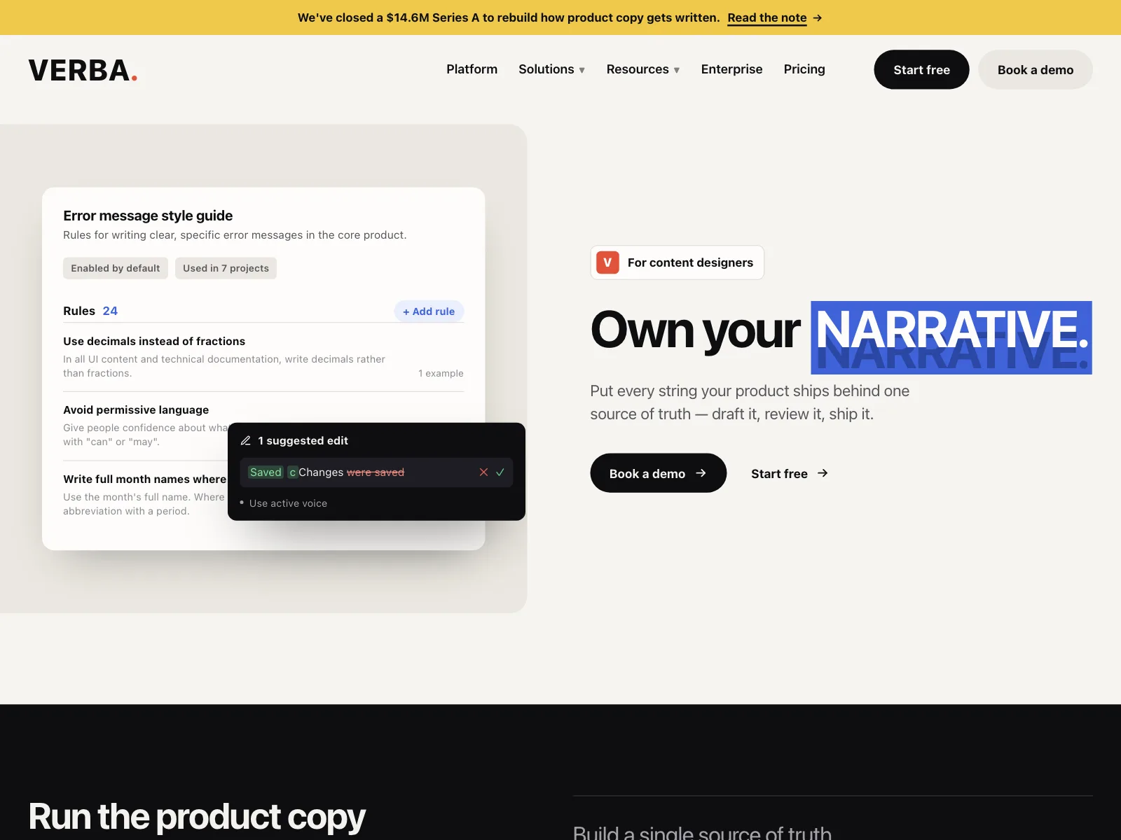
Copy on one side and one large visual on the other. Long pages stack several and swap sides, and phones put the visual above or below the copy.

4. List beside a visual
A short list of features next to one visual, often with the selected item expanded to explain it.


5. Tabbed features
Tabs or a segmented control above one panel, so each audience or use case gets its own view.


6. Feature carousel
Large cards in a row that scrolls sideways, one feature per card, with arrows or dots.


Where feature sections show up
Developer tools
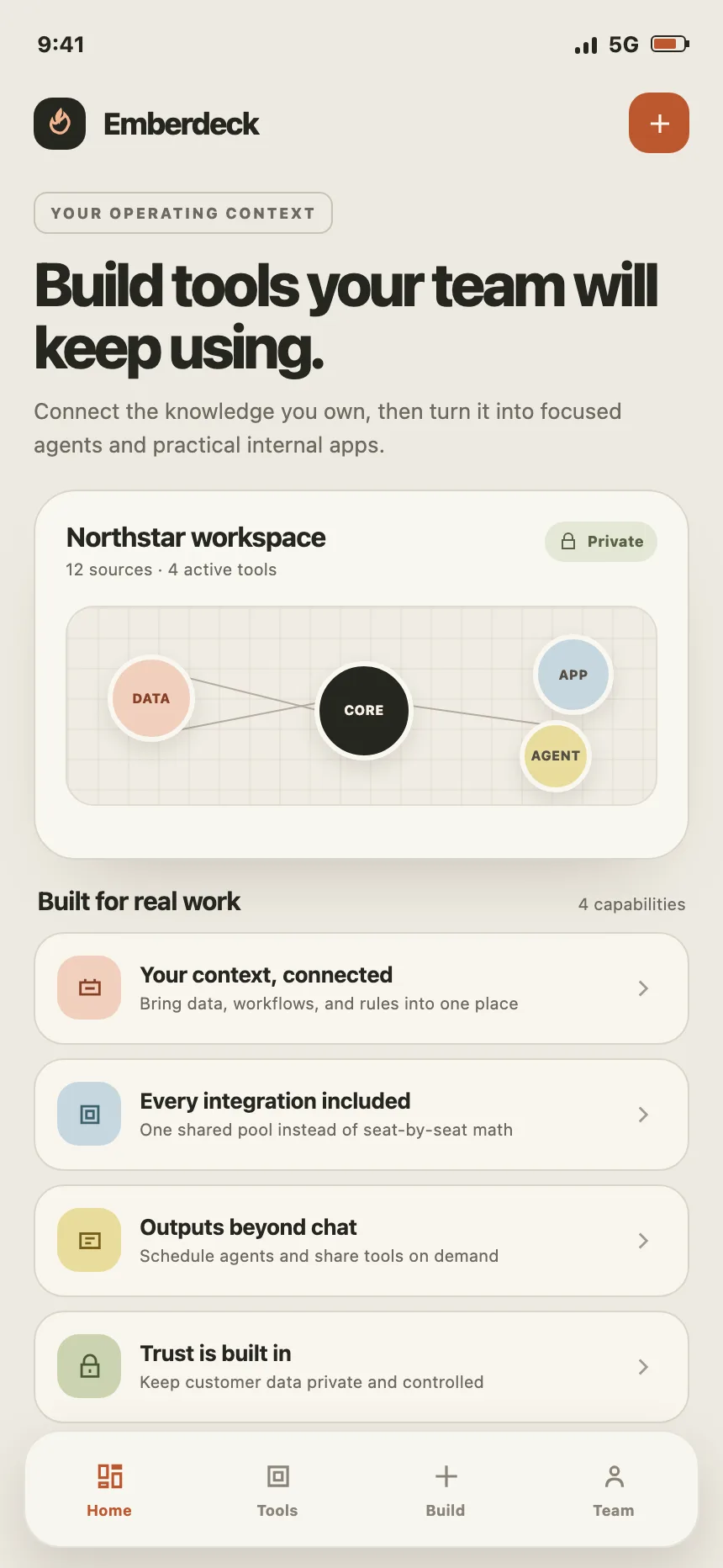
APIs, editors and build tools show code, diagrams and settings right in the feature cards.


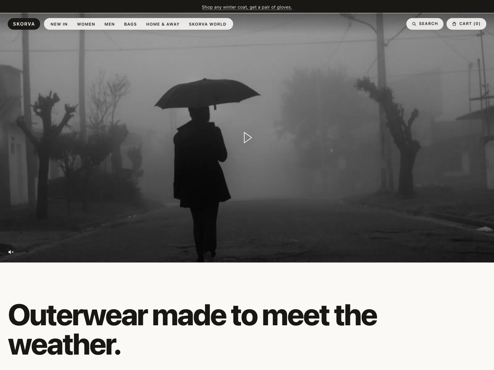
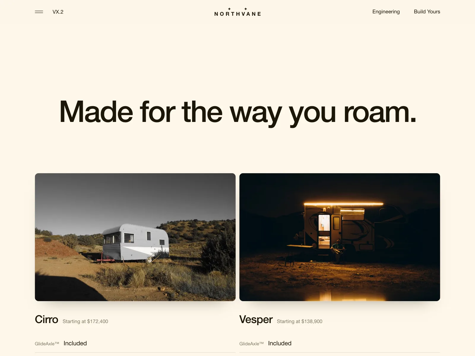
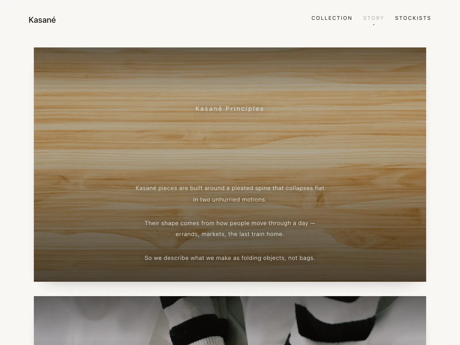
Physical products
Large photography carries the feature, with a short claim about what the material or design does.
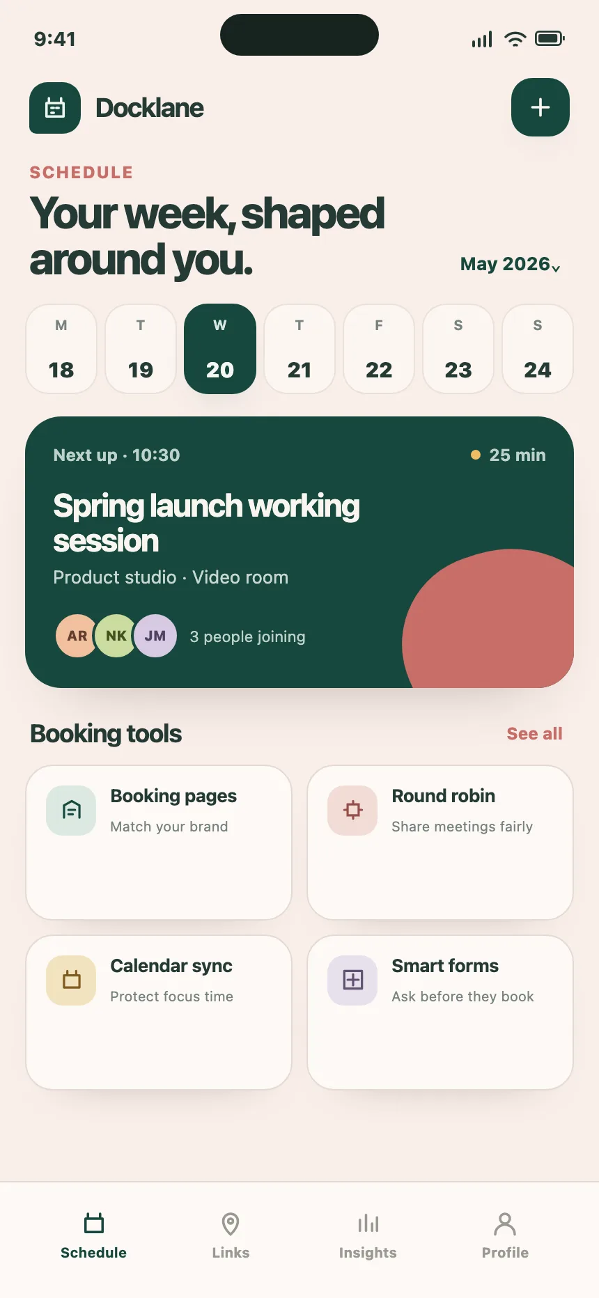
Mobile app tours
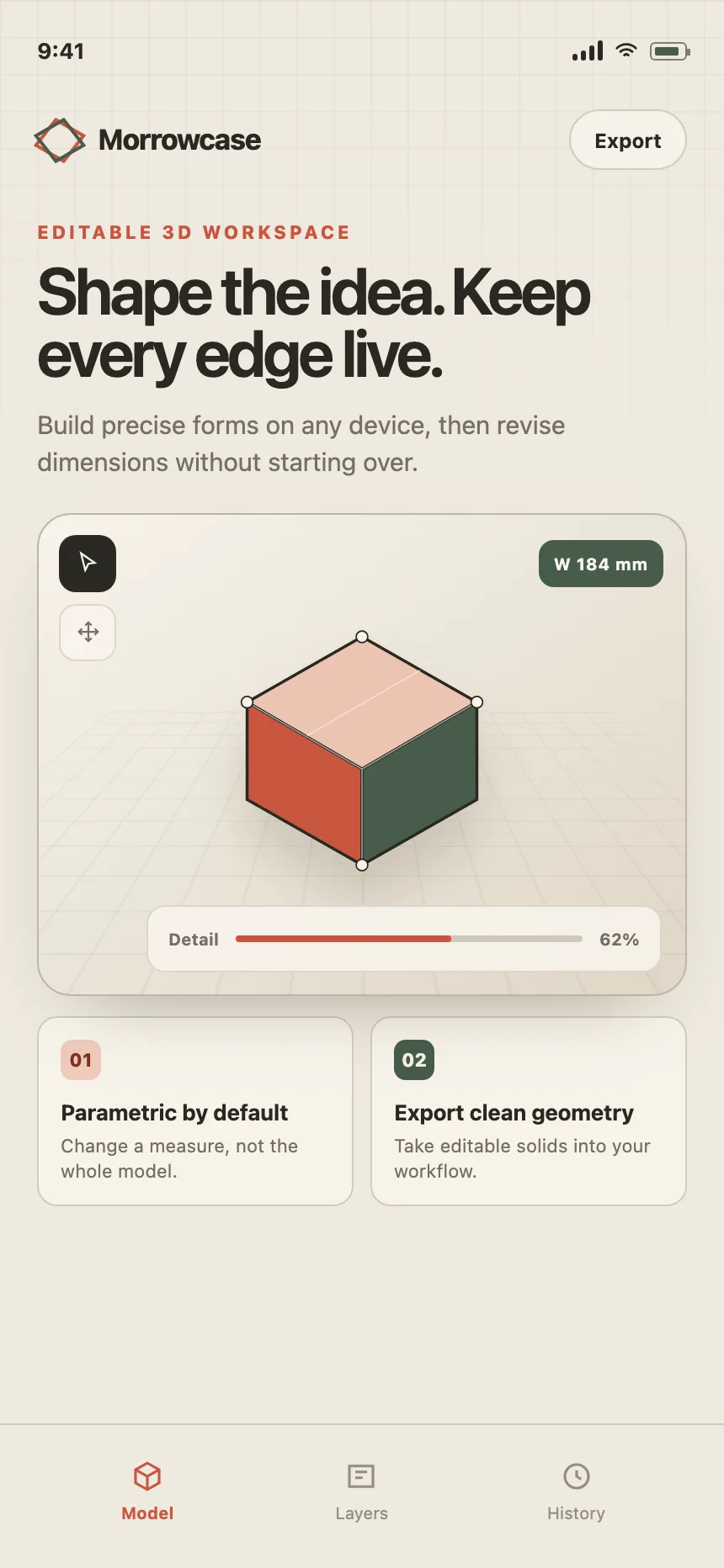
One screen that sums up what an app does, as cards, tiles or a phone mock ringed by labels.

Security and trust
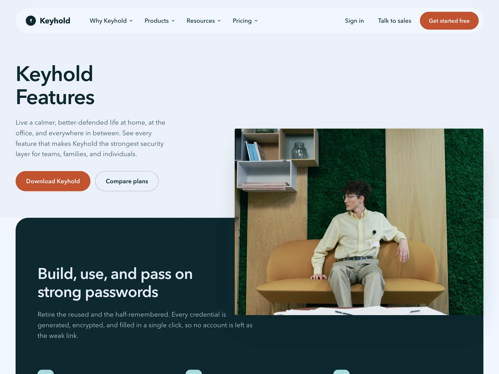
Security, privacy and reliability laid out as features, from enterprise pages to password managers.


Feature section vs similar components


Build notes
- Give the section an <h2> and each feature an <h3>, so it reads as an outline.
- Keep every item to a title, one or two lines and one visual.
- For a list that swaps a visual, use the tabs pattern: tablist, tab and tabpanel roles.
- Arrow keys move between tabs, and Tab moves on into the panel.
- Give a screenshot alt text that says what it shows, or alt="" when the copy beside it already does.
- On phones, stack each split copy first and turn tabs into stacked sections.
FAQ
How many features should a feature section show?
Three to six. Fewer looks thin and more turns into a checklist nobody reads. If the product does more, group the features under a few headlines and give each group its own section.
Icons, screenshots or illustrations?
Screenshots when the interface is the selling point, since they show the product working. Icons when the features are abstract, like security or support. Illustrations sit in between and suit early products with little UI to show yet.
Should features be benefits or capabilities?
Lead with the benefit in the title and name the capability in the description. "Close the month in one pass" says why it matters, and the line under it can say it reconciles card statements.
What's the difference between a feature section and a how it works section?
A feature section lists what a product can do, in any order. A how it works section walks through steps people take in sequence, so it is numbered and reads top to bottom or left to right.
Related terms
All glossary terms · Browse 224 web and 44 mobile feature section designs