

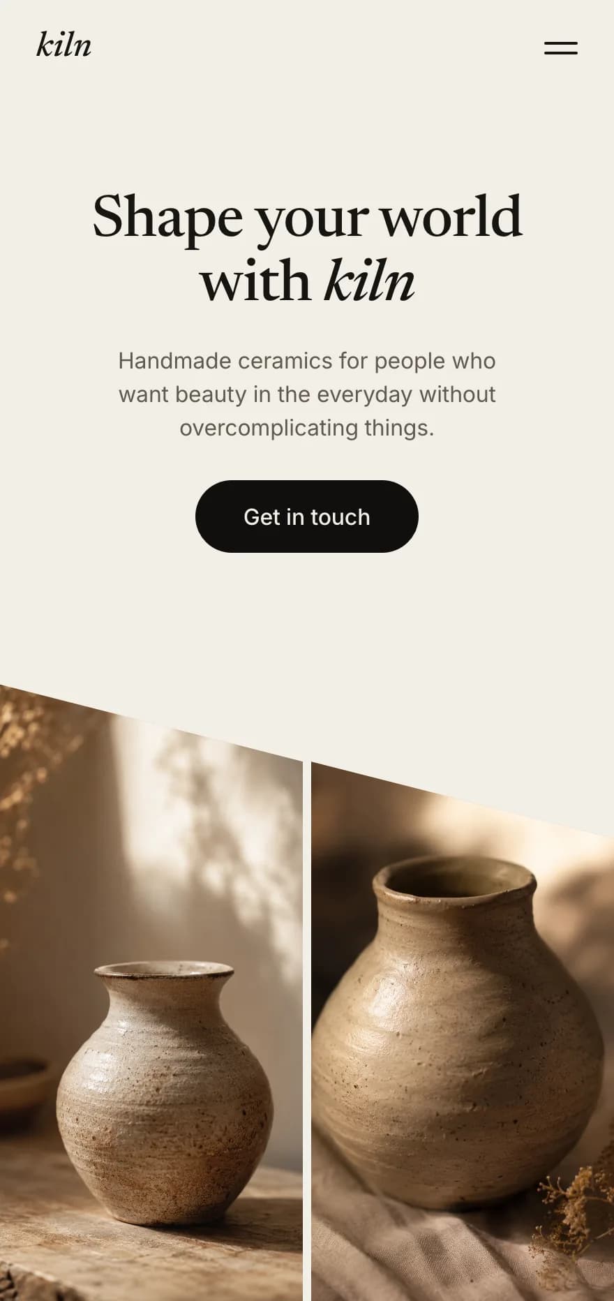
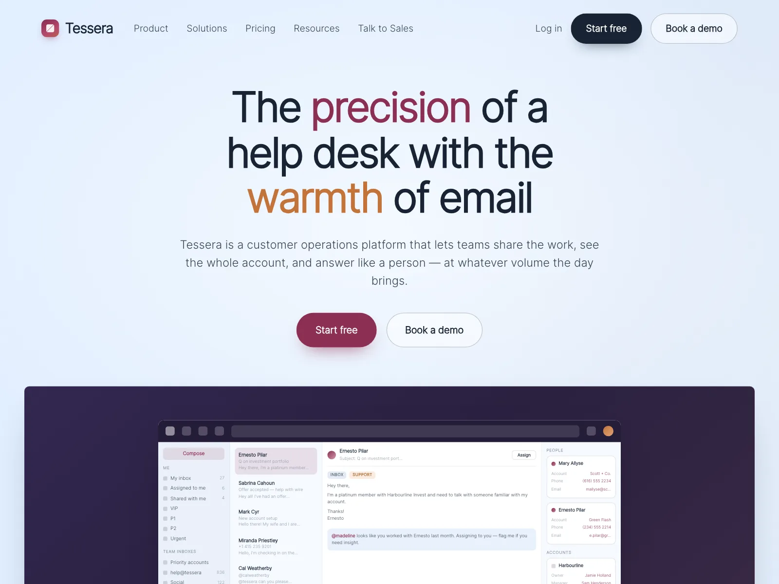
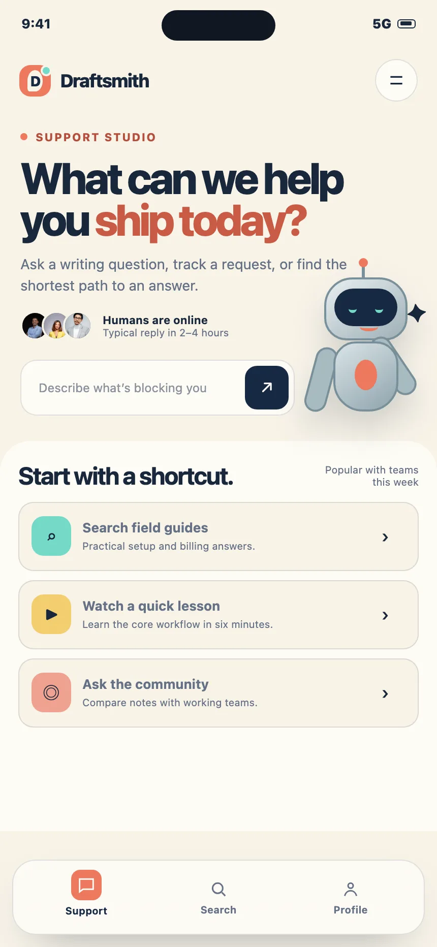
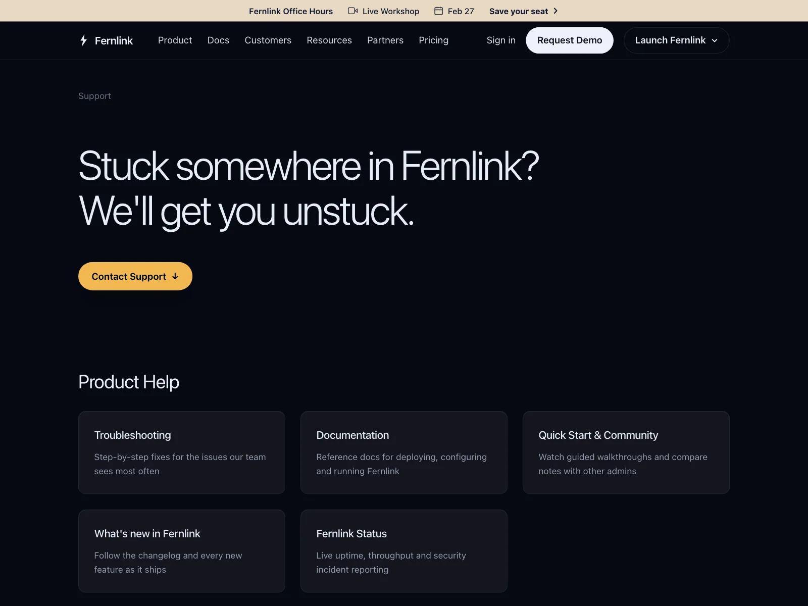
Hero sections from the Kombai gallery: a voice AI platform's headline over a mountain photo, a ceramics studio's mobile home and a help desk's pitch above its inbox.
What is a hero section?
A hero section is the first block of a page, right under the navigation. It says what the product or page is in one headline, backs it up with a line or two of copy and offers one main action, usually with a product shot, photo or illustration beside or behind it. Everything below it is detail.
- The headline is the largest text on the page and usually its only h1.
- One primary button leads, sometimes with a quieter second option beside it.
Hero sections show up across home, about, careers and storefront screens.
When to use a hero section
- Landing and home pagesThe first screen has to say what the product is and what to do next.
- Launches and campaignsA new product, a sale or an event that needs one clear message.
- Front doors to a sectionCareers, help and pricing pages that open with a short promise.
When not to use one
- Task screensIn an app, a dashboard or settings, people came to work. Show the work.
- Pages people scanSearch results, docs and lists should open on the content, not a banner.
- No clear offer yetIf you can't name the offer in one line, a bigger headline won't fix it.
Anatomy of a hero section
This one works. Switch between the centered and split layouts, or tab to the buttons.
- Centered
- Split
- Mobile
- Keyboard focus
- EyebrowKicker or announcement pill
- HeadlineThe one promise, as the h1
- Supporting copyOne or two lines of detail
- Calls to actionA primary and a quieter second
- VisualProduct shot, photo or art
- StatesCentered, split, mobile, focus
Hero section variants
We sorted every hero design in the Kombai gallery and found six patterns. Browse all 370 web and 39 mobile designs.
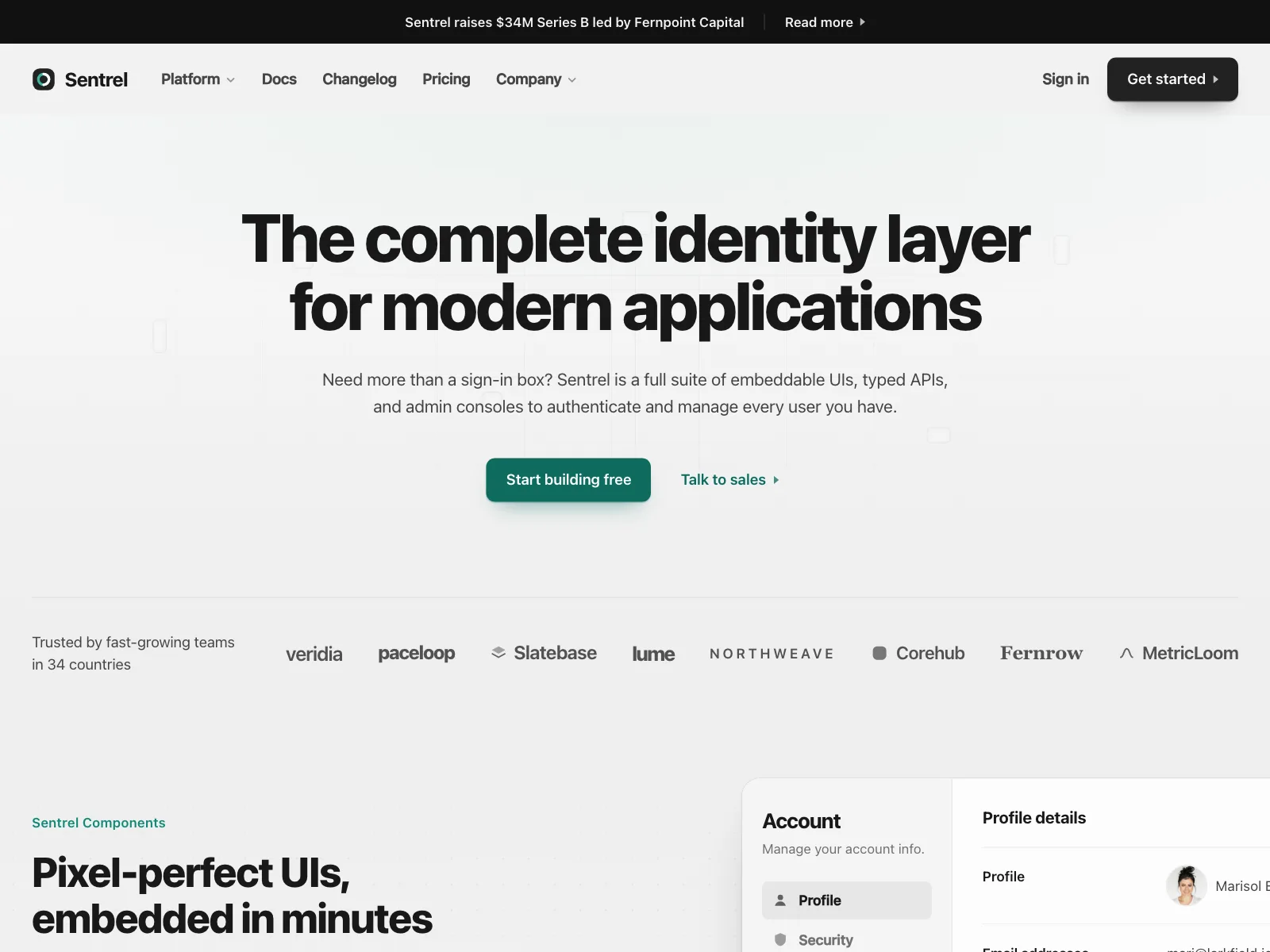
1. Centered stack
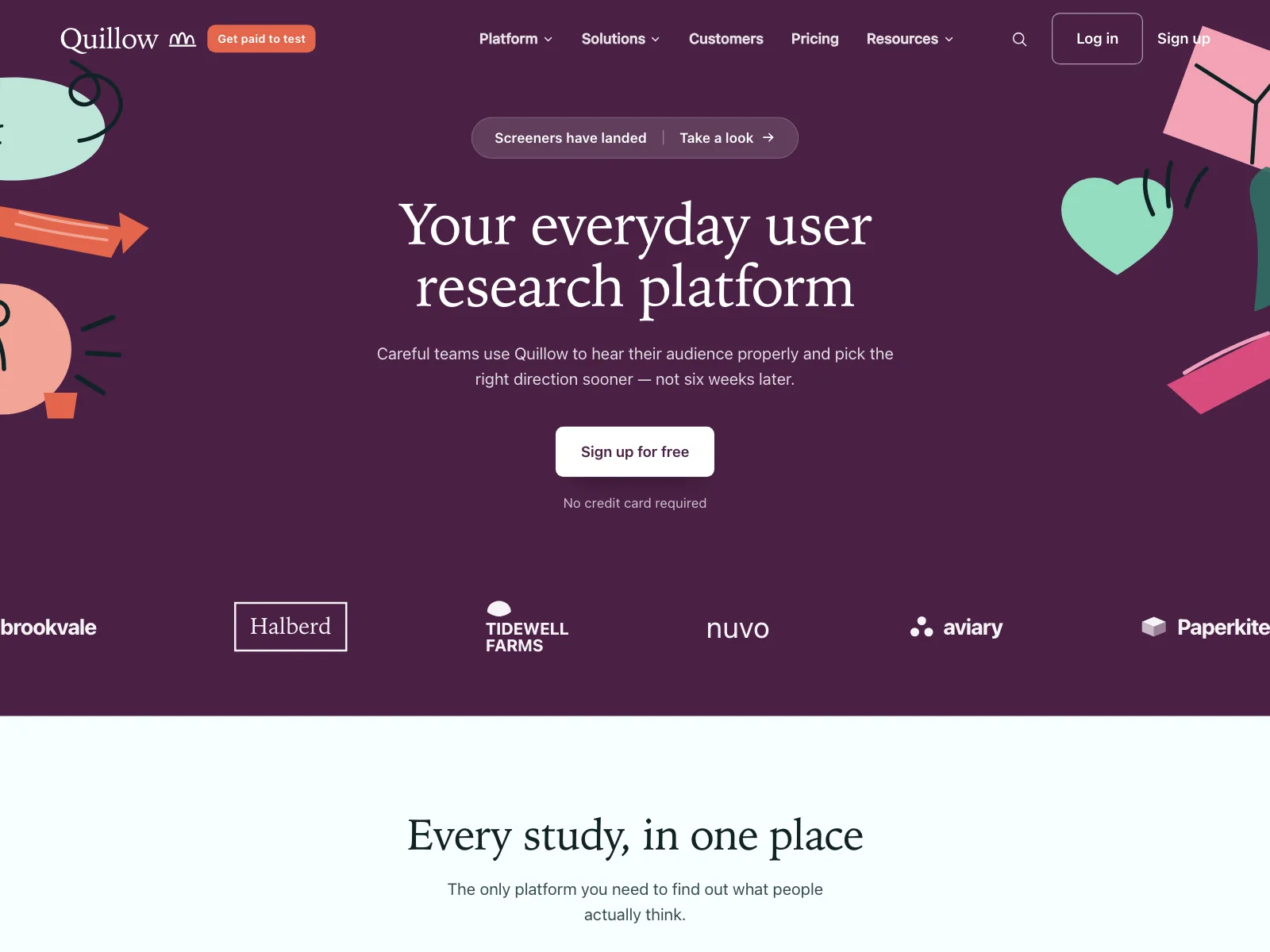
The default. Eyebrow, headline, copy and buttons stacked in the middle, often with a row of customer logos underneath.


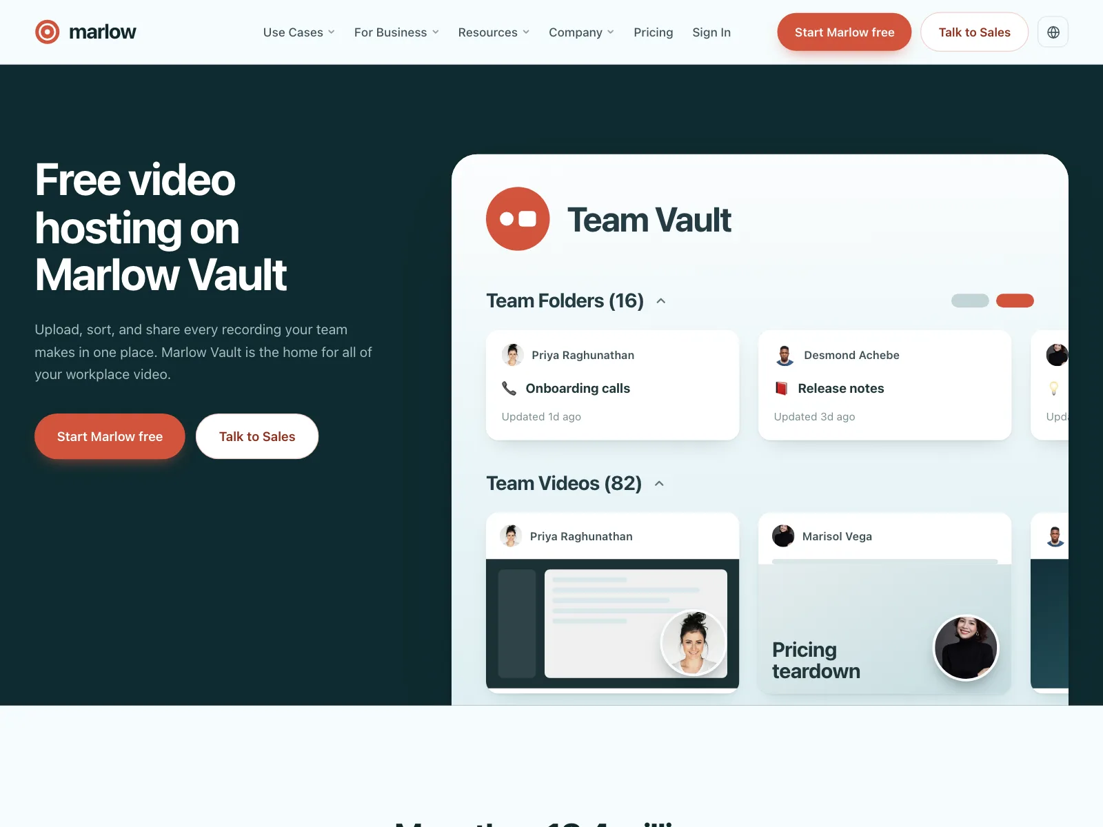
2. Split hero
Copy on one side and a product shot or illustration on the other. On a phone it stacks, copy first.

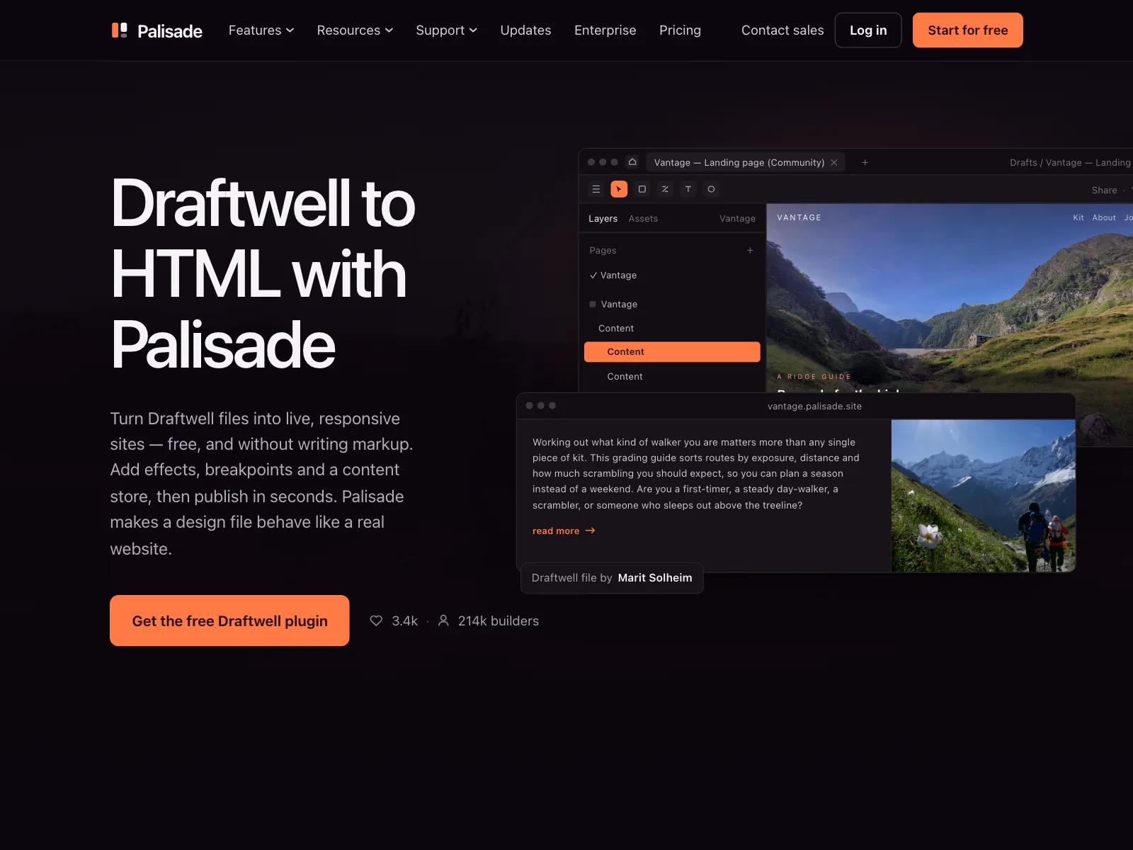
3. Headline over the product
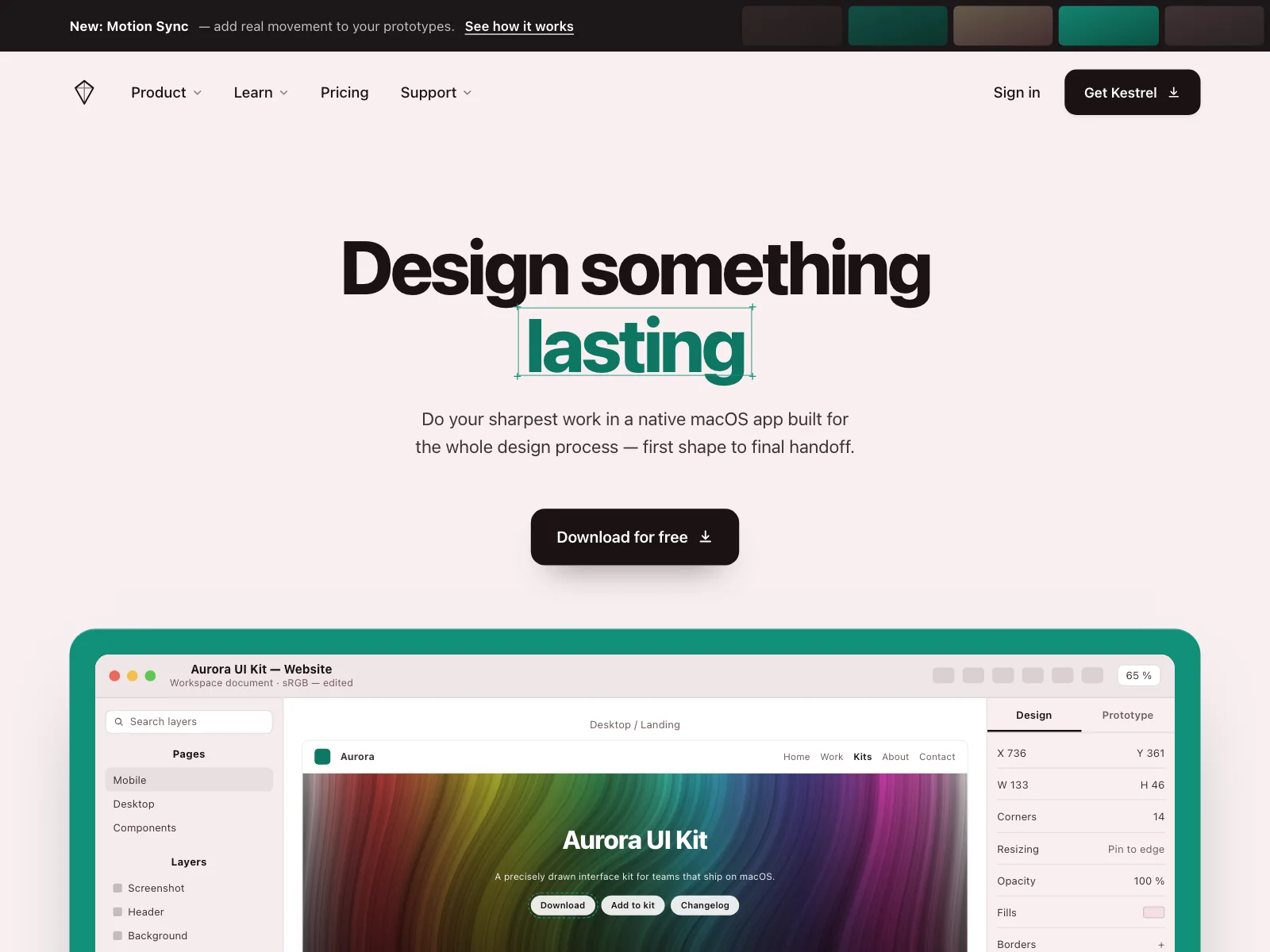
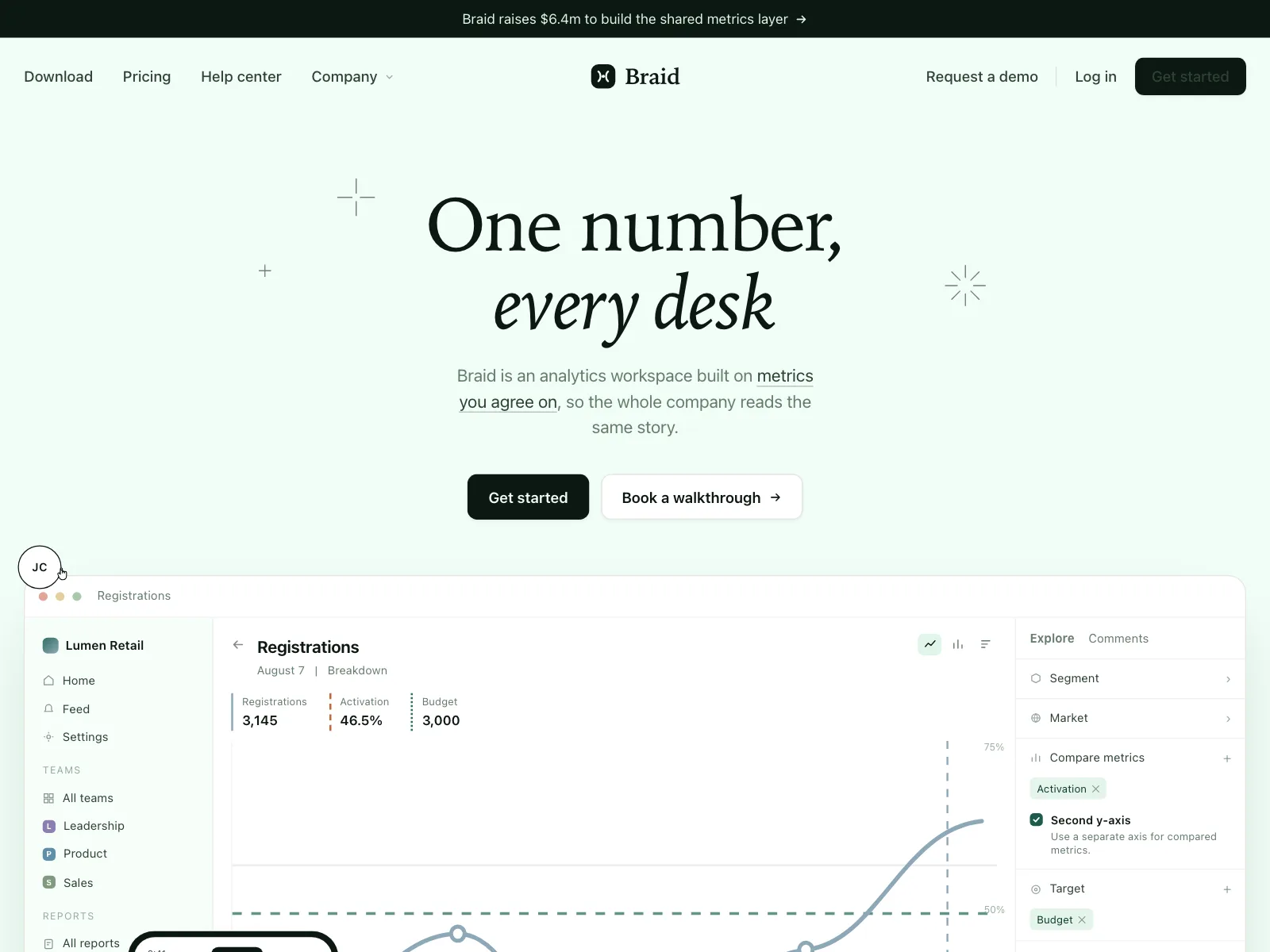
A centered headline above a wide screenshot of the app, so people see the product before they scroll.


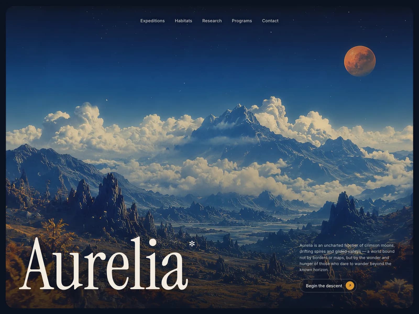
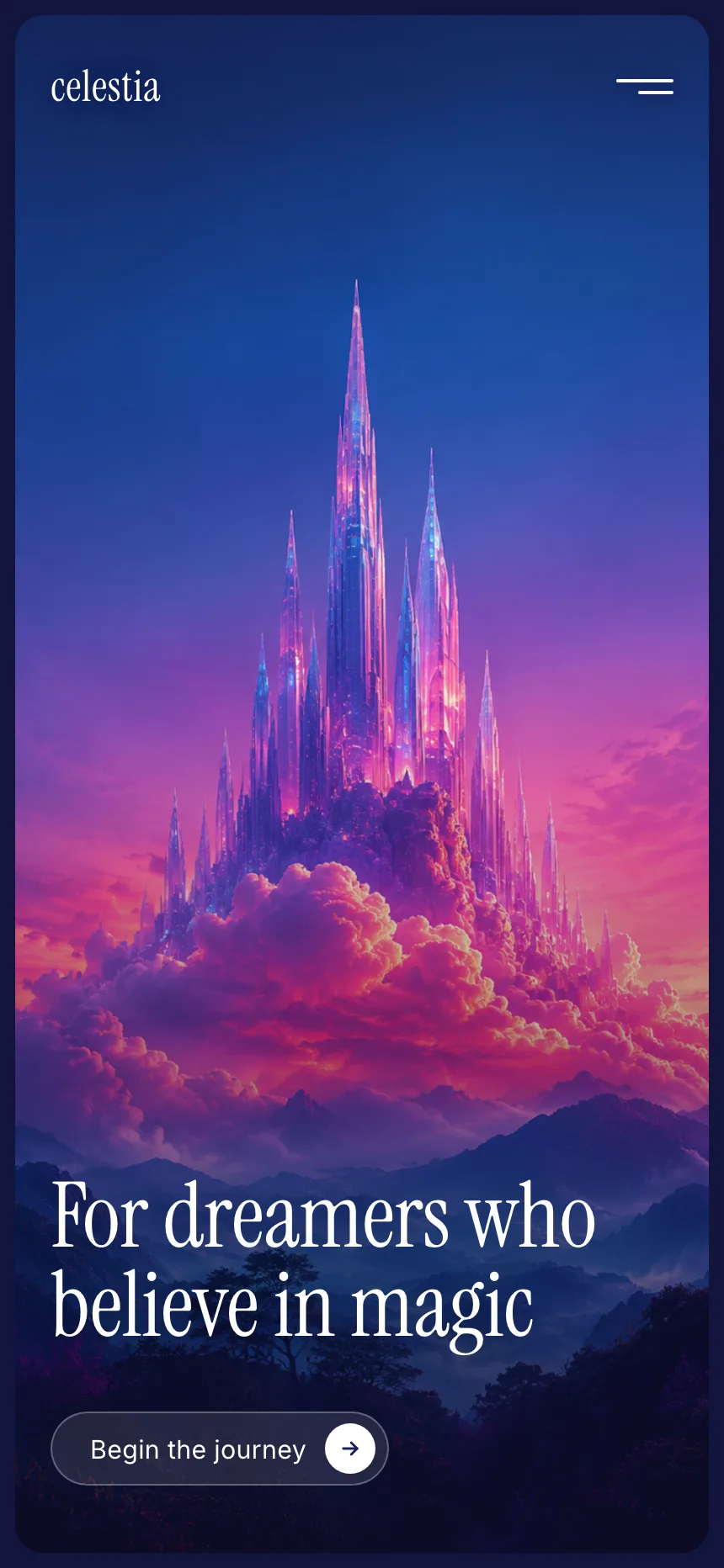
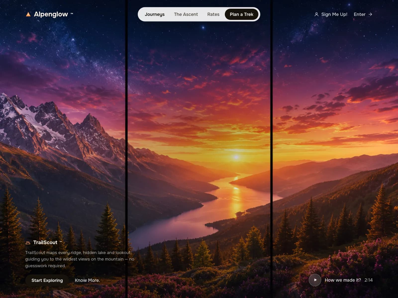
4. Full-bleed image
A photo or painting fills the section and the copy sits on top, often in a lower corner.
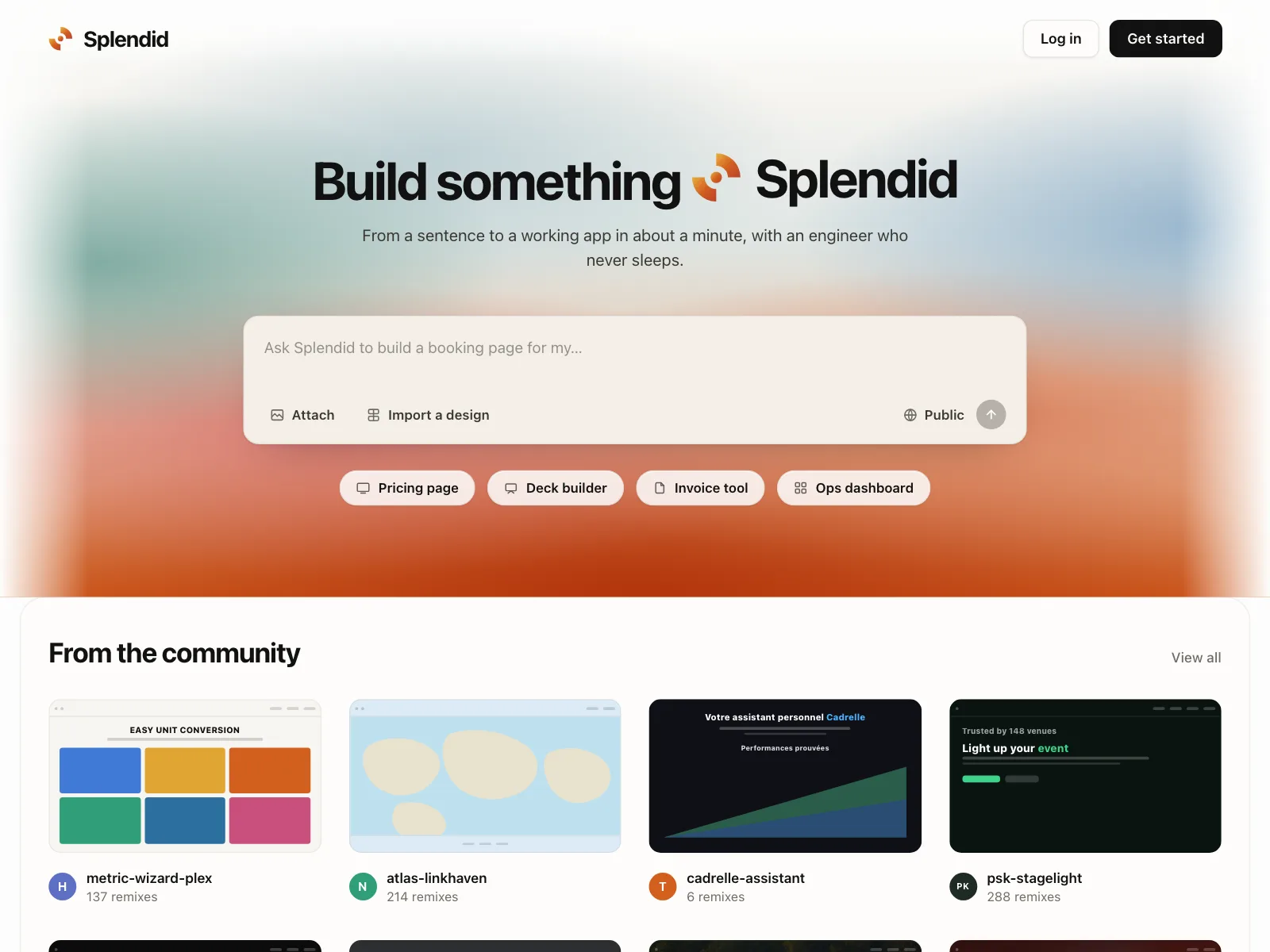
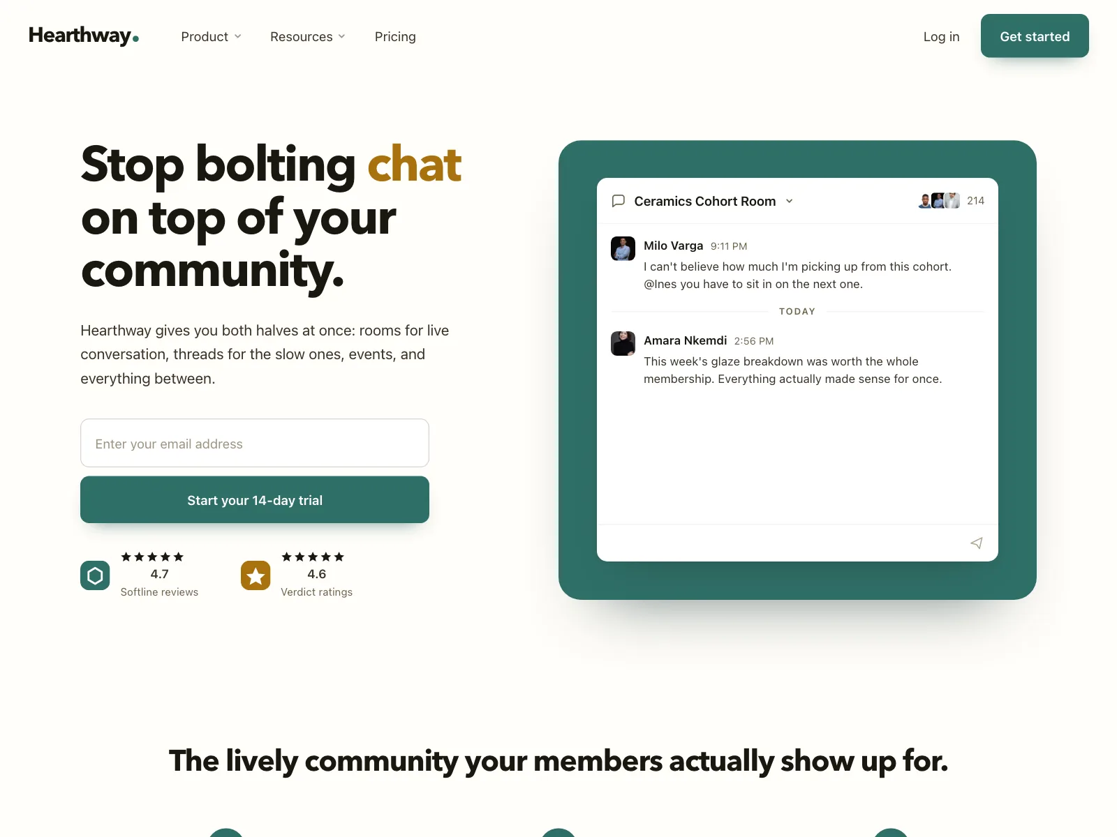
5. Input in the hero
The main action is a field instead of a button: an email signup, a search box or a prompt to type into.

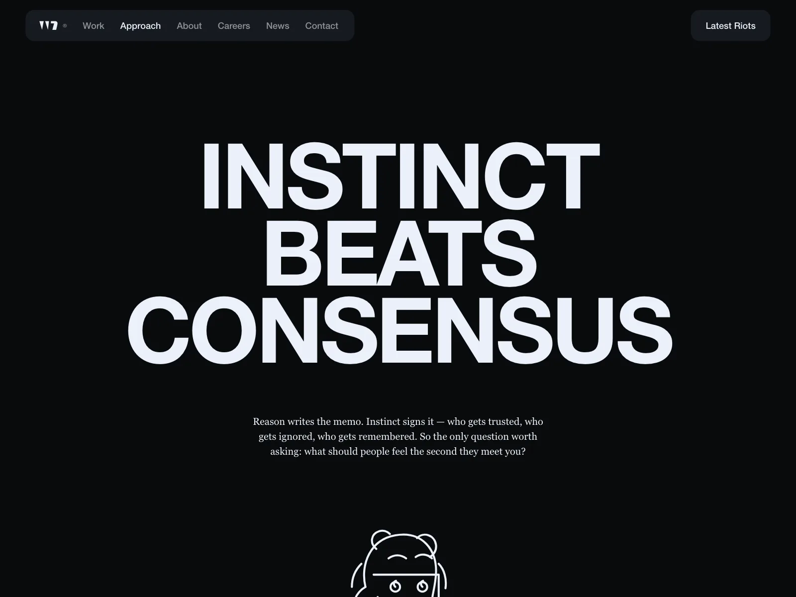
6. Type-led hero
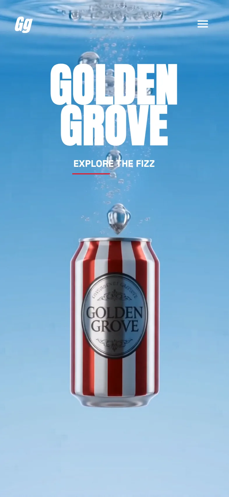
An oversized headline or wordmark carries the section with little else around it. Common for brands and studios.

Where hero sections show up
Launches and announcements
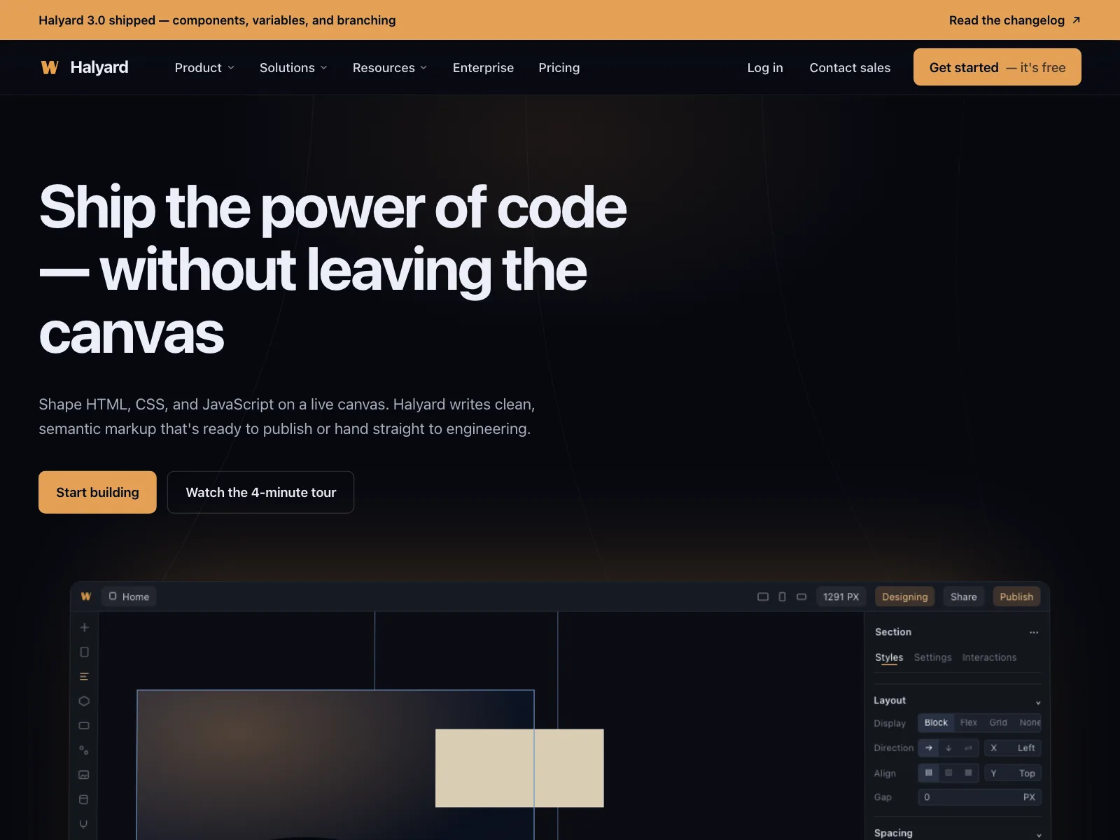
A pill above the headline or a bar above the nav points to the newest release, feature or funding round.

Storefronts and campaigns
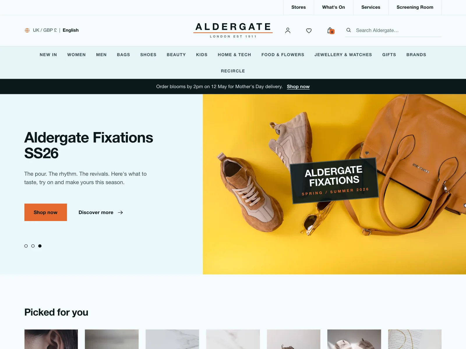
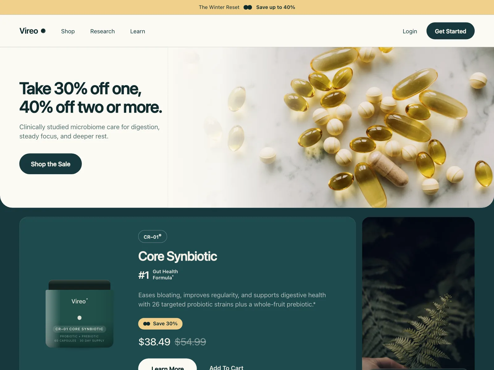
A seasonal collection or a sale takes over the hero, with a Shop button straight into it.

Careers pages
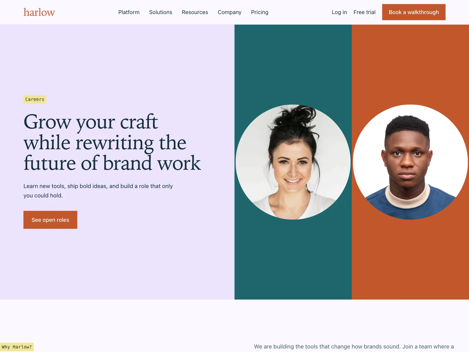
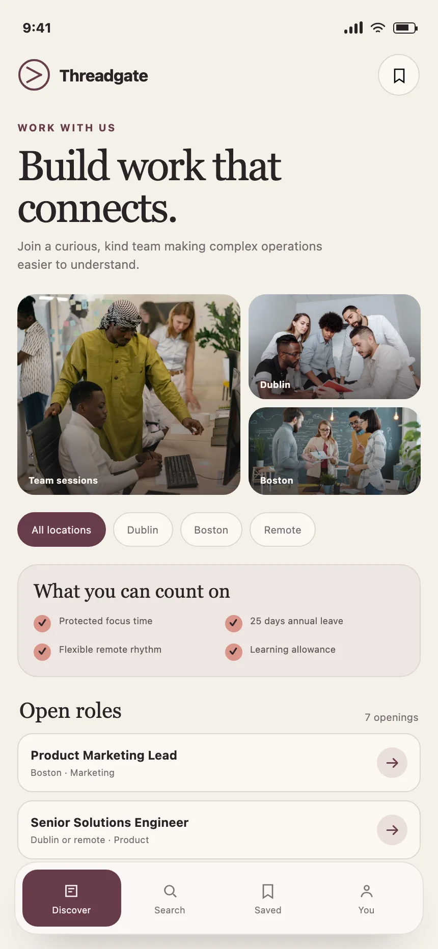
A short promise about the team, real team photos and one button to the open roles.

Help centers
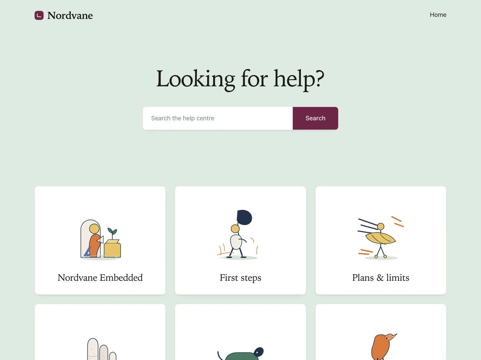
A question as the headline, with a search field or a contact button as the action.
Hero section vs similar components
Build notes
- Make the headline the page's one <h1>. Headings below it start at <h2>.
- Set the headline in live text, never inside the image.
- Text over a photo needs 4.5:1 contrast, or 3:1 for large text. Add a scrim.
- Never lazy-load the hero image. Give it fetchpriority="high" instead.
- Background video that plays on its own for more than five seconds needs a pause control.
- Stack the copy above the visual on phones, with the main button on the first screen.
FAQ
What should a hero section include?
A headline that says what the product or page is, one or two lines of supporting copy, one primary call to action and a visual that shows the product or sets the mood. An eyebrow, a second button and a row of customer logos are common extras.
Should a hero have one call to action or two?
One primary action, always. A second, quieter option works when there are two real paths, like Start free and Book a demo. Style the second as an outline button or a text link so the first one still leads.
Is a hero section the same as above the fold?
No. Above the fold is whatever shows before people scroll, and it changes with every screen size. A hero section is the block designed to fill that space. On a phone the fold often cuts through the hero, so put the headline and the main button first.
Should a hero section be a carousel?
Usually not. A rotating hero splits one first impression across several messages, and anyone who doesn't wait sees only the first slide. If it advances on its own, WCAG asks for a way to pause, stop or hide it.
Related terms
All glossary terms · Browse 370 web and 39 mobile hero section designs