

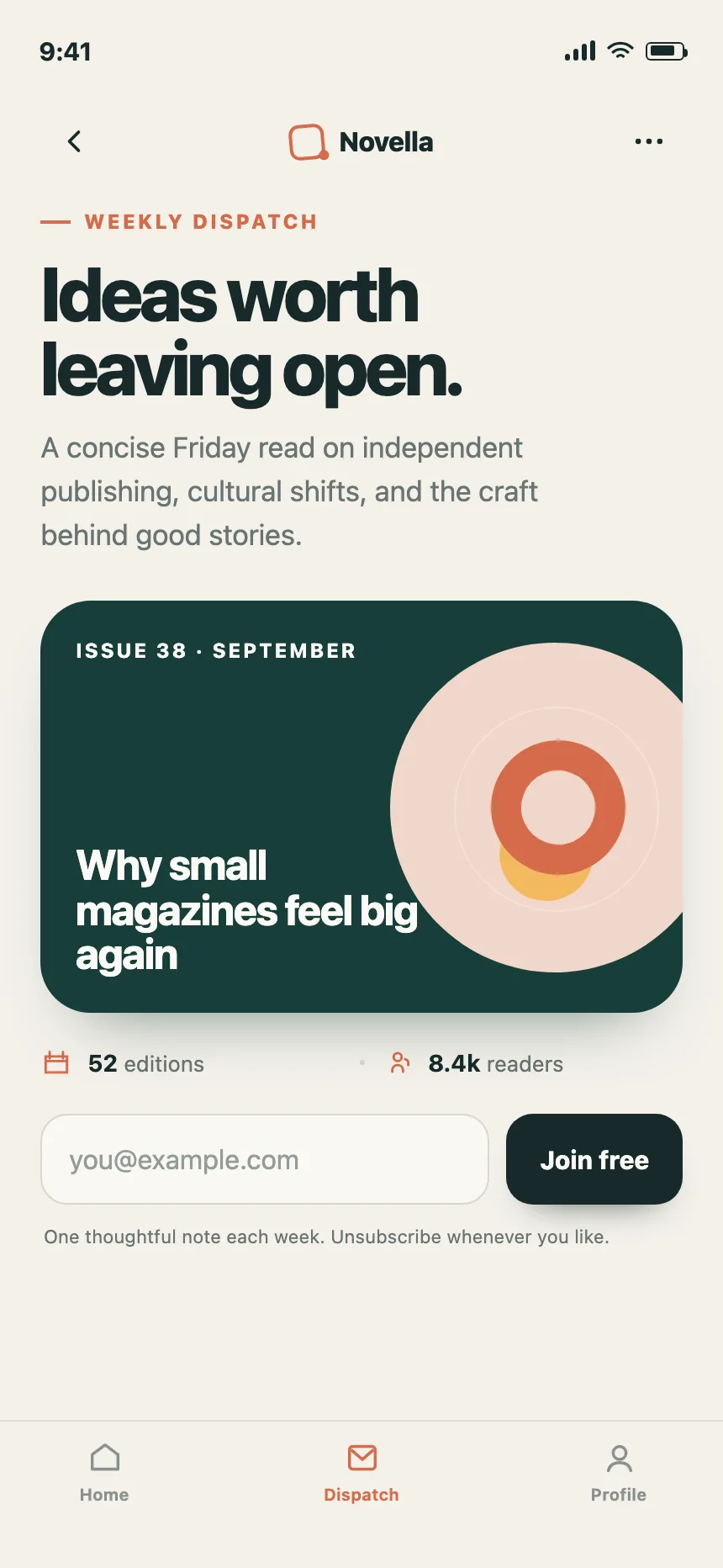
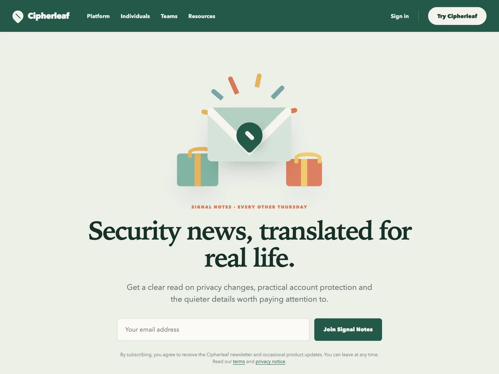
Newsletter signups from the Kombai gallery: a product platform's update list, a weekly letter's subscribe screen and a security newsletter's landing hero.
What is a newsletter signup?
A newsletter signup is a small form, usually one email field and one button, set inside a band, a footer or a page of its own. A line above it sells the letter: what is in it and how often it arrives. After submit, the form gives way to a confirmation, so people never leave the page.
- One labeled email field and one button, often side by side.
- A short promise above the field, and a privacy line below it.
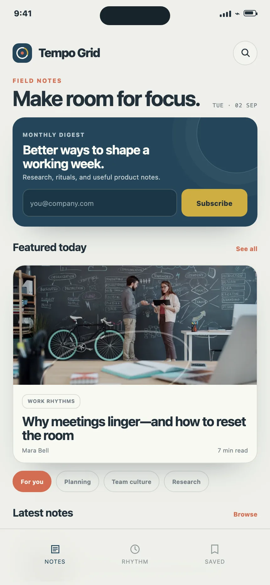
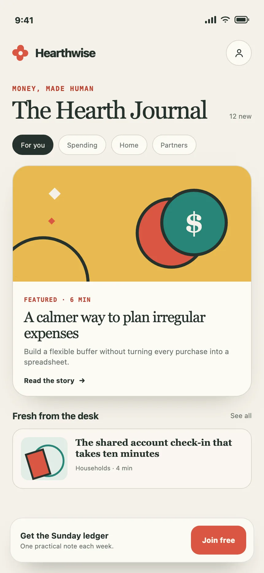
Newsletter signups show up across footer, CTA band, news feed and magazine screens.
When to use a newsletter signup
- Regular updatesA letter that goes out on a schedule, like weekly or monthly.
- The end of a readBelow an article or a guide, when people want more of the same.
- A store mailing listDrops, restocks and offers, often with a first-order discount.
When not to use one
- No letter to sendDon't collect emails before you have something to send on a schedule.
- Before people readA popup over the first screen asks for trust the page has not earned.
- Account signupCreating an account needs a sign-up form, not a mailing list field.
Anatomy of a newsletter signup
This one works, and sends nothing. Submit it empty or with a typo to see the error, then with a real-looking address to see the success state.
- Empty
- Error
- Sending
- Subscribed
- PitchWhat people get, how often
- Email fieldLabeled, type="email"
- ButtonSays what happens
- Privacy lineHow to unsubscribe
- MessageError or success, announced
- StatesEmpty, error, sending, done
Newsletter signup variants
We sorted every newsletter design in the Kombai gallery and found six patterns. Browse all 60 web and 38 mobile designs.
1. Inline band
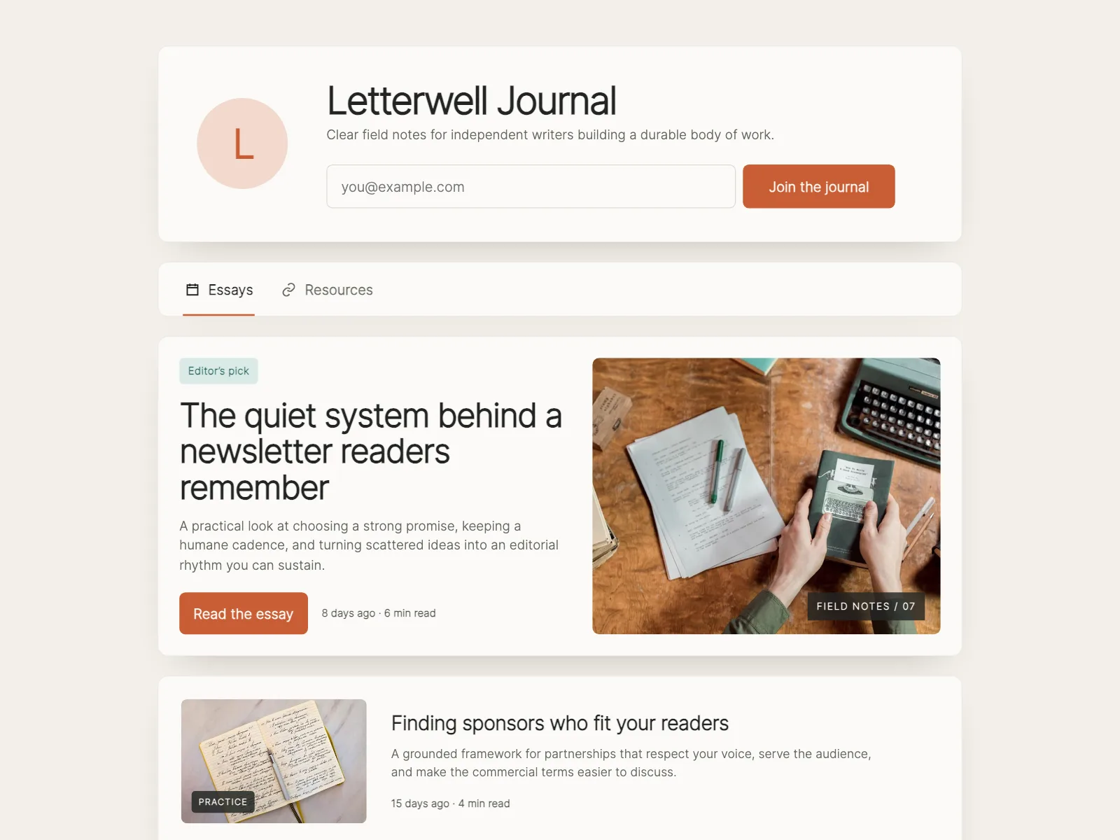
The default. A short line on one side, the email field and button on the other, in a single row.


2. Over an image
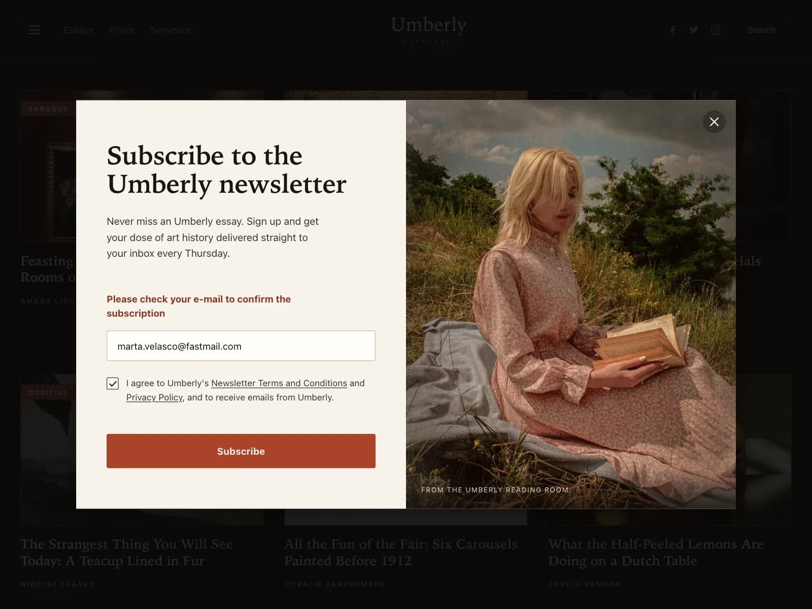
The pitch and form sit on a full-bleed photo, so the letter gets a mood before anyone reads a word.


3. In the footer
A subscribe block in a column of the site footer, next to the links.


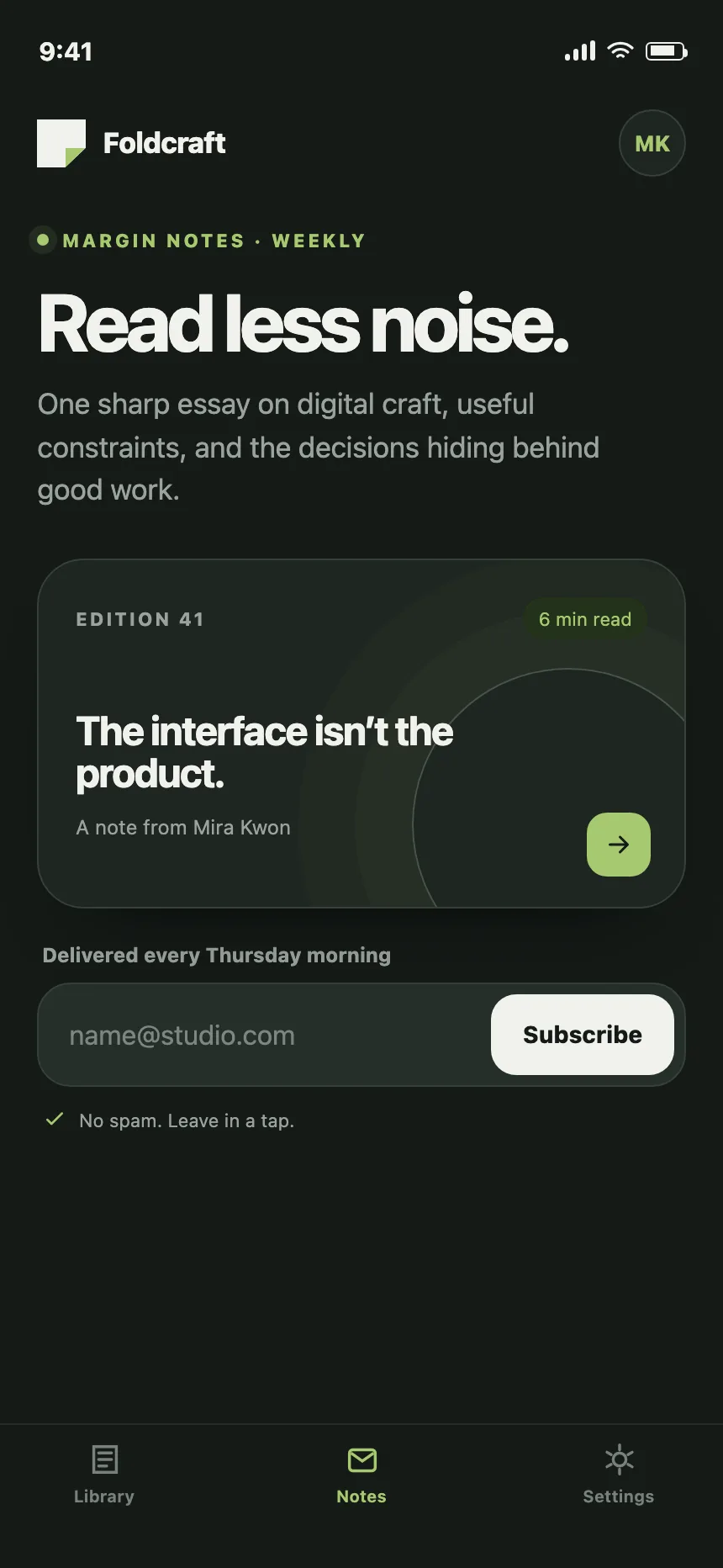
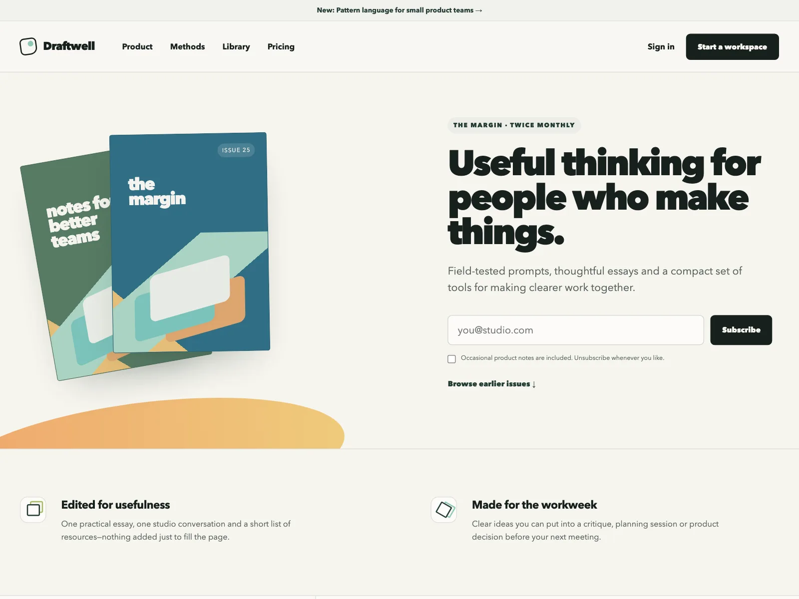
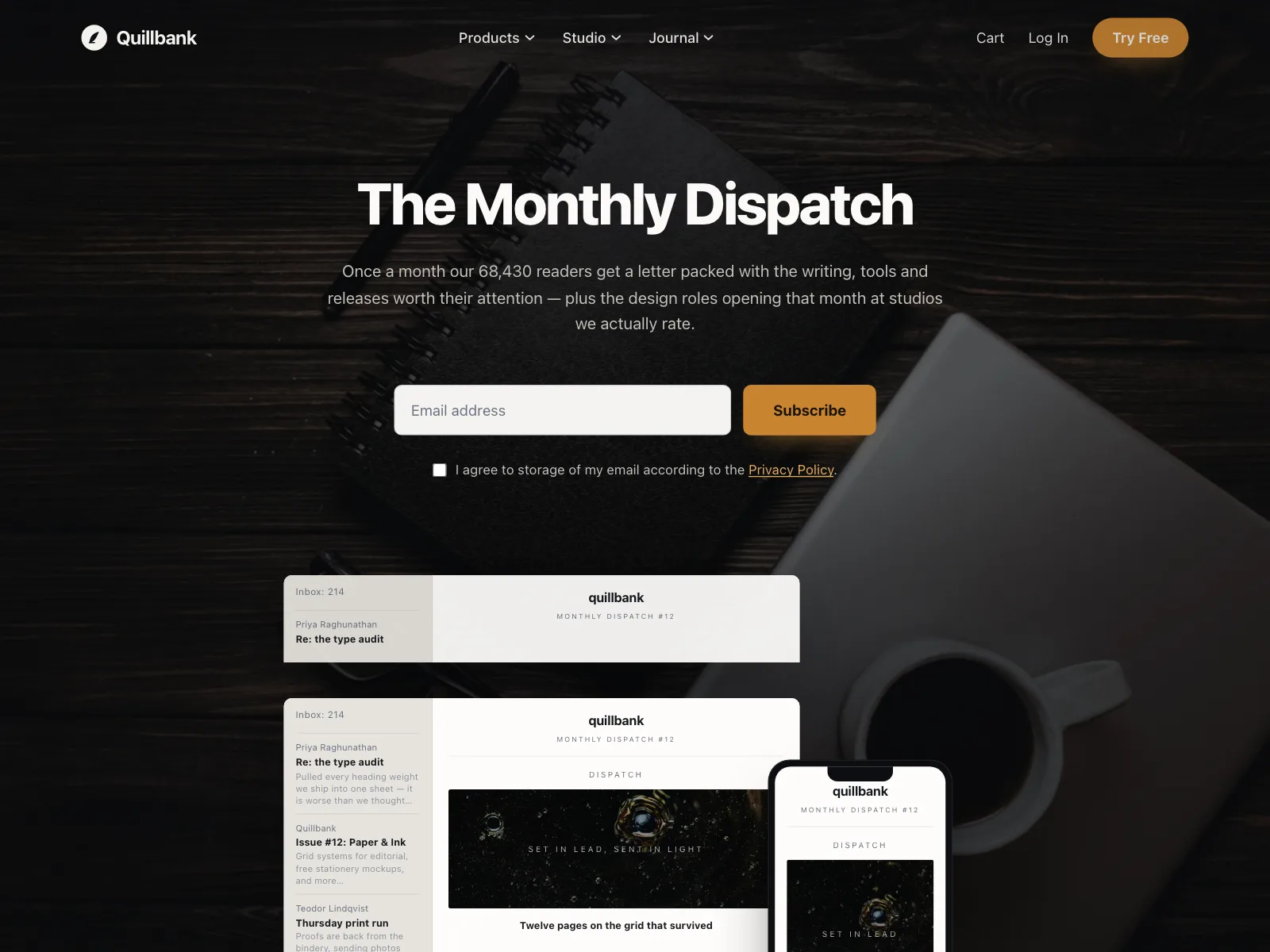
4. With an issue preview
A recent issue, past covers or a reader count next to the form, to show what people are signing up for.
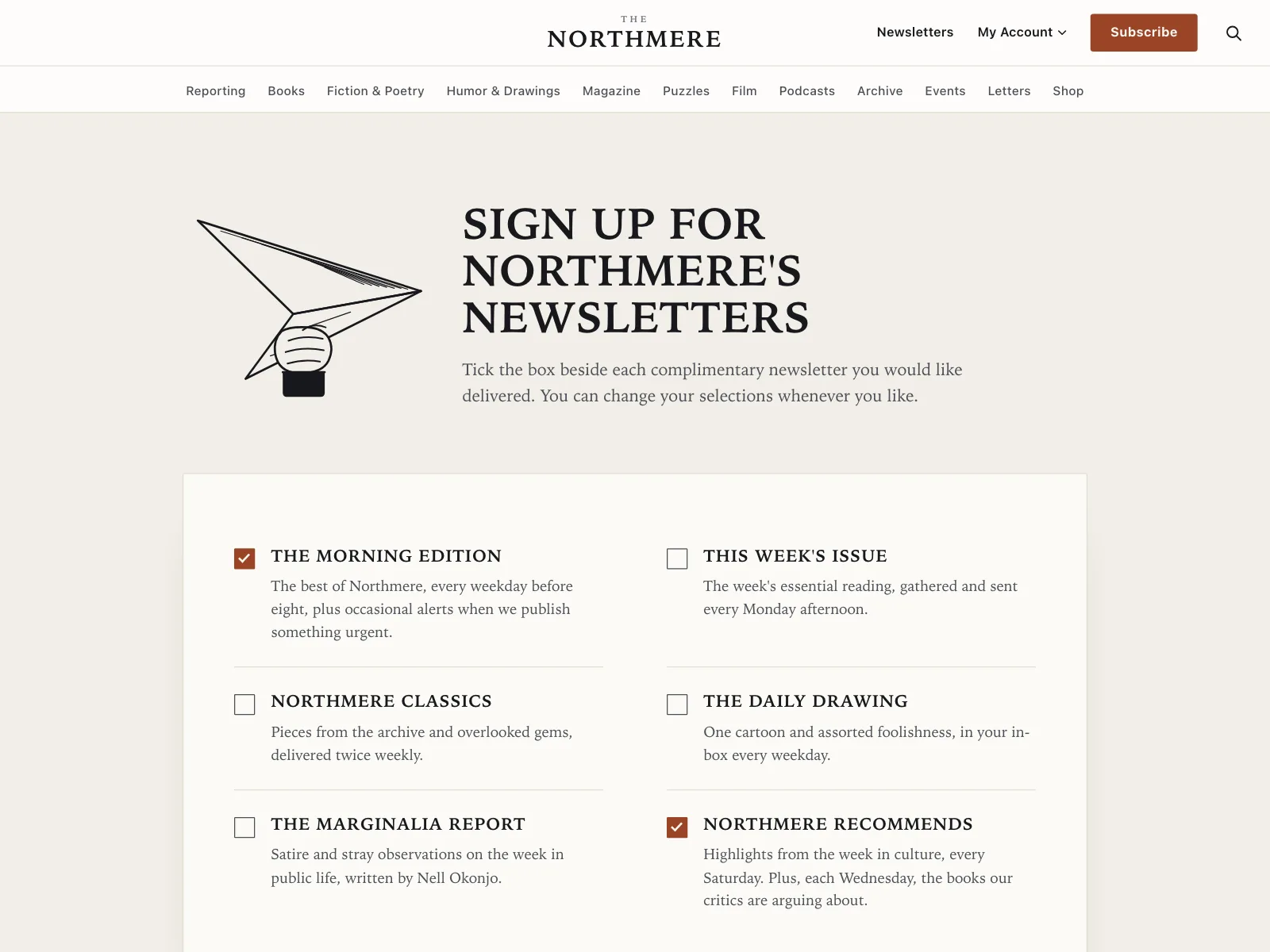
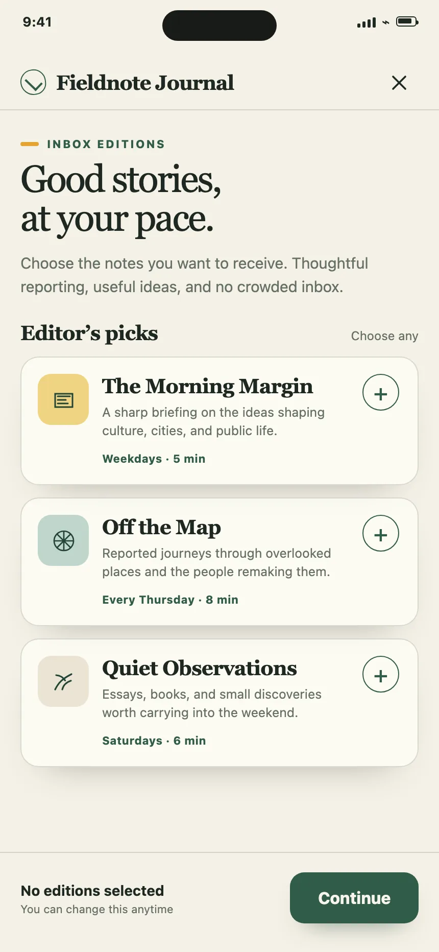
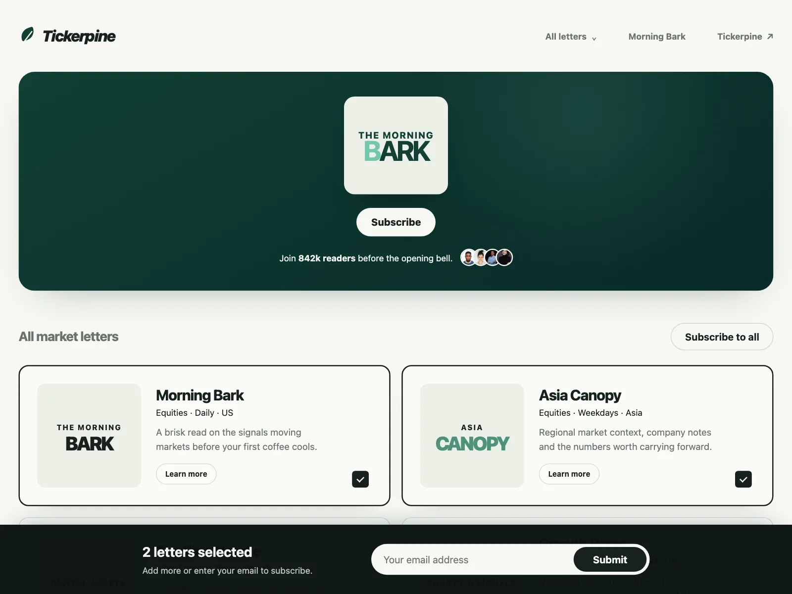
5. Pick your letters
Publishers with several newsletters list them as cards or checkboxes, and one email subscribes to all the picks.
6. Topics and frequency
Chips for topics and a choice of rhythm, like weekly or twice a month, before the subscribe button.
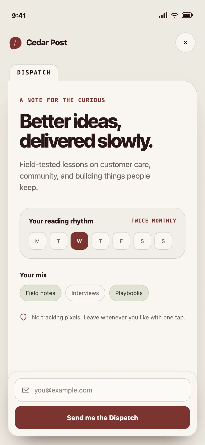
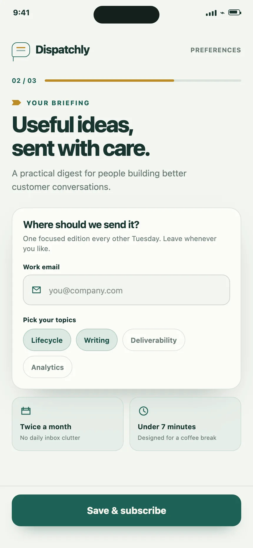
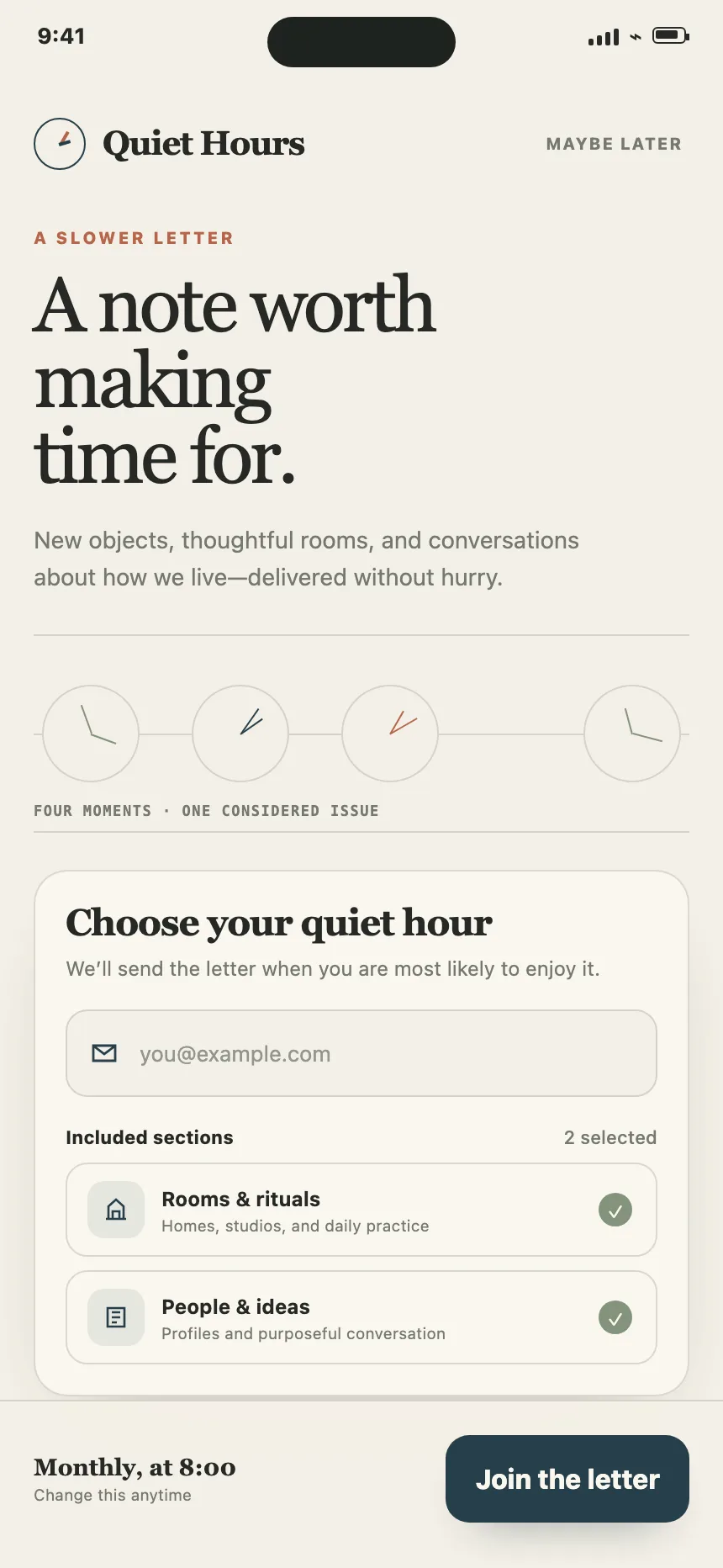
Where newsletter signups show up
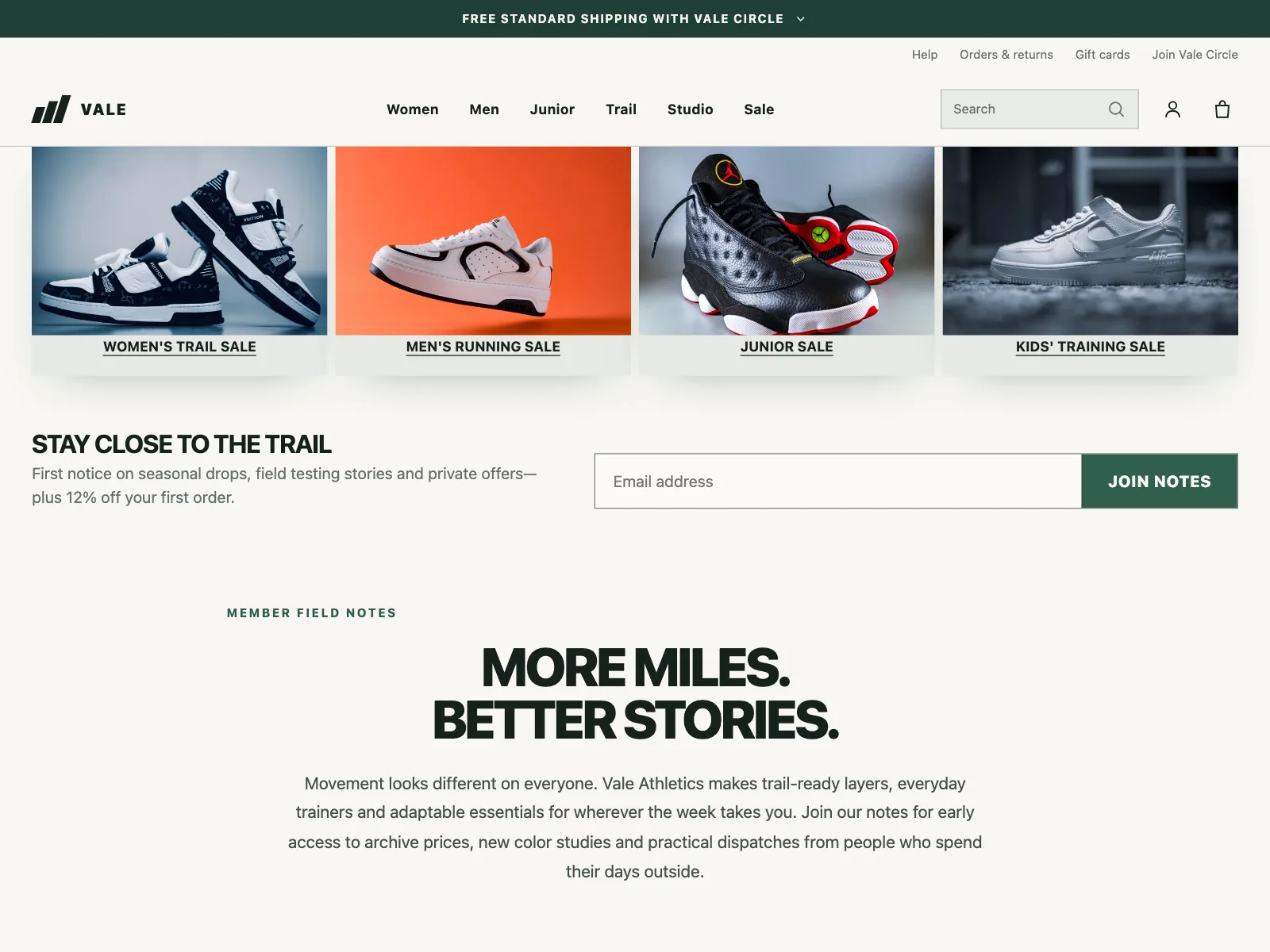
Online stores
A signup strip or page that trades a first-order discount for an email address.
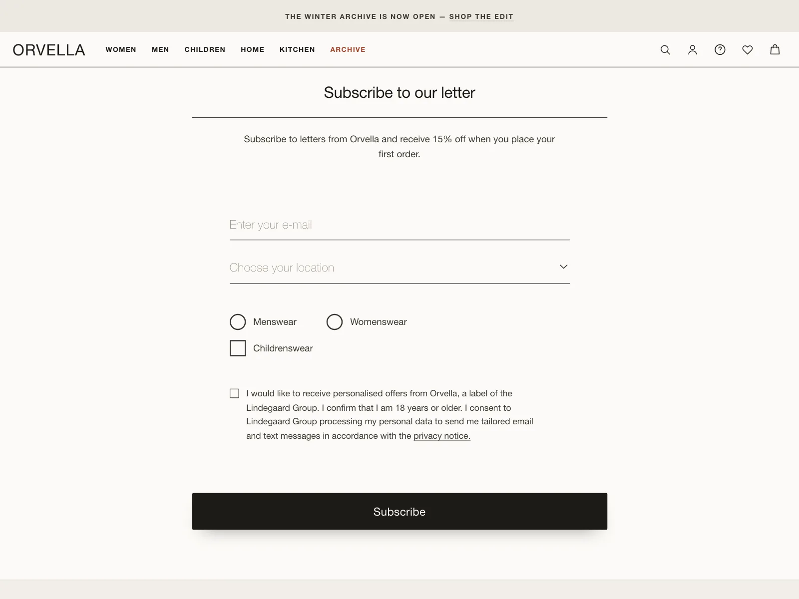

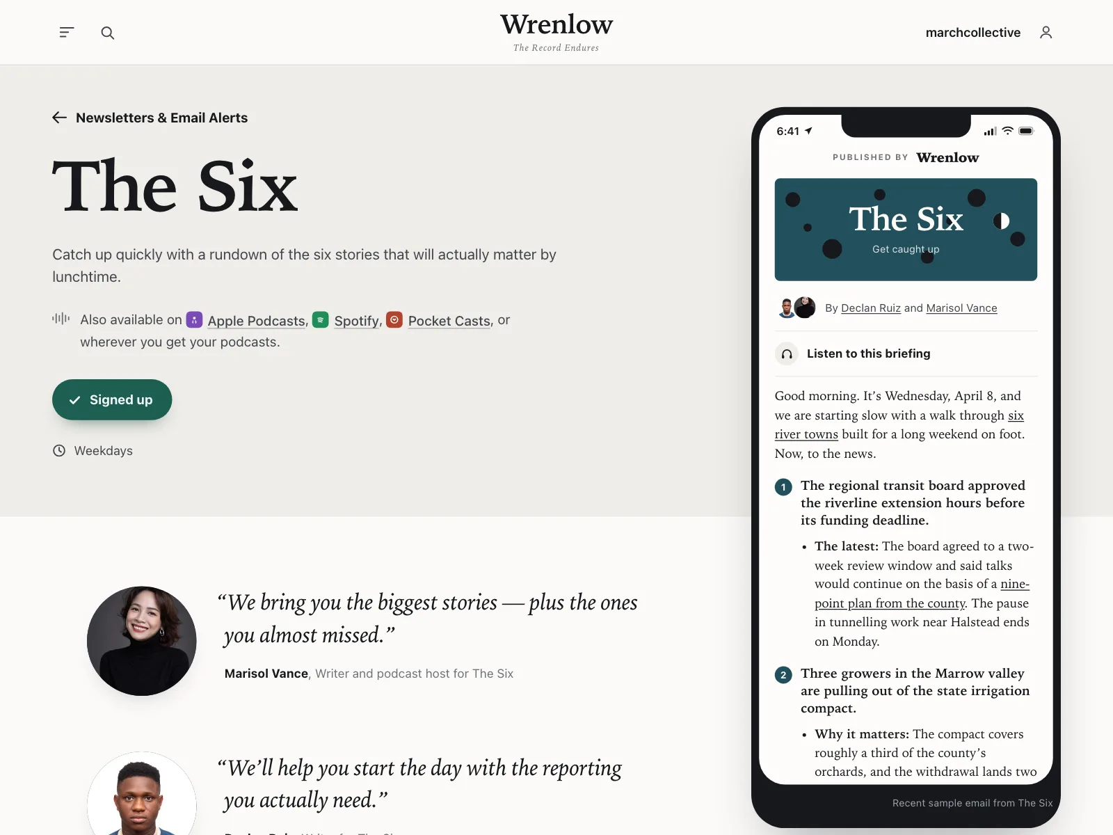
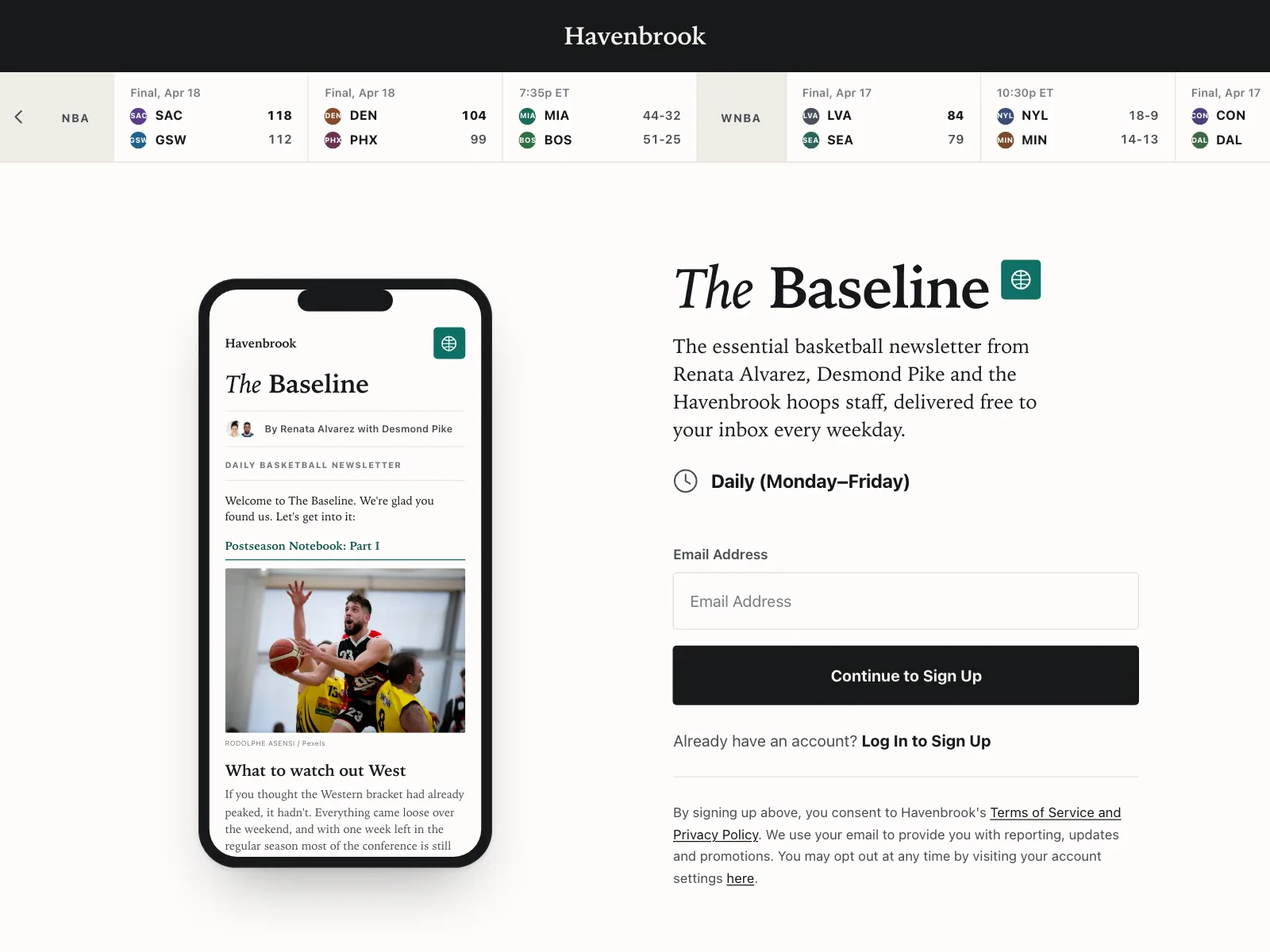
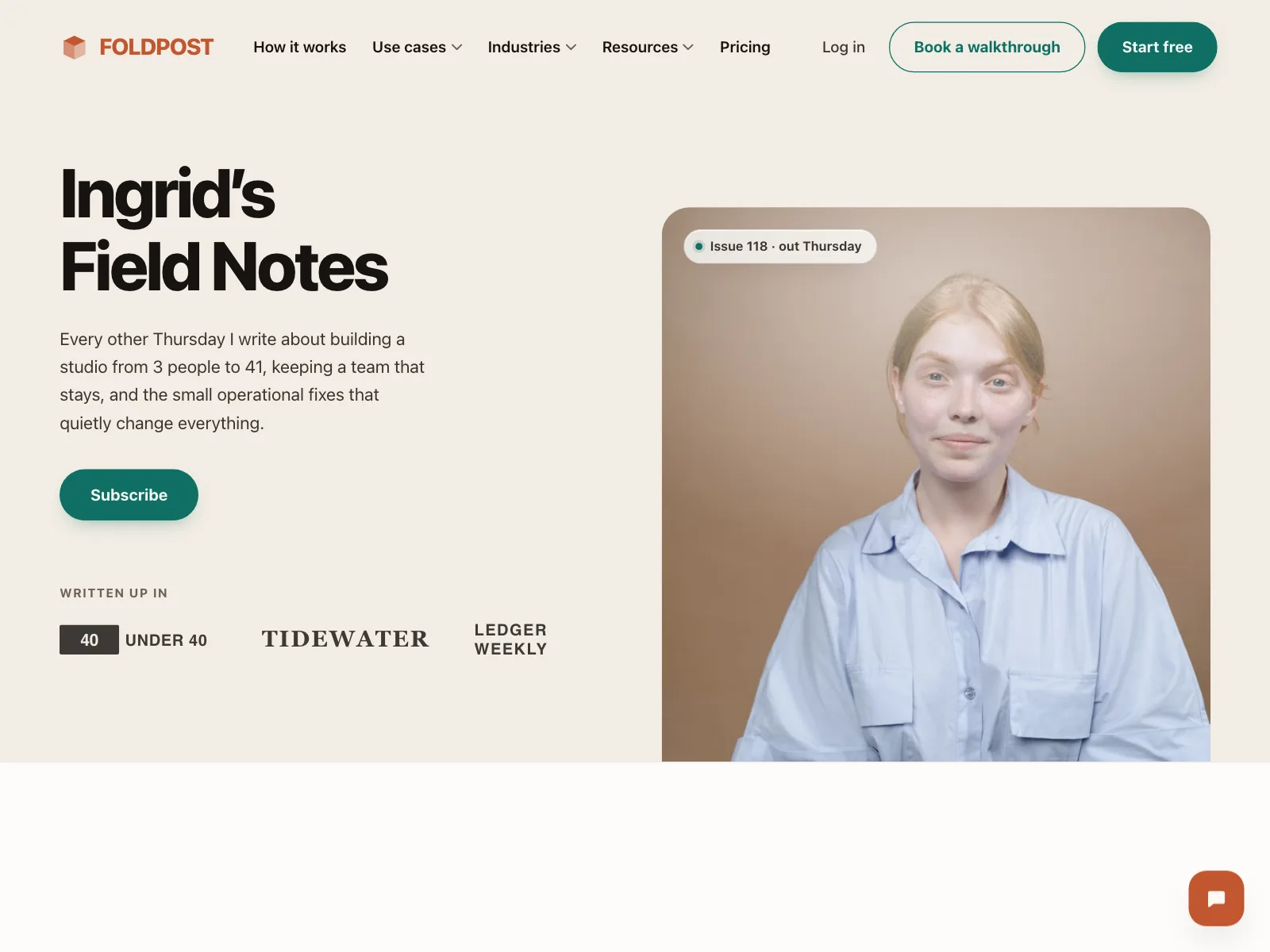
Publishers
A landing page for one letter, with the writers, the schedule and often a sample issue.
Blogs and journals
A signup card or docked bar inside the article feed, so readers subscribe while they browse.
Newsletter signup vs similar components

Build notes
- Use <input type="email"> with autocomplete="email" and spellcheck="false", so phones show the right keyboard.
- Give the field a real label. A placeholder alone disappears as soon as people type.
- Check the format on submit and say how to fix it: "Enter an email address in the correct format, like name@example.com".
- Link the error to the field with aria-describedby, and set aria-invalid="true" while it is wrong.
- Show the result in a role="status" region, so screen readers announce it without moving focus.
- Say how often the letter arrives and how to unsubscribe, right by the button.
FAQ
Should a newsletter signup ask for a name?
Only if you use it. One email field is the shortest path to subscribed. Ask for a name later, in the welcome email, if you want to personalize the letter.
Where should a newsletter signup go?
Where readers finish something: the end of an article, the footer, or a band between sections of a landing page. A popup that opens before anyone has read the page asks for trust it has not earned yet.
Should the form check the email address?
Check the format when people submit, and allow pasting. A format check cannot tell whether an inbox exists, so you may also need to confirm people can open it, for example with a confirmation email.
What should happen after someone subscribes?
Keep them on the page. Replace the form with a short confirmation that repeats the address, so they can spot a typo, and says what comes next.
Related terms
All glossary terms · Browse 60 web and 38 mobile newsletter signup designs