
Form
A form groups labeled fields and a submit button, so people can hand over information in one go.
- Also called
- form layout
- Platforms
- Web, Mobile
- In the gallery
- 198 web and 164 mobile designs
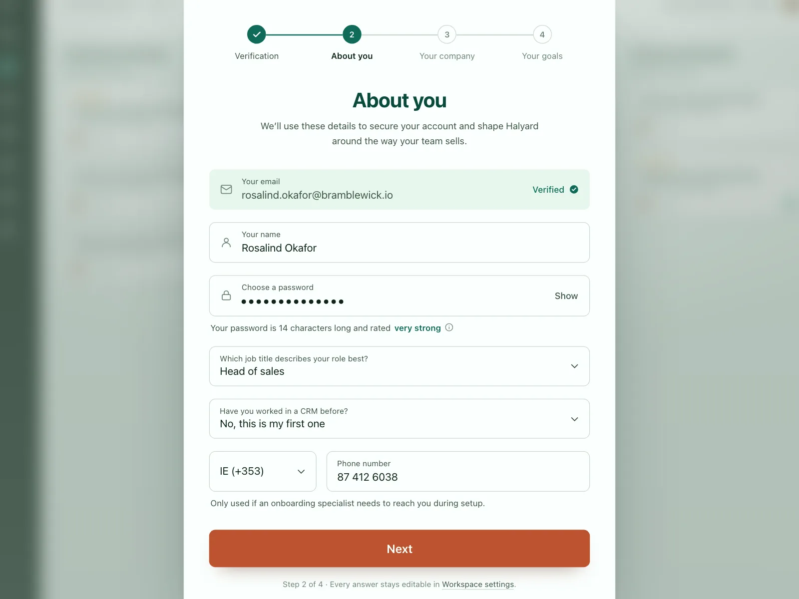
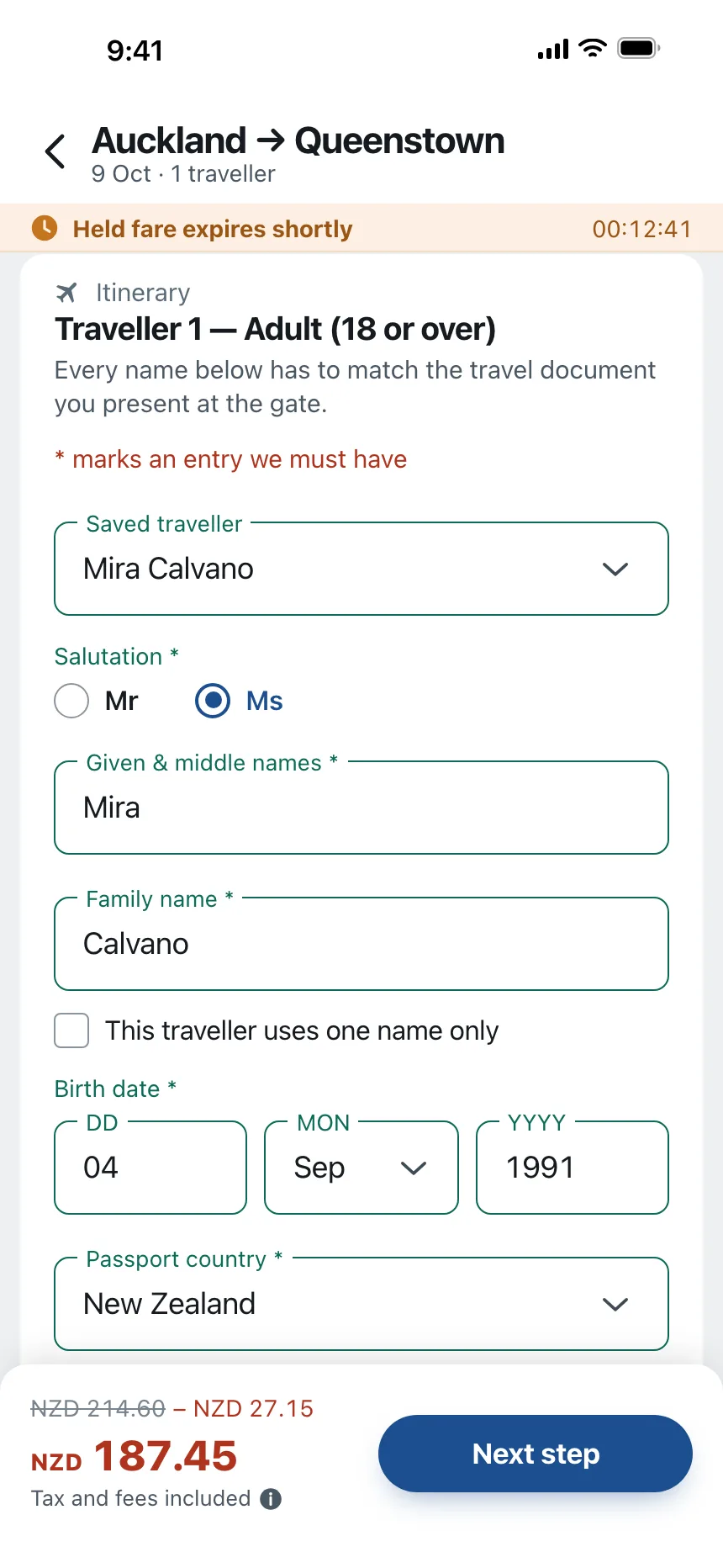

Forms from the Kombai gallery: a sales CRM's account setup step, a flight app's traveller details and a speech SDK's developer request form.
What is a form?
A form is a set of fields, like text fields, selects, checkboxes and radio buttons, that collect related answers and send them together. Each field has a label that says what to enter. People fill the fields in order, then press one button to submit. If something is missing or wrong, the form says which field and how to fix it.
- Every field has a visible label, and related fields sit together under a heading.
- One primary button submits the whole form, and errors point to the exact field.
Forms show up across sign up, checkout, account setup and settings screens.
When to use a form
- Collecting detailsSign-ups, addresses, payment and profile details that a system has to store.
- Creating somethingA new contact, project, event or listing with a few fields to fill.
- Requests and applicationsContact sales, support requests and job applications that someone reviews.
When not to use one
- A single settingA toggle that saves on its own needs no form or Save button.
- SearchingUse a search bar. People expect results as they type, not a submit step.
- Long questionnaires on one pageSplit long forms into short steps with a progress indicator.
Anatomy of a form
This one works. Submit it empty to see the errors, then fill it in and send it.
- Empty
- Error
- Sending
- Sent
- HeadingSays what the form is for
- LabelNames each field
- FieldWhere the answer goes
- Hint or errorHelp, or what to fix
- Submit buttonSends everything at once
- StatesEmpty, error, sending, sent
Form variants
We sorted the form designs in the Kombai gallery into five patterns. Browse all 198 web and 164 mobile designs.
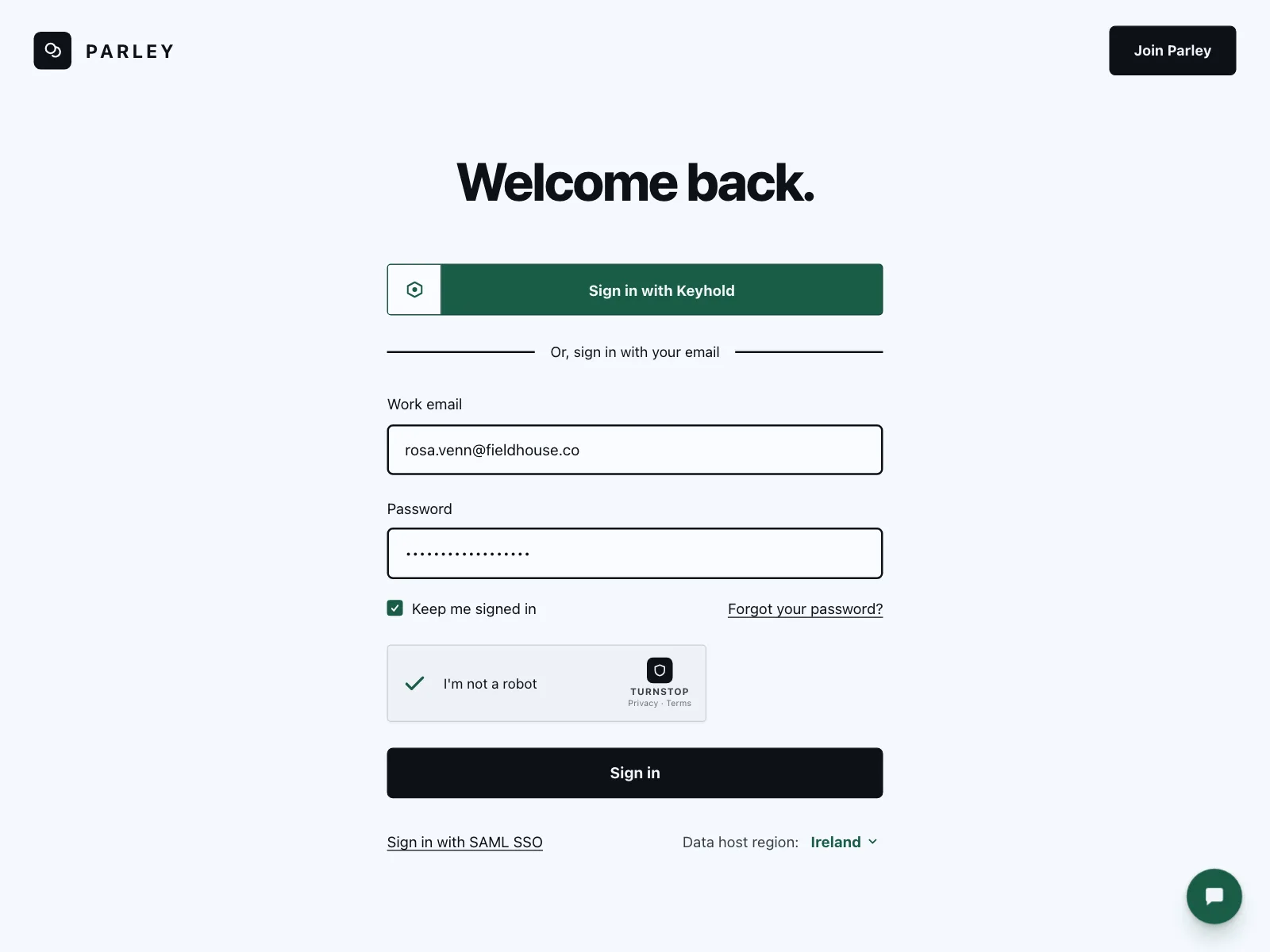
1. Sign-in and sign-up forms
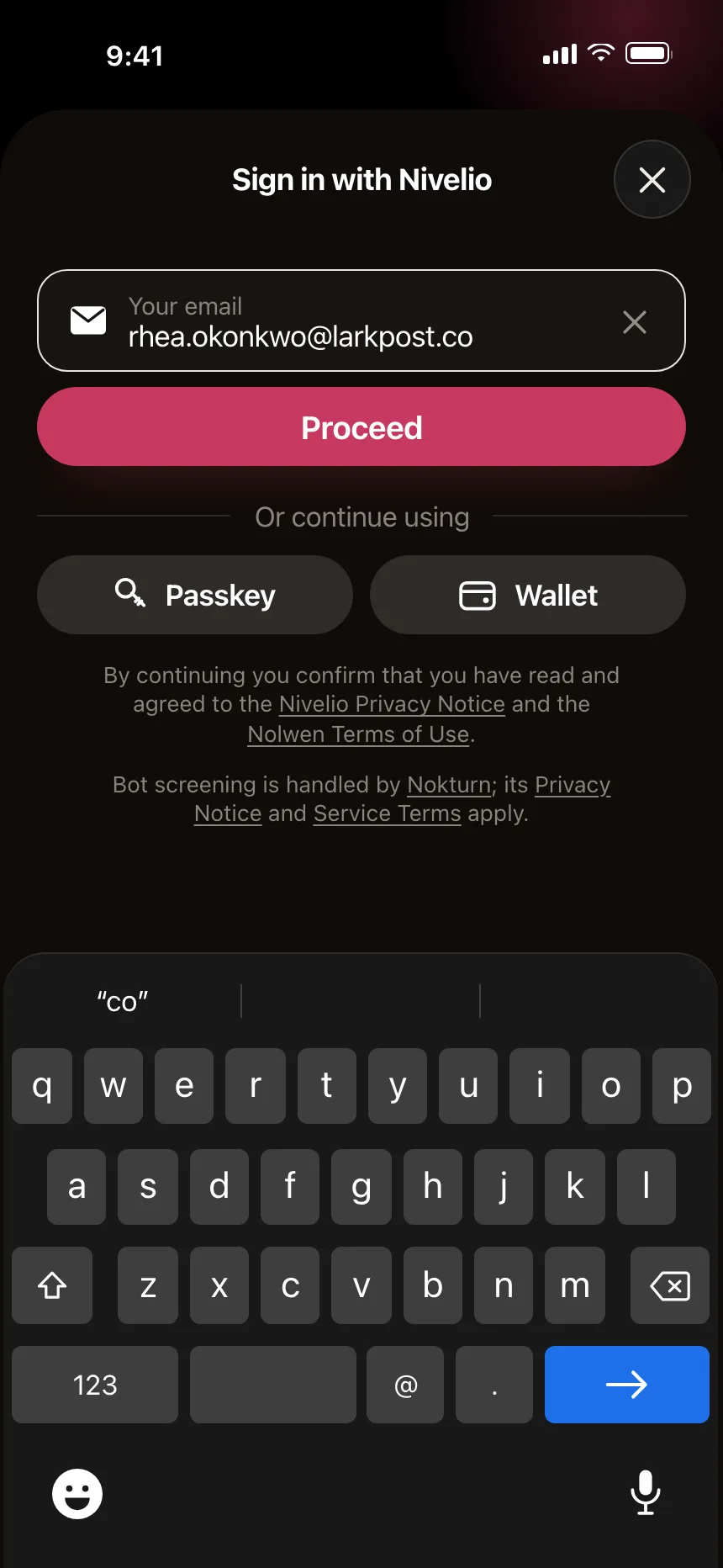
An email, a password and a button, often with social sign-in above or below and inline password rules.


2. One question per step
Onboarding and surveys that ask one thing per screen, with a Next button and an Other option that opens a field.


3. Address and payment forms
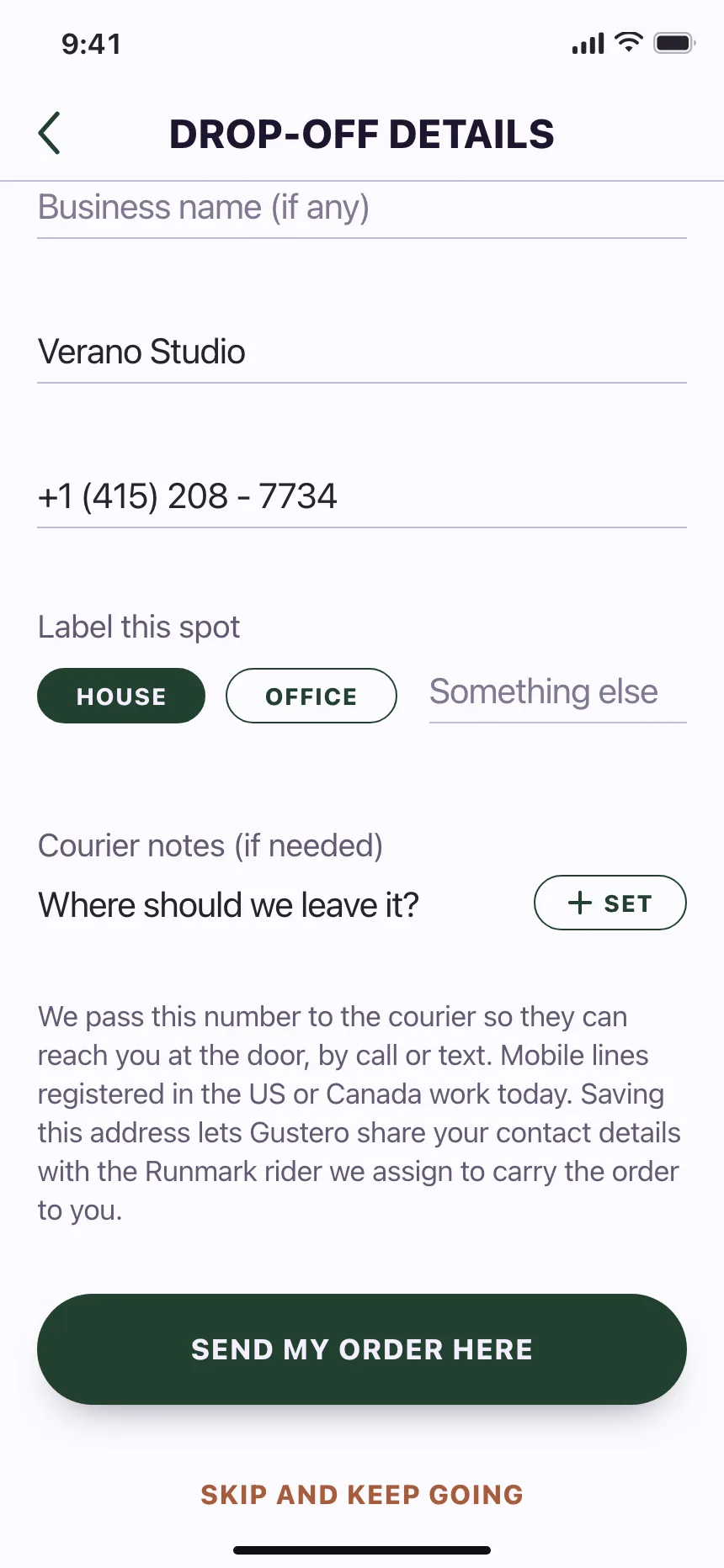
Long runs of short fields for a street, city, postcode and card, with paired fields on one row.


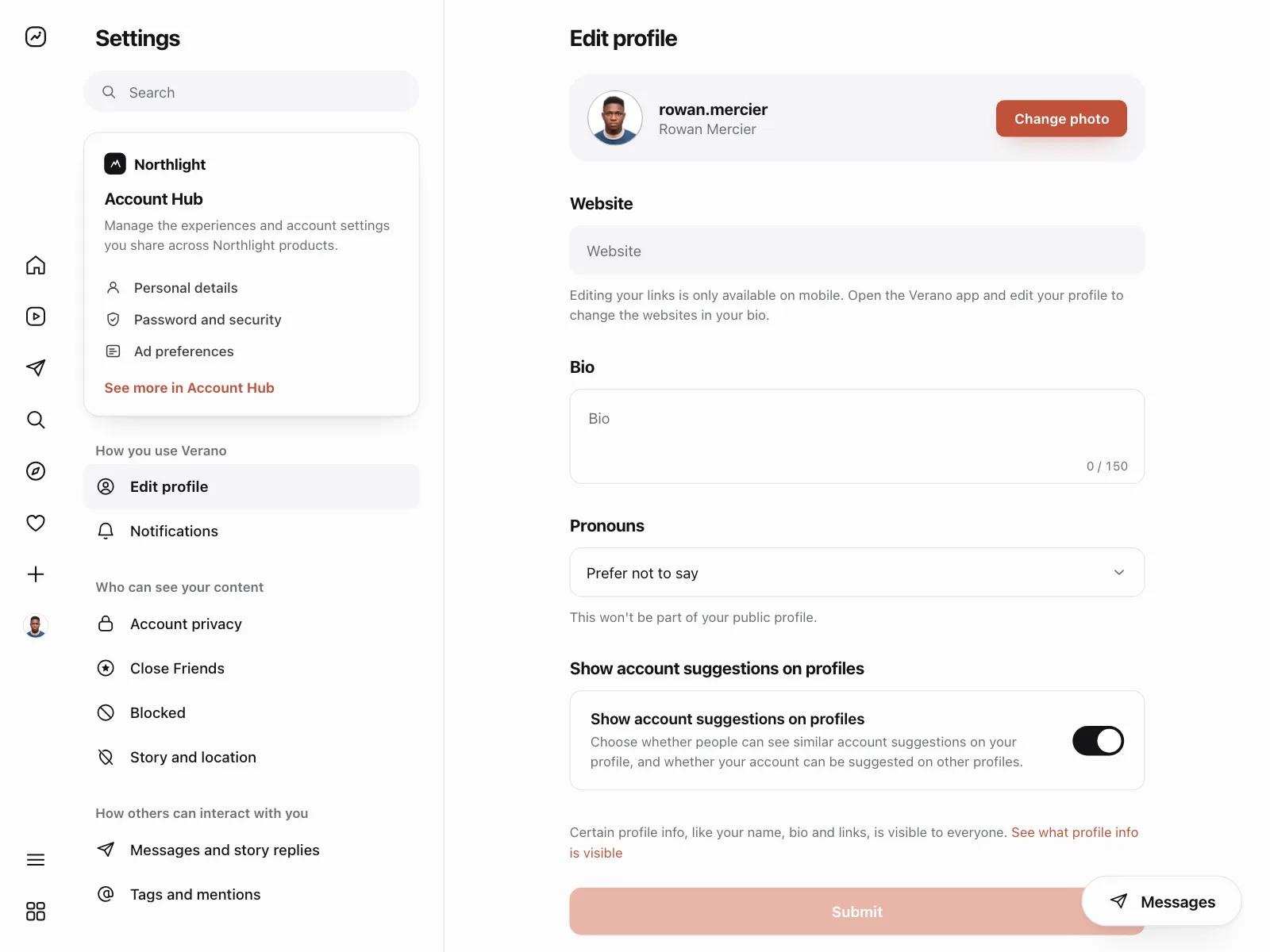
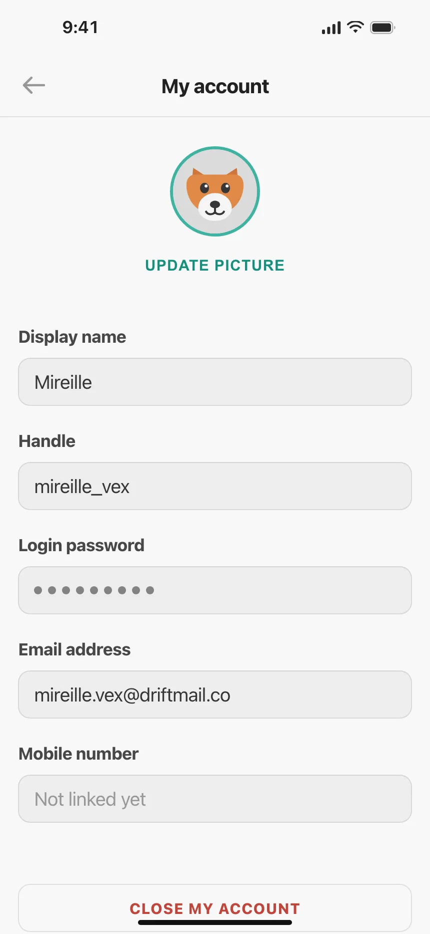
4. Profile and settings forms
Saved details shown in editable fields, with a Save button and, on the web, sections in a side menu.

5. Forms in a dialog or sheet
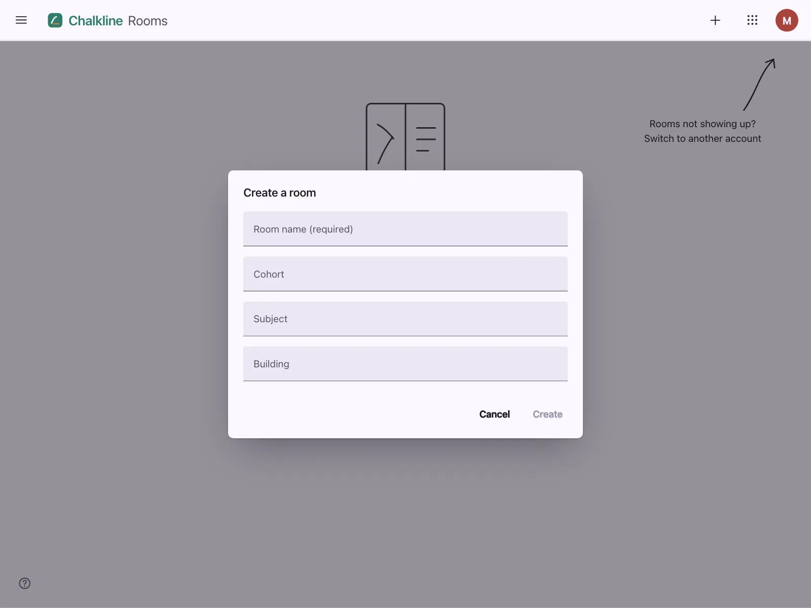
Short forms that open over the page to add a team member, a staff role or a poll, with a cancel and a confirm button.


Where forms show up
Checkout and booking
Contact, delivery and payment details collected step by step, next to an order or booking summary.


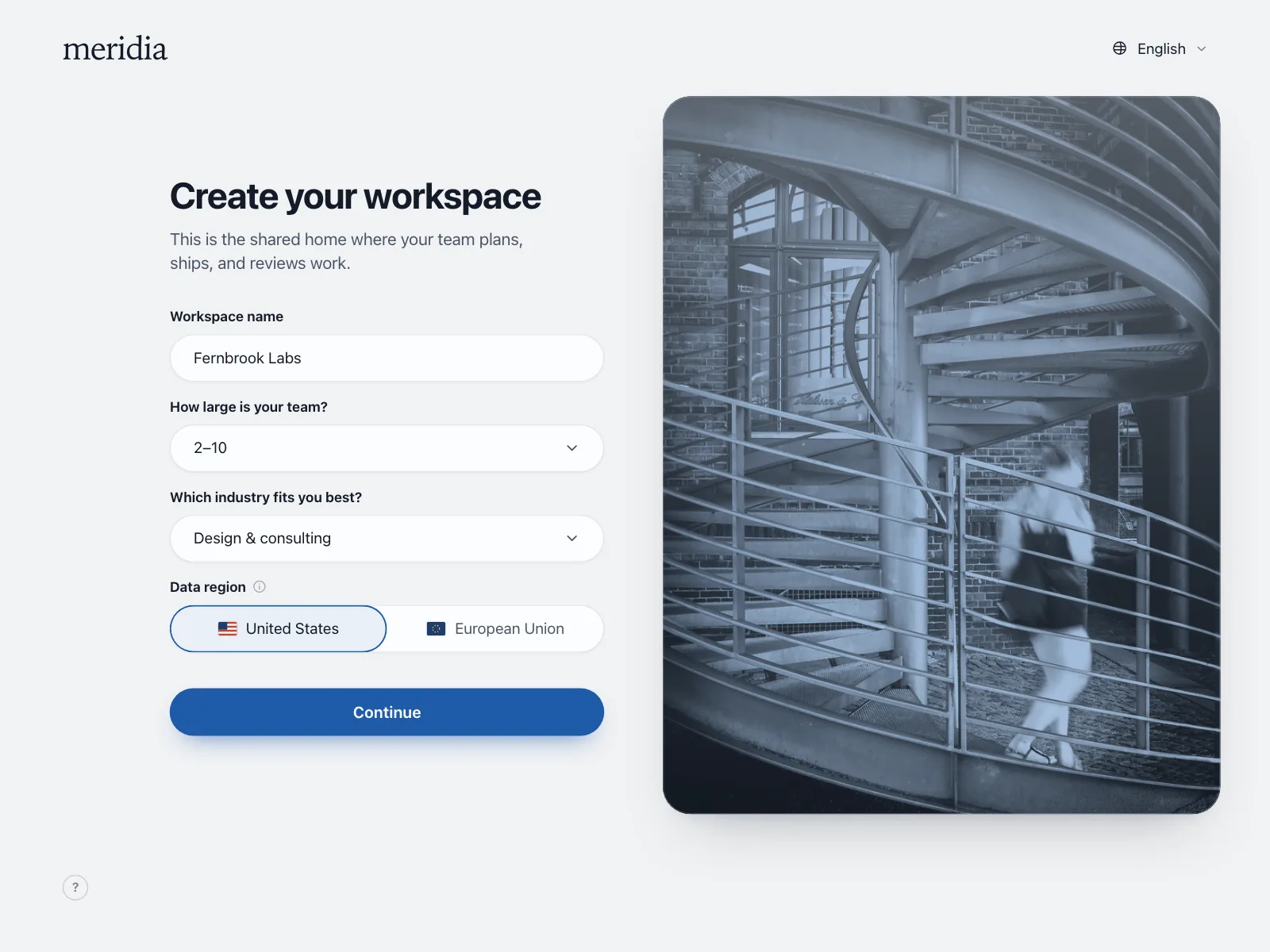
Onboarding
A workspace name, team size and a few preferences asked right after sign-up, so the app starts set up.

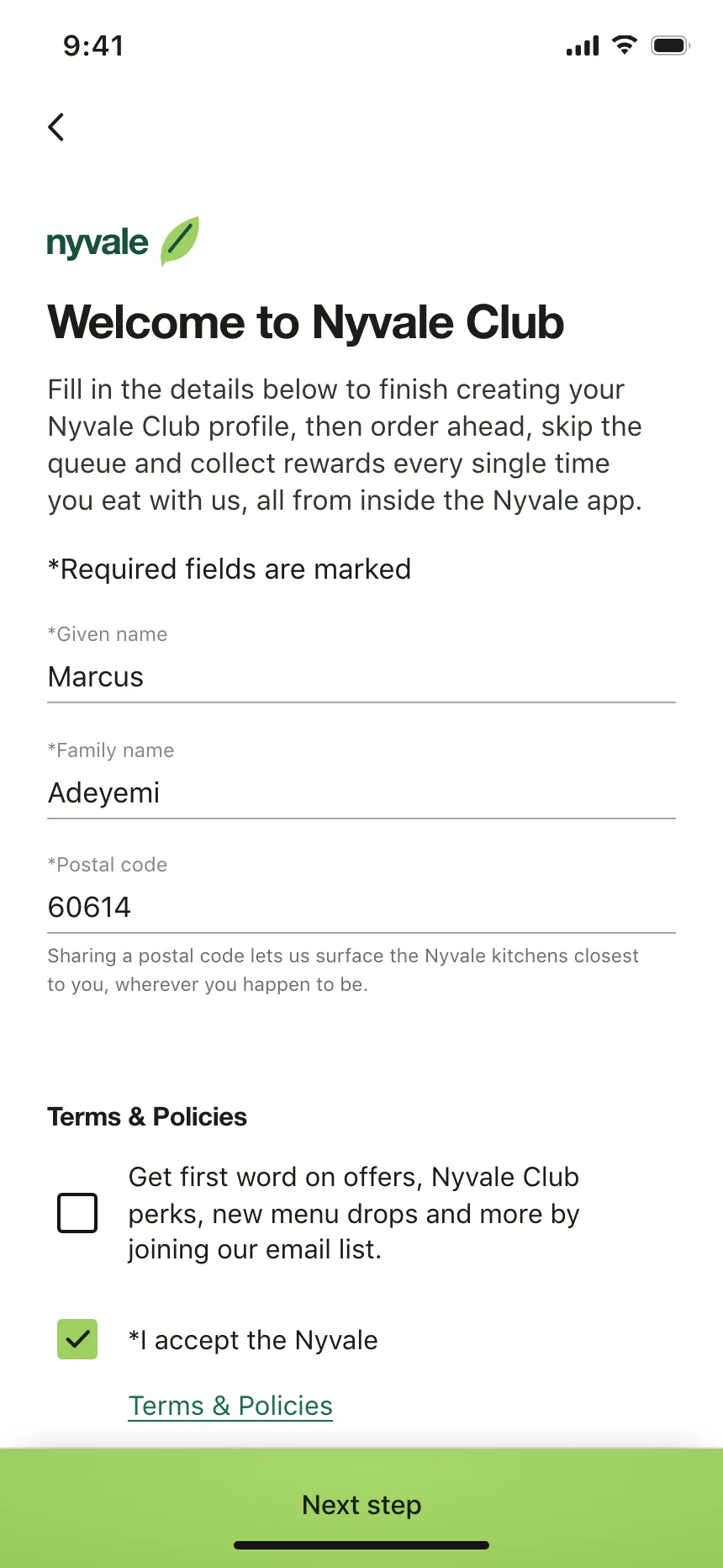
Identity and business details
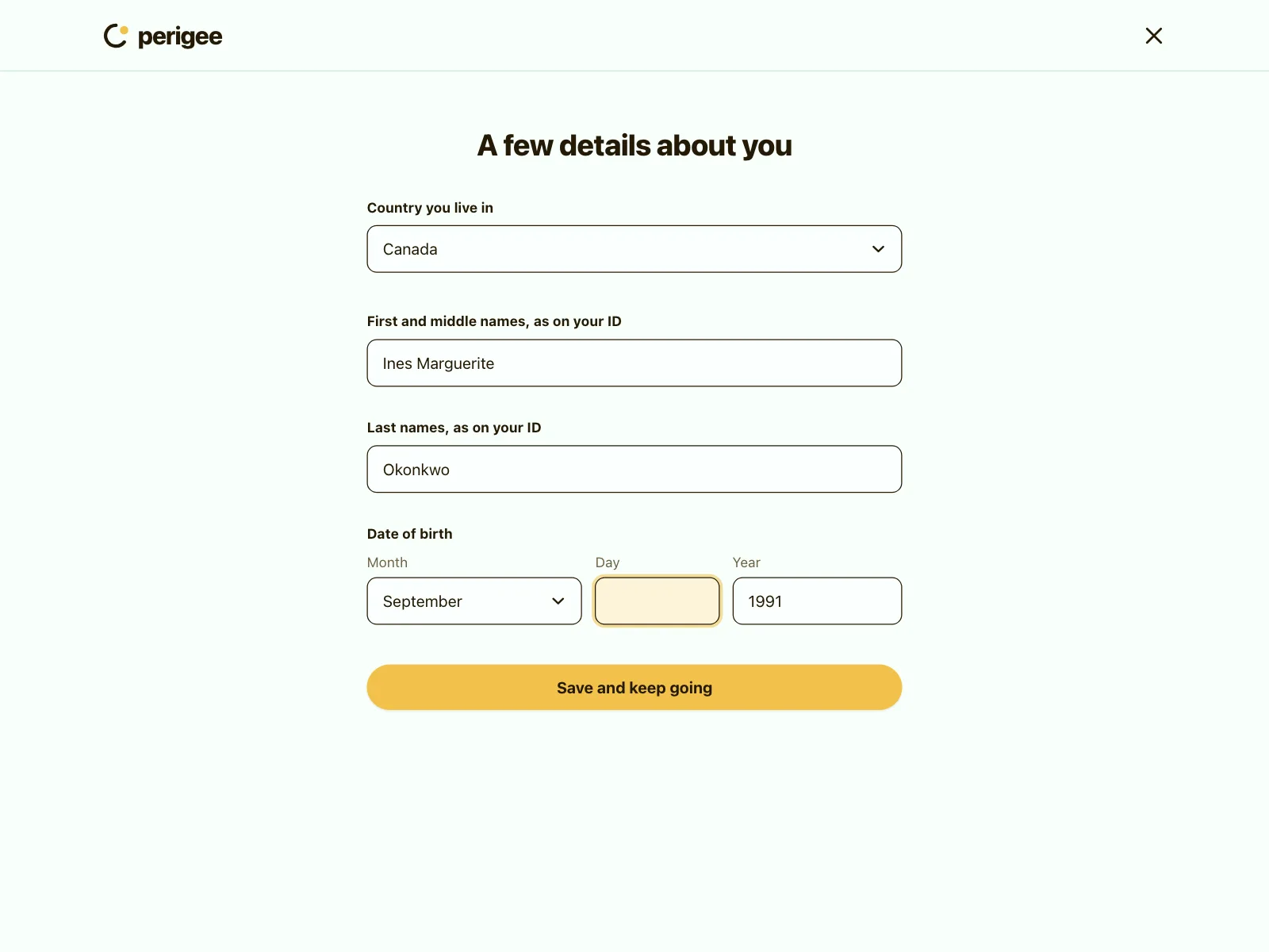
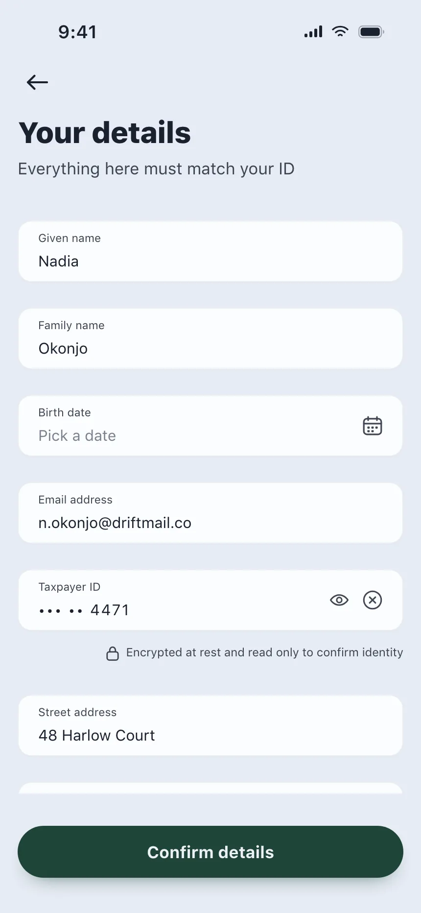
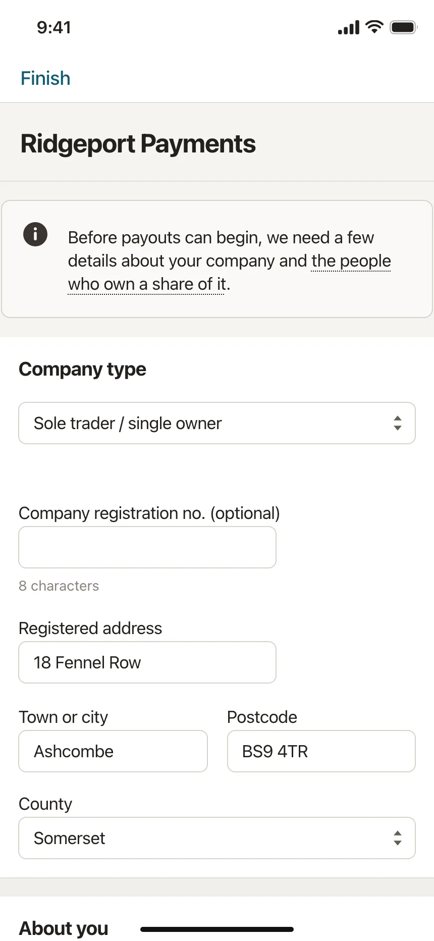
Legal names, dates of birth and company details that must match an ID or a register, with notes on why they are needed.
Form vs similar components
Build notes
- Wrap the fields in a <form> and use a <button type="submit">, so Enter submits from any field.
- Give every field a visible <label> tied to it with for and id. A placeholder is not a label.
- Use the right type and autocomplete values, like type="email" and autocomplete="email", so browsers can fill them.
- Check fields when people leave them or submit, not on every keystroke, and move focus to the first field with an error.
- Tie hints and errors to their field with aria-describedby, and set aria-invalid on fields that need fixing.
- Disable the submit button only while sending, and say clearly when the form went through.
FAQ
Should a form mark required or optional fields?
Mark whichever is rarer. When most fields are required, add "optional" to the few that are not. When most are optional, mark the required ones. Either way, say it in words; an asterisk alone needs a legend.
When should a form show errors?
When people leave a field or press submit. Errors that appear while someone is still typing are noise. Once an error shows, clear it as soon as the value is fixed, and keep the error text next to the field it is about.
One long page or several steps?
Keep short forms on one page. Split long ones, like insurance quotes or onboarding, into steps of related questions, show progress, and let people go back without losing what they typed.
Should the submit button be disabled until the form is valid?
Usually not. A disabled button does not say what is missing, and some people cannot tell it is disabled. Keep it enabled and show the errors when it is pressed.
Related terms
All glossary terms · Browse 198 web and 164 mobile form designs