
Select
A select is a form field that opens a list of options and keeps the one people pick on show.
- Also called
- select menu, picker, dropdown field
- Platforms
- Web, Mobile
- In the gallery
- Coming soon
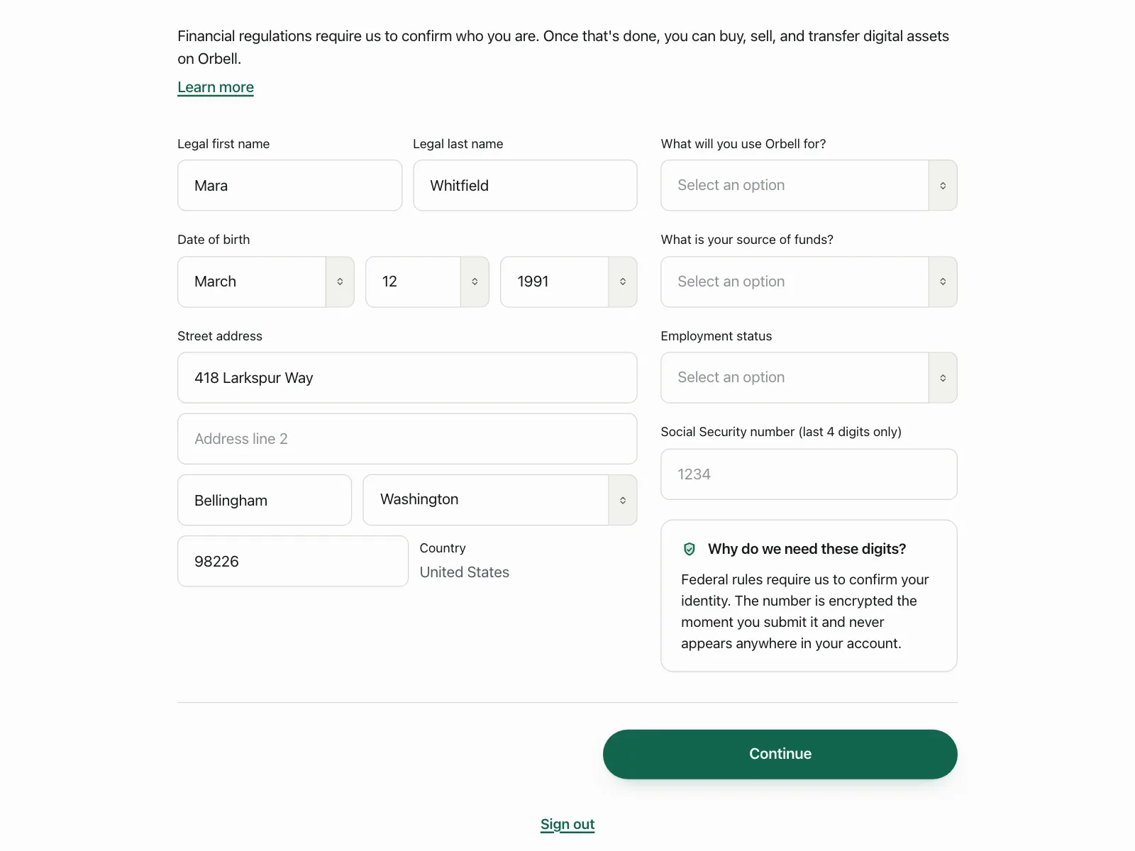


Selects from the Kombai gallery: a crypto exchange's identity form, a payments app's transfer method and a department store's size picker.
What is a select?
A select is a field that holds one value from a fixed list, like a country, a time zone or a size. Closed, it looks like a text field with a chevron and shows the current choice. Opened, it shows the options, marks the selected one and closes as soon as people pick another.
- The field shows the chosen value, or a prompt like "Select an option" before there is one.
- Only listed values can be picked, so the answer is always valid.
Selects show up across forms, settings, checkout and account setup screens.
When to use a select
- Many options, one answerCountries, time zones, currencies and states, where a list of radio buttons would be too long.
- A value with a defaultA language or region that is usually right but sometimes needs changing.
- Tight spaceSettings rows and filters where the options only need to show on demand.
When not to use one
- Two to five optionsRadio buttons or a segmented control show every choice without a click.
- Very long listsFor hundreds of options, use a combobox so people can type to filter.
- ActionsCommands like Export or Delete belong in a dropdown menu.
Anatomy of a select
This one works. Click the field, or tab to it and use the arrow keys, a first letter, Enter or Escape.
- English (UK)
- English (US)
- Français
- Deutsch
- Italiano
- Nederlands
- Português
- Español
Dates and menus will show in English (US).
- Closed
- Open
- Keyboard focus
- Disabled
- LabelSays what is being chosen
- TriggerShows the current value
- Option listOpens below the field
- OptionOne choice in the list
- Selected markChecks the current value
- StatesClosed, open, focus, disabled
Select variants
We sorted the select designs in the Kombai gallery into four patterns.
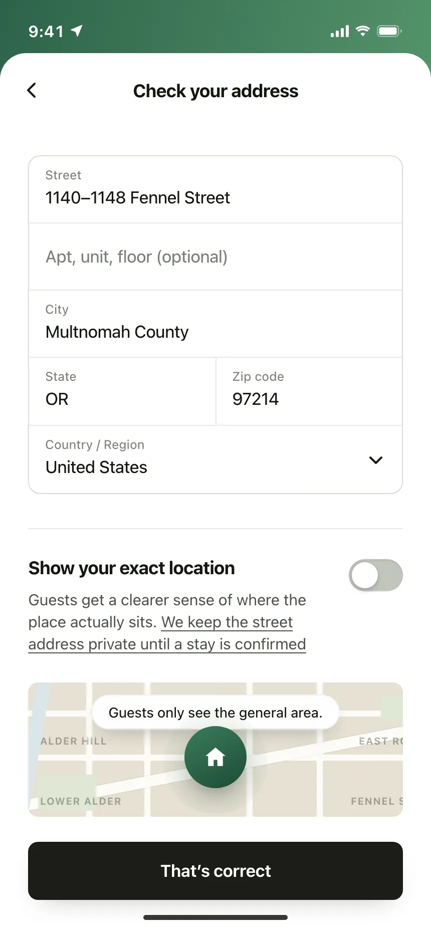
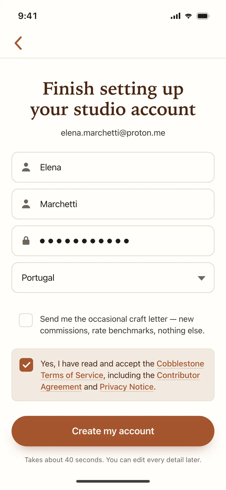
1. Dropdown fields in forms
The default. A field with a chevron for a country, a state or a role, sitting in line with the text fields.

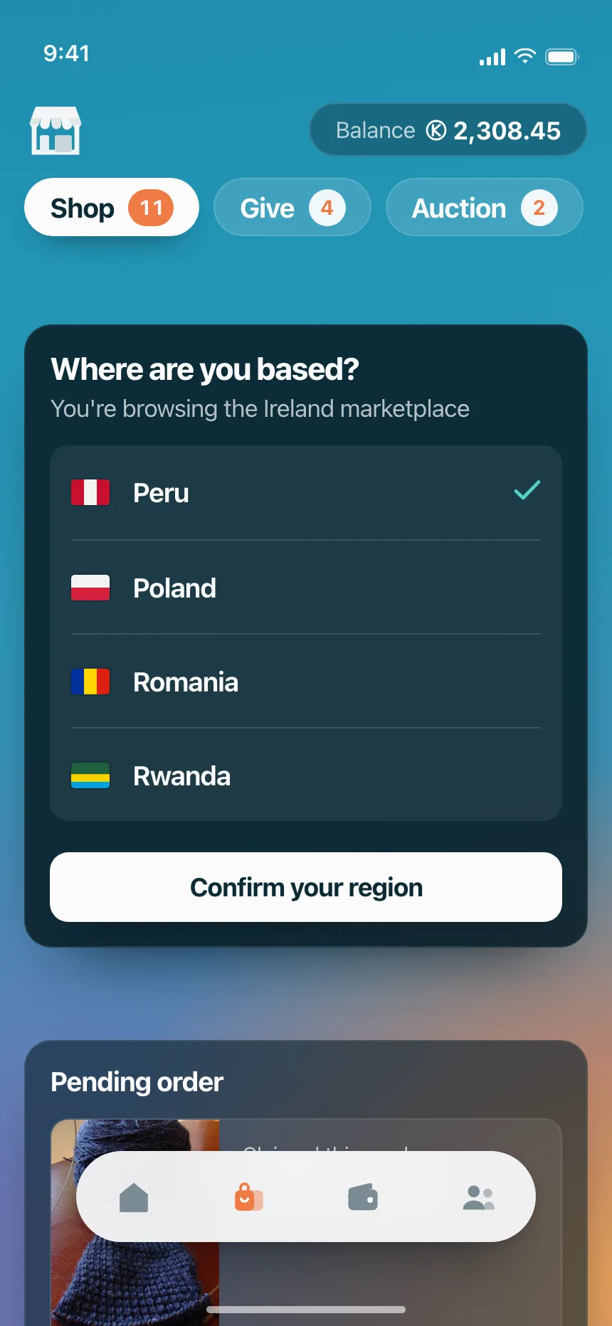
2. Open option lists
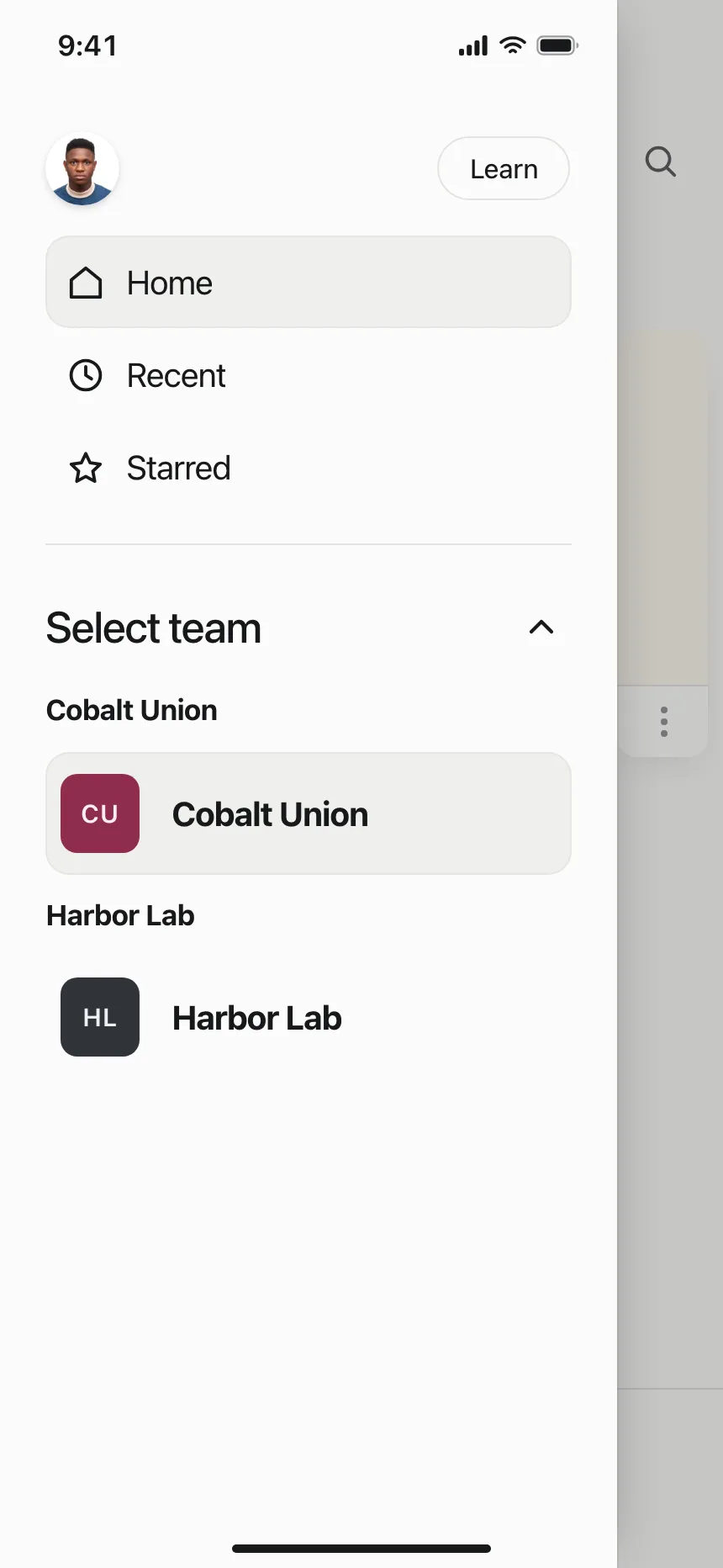
The list opened over the screen, with a check or a highlight on the current value and groups for long lists.

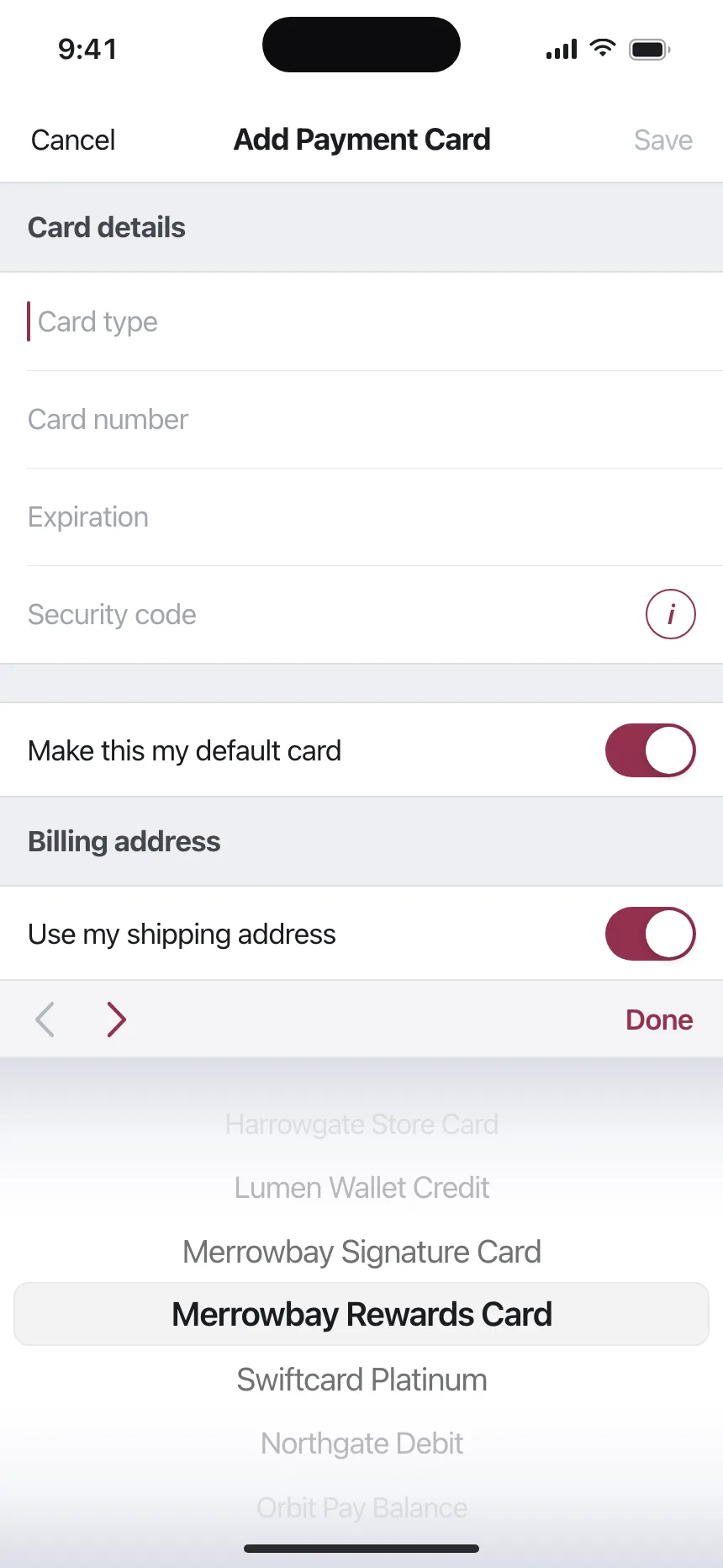
3. Wheel pickers
The iOS take on a select: a spinning wheel of options under the field, for card types, years and dates.


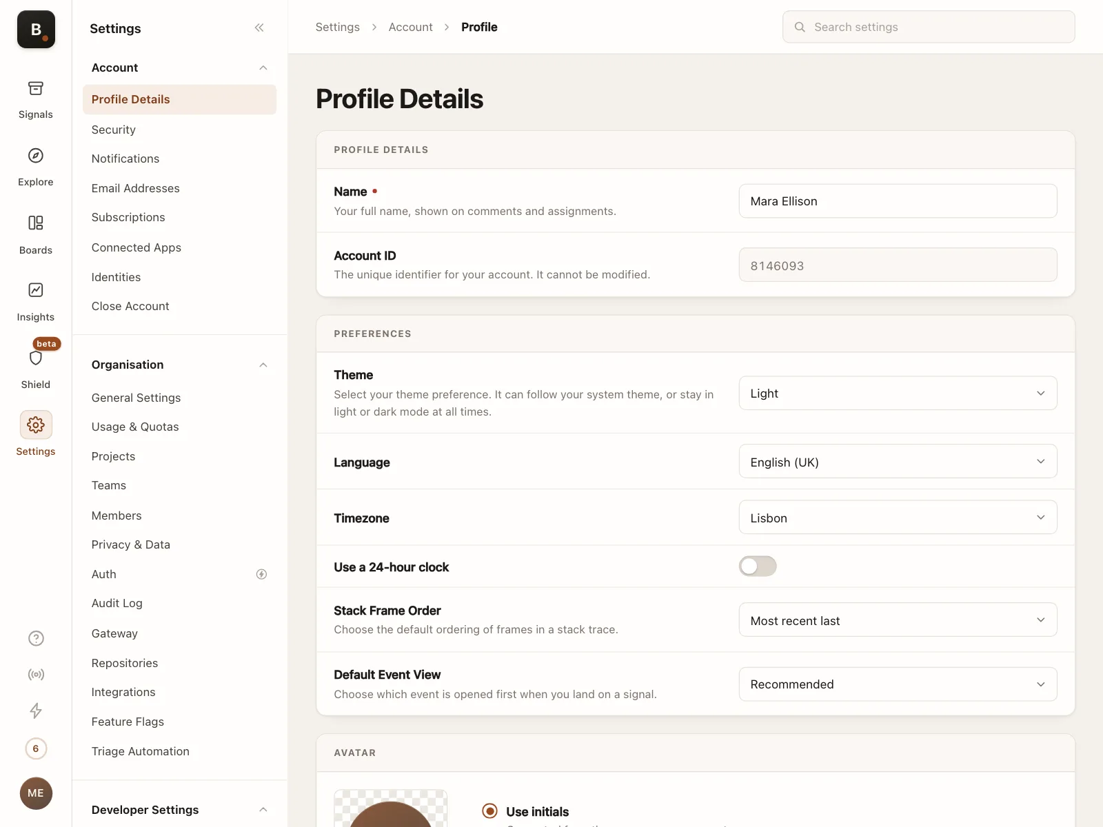
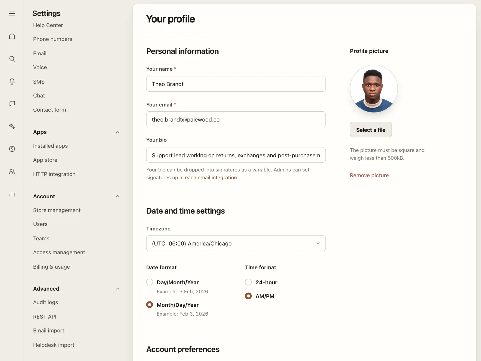
4. Settings rows
Language, time zone and theme selects lined up in a settings page, each saving a preference.

Where selects show up
Scheduling
A time zone select next to the calendar, so booking slots show in the visitor's own time.


Checkout and billing
A country select in the payment form, often next to a postcode field that depends on it.


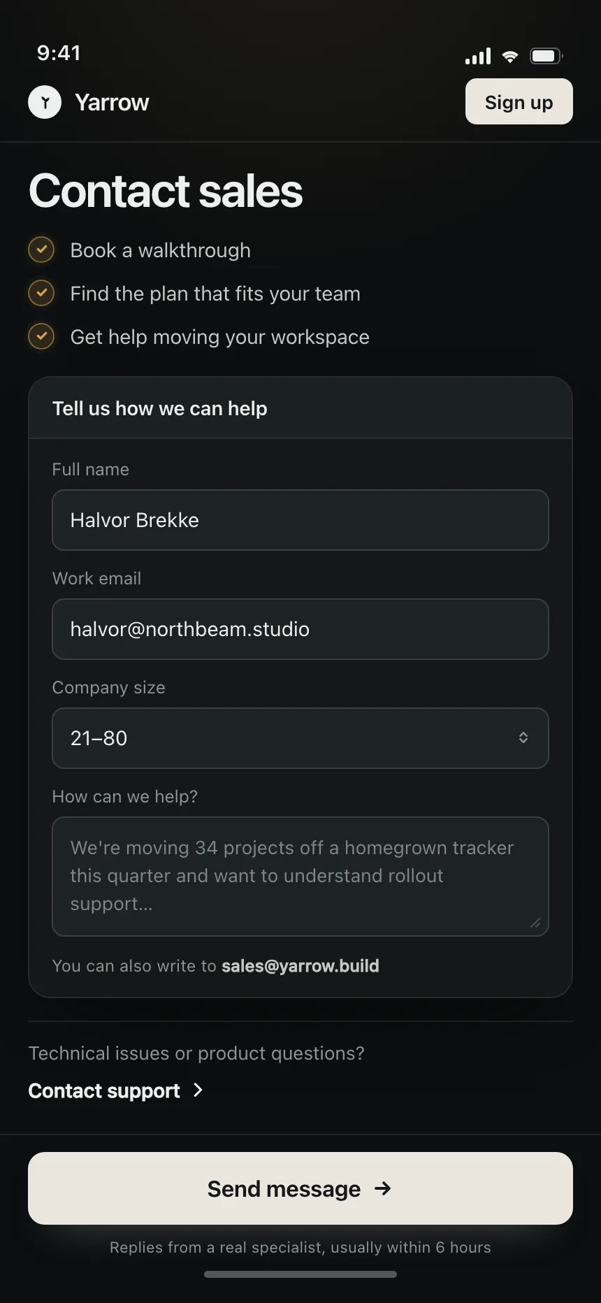
Contact sales forms
Company size, role and topic selects that help route a demo request to the right team.


Select vs similar components


Build notes
- Start with the native <select>. It works with every keyboard, screen reader and phone, and opens the platform picker on mobile.
- For a custom select, follow the select-only combobox pattern: role="combobox" on the trigger and role="listbox" on the list.
- Set aria-expanded on the trigger and point aria-activedescendant at the highlighted option, so focus stays on the trigger.
- Down Arrow, Enter or Space opens the list. Arrows, Home and End move, a typed letter jumps, Enter picks and Escape closes.
- Mark the chosen option with aria-selected and a visible check, not with color alone.
- Order options in a way people expect, like A to Z for countries, and put common choices first only with a divider.
FAQ
What's the difference between a select and a dropdown menu?
A select is a form field: it holds a value and keeps showing it after the list closes. A dropdown menu holds actions, like Rename or Delete, and runs the one people pick. If the choice is saved as data, use a select.
Should I use a native select or build my own?
Use the native element when you can. It is accessible out of the box and uses the phone's own picker. Build a custom one only when you need things the native list cannot show, like icons or two-line options, and follow the WAI-ARIA combobox pattern when you do.
How many options are too many for a select?
Under six, show them all as radio buttons or a segmented control. Up to a few dozen, a select works. Beyond that, scrolling gets slow, so let people type to filter with a combobox.
Should a select have a placeholder?
Use one, like "Select an option", when there is no sensible default and the answer is required, so nobody submits a value they never chose. When most people want the same value, like their own country, preselect it.