
Combobox
A combobox is a text field with a list of options that narrows as people type, so they can find one value among many.
- Also called
- autocomplete, typeahead, searchable select
- Platforms
- Web, Mobile
- In the gallery
- Coming soon


Comboboxes from the Kombai gallery: a location picker, a business account's country search and a spreadsheet's formula suggestions.
What is a combobox?
A combobox pairs a text input with a list of suggestions. As people type, the list keeps only the options that match, often with the matching letters in bold. They pick one with a tap, a click or the arrow keys and Enter, and it fills the field. Also called autocomplete or typeahead.
- The list filters with every keystroke and says so when nothing matches.
- Focus stays in the text field while the arrow keys move through the list.
Comboboxes show up across search, search bar, forms and chat detail screens.
When to use a combobox
- Long lists of known valuesCountries, cities, airports and banks, where scrolling a select would take too long.
- Picking peopleRecipients, assignees and teammates found by typing part of a name.
- Search with suggestionsCompleting a query or jumping to a product before the full search runs.
When not to use one
- Short listsUnder a few dozen options, a select or radio buttons are quicker to scan.
- Free text with no listIf there is nothing to suggest, a plain text field is enough.
- Running commandsA keyboard-first launcher for actions is a command palette.
Anatomy of a combobox
This one works. Type part of a city, then use the arrow keys and Enter, or click a suggestion.
- Port LouisMauritius
- PortlandUnited States
- PortoPortugal
Type part of a city name.
3 cities found
- Empty
- Typing
- No matches
- Picked
- LabelSays what to look for
- InputWhere people type
- Suggestion listNarrows as they type
- Matched textThe typed letters, in bold
- Clear buttonEmpties the field
- StatesEmpty, typing, no match, picked
Combobox variants
We sorted the combobox designs in the Kombai gallery into five patterns.
1. Search suggestions
Completed queries listed under a search field, updating with each letter people type.


2. Place and address lookups
Typing a street or a place name lists matching places, often with a second line for the town or region.


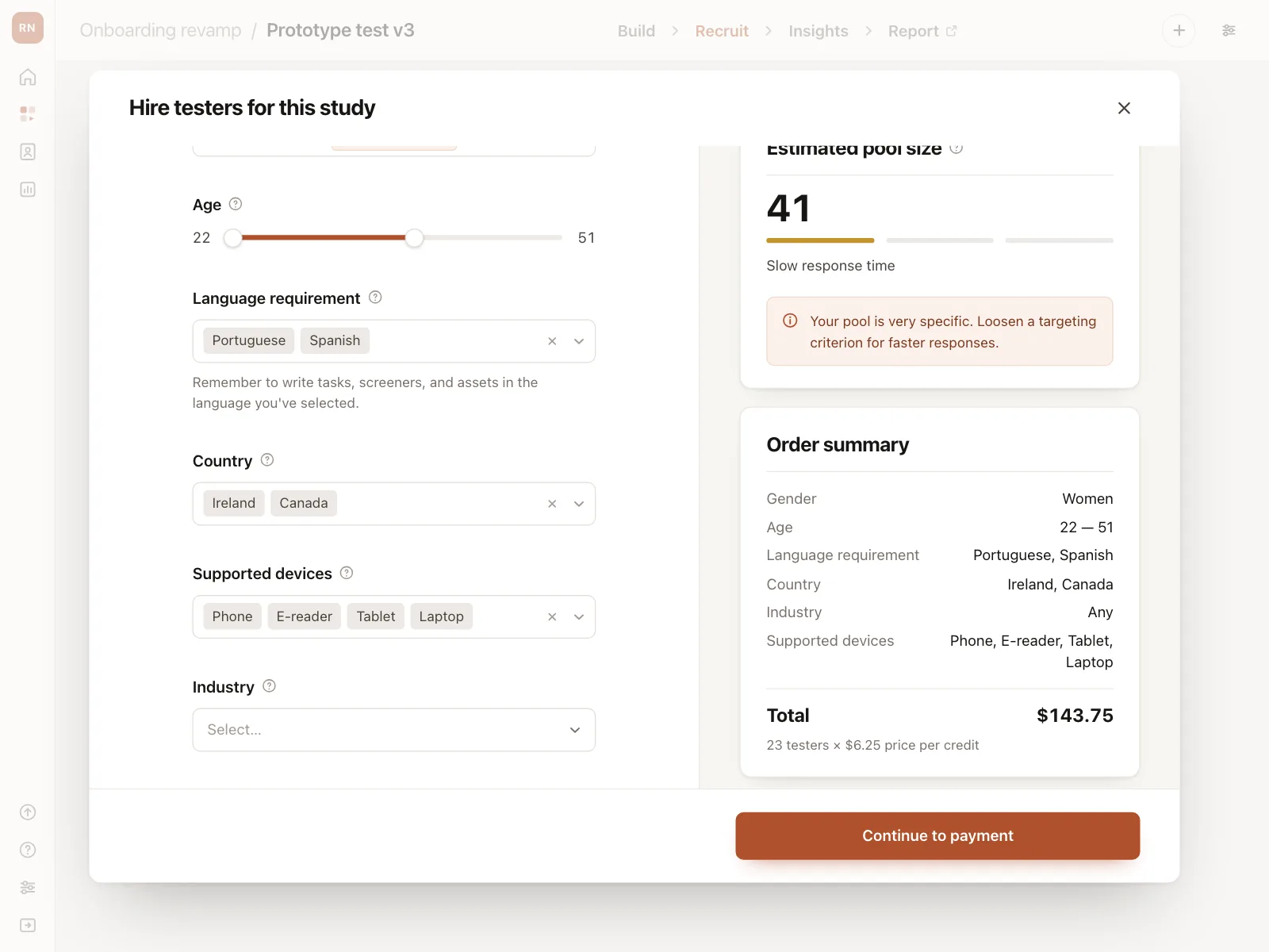
3. Multi-select with chips
Each pick becomes a removable chip in the field, and the input stays open for the next one.


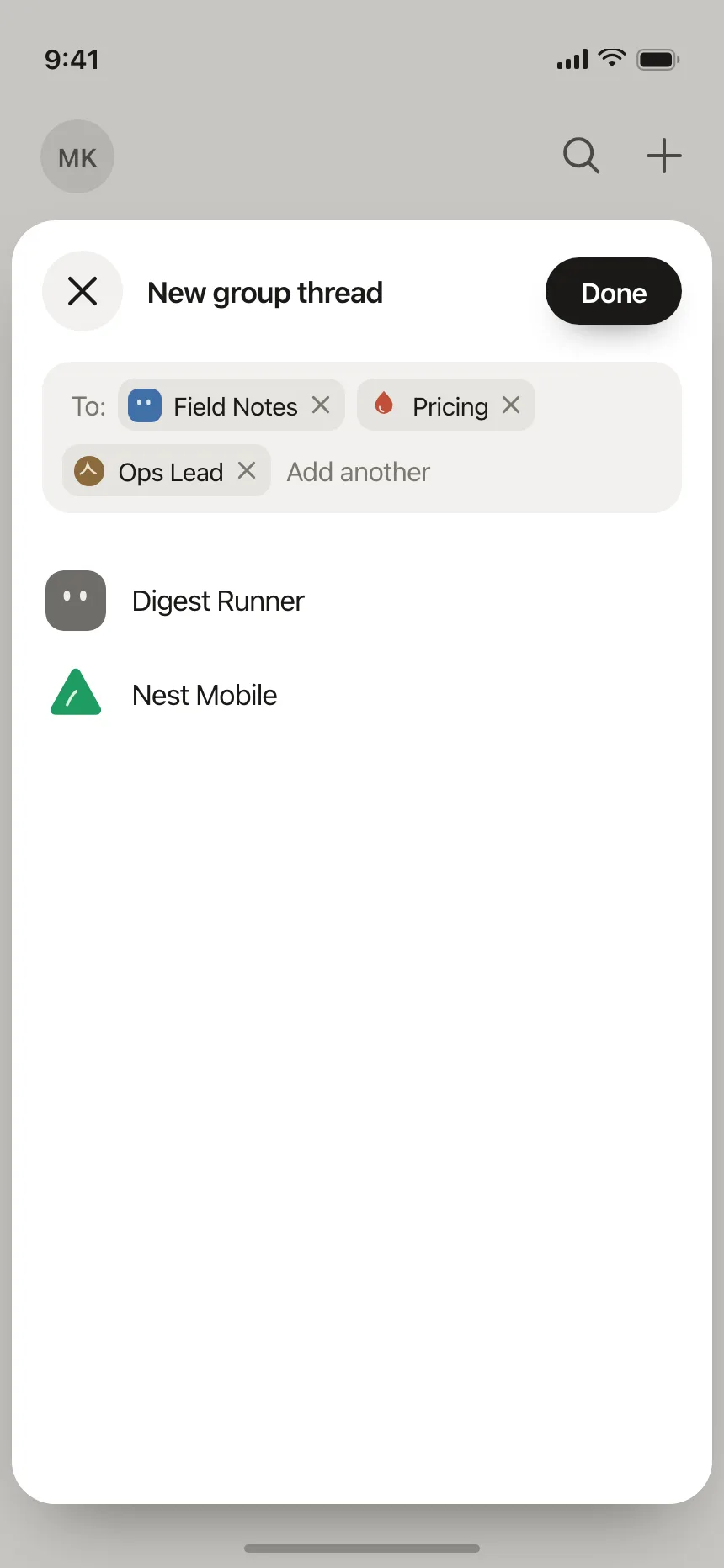
4. Recipient pickers
A To field in a new message or group, with suggested people below and picked names as chips.


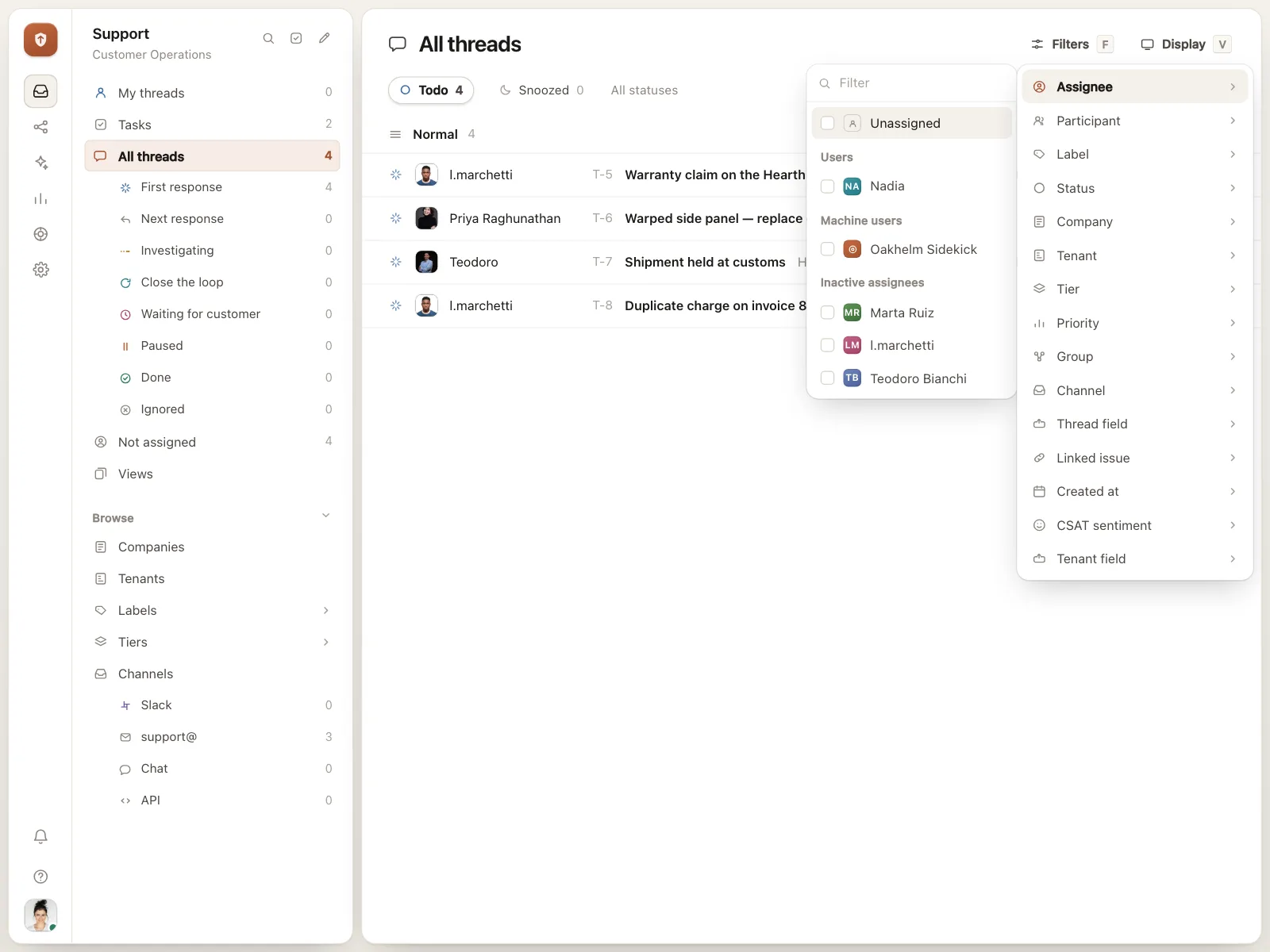
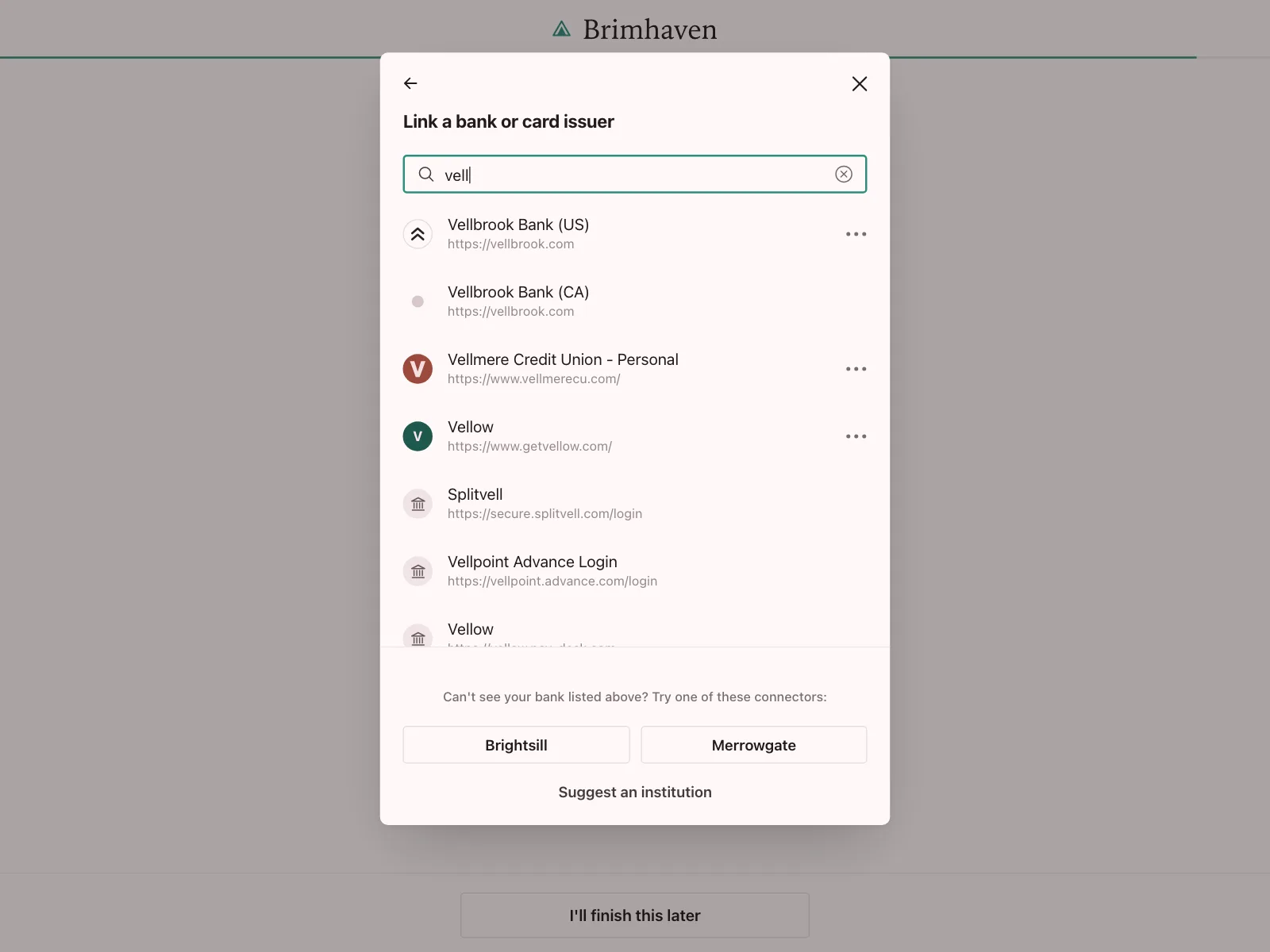
5. Searchable pickers
A filter field at the top of a popover or dialog, over a list of sources, assignees or institutions.

Where comboboxes show up
Shop search
Suggested queries and products open under the search field as soon as people start typing.


Known values in forms
A home airport, a region or a service area picked from matches, so the form gets a value it recognizes.


Adding people
Finding a neighbor, a payee or a teammate by name, with near matches when the spelling is off.


Combobox vs similar components
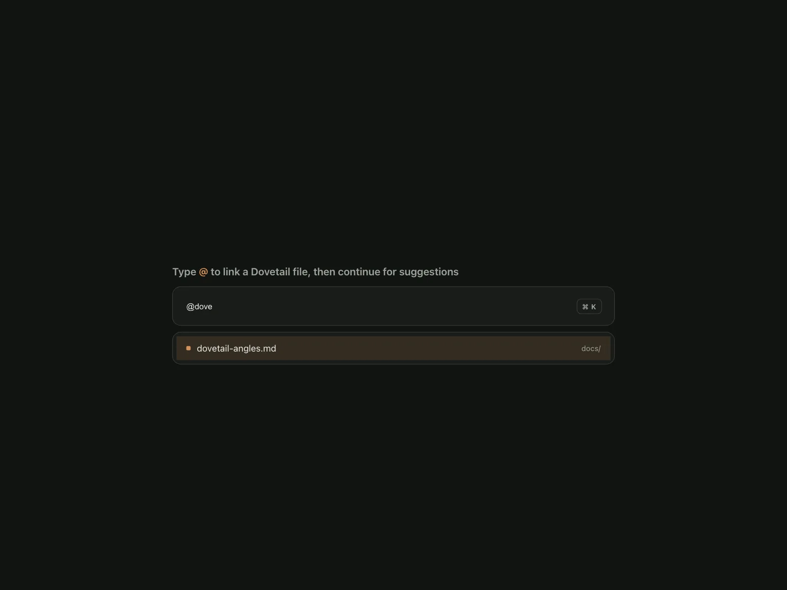
Build notes
- Give the input role="combobox", aria-expanded and aria-controls pointing at a role="listbox" list.
- Keep focus in the input and move the highlight with aria-activedescendant, so people can keep typing.
- Down Arrow opens the list and moves down, Enter picks the highlighted option, and Escape closes the list.
- Set aria-autocomplete="list" when the list filters, and announce the number of matches in a live region.
- Show a "No matches" row instead of an empty list, and keep what people typed when nothing matches.
- Debounce server lookups by a couple of hundred milliseconds, and show stale results rather than flashing an empty list.
FAQ
What's the difference between a combobox and a select?
A select opens a list to scroll; a combobox lets people type to narrow the list first. Both end with one value from the list. Pick a select for short lists and a combobox when the list is long or people know what they want.
Is autocomplete the same as a combobox?
Mostly. "Combobox" is the accessibility name for the pattern: an input plus a popup of options. Autocomplete and typeahead describe what it does. A search box with suggestions is a combobox too.
Should the first suggestion be highlighted automatically?
Only when Enter should pick it, like in an address or city lookup. In search, leave nothing highlighted, so Enter runs the search for exactly what was typed.
Can people enter a value that is not in the list?
It depends on the field. For a country or an assignee, only list values make sense, so treat other text as unfinished. For tags or search queries, let people keep their own text and offer it as an option, like "Add 'kayaking'".