Mobile Responsiveness
Kombai-generated code is mobile responsive by-default and works on devices of all screen sizes and dimensions. Your emails should render pixel-perfect across all mobile devices without the need of any manual adjustments or extra effort on your part.
Let's look at the example below where we have generated the code for a design and tested it on Email on Acid to know how the email will render on multiple devices:
Users that are on Business plan can further customize the responsive behavior of their emails by configuring the following options:
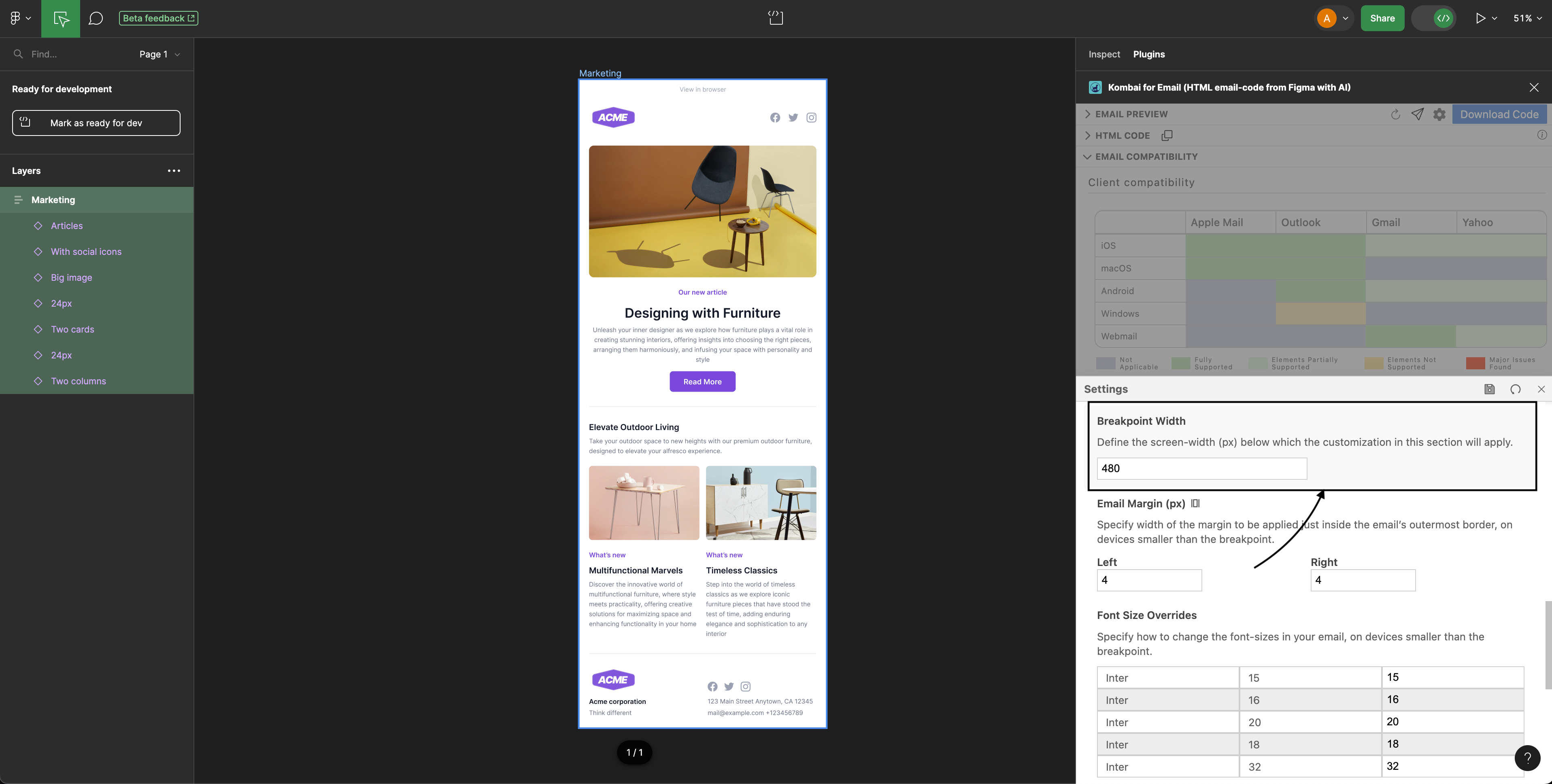
1. Breakpoint Width
Breakpoint Width is the width below which the defined responsive behavior will be enabled. We use 480px as the default breakpoint. However, you can change it as per your preference.
2. Email Margin
Email Margin is the width between the content and the email’s outermost border. We use 4px as the default value. However, you can specify your own margin for both sides: left, and right on devices below the breakpoint.

3. Font Size Overrides
We let you define font sizes for devices below the breakpoint. When email renders on a device smaller than the breakpoint, the new font size will override the default one.
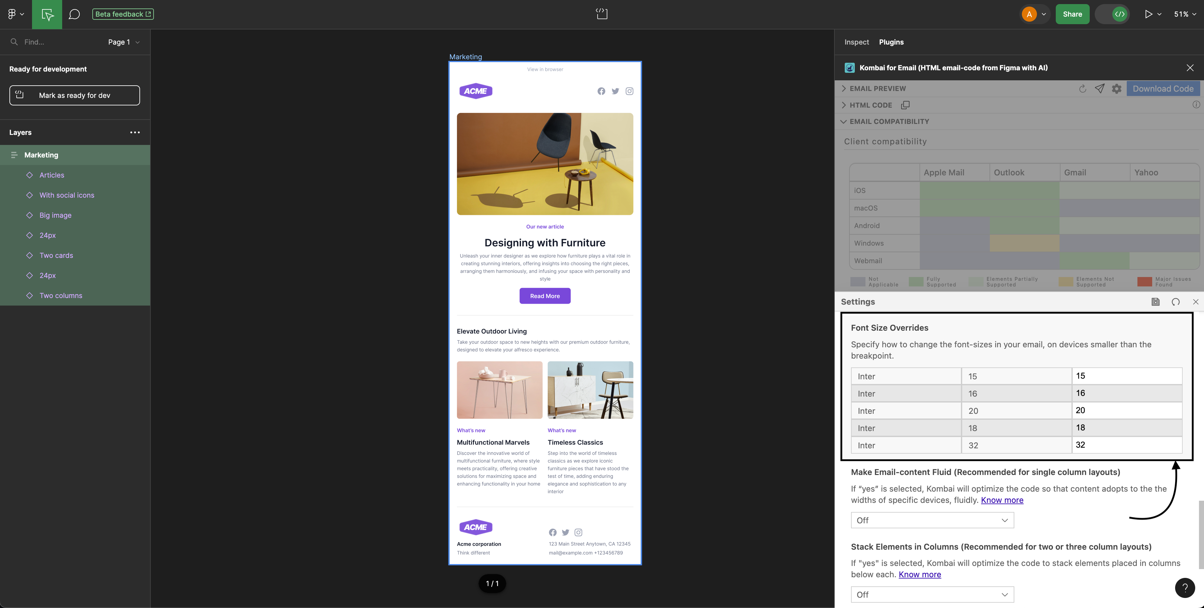
4. Make Email-content Fluid (Recommended for single-column layouts)
Fluid content means that your content will adapt to the screen size of the reader. If Make Email-content Fluid is enabled in settings, Kombai will optimize the code to make your content adapt itself to the widths of the devices below the specified breakpoint.
As a result, images inside the email will be resized, and the text will be wrapped according to the width of the device.
Note: For best experience, we recommend you to turn on Make Email-content Fluid along with the Stack Elements in Columns(see the example in the next section).
5. Stack Elements in Columns (Recommended for two or three-column layouts)
If Stack Elements in Columns is enabled, all two and three-column layouts in your email will be stacked on top of one another below the breakpoint device(see the example below).