

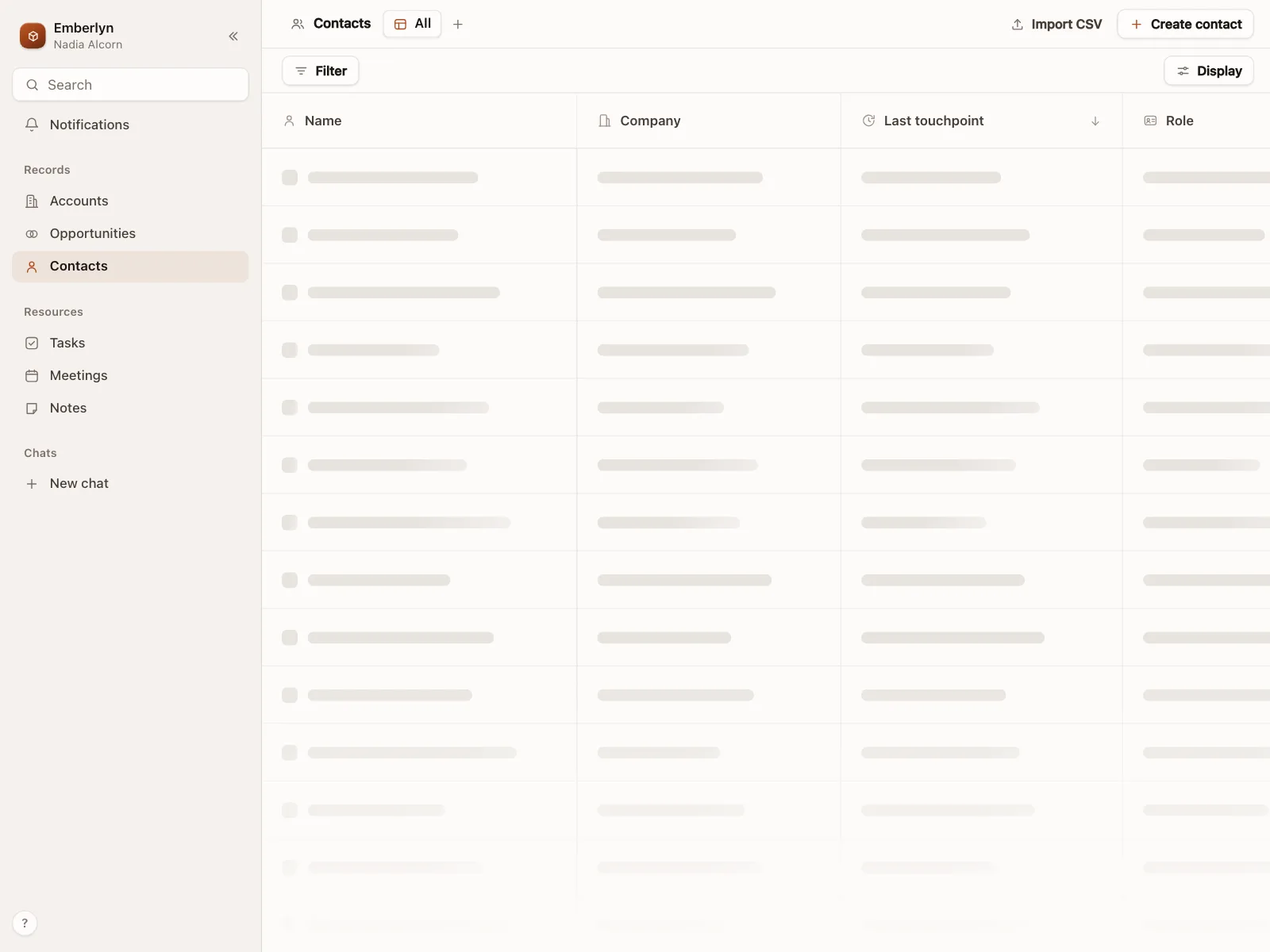
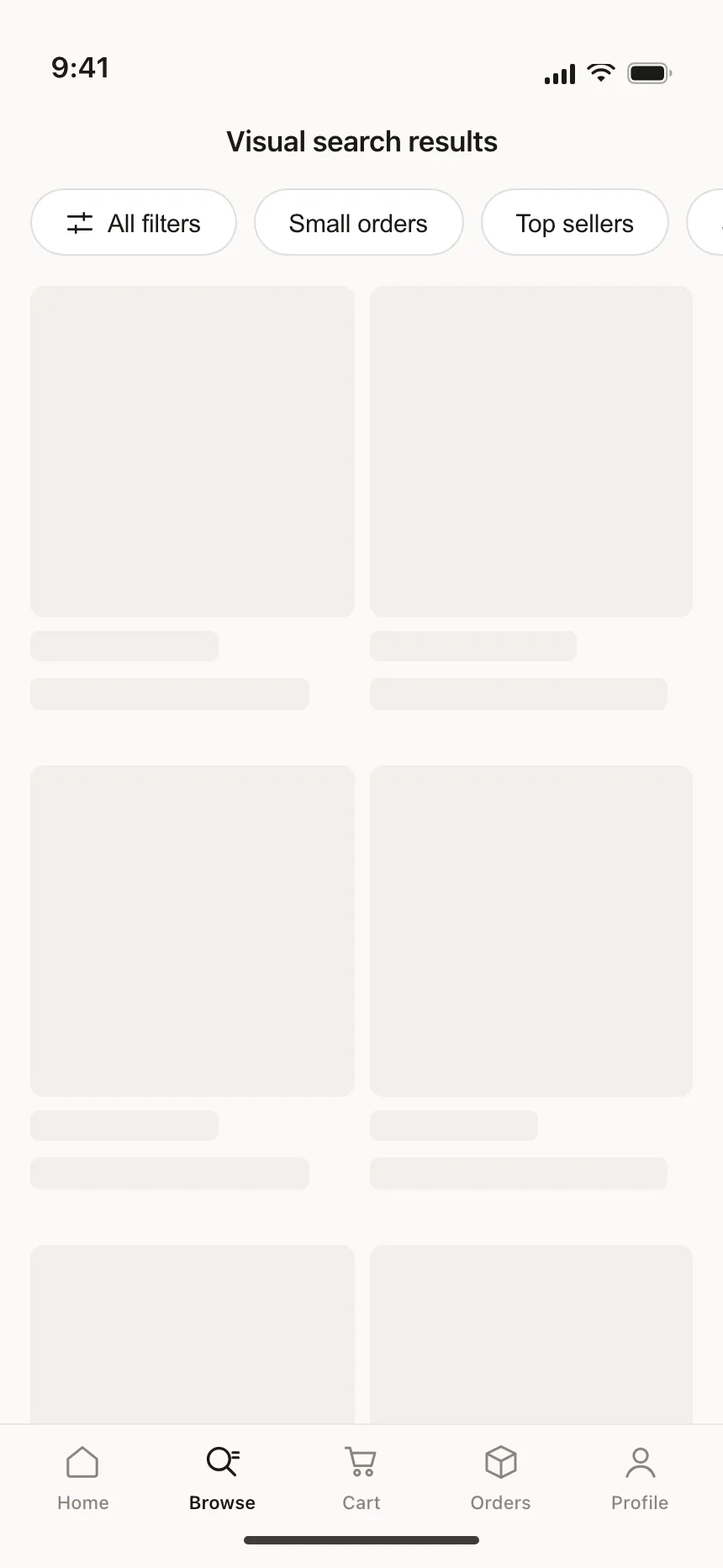
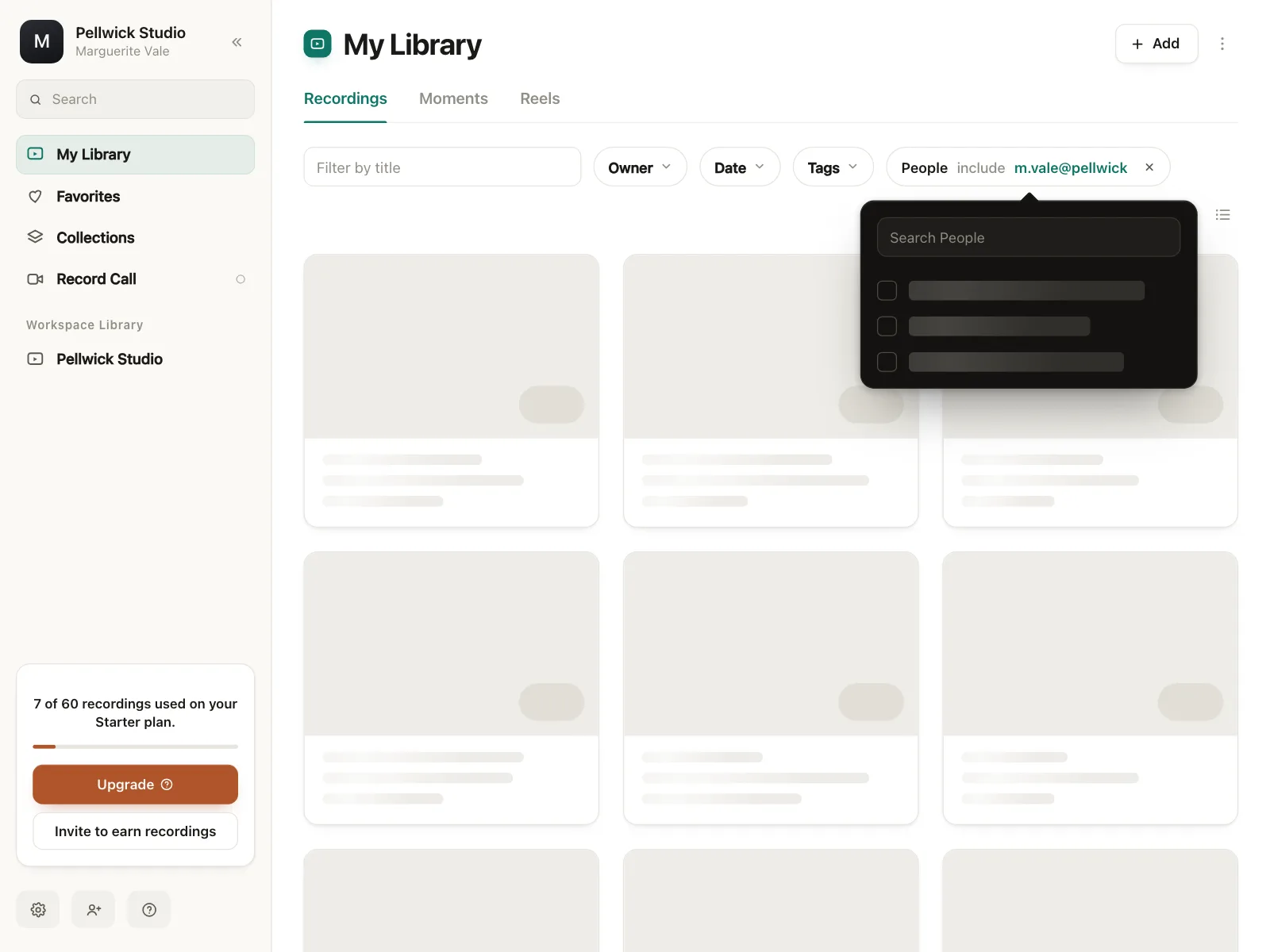
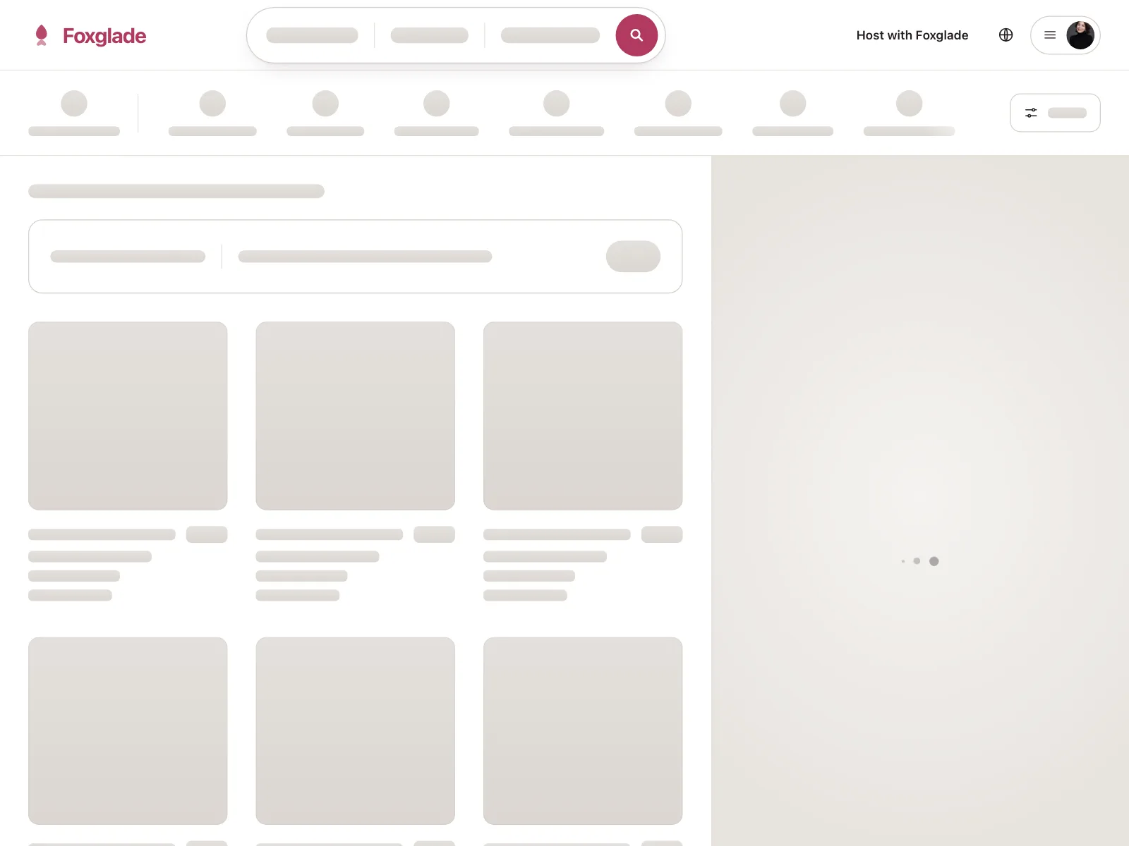
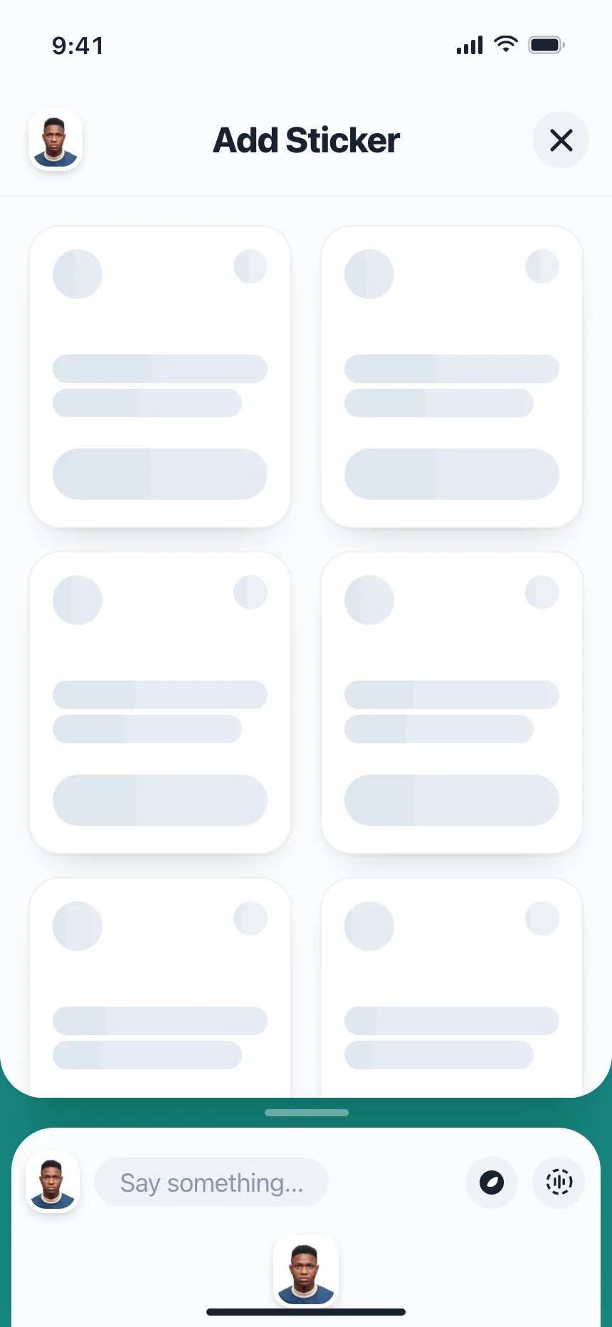
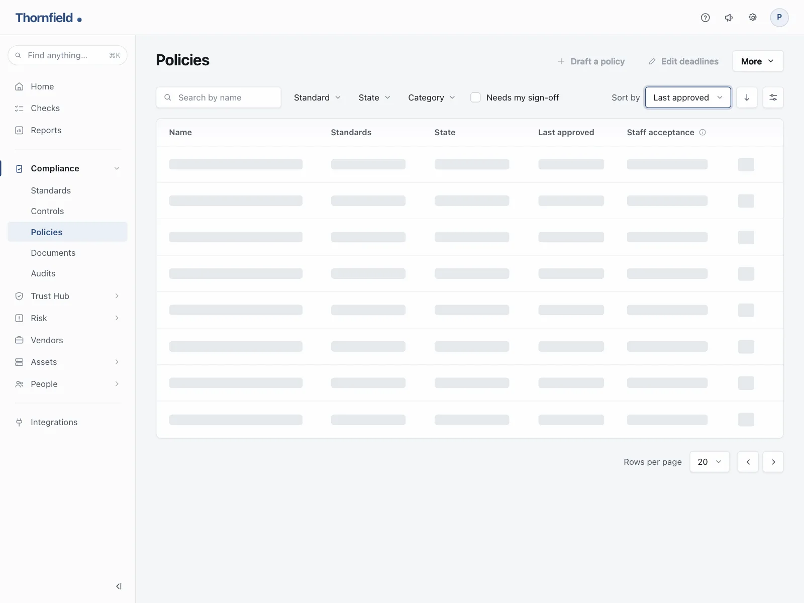
Skeleton loaders from the Kombai gallery: a community app's feed, a CRM's contacts table and a wholesale shop's product grid.
What is a skeleton loader?
A skeleton loader is a stand-in for content that is still loading. Gray bars, circles and blocks sit exactly where the text, avatars and images will go, often with a slow shimmer, and real content replaces each shape as it arrives. The page keeps its layout the whole time, so nothing jumps.
- Shapes follow the final layout: circles for avatars, blocks for images, bars for lines of text.
- Headings, tabs and controls stay real. Only the data is a placeholder.
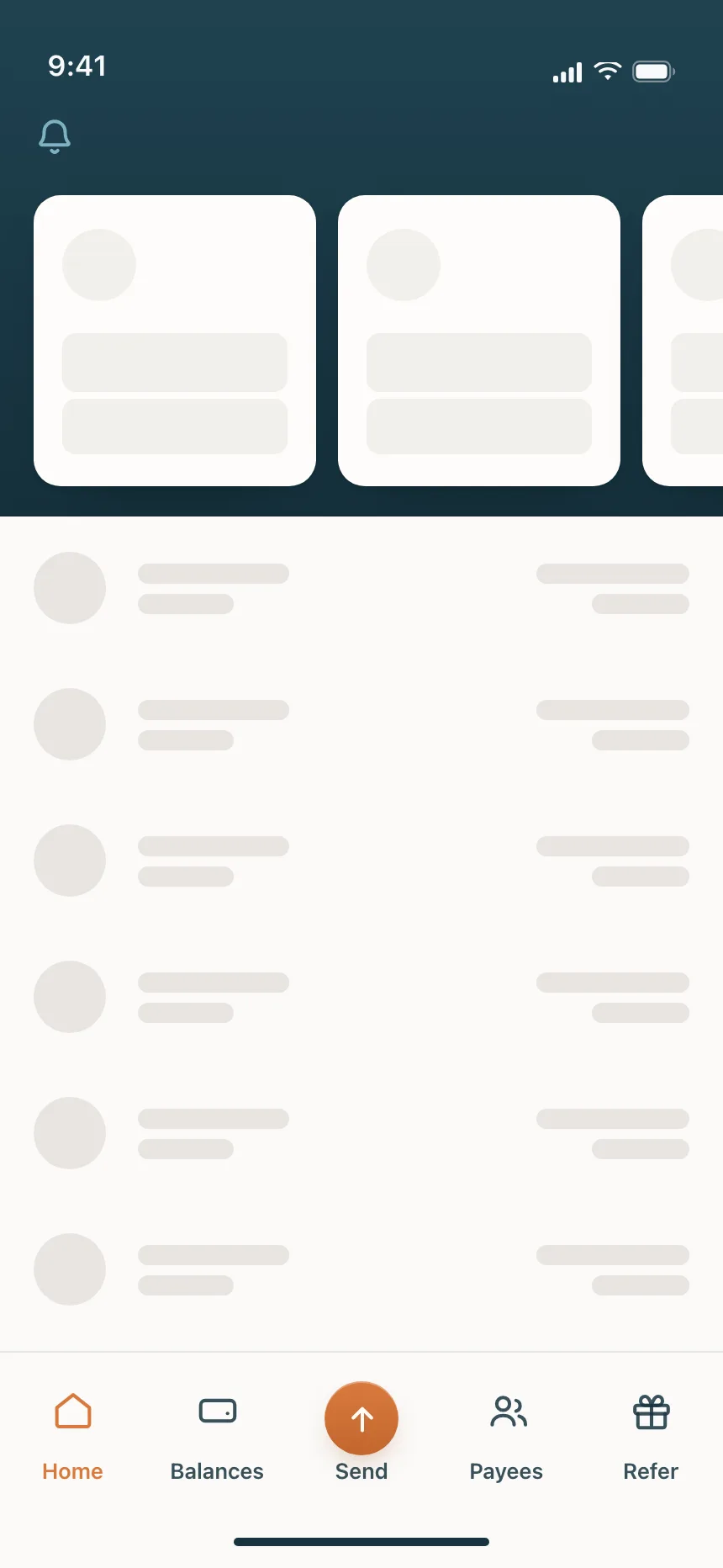
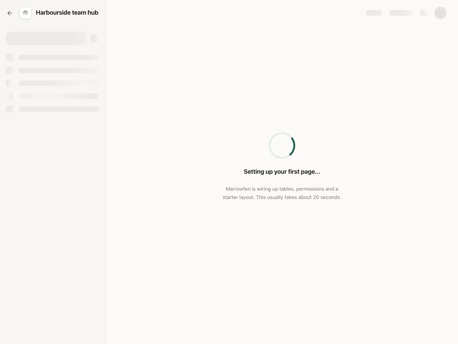
Skeleton loaders show up across loading, table, checkout and account setup screens.
When to use a skeleton loader
- A known layoutFeeds, lists, tables and grids whose shape you can draw before the data comes.
- First load of a screenOpening a page or a tab where every item loads at once.
- Content arriving in partsSections that fill in one by one as each request returns.
When not to use one
- Actions and short waitsSaving or sending needs a spinner on the button, not a fake page.
- Unknown layoutsIf you can't predict the shape, a skeleton will be wrong. Use a spinner.
- Failed requestsDon't leave shapes on screen. Replace them with an error and a retry.
Anatomy of a skeleton loader
This one works. It loads when it scrolls into view, one post at a time. Press Reload to watch it again.
Neighbourhood feed
- Loading
- Partly loaded
- Loaded
- Reduced motion
- AvatarA circle where a photo goes
- Text barsClose to real line lengths
- Media blockHolds the image's space
- ShimmerOptional, shows it is working
- StatesLoading, partial, loaded, still
Skeleton loader variants
We sorted every skeleton loader design in the Kombai gallery and found six patterns. Browse all 55 web and 35 mobile designs.
1. List rows
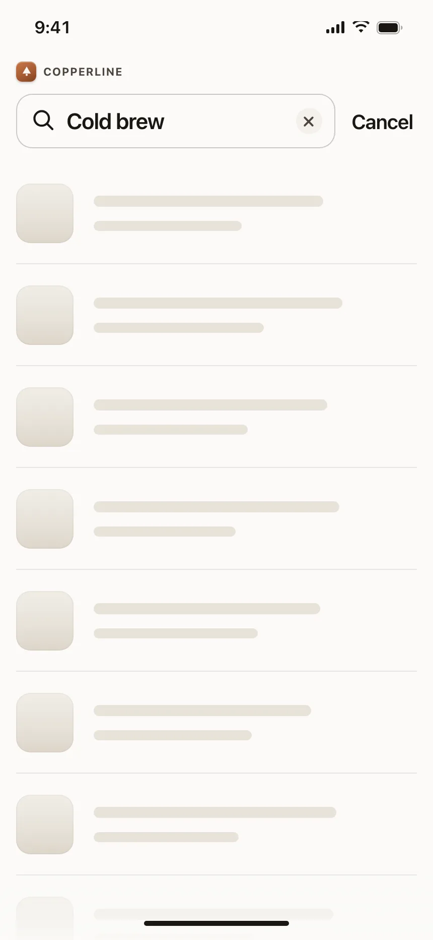
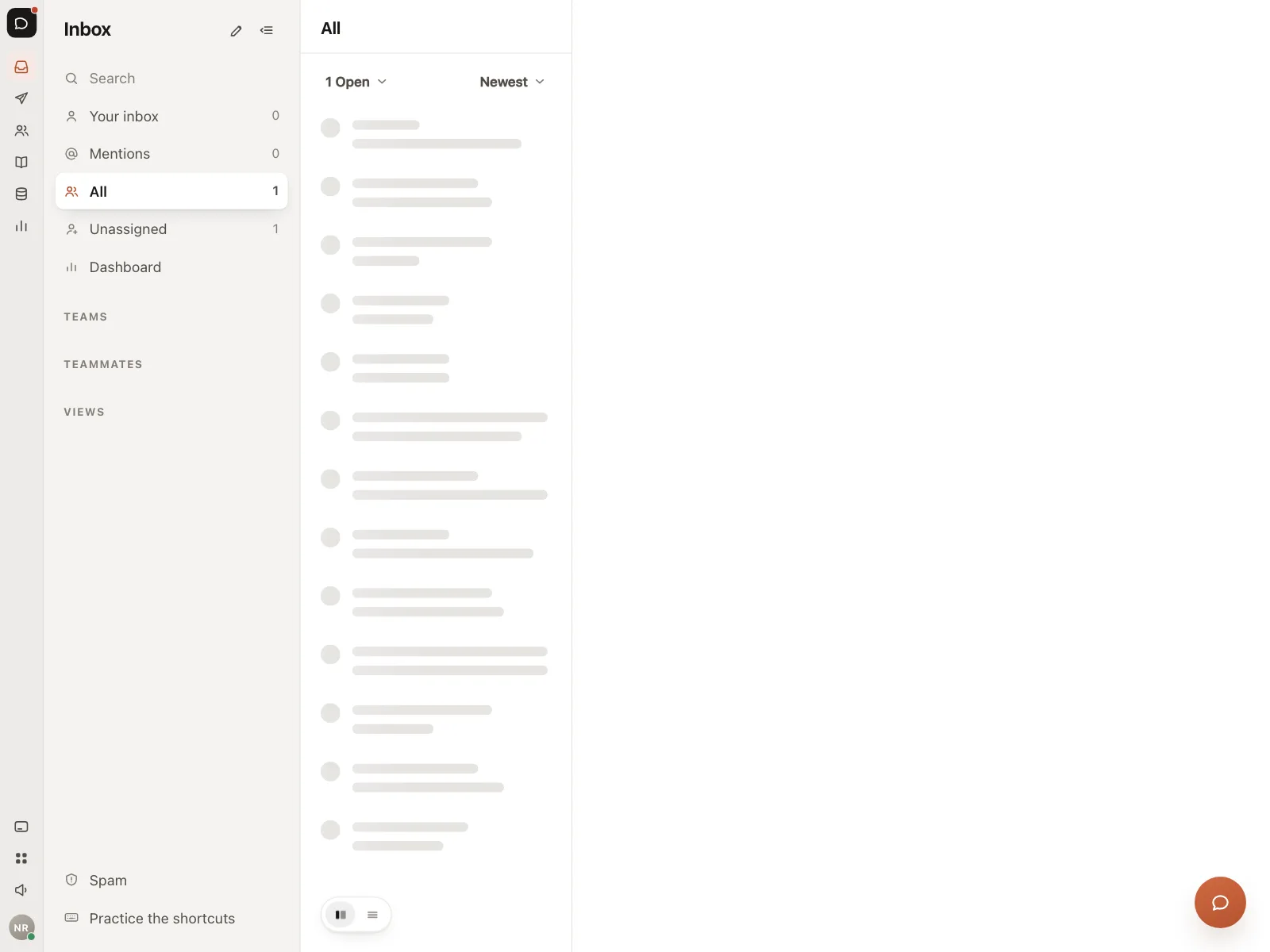
The default. A circle or square beside two bars, repeated down the screen for creators, search results and inboxes.

2. Card grids
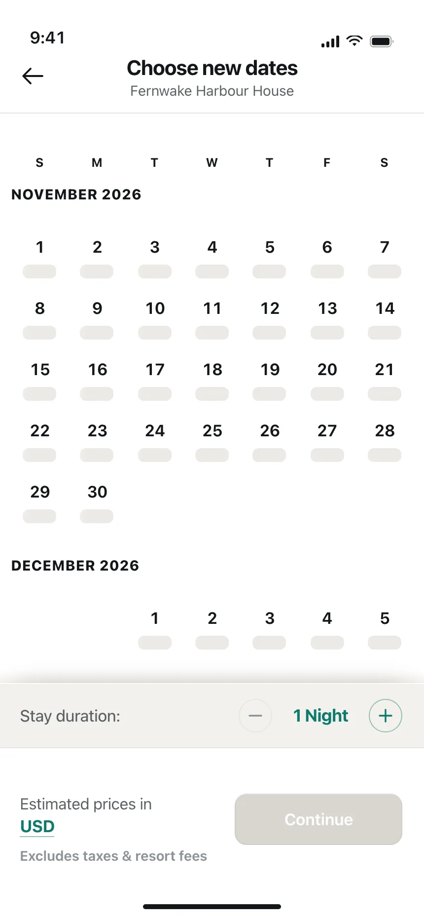
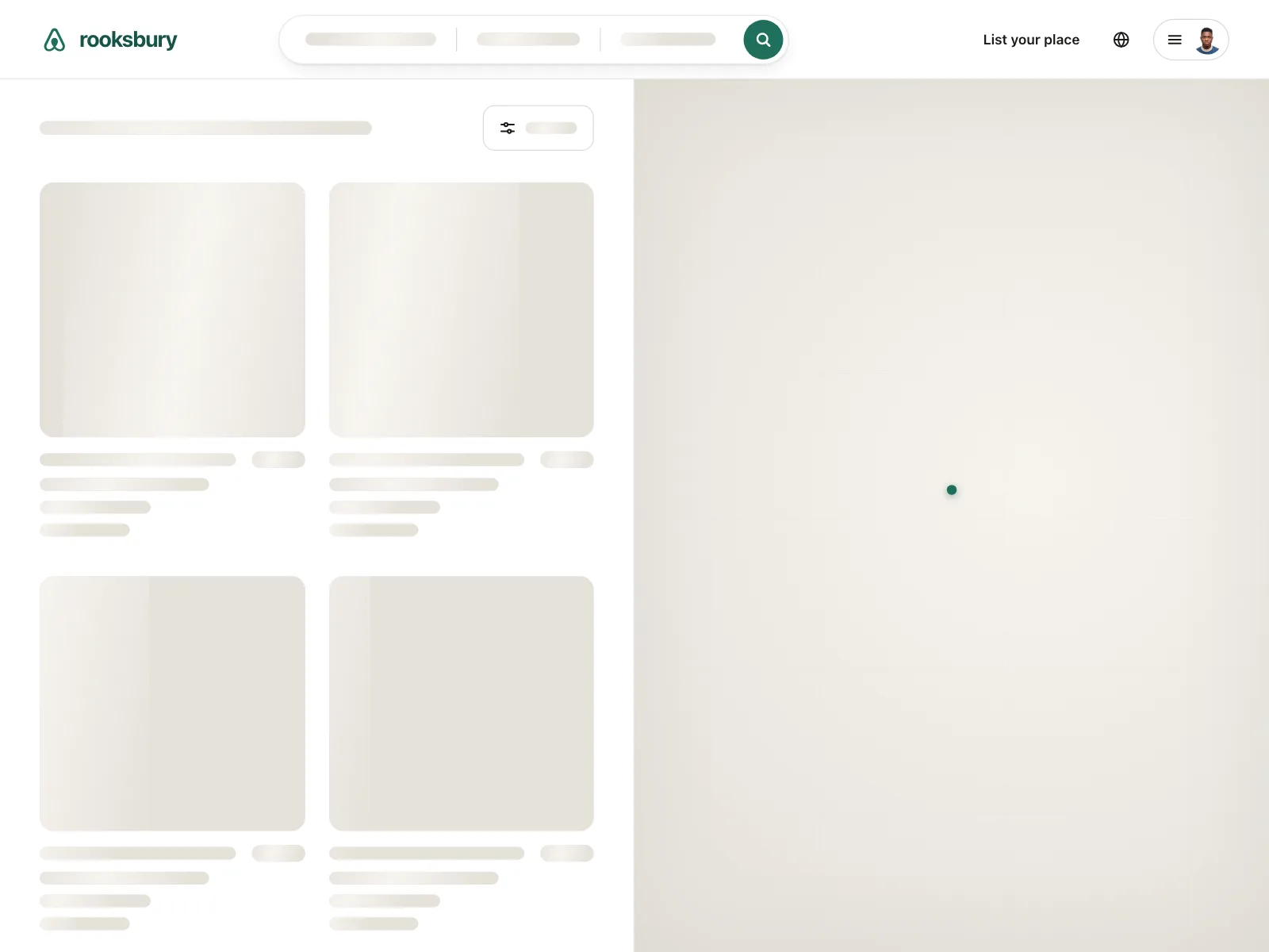
Image blocks with short bars under each one, laid out in the same grid the stickers, recordings or stays will fill.
3. Tables and dashboards
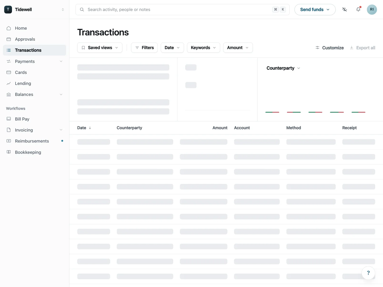
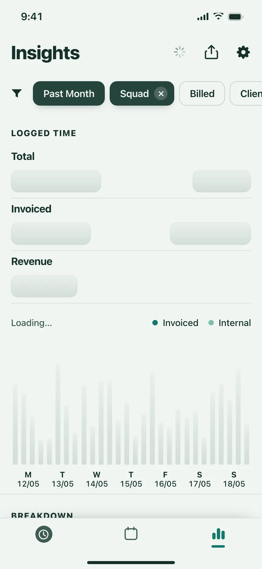
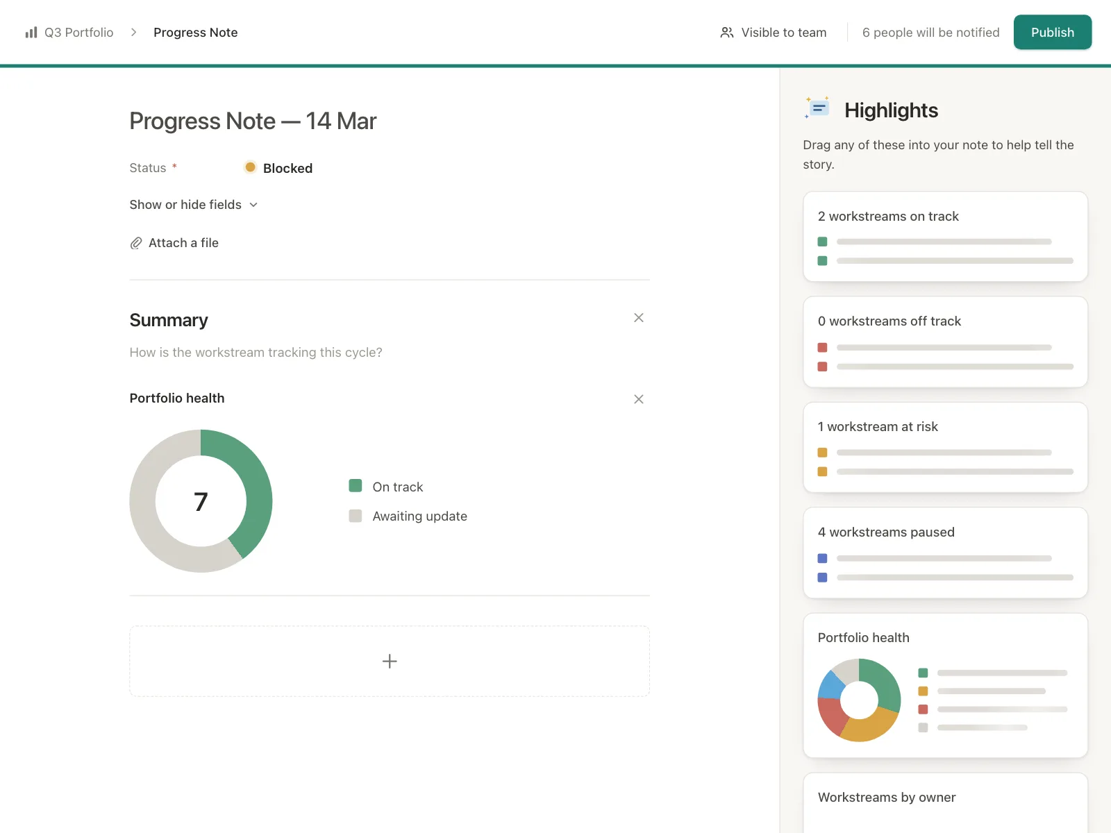
Real column headers and filters above gray cells, stat blocks and faded charts.
4. Text lines
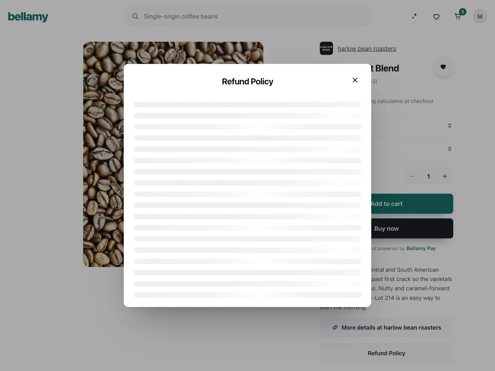
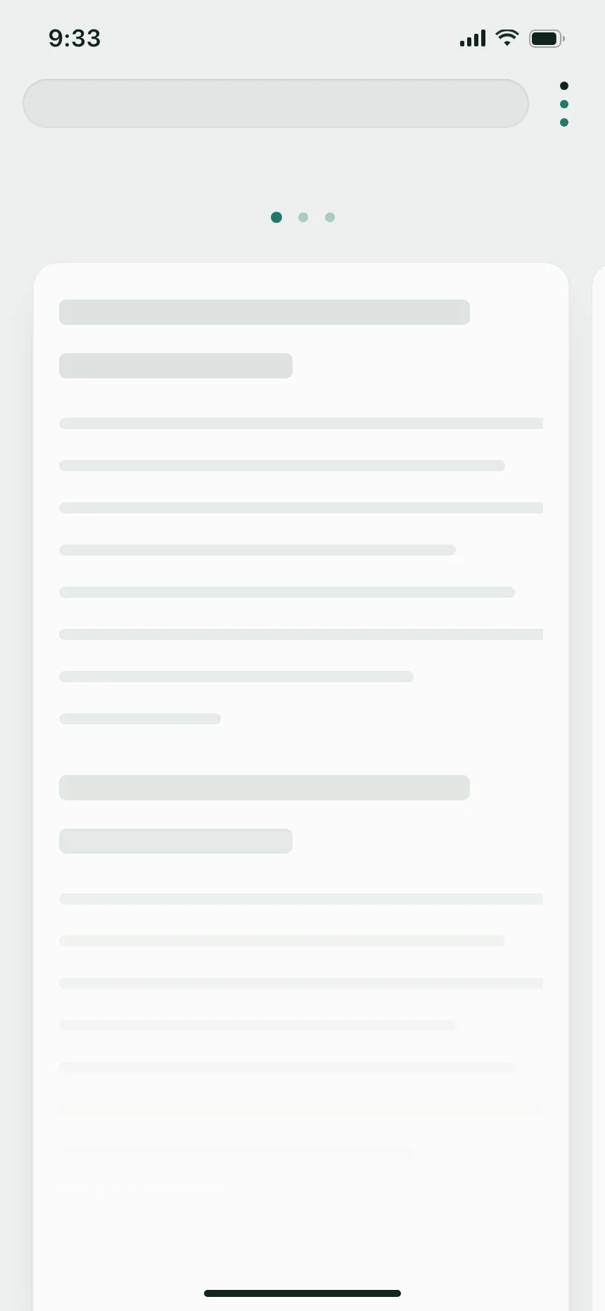
Stacks of bars of uneven length for documents, policies and briefs, so the block reads as a paragraph.
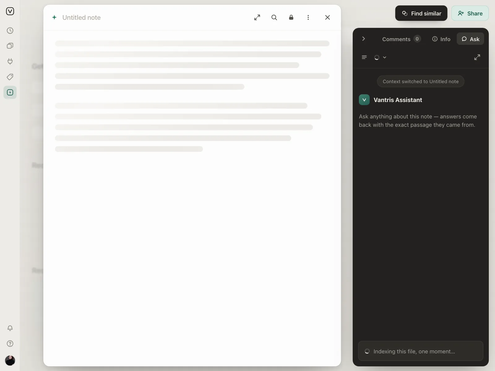
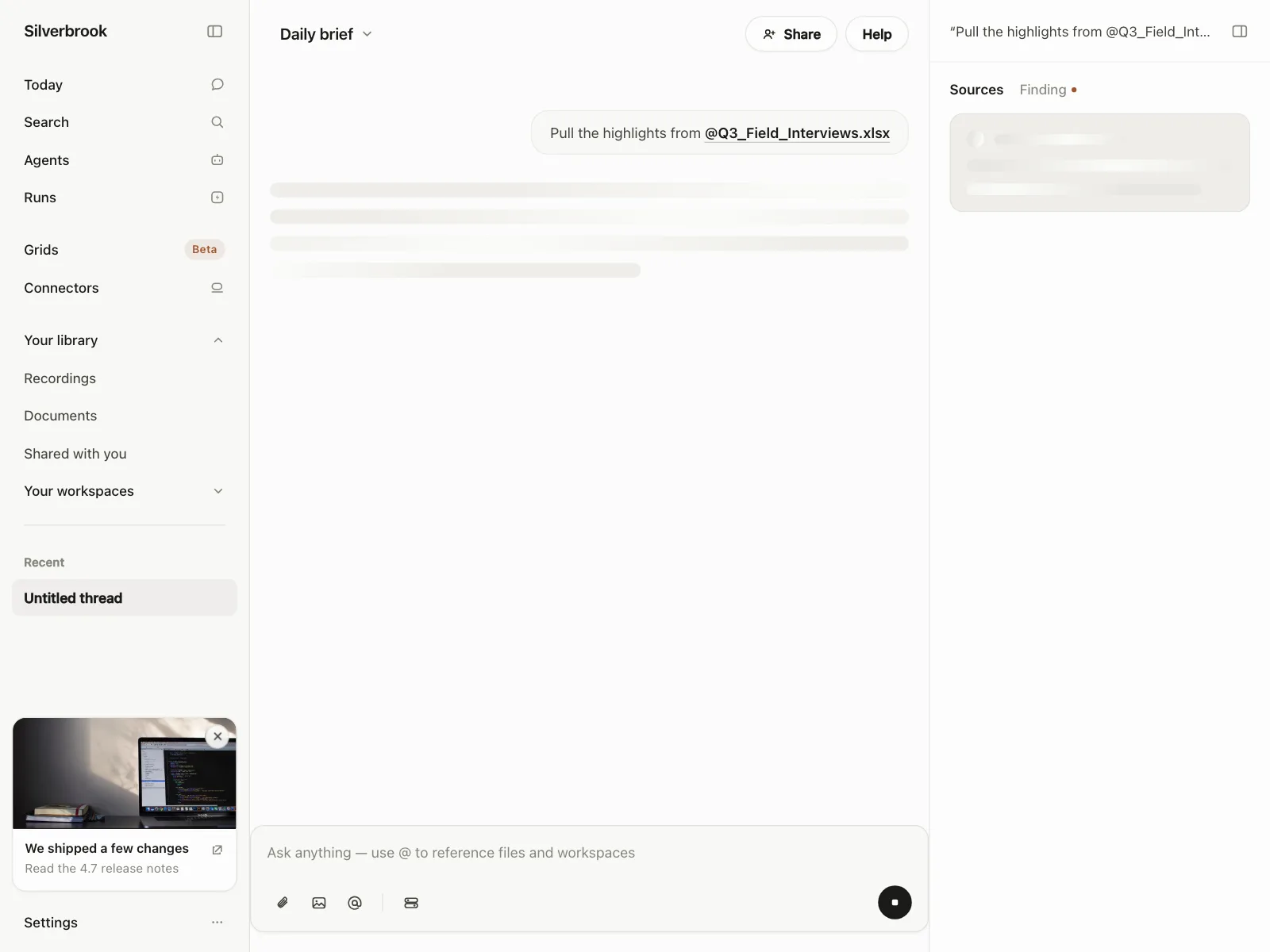
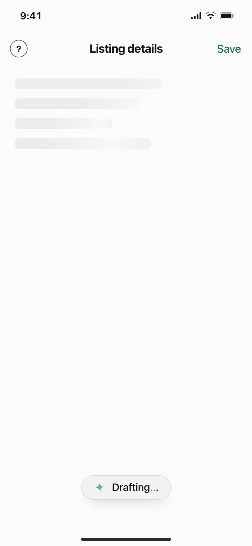
5. AI drafts
An assistant writing a brief, a listing or a set of ideas shows bars and cards where its output will land.
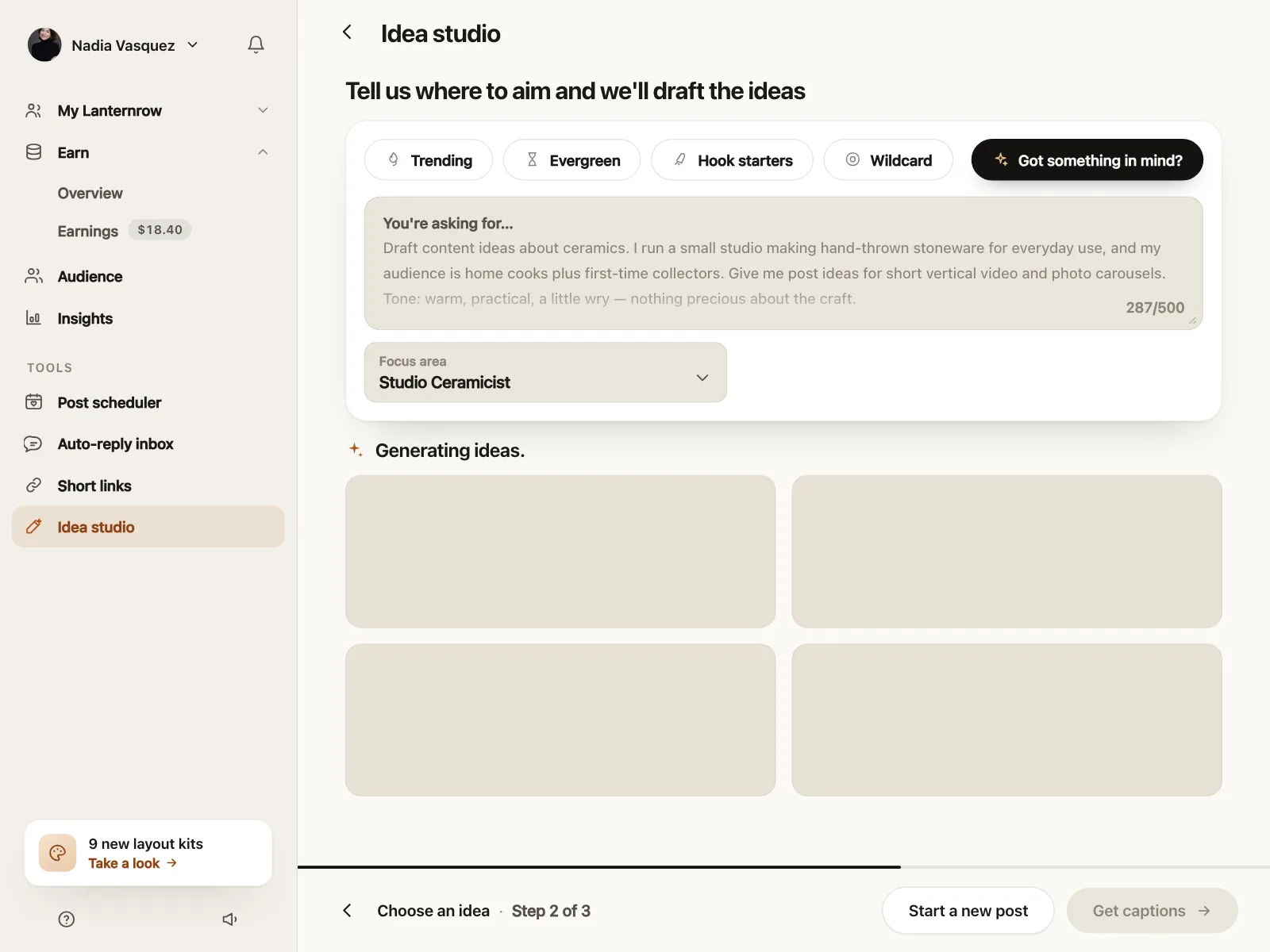
6. Partial skeletons
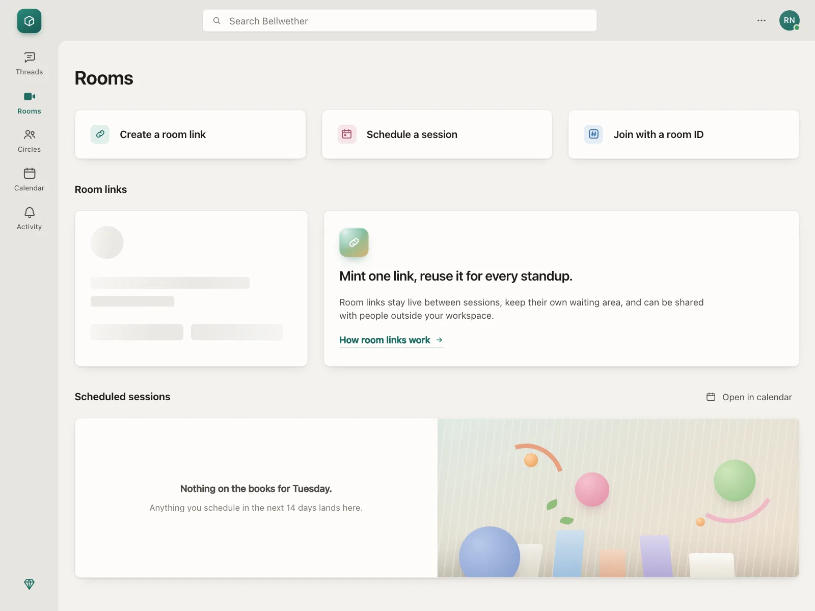
Most of the screen is real and one panel, card or set of prices is still a placeholder.
Where skeleton loaders show up
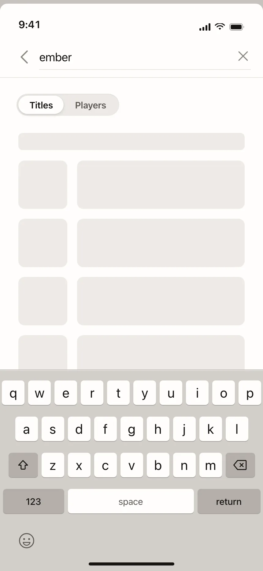
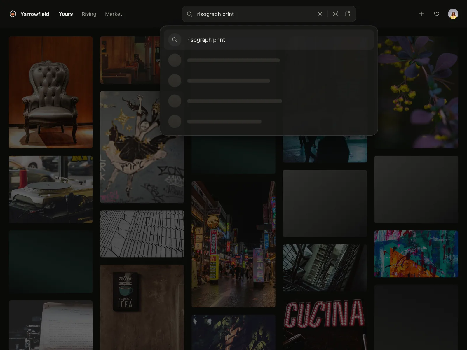
Search results
The query and filters stay put while result rows or tiles load below them.

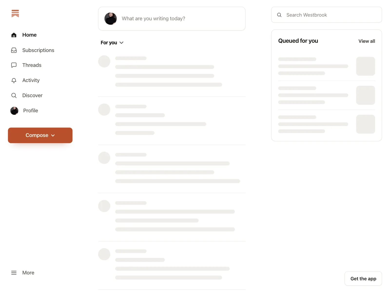
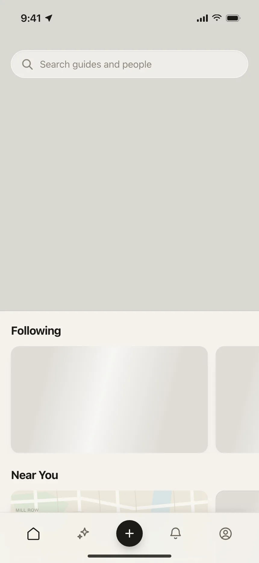
Feeds and profiles
Posts, guides and profile grids drawn as shapes, so scrolling starts before the data is in.

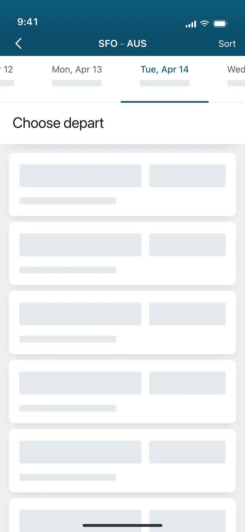
Travel and stays
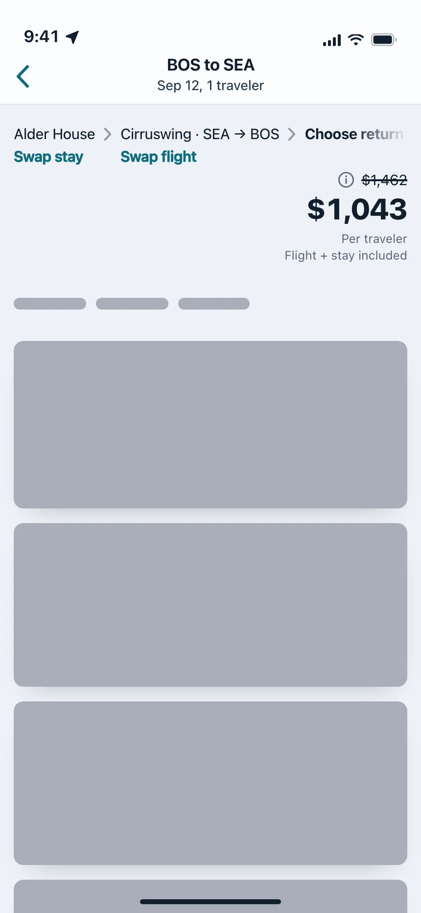
Flight, bundle and stay cards hold their places under a real route or search bar.
Checkout and balances
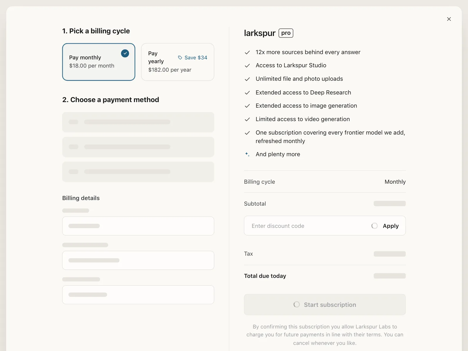
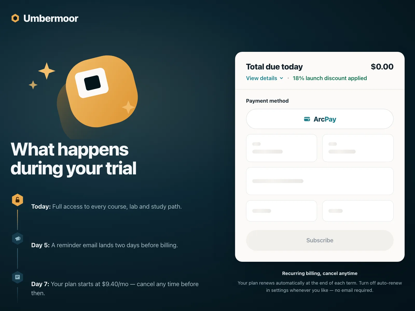
Payment fields, totals and balances load as shapes, so the form doesn't jump when the numbers arrive.
Skeleton loader vs similar components

Build notes
- Size each shape to the content it replaces, so nothing jumps when data lands (Cumulative Layout Shift).
- Hide the shapes from screen readers with aria-hidden, and say "Loading" in a role="status" region.
- Set aria-busy="true" on the container until its content is in.
- Swap in real content as each part arrives instead of waiting for everything.
- Keep headings, tabs and filters real. Only the data should be a placeholder.
- Under prefers-reduced-motion, drop the shimmer and keep the shapes still.
FAQ
Skeleton loader or spinner?
Use a skeleton when you know the layout that's coming, like a feed, a table or a product grid. Use a spinner for actions like saving, and for areas whose shape you can't predict.
Should a skeleton shimmer?
It's optional. A slow shimmer or pulse shows the page is still working, but keep it low contrast, and turn it off for people who have reduced motion set.
What happens if loading fails?
Replace the skeleton with an error message and a retry. Gray shapes that never fill in look like a frozen page.
Are skeleton screens accessible?
They can be. The shapes mean nothing to a screen reader, so hide them, mark the container aria-busy and put a short text status like 'Loading results' in a live region.
Related terms
All glossary terms · Browse 55 web and 35 mobile skeleton loader designs