
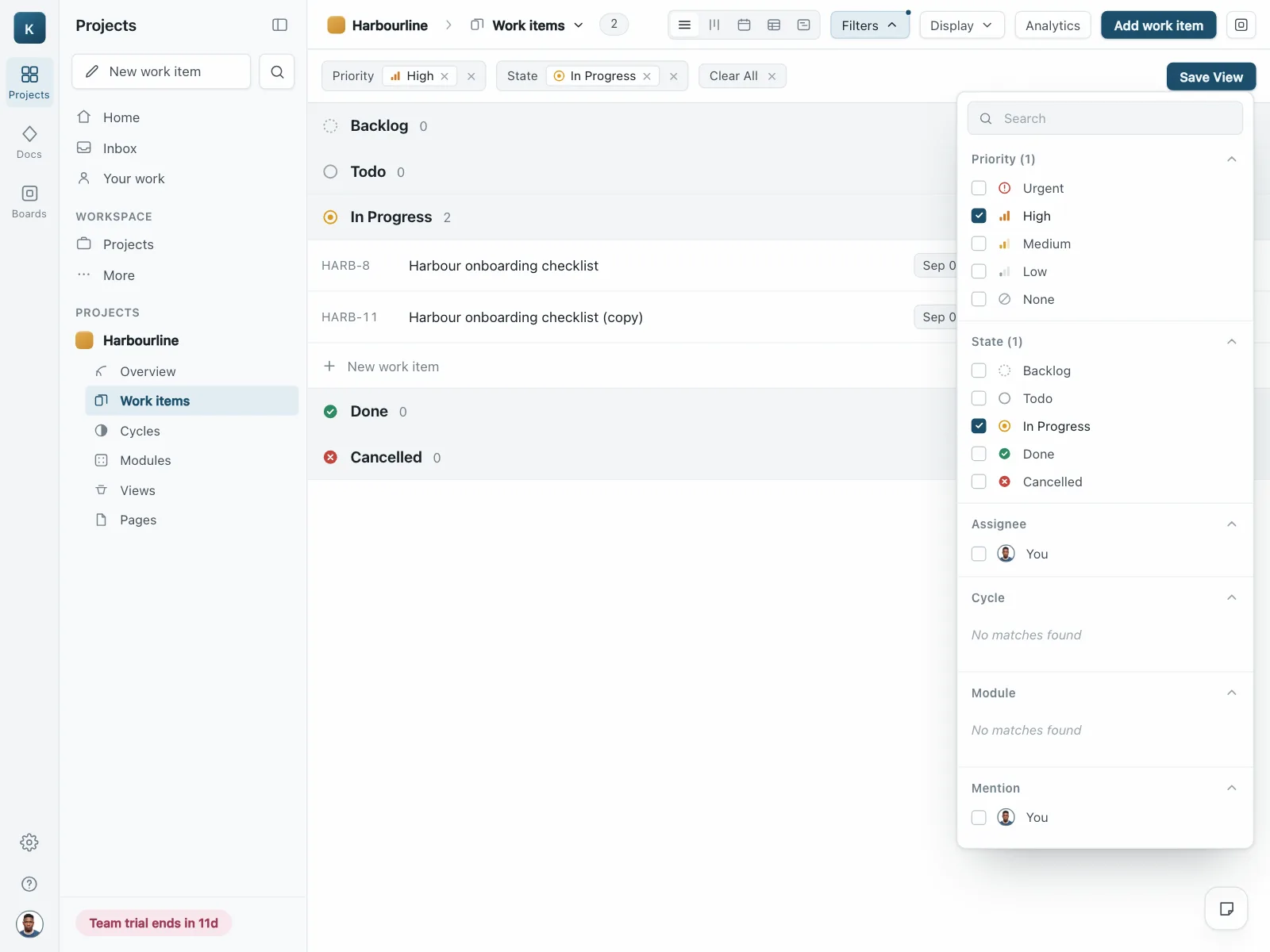
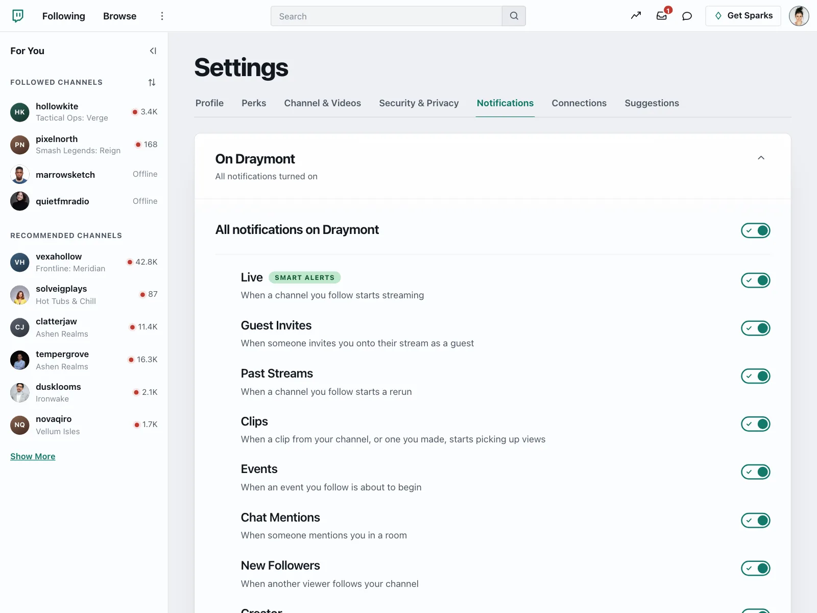
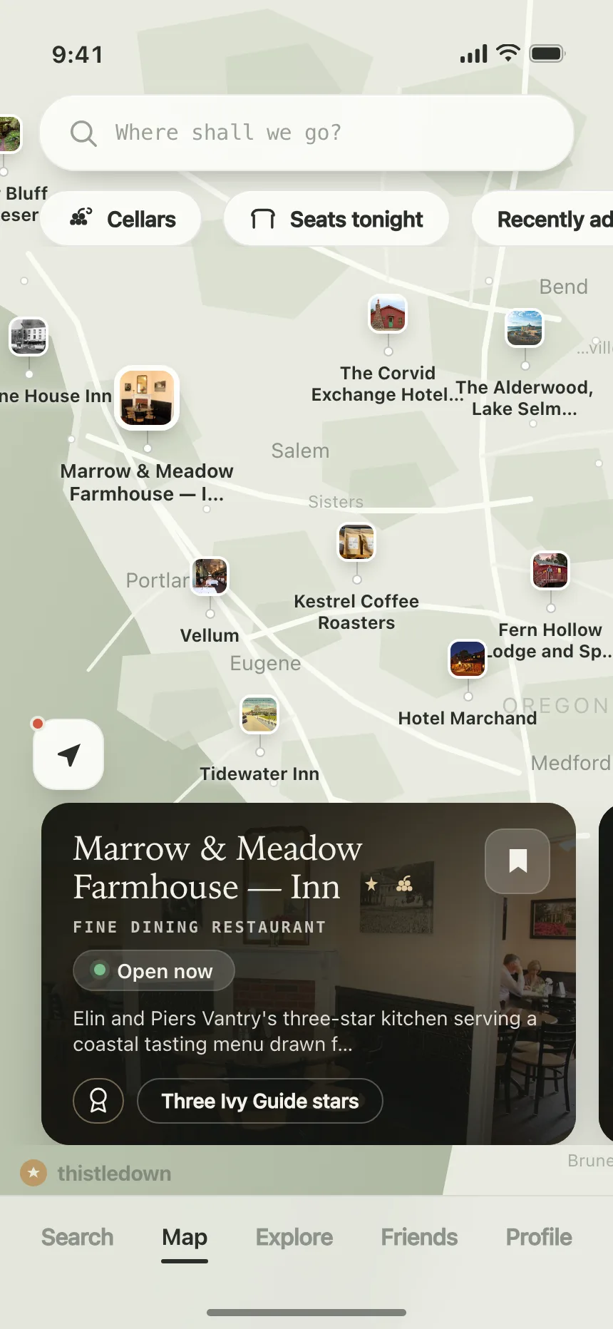
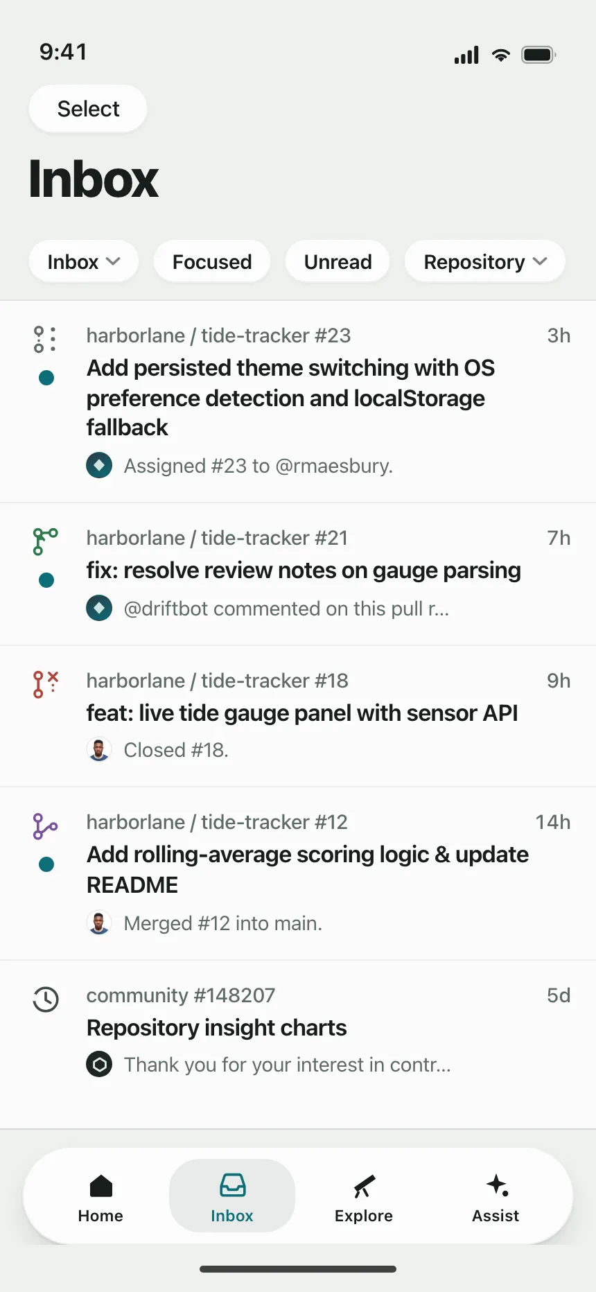
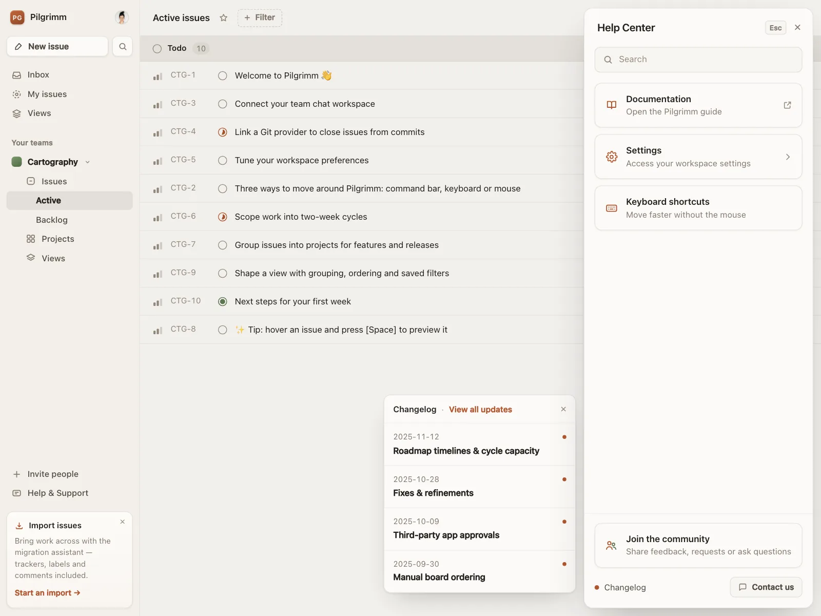
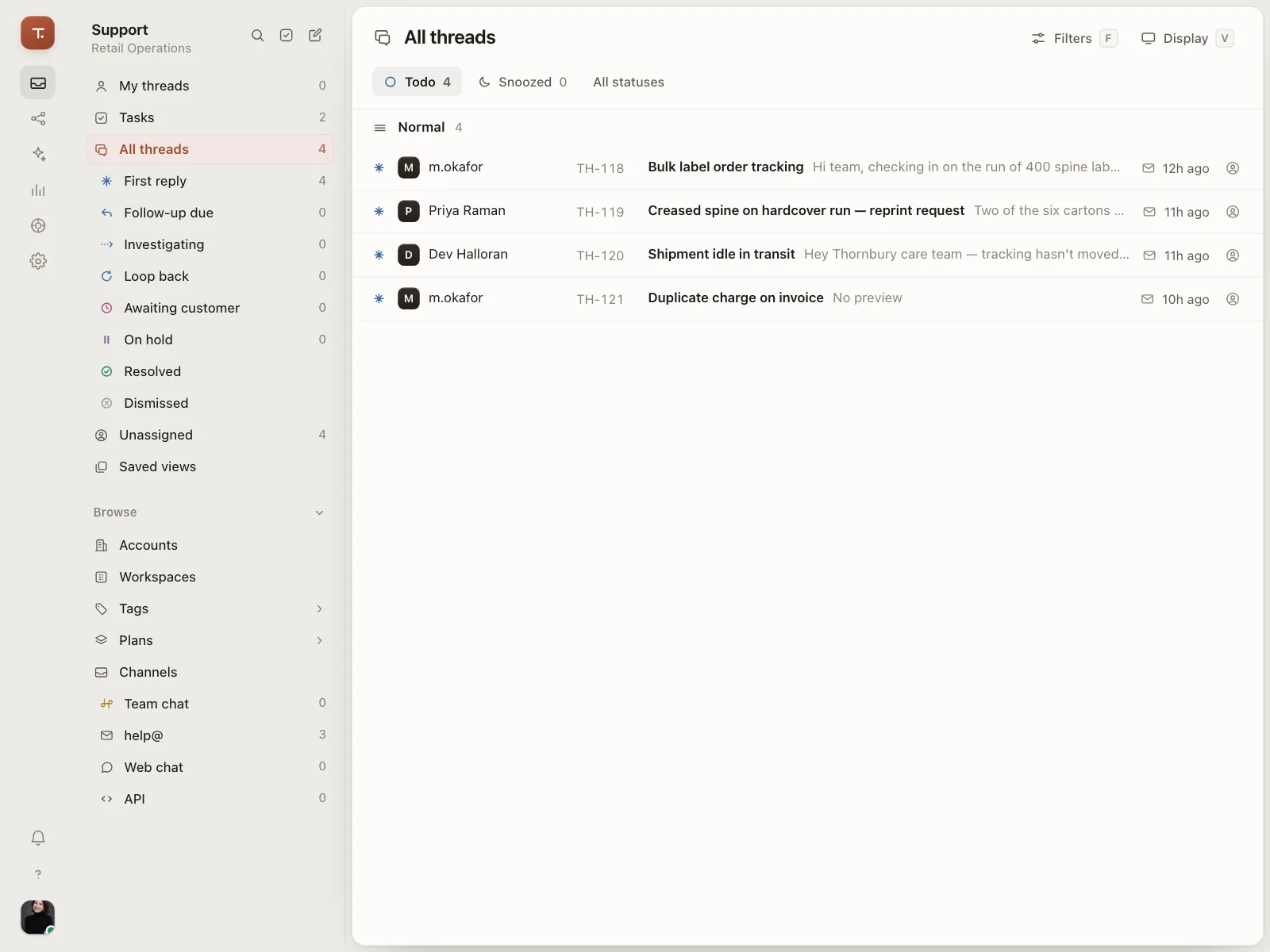
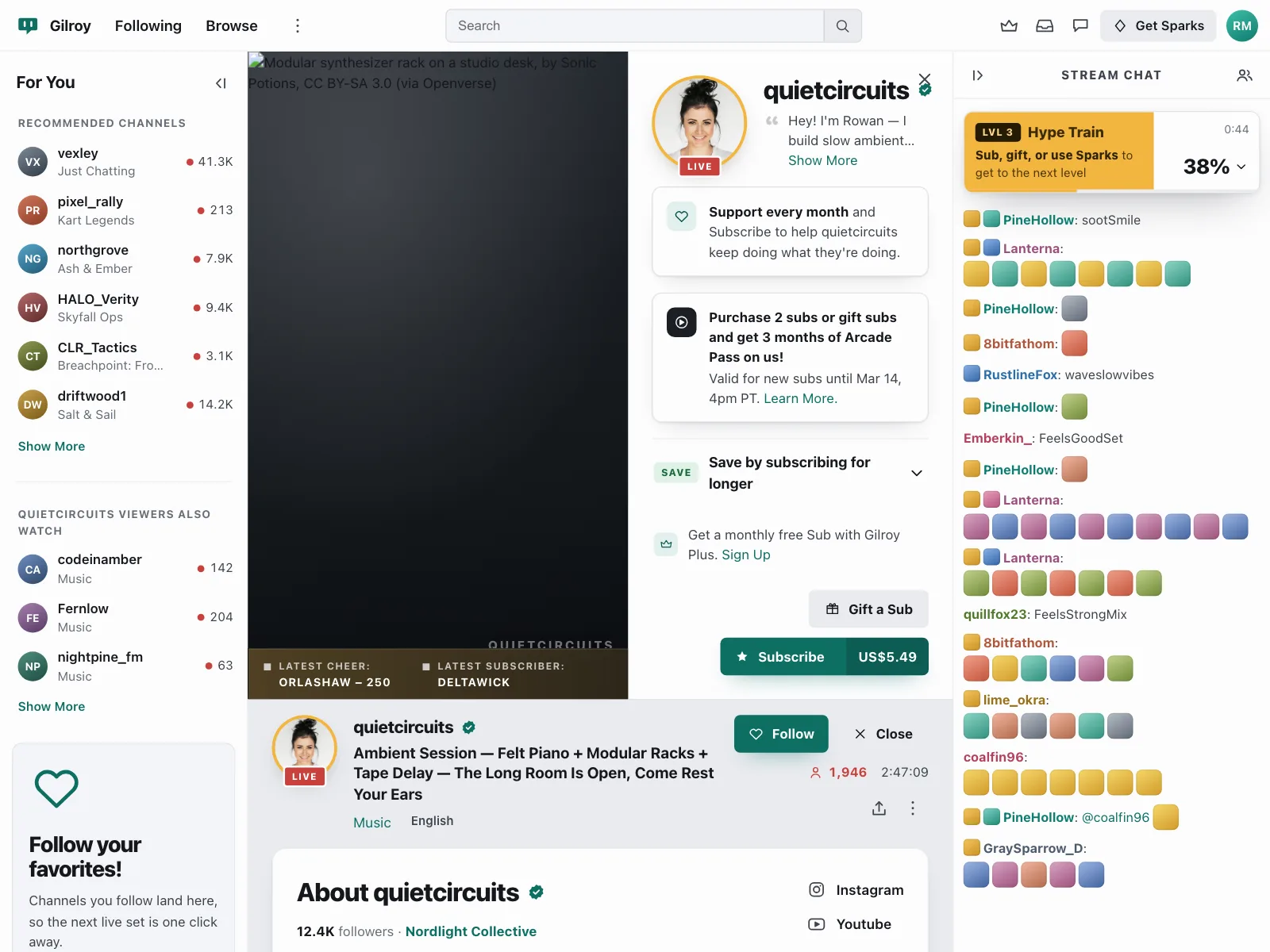
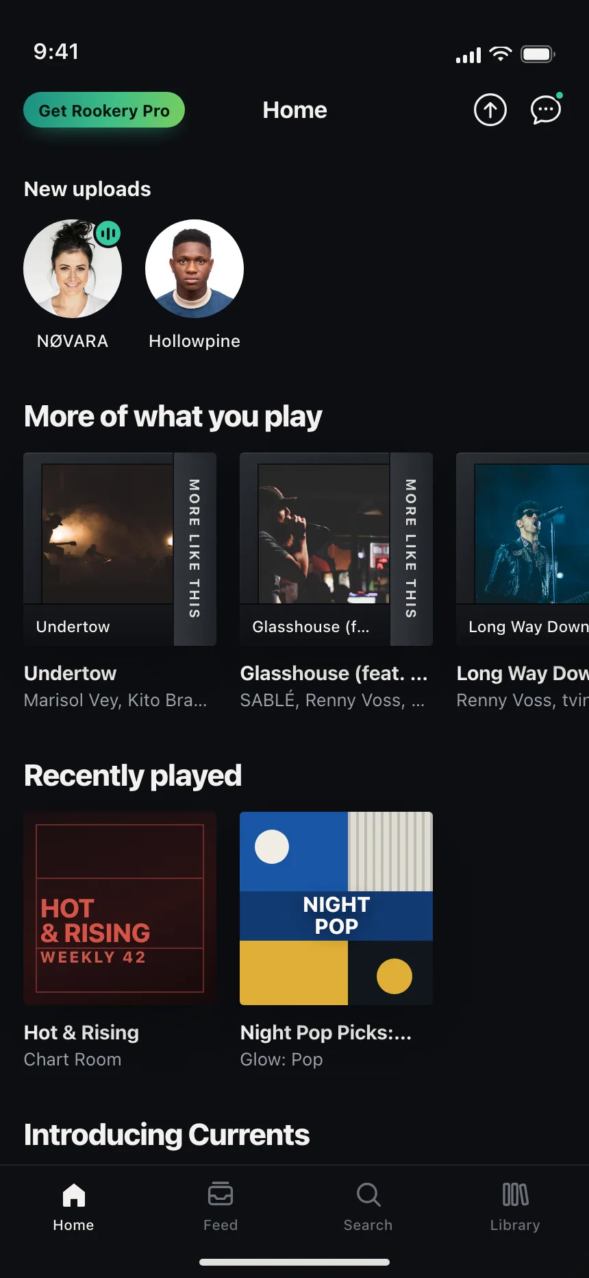
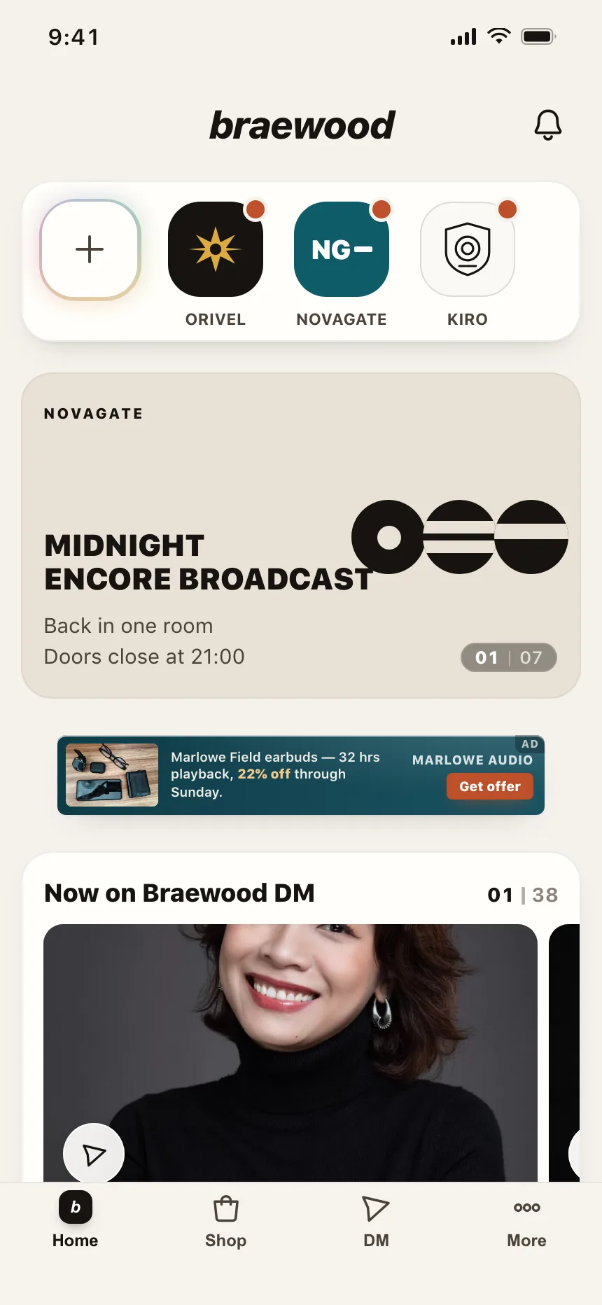
Status indicators from the Kombai gallery: an issue tracker's state icons, a streaming app's live and offline channels and an Open now pill on a map.
What is a status indicator?
A status indicator attaches a state to something people are already looking at: a person, a task, an order, a channel. It is usually a colored dot, a small icon or a short pill, placed beside or on top of the item. Color makes it quick to scan, and a label, icon shape or tooltip makes it readable without color.
- Small and attached to an item, never a message of its own.
- Uses a fixed set of states, each with its own color and shape or label.
Status indicators show up across notifications, tables, dashboards and project trackers screens.
When to use a status indicator
- PresenceWhether a person is online, away or offline, right on their avatar.
- Workflow stateWhere a task, order or ticket sits, from to do through to done.
- Something newAn unread message or a fresh upload that people have not seen yet.
When not to use one
- CountsFor a number, like 12 unread, use a badge.
- EventsWhen something just happened and people should know now, use a toast.
- Long explanationsIf the state needs a sentence, write it in the row or show a message.
Anatomy of a status indicator
This one works. Change your own status and watch your row update: each state has its own color, shape and label.
- YouOnline
- Priya RamanOnline
- Teo MarchettiBusyIn a call
- Dara OkonjoOfflineLast seen 4:12 PM
- Online
- Away
- Busy
- Offline
- ItemThe thing that has a state
- DotColor and shape per state
- RingKeeps the dot clear of photos
- LabelThe state in words
- StatesOnline, away, busy, offline
Status indicator variants
We sorted the status indicator designs in the Kombai gallery and found four patterns. Browse all 55 web and 35 mobile designs.
1. Presence dots on avatars
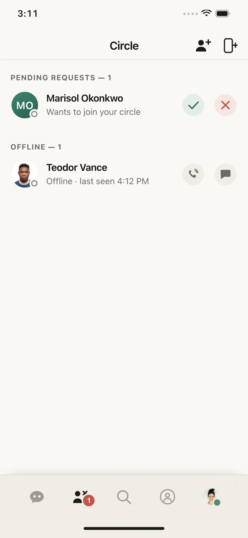
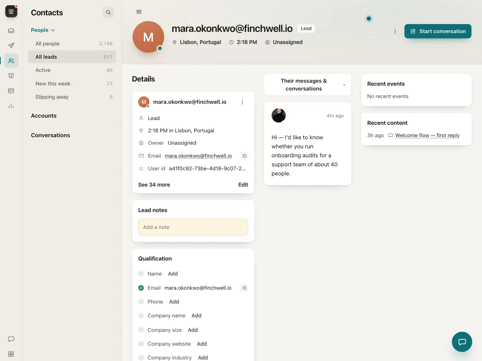
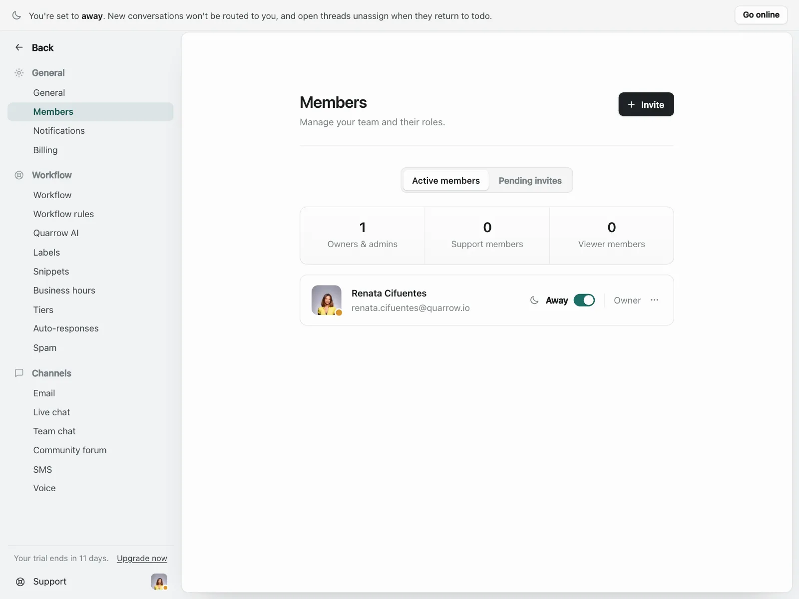
A dot on the corner of an avatar: green for online, gray or hollow for offline, sometimes with a last-seen time.
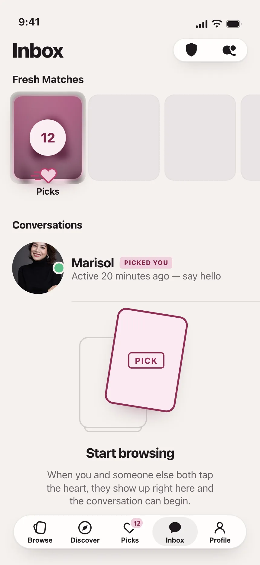
2. Unread dots
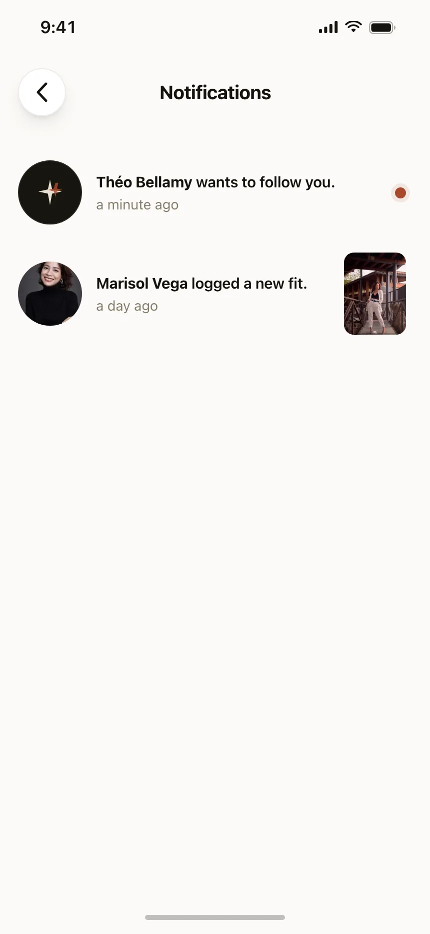
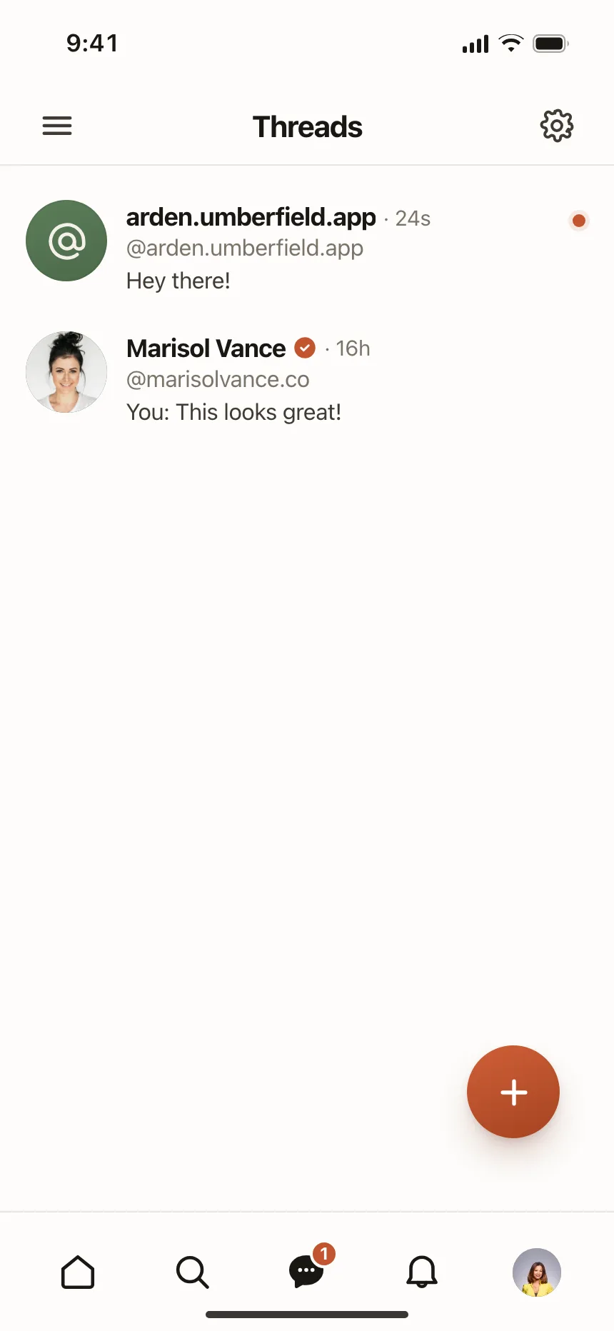
A single bright dot at the end of a row that disappears once the item is opened.
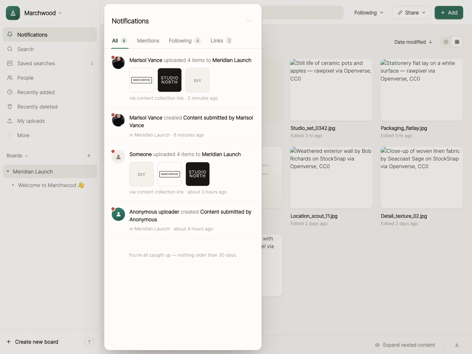
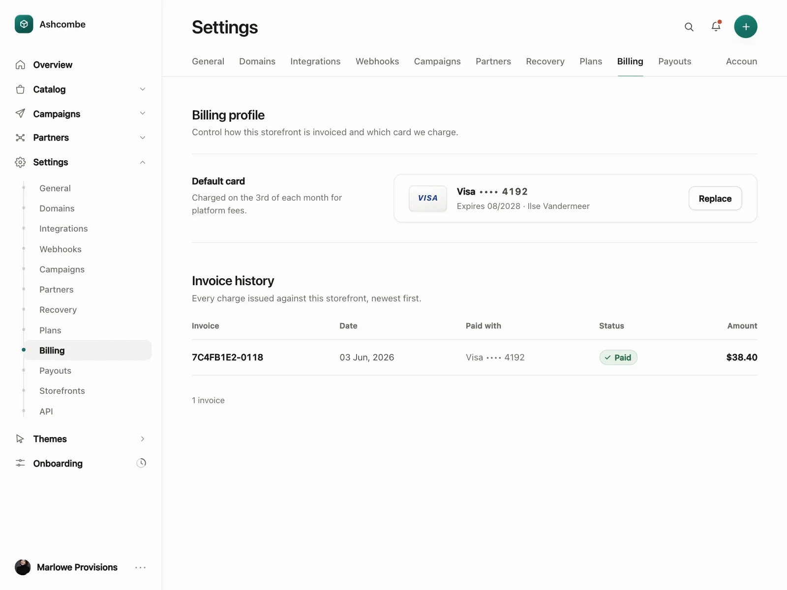
3. Labeled status pills
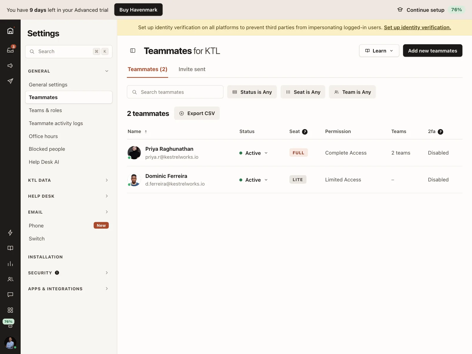
A dot plus a word, like Active or Paid, often inside a tinted pill in a card or table cell.
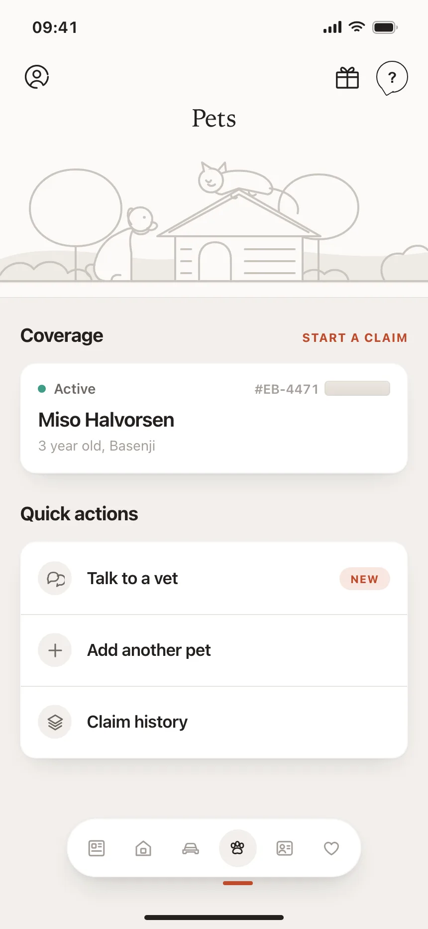
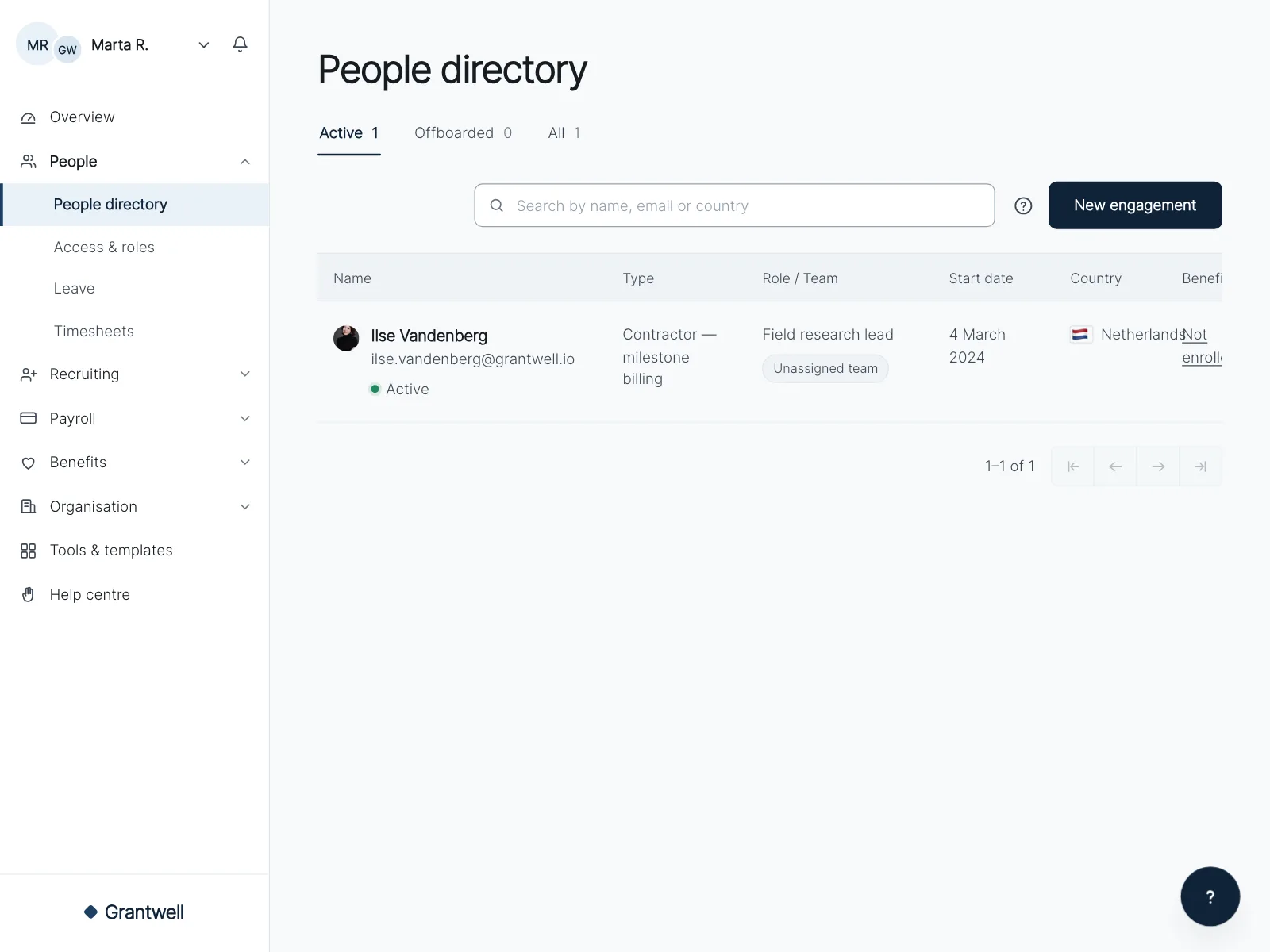
4. Workflow state icons
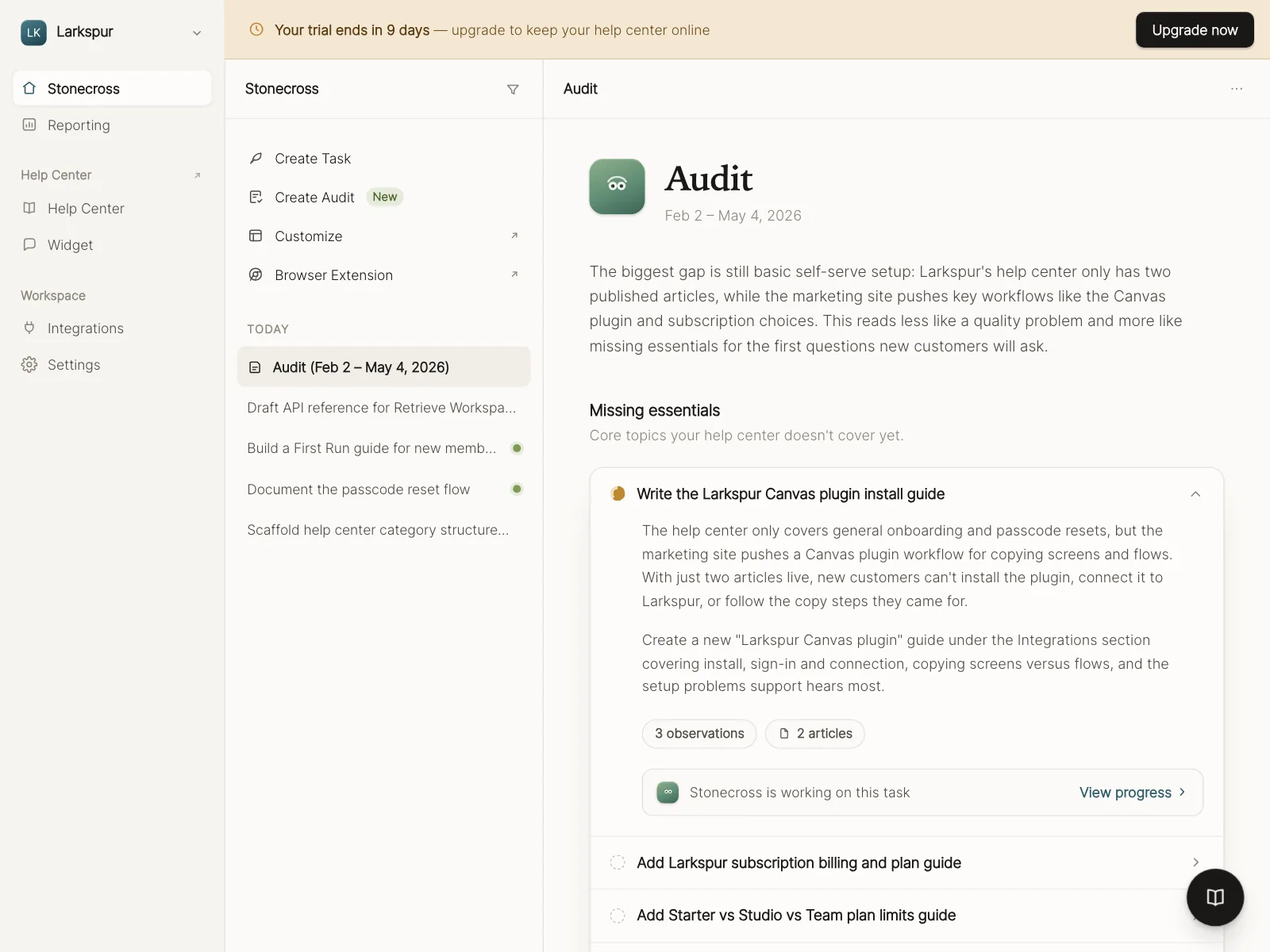
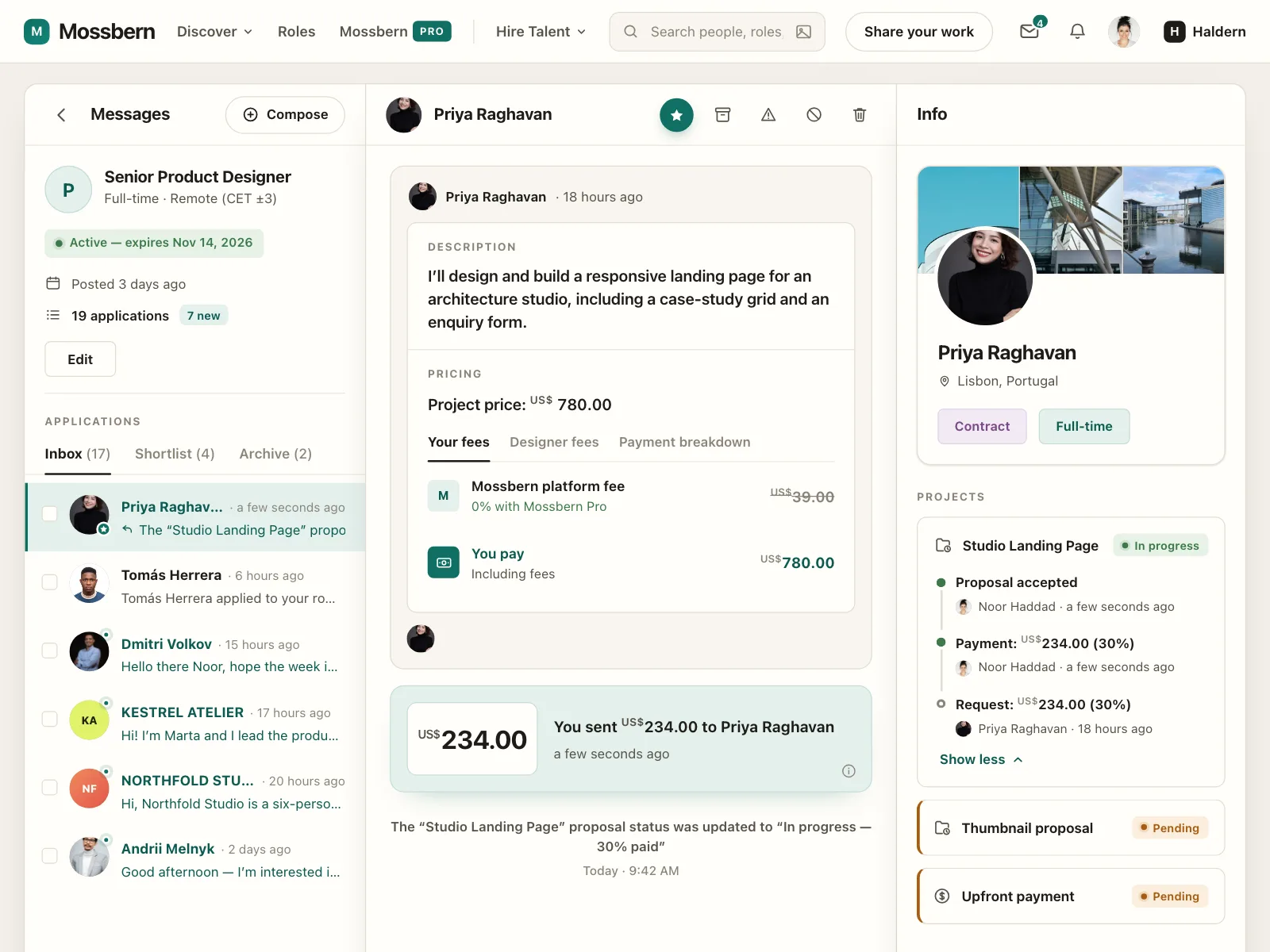
Icons whose shape changes with the state: an empty circle for to do, a half-filled one in progress, a check when done.
Where status indicators show up
Social and streaming
Live markers, viewer counts and activity rings show who is broadcasting or posting right now.
Projects and tasks
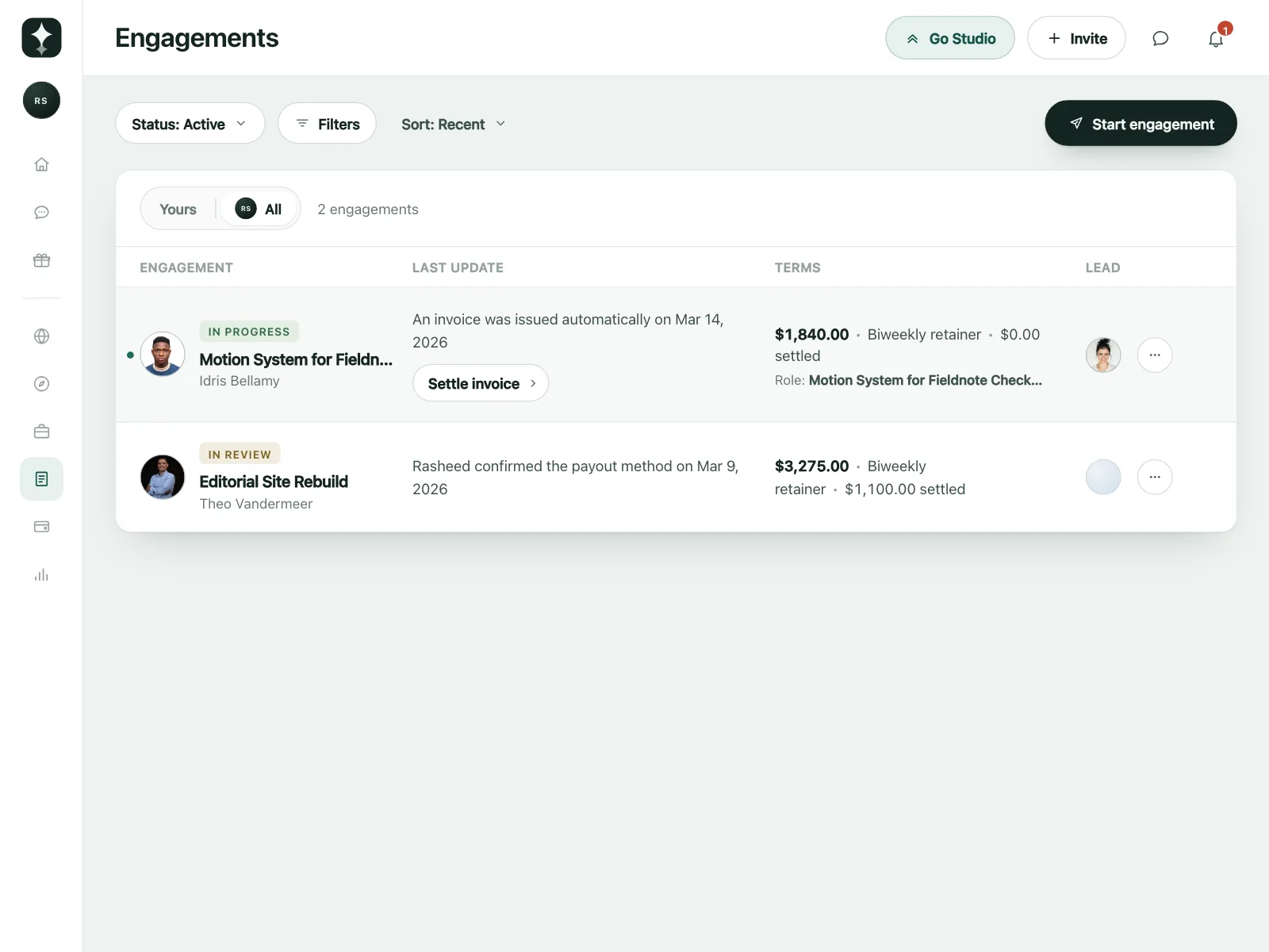
Tags and circles mark each task or engagement as in progress, in review, pending or done.
Team and account admin
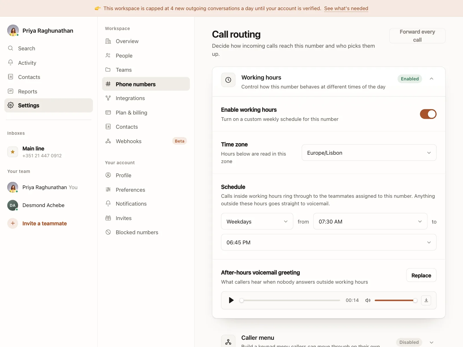
Member tables and settings show who is active, who is away and which features are on.
Status indicator vs similar components
Build notes
- Never rely on color alone. Pair each color with a label, a distinct shape or an accessible name.
- Give a dot-only indicator text for screen readers, like a visually hidden "Online" next to the name.
- Keep the dot at least 3:1 against what is behind it, and add a ring when it sits on a photo.
- Use the same colors for the same states everywhere in the product.
- Announce changes people need to know about, like going offline, through a role="status" region.
- Don't animate a live dot under prefers-reduced-motion.
FAQ
What colors should status indicators use?
Most products use green for online, active or done, amber for away or pending, red for errors, busy or live, and gray for offline or inactive. The exact palette matters less than using it the same way everywhere and never letting color be the only signal.
What is the difference between a status indicator and a badge?
A badge usually carries a count or a short tag, like 3 or New. A status indicator carries a state from a fixed set, like online or paid. They often look alike, and a labeled status pill is sometimes called a status badge.
Where should a presence dot go on an avatar?
The bottom-right corner is the common convention. Give the dot a ring in the background color so it stays visible on any photo, and keep it the same size across the app.
How do I make a status dot accessible?
Add the state as text, either visible next to the item or visually hidden for screen readers. A different icon shape per state also helps people who cannot tell the colors apart.
Related terms
All glossary terms · Browse 55 web and 35 mobile status indicator designs