
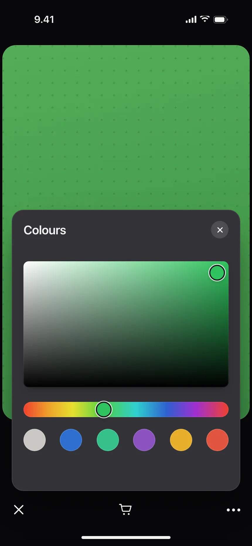
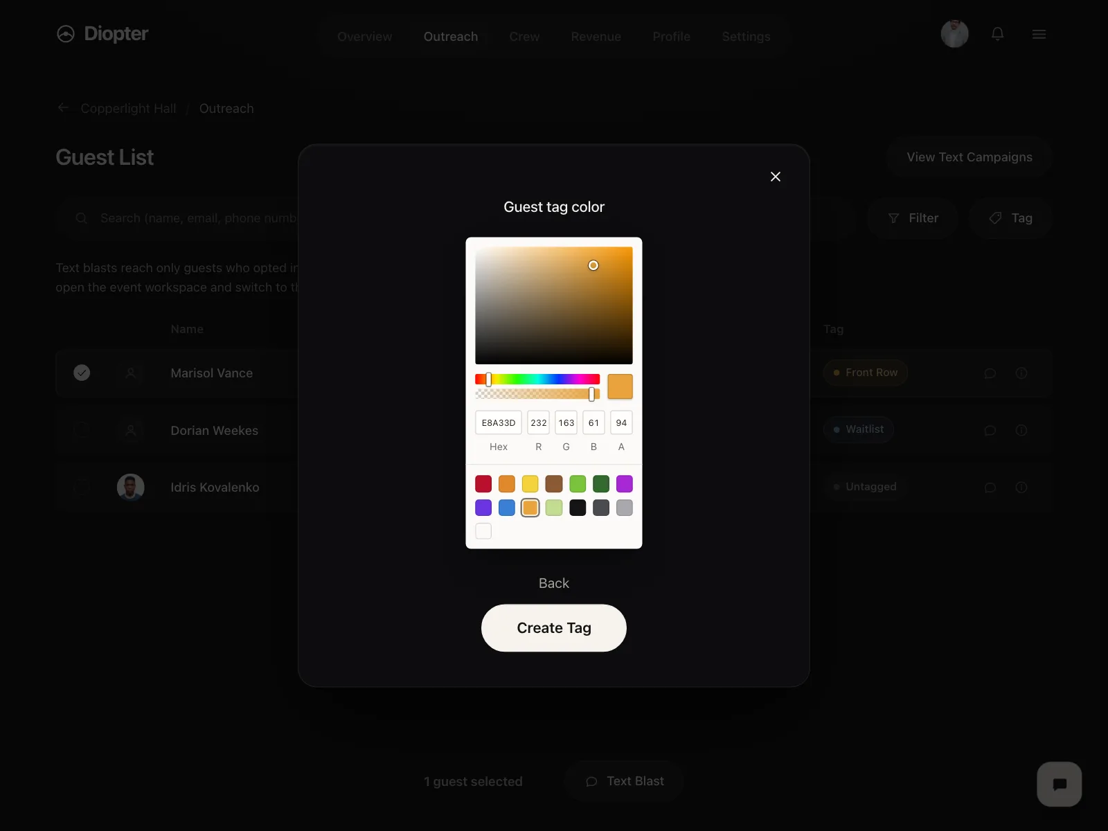

Color pickers from the Kombai gallery: a design canvas app's color sheet, an event venue tool's tag color and a smart-home app's room color.
What is a color picker?
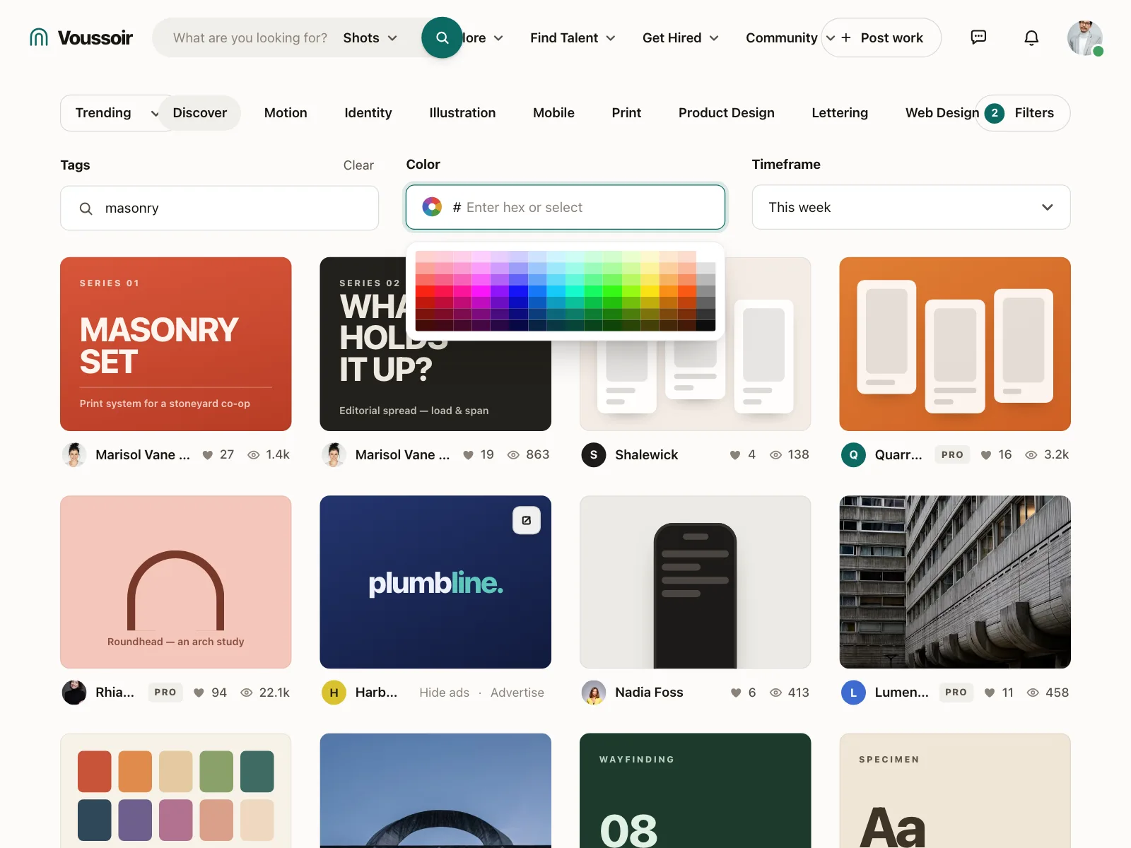
A color picker is a control for choosing a color. Most offer a short row or grid of preset swatches, and some add a spectrum, a hue slider and a hex field for any exact color. The choice shows right away on whatever it colors: a tag, a card, a theme or a shape.
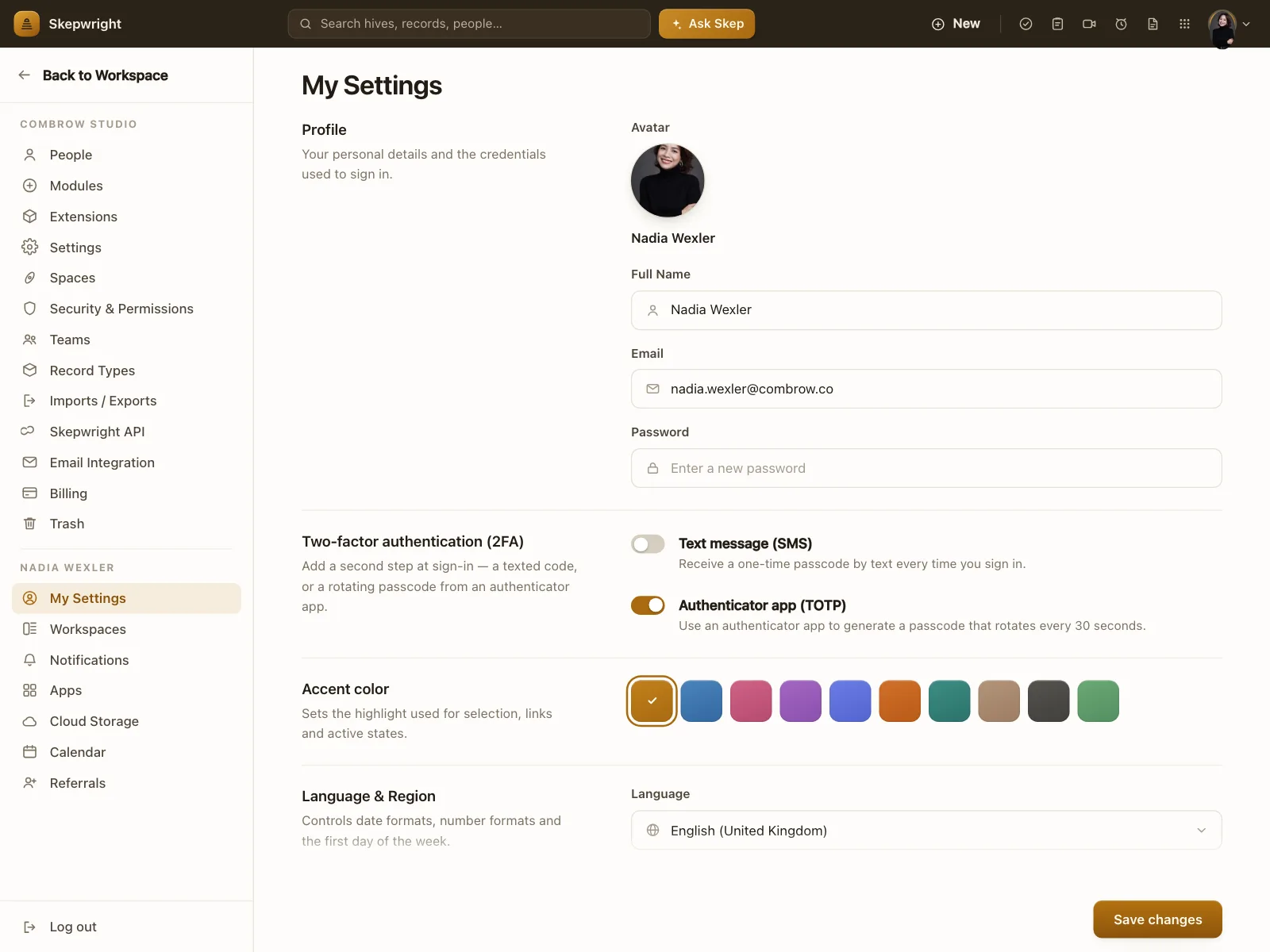
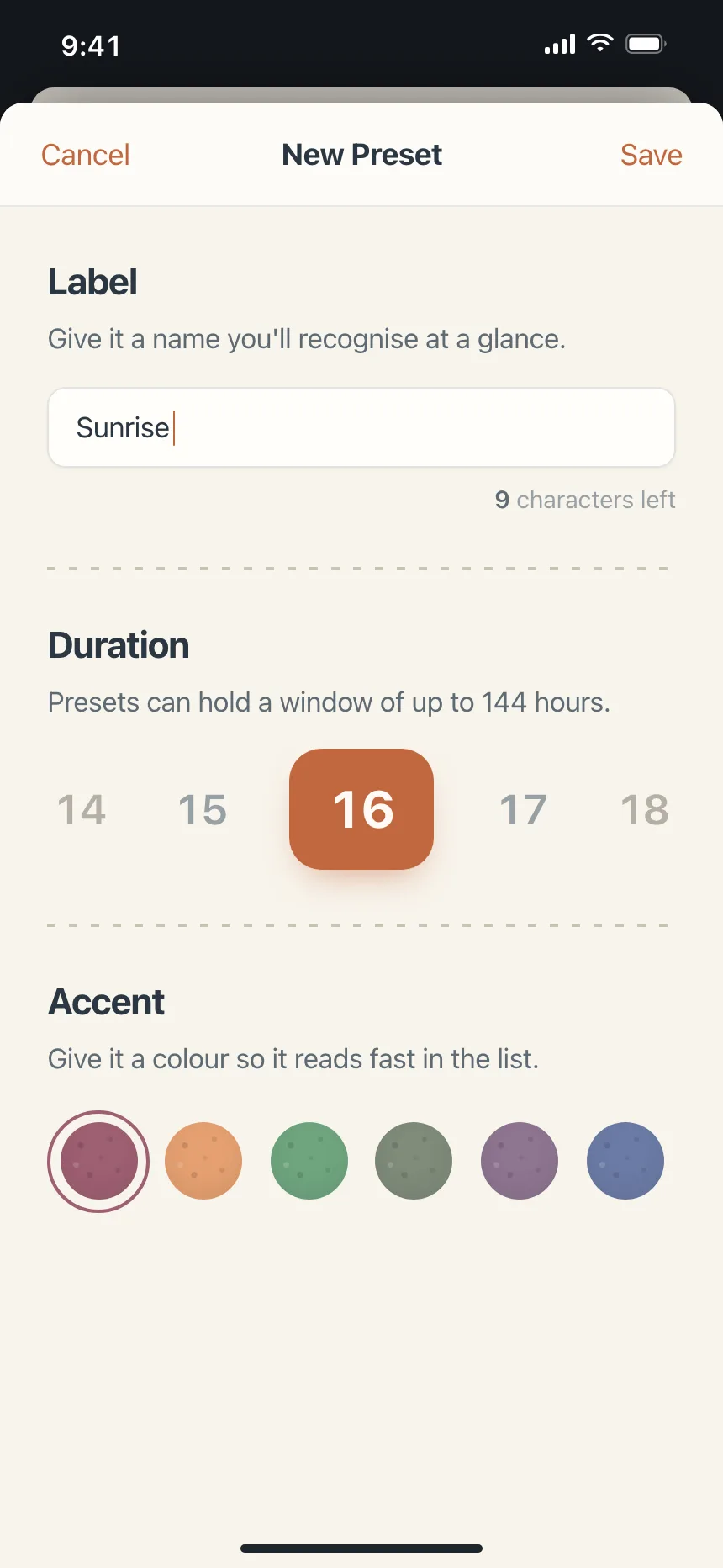
- The selected swatch gets a ring or a check, not only a color change.
- Custom pickers pair a saturation square with a hue slider and a hex field.
Color pickers show up across settings, product detail and shop screens.
When to use a color picker
- Color-codingTags, stages, calendars and projects that people spot by color.
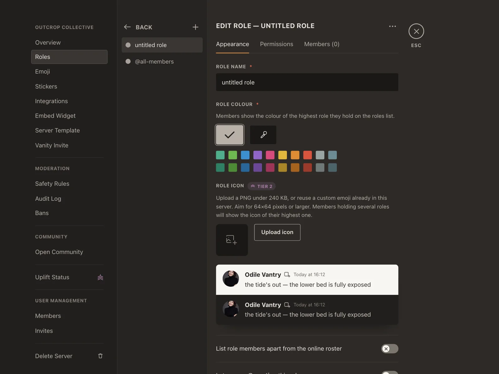
- PersonalizingAccent colors, themes, cards and avatars.
- Design and editingFill, text and backdrop colors in canvas, photo and video tools.
When not to use one
- Color as the only signalA status still needs a label or an icon for people who can't tell colors apart.
- Fixed brand palettesOffer only the brand swatches, not a full spectrum.
- Unchecked text colorsIf people pick text and background colors, check the contrast or limit the choices.
Anatomy of a color picker
This one works. Pick a swatch, or tab into the swatches and use the arrow keys, or type a hex code.
5.0:1with dark text, passes 4.5:1
- Default
- Selected
- Keyboard focus
- Invalid hex
- PreviewThe color in use
- SwatchesPreset colors
- Selected swatchRing and check
- Hex fieldAny exact color
- Contrast checkText stays readable
- StatesDefault, selected, focus, invalid hex
Color picker variants
We sorted every color picker design in the Kombai gallery and found five patterns. Browse all 50 web and 30 mobile designs.
1. Swatch rows
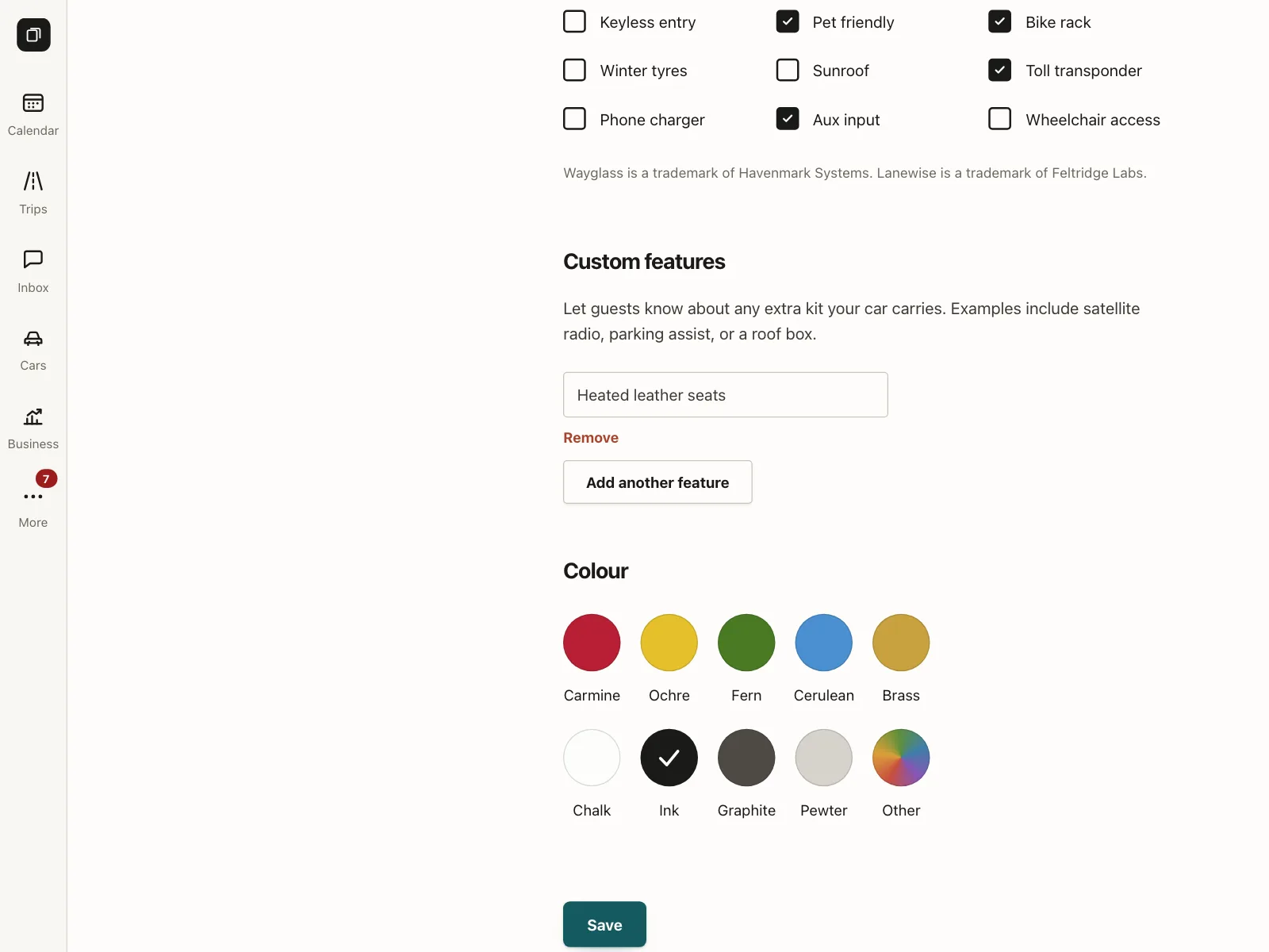
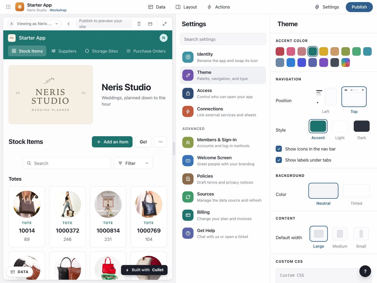
The default. A single line of four to twelve circles, for an accent, a label or an ink color.

2. Swatch grids
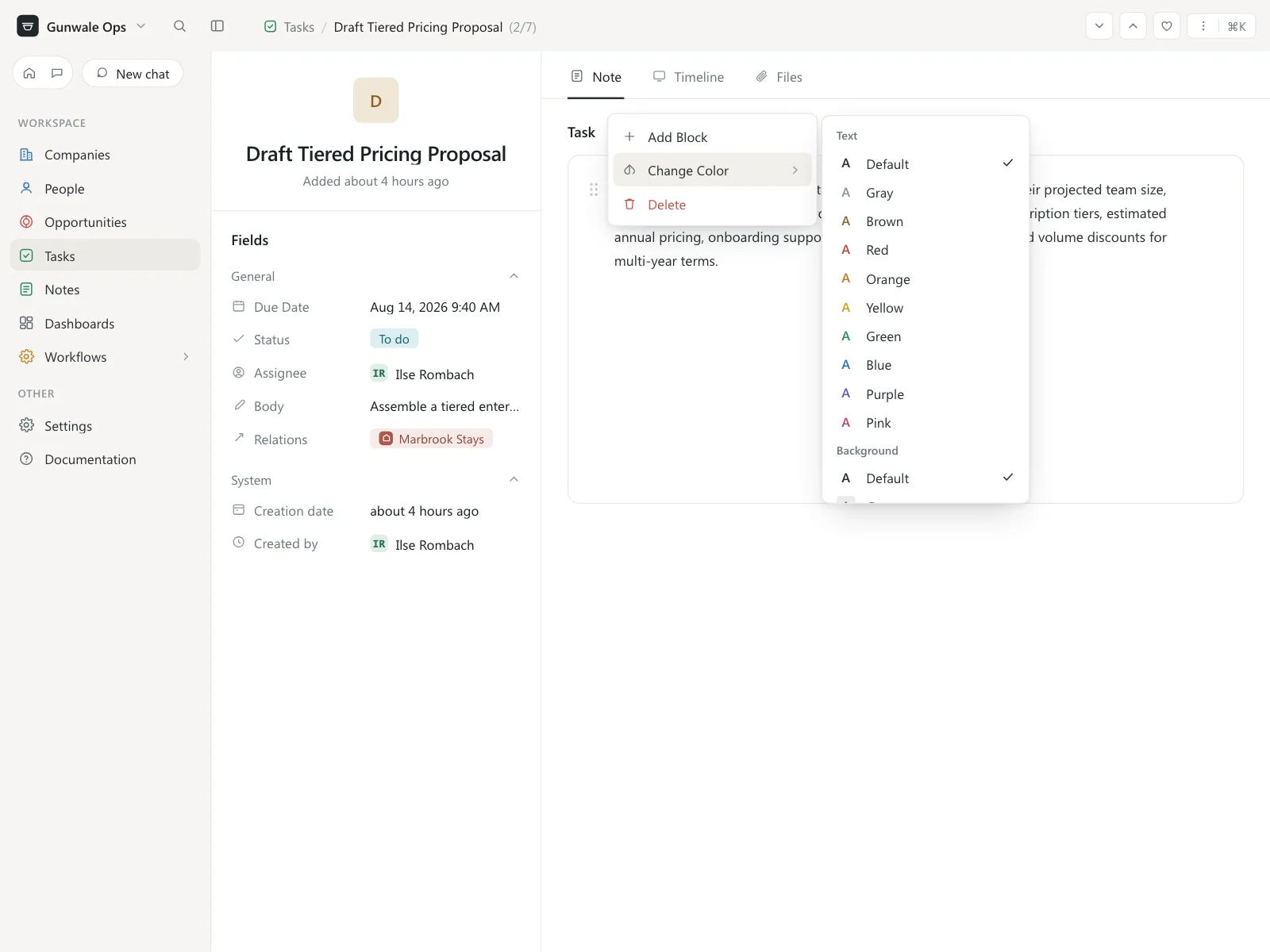
Rows of tiles or circles in tints and shades, for backgrounds and palettes with more choices.

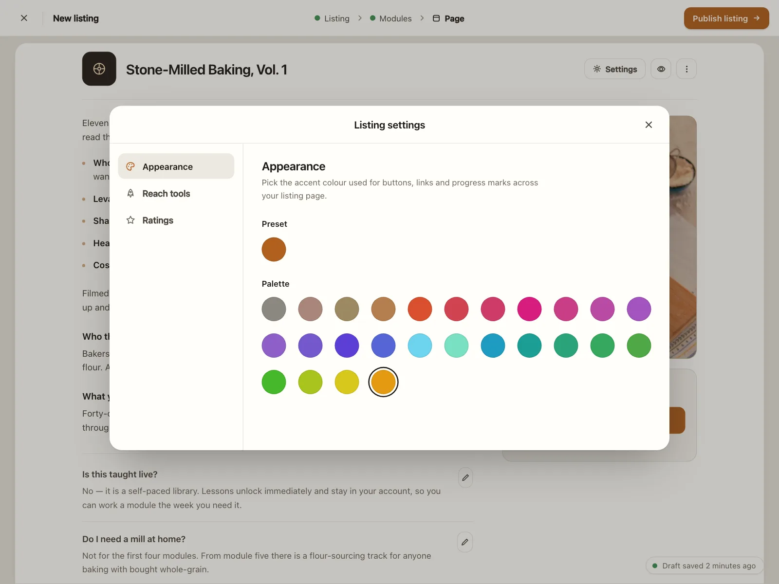
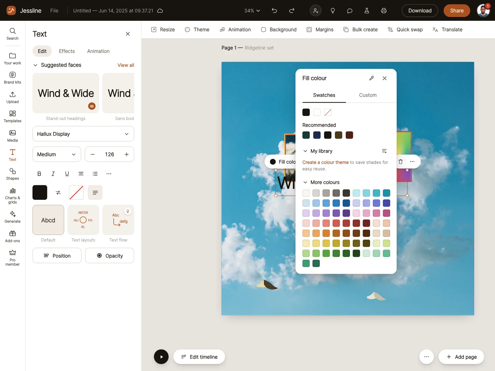
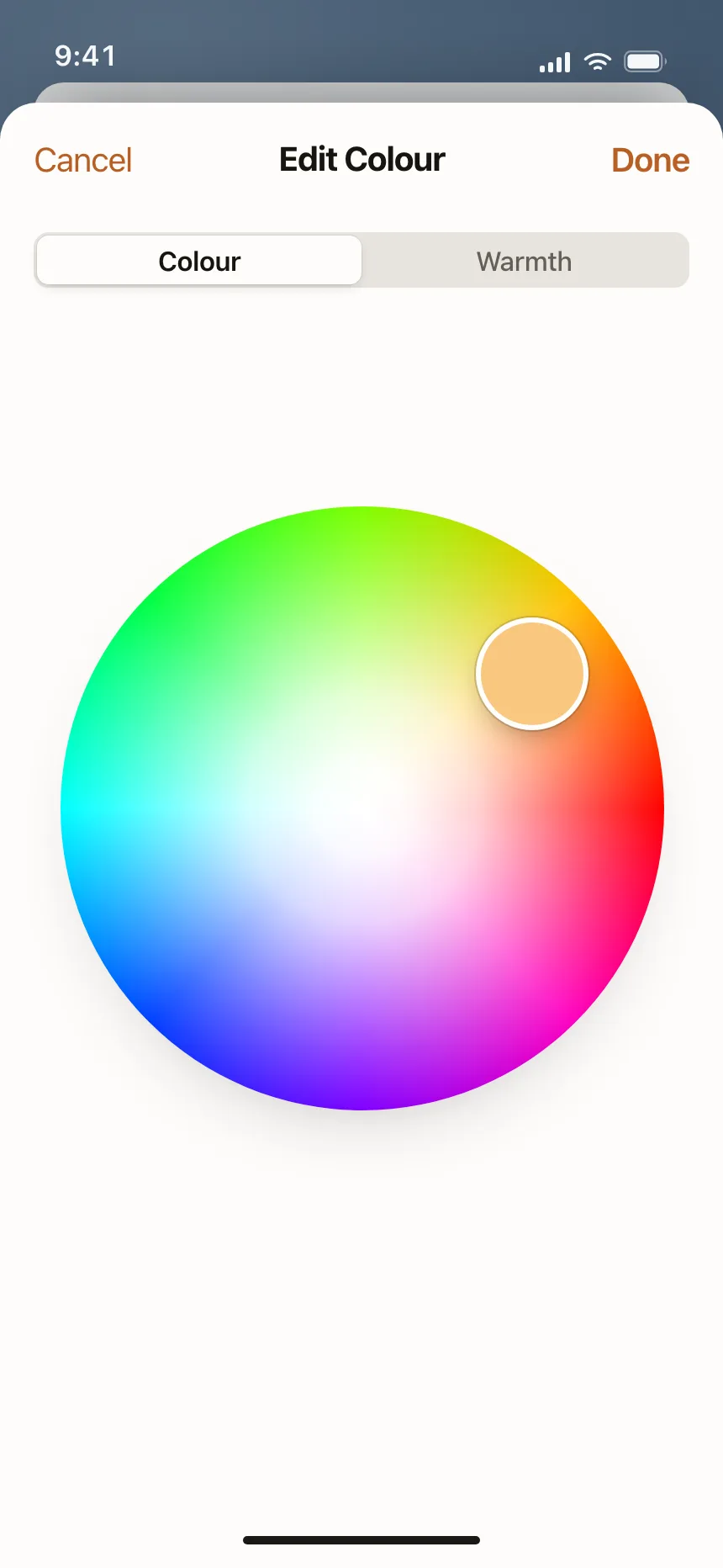
3. Spectrum and wheel pickers
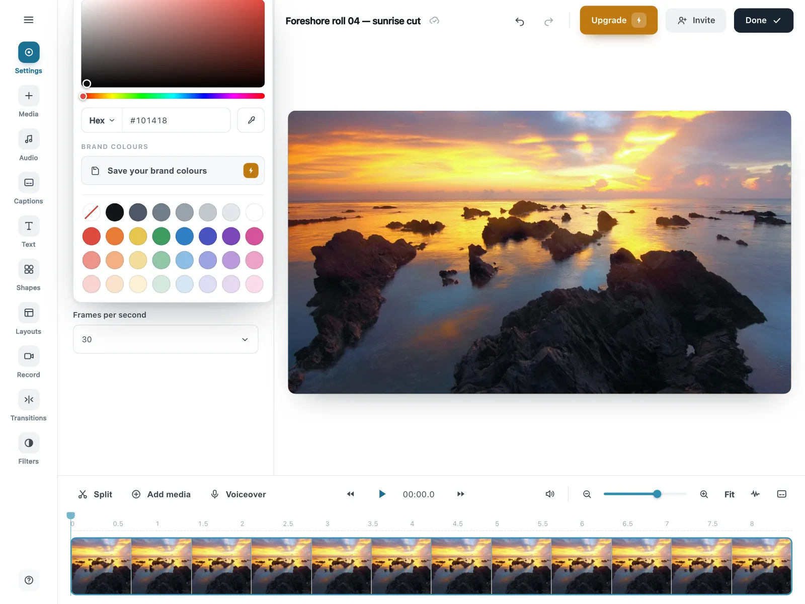
A saturation square with a hue slider and a hex field, or a round color wheel, for any color at all.
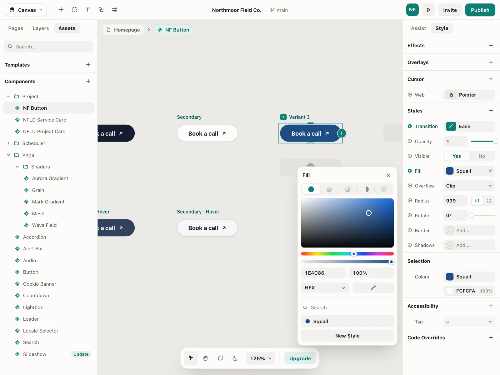
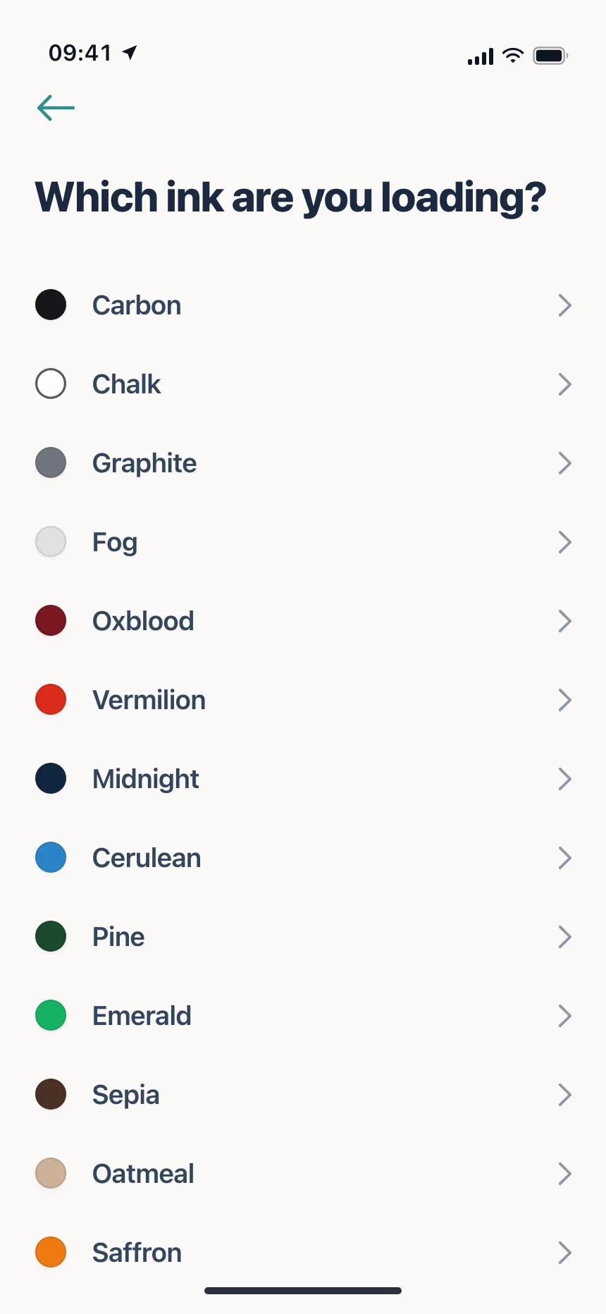
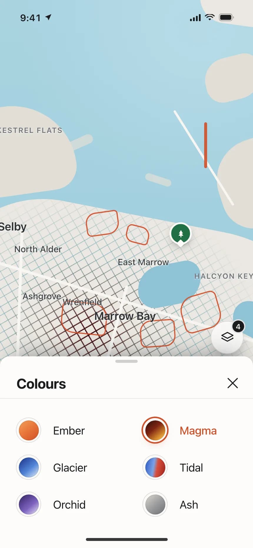
4. Named color lists
Rows that pair each swatch with a name, like Oxblood or Glacier, when the name matters as much as the color.
5. Presets with a custom option
A set of swatches ending in a rainbow button or an eyedropper that opens a full picker.
Where color pickers show up
Tags, stages and categories
Each pipeline stage, status or category gets a color in settings, often from a swatch popover with a hex field.
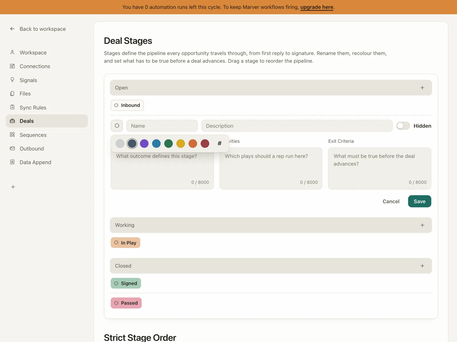

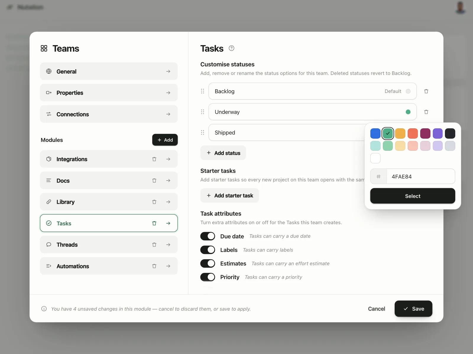
Photo and video editors
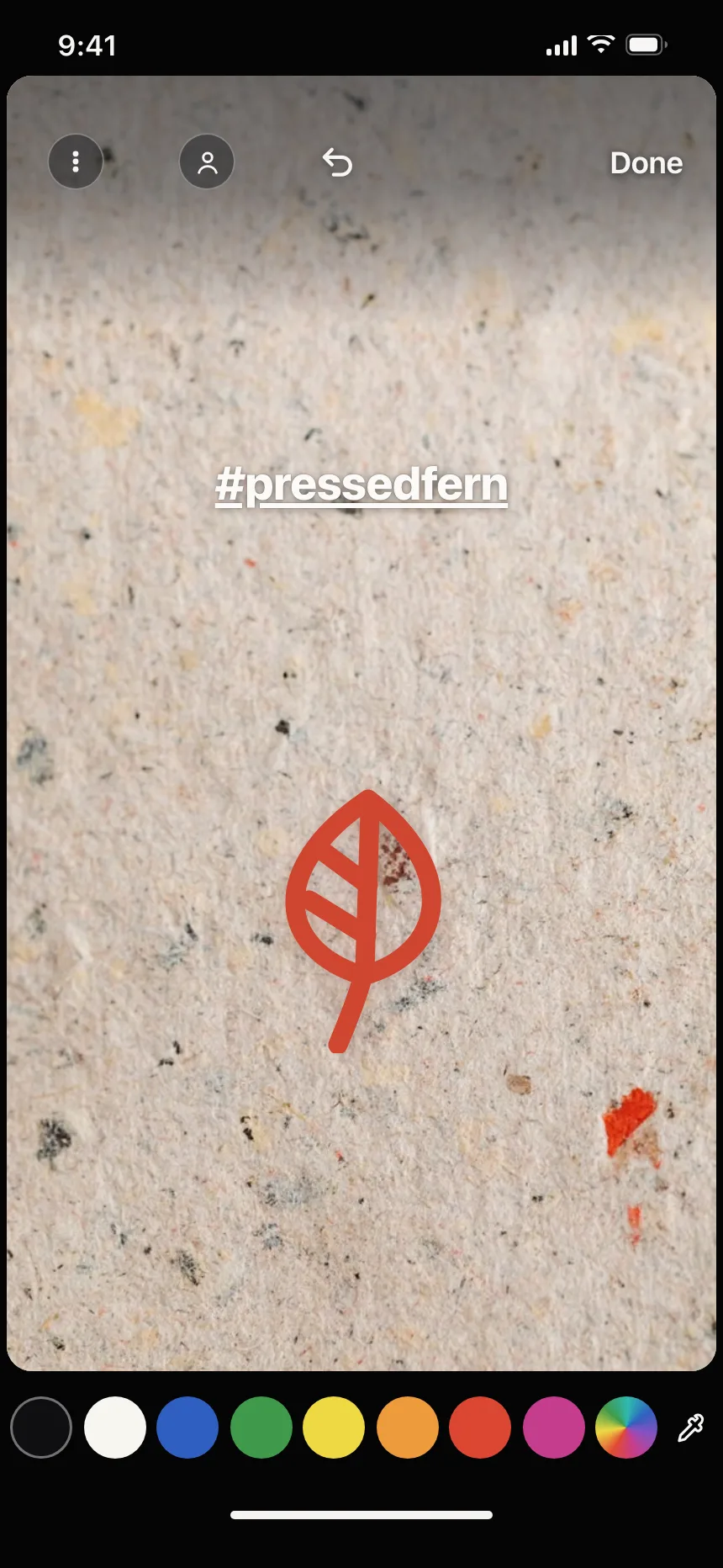
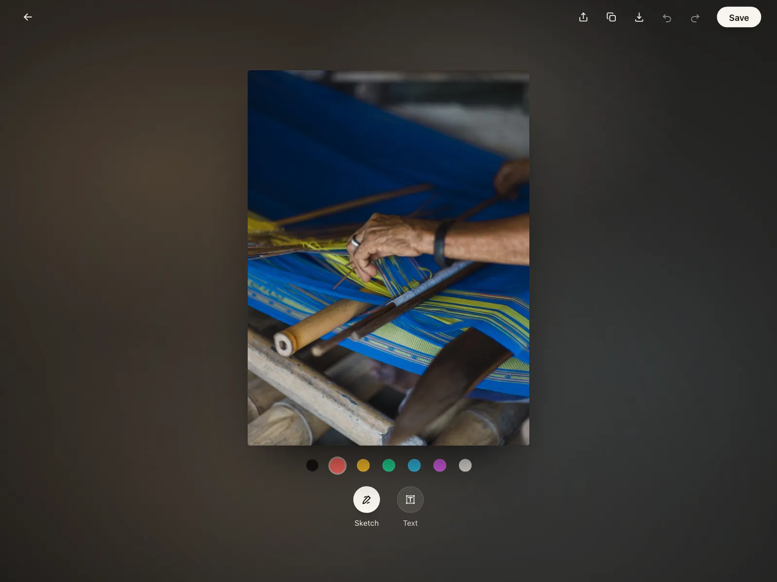
A row of colors for captions, markup and frame tints, sitting right above the photo.


Product colorways
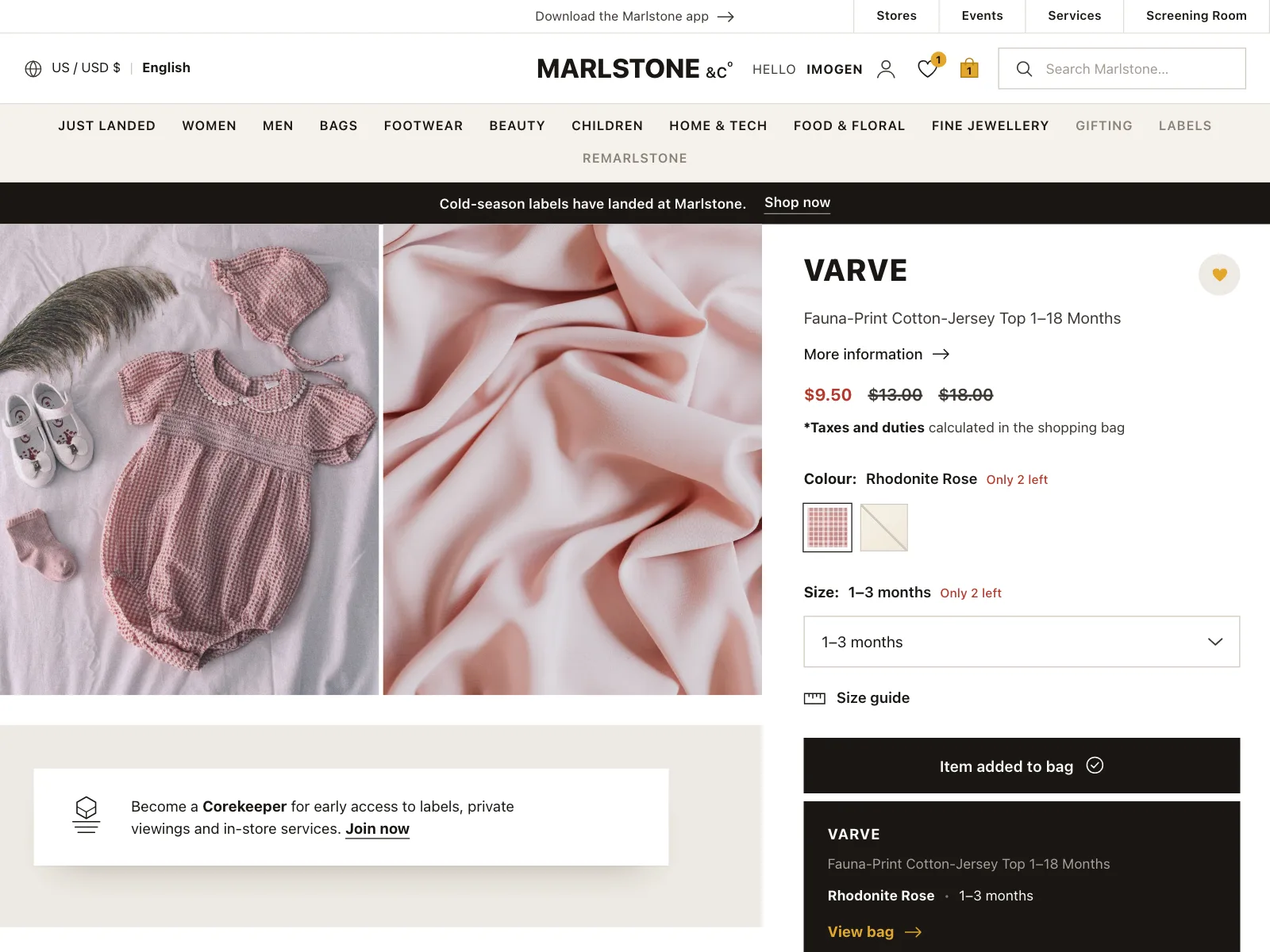
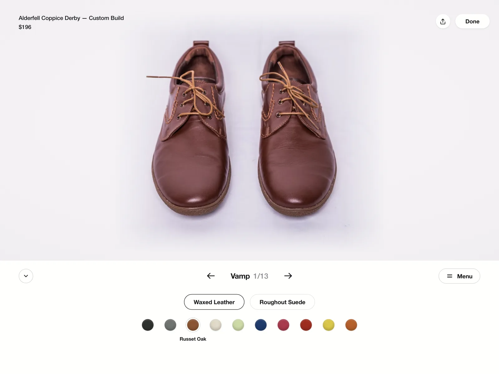
Swatches on a product page switch the colorway, with the name of the chosen color beside them.

Filtering by color
A swatch matrix or a hex field narrows a shop or an inspiration feed to one color.


Color picker vs similar components

Build notes
- Treat a set of swatches as a radio group: role="radiogroup", and role="radio" with aria-checked on each swatch.
- Name every swatch, like aria-label="Teal". A color on its own is not a label.
- Arrow keys move through the swatches and select as they go. Tab moves into and out of the group.
- Mark the selected swatch with a ring or a check, not only a change of color.
- For a quick custom color, <input type="color"> opens the browser or system picker.
- When people pick text or background colors, check the contrast: at least 4.5:1 for normal text.
FAQ
Swatches or a full color picker?
Start with swatches. A curated set keeps colors on brand, readable and easy to tell apart, and it takes one tap. Add a spectrum or a hex field only when people need exact colors, like in a design tool or a brand settings page.
How many swatches should a color picker show?
Enough to cover distinct hues without near-duplicates. For labels and accents, the swatch rows in the gallery mostly hold four to twelve colors. Grids with tints and shades suit backgrounds and design work.
How do I make a color picker accessible?
Give every swatch a text name, make the set a radio group so arrow keys move through it, and show the selection with a ring or a check. If the color will sit behind text, show the contrast ratio and warn below 4.5:1.
Should a color picker accept hex codes?
Yes, when people bring colors from somewhere else, like a brand guide. Accept codes with or without the #, in upper or lower case, and say what is wrong if the code is not six characters from 0 to 9 and A to F.
Related terms
All glossary terms · Browse 50 web and 30 mobile color picker designs