Hollis

Compare section#28 of 31Mobile

About this design

Compare section for Mobile: hollis versus Quillpress for agency site work, comparing four things clients feel and scoring each side with ASCII kaomoji verdicts.

  • Style: dark slate-navy surfaces, mint-green accent with a rose counterpoint, SF system type with monospace faces.

  • Layout: 430px iOS screen, navbar.

  • Components: Start for free and Import a site buttons, paired cards, Try Hollis CTA.

  • Vibe: dark, wry, agency-savvy — web platform comparison.

More Compare sections

View all 31
Compare
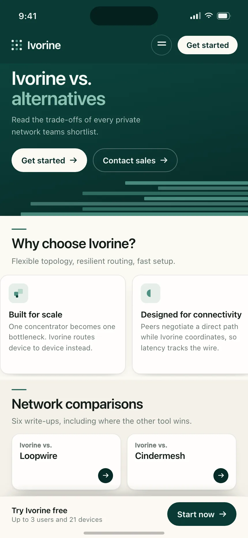
Compare | Ivorine
Compare
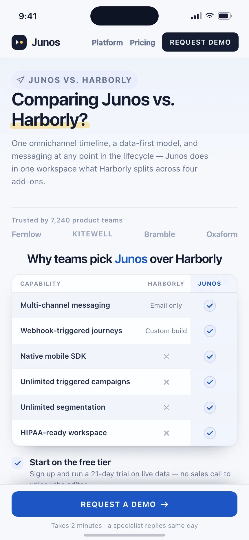
Compare | Junos
Compare
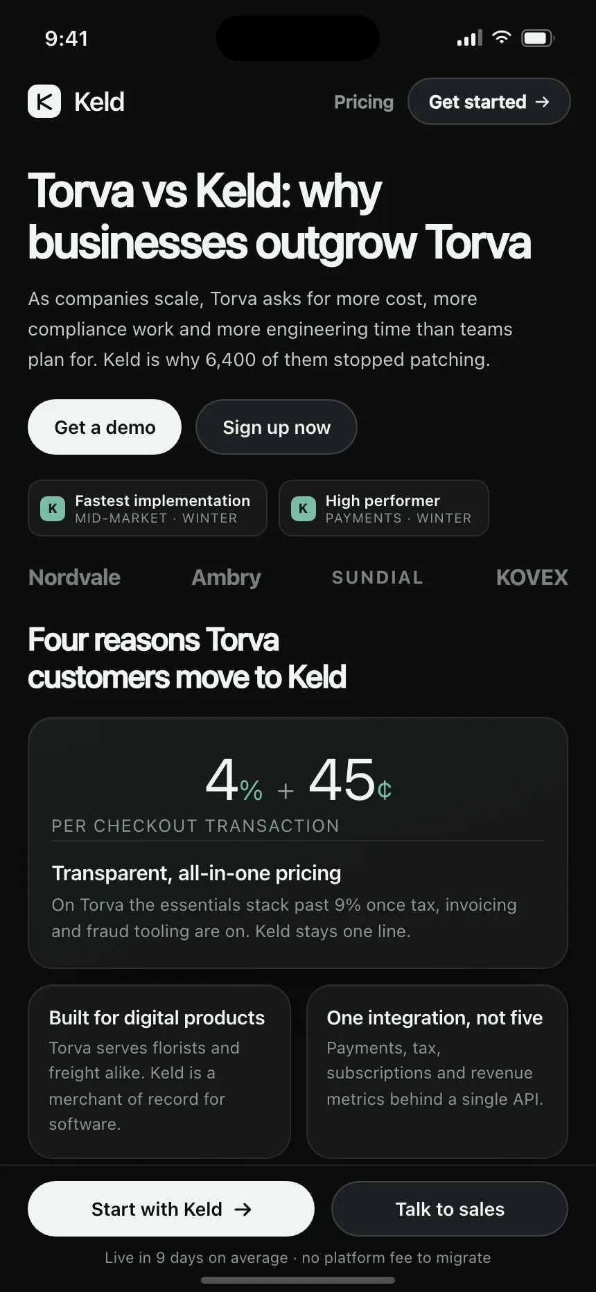
Compare | Keld
Compare
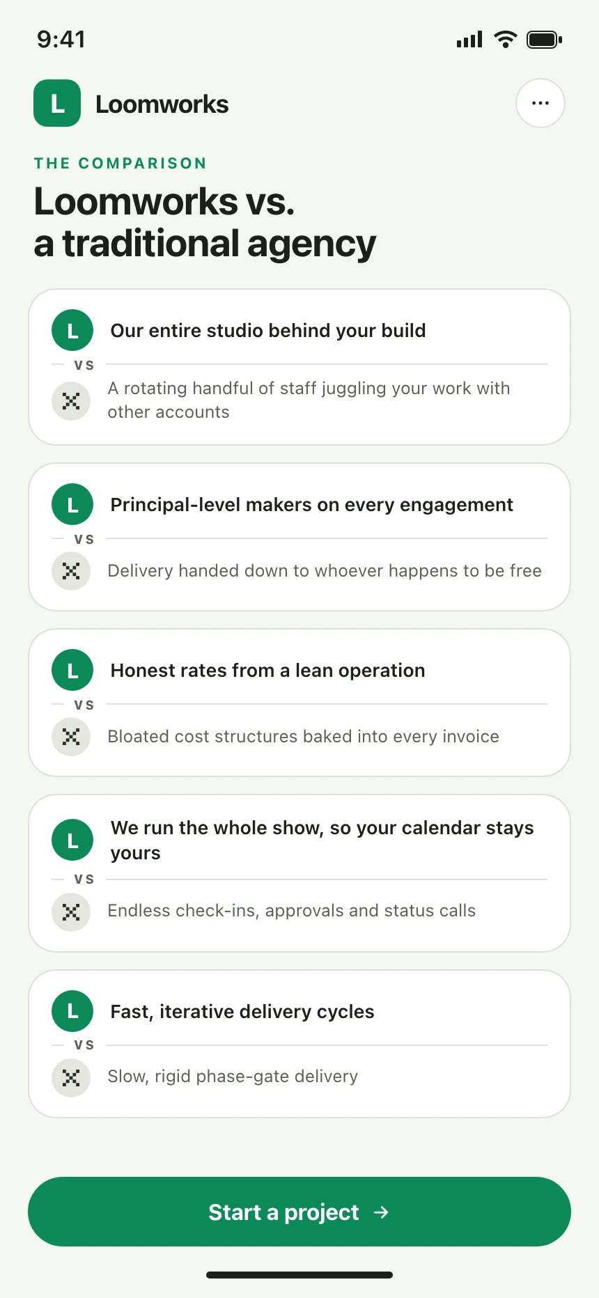
Compare | Loomworks
Compare
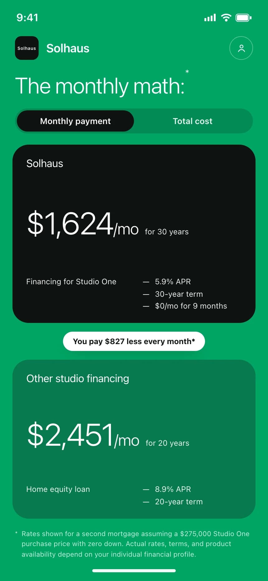
Compare | Solhaus
Compare
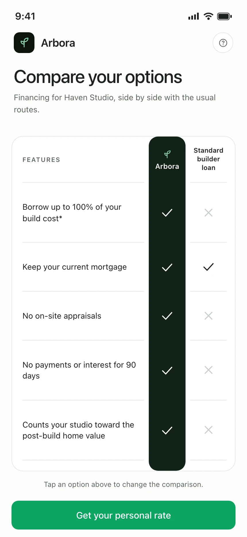
Compare | Arbora