About this design
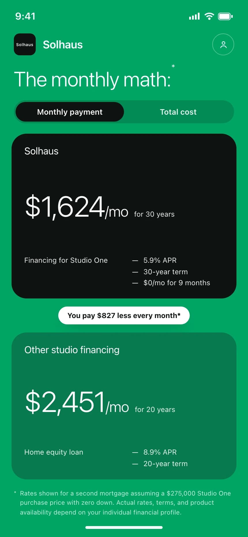
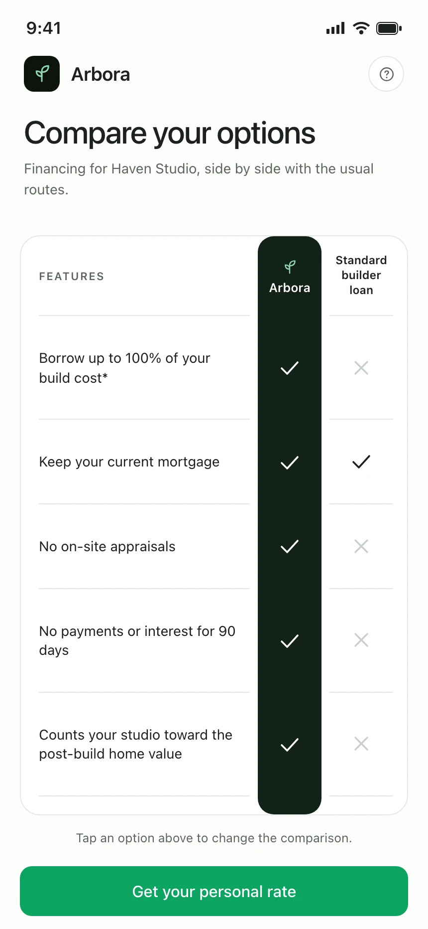
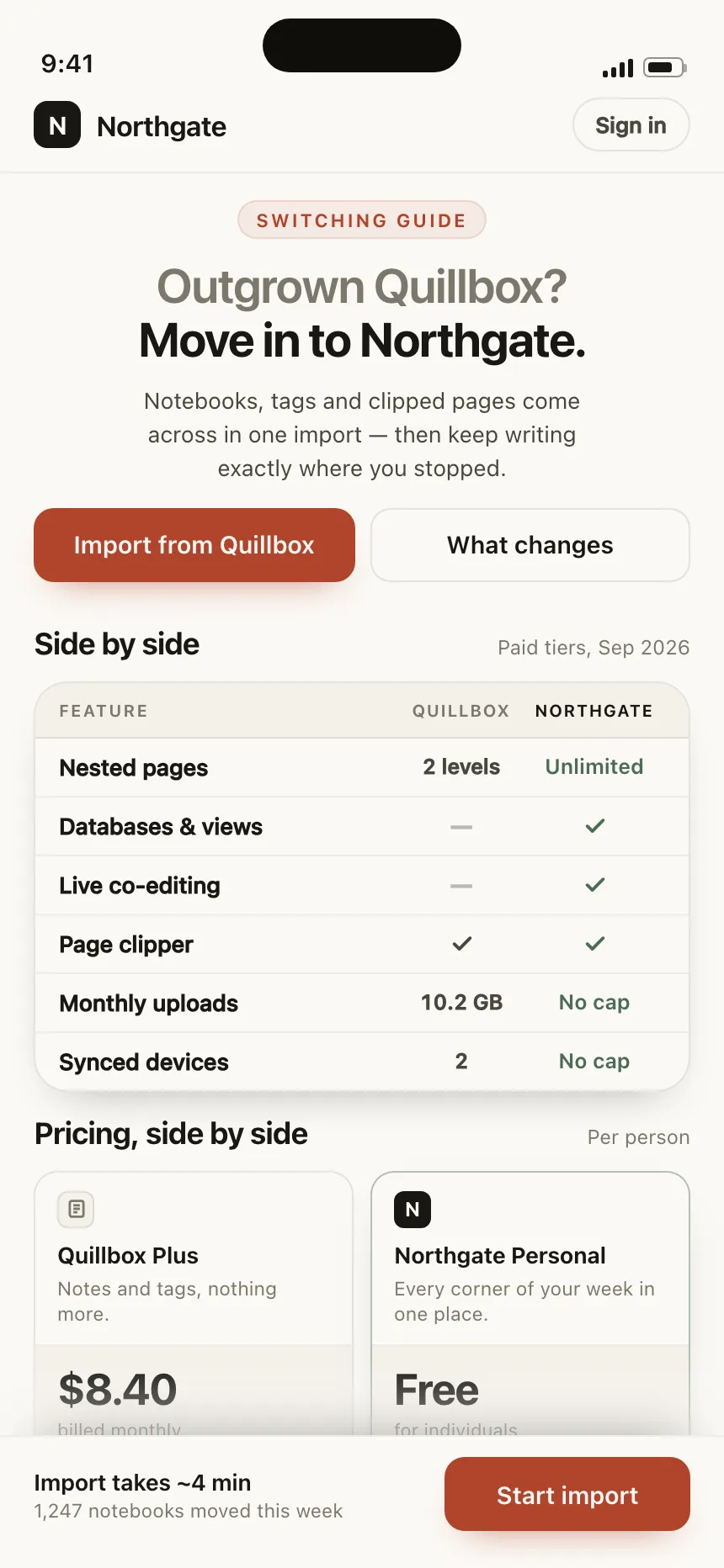
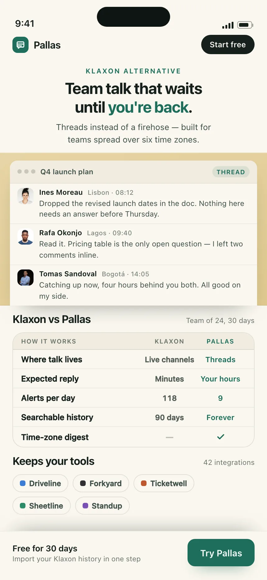
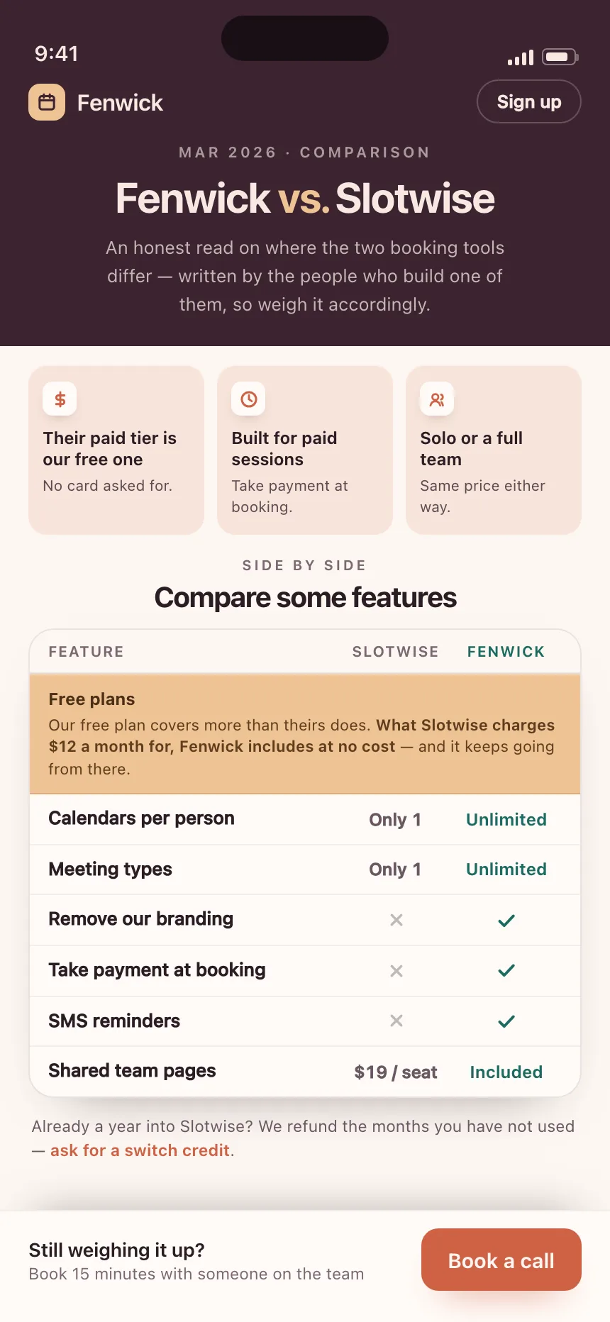
iOS comparison section for Loomworks, a design studio pitching itself against traditional agencies.
- Style
- flat, light off-white canvas, green brand accents, bold black headline.
- Layout
- vertical stack of VS cards running down the screen, full-width CTA at the bottom.