Junos

Compare section#30 of 31Mobile

About this design

Compare section for Mobile: junos versus Harborly, arguing Junos does in one workspace what Harborly splits across four add-ons, trusted by 7,240 teams.

  • Style: cool blue-white page, cobalt accent with amber highlight marks, SF system type.

  • Layout: 430px iOS screen, nav, hero with a highlighted rival name, customer logo row.
  • Components: Request demo nav, logo strip, table with ticks and x marks.

  • Vibe: assertive, marketing-platform, structured — competitor screen.

More Compare sections

View all 31
Compare
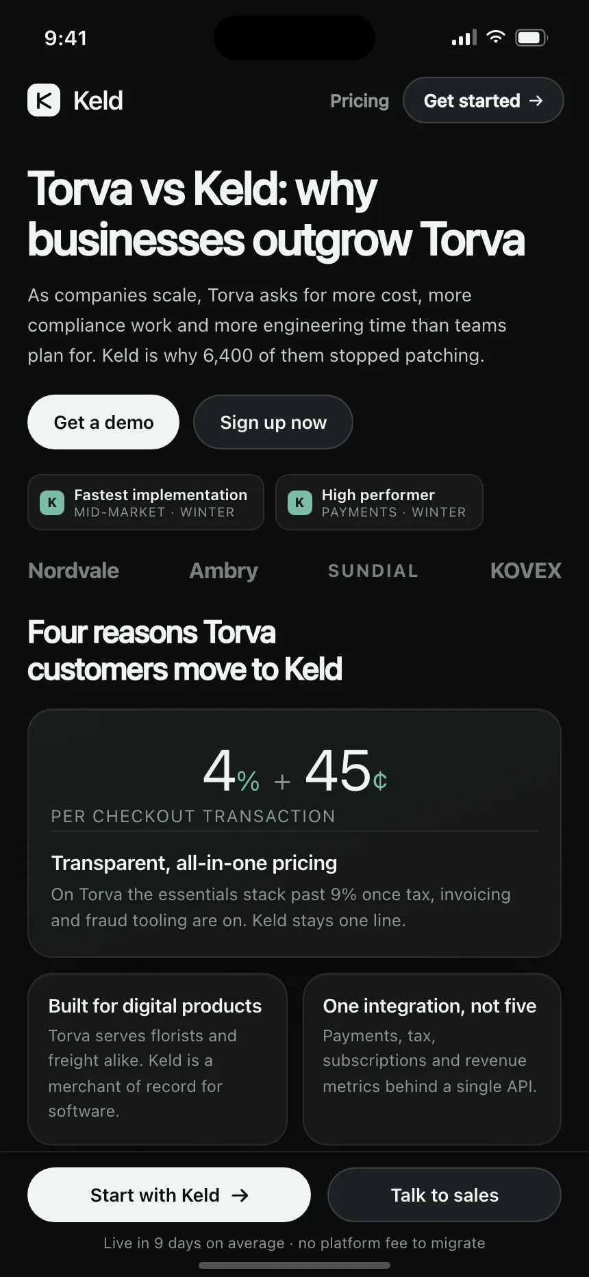
Compare | Keld
Compare
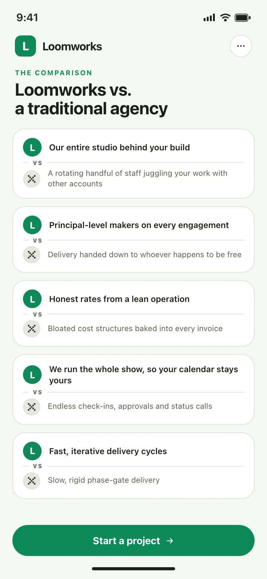
Compare | Loomworks
Compare
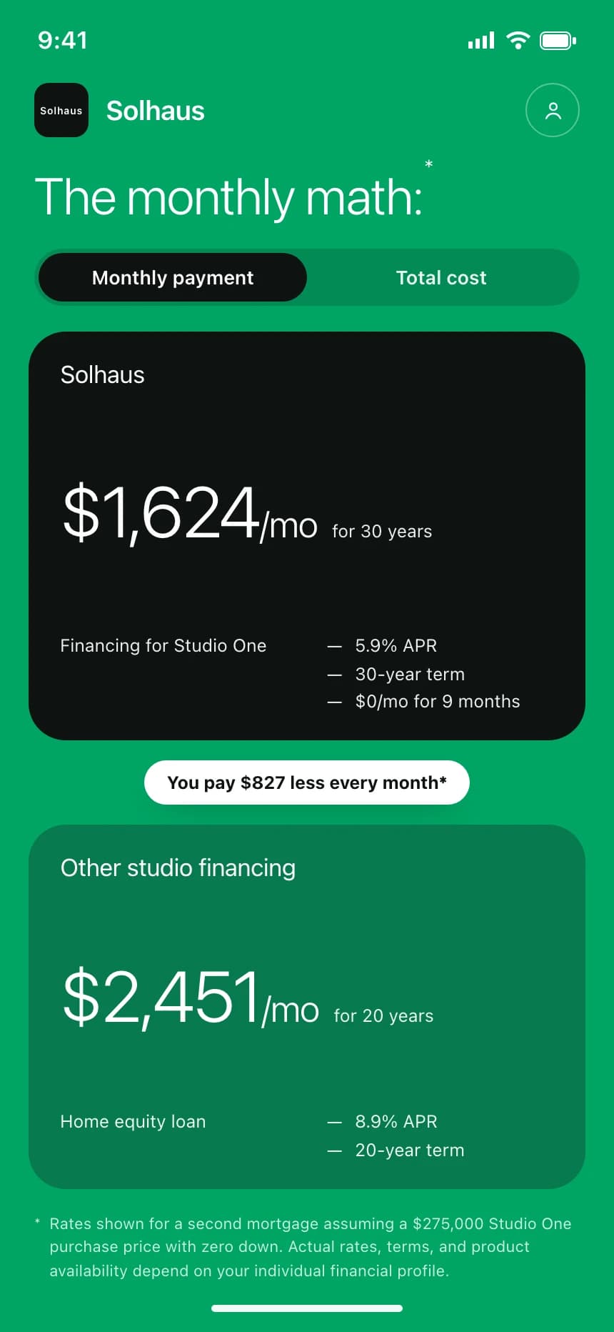
Compare | Solhaus
Compare
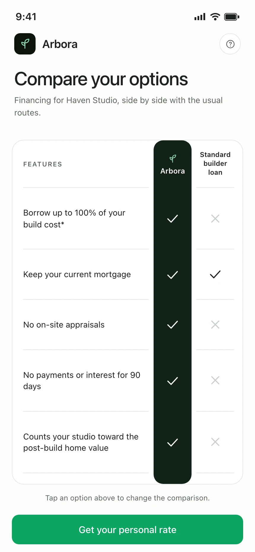
Compare | Arbora
Compare
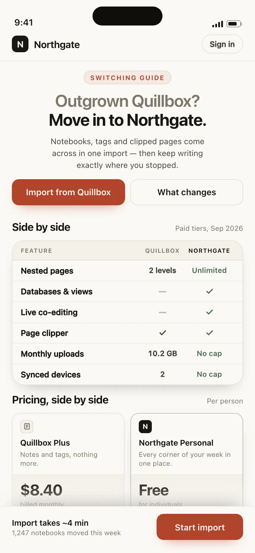
Compare | Northgate
Compare
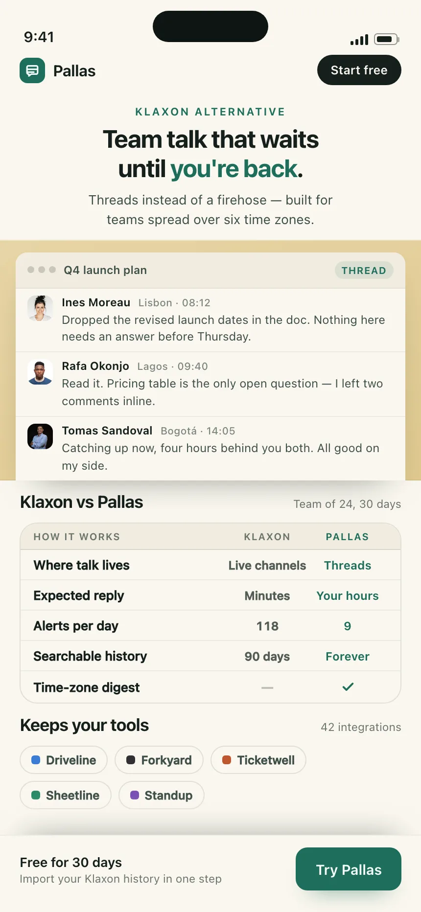
Compare | Pallas