About this design
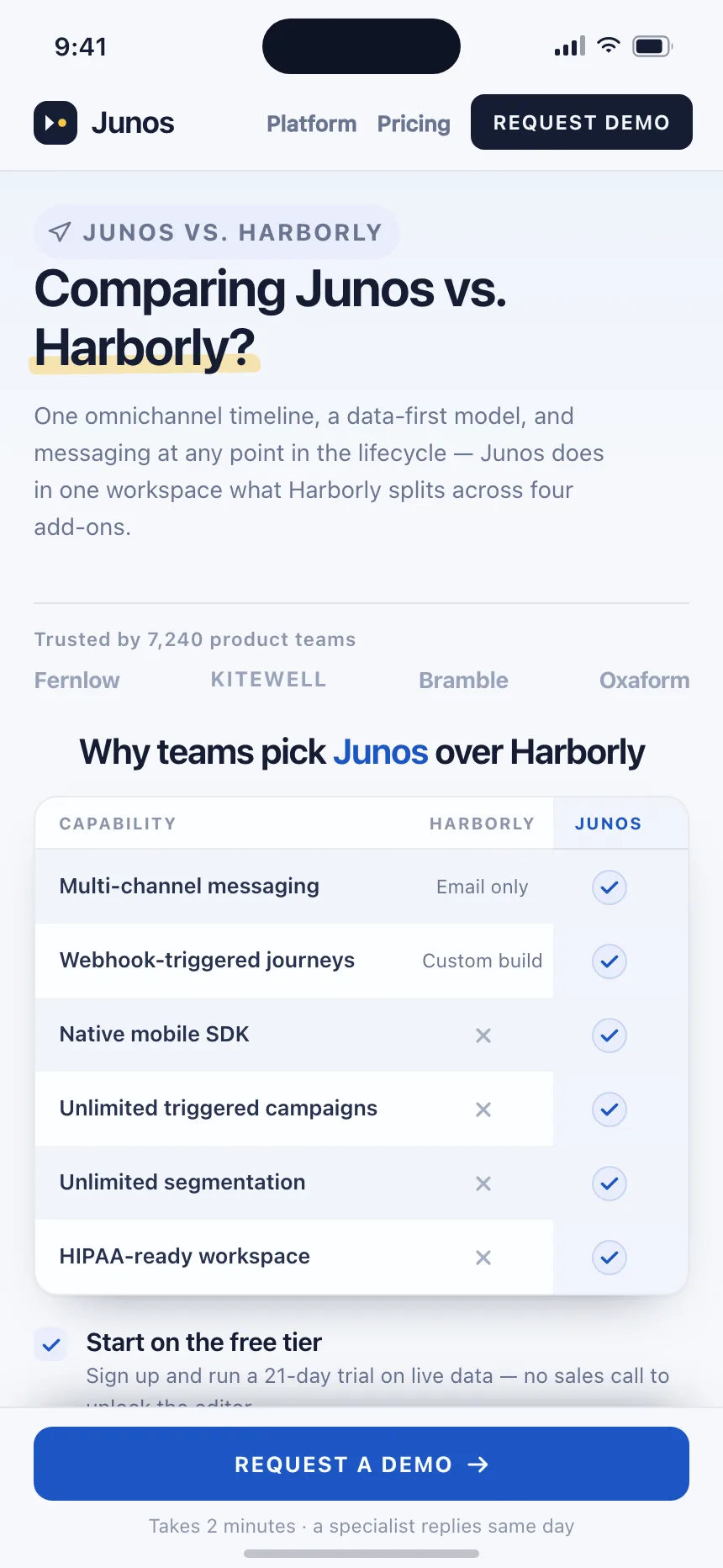
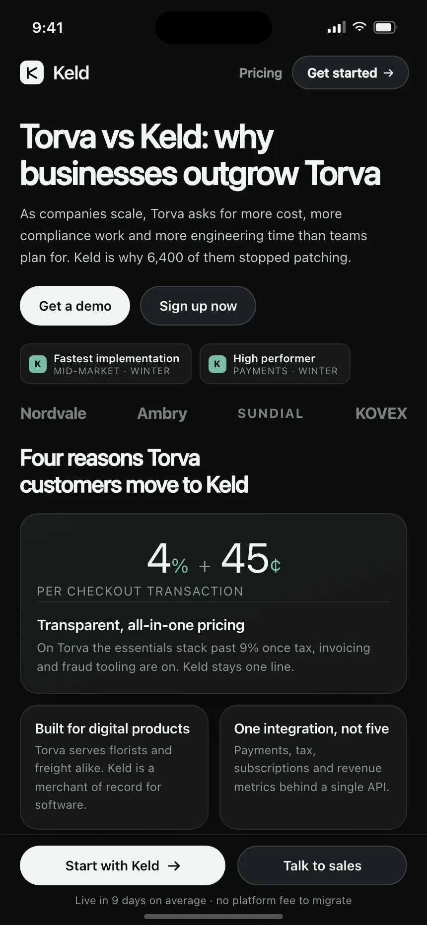
Dunmore as the Strella alternative for B2B product analytics, reading usage at account level with two weeks backfilled free.
- Style
- warm off-white ground, terracotta accent with a plum secondary and green and red yes-no badges, SF system type.
- Layout
- 430px iOS screen, navbar, hero with dual CTAs.