Bellweather

Compare section#23 of 31Mobile

About this design

Compare section for Mobile: bellweather versus Fernpost on form endpoints, contrasting archives kept forever against 30-365 days and free submissions of 60 against 50.

  • Style: warm greige shell with near-white paper, wine-red accent, SF system type.

  • Layout: 430px iOS screen, brand-bar app bar, hero with a single CTA.
  • Components: paired logo tiles, Get started free button, yes/no cells.

  • Vibe: straightforward, no-frills, table-driven — form comparison.

More Compare sections

View all 31
Compare
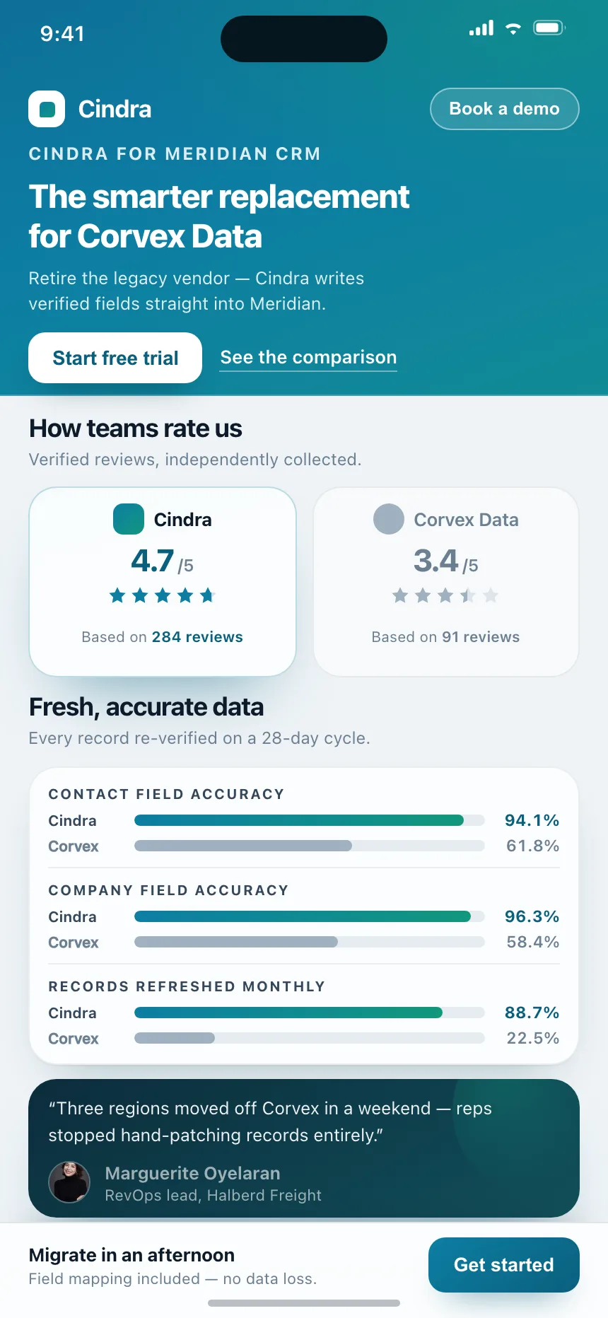
Compare | Cindra
Compare
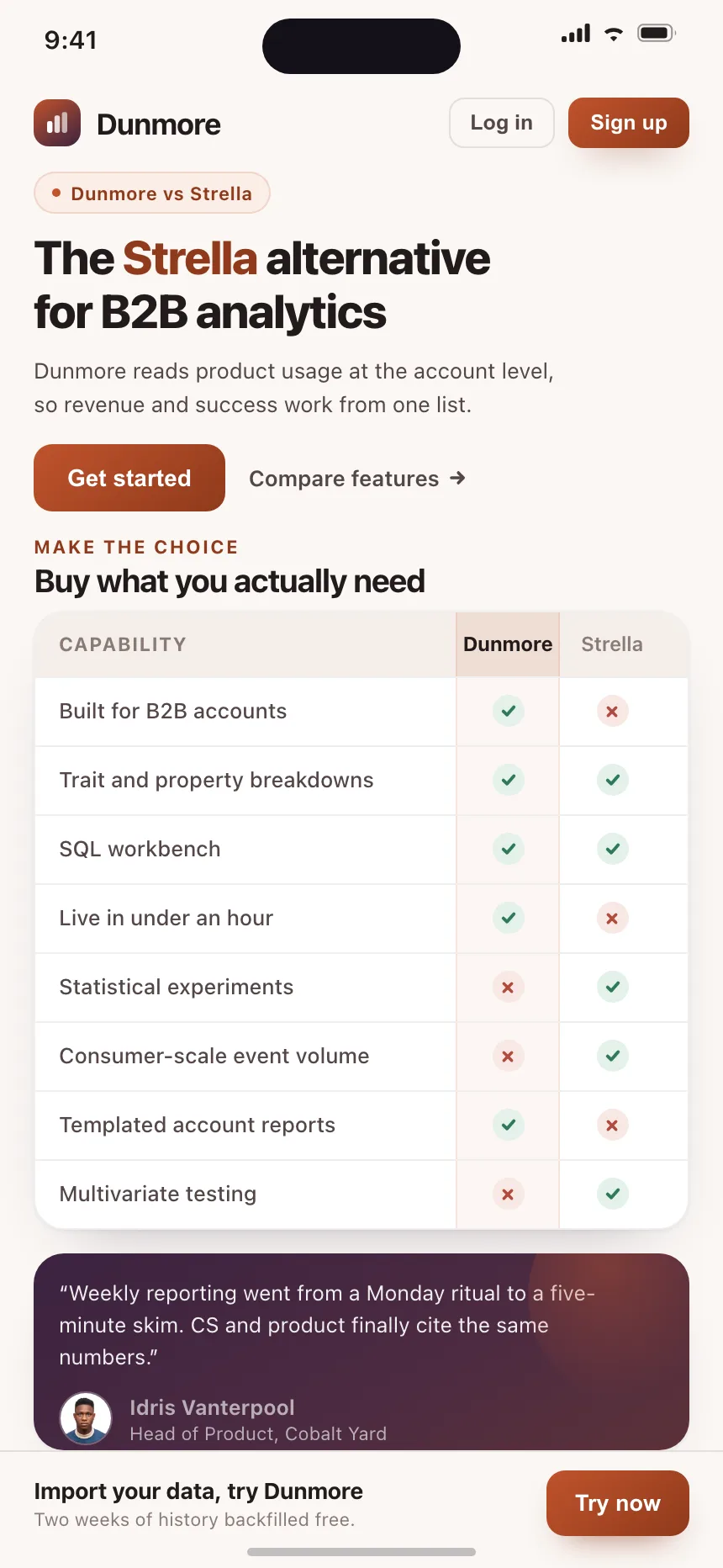
Compare | Dunmore
Compare
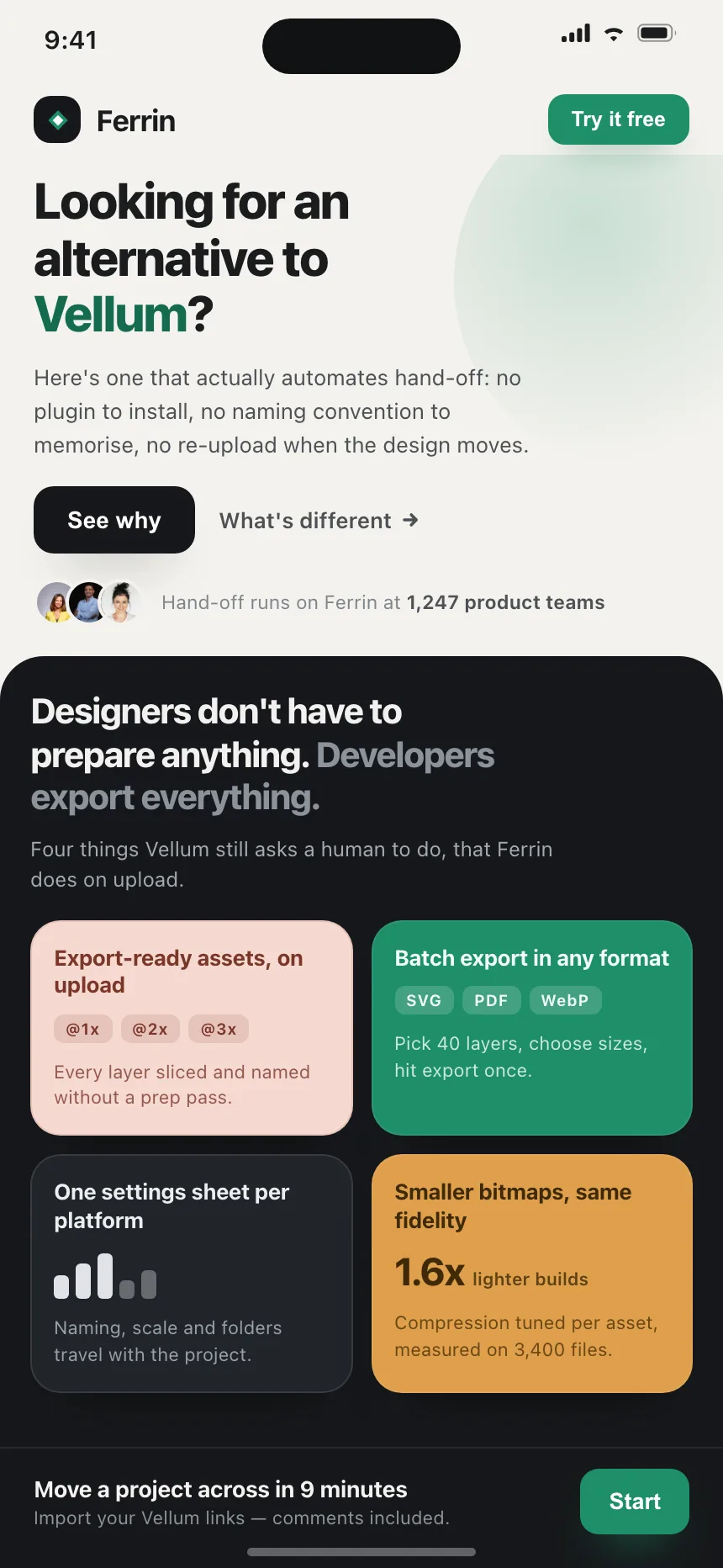
Compare | Ferrin
Compare
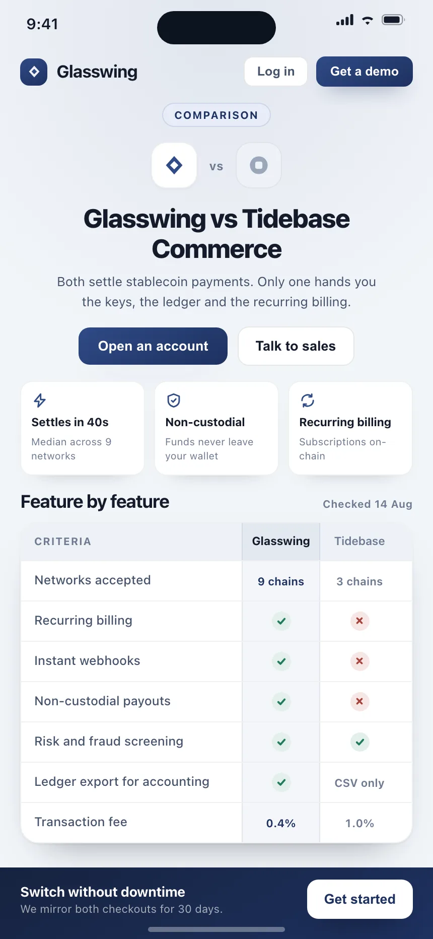
Compare | Glasswing
Compare
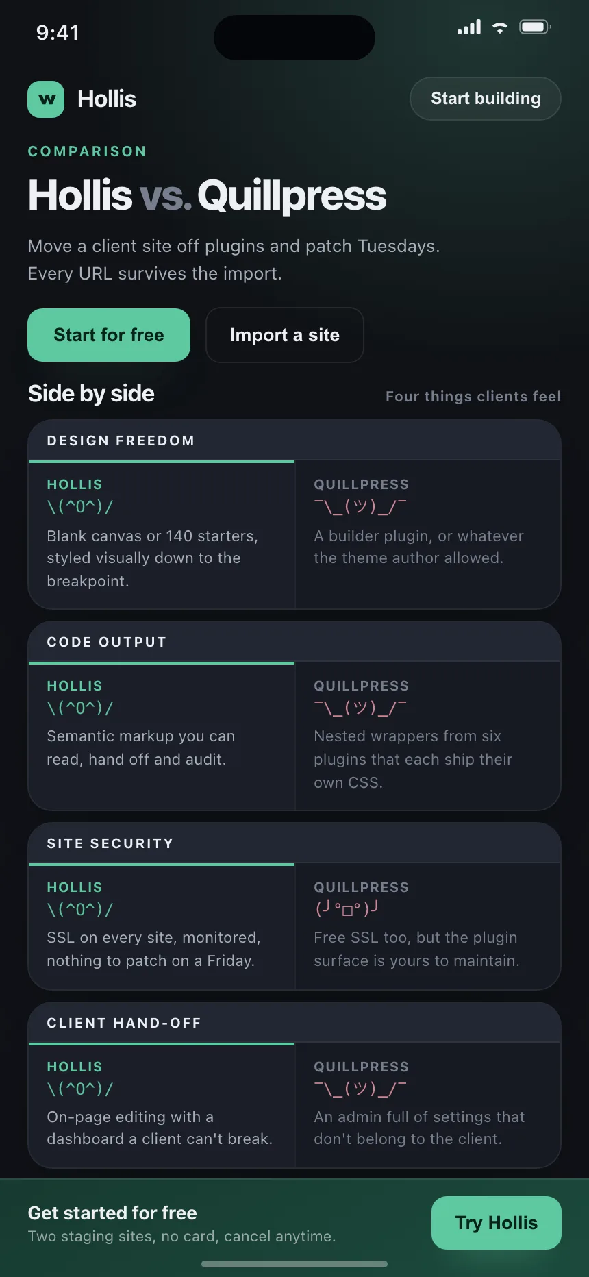
Compare | Hollis
Compare
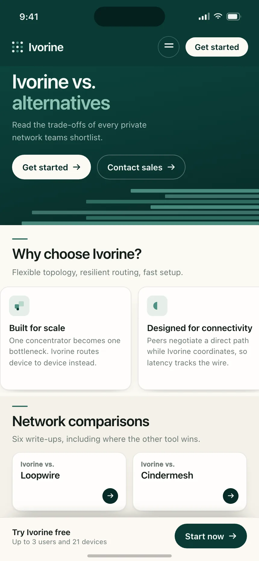
Compare | Ivorine