About this design
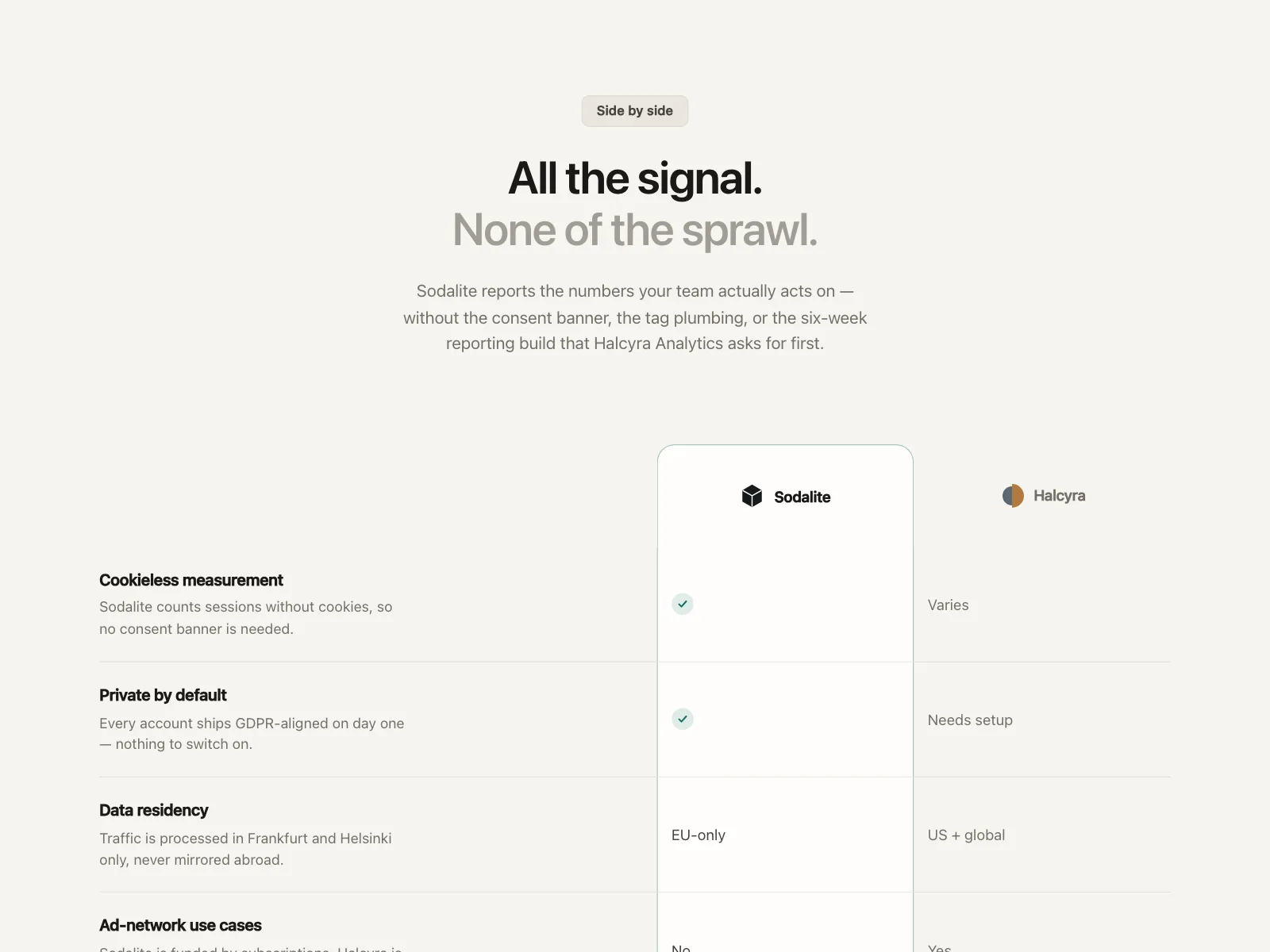
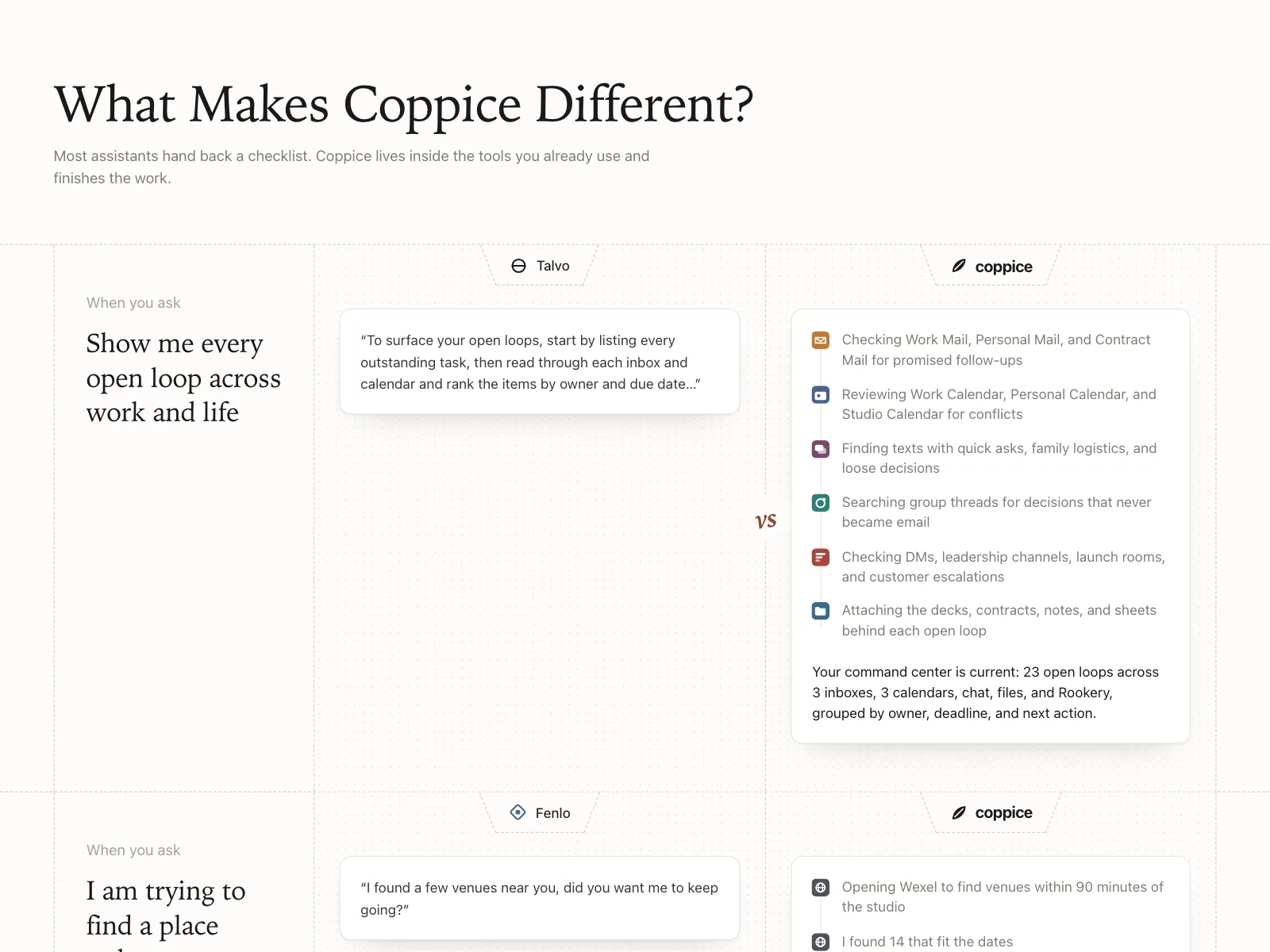
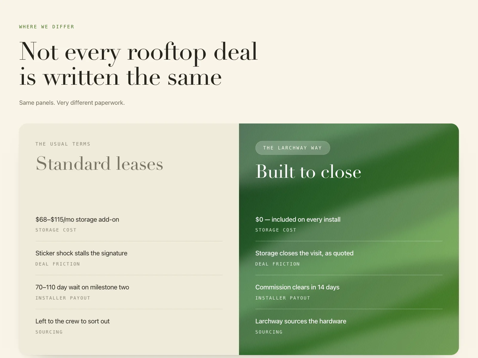
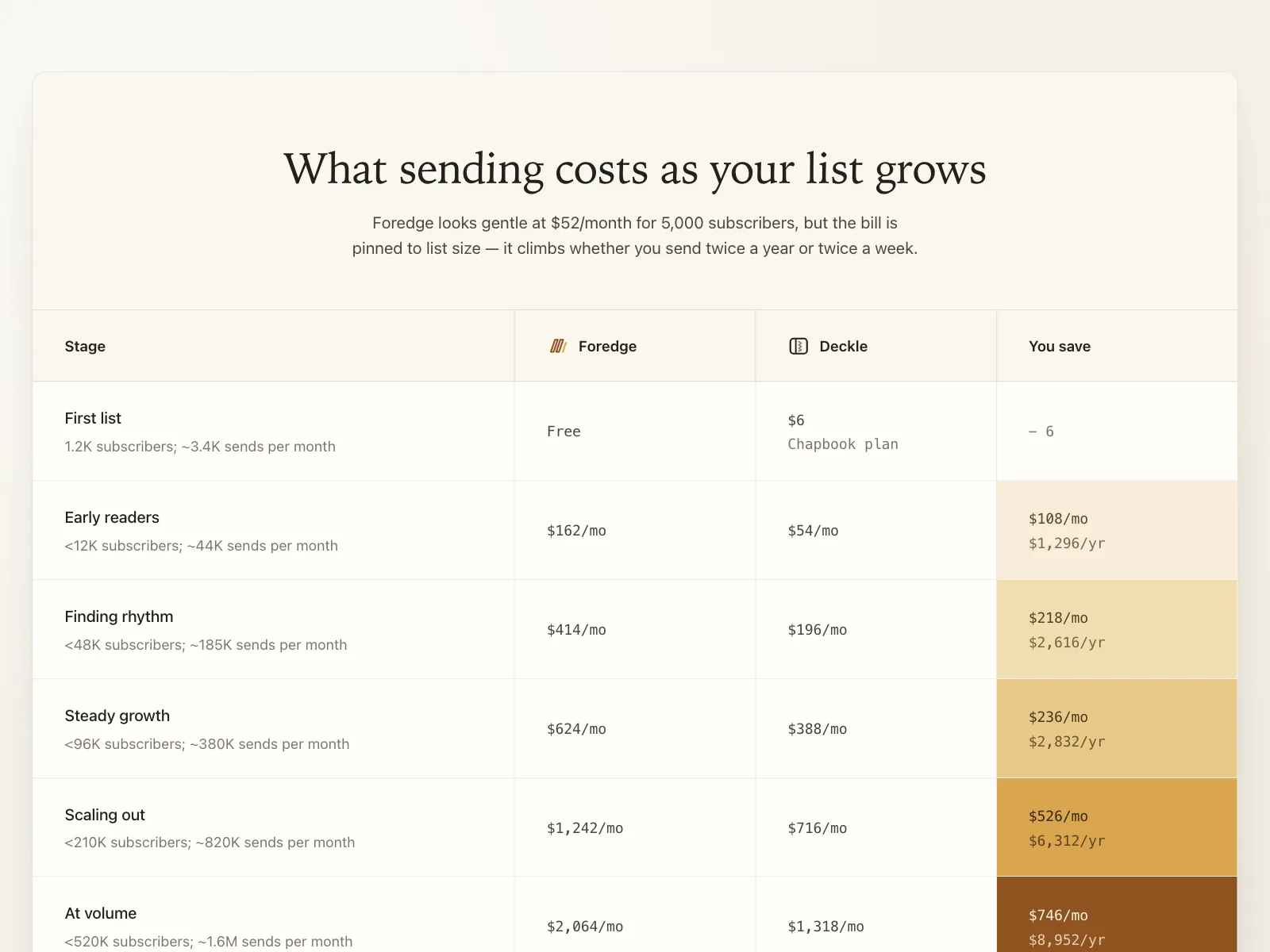
Why-switch comparison section for Vantry, a corporate spend-card platform.
- Style
- flat dark theme, near-black navy canvas, green check icons against pink cross icons, bold white display headline.
- Layout
- centered headline over a split two-column advantages table.