Burin Learn

Compare section#22 of 65Web

About this design

Compare section for Web: comparison section for Burin Learn, an AI-first corporate learning platform contrasted with static course catalogues.

  • Style: minimal, light sage-tinted off-white canvas, oversized bold sans headline, black pill CTA.

  • Layout: centred hero above a two-column comparison table with hairline dividers.
  • Components: Book a walkthrough button, usual-setup versus Burin Learn column headers, bold row labels: programme admin, skills mapping, course building.

  • Vibe: assured, corporate, L&D enterprise.

More Compare sections

View all 65
Compare
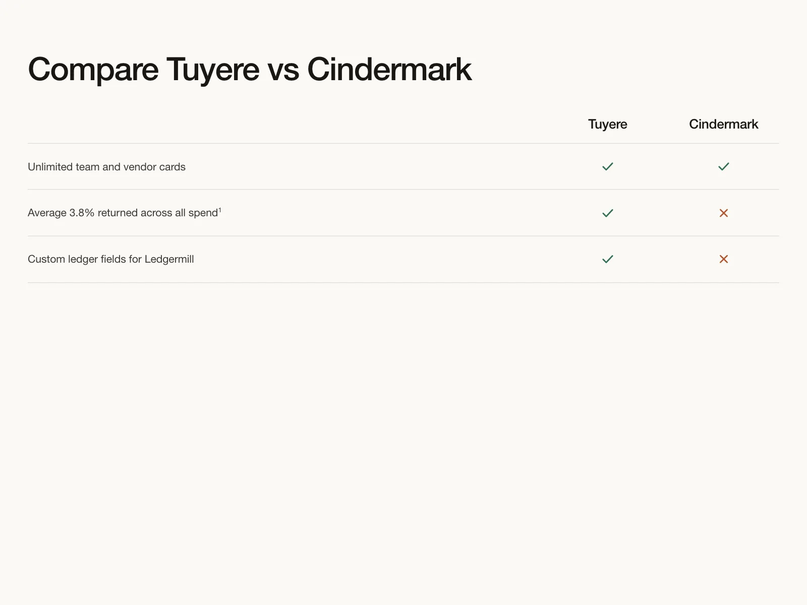
Compare | Tuyere
Compare
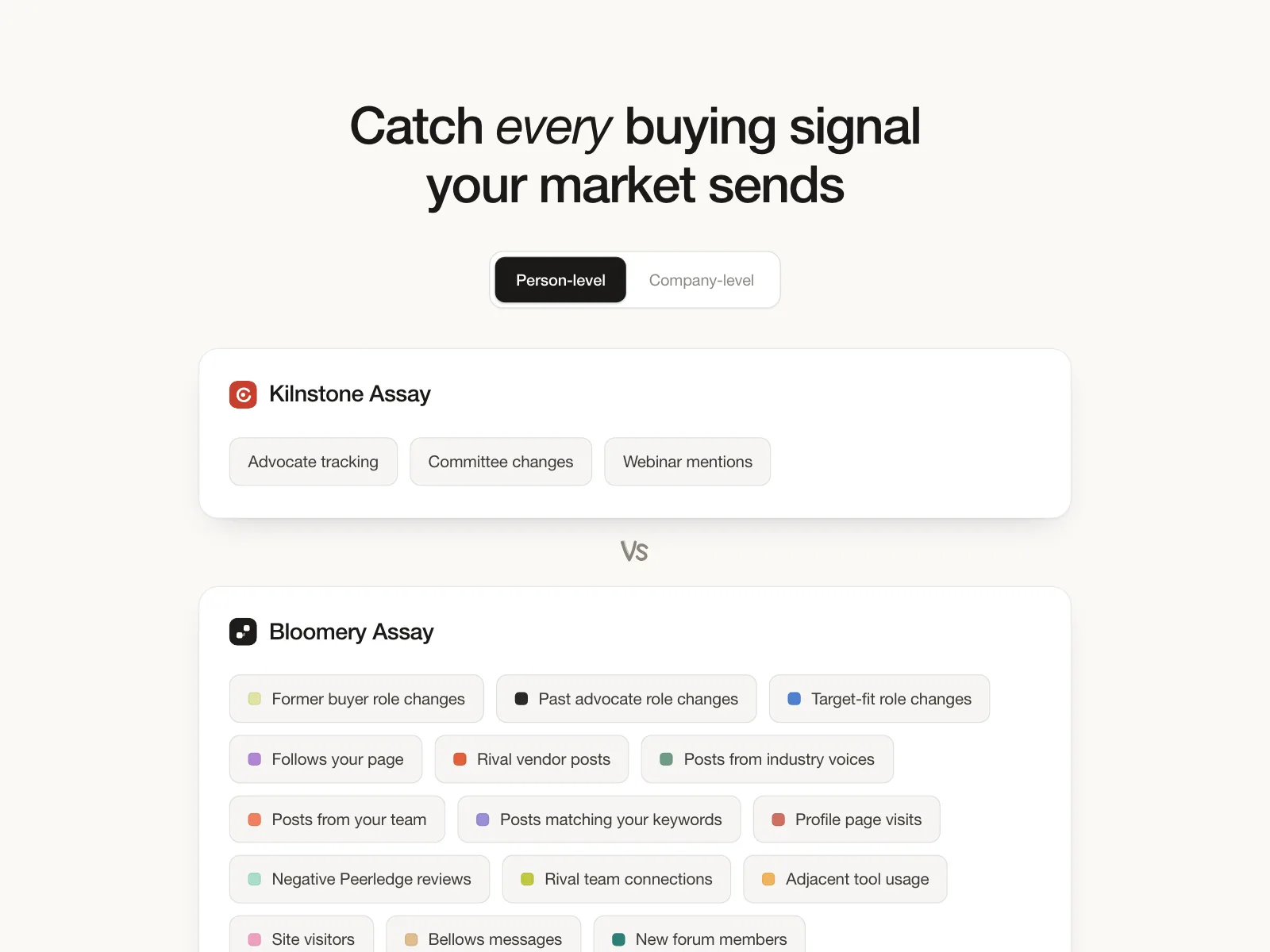
Compare | Bloomery Assay
Compare
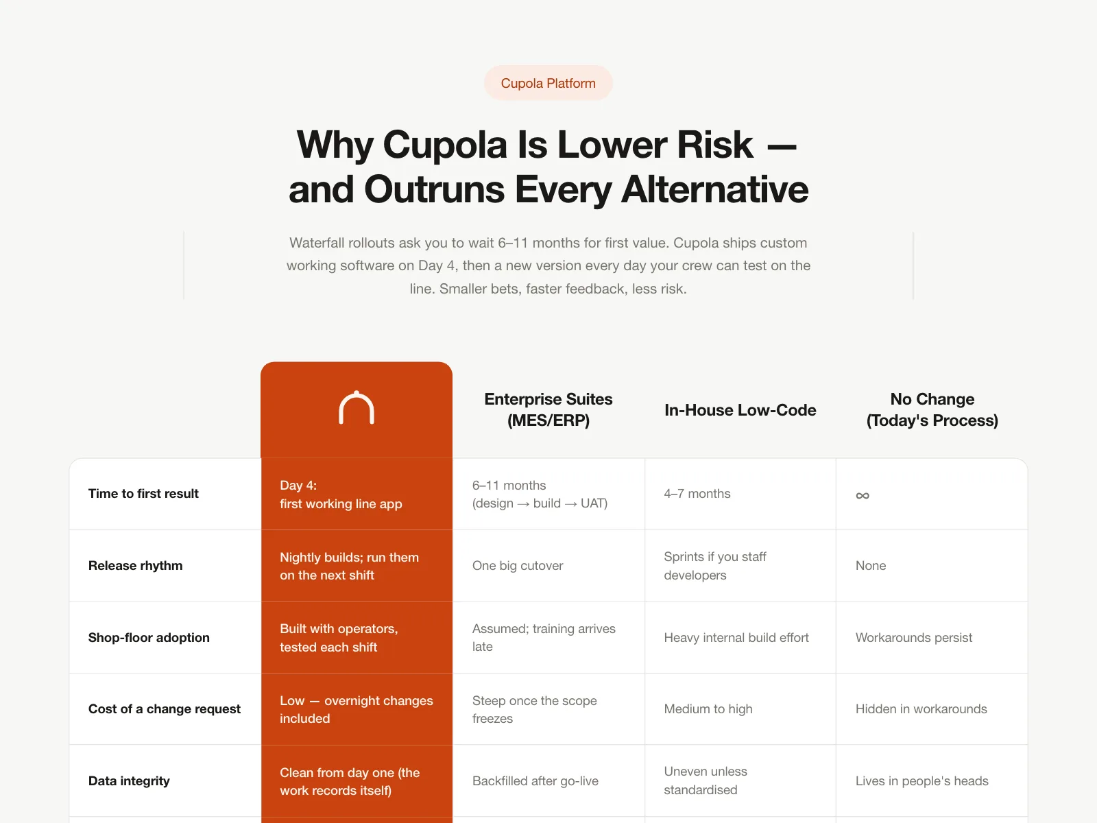
Compare | Cupola Platform
Compare
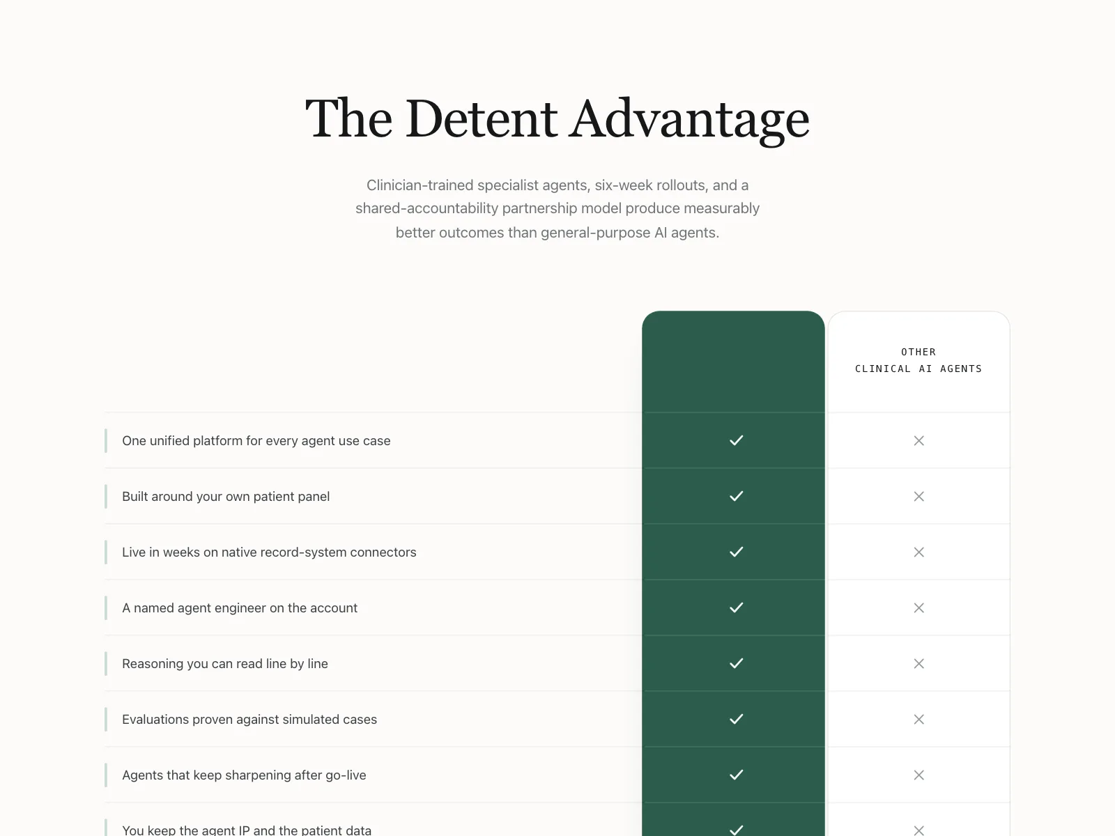
Compare | Detent