Lexora

Checklist section#16 of 51Web

About this design

Checklist section for Web: plan upgrade step in Lexora's onboarding, comparing Starter with Plus.

  • Style: warm bone canvas, navy progress bars and primary button, peach Plus tab, subtle grey comparison shading.

  • Layout: logo, five-segment progress, centered headline and subhead, a feature comparison card, then stacked CTAs.

  • Components: Starter/Plus toggle tabs, five feature rows with grey and black check marks.

  • Vibe: persuasive, tidy, considered — writing app upsell.

More Checklist sections

View all 51
Checklist
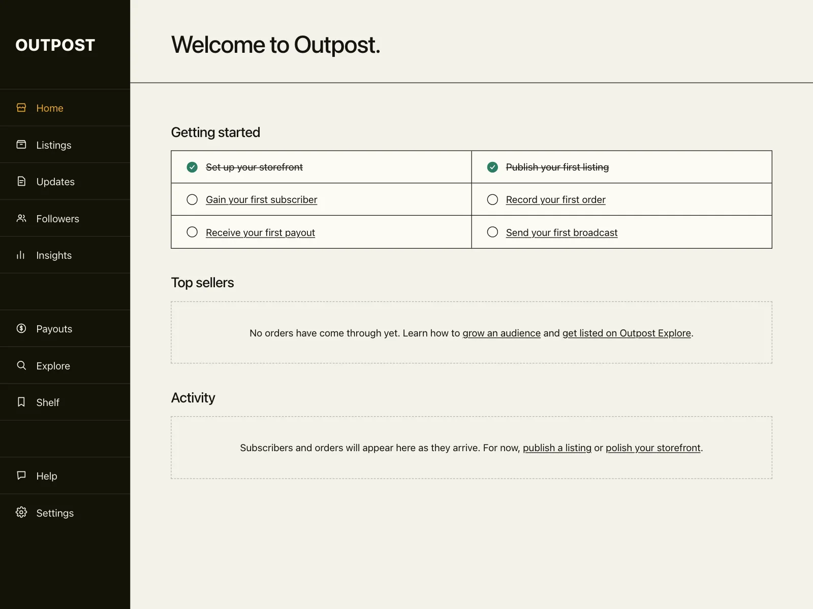
Checklist | #17, Outpost
Checklist
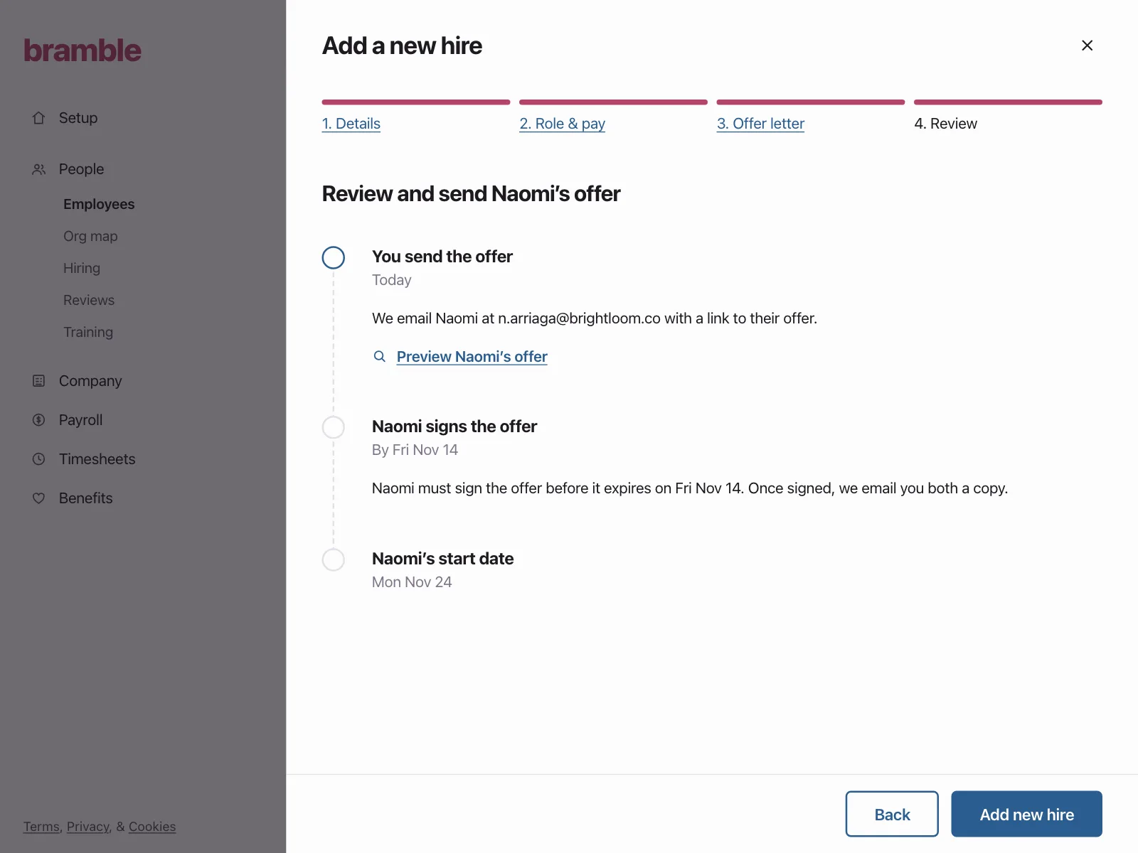
Checklist | #18, Bramble
Checklist
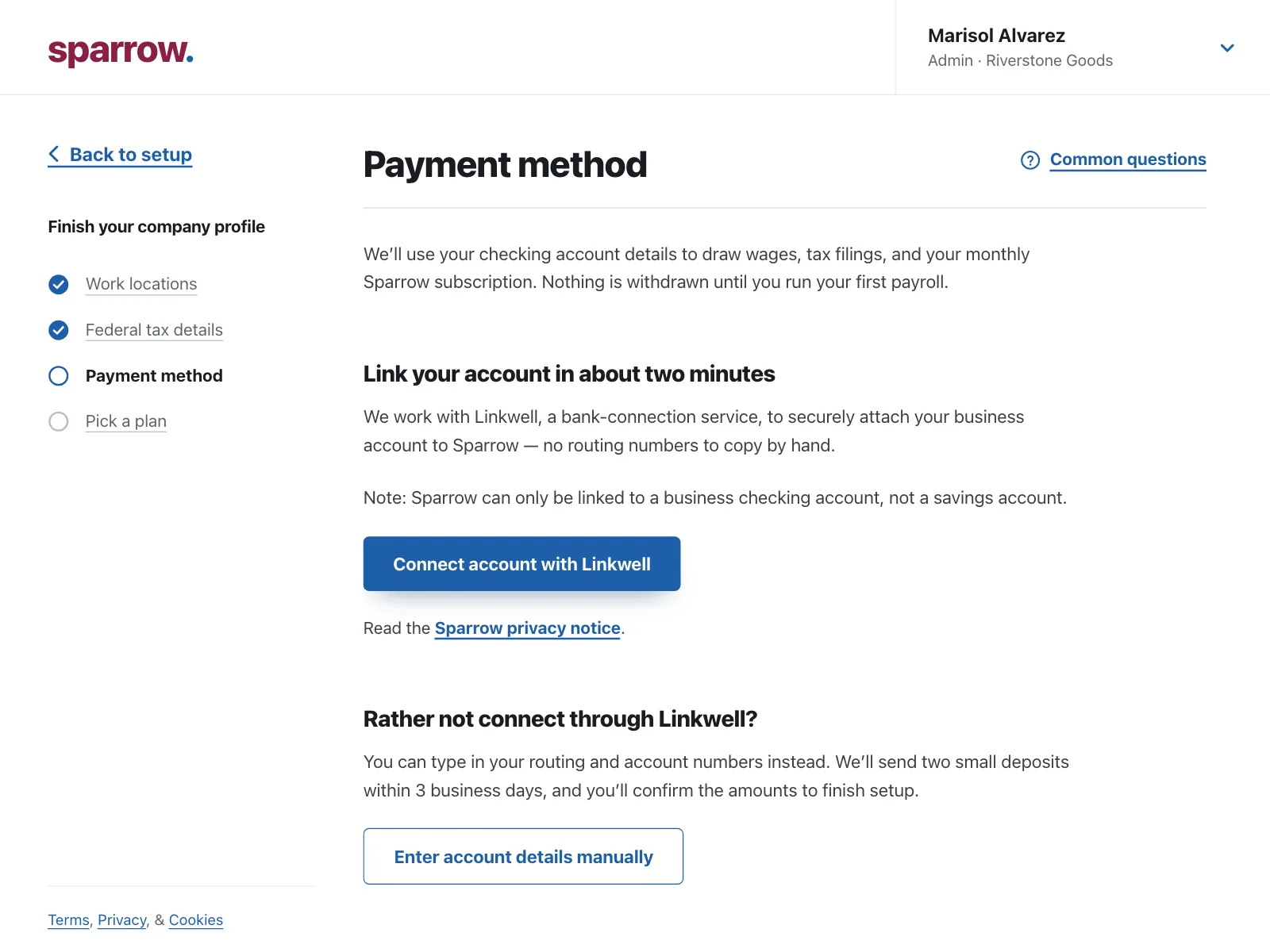
Checklist | #19, Sparrow
Checklist
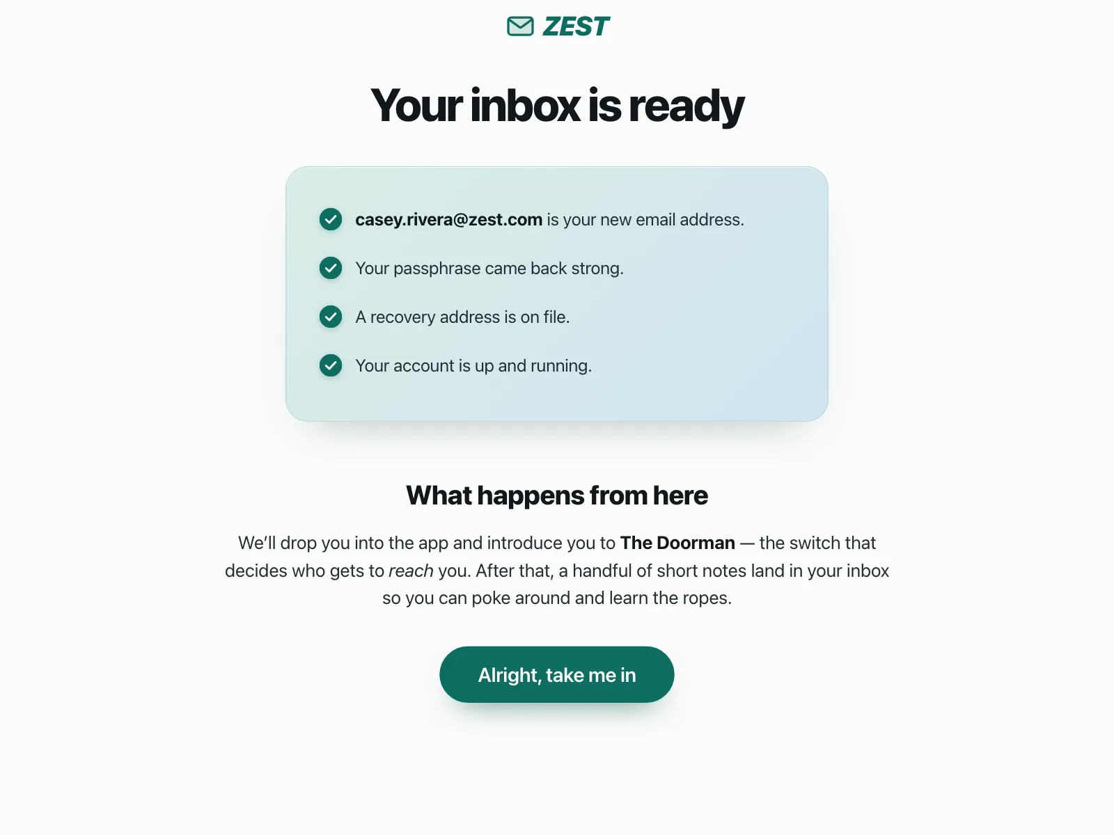
Checklist | #20, Zest