Back to Examples
Slipstream
Charts
Use this section to import its canvas into your workspace, then remix it into your own design — same layout, components & styling.
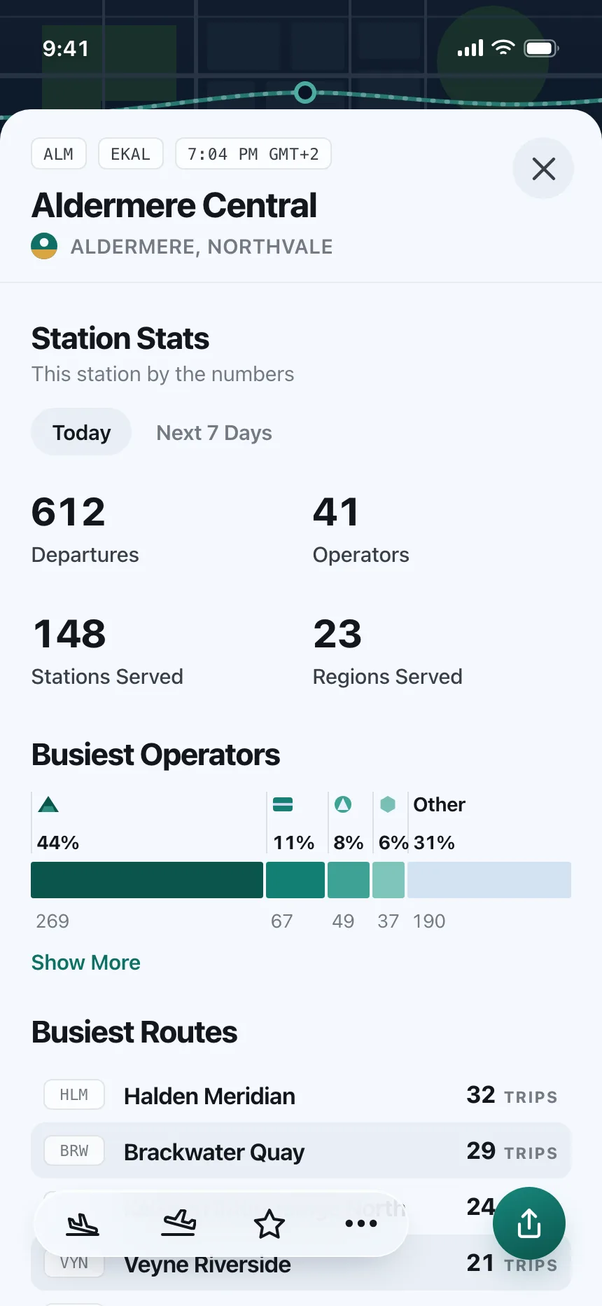
Gate departures screen charting hourly flight punctuality at one airport. Style: light mode, near-white sheet over an olive airfield map, blue accent, amber and red status hues. Layout: map header, filter row, hourly chart, then a flight list. Components: stacked hour columns with a now marker, on-time to diverted legend, scheduled versus actual times, gate chips. Vibe: operational, timetable-like, dense — aviation data.