Tailwind CSS is a widely used utility-first framework that simplifies building modern, responsive web applications. When paired with Next.js, it enables you to create fast, scalable, and highly optimized applications with minimal effort.
In this guide, we’ll cover the complete process of using Tailwind CSS with Next.js, including both automatic installation (when creating a new Next.js app) and manual installation (for existing projects). Additionally, we’ll walk through building a custom Next.js project styled with Tailwind and explore theme customization with fonts and colors.
Prerequisites
Before proceeding ahead, make sure you have the following:
- Knowledge of Next.js and Tailwind.
- An IDE - VS Code, Cursor, etc.
- Node v18.18 or above and npm installed.
Create Next.js app(with Tailwind pre-installed)
From Next.js 13 onwards, you can create a Next.js app with Tailwind pre-installed. Follow the steps below to create a Next.js and Tailwind app:
Step 1: Go to the concerned directory, open the terminal and run the following command:
npx create-next-app@latest
Step 2: On installation, you will be asked the below questions. Select Yes for Tailwind CSS to ensure that the project comes with Tailwind pre-installed. Keep default settings for the rest or change as per your project's configuration.
What is your project named? my-app
Would you like to use TypeScript? No / Yes
Would you like to use ESLint? No / Yes
Would you like to use Tailwind CSS? No / Yes
Would you like your code inside a `src/` directory? No / Yes
Would you like to use App Router? (recommended) No / Yes
Would you like to use Turbopack for `next dev`?  No / Yes
Would you like to customize the import alias (`@/*` by default)? No / Yes
What import alias would you like configured? @/*
Once the installation is finished, create-next-app will create a Next.js app with your project name and installed dependencies.
Install Tailwind manually
If you already have an active Next.js project, install Tailiwind CSS manually. Go to your Next.js project, open the terminal, and follow the steps below:
Step 1: Install Tailwind & dependencies
Run the following command to install Tailwind CSS and its peer dependencies:
npm install tailwindcss @tailwindcss/postcss postcss
Step 2: Set up PostCSS plugins
Create a postcss.config.mjs file in your project's root and include @tailwindcss/postcss in the configuration.
const config = {
  plugins: {
    '@tailwindcss/postcss': {},
  },
};
export default config;
Step 3: Import Tailwind
Add @import to ./src/app/globals.css to import Tailwind CSS into your project.
@import 'tailwindcss';
Step 4: Run build process
Start the dev server with npm run dev
npm run dev
Step 5: Use Tailwind classes
Now, you can use any Tailwind CSS utility class to style your project.
export default function Home() {
  return <h1 className="text-2xl font-bold">Welcome to Next.js!</h1>;
}
Build a social media card with Next.js and Tailwind
In this section, we'll learn how to build a social media card in Next.js and style it with Tailwind. The complete code of the project can be found in the below CodeSandbox.
Component structure
In our implementation, we've adopted a modular approach by breaking down the social media card into smaller, focused components. The architecture follows a hierarchical pattern where each component is responsible for a specific aspect of the UI.
At the top level, we have the Home component in page.jsx that serves as the main container. Within it, the SocialFeed component orchestrates the display and navigation between posts. The SocialFeed component manages the state for post navigation and renders individual Post components, which are composed of smaller, specialized components like Avatar, UserInfo, and InteractionBar.
Home (page.jsx)
│
└── SocialFeed
    │
    ├── SliderIcons
    │   ├── PrevIcon
    │   └── NextIcon
    │
    └── Post
        ├── Avatar (Next/Image)
        ├── UserInfo
        ├── PostContent (Next/Image)
        └── InteractionBar
            └── InteractionButton
                ├── HeartIcon
                ├── CommentIcon
                └── ShareIcon

Configuration
├── next.config.js
│
└── data
    └── postsData.js
Build core components
In this section, we have covered implementation of some of our core components.
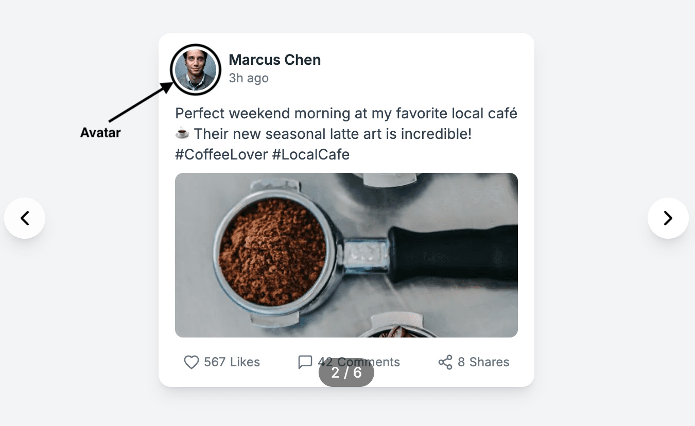
1. Avatar Component
The h-10 w-10 classes with rounded-full creates a circular container of fixed size. We use relative positioning to properly contain the Next.js Image component, and overflow-hidden ensures the image doesn't spill outside its circular boundary.
The priority prop in the Image component ensures that avatar images load immediately.
import Image from 'next/image';

const Avatar = ({ src, alt }) => (
  <div className="h-10 w-10 relative rounded-full overflow-hidden">
    <Image
      src={src}
      alt={alt}
      fill
      className="object-cover"
      sizes="40px"
      priority
    />
  </div>
);
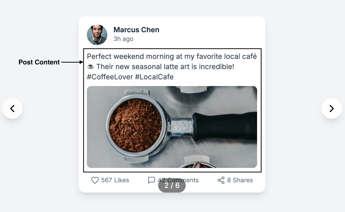
2. Post content component
The PostContent component handles the main content of our social media card, including both text and images.
The component handles both text-only and image-with-text posts gracefully through conditional rendering. The image section only renders when an image URL is provided, making the component flexible enough to handle various types of content.
The spacing utilities (mt-3, mb-2) and typography utilities (text-sm, text-gray-700) further ensure a clean and readable UI.
import Image from 'next/image';

const PostContent = ({ text, image }) => (
  <div className="mt-3">
    <p className="text-sm text-gray-700 mb-2">{text}</p>
    {image && (
      <div className="relative w-full h-40 rounded-lg overflow-hidden">
        <Image
          src={image}
          alt="Post content"
          fill
          className="object-cover"
          sizes="(max-width: 365px) 100vw, 365px"
        />
      </div>
    )}
  </div>
);
3. Interaction System
Our interaction system consists of custom SVG icons and interactive buttons.
const InteractionButton = ({ Icon, count, label }) => (
  <button className="flex items-center space-x-1 text-gray-500 hover:text-gray-700">
    <Icon />
    <span className="text-xs">{count}</span>
    <span className="text-xs">{label}</span>
  </button>
);
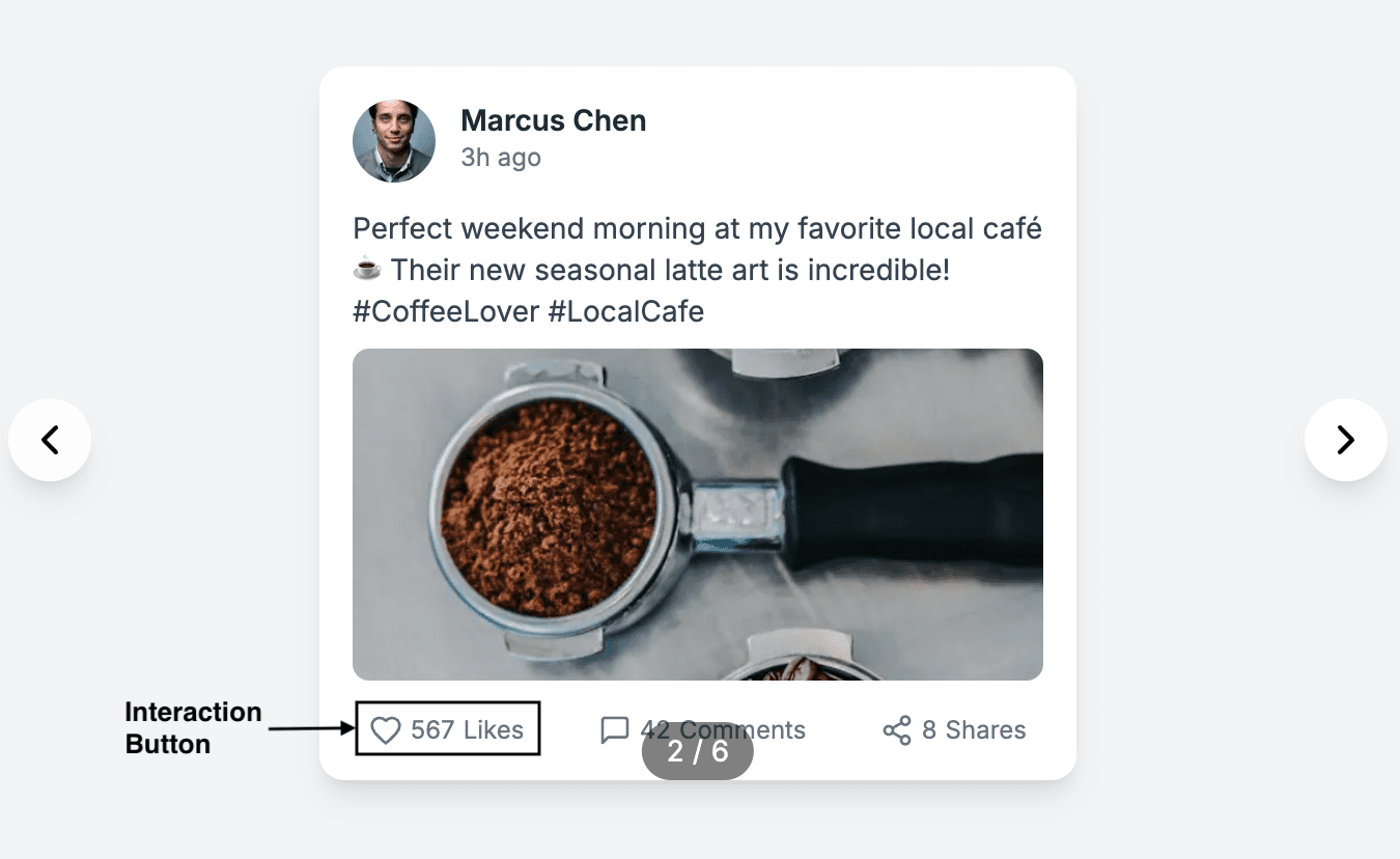
We've created a consistent visual language using gray tones from Tailwind's color palette, with lighter shades for the default state and darker ones for hover interactions.
We've also implemented custom SVG icons that maintain consistent styling with our overall design system. These icons are optimized for size and accessibility:
export const HeartIcon = () => (
  <svg
    xmlns="http://www.w3.org/2000/svg"
    width="16"
    height="16"
    viewBox="0 0 24 24"
    fill="none"
    stroke="currentColor"
    strokeWidth="2"
    strokeLinecap="round"
    strokeLinejoin="round"
    aria-label="Like"
  >
    <path d="M12 21.35l-1.45-1.32C5.4 15.36 2 12.28 2 8.5 2 5.42 4.42 3 7.5 3c1.74 0 3.41.81 4.5 2.09C13.09 3.81 14.76 3 16.5 3 19.58 3 22 5.42 22 8.5c0 3.78-3.4 6.86-8.55 11.54L12 21.35z" />
  </svg>
);
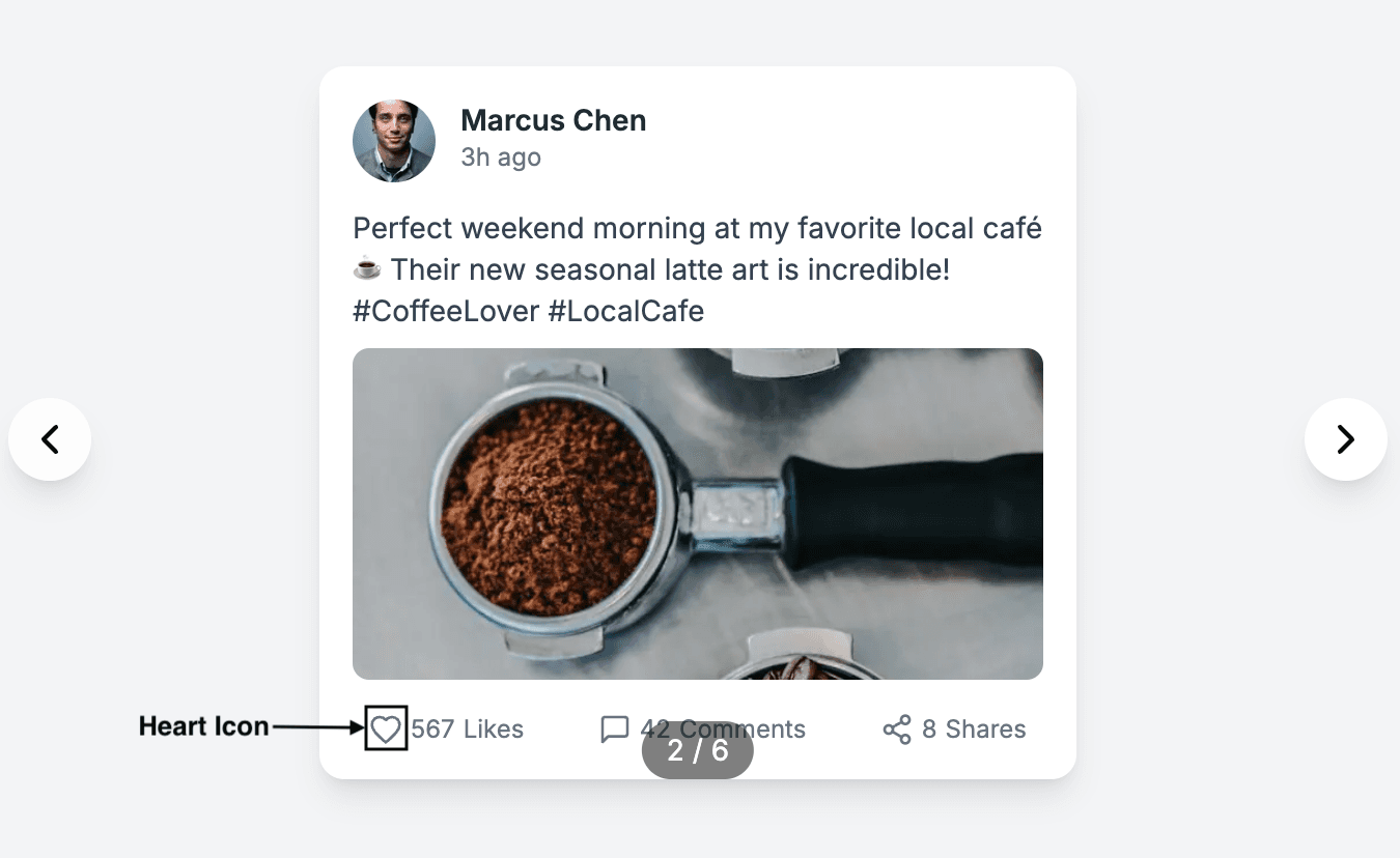
Image optimization
Next.js's <Image /> component provides several crucial benefits for our social media card implementation. By replacing standard <img> tags with next/image, we gain automatic image optimization, efficient lazy loading, and reduced Cumulative Layout Shift (CLS).
Our configuration in next.config.js enables secure image loading from Unsplash:
/** @type {import('next').NextConfig} */
const nextConfig = {
  images: {
    remotePatterns: [
      {
        protocol: 'https',
        hostname: 'images.unsplash.com',
        pathname: '/**',
      },
    ],
  },
};

module.exports = nextConfig;
This allows us to optimize external images while maintaining security through specific domain allowlisting.
One of the most significant advantages of using Next.js's Image component is its built-in optimization pipeline. Images are automatically served in modern formats like WebP when supported by the browser. The Image component also provides automatic lazy loading, meaning images outside the viewport aren't loaded until they're needed.
<Image
  src={image}
  alt="Post content"
  fill
  className="object-cover"
  sizes="(max-width: 365px) 100vw, 365px"
/>
Bring it all together
The SocialFeed component serves as the orchestrator for our social media card system:
const SocialFeed = () => {
  const [currentIndex, setCurrentIndex] = useState(0);
  // other state and functions

  return (
    <div className="relative flex items-center justify-center py-8 px-4">
      {/* Previous button */}
      <Post post={postsData[currentIndex]} />
      {/* Next button and post counter */}
    </div>
  );
};
In our page.jsx, we integrate the SocialFeed into the larger application context:
export default function Home() {
  return (
    <div className="min-h-screen bg-gray-100 py-8">
      <SocialFeed />
    </div>
  );
}
What we've built here is more than just a pretty social media card - it's a thoughtful example of how to structure modern web components. By breaking everything into smaller, focused pieces, different team members can work on their parts without stepping on each other's toes.
This approach works just as well whether you're building a simple personal project or a complex application used by thousands. The way we've set things up gives you a reliable blueprint for building interfaces that are both easy to maintain and ready to grow with your needs.
Customize the theme
Custom Google Fonts
Next.js automatically handles fonts for you with next/font. This means fonts load properly without any layout shift. It also lets you use Google Fonts without slowing down your site. The fonts are downloaded when you build your site and stored with your files, so the browser doesn’t need to fetch them from Google.
Let's see an example of importing and using the Google Font Geist Mono:
Step 1: Import the Geist Mono font from Google Fonts.
Step 2: Then, load the font with a CSS variable.
Step 3: Use geistMono.variable to add variable to the HTML document.
// app/layout.js
import { Geist_Mono } from 'next/font/google';

const geistMono = Geist_Mono({
  variable: '--font-geist-mono',
});

export default function RootLayout({ children }) {
  return (
    <html lang="en">
      <body className={`${geistMono.variable}`}>{children}</body>
    </html>
  );
}
Step 4: In the globals.css file, import Tailwind CSS and use @theme directive to add the CSS variable:
@import 'tailwindcss';

@theme inline {
  --font-geist-mono: var(--font-geist-mono);
}
Step 5: Now, you use the font-geist-mono utility in your markup:
export default function Home() {
  return (
    <div className="font-geist-mono font-2xl underline">
      Welcome to Tailwind!
    </div>
  );
}
Custom colors
Similar to fonts, you can also use the @theme directive to add custom colors to your projects. With @theme, you can expand Tailwind’s default color system by adding custom brand colors, shades, and tints.
Let's see an example of using a custom color in our project:
Step 1: In the globals.css file, import Tailwind CSS and use @theme directive to define the brand color.
@import 'tailwindcss';

@theme {
  --color-custom: #36c4c5;
}
Step 2: Use the defined color with the color based utilities, e.g., text-custom, bg-custom.
export default function Home() {
  return (
    <div className="text-custom font-2xl underline">Welcome to Tailwind!</div>
  );
}
Conclusion
In this guide, we covered the complete process of using Tailwind CSS with Next.js, from automatic installation in new projects to manually adding it to existing ones. We also built a social media card component in Next.js, styled with Tailwind, and explored theme customization with custom fonts and colors.
With this foundation, you're now ready to use Tailwind CSS effectively in your Next.js applications. The best way to master it is through hands-on practice—experiment with different utilities, customize themes, and build projects to refine your skills.
