
See how Kombai generates production-ready Material-UI code.

Kombai’s built-in, human-tested context tools help generate MUI code with up-to-date, version-specific best practices.
Kombai can code three different versions of MUI - v5, v6, and v7. It’s context-aware of each version’s components, props, and best practices.
Kombai understands the intent behind UI elements in Figma. It understands that a button with a down arrow means a dropdown. As a result, it will use MUI’s Menu component instead of Button component.
Kombai is trained on typical LLM/agent pitfalls for MUI. It fixes wrong imports, missing providers, and version mismatches long before they hit your build.
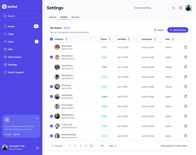
import { Tabs, Tab, useMediaQuery, useTheme } from '@mui/material';

interface NavigationTabsProps {
  activeTab: string;
  onTabChange: (tab: string) => void;
}

const desktopTabs = ['General', 'Details', 'Account'];
const mobileTabs = ['Details', 'Personal', 'Account', 'Profile', 'Security'];

export default function NavigationTabs({ activeTab, onTabChange }: NavigationTabsProps) {
  const theme = useTheme();
  const isMobile = useMediaQuery(theme.breakpoints.down('md'));
  const tabs = isMobile ? mobileTabs : desktopTabs;
  return (
    <Tabs
      value={activeTab}
      onChange={(_, value) => onTabChange(value)}
      sx={{
        minHeight: 'auto',
        '& .MuiTabs-indicator': {
          height: '3px',
          bgcolor: 'primary.main'
        }
      }}
    >
      {tabs.map((tab) => (
        <Tab
          key={tab}
          label={tab}
          value={tab}
          sx={{
            fontSize: '14px',
            fontWeight: 700,
            letterSpacing: '-0.08px',
            textTransform: 'none',
            minHeight: 'auto',
            py: 1.5,
            px: 2,
            color: 'text.secondary',
            '&.Mui-selected': {
              color: 'text.primary'
            }
          }}
        />
      ))}
    </Tabs>
  );
}
Kombai always uses the sx prop for styling MUI components over inline CSS. This keeps your code clean, theme-aware, and consistent with MUI best practices.
Kombai has built-in support for MUI X components and smart icon search for MUI icons. Whether it’s matching icons from Figma designs or picking them based on a text description, Kombai always finds the closest match.
Kombai’s MUI context engine stays updated with the latest components. For example, it automatically uses the Grid2 component instead of the deprecated Grid in MUI v6, so your code always follows MUI’s latest standards.
Specialized tools for theme generation and color management.
See what MUI devs are saying about Kombai.